

Velvet color is a deep wine-plum tone that looks rich, smooth, and slightly muted—like dyed velvet fabric under soft light.
Its signature hex code is #5A1A3A, and it's often read as luxurious, intimate, and dramatic without the loudness of bright magenta.
Velvet Color: Codes & Values
Here are the essential velvet color codes designers use for web, UI, and print work.
| Parameters | VALUE |
| HEX Code | #5A1A3A |
| RGB DECIMAL | 90, 26, 58 |
| RGB PERCENTAGE | 35.3%, 10.2%, 22.7% |
| CMYK | 0%,71%,36%,65% |
| HSL | 330°, 55%, 23% |
| HSV (HSB) | 330°, 71%, 35% |
| Web Safe | #663333 |
Key Color Space Explanations:
- HEX - HEX is the most common digital identifier for velvet color and is used in web design and UI styling. Use it when you need consistent display across screens.
- RGB - RGB mixes red, green, and blue light to create velvet on screens. It is the go-to format for CSS effects, overlays, and motion graphics.
- CMYK - CMYK is used for printing, where inks combine to approximate velvet on paper. Always test a proof because deep wine-plum tones can shift based on stock and coating.
- HSL - HSL describes velvet by hue, saturation, and lightness, which is convenient for adjusting tone while keeping the same base hue. It is helpful when generating tints, shades, and hover states.
- Web Safe - Web Safe is the closest legacy-safe screen approximation for older palettes and constraints. It is mainly useful for fallback or strict compatibility workflows.
Use HEX for UI and brand guidelines, RGB for on-screen effects, and CMYK for print files—then validate the final look under real lighting and materials.
Velvet Color Conversions
Need velvet color in a different format? Copy the exact value below for design tools, CSS, and production workflows.
| Parameters | VALUE | CSS |
| HEX | #5a1a3a | #5a1a3a |
| RGB DECIMAL | 90, 26, 58 | rgb(90,26,58) |
| RGB PERCENTAGE | 35.3%, 10.2%, 22.7% | rgb(35.3%,10.2%,22.7%) |
| CMYK | 0%,71%,36%,65% | cmyk(0%,71%,36%,65%) |
| HSL | 330°, 55%, 23% | hsl(330°,55%,23%) |
| HSV (or HSB) | 330°, 71%, 35% | -- |
| Web Safe | 663333 | #663333 |
| CIE-LAB | 21, 33, -5 | -- |
| XYZ | 5.35, 3.22, 4.35 | -- |
| xyY | 0.414, 0.249, 3.22 | -- |
| CIE-LCH | 21, 33, 351° | -- |
| CIE-LUV | 21, 34, -9 | -- |
| Hunter-Lab | 18, 24, -3 | -- |
| Binary | 01011010 00011010 00111010 | -- |
Want to generate Velvet Color photos or posters? Try Media.io's AI Image Generator now!
Velvet Color Meaning & Symbolism
Velvet color is widely associated with luxury, depth, and a quiet kind of confidence. In everyday life it often reads as romantic and refined, making it a popular choice when you want a premium feel without shouting for attention.
Psychological Effects
Because it's dark and saturated, velvet can change how a layout "feels" at first glance.
- Intimacy - Creates a close, personal mood that feels warm and considered.
- Visual Focus - Naturally draws attention to key elements like headlines, badges, and featured products.
- Slower Pace - Makes compositions feel calmer and more deliberate, especially in editorial layouts.
- Creative Depth - Supports artistic, boutique, and premium storytelling without needing loud accents.
- Heaviness Risk - Overuse can feel moody or overly formal and may reduce perceived brightness.
Positive Associations
These are the most common "good" signals velvet brings to branding and design.
- Luxury - Suggests premium materials, craftsmanship, and elevated taste.
- Romance - Reads softly romantic, ideal for intimate and evening-forward themes.
- Sophistication - Feels refined and confident, especially with clean typography.
- Warmth - The red base adds approachability when balanced with light neutrals.
- Drama - Adds cinematic contrast and hierarchy without going neon or overly bright.
Cultural Significance Across the World
Deep wine-plum tones tend to carry "occasion" energy, but context still matters.
- Evening Wear - Often linked with formal dressing, glamour, and night-time events.
- Theater & Performance - Commonly associated with stage curtains and dramatic lighting palettes.
- Ceremony - Can feel ceremonial and elegant in invitations and formal stationery.
- Context Sensitivity - Meanings vary by culture, so it's best used as a mood cue rather than a fixed symbol.
Design Applications
Velvet color works best as a statement tone: rich enough to feel premium, but muted enough to stay usable. It is especially effective when you need depth, hierarchy, or a sophisticated accent.
Graphic Design Tips
- Use velvet as an accent color for premium labels, callouts, and packaging panels.
- Balance large velvet areas with light space so layouts don't feel too heavy.
- Pair velvet with clean typefaces and generous line-height for a modern, editorial feel.
- For gradients, shift gently toward neighboring plum/wine tones to keep it smooth and luxe.
- In print, test on your chosen paper stock—deep wine-plum hues can shift with coating and finish.
If velvet is your hero color, keep your supporting palette restrained and let texture (paper, foil, varnish, or photography) do the extra work.
Velvet Color in Photography & Video
- Use velvet as a backdrop tone to add depth without the harshness of pure black.
- Warm key lights can push velvet more burgundy; cooler lights can make it read more purple.
- Protect shadow detail—crushed blacks can flatten velvet and hide its plum character.
- For product shots, velvet works well with reflective props and soft neutrals for contrast.
- In motion design, reserve velvet for titles, lower-thirds, or selected states to keep clarity high.
Recommended Tool for Image Enhancement: When incorporating velvet color into your photography projects, Media.io's AI Image tools can help you achieve more refined results. With AI-powered color enhancement, photo colorization, image upscaling, and old photo restoration, you can easily enrich velvet color tones, improve overall image quality, and highlight the color's elegant and sophisticated aesthetic.
Color Combinations
Velvet color pairs well with both warm neutrals and cool greens and blues. Use the schemes below to create balanced palettes for branding, UI, illustration, and interiors.
Complementary Colors
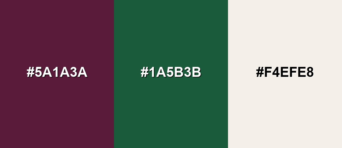
A complementary pairing places velvet against a green-leaning counter-tone for strong contrast and energy. This is a reliable setup for modern branding, buttons, and highlighted UI states.
Complementary Palette Example: Try velvet with pine green and a soft ivory to keep the contrast bold but still elegant.
Analogous Color Schemes
Analogous colors sit adjacent to each other on the color wheel, creating harmonious, cohesive palettes with subtle variation.
Analogous scheme: lean into neighboring plum and wine tones for a smooth, luxurious gradient look.
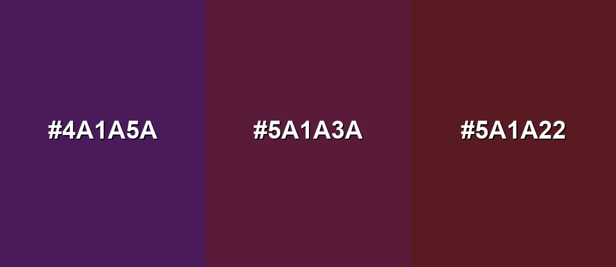
- Mulberry Shadow: #4A1A5A
- Velvet: #5A1A3A
- Bordeaux Wine: #5A1A22
Analogous scheme: use softened variations around velvet to build depth without harsh contrast.
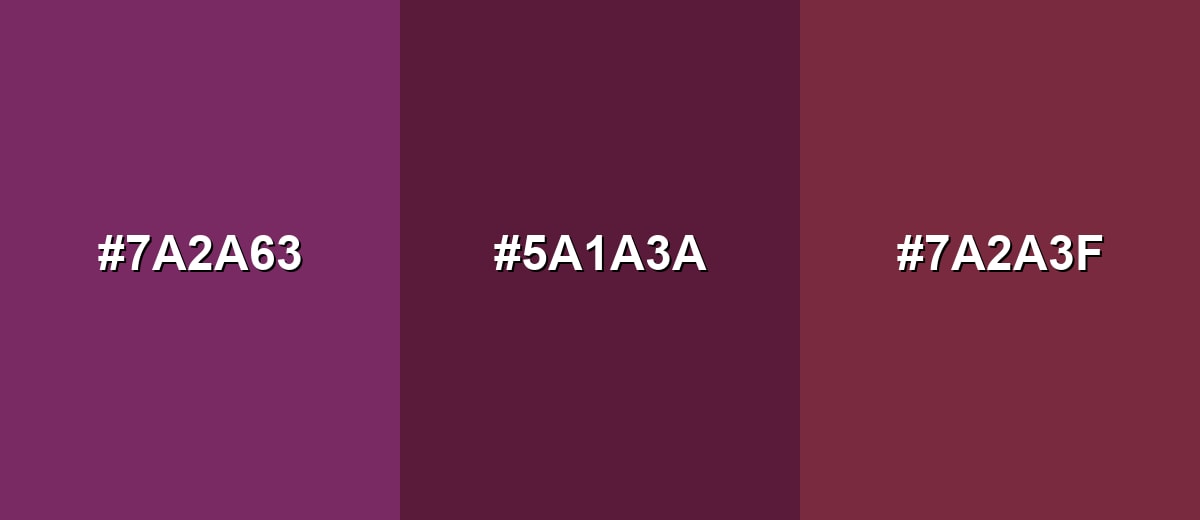
- Dusty Plum: #7A2A63
- Velvet: #5A1A3A
- Deep Rose: #7A2A3F
Triadic & Tetradic Combinations
A triadic palette spreads hues evenly for a lively but controlled look.
Triadic scheme: pair velvet with olive and slate blue for creative, editorial-friendly contrast.
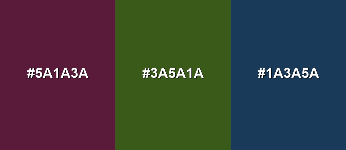
- Velvet: #5A1A3A
- Olive Bark: #3A5A1A
- Slate Blue: #1A3A5A
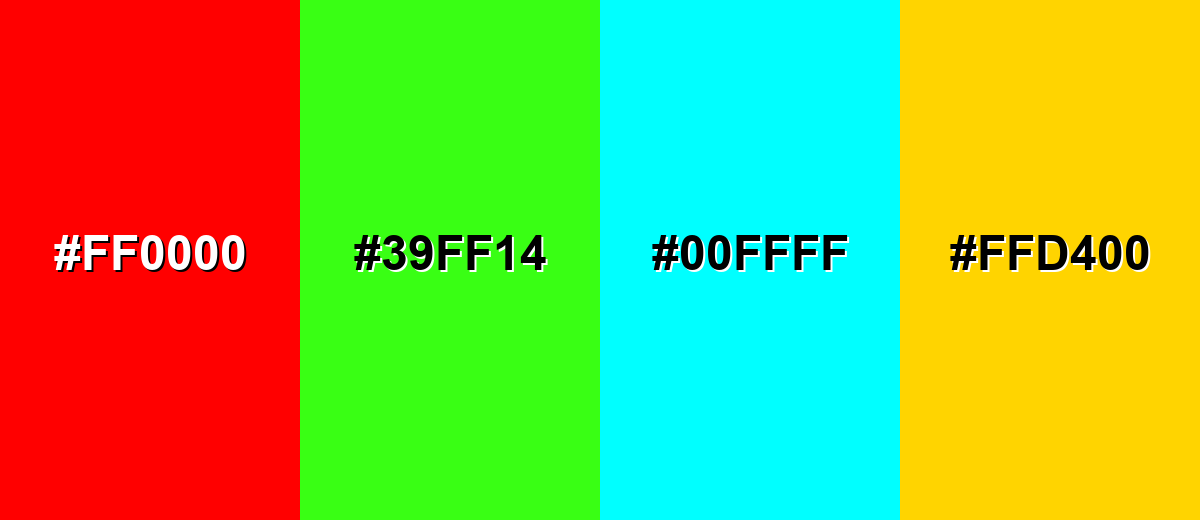
Colors to Avoid
While velvet color is remarkably versatile, certain combinations can create problematic visual effects:
- Pure Red (#FF0000) - Competes with velvet's red base and can make the palette feel harsh and noisy, especially in UI accents.
- Neon Green (#39FF14) - The high intensity clashes with velvet's muted richness and can look unrefined in premium contexts.
- Bright Cyan (#00FFFF) - Creates a cold, synthetic contrast that can overpower velvet and disrupt a warm, luxe mood.
- Vivid Yellow (#FFD400) - Reads very loud against dark plum tones and can make layouts feel unbalanced unless carefully constrained.
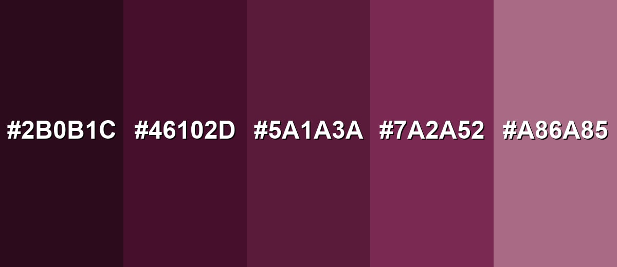
Shades, Tints & Variations of Velvet Color
Velvet isn't just one note—it ranges from near-black plums to dusty rosy tints. This range is useful for building hierarchy (background → surface → accent) while keeping a cohesive, luxe mood.
- Black Velvet (#2B0B1C) - An almost-black plum that keeps a hint of red for warmth. It's best used for High-end backgrounds, dramatic photography backdrops, and dark-mode surfaces.
- Deep Velvet (#46102D) - A darker, inkier version that feels intense and elegant. It's best used for Headers, packaging panels, and premium UI sections where contrast is critical.
- Velvet (#5A1A3A) - The core velvet tone: wine-plum with a soft, luxurious feel. It's best used for Brand accents, featured UI components, editorial highlights, and statement decor.
- Soft Velvet (#7A2A52) - A lighter, friendlier plum that stays rich but feels more approachable. It's best used for Secondary buttons, illustrations, gradients, and warm accent walls.
- Velvet Blush (#A86A85) - A dusty rosy tint that pairs easily with neutrals and warm materials. It's best used for Background washes, beauty branding, wedding stationery, and gentle UI panels.
Industry Applications
Because velvet sits between burgundy and purple, it adapts across industries that want depth and sophistication—especially where mood and perceived quality matter.
Fashion & Beauty
- Use velvet for cosmetics packaging and fragrance visuals to create an evening-ready, premium feel.
- Pair it with light neutrals in layouts so product names and ingredients stay readable.
- It works especially well for limited editions, gift sets, and "signature" collections.
- Keep accent finishes subtle to match velvet's refined, softly muted character.
Interior Design & Decor
- Apply velvet on accent walls, upholstery, curtains, or decor pieces for a cozy, upscale effect.
- Balance it with lighter walls and reflective finishes to prevent the space from feeling closed in.
- Warm lighting helps velvet read inviting; harsh cool lighting can make it feel more severe.
- Use it sparingly in smaller rooms and let neutrals do the heavy lifting on large surfaces.
Branding & Marketing
- Velvet is strong for premium labels, editorial-style campaigns, and boutique brand identities.
- It's a smart choice for wine, chocolate, and specialty foods where "richness" is part of the story.
- In modern UI, treat velvet as an accent for selected states and highlights rather than an all-over background.
- Prioritize contrast for accessibility—near-white text is typically the safest option on deep velvet.
Conclusion
Velvet color stands out for its rich wine-plum character that feels soft, intimate, and premium without being overly bright. With #5A1A3A as a reliable base, you can create everything from dramatic dark palettes to approachable rosy tints—especially when you balance velvet with light neutrals for clarity or pair it with greens and blues for modern contrast. Used thoughtfully, velvet color brings hierarchy, mood, and a polished, memorable finish to branding, UI, print, and interiors.
Design Smarter with AI: Media.io is an online AI studio that empowers creators with advanced image generation and enhancement tools. From text-to-image and image-to-image creation to AI upscaling and color optimization, it enables fast, creative, and professional results—all in your browser.

Frequently Asked Questions About Velvet Color
Velvet color is a deep wine-plum tone that looks rich and softly muted, similar to dyed velvet fabric under warm light. It often sits between burgundy and purple.
A commonly used digital hex value for velvet color is #5a1a3a. It produces a dark, saturated plum-wine appearance on screens.
Velvet typically leans slightly purple compared with classic burgundy, but it can look more burgundy in warm lighting or when paired with warm neutrals and reds.
Velvet pairs well with soft neutrals like ivory and with deep greens for complementary contrast. It also looks great with slate blues, charcoal grays, and warm copper-brown accents.
Use velvet as an accent for headers, badges, or selected states, and keep most surfaces light. Choose near-white text and test contrast, especially for small labels and buttons.
Velvet color symbolism often suggests luxury, romance, depth, and sophistication. Depending on context, it can also feel dramatic or serious, so pairing and spacing matter.


