

 TL;DR:
Tan (reference HEX #d2b48c) is a warm, light brown neutral that offers a stable, approachable foundation for digital and physical designs requiring an earthy, natural aesthetic.
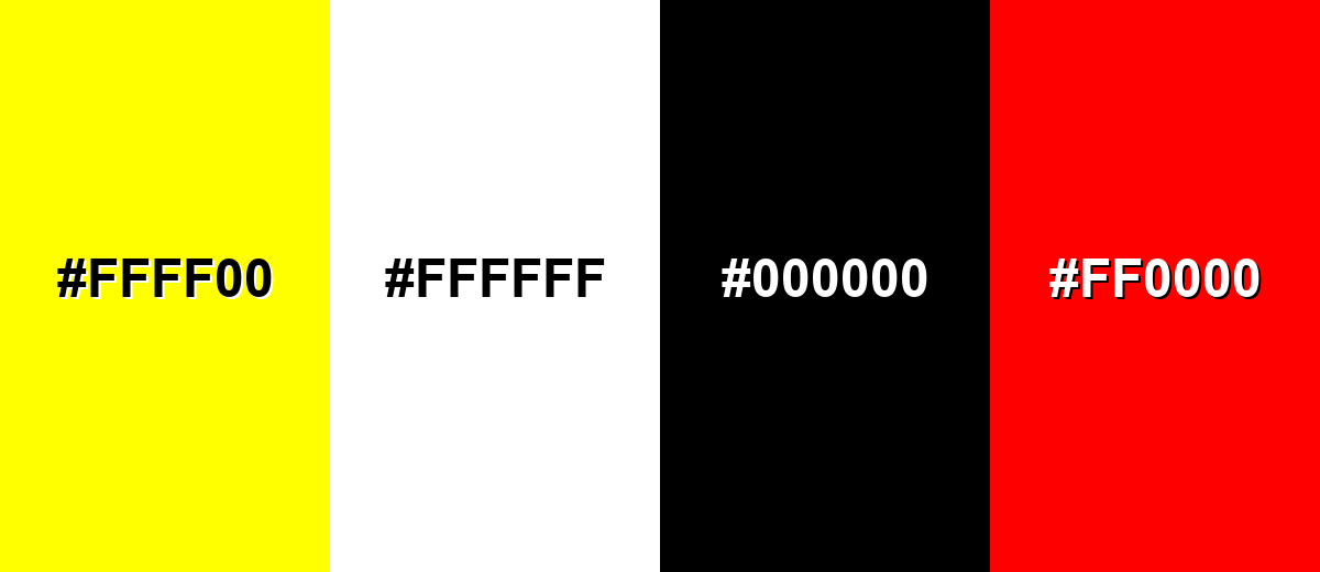
● To prevent layouts from appearing flat or dull, avoid pairing tan with neon yellow, pure white, true black, or bright red, and instead use a deeper anchor tone like Dark Tan Brown (#8A6A44) for structural contrast.
● Tan differs from lighter, creamier beige by featuring darker golden-brown undertones, making it highly compatible with muted blues, soft greens, and organic textures like kraft paper, wood, and leather.
● Maintain color consistency across workflows by utilizing HEX #d2b48c or RGB (210, 180, 140) for screen-based UI and digital imagery, switching strictly to CMYK (0%, 14%, 33%, 18%) for print proofs and packaging.
Ask AI for a summary
 ChatGPT
 Perplexity
 Gemini
 Claude
 Grok
Grok
Tan is a warm, light brown neutral that looks like sun-baked sand or natural leather. A common reference shade is #d2b48c, which sits between beige and light brown with a gentle golden cast.
It's often perceived as grounded, calm, and approachable rather than flashy. Below, you'll find tan's color codes, practical pairings, popular shades, and design tips for modern use.
Tan Color: Codes & Values
If you want a reliable "classic tan" for design tools, print specs, or CSS, these values are the most commonly referenced.
| Parameters | VALUE |
| HEX Code | #D2B48C |
| RGB DECIMAL | 210, 180, 140 |
| RGB PERCENTAGE | 82.35%, 70.59%, 54.90% |
| CMYK | 0%,14%,33%,18% |
| HSL | 34°, 44%, 69% |
| HSV (HSB) | 34°, 33%, 82% |
| Web Safe | #CCCC99 |
Key Color Space Explanations:
- HEX - HEX is the most common way to specify tan in web design and digital tools using a six-digit code. It is ideal for CSS, UI libraries, and design systems.
- RGB - RGB defines tan by mixing red, green, and blue light values. It is used for screens, digital imaging, and any workflow based on light output.
- CMYK - CMYK describes how much cyan, magenta, yellow, and black ink are used to print tan. It is the go-to format for print proofs, packaging, and production printing.
- HSL - HSL expresses tan by hue, saturation, and lightness, which is handy for making lighter or darker variants. Designers often use it to tune warmth and contrast more intuitively.
- Web Safe - Web Safe is the closest legacy-safe approximation for older display constraints. It is mainly useful for compatibility checks and quick fallbacks.
Use HEX/RGB for anything on-screen, and switch to CMYK when you're preparing files for print. If you're building a palette, HSL is a quick way to create lighter tints and deeper anchor tones.
Tan Color Conversions
Need tan in multiple formats for design apps, coding, or print checks? Here's a quick conversion table you can copy and use.
| Parameters | VALUE | CSS |
| HEX | #d2b48c | #d2b48c |
| RGB DECIMAL | 210, 180, 140 | rgb(210,180,140) |
| RGB PERCENTAGE | 82.35%, 70.59%, 54.90% | rgb(82.35%,70.59%,54.90%) |
| CMYK | 0%,14%,33%,18% | cmyk(0%,14%,33%,18%) |
| HSL | 34°, 44%, 69% | hsl(34°,44%,69%) |
| HSV (or HSB) | 34°, 33%, 82% | -- |
| Web Safe | cccc99 | #cccc99 |
| CIE-LAB | 74.1, 6.1, 25.3 | -- |
| XYZ | 47.9, 47.6, 32.0 | -- |
| xyY | 0.360, 0.357, 47.6 | -- |
| CIE-LCH | 74.1, 26.0, 76.4° | -- |
| CIE-LUV | 74.1, 16.0, 33.0 | -- |
| Hunter-Lab | 69.0, 5.6, 18.0 | -- |
| Binary | 11010010 10110100 10001100 | -- |
Want to generate Tan Color photos or posters? Try Media.io's AI Image Generator now!
Tan Color Meaning & Symbolism
Tan is widely associated with earthiness, stability, and a comfortable sense of simplicity. Because it resembles sand, wood, and leather, it often reads as practical and reliable in everyday visuals. It also works as a friendly neutral that supports other tones without feeling stark.
Psychological Effects
Tan is typically used to bring warmth and ease to a space without stealing attention.
- Calm - Tan tends to make screens and rooms feel settled and less visually "loud."
- Approachability - Compared with bright white, tan can feel softer and more welcoming for long-form content.
- Understated Confidence - In UI and branding, tan often signals quiet quality rather than high energy.
- Natural Comfort - Its sand/wood/leather vibe can make designs feel cozy and lived-in.
- Low-Contrast Risk - Overusing tan-on-tan can look flat, so strong hierarchy and accents are important.
Positive Associations
These are common "good" signals designers lean on when using tan as a base neutral.
- Earthiness - Suggests a grounded, outdoors-inspired aesthetic tied to natural materials.
- Stability - Communicates reliability, practicality, and a steady visual foundation.
- Simplicity - Supports minimalist layouts where the content or product should lead.
- Craftsmanship - Often reads as artisanal when paired with paper textures, wood tones, or leather cues.
- Warm Neutrality - Blends with both warm and cool accents without feeling sterile.
Cultural Significance Across the World
Tan's meaning shifts with context, styling, and neighboring colors, but the "natural materials" story is a common thread.
- Outdoors Aesthetic - Commonly linked to sand, stone, and landscape tones in nature-driven visuals.
- Tradition - Frequently used to suggest heritage and timelessness, especially with classic typography.
- Everyday Practicality - Reads as functional and unfussy, which can feel familiar and dependable.
- Material Culture - Strongly associated with wood, linen, paper, and leather across lifestyle design.
Design Applications
Tan is a versatile base tone for layouts that need warmth without visual noise. It's most effective when used to support typography, highlight natural textures, or build a soft background that still feels premium.
Graphic Design Tips
- Use tan as a background to reduce glare and keep pages feeling warm and readable.
- Pair it with a deeper anchor tone for headings and navigation so hierarchy stays crisp.
- Choose accents intentionally (one or two) to avoid a "dusty" or overly beige-heavy look.
- Let texture do some of the work—grain, kraft paper, or subtle noise makes tan feel richer.
- In brand systems, define clear roles (surface, border, accent) so tan doesn't blur states together.
If your layout starts to feel flat, add contrast with a darker tan-brown for structure and a cool accent to keep the palette modern.
Tan Color in Photography & Video
- Tan looks especially natural in lifestyle shots with wood, linen, ceramics, and leather.
- Warm lighting can push tan more golden—lock white balance if you need consistency across scenes.
- For product videos, tan backdrops help reduce harsh reflections compared to pure white.
- Use gentle contrast (shadows and midtones) to prevent tan-heavy frames from looking hazy.
- Tan pairs well with muted blues/greens in grading for a calm, premium "earthy" look.
Recommended Tool for Image Enhancement: When incorporating tan color into your photography projects, Media.io's AI Image tools can help you achieve more refined results. With AI-powered color enhancement, photo colorization, image upscaling, and old photo restoration, you can easily enrich tan color tones, improve overall image quality, and highlight the color's elegant and sophisticated aesthetic.
Color Combinations
Tan is easy to pair because it sits in the warm neutral range and plays well with both cool and warm accents. The combinations below show dependable directions for interfaces, rooms, and brand palettes.
Complementary Colors
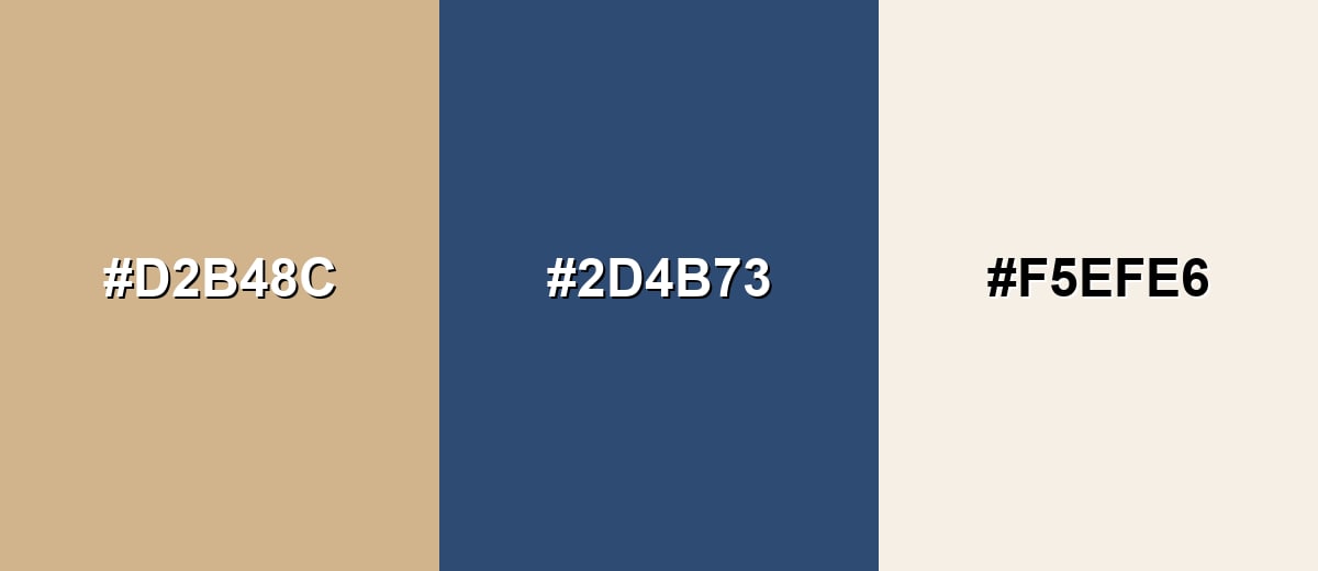
A cool, muted blue is a natural counterbalance to tan, creating contrast without feeling loud. Add a light neutral to keep the palette breathable.
Complementary Palette Example: Use classic tan with deep slate blue and a soft off-white for a balanced, timeless look.
Analogous Color Schemes
Analogous colors sit adjacent to each other on the color wheel, creating harmonious, cohesive palettes with subtle variation.
A warm, sunlit scheme that moves from beige to camel for an easy, natural gradient.
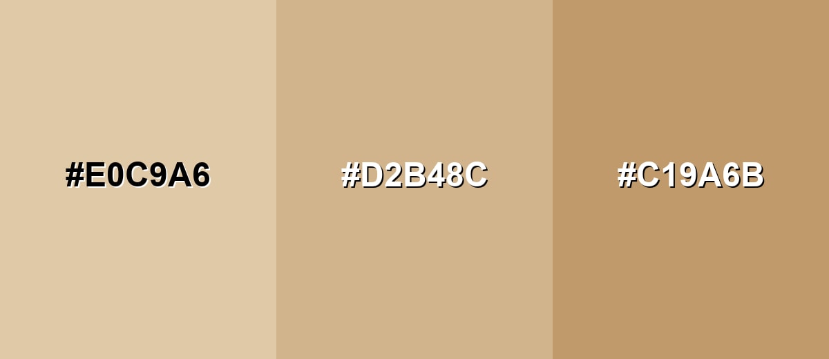
- Oat Beige: #E0C9A6
- Classic Tan: #D2B48C
- Camel Brown: #C19A6B
A slightly richer set that leans golden and works well with wood tones and warm photography.
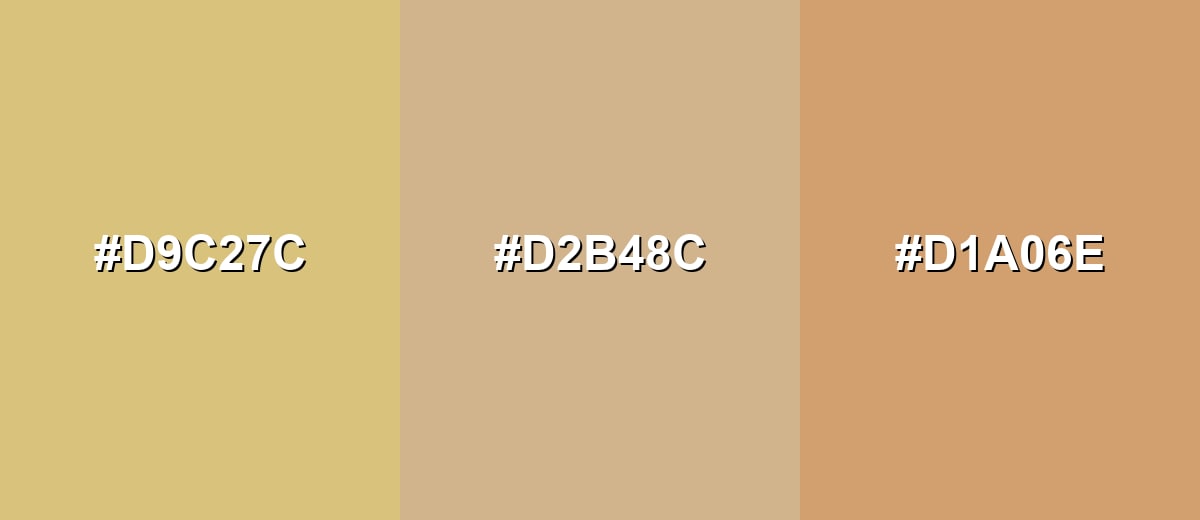
- Golden Sand: #D9C27C
- Classic Tan: #D2B48C
- Soft Apricot: #D1A06E
Triadic & Tetradic Combinations
A triadic palette adds variety while keeping the overall look muted and usable.
Pair tan with a calm teal and a soft violet for a modern, friendly contrast that still feels natural.
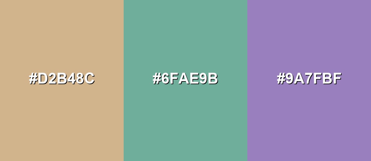
- Classic Tan: #D2B48C
- Muted Teal: #6FAE9B
- Soft Violet: #9A7FBF
Colors to Avoid
While tan color is remarkably versatile, certain combinations can create problematic visual effects:
- Neon Yellow (#FFFF00) - The intensity can overpower tan and create a harsh, vibrating contrast that looks unrefined.
- Pure White (#FFFFFF) - On large surfaces it can make tan appear dull or dirty by comparison unless contrast and lighting are carefully managed.
- True Black (#000000) - The jump can feel heavy and severe, which may fight tan's softer, natural character in calm layouts.
- Bright Red (#FF0000) - This combination can look abrupt and overly aggressive unless the red is heavily muted and used sparingly.
Shades, Tints & Variations of Tan Color
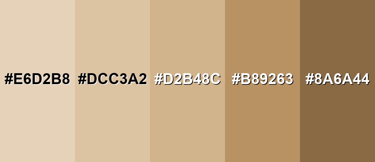
Tan isn't just one shade—it ranges from pale, airy neutrals to deeper camel-like browns. Having a few variations on hand makes it easier to build contrast, define UI hierarchy, and create more realistic, material-inspired palettes.
- Pale Tan (#E6D2B8) - A lighter, airy tan that feels soft and spacious with minimal visual weight. It's best used for Backgrounds, cards, large surfaces, and subtle branding systems.
- Sand Beige (#DCC3A2) - A sandy neutral that keeps warmth while reading a bit more beige than brown. It's best used for Interior palettes, lifestyle imagery overlays, and calm UI sections.
- Classic Tan (#D2B48C) - The familiar reference shade with a balanced golden-brown look. It's best used for Primary neutral, product backdrops, and dependable base palettes.
- Warm Camel (#B89263) - A deeper, warmer variant that brings more richness and definition. It's best used for Buttons, headings, trims, leather-like accents, and earthy brand elements.
- Dark Tan Brown (#8A6A44) - A grounded shade that reads closer to brown while still keeping tan's warmth. It's best used for Text accents, outlines, navigation bars, and depth for contrast.
Industry Applications
Because tan feels natural and dependable, it shows up across industries that value comfort, craftsmanship, and clarity. It can work as a quiet backdrop or as a defining brand tone when paired with strong typography and intentional contrast.
Fashion & Beauty
- Use tan as a leather-inspired neutral in lookbooks, packaging, and minimalist collections.
- Pair tan with deeper browns for a timeless, premium accessories aesthetic.
- In wellness and personal care, tan helps labels feel simple, clean, and gentle.
- Tan backdrops keep product photography cohesive while letting textures stand out.
Interior Design & Decor
- Tan works beautifully on walls, rugs, and upholstery where you want warmth that still reads neutral.
- Balance it with brighter highlights and deeper anchor tones to avoid a monotone room.
- Natural textures (woven fabrics, matte finishes, wood grain) make tan feel richer and less flat.
- It pairs easily with wood tones, making it a practical base for home goods styling.
Branding & Marketing
- Tan supports craft-oriented positioning—think artisanal goods, hospitality, and coffee brands.
- It's ideal for kraft-paper looks and minimalist packaging that communicates "natural."
- In ecommerce UI, tan surfaces add warmth while keeping attention on the products.
- Use high-contrast typography so tan-heavy layouts stay crisp and readable.
Conclusion
Tan is a warm neutral that brings grounded comfort to modern design—whether you're building a calm UI, a craft-forward brand palette, or a cozy interior mood. With its classic reference shade #D2B48C, tan sits neatly between beige and light brown, making it easy to layer with other neutrals and elevate with muted blues, greens, or purples. The key is contrast: give tan a deeper anchor tone for structure and use a focused accent for energy, and it will look intentional, premium, and easy to live with.
Design Smarter with AI: Media.io is an online AI studio that empowers creators with advanced image generation and enhancement tools. From text-to-image and image-to-image creation to AI upscaling and color optimization, it enables fast, creative, and professional results—all in your browser.

Frequently Asked Questions About Tan Color
Tan is a warm, light brown neutral that often resembles sand, natural leather, or light wood. It usually sits between beige and light brown and is commonly used as a soft base tone.
A widely used reference hex code for tan is #d2b48c. Other tan-like shades can shift more beige, more golden, or more brown depending on the palette.
They are similar, but not identical. Beige typically looks lighter and more creamy, while tan tends to feel slightly darker and more golden or brown.
Tan pairs well with muted blues, soft greens, warm whites, charcoal-like darks, and dusty purples. It also works with other warm neutrals such as beige and camel for layered, natural palettes.
Tan is generally considered warm because it has yellow and brown undertones. It can appear cooler when placed next to strong warm hues or when lighting is cool and neutral.
A practical approach is to start with white, add a small amount of brown, then warm it slightly with a touch of yellow or raw sienna. Adjust slowly, since tan shifts quickly with small changes.


