

Cerulean blue color is a vivid, medium-deep blue that feels like clear sky meeting open water. Its most common digital reference is #2A52BE, giving you a crisp, confident blue that’s bright without going neon.
Often read as calm, trustworthy, and quietly energetic, cerulean blue is a go-to for modern UI, branding, and clean layouts. Below, you’ll find its exact color codes, conversions, pairings, shades, and practical design tips.
Cerulean Blue Color: Codes & Values
If you want cerulean blue to look consistent across screens and print, start with these core color values.
| Parameters | VALUE |
| HEX Code | #2A52BE |
| RGB DECIMAL | 42, 82, 190 |
| RGB PERCENTAGE | 16.5%, 32.2%, 74.5% |
| CMYK | 77.9%,56.8%,0%,25.5% |
| HSL | 224°, 64%, 45% |
| HSV (HSB) | 224°, 78%, 75% |
| Web Safe | #3366CC |
Key Color Space Explanations:
- HEX - A six-digit code used in web and UI design to define cerulean blue precisely. Use #2a52be for consistent results across screens.
- RGB - RGB mixes red, green, and blue light to build the on-screen appearance. For this shade, 42, 82, 190 produces a clear, saturated blue.
- CMYK - CMYK is the ink formula used in printing. The mix 77.9%,56.8%,0%,25.5% helps approximate the same look on paper, though results vary by stock and press.
- HSL - HSL describes hue, saturation, and lightness in a more intuitive way for tweaking tones. It is useful when building tints, shades, and balanced palettes around cerulean blue.
- Web Safe - Web-safe values map to a limited legacy palette that displays predictably on older systems. #3366cc is the closest web-safe match to this cerulean blue.
Use HEX for UI mockups and CSS, RGB for screen-based apps and video workflows, and CMYK when you’re preparing print files or brand guidelines.
Cerulean Blue Color Conversions
Here’s a quick conversion table for cerulean blue, including copy-ready CSS formats where available.
| Parameters | VALUE | CSS |
| HEX | #2a52be | #2a52be |
| RGB DECIMAL | 42, 82, 190 | rgb(42,82,190) |
| RGB PERCENTAGE | 16.5%, 32.2%, 74.5% | rgb(16.5%,32.2%,74.5%) |
| CMYK | 77.9%,56.8%,0%,25.5% | cmyk(77.9%,56.8%,0%,25.5%) |
| HSL | 224°, 64%, 45% | hsl(224°,64%,45%) |
| HSV (or HSB) | 224°, 78%, 75% | -- |
| Web Safe | 3366cc | #3366cc |
| CIE-LAB | 38.2, 23.5, -60.6 | -- |
| XYZ | 13.19, 10.24, 49.95 | -- |
| xyY | 0.180, 0.140, 10.24 | -- |
| CIE-LCH | 38.2, 65.0, 291.3° | -- |
| CIE-LUV | 38.2, -15.5, -88.0 | -- |
| Hunter-Lab | 32.0, 19.8, -77.9 | -- |
| Binary | 00101010 01010010 10111110 | -- |
Want to generate cerulean blue color photos or posters? Try Media.io's AI Image Generator now!
Cerulean Blue Meaning & Symbolism
Cerulean blue is commonly linked with clear thinking, reliability, and a steady sense of openness. Because it sits between sky-blue freshness and deeper ocean tones, it often signals both calm and confidence in everyday visuals.
Psychological Effects
In day-to-day design, cerulean blue tends to guide the eye without raising stress.
- Calm Focus - Cerulean blue often feels soothing and organized, helping users concentrate in busy interfaces.
- Clean Modernity - It can look crisp and contemporary without feeling as formal or heavy as navy.
- Trust & Competence - In branding, it commonly reads as reliable and capable, especially with simple typography and plenty of space.
- Quiet Energy - The saturation gives it enough punch for tech, creative work, and interactive accents.
- Cool Distance Risk - Overuse (or pairing with very cool neutrals) can feel clinical, so warm balance matters.
Positive Associations
These are common “good signal” messages cerulean blue can communicate when used with intention.
- Clarity - Suggests clean thinking, straightforward navigation, and easy-to-scan structure.
- Reliability - Feels steady and dependable, making it a safe choice for service and support messaging.
- Openness - Sky-and-water vibes can make pages feel more breathable and welcoming.
- Confidence - Strong enough for CTAs and highlights without looking aggressive or loud.
- Fresh Professionalism - Keeps “business-ready” cues while staying lighter and more approachable than darker blues.
Cultural Significance Across the World
While meanings vary by context, cerulean blue frequently carries familiar modern cues across many audiences.
- Safety & Stability - Blue shades are widely tied to trust, professionalism, and security in modern communication.
- Sky & Sea Symbolism - Cerulean’s sky-like character naturally connects to openness, travel, and calm environments.
- Art & Craft Heritage - Cerulean pigments gained popularity for a cleaner, more stable blue character in visual art.
- Tech-Forward Familiarity - In digital products, it feels “standard” for clickable elements, reducing friction and confusion.
Design Applications
Cerulean blue works well when you need a strong, friendly blue that stays readable and modern. Use it as a primary brand tone, an interactive accent, or a background block, then fine-tune contrast and temperature with supporting neutrals.
Graphic Design Tips
- Use it for clear actions - Cerulean blue is a natural fit for primary buttons, links, and selected states.
- Keep large areas airy - Reserve fully saturated blocks for key sections and lean on lighter tints for panels.
- Pair with warm accents - A warm orange or coral accent adds human warmth and strengthens hierarchy.
- Plan for readability - White text is usually the safest choice on cerulean blue backgrounds at typical UI sizes.
- Use deeper shades for structure - Darker cerulean variations work well for navigation bars, headers, and premium cues.
Pro tip: build your system around #2A52BE, then create one lighter tint for backgrounds and one deeper shade for headers—this keeps your UI consistent without feeling flat.
Cerulean Blue in Photography & Video
- Lean into sky-and-water scenes - Cerulean naturally enhances coastal, travel, and outdoor visuals.
- Use it as a wardrobe “pop” - Small cerulean elements (jackets, props, product accents) read clean on neutral sets.
- Balance cool grades with warmth - Add skin-tone warmth or golden highlights so the image doesn’t drift clinical.
- Great for tech and product shots - It complements glass, metal, and minimal layouts, keeping the frame modern.
- Watch oversaturation - If blues clip, pull saturation down slightly or shift toward softer cerulean tints.
Recommended Tool for Image Enhancement: When incorporating cerulean blue into your photography projects, Media.io's AI Image tools can help you achieve more refined results. With AI-powered color enhancement, photo colorization, image upscaling, and old photo restoration, you can easily enrich cerulean blue tones, improve overall image quality, and highlight the color's elegant and sophisticated aesthetic.
Color Combinations
Cerulean blue pairs best with warm complements for punch, nearby blues and teals for smooth gradients, and balanced neutrals for clean layouts. The palettes below give you dependable starting points for branding, UI, illustration, and interiors.
Complementary Colors
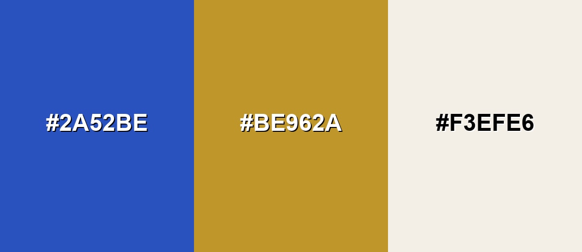
A complementary pairing places cerulean blue opposite a warm orange tone, creating high energy and clear separation. Add a soft neutral to keep the look polished and readable.
Complementary Palette Example: Try cerulean blue with a warm orange accent and an ivory neutral for a confident, friendly balance.
Analogous Color Schemes
Analogous colors sit adjacent to each other on the color wheel, creating harmonious, cohesive palettes with subtle variation.
Indigo to cerulean to bright blue builds a smooth, ocean-to-sky progression with a modern edge.
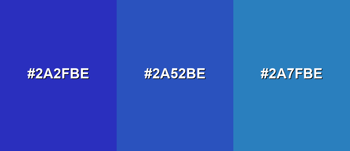
- Deep Indigo: #2A2FBE
- Cerulean Blue: #2A52BE
- Bright Blue: #2A7FBE
Cerulean blue with teal and aqua-leaning tones is ideal for calm, clean gradients and fresh interfaces.
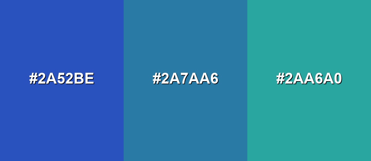
- Cerulean Blue: #2A52BE
- Blue Teal: #2A7AA6
- Sea Teal: #2AA6A0
Triadic & Tetradic Combinations
A triadic palette keeps contrast lively while staying balanced across the spectrum.
Use cerulean blue with coral red and apple green for playful, high-clarity visuals that still feel structured.
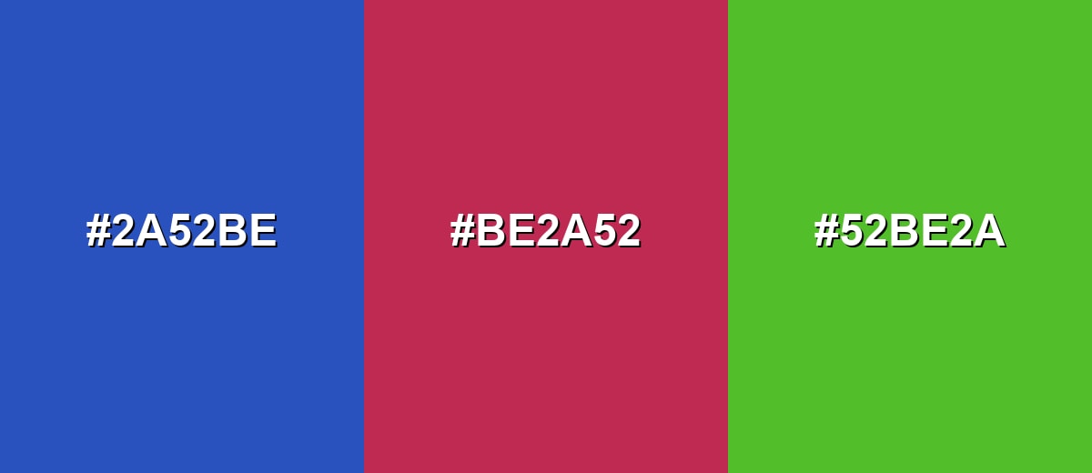
- Cerulean Blue: #2A52BE
- Coral Red: #BE2A52
- Apple Green: #52BE2A
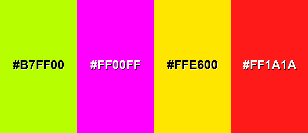
Colors to Avoid
While cerulean blue is remarkably versatile, certain combinations can create problematic visual effects:
- Neon Lime (#B7FF00) - Both shades demand attention, and the pairing can feel harsh and hard to read in UI.
- Pure Magenta (#FF00FF) - High saturation on both sides can look noisy and reduce perceived clarity in layouts.
- Electric Yellow (#FFE600) - Creates a vibrating effect against cerulean blue, which can be fatiguing in large areas.
- Bright Red (#FF1A1A) - The combination can signal error or urgency unintentionally, especially in product interfaces.
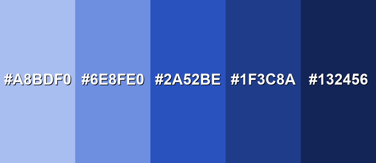
Shades, Tints & Variations of Cerulean Blue
Cerulean blue has a useful range—from pale, airy tints to near-navy depths—so you can build hierarchy without changing the overall mood. These variations make it easier to design backgrounds, accents, and high-contrast components that still feel like one cohesive blue family.
- Pale Cerulean (#A8BDF0) - A light, airy tint that keeps the sky-like feel while reducing intensity. It’s best used for Background panels, large sections, and subtle gradients.
- Soft Cerulean (#6E8FE0) - A gentler mid-light option that stays vivid but feels more approachable. It’s best used for Cards, secondary buttons, highlights, and illustrations.
- Cerulean Blue (#2A52BE) - The core cerulean blue tone: crisp, confident, and easy to spot in a layout. It’s best used for Primary accents, CTAs, links, and brand elements.
- Deep Cerulean (#1F3C8A) - A darker shade that adds weight and a more professional, grounded feel. It’s best used for Headers, footers, navigation bars, and emphasis text.
- Midnight Cerulean (#132456) - A near-navy variation that preserves the blue character while feeling bold and premium. It’s best used for High-contrast themes, overlays, and sophisticated brand systems.
Industry Applications
Cerulean blue is flexible enough for calm, trustworthy communication and bold, modern accents. It fits naturally anywhere you need clarity, easy navigation cues, and a polished but approachable tone.
Fashion & Beauty
- Clean statement pieces - Works well as an accent color in outfits where you want a crisp, confident focal point.
- Fresh seasonal palettes - Sky-and-sea vibes suit spring/summer collections and travel-inspired looks.
- Minimal packaging pop - Adds clarity on labels and product boxes without feeling overly loud.
- Premium contrast - Deeper cerulean shades can signal a more refined, “elevated” finish.
Interior Design & Decor
- Accent walls and decor - Great for a fresh focal point in studios, bathrooms, and workspaces.
- Balances warm materials - Pair with warm woods, creams, or sand tones to avoid a cold edge.
- Softens with dusty tints - Pale and soft cerulean variations create a calmer, more lived-in look.
- Modern, open atmosphere - Helps spaces feel clean and airy when used in measured blocks.
Branding & Marketing
- Tech and SaaS clarity - Strong for CTAs, links, dashboards, and structured UI systems.
- Trust-forward messaging - Useful for education, services, and finance when navy feels too heavy.
- Reassuring wellness visuals - Works for healthcare and wellness when balanced with warmer neutrals.
- Readable, modern campaigns - Keeps layouts clean and scannable across web pages, ads, and thumbnails.
Conclusion
Cerulean blue is a clear, confident shade that sits right between sky freshness and ocean depth—making it an easy win for modern design. With #2A52BE as your anchor, you can build calm, trustworthy interfaces, strong brand accents, and clean visual hierarchy, especially when you balance it with warm complements or soft neutrals. Whether you’re designing UI components, marketing creatives, or print-ready brand assets, cerulean blue delivers that “reliable but not heavy” tone that keeps work looking crisp and current.
Design Smarter with AI: Media.io is an online AI studio that empowers creators with advanced image generation and enhancement tools. From text-to-image and image-to-image creation to AI upscaling and color optimization, it enables fast, creative, and professional results—all in your browser.

Frequently Asked Questions About Cerulean Blue Color
Cerulean blue is a vivid medium-deep blue that resembles clear sky and open water. It is often used when you want a calm, clean, and confident look.
A common HEX reference for cerulean blue is #2a52be. This value is widely used in digital design to keep the shade consistent.
Cerulean blue is RGB 42, 82, 190. In CSS, you can use rgb(42,82,190).
Cerulean blue symbolism often leans toward calm, clarity, trust, and competence. In everyday design, it is a dependable choice for interfaces, service brands, and communication that should feel steady and open.
Warm oranges and corals create strong contrast, while teals and nearby blues create smooth, cohesive palettes. Clean neutrals like ivory and soft grays help it look modern and readable.
Cerulean blue can work well for accessibility when contrast is handled carefully. White text on cerulean blue backgrounds is typically a safer choice than black text for small sizes.


