

Almond color is a gentle, warm beige that resembles the light tan of an almond shell mixed with cream. With a soft, sunlit look on screens, it's an easy neutral that feels friendly and understated.
Its go-to digital reference is #EFDECD, and it can read warmer under yellow indoor lighting and slightly cooler in daylight. Below, you'll find almond's color codes, best pairings, shade range, and practical ways to use it in modern design.
Almond Color: Codes & Values
These are the standard almond color codes and values you can use to recreate almond consistently across web, UI, and print workflows.
| Parameters | VALUE |
| HEX Code | #EFDECD |
| RGB DECIMAL | 239, 222, 205 |
| RGB PERCENTAGE | 93.7%, 87.1%, 80.4% |
| CMYK | 0%,7%,14%,6% |
| HSL | 30°, 52%, 87% |
| HSV (HSB) | 30°, 14%, 94% |
| Web Safe | #FFCCCC |
Key Color Space Explanations:
- HEX - HEX is the most common way to specify almond in digital design and CSS. Use #efdecd to match the standard on-screen appearance.
- RGB - RGB defines almond by mixing red, green, and blue light. It is useful for screen-based work like UI, video, and web graphics.
- CMYK - CMYK is used for print production and separates the shade into ink percentages. Results can vary by paper and coating, so a proof helps for precise matching.
- HSL - HSL describes almond by hue, saturation, and lightness, which is helpful for building consistent palettes. It makes it easier to create lighter tints or deeper tones while staying in the same family.
- Web Safe - Web safe values approximate colors using a limited historical palette for older displays. The closest web-safe alternative is #ffcccc.
For most projects, use the HEX code for web and UI, RGB for screen graphics, and CMYK when you need predictable print output.
Almond Color Conversions
Use this conversion table to plug almond into different tools, specs, and color-managed workflows without guessing.
| Parameters | VALUE | CSS |
| HEX | #efdecd | #efdecd |
| RGB DECIMAL | 239, 222, 205 | rgb(239,222,205) |
| RGB PERCENTAGE | 93.7%, 87.1%, 80.4% | rgb(93.7%,87.1%,80.4%) |
| CMYK | 0%,7%,14%,6% | cmyk(0%,7%,14%,6%) |
| HSL | 30°, 52%, 87% | hsl(30°, 52%, 87%) |
| HSV (or HSB) | 30°, 14%, 94% | -- |
| Web Safe | ffcccc | #ffcccc |
| CIE-LAB | 88.6, 4.2, 12.3 | -- |
| XYZ | 82.4, 84.0, 70.5 | -- |
| xyY | 0.329, 0.336, 84.0 | -- |
| CIE-LCH | 88.6, 13.0, 71° | -- |
| CIE-LUV | 88.6, 7.0, 15.5 | -- |
| Hunter-Lab | 91.6, 2.5, 8.5 | -- |
| Binary | 11101111 11011110 11001101 | -- |
Want to generate Almond Color photos or posters? Try Media.io's AI Image Generator now!
Almond Color Meaning & Symbolism
Almond is commonly associated with warmth, simplicity, and natural comfort. Because it sits close to cream and beige, it often reads as grounded and approachable in everyday visual communication. This Almond Color meaning makes it a practical choice when you want a soft neutral that still feels human and welcoming.
Psychological Effects
Almond's lightness and warmth can subtly shape how a page, room, or brand experience feels.
- Calming Feel - Almond can make spaces and interfaces feel calmer and less demanding than stark white.
- Lower Visual Stress - It softens contrast, helping content feel easier to take in—especially in text-heavy layouts.
- Cozy Atmosphere - The warm undertone supports a cozy, comfortable mood without looking overly decorative.
- Quiet Confidence - As a subtle neutral, it communicates understated polish rather than loud attention-seeking energy.
- Risk Of Flatness - If everything is too close in value, designs can feel washed out, so a darker anchor helps.
Positive Associations
Because it's nut- and material-inspired, almond tends to feel natural, everyday, and easy to trust.
- Warmth - Almond is often read as warm and welcoming, making it a friendly base tone.
- Simplicity - It supports "less is more" design by staying clean and understated.
- Authenticity - In branding, it can signal care and an honest, natural lifestyle.
- Comfort - Its creamy-beige balance suggests softness, ease, and a lived-in feel.
- Approachability - Close to cream and beige, it feels grounded and accessible in daily communication.
Cultural Significance Across the World
Almond is generally interpreted as gentle rather than bold, but the details shift with context and materials.
- Nature Connection - As a nut-inspired neutral, almond is often linked to natural ingredients and organic themes.
- Simple Foods - It can evoke wholesome, familiar food cues that feel homemade and inviting.
- Everyday Materials - Almond is associated with understated textures like linen, paper, and unglazed ceramics.
- Soft Neutral Reading - Meanings vary by use, but it's typically seen as gentle and calm instead of statement-making.
Design Applications
Almond works best as a soft foundation—light enough for backgrounds, yet warm enough to keep a layout from feeling sterile.
Graphic Design Tips
- Use almond for backgrounds, cards, and large negative space when you want a warm, low-glare surface.
- Pair it with a strong dark anchor for typography so headlines and UI labels stay crisp.
- Add one muted accent color for buttons or highlights to avoid an overly monochrome look.
- Bring in subtle texture (paper grain, fabric, or soft gradients) to keep large almond areas from feeling flat.
- If you're designing for readability, avoid pale grays or pastels for essential UI elements on almond.
Pro tip: Treat almond like a "warm off-white"—it shines when you keep your system simple (one accent, one dark anchor) and let photography or typography do the heavy lifting.
Almond Color in Photography & Video
- Use almond as a clean, cozy backdrop for warm product shots and lifestyle scenes.
- It pairs naturally with earthy materials (wood, paper, linen), helping props look softer and more premium.
- When grading, protect highlights—almond can blow out quickly because it's very light.
- Balance warmth carefully: under yellow light, almond can look more golden; in daylight it can read cooler.
- For contrast on screen, add a deeper shadow tone so subjects don't blend into the background.
Recommended Tool for Image Enhancement: When incorporating almond color into your photography projects, Media.io's AI Image tools can help you achieve more refined results. With AI-powered color enhancement, photo colorization, image upscaling, and old photo restoration, you can easily enrich almond color tones, improve overall image quality, and highlight the color's elegant and sophisticated aesthetic.
Color Combinations
Almond is flexible: it can lean cozy with warm neutrals, fresh with muted greens, or modern with deep blues. The palettes below show reliable options for contrast, harmony, and balance.
Complementary Colors
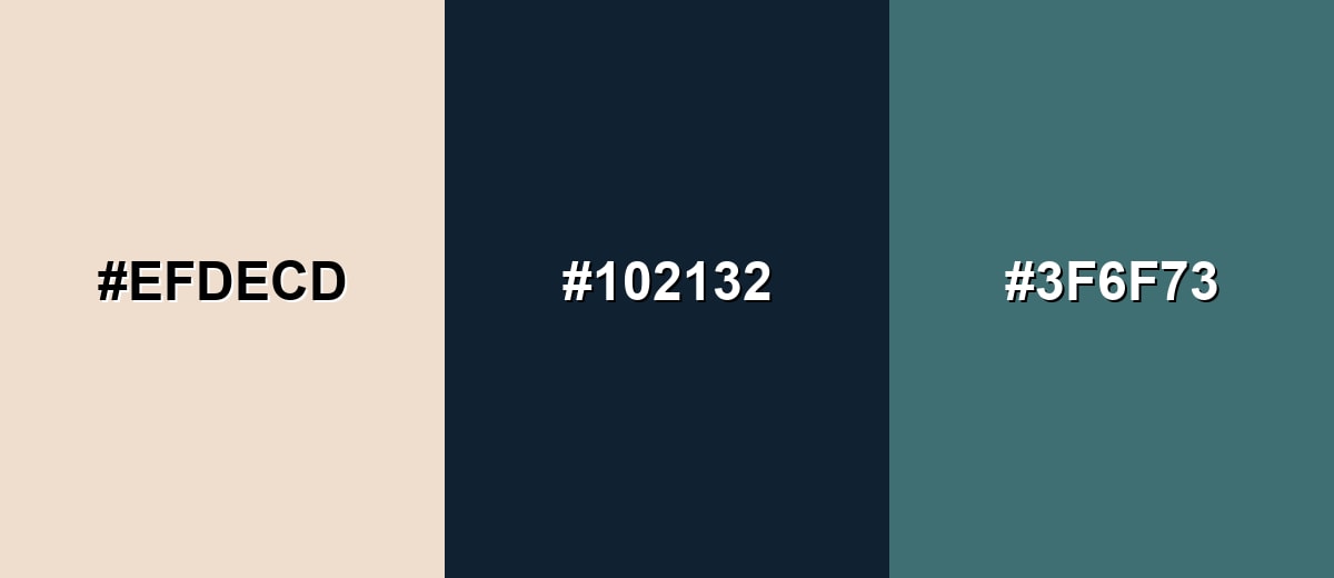
A complementary scheme pairs almond with a deep blue-based opposite to create strong, clean contrast that feels modern rather than loud.
Complementary Palette Example: Use Almond as the background, Midnight Slate for typography, and Dusty Teal as the supporting accent.
Analogous Color Schemes
Analogous colors sit adjacent to each other on the color wheel, creating harmonious, cohesive palettes with subtle variation.
A soft warm-neutral trio for calm, layered layouts with gentle depth.
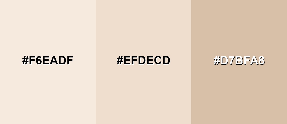
- Ivory Cream: #F6EADF
- Almond: #EFDECD
- Sandstone: #D7BFA8
A slightly richer warm set that adds a peachy lift and a grounded tan.
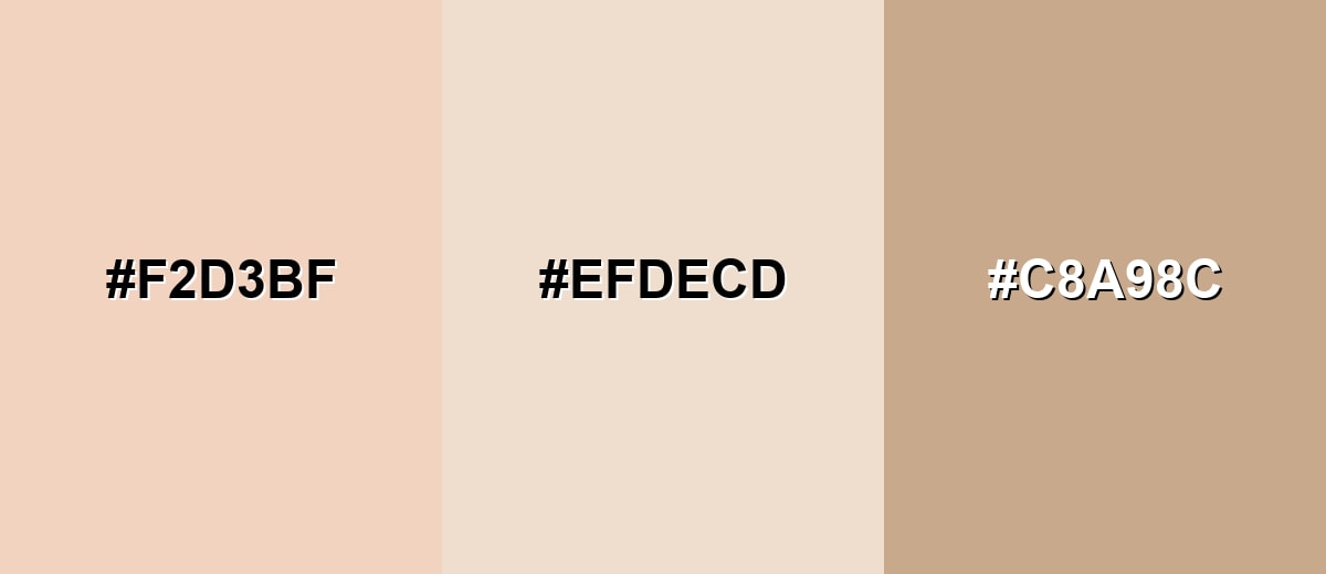
- Peach Beige: #F2D3BF
- Almond: #EFDECD
- Camel Tan: #C8A98C
Triadic & Tetradic Combinations
Triadic palettes keep balance by spacing hues evenly, giving almond a more playful, contemporary range.
Try Almond with Soft Sage and Muted Lavender for a gentle, editorial feel.
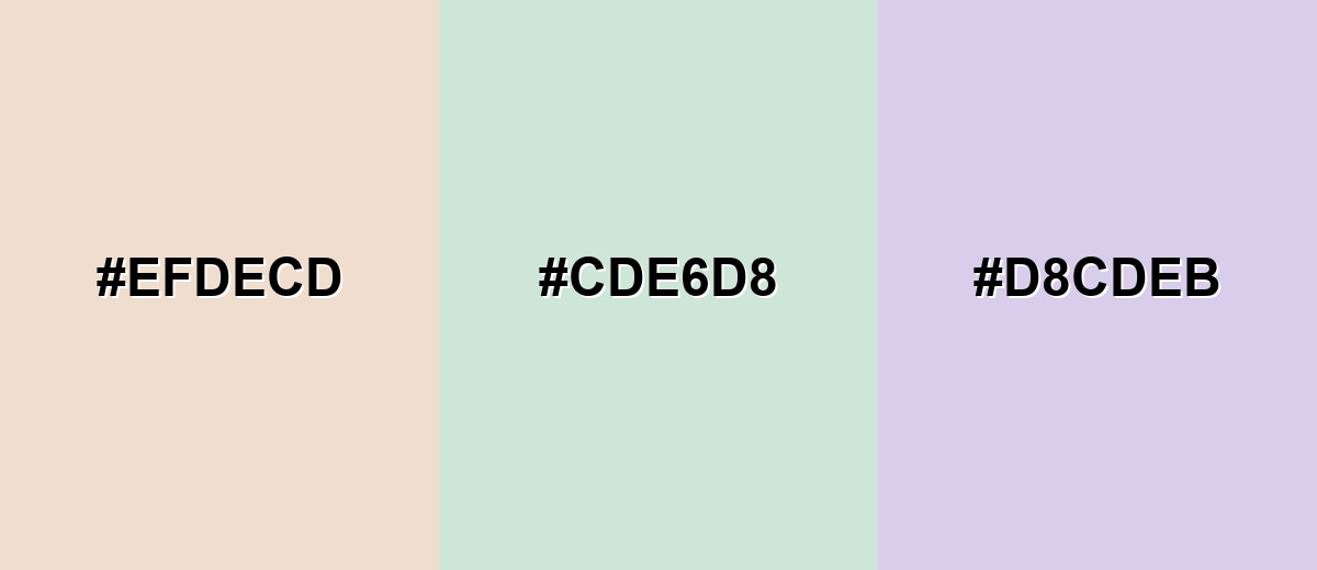
- Almond: #EFDECD
- Soft Sage: #CDE6D8
- Muted Lavender: #D8CDEB
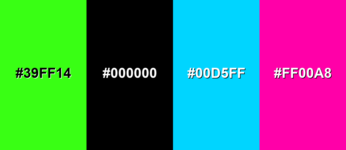
Colors to Avoid
While almond color is remarkably versatile, certain combinations can create problematic visual effects:
- Neon Lime (#39FF14) - The intensity overwhelms almond's softness and can make designs feel harsh or unbalanced.
- Pure Black (#000000) - The contrast can look abrupt and heavy, reducing almond's warm, gentle character.
- Electric Cyan (#00D5FF) - A highly saturated cool accent can create a jarring clash against almond's muted warmth.
- Hot Magenta (#FF00A8) - This bold pink can feel loud and artificial next to almond, especially in large blocks.
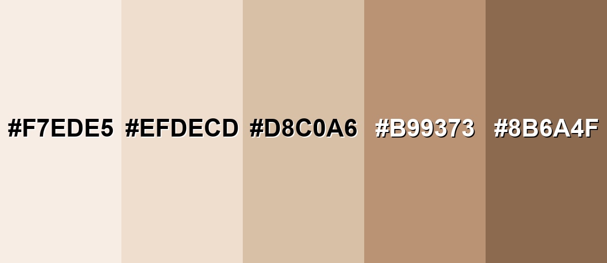
Shades, Tints & Variations of Almond Color
Almond isn't just one beige—it spans airy, creamy tints through to deeper, nutty browns. Having a small range makes it easier to build hierarchy (backgrounds, surfaces, text, accents) while keeping a cohesive warm-neutral look.
- Almond Cream (#F7EDE5) - A lighter, airier tint that feels closer to cream while keeping a warm undertone. It's best used for Large backgrounds, minimal layouts, soft packaging, and gentle lighting effects..
- Classic Almond (#EFDECD) - The standard almond tone: warm, calm, and neutral with a natural, beige-cream balance. It's best used for Base neutral for brand systems, UI backgrounds, and interior palettes..
- Toasted Almond (#D8C0A6) - A slightly deeper variation that adds warmth and structure without turning brown. It's best used for Secondary surfaces, cards, dividers, and understated accent areas..
- Roasted Almond (#B99373) - A mid-tone almond-brown that feels earthy and more substantial. It's best used for Buttons, headers, product labels, and warm, grounded accents..
- Brown Almond (#8B6A4F) - A darker, nutty brown with almond's warmth, suitable as an anchor shade. It's best used for Typography, outlines, contrast elements, and premium, natural branding..
Industry Applications
Almond is widely used because it supports content and imagery without demanding attention. With a clear accent and a strong dark contrast, it adapts smoothly across both digital design and physical materials.
Fashion & Beauty
- Use almond in lookbooks to create a soft, editorial backdrop that doesn't fight the styling.
- It works well behind product photography, especially when you want warm materials and tones to feel flattering.
- Build neutral collections and palettes around almond to keep visuals consistent across campaigns.
- Pair it with deeper accents for typography so labels and product names stay sharp and premium.
Interior Design & Decor
- Use almond as a cozy off-white direction for walls when stark white feels too clinical.
- Layer it through textiles and decor to keep a room bright while still warm.
- Combine almond with wood and relaxed finishes for a modern, natural look.
- Add darker furniture or trim to create definition against almond-heavy surfaces.
Branding & Marketing
- Almond supports natural, clean, premium-neutral identities for skincare, wellness, and home goods.
- It fits artisan products where you want a calm, approachable tone instead of a trendy color hit.
- For food brands (cafés, bakeries, menus), almond helps packaging feel wholesome and inviting.
- In invitations and stationery, almond adds softness and elegance while keeping typography the hero.
Conclusion
Almond is a warm beige neutral that feels natural, calm, and easy to live with—making it a smart base for UI, branding, interiors, and packaging. With #EFDECD as your dependable starting point, you can push the look cozy and earthy with deeper browns or keep it clean and modern with strong dark anchors and muted accents. If you want a subtle background that flatters photography and makes content feel more welcoming than plain white, almond is a reliable choice.
Design Smarter with AI: Media.io is an online AI studio that empowers creators with advanced image generation and enhancement tools. From text-to-image and image-to-image creation to AI upscaling and color optimization, it enables fast, creative, and professional results—all in your browser.

Frequently Asked Questions About Almond Color
Almond is a soft warm beige that resembles the light tan of an almond shell mixed with cream. It is commonly used as a gentle neutral for backgrounds and natural-looking palettes.
A widely used digital reference for almond is #efdecd. This value is a light, warm beige that works well as a base tone in many designs.
Almond is mainly beige with a warm, slightly rosy undertone. Depending on nearby colors and lighting, it can read a bit peachy, but it typically stays in the beige family.
Almond pairs well with deep navies, muted teals, soft sages, warm browns, and gentle rose tones. These combinations keep the palette balanced while preserving almond's calm, natural feel.
Yes, almond is a comfortable background choice because it is light and warm. For accessibility, use sufficiently dark text and icons and avoid very pale accents for essential controls.
Start with a white base, then add small amounts of yellow ochre and a touch of brown to warm it up. If it looks too yellow, add a tiny amount of red or umber to bring it back toward a natural beige.


