

Light violet color is a soft, pastel purple with a cool blue undertone, similar to spring lilacs or tinted lavender icing. Its hex code is #D6B4FF.
Many people experience it as gentle, imaginative, and calming, with a hint of mystery inherited from deeper violets. Because it sits between blue and purple, it can read cooler or warmer depending on surrounding tones—so pairing and contrast matter.
Light Violet Color: Codes & Values
Here are the core color codes you'll use to match light violet accurately across web, UI, and print workflows.
| Parameters | VALUE |
| HEX Code | #D6B4FF |
| RGB DECIMAL | 214, 180, 255 |
| RGB PERCENTAGE | 84%, 71%, 100% |
| CMYK | 16%,29%,0%,0% |
| HSL | 267°, 100%, 85% |
| HSV (HSB) | 267°, 29%, 100% |
| Web Safe | #CCCCFF |
Key Color Space Explanations:
- HEX - HEX is the most common way to specify this tint in digital design. Use #d6b4ff for consistent results across web and UI tools.
- RGB - RGB describes how much red, green, and blue light create the shade on screens. Light violet is 214, 180, 255, which explains its bright, pastel look.
- CMYK - CMYK is used for printing and represents ink percentages. A light mix like 16%,29%,0%,0% helps keep the violet soft instead of muddy.
- HSL - HSL shows the hue angle plus saturation and lightness, which is useful for adjusting tints and tones. At 267°, 100%, 85%, it sits firmly in violet while staying very light.
- Web Safe - Web-safe values are older, simplified screen-safe approximations. The closest web-safe match to light violet is #ccccff.
For UI and web design, start with HEX/RGB, then adjust HSL lightness for hover states and backgrounds while keeping the same hue angle for a consistent "light violet" feel.
Light Violet Color Conversions
Need light violet in a different format? Use the conversion table below to copy the exact value into your design tool or CSS.
| Parameters | VALUE | CSS |
| HEX | #d6b4ff | #d6b4ff |
| RGB DECIMAL | 214, 180, 255 | rgb(214,180,255) |
| RGB PERCENTAGE | 84%, 71%, 100% | rgb(84%,71%,100%) |
| CMYK | 16%,29%,0%,0% | cmyk(16%,29%,0%,0%) |
| HSL | 267°, 100%, 85% | hsl(267°, 100%, 85%) |
| HSV (or HSB) | 267°, 29%, 100% | -- |
| Web Safe | ccccff | #ccccff |
| CIE-LAB | 78.7, 25.0, -32.6 | -- |
| XYZ | 62.1, 54.2, 101.8 | -- |
| xyY | 0.285, 0.249, 54.2 | -- |
| CIE-LCH | 78.7, 41.1, 307.3° | -- |
| CIE-LUV | 78.7, 12.8, -56.2 | -- |
| Hunter-Lab | 73.6, 26.4, -37.4 | -- |
| Binary | 11010110 10110100 11111111 | -- |
Want to generate Light Violet Color photos or posters? Try Media.io's AI Image Generator now!
Light Violet Color Meaning & Symbolism
Light violet is commonly linked with softness, imagination, and a gentle sense of luxury. In everyday life it often reads as thoughtful and calming, like a quieter version of traditional violet.
Psychological Effects
Because it's light, cool-leaning, and still clearly "violet," it can shift the mood of a space without feeling heavy.
- Calmer Atmosphere - Light violet tends to make rooms, layouts, and interfaces feel less demanding and more soothing.
- Dreamy Focus - It supports an imaginative, reflective mood that works well for creative content and gentle storytelling.
- Airy Cleanliness - When paired with white space, it can feel organized and fresh rather than overly decorative.
- Soft Luxury Cue - It keeps violet's refined edge, but in a more approachable, everyday-friendly way.
- Low-Energy Risk - Overuse can read sleepy or distant, especially alongside pale grays without a grounding accent.
Positive Associations
In design and branding, light violet often signals "care" and "creativity" without turning loud or intense.
- Gentleness - A soft tone that feels considerate, supportive, and kind.
- Imagination - Suggests creativity and a touch of mystery, especially in gradients and illustrations.
- Wellness - Common in self-care visuals because it reads calm and restorative.
- Romance - A subtle romantic vibe that stays modern when balanced with clean neutrals.
- Refinement - Feels elevated and polished when paired with deeper violets or structured typography.
Cultural Significance Across the World
Violet meanings change by context, and lighter tints often soften the message into something more approachable.
- Creativity & Art - Many cultures link violet hues to artistic expression, and lighter tints make it feel more friendly.
- Refinement - Traditional violet can signal status or luxury; light violet keeps the elegance with less formality.
- Spiritual Calm - Soft violets are often used in calming spaces and rituals where a quiet mood matters.
- Modern Serenity - In contemporary design, light violet is widely read as gentle, mindful, and "soft modern."
Design Applications
Light violet works best when you want a soft, modern mood without losing personality—especially as a background tint, a UI surface, or a supporting accent.
Graphic Design Tips
- Use It as a Soft Background - Apply light violet to section panels to create separation without heavy borders.
- Build Contrast with Deep Violet - Pair it with darker violet accents for structure and clearer hierarchy.
- Keep Typography Crisp - Clean fonts and simple weights help the pastel tone feel modern, not sugary.
- Try Dreamy Gradients - Blend it with nearby pastels for airy hero banners and illustration fills.
- Reserve It for Highlights - Use sparingly on tags, badges, or callouts so it stays special and readable.
Pro tip: If your layout starts to feel "too pastel," anchor it with one darker violet shade for headings, icons, or key buttons.
Light Violet Color in Photography & Video
- Great for Soft Portrait Styling - It flatters gentle lighting setups and beauty-focused edits.
- Works Well in Overlays - Use a light violet tint for readable text overlays without harsh mood shifts.
- Boosts a Dreamy Aesthetic - Especially effective for spring themes, lifestyle reels, and romantic visuals.
- Watch Skin Tone Balance - Too much violet can cool skin; balance with warm highlights when needed.
- Keep Saturation Controlled - Small increases go a long way—avoid pushing it into neon territory.
Recommended Tool for Image Enhancement: When incorporating light violet color into your photography projects, Media.io's AI Image tools can help you achieve more refined results. With AI-powered color enhancement, photo colorization, image upscaling, and old photo restoration, you can easily enrich light violet color tones, improve overall image quality, and highlight the color's elegant and sophisticated aesthetic.
Color Combinations
Pairings can push light violet toward dreamy, fresh, or playful depending on the hues you place next to it. Use the palettes below as starting points, then adjust saturation and contrast to fit your layout and content.
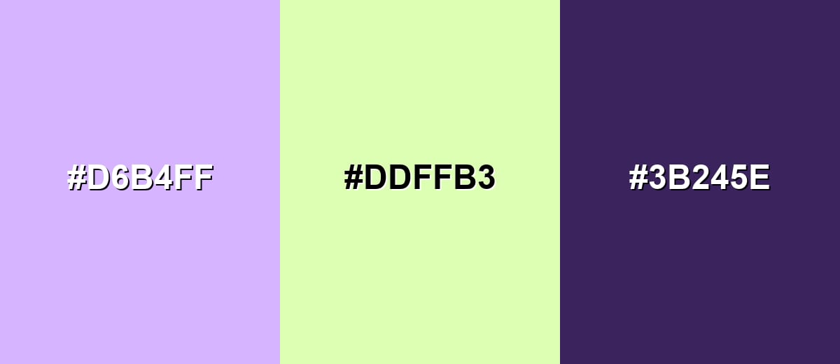
Complementary Colors
A complementary pairing puts light violet against a soft yellow-green for lively contrast without harshness. This is a good option when you want a pastel look that still feels energetic.
Complementary Palette Example: Try light violet with pistachio and a deep eggplant accent to keep the palette balanced and readable.
Analogous Color Schemes
Analogous colors sit adjacent to each other on the color wheel, creating harmonious, cohesive palettes with subtle variation.
Blue-leaning violet tints feel airy and cohesive, ideal for calm layouts and gentle gradients.
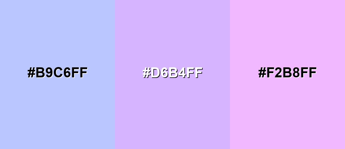
- Soft Periwinkle: #B9C6FF
- Light Violet: #D6B4FF
- Light Orchid: #F2B8FF
A slightly warmer analogous mix adds a romantic, friendly feel while still staying pastel.
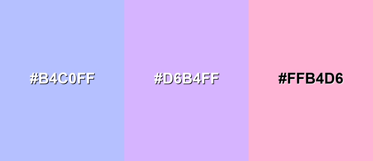
- Pale Blue Violet: #B4C0FF
- Light Violet: #D6B4FF
- Blush Pink: #FFB4D6
Triadic & Tetradic Combinations
Triadic palettes create variety while keeping visual balance across three evenly spaced hues.
Light violet with mint and soft peach feels playful and fresh, great for upbeat branding or seasonal graphics.
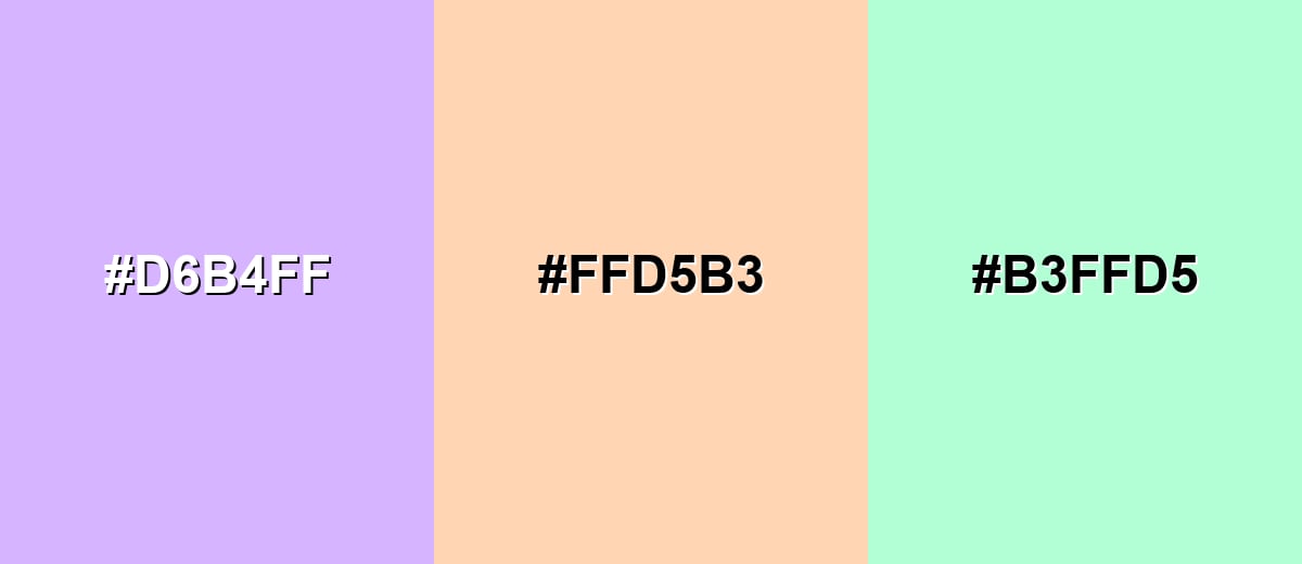
- Light Violet: #D6B4FF
- Soft Peach: #FFD5B3
- Mint Tint: #B3FFD5
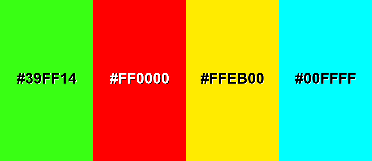
Colors to Avoid
While light violet color is remarkably versatile, certain combinations can create problematic visual effects:
- Neon Green (#39FF14) - The intensity overwhelms the pastel feel and creates a vibrating edge that can be tiring on screens.
- Pure Red (#FF0000) - High-contrast red can make light violet look washed out and can shift the mood from calm to alarm-like.
- Electric Yellow (#FFEB00) - Both are very bright, and together they can look harsh and reduce readability for UI elements.
- Bright Cyan (#00FFFF) - The combination can feel overly synthetic, and small elements may appear noisy rather than refined.
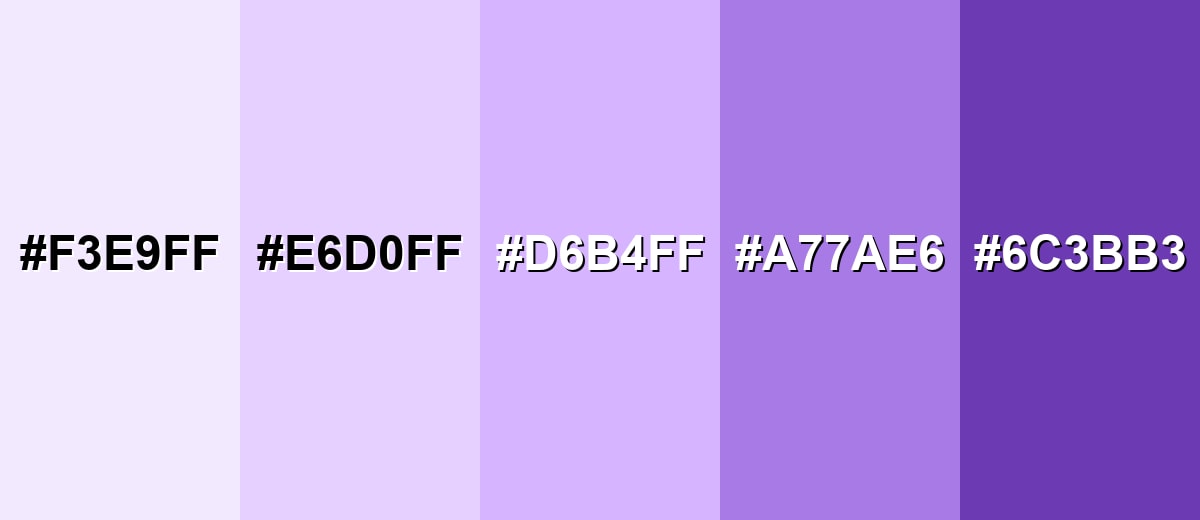
Shades, Tints & Variations of Light Violet Color
Light violet isn't just one static swatch—there's a whole range from barely-there tints to deeper violets that add structure. Using coordinated variations makes it easier to design consistent UI states, build gradients, and keep contrast under control.
- Very Pale Violet (#F3E9FF) - An almost-white violet tint that reads clean and airy with a slight purple cast. It's best used for Large backgrounds, subtle panels, and soft highlights behind text..
- Soft Lilac (#E6D0FF) - A gentle lilac that stays pastel but is more visible than near-white tints. It's best used for UI surfaces, cards, and gentle gradients with minimal contrast shifts..
- Light Violet (#D6B4FF) - The core shade: a bright pastel violet with a cool undertone and a smooth finish. It's best used for Brand accents, illustrations, and section backgrounds that need personality..
- Medium Violet (#A77AE6) - A more saturated violet that still feels friendly but adds clearer structure. It's best used for Buttons, icons, charts, and headings where stronger emphasis is needed..
- Deep Violet (#6C3BB3) - A richer, darker violet that anchors pastel palettes and improves contrast. It's best used for Text on light violet, strong accents, and high-contrast UI states..
Industry Applications
Because it feels soft yet modern, light violet fits a wide range of visual systems. The trick is choosing whether it plays the role of gentle background, friendly accent, or the main tone in your brand.
Fashion & Beauty
- Skincare & Self-Care Packaging - Helps products feel calming, clean, and pampering.
- Beauty Campaign Visuals - Supports soft lighting, dreamy gradients, and premium-pastel styling.
- Seasonal Drops - Works well for spring edits and limited editions that need a giftable look.
- Boutique Positioning - Reads "elevated but approachable" when paired with deeper violet accents.
Interior Design & Decor
- Bedrooms & Reading Corners - Creates a gentle atmosphere that doesn't feel busy.
- Textiles & Soft Furnishings - Easy to layer with warm neutrals and natural wood tones.
- Feature Walls - Adds personality without the intensity of darker purples.
- Kid-Friendly Spaces - A softer alternative to bright pink while still feeling playful.
Branding & Marketing
- Wellness & Lifestyle Brands - Signals calm, care, and friendliness at first glance.
- UI Onboarding & Empty States - Reduces friction by keeping screens light and welcoming.
- Editorial Callouts - Great for chapter dividers and gentle highlights in long-form layouts.
- Event Design - Fits invitations and social graphics that lean romantic or dreamy.
Conclusion
Light violet (#D6B4FF) is a pastel purple that feels calm, airy, and quietly expressive—perfect when you want softness without losing a modern edge. It shines as a background tint, a gentle highlight, or a dreamy gradient base, and it becomes much more confident when anchored by deeper violet accents and balanced with warm neutrals. If you keep contrast in check for text and UI elements, light violet's meaning—gentleness, imagination, and refined calm—stays clear and consistent across real-world design.
Design Smarter with AI: Media.io is an online AI studio that empowers creators with advanced image generation and enhancement tools. From text-to-image and image-to-image creation to AI upscaling and color optimization, it enables fast, creative, and professional results—all in your browser.

Frequently Asked Questions About Light Violet Color
Light violet is a pale, pastel version of violet with a cool, slightly bluish undertone. It looks soft and airy, like diluted lavender or lilac.
A commonly used hex code for light violet is #d6b4ff. This value produces a bright pastel violet that works well for digital design.
It can sit between them depending on the exact mix. Light violet is often a bit cooler and more blue-leaning than many lilacs, while still sharing lavender's soft, calming vibe.
It is often associated with gentleness, imagination, and a calm, caring tone. In visual communication it can also suggest refinement when paired with darker violets or clean neutrals.
Deep violet, soft peach, mint tints, icy blues, and warm neutrals like cream pair well with light violet. These combinations keep the palette balanced while letting the pastel tone feel intentional.
Use dark text (like deep violet or charcoal) on light violet backgrounds, and test contrast for small text and icons. Avoid pairing it with other very light pastels unless you add clear borders, shadows, or spacing.


