

 TL;DR:
Amber (Hex #FFBF00) is a high-visibility, golden-orange color optimal for digital calls-to-action and interface highlights when anchored by dark contrasting elements to prevent eye strain and maintain readability.
● Apply RGB (255, 191, 0) for digital interfaces and CMYK (0%, 25%, 100%, 0%) for print, pairing the core shade with deep blues (#003fff) or dark neutrals (#1f1f1f) to ensure crisp visual contrast.
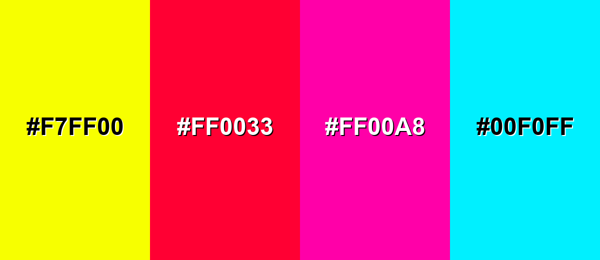
● Avoid combinations with neon yellow (#F7FF00), pure red, hot pink, or electric cyan (#00F0FF), as these saturated pairings flatten contrast, create aggressive visual tension, and cause readability-reducing vibration in UI elements.
● Establish clear design hierarchy by restricting light amber (#FFD566) to background tints and utilizing dark amber brown (#805A00) specifically for text and borders over lighter variations.
Ask AI for a summary
 ChatGPT
 Perplexity
 Gemini
 Claude
 Grok
Grok
Amber is a warm golden-orange shade that looks like glowing resin, honey, or late-afternoon sunlight. Its most common digital reference is hex #ffbf00, a bright tone that sits between yellow and orange.
Many people read amber as upbeat and welcoming, with a hint of alertness. Named after fossilized amber resin, it naturally suggests warmth and glow—so below you'll find its meaning, color codes, reliable pairings, shades, and modern design uses.
Amber Color: Codes & Values
If you're building a palette or matching amber across screens and print, these are the most-used reference values for the classic shade.
| Parameters | VALUE |
| HEX Code | #FFBF00 |
| RGB DECIMAL | 255, 191, 0 |
| RGB PERCENTAGE | 100%, 74.9%, 0% |
| CMYK | 0%,25%,100%,0% |
| HSL | 45°, 100%, 50% |
| HSV (HSB) | 45°, 100%, 100% |
| Web Safe | #FFCC00 |
Key Color Space Explanations:
- HEX - HEX is the most common way to specify this shade in web design, using a six-digit code. For amber, #ffbf00 maps directly to its red, green, and blue channel values.
- RGB - RGB defines the mix of red, green, and blue light used on screens. Amber is high in red and green with no blue, creating a vivid golden glow.
- CMYK - CMYK is used for printing, representing cyan, magenta, yellow, and black ink. Amber relies heavily on yellow with a touch of magenta to push it toward orange.
- HSL - HSL describes hue, saturation, and lightness, which can feel more intuitive for adjusting tone. Amber sits near 45° with full saturation for a bold, energetic look.
- Web Safe - Web safe values are a legacy palette designed for older displays. #ffcc00 is the closest web safe match and is a slightly lighter, more yellow-leaning alternative.
Use HEX or RGB for websites and UI, CMYK for print files, and HSL/HSV when you need quick tweaks to saturation or brightness while keeping the same amber hue.
Amber Color Conversions
This quick amber color conversion table helps you switch amber between common design and color-management formats without guessing.
| Parameters | VALUE | CSS |
| HEX | #ffbf00 | #ffbf00 |
| RGB DECIMAL | 255, 191, 0 | rgb(255,191,0) |
| RGB PERCENTAGE | 100%, 74.9%, 0% | rgb(100%,74.9%,0%) |
| CMYK | 0%,25%,100%,0% | cmyk(0%,25%,100%,0%) |
| HSL | 45°, 100%, 50% | hsl(45°, 100%, 50%) |
| HSV (or HSB) | 45°, 100%, 100% | -- |
| Web Safe | ffcc00 | #ffcc00 |
| CIE-LAB | 80.0, 7.0, 82.0 | -- |
| XYZ | 63.1, 60.2, 8.5 | -- |
| xyY | 0.488, 0.466, 60.2 | -- |
| CIE-LCH | 80.0, 82.3, 85.1° | -- |
| CIE-LUV | 80.0, 55.0, 80.0 | -- |
| Hunter-Lab | 77.6, 3.5, 63.0 | -- |
| Binary | 11111111 10111111 00000000 | -- |
Want to generate Amber Color photos or posters? Try Media.io's AI Image Generator now!
Amber Color Meaning & Symbolism
Amber is widely associated with warmth, vitality, and a sense of positive momentum. Because it sits between yellow and orange, it often feels friendly like sunshine but more grounded and confident. In everyday life, that blend makes it a natural choice for calls to action, highlights, and anything meant to feel upbeat without being overly loud.
Psychological Effects
In visual design, amber often shapes how "fast" and "friendly" something feels at first glance.
- Warmth - Amber can make interfaces and layouts feel more inviting, helping reduce friction and encourage action.
- Energy - Its bright golden tone reads as lively and active, which is why it's common in buttons, badges, and highlights.
- Attention - Amber is naturally high-visibility, so it pulls focus to key moments like progress, notifications, or featured content.
- Caution - Like indicator lights and signals, amber can imply "pay attention" without the intensity of a danger-red warning.
- Intensity - Used too heavily at full saturation, amber may feel impatient or visually tiring, especially on bright screens.
Positive Associations
These are the upbeat, brand-friendly meanings amber tends to carry when used with balanced contrast.
- Optimism - Amber feels sunny and forward-moving, making it a strong accent for uplifting messaging.
- Confidence - Compared to pure yellow, amber can feel more grounded and decisive, especially in modern UI.
- Comfort - The honey-like warmth suggests coziness, friendliness, and approachability in visuals.
- Craftsmanship - The resin origin connects amber to handmade quality, natural materials, and a warm "glow" aesthetic.
- Momentum - Amber often implies progress and action, which fits CTAs and feature highlights in product design.
Cultural Significance Across the World
While interpretations vary, amber's natural roots and safety usage shape how it's perceived in many contexts.
- Natural Glow - Named after fossilized tree resin, amber is often tied to warmth, nature, and luminous materials.
- Safety Signaling - In traffic and indicator systems, amber commonly communicates awareness, transition, or caution.
- Handcrafted Value - Amber tones frequently appear in wood, leather, and artisan aesthetics that suggest tradition and care.
- Seasonal Warmth - The golden-orange range is regularly linked to late-afternoon light and autumnal color stories.
Design Applications
Amber works best when it has a clear job in the layout: attracting attention, guiding the eye, or adding warmth. Start small, then build contrast around it so it stays readable and polished.
Graphic Design Tips
- Use amber as an accent for CTAs, labels, or key data points so it feels intentional instead of overwhelming.
- Anchor bright amber with dark neutrals to keep the palette modern and reduce eye strain.
- Lean on warm neighbors (yellow/orange) for friendly, cohesive branding and editorial layouts.
- Use consistent roles in your design system (e.g., amber = highlight/status) to avoid visual noise.
- Check contrast early—amber is bright, so it usually needs dark text, clear spacing, and crisp icon edges.
If you're using amber for primary actions, reserve it for the "main click" moment and keep other accents calmer—this preserves hierarchy and makes the UI feel more premium.
Amber Color in Photography & Video
- Use amber tones to mimic golden-hour warmth, adding a natural glow to portraits, food, and lifestyle shots.
- For cinematic contrast, pair amber highlights with deep blue shadows to create a clean teal-and-amber vibe.
- In product photography, amber accents can suggest warmth and quality (especially for wood, leather, and handcrafted goods).
- Keep skin tones in check—too much amber saturation can push faces toward yellow/orange, so adjust selectively.
- In motion graphics, amber makes strong callouts for titles, lower-thirds, and key beats without the harshness of red.
Recommended Tool for Image Enhancement: When incorporating amber color into your photography projects, Media.io's AI Image tools can help you achieve more refined results. With AI-powered color enhancement, photo colorization, image upscaling, and old photo restoration, you can easily enrich amber color tones, improve overall image quality, and highlight the color's elegant and sophisticated aesthetic.
Color Combinations
Amber is easy to style because it sits in a highly visible part of the spectrum. These palettes show reliable ways to balance its warmth with contrast, harmony, or more playful variety.
Complementary Colors
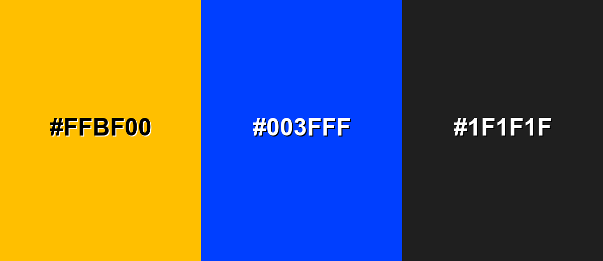
A complementary palette pairs amber with a blue opposite it on the color wheel, creating strong contrast that feels crisp and modern.
Complementary Palette Example: Use #ffbf00 with #003fff, then add #1f1f1f to keep the layout grounded and readable.
Analogous Color Schemes
Analogous colors sit adjacent to each other on the color wheel, creating harmonious, cohesive palettes with subtle variation.
Warm analogous tones feel sunny and cohesive for friendly branding and editorial layouts.
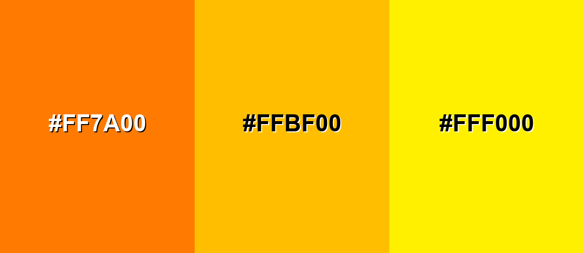
- Tangerine: #FF7A00
- Amber: #FFBF00
- Lemon Yellow: #FFF000
A deeper analogous set adds a more mature, golden feel while staying harmonious.
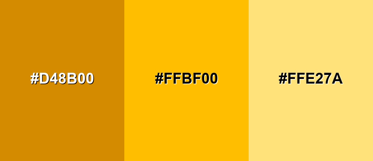
- Burnt Gold: #D48B00
- Amber: #FFBF00
- Pale Honey: #FFE27A
Triadic & Tetradic Combinations
Triadic palettes create balance by spacing hues evenly, giving you contrast without the sharpness of a direct complement.
Try #ffbf00 with #00c27a and #7a00c2 for vibrant UI accents and playful brand graphics.
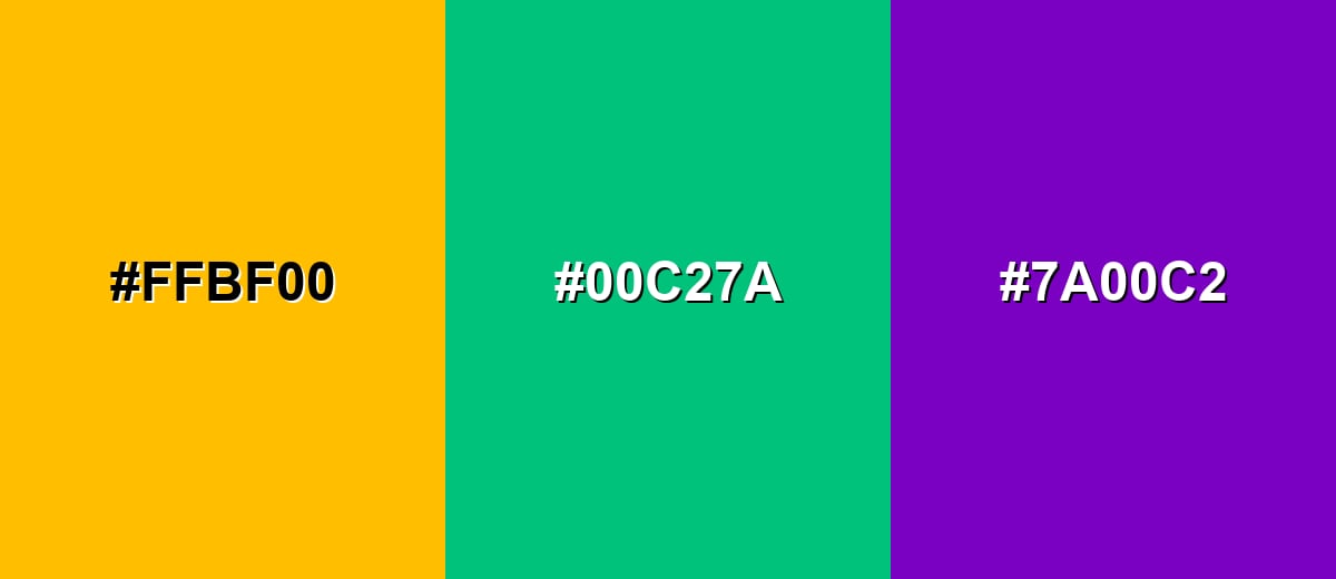
- Amber: #FFBF00
- Jade Green: #00C27A
- Purple Iris: #7A00C2
Colors to Avoid
While amber color is remarkably versatile, certain combinations can create problematic visual effects:
- Neon Yellow (#F7FF00) - Too close in brightness and hue, which can flatten contrast and make edges hard to see.
- Pure Red (#FF0033) - Creates a high-tension pairing that can feel aggressive and distracting in interfaces.
- Hot Pink (#FF00A8) - Competes for attention and can look chaotic unless carefully separated with neutrals.
- Electric Cyan (#00F0FF) - Both are highly saturated, producing visual vibration that reduces readability in small UI elements.
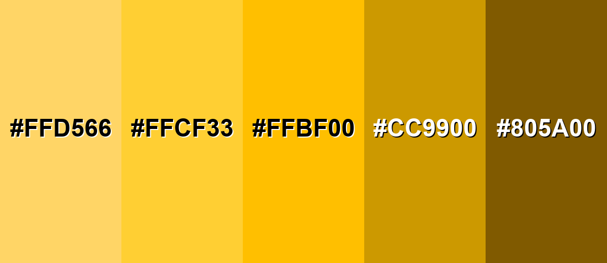
Shades, Tints & Variations of Amber Color
Amber isn't just one bright golden tone—there's a useful range from airy tints to deeper, earthy browns. Having multiple shades makes it easier to build hierarchy (backgrounds, borders, accents, and text) while keeping a consistent warm mood.
- Light Amber (#FFD566) - A softer, airy take that keeps the warmth while feeling less intense. It's best used for Background tints, cards, and gentle highlights..
- Soft Amber (#FFCF33) - A balanced mid-light shade that stays bright but is easier on the eyes than the pure tone. It's best used for UI badges, hover states, and subtle emphasis..
- Classic Amber (#FFBF00) - The standard vivid amber with a strong golden glow. It's best used for Primary accents, CTAs, and key data points..
- Deep Amber (#CC9900) - A richer, more grounded version that feels warmer and more premium. It's best used for Headers, icons, and packaging-style visuals..
- Dark Amber Brown (#805A00) - A dark, earthy amber that reads more like a brown-gold and adds weight. It's best used for Text on light amber tints, borders, and traditional themes..
Industry Applications
Because amber is both warm and attention-grabbing, it shows up in products that need clarity, energy, or a safety-adjacent signal without harshness.
Fashion & Beauty
- Amber accents add warmth to seasonal collections, especially for autumn palettes and golden neutrals.
- In cosmetics visuals, amber reads as radiant and sunlit—great for "glow," bronzing, and warmth-focused campaigns.
- Pairing amber with deep neutrals can feel premium, making it useful for packaging-style brand photography.
- Used sparingly in lookbooks, amber draws the eye to key pieces without overpowering the styling.
Interior Design & Decor
- Amber works well as an accent (pillows, throws, art) to bring warmth into neutral rooms.
- Deeper amber shades can echo wood tones and add a handcrafted, cozy mood.
- Amber lighting and golden highlights can create a welcoming atmosphere in hospitality visuals.
- For modern interiors, balance amber with darker anchors so the space feels grounded and not overly bright.
Branding & Marketing
- Amber adds optimism and momentum to logos, campaign accents, and promotional graphics.
- In UI-led brands, amber is effective for CTAs and highlights when you want warmth without the urgency of red.
- It supports "crafted quality" positioning, especially when paired with earthy neutrals and clean typography.
- For attention systems (alerts, progress, status), amber communicates "notice this" in a friendlier tone.
Conclusion
Amber stands out for its golden-orange glow that feels both welcoming and attention-ready, which is why it works so well as a modern accent in digital and print design. Whether you're using #FFBF00 to energize a brand, guide users through a UI, or add warmth to photos and illustrations, it performs best when you give it a clear role and balance it with strong contrast. With the right pairings, smart spacing, and a few supporting shades, amber becomes a practical, high-impact color that's easy to read—and hard to ignore.
Design Smarter with AI: Media.io is an online AI studio that empowers creators with advanced image generation and enhancement tools. From text-to-image and image-to-image creation to AI upscaling and color optimization, it enables fast, creative, and professional results—all in your browser.

Frequently Asked Questions About Amber Color
Amber is a warm golden-orange shade that resembles honey or glowing resin. It sits between yellow and orange and is often used as a bright accent.
A widely used hex value for amber is #ffbf00. It produces a vivid golden tone with strong visibility on screens.
For #ffbf00, the RGB values are 255, 191, 0. The CMYK values are 0%,25%,100%,0%, which is useful when preparing print files.
Deep blues and dark neutrals create clean contrast, such as #003fff and #1f1f1f. For a warmer look, analogous pairings like #ff7a00 and #fff000 feel cohesive.
Use amber for CTAs, highlights, and status indicators where you need quick visibility. Keep it consistent in your design system, and support it with darker tones so text and icons remain readable.
Amber is typically closer to orange than classic metallic gold, but it can read as gold in bright contexts. Shifts toward yellow, such as #ffcf33, feel more golden, while deeper tones like #cc9900 feel richer and more traditional.


