

 TL;DR:
Indigo (#4B0082) functions as a premium, deep blue-violet design anchor that replaces black or navy, requiring high-contrast pairings with light neutrals to prevent visual heaviness.
● Maintain cross-platform accuracy by using HEX #4B0082 or RGB (75, 0, 130) for digital assets, and CMYK (42%, 100%, 0%, 49%) for print, ensuring you slightly lighten large fills to prevent ink saturation and dullness on uncoated paper.
● Combine this shade with off-whites, soft grays, or a single bright accent like chartreuse green or tangerine orange, while strictly avoiding true black (#000000) and neon magenta (#FF00FF) which collapse layout details and cause harsh visual vibration.
● Anchor digital interfaces by applying indigo to heavy structural elements like navigation bars and primary buttons, mandating white or near-white text overlays to pass legibility and contrast requirements.
Ask AI for a summary
 ChatGPT
 Perplexity
 Gemini
 Claude
 Grok
Grok
Indigo is a deep blue-purple hue positioned between blue and violet on the color spectrum. The indigo color meaning is often associated with depth, intuition, and quiet authority. It's a classic choice when you want a design to feel thoughtful, premium, and slightly mysterious—offering more richness than navy and more restraint than pure purple.
On this page, you'll find the indigo color code in HEX, RGB, CMYK, HSL/HSV, plus practical palettes and shades you can use in web, print, and branding.
Indigo Color: Codes & Values
If you're matching indigo color codes across screens, print materials, and brand assets, these are the core reference values you'll want to save. The HEX, RGB, CMYK, and HSL specifications below help ensure accurate indigo color reproduction in web design, UI systems, packaging, and professional print workflows. Starting with standardized indigo color values reduces unexpected shifts between digital displays and physical outputs, keeping your deep blue-purple tone consistent and true across platforms.
| Parameters | VALUE |
| HEX Code | #4B0082 |
| RGB DECIMAL | 75, 0, 130 |
| RGB PERCENTAGE | 29.4%, 0%, 51.0% |
| CMYK | 42%,100%,0%,49% |
| HSL | 275°, 100%, 25% |
| HSV (HSB) | 275°, 100%, 51% |
| Web Safe | #330099 |
Key Color Space Explanations:
- HEX - HEX is the most common way to specify indigo for screens and web UI. It's written as a # plus six characters that represent red, green, and blue.
- RGB - RGB defines indigo by mixing red, green, and blue light values. It's useful for digital design tools and CSS color functions.
- CMYK - CMYK is used for print, describing how much cyan, magenta, yellow, and black ink to apply. Indigo typically needs strong magenta and black to keep its depth on paper.
- HSL - HSL describes indigo by hue, saturation, and lightness, which is helpful when building harmonious palettes. It makes it easier to create tints and shades while keeping the same hue family.
- Web Safe - Web-safe colors are a small set historically used for consistent display on older devices. Today it's mainly helpful as a simplified fallback or for pixel-art style constraints.
For most web and UI work, start with HEX (#4B0082) or RGB (75, 0, 130). Switch to CMYK when you're preparing files for print.
Want to generate indigo color photos or posters? Try Media.io's AI Image Generator now!
Indigo Color Conversions
Need indigo in another color space for a specific tool or workflow? Use the conversions below to copy, paste, and stay consistent.
| Parameters | VALUE | CSS |
| HEX | #4b0082 | #4b0082 |
| RGB DECIMAL | 75, 0, 130 | rgb(75,0,130) |
| RGB PERCENTAGE | 29.4%, 0%, 51.0% | rgb(29.4%,0%,51.0%) |
| CMYK | 42%,100%,0%,49% | cmyk(42%,100%,0%,49%) |
| HSL | 275°, 100%, 25% | hsl(275°, 100%, 25%) |
| HSV (or HSB) | 275°, 100%, 51% | -- |
| Web Safe | 330099 | #330099 |
| CIE-LAB | 20.4, 51.0, -53.2 | -- |
| XYZ | 6.92, 3.10, 21.36 | -- |
| xyY | 0.221, 0.099, 3.10 | -- |
| CIE-LCH | 20.4, 73.7, 313.5° | -- |
| CIE-LUV | 20.4, 10.0, -61.2 | -- |
| Hunter-Lab | 17.6, 40.9, -63.1 | -- |
| Binary | 01001011, 00000000, 10000010 | -- |
Indigo Color Meaning & Symbolism
The indigo color meaning blends intelligence with artistry. Sitting between blue and violet, indigo carries the trust and stability of blue while adding the imagination and depth of purple. Because it's darker and richer than many standard purples, indigo often feels grounded yet expressive—making it a strong choice for thoughtful, premium, and slightly mysterious brand identities.
Psychological Effects
From a color psychology perspective, indigo shapes a mood that feels calm, focused, and refined. The psychological effects of indigo are especially powerful in digital interfaces, editorial layouts, and branding systems where concentration, clarity, and quiet authority matter.
- Wisdom - Indigo is often linked with insight and a "think-first" tone that supports reflective content and serious topics.
- Creativity - Its blue-violet balance feels original and expressive, making it a strong choice for artistic or editorial direction.
- Focus - The depth of indigo can add structure and concentration, especially when it anchors headers or navigation.
- Calm Confidence - Compared to brighter purples, indigo feels steadier and more grounded while still being distinctive.
- Emotional Distance - When overused (or paired with other dark tones), indigo can read as reserved and a bit moody in low-light layouts.
Positive Associations
In branding and visual communication, the symbolism of indigo is often tied to wisdom, originality, and structured thinking. Indigo color associations commonly include expertise, integrity, and calm confidence—qualities that help position a brand as both creative and dependable.
- Wisdom And Insight - Suggests knowledge, expertise, and careful thinking.
- Creativity And Originality - Feels imaginative and modern without going neon.
- Integrity, Structure, And Focus - Adds authority and clarity, often replacing black while staying more brandable.
- Calm Confidence And Depth - Creates a composed, premium mood that holds attention.
- Craft And Premium Quality - Works well for systems that want to signal craft, expertise, and a modern premium feel.
Cultural Significance Across the World
The cultural significance of indigo stretches across nature, craft, and design history. From indigo dye traditions in textiles to its presence in night-sky and deep-water imagery, indigo has long represented depth, craftsmanship, and enduring quality in global visual culture.
- Night Skies - Often associated with evening tones and the "deep" feeling of nighttime visuals.
- Deep Water - Commonly tied to ocean-like depth and a quiet, immersive mood.
- Dye Traditions - Connected to indigo dye heritage and the rich history of colored textiles.
- Ink And Editorial Design - Frequently used in premium packaging and editorial layouts where a refined, inky tone feels intentional.
Design Applications
The indigo color in design is highly versatile. It can anchor a color palette as a rich background, replace black in premium brand systems, or serve as a bold accent in buttons, data visualizations, and typography. To keep indigo from feeling overly dark or heavy, balance it with light neutrals, controlled contrast, and intentional spacing—ensuring the final layout feels polished, modern, and visually stable.
Graphic Design Tips
- Use indigo as a primary anchor (headers, nav, key CTAs), then keep supporting surfaces lighter for clarity.
- Pair indigo with off-whites and soft grays to reduce visual heaviness in layouts.
- Introduce one bright accent (like lime, teal, orange, or cyan) sparingly to guide attention without creating noise.
- In print, test on the intended stock—uncoated paper can dull indigo and shift it toward muted purple.
- For large indigo fills, consider slightly lightening the value to avoid ink saturation issues and overly dark blocks.
Pro tip: treat indigo like a "premium neutral." Give it breathing room, keep your typography crisp, and let a single accent color do the heavy lifting for emphasis.
Indigo Color in Photography & Video
- Use indigo as an overlay or background tone to create a cinematic, night-sky mood without going full black.
- Balance indigo-heavy frames with lighter neutrals so details don't collapse in shadows.
- For product shots, indigo backdrops can feel premium—especially when paired with warm metallic highlights.
- In edits, keep an eye on "muddy" mids: indigo can look heavy if neighboring tones are too dark.
- When using indigo for titles or lower-thirds, choose near-white text for clean contrast and readability.
Recommended Tool for Image Enhancement: When incorporating indigo color into your photography projects, Media.io's AI Image tools can help you achieve more refined results. With AI-powered color enhancement, photo colorization, image upscaling, and old photo restoration, you can easily enrich indigo color tones, improve overall image quality, and highlight the color's elegant and sophisticated aesthetic.
Color Combinations
Indigo pairs easily with neutrals, but it also shines with bright opposites and clean modern accents. The palettes below cover safe everyday matches and more energetic combinations.
Complementary Colors
A complementary palette uses colors opposite on the wheel, creating strong contrast and high energy. With indigo, yellow-green accents can feel fresh and modern when balanced with a soft neutral.
Complementary Palette Example: Try Indigo with Chartreuse Green, then soften the contrast using Porcelain White.
Analogous Color Schemes
Analogous colors sit adjacent to each other on the color wheel, creating harmonious, cohesive palettes with subtle variation.
Analogous blues: Indigo, Deep Cobalt, and Blue Violet for a smooth, tech-forward gradient feel.
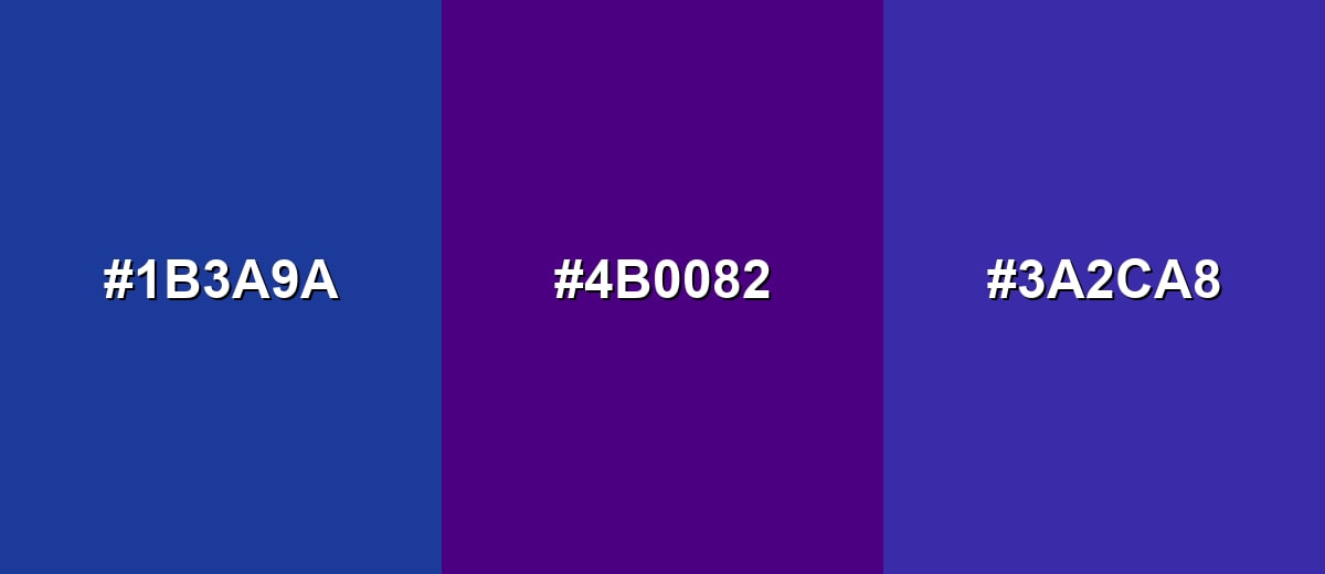
- Deep Cobalt: #1B3A9A
- Indigo: #4B0082
- Blue Violet: #3A2CA8
Analogous purples: Indigo with Royal Purple and Electric Purple for a creative, editorial mood.
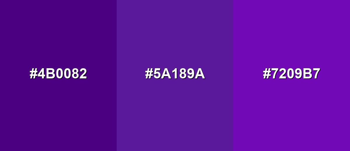
- Indigo: #4B0082
- Royal Purple: #5A189A
- Electric Purple: #7209B7
Triadic & Tetradic Combinations
Triadic palettes are spaced evenly across the color wheel, so they feel vibrant but balanced when one color leads.
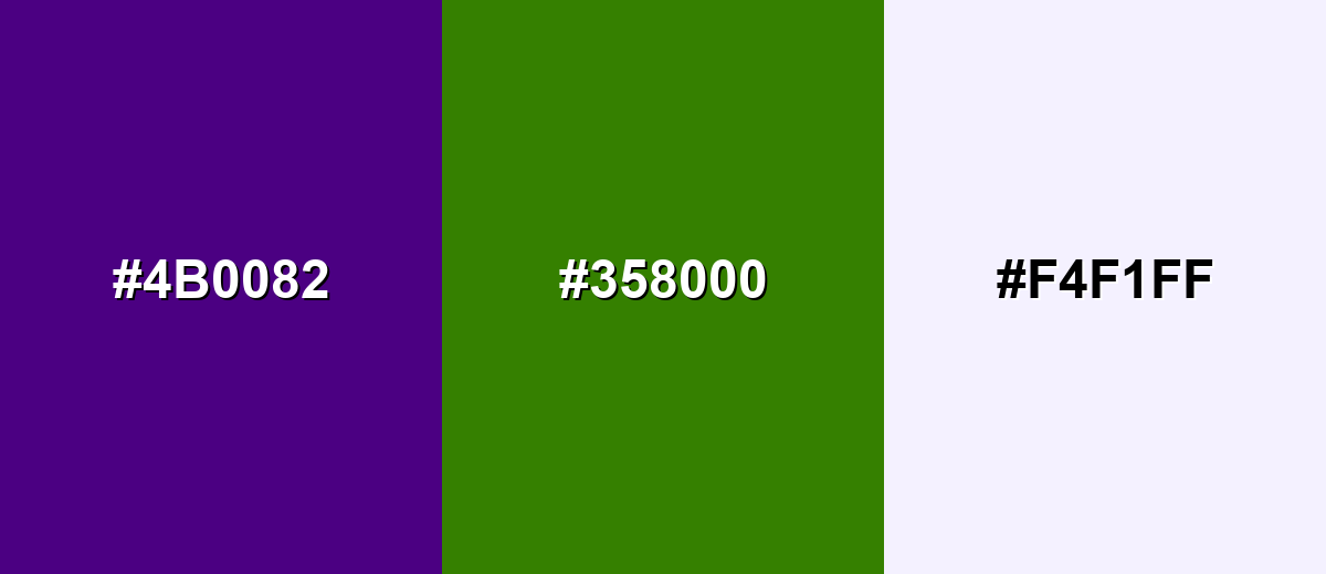
Use Indigo as the anchor, with Tangerine Orange and Sea Green as energetic supporting accents.
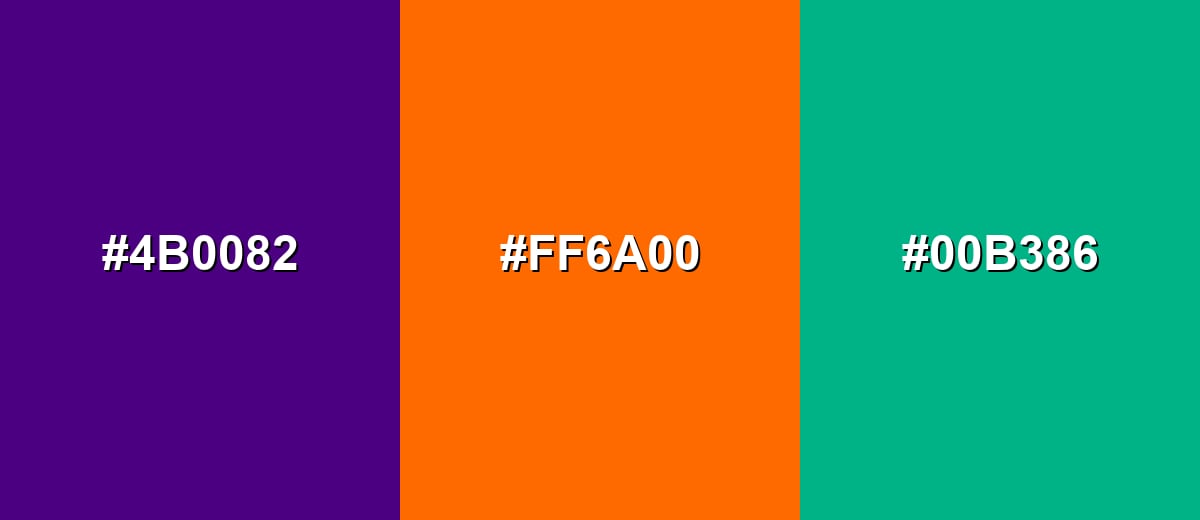
- Indigo: #4B0082
- Tangerine Orange: #FF6A00
- Sea Green: #00B386
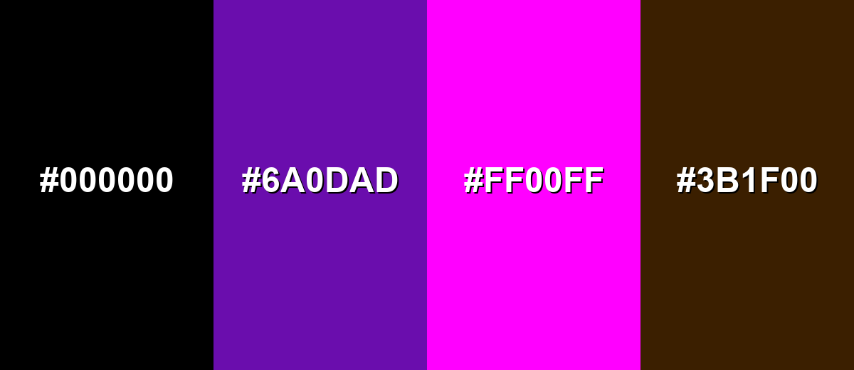
Colors to Avoid
While indigo color is remarkably versatile, certain combinations can create problematic visual effects:
- True Black (#000000) - Black next to indigo can collapse detail and make layouts feel overly heavy, especially in dense UI or small typography.
- Vivid Purple (#6A0DAD) - Very close purples can look unintentionally mismatched, creating a muddy or unclear hierarchy instead of a clean tonal palette.
- Neon Magenta (#FF00FF) - Highly saturated magenta can create harsh vibration against indigo, pulling attention away from content and reducing readability.
- Dark Brown (#3B1F00) - Deep brown and indigo together can feel dull and low-contrast, especially under warm lighting or on textured backgrounds.
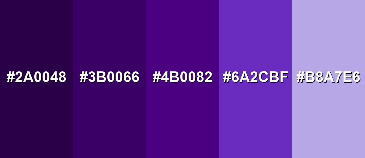
Shades, Tints & Variations of Indigo Color
Indigo has a surprisingly flexible range—from near-black, cinematic shadows to soft, airy tints. Building with multiple indigo values makes it easier to create hierarchy in UI, depth in print, and smooth gradients in branding.
- Midnight Indigo (#2A0048) - A near-black indigo with a subtle violet undertone that feels dramatic and cinematic. It's best used for Backgrounds, hero sections, premium packaging, dark-mode surfaces.
- Deep Indigo (#3B0066) - A darker, richer indigo that keeps the hue clearly blue-violet while increasing contrast. It's best used for Headers, navigation bars, button states, and bold typography.
- Classic Indigo (#4B0082) - The recognizable indigo tone—deep, saturated, and balanced between blue and purple. It's best used for Primary brand color, strong accents, charts, and icon fills.
- Soft Indigo (#6A2CBF) - A brighter indigo that leans more violet, feeling energetic and modern without turning neon. It's best used for Highlights, gradients, illustrations, and youthful brand accents.
- Pale Indigo (#B8A7E6) - A light indigo tint that reads airy and calming, with a gentle lavender cast. It's best used for Background panels, subtle UI sections, and secondary surfaces.
Industry Applications
Indigo is widely used because it communicates trust like blue, but adds creativity and sophistication through its violet edge. It's especially useful when a brand wants to feel modern and premium without looking cold.
Fashion & Beauty
- Lean into indigo's denim roots for familiar, wearable styling that still feels elevated.
- Pair indigo with crisp whites for clean contrast, or camel tones for a refined, premium palette.
- Use metallic accents (gold or silver) to enhance the luxurious feel in beauty packaging and visuals.
- For night-time product lines, indigo can feel calming and premium—especially alongside soft neutrals.
Interior Design & Decor
- Use indigo as an accent wall or in textiles (rugs, curtains) to avoid making the space feel smaller.
- Balance indigo with warm woods, brass tones, and creamy whites for a welcoming look.
- Layer multiple indigo values for depth instead of mixing many unrelated dark colors.
- Indigo works especially well under warm lighting, creating a cozy, sophisticated mood.
Branding & Marketing
- For Technology & SaaS, indigo feels smart and dependable while staying distinctive beyond standard blues.
- For Education & Publishing, indigo suggests knowledge, depth, and concentration—ideal for editorial systems.
- For Finance & Professional Services, indigo offers authority like navy but looks more contemporary and brandable.
- Use indigo in logos, wordmarks, and web hero banners when you want craft, expertise, and a modern premium feel.
Conclusion
Indigo (#4B0082) is a deep, expressive blue-purple that brings calm confidence, structure, and creativity into a palette. It works beautifully as a premium base for headers, navigation, and rich backgrounds—just keep most supporting surfaces light, confirm text contrast, and add one bright accent when you need extra clarity or energy. With the codes, conversions, combinations, and shades above, you can use indigo consistently across UI, print, photography, and branding.
Design Smarter with AI: Media.io is an online AI studio that empowers creators with advanced image generation and enhancement tools. From text-to-image and image-to-image creation to AI upscaling and color optimization, it enables fast, creative, and professional results—all in your browser.

Frequently Asked Questions About Indigo Color
Indigo is a deep blue-violet color positioned between blue and purple. It often appears richer than navy and less pink than many purples.
For this indigo, RGB is 75, 0, 130 and CMYK is 42%,100%,0%,49%. RGB is best for screens, while CMYK is used for printing.
Indigo can lean either way depending on the shade, but it typically sits near the boundary—blue at its core with a noticeable violet undertone.
Indigo pairs well with soft whites, light grays, warm metallics, and high-contrast accents like yellow-green, orange, teal, or cyan—depending on the mood you want.
Use indigo for key UI anchors like headers, navigation, and primary buttons, then keep most surfaces light for readability. Add one bright accent color sparingly to guide attention.
White or near-white text is usually the safest choice on indigo because the background is dark. For small text and thin UI elements, always verify contrast to maintain legibility.


