

 TL;DR:
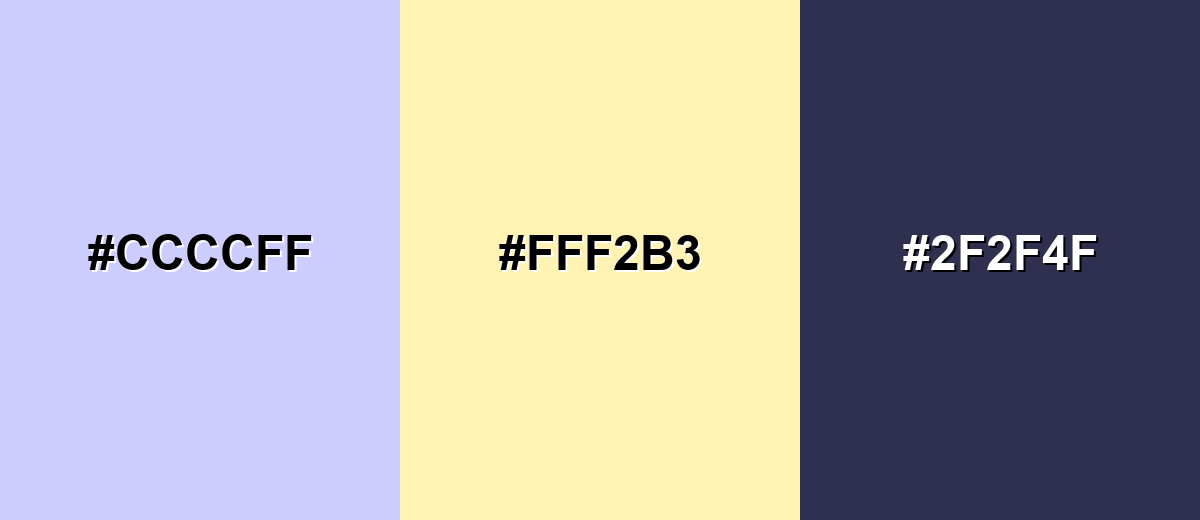
Periwinkle (HEX #CCCCFF) is a light blue-violet pastel that provides a calming, tech-friendly aesthetic ideal for spacious web backgrounds and modern branding.
● Reproducing periwinkle in print workflows (CMYK 20%, 20%, 0%, 0%) requires testing on actual paper stock, as pastel blue-violet tones can shift significantly depending on coating and lighting.
● When applying it as a primary web background, you must pair it with darker anchor shades like Periwinkle Indigo (#4D4DCC) for headings and interactive elements to maintain visual structure and legibility.
● Avoid combining periwinkle with pure red, true black, neon yellow, or dark brown, as these extreme contrasts overpower its soft base and create harsh or muddy visual noise.
Ask AI for a summary
 ChatGPT
 Perplexity
 Gemini
 Claude
 Grok
Grok
Periwinkle is a soft, airy blend of blue and violet that feels both calming and gently expressive. It carries the clarity and freshness of pastel blue, while a subtle purple undertone introduces imagination, warmth, and quiet charm.
Positioned between cool blue and dreamy lavender, periwinkle offers a balanced, versatile presence. It works beautifully in digital design, branding, and interiors—especially when you want to create a light, optimistic atmosphere without leaning fully into pink sweetness or pure blue minimalism.
In this guide, we'll explore periwinkle's meaning and symbolism, Hex codes and color values, conversions across major color models, complementary combinations, popular shades and variations, and practical applications in design.
Periwinkle Color: Codes & Values
Periwinkle is a soft blend of blue and lavender that brings a calm, modern feel to digital and print design. Because colors can display differently across screens, browsers, and printers, using standardized values is essential for maintaining visual consistency. Use these standard color codes to accurately reproduce periwinkle across web design, user interfaces, branding systems, and professional print workflows. These specifications help ensure the color appears balanced and consistent, no matter the platform or output method.
| Parameters | VALUE |
| HEX Code | #CCCCFF |
| RGB DECIMAL | 204, 204, 255 |
| RGB PERCENTAGE | 80%, 80%, 100% |
| CMYK | 20%,20%,0%,0% |
| HSL | 240°, 100%, 90% |
| HSV (HSB) | 240°, 20%, 100% |
| Web Safe | #CCCCFF |
Key Color Space Explanations:
- HEX - HEX is the most common way to specify periwinkle in web design and digital tools. It represents the red, green, and blue channels as a single six-digit code.
- RGB - RGB defines periwinkle using red, green, and blue light values. It's the default for screens, UI design, and most color pickers.
- CMYK - CMYK is used for print workflows and describes ink percentages. Conversions from RGB can vary slightly by printer, paper, and color profile.
- HSL - HSL describes periwinkle by hue, saturation, and lightness, which is helpful when creating tints and shades. It's especially useful for building consistent UI palettes.
- Web Safe - Web-safe colors are a classic set intended to display consistently across older systems. The closest web-safe value helps when you need maximum compatibility.
For most design tools, start with HEX or RGB on screen, then switch to CMYK when you're prepping files for print.
Want to generate periwinkle color photos or posters? Try Media.io's AI Image Generator now!
Periwinkle Color Conversions
To help you move seamlessly between digital and print workflows, the chart below provides a comprehensive set of periwinkle color conversions across the most widely used color models. Whether you're adjusting tones in HSL, preparing assets in RGB, or converting files for CMYK print production, these values make it easy to maintain accuracy and consistency. We've also included ready-to-copy CSS code where applicable, so you can quickly apply periwinkle in web projects without additional formatting or conversion steps.
| Parameters | VALUE | CSS |
| HEX | #ccccff | #ccccff |
| RGB DECIMAL | 204, 204, 255 | rgb(204,204,255) |
| RGB PERCENTAGE | 80%, 80%, 100% | rgb(80%,80%,100%) |
| CMYK | 20%,20%,0%,0% | cmyk(20%,20%,0%,0%) |
| HSL | 240°, 100%, 90% | hsl(240°,100%,90%) |
| HSV (or HSB) | 240°, 20%, 100% | -- |
| Web Safe | ccccff | #ccccff |
| CIE-LAB | 83.5, 11.0, -25.0 | -- |
| XYZ | 64.6, 63.2, 103.4 | -- |
| xyY | 0.279, 0.274, 63.2 | -- |
| CIE-LCH | 83.5, 27.3, 293.2° | -- |
| CIE-LUV | 83.5, -2.8, -41.6 | -- |
| Hunter-Lab | 79.5, 10.3, -28.0 | -- |
| Binary | 11001100, 11001100, 11111111 | -- |
Periwinkle Color Meaning & Symbolism
Periwinkle's personality comes from its natural balance: blue contributes clarity, calm, and stability, while violet introduces creativity, warmth, and a subtle softness. This harmonious blend gives the color emotional depth, making it feel soothing yet expressive—an ideal choice when you want something gentle without appearing sterile or distant.
Psychological Effects
Psychologically, periwinkle tends to feel light, reassuring, and mentally “spacious,” especially in bright or minimal layouts. Its soft luminosity creates visual breathing room, helping reduce strain and support focus while maintaining a friendly, uplifting atmosphere.
- Relaxation - Its pastel softness helps reduce visual tension and makes pages feel easier to scan.
- Clarity - The blue base supports focus and order, which is useful for interfaces and information-heavy screens.
- Gentle Uplift - The violet undertone adds a hopeful, dreamy mood without becoming overly playful.
- Emotional Safety - It can feel reassuring and kind, fitting supportive messaging and wellness themes.
- Creativity - Periwinkle subtly encourages curiosity and imagination, especially when paired with other pastels.
Positive Associations
In design and branding, these are the most common positive associations people attach to periwinkle. It frequently communicates calm confidence, creative thinking, and a sense of approachable polish—qualities that feel both modern and emotionally balanced.
- Calm And Comfort - Its pastel lightness feels gentle, making it a good fit for restful layouts and supportive messaging.
- Imagination And Curiosity - The hint of violet can suggest creativity, playfulness, and a slightly whimsical edge.
- Trust With Warmth - Compared with stronger blues, periwinkle can feel more welcoming while still staying clean and dependable.
- Youthful And Fresh - Because it's bright and airy, it's often used to keep designs feeling modern and upbeat.
- Approachability - It softens "serious" layouts and makes products feel friendlier without losing polish.
Cultural Significance Across the World
Cultural interpretations of color always vary by region and context, but periwinkle consistently leans toward a positive, calming perception worldwide. Its soft blue-violet character often suggests renewal, gentleness, and contemporary elegance rather than intensity or rigidity.
- Springtime Mood - In many places, light blue-violet tones are tied to renewal, softness, and brighter seasons.
- Modern Femininity - Periwinkle can signal a gentle, contemporary feminine vibe without leaning strongly pink.
- Tech-Friendly Calm - In digital products, it frequently communicates "friendly innovation" and low-stress usability.
- Quiet Luxury - When paired with clean neutrals, it can feel premium, minimal, and intentionally understated.
Design Applications
Periwinkle is flexible: it can act as a soft background, a friendly highlight, or a signature brand tone. The key is pairing it with enough contrast and a clear visual hierarchy.
Graphic Design Tips
- Use periwinkle for hero backgrounds, cards, or section breaks to keep layouts calm and airy.
- Pair it with a deeper blue-violet for buttons, active states, and navigation so key UI doesn't fade.
- Reserve periwinkle for secondary data series in charts and keep the primary series more saturated for clarity.
- Balance pastel-heavy palettes with crisp neutrals to avoid a washed-out look on bright screens.
- For print, test on the actual paper stock—pastel blue-violets can shift depending on coating and lighting.
Pro tip: If periwinkle is your main background, choose one darker "anchor" shade for headings and components so the page keeps structure even at low brightness.
Periwinkle Color in Photography & Video
- Use periwinkle gels or LED hues to create soft, cinematic highlights in portraits and product shots.
- In color grading, nudge shadows toward blue-violet for a modern, dreamy feel—without crushing blacks.
- Pair periwinkle backgrounds with neutral wardrobe choices to keep skin tones natural and flattering.
- For social video, periwinkle works well as a consistent lower-third or caption panel color (with dark text).
- When shooting glossy packaging, watch for cool reflections that can push the color too blue on camera.
Recommended Tool for Image Enhancement: When incorporating periwinkle color into your photography projects, Media.io's AI Image tools can help you achieve more refined results. With AI-powered color enhancement, photo colorization, image upscaling, and old photo restoration, you can easily enrich periwinkle color tones, improve overall image quality, and highlight the color's elegant and sophisticated aesthetic.
Color Combinations
Periwinkle pairs easily with both cool and warm companions. Use warm accents to add energy, or stay in neighboring hues for a softer, more atmospheric palette.
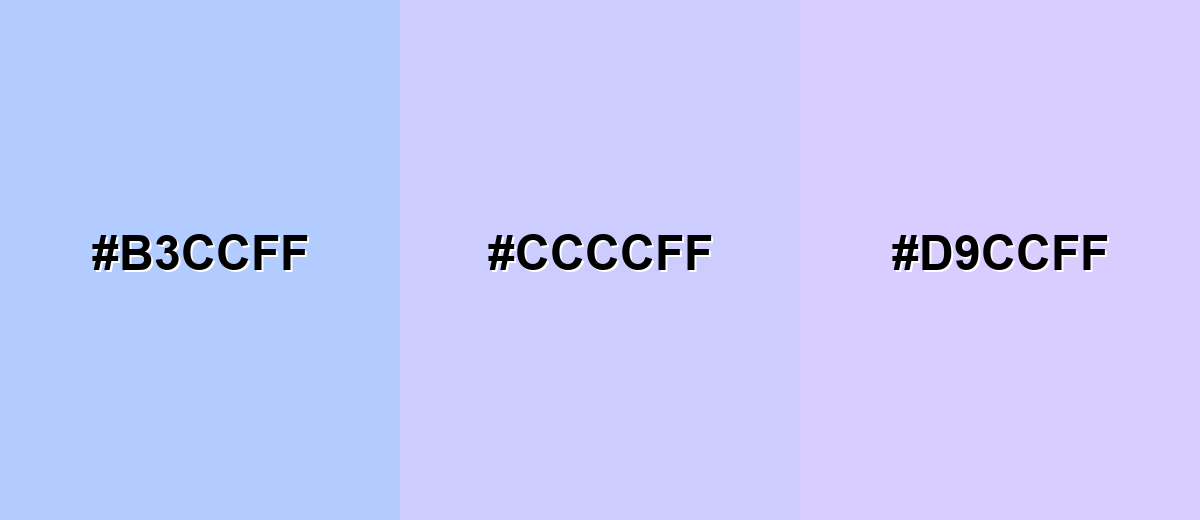
Complementary Colors
A complementary pairing places periwinkle opposite a soft yellow family, creating a balanced contrast that still feels gentle because both tones are light.
Complementary Palette Example: Use periwinkle as the main field, butter yellow for highlights, and deep twilight navy for structure and legibility.
- Periwinkle: #B3CCFF
- Butter Yellow: #CCCCFF
- Deep Twilight: #D9CCFF
Analogous Color Schemes
Analogous colors sit adjacent to each other on the color wheel, creating harmonious, cohesive palettes with subtle variation.
Blue-to-lavender analogous tones feel cohesive, calm, and modern for backgrounds and gradients.
- Pastel Blue: #B3CCFF
- Periwinkle: #CCCCFF
- Pastel Lavender: #D9CCFF
A slightly cooler analogous set keeps things crisp while preserving periwinkle's soft, dreamy character.
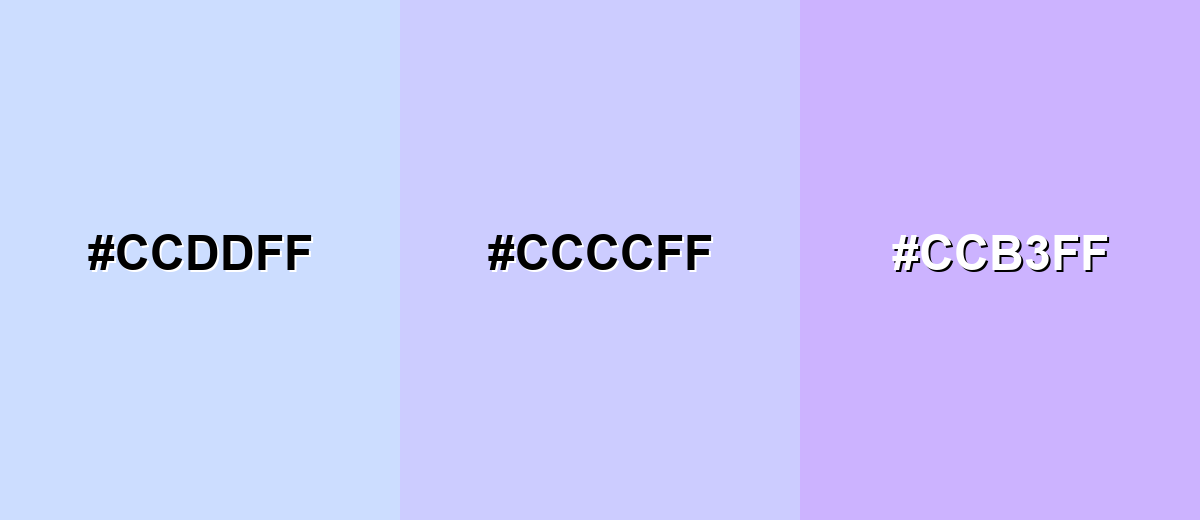
- Ice Blue: #CCDDFF
- Periwinkle: #CCCCFF
- Lilac Tint: #CCB3FF
Triadic & Tetradic Combinations
Triadic palettes create lively contrast without the sharpness of pure complementary schemes.
Periwinkle with soft pink and mint green makes a playful, friendly trio for lifestyle, creative, and community-focused designs.
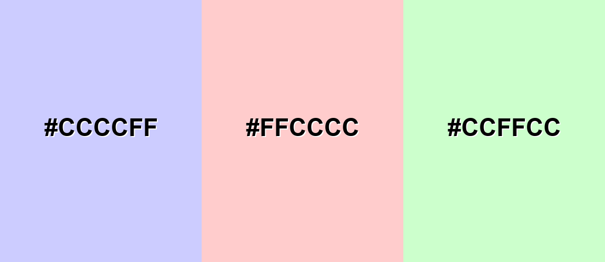
- Periwinkle: #CCCCFF
- Blush Pink: #FFCCCC
- Mint Green: #CCFFCC
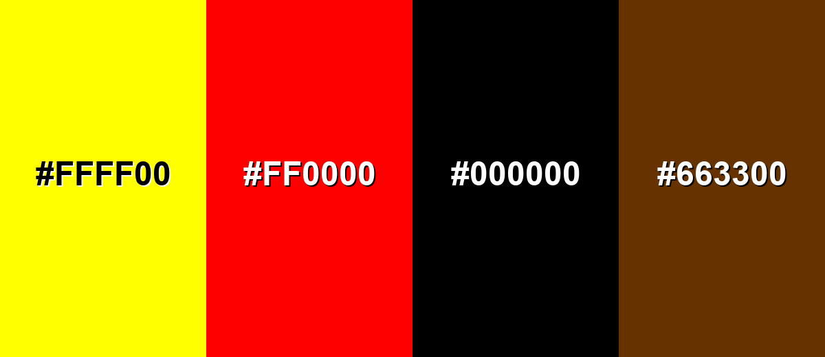
Colors to Avoid
While periwinkle color is remarkably versatile, certain combinations can create problematic visual effects:
- Neon Yellow (#FFFF00) - Too intense next to periwinkle's softness, often creating a harsh, vibrating contrast.
- Pure Red (#FF0000) - Overpowers periwinkle and can make the palette feel noisy instead of calm.
- True Black (#000000) - The jump in contrast can look abrupt; a softer dark tone usually blends more naturally.
- Dark Brown (#663300) - Can read muddy against periwinkle's cool, clean character unless carefully balanced with neutrals.
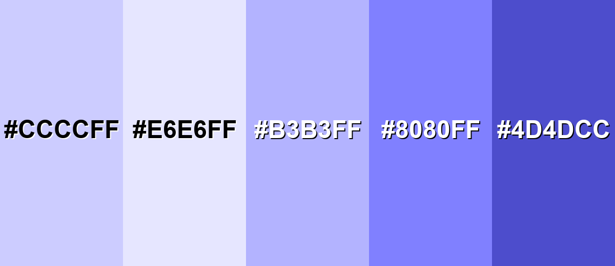
Shades, Tints & Variations of Periwinkle Color
Periwinkle isn't just one pastel—there's a full range from barely-there tints to deeper blue-violet anchors. Having a few consistent variations makes it much easier to design buttons, backgrounds, borders, and text with clear contrast.
- Periwinkle (#CCCCFF) - The classic light blue-violet periwinkle—bright, calm, and easy to pair with neutrals. It's best used for Primary backgrounds, gentle branding accents, and soft UI sections.
- Light Periwinkle (#E6E6FF) - A subtle tint that feels airy and minimal, with just a whisper of blue-violet. It's best used for Large background areas, spacious layouts, and quiet gradients.
- Soft Periwinkle (#B3B3FF) - A slightly deeper pastel that stays friendly while offering more definition than the base tone. It's best used for Cards, badges, secondary buttons, and decorative patterns.
- Deep Periwinkle (#8080FF) - A richer periwinkle that leans more blue and reads clearly on both light and mid-tone surfaces. It's best used for Interactive states, icons, headings, and UI highlights.
- Periwinkle Indigo (#4D4DCC) - A dark blue-violet shade that adds contrast while staying in the same color family. It's best used for Text on light periwinkle backgrounds, outlines, and navigation elements.
Industry Applications
Periwinkle is popular in industries that benefit from calm confidence and a touch of creativity. It can look soft and comforting or clean and tech-forward, depending on the supporting palette and typography.
Fashion & Beauty
- Skincare and personal care visuals that feel clean, light, and modern.
- Pastel seasonal campaigns where you want a "fresh" look without leaning too pink.
- Packaging accents that read gentle and premium on matte finishes.
- Social templates and lookbooks that stay soft while still feeling polished.
Interior Design & Decor
- Bedrooms and calm workspaces where you want a restful, airy atmosphere.
- Studios or creative rooms that benefit from a subtle imaginative vibe.
- Pairing with soft whites and light woods for bright, open-feeling rooms.
- Layering with deeper, cooler tones for a more tailored and structured look.
Branding & Marketing
- Wellness and self-care brands that need trust plus approachability.
- Education and learning platforms aiming for a supportive, friendly tone.
- Tech and SaaS onboarding screens, empty states, and illustration systems.
- Product-led growth visuals where periwinkle supports calm dashboards and UI.
Conclusion
Periwinkle is a versatile blue-violet that combines calm with a creative lift. Use #CCCCFF as a soft base for backgrounds or brand accents, then add definition with deeper periwinkle shades for navigation and UI states. For palettes, keep things airy with nearby blues and lavenders, or introduce a warm, gentle contrast when you need more energy and focus.
Design Smarter with AI: Media.io is an online AI studio that empowers creators with advanced image generation and enhancement tools. From text-to-image and image-to-image creation to AI upscaling and color optimization, it enables fast, creative, and professional results—all in your browser.

Frequently Asked Questions About Periwinkle Color
Periwinkle is a light blue-violet color that sits between pastel blue and lavender. It's known for a calm, airy look with a subtle hint of purple.
A commonly used digital value for periwinkle is HEX #ccccff. It's a light, screen-friendly blue-violet often used in UI and brand palettes.
Periwinkle is balanced, but it typically reads slightly more blue because of its cool, clean base. The violet influence shows up as a soft, dreamy undertone.
Periwinkle pairs well with soft yellows for contrast, neighboring blues and lavenders for smooth harmony, and gentle pinks or mints for playful palettes. Neutrals like off-white and cool grays also help it feel polished.
Start with a light blue, then mix in a small amount of violet until you get a blue-violet tone. Add white to reach the airy, pastel lightness associated with periwinkle.
Yes, especially for calm, friendly layouts. Use darker text and clear contrast for buttons and links, since periwinkle is light and can reduce readability if paired with pale elements.


