

Pastel blue color is a pale, softened blue that looks like a clear sky seen through a light haze, with a slightly gray, milky finish.
Its signature digital code is #AEC6CF, which stays bright and fresh while remaining gentle on the eyes—making it a go-to for calm, clean visuals in UI, branding, and interiors.
Pastel Blue Color: Codes & Values
Here are the standard values designers use to match pastel blue across screens, print workflows, and adjustable color spaces.
| Parameters | VALUE |
| HEX Code | #AEC6CF |
| RGB DECIMAL | 174, 198, 207 |
| RGB PERCENTAGE | 68.2%, 77.6%, 81.2% |
| CMYK | 16%,4%,0%,19% |
| HSL | 196°, 26%, 75% |
| HSV (HSB) | 196°, 16%, 81% |
| Web Safe | #99CCCC |
Key Color Space Explanations:
- HEX - HEX is a six-digit code used on the web to represent a specific sRGB value. For pastel blue, #aec6cf is the most common starting point in UI and CSS.
- RGB - RGB mixes red, green, and blue light to create the final on-screen look. The RGB values 174, 198, 207 show a blue-leaning tint with plenty of lightness.
- CMYK - CMYK is used for printing and describes how inks combine on paper. The values 16%,4%,0%,19% help approximate pastel blue in print workflows.
- HSL - HSL describes hue, saturation, and lightness in a way that is easy to adjust for design. Pastel blue sits around 196° with low saturation and high lightness for a soft look.
- Web Safe - Web-safe values are a legacy palette that aimed to look consistent on older displays. The closest web-safe match to pastel blue is #99cccc.
In practice, start with HEX/RGB for UI and web, switch to HSL when you need quick tweaks to softness, and use CMYK as your print approximation (then test a proof).
Pastel Blue Color Conversions
If you need pastel blue in multiple formats for design tools, development, or prepress, use the conversions below as a reliable reference.
| Parameters | VALUE | CSS |
| HEX | #aec6cf | #aec6cf |
| RGB DECIMAL | 174, 198, 207 | rgb(174,198,207) |
| RGB PERCENTAGE | 68.2%, 77.6%, 81.2% | rgb(68.2%,77.6%,81.2%) |
| CMYK | 16%,4%,0%,19% | cmyk(16%,4%,0%,19%) |
| HSL | 196°, 26%, 75% | hsl(196°, 26%, 75%) |
| HSV (or HSB) | 196°, 16%, 81% | -- |
| Web Safe | 99cccc | #99cccc |
| CIE-LAB | 78.5, -5.5, -7.2 | -- |
| XYZ | 49.0, 53.9, 66.8 | -- |
| xyY | 0.289, 0.318, 53.9 | -- |
| CIE-LCH | 78.5, 9.0, 232.6° | -- |
| CIE-LUV | 78.5, -12.8, -10.0 | -- |
| Hunter-Lab | 73.4, -5.6, -7.1 | -- |
| Binary | 101011101100011011001111 | -- |
Want to generate pastel blue color photos or posters? Try Media.io's AI Image Generator now!
Pastel Blue Color Meaning & Symbolism
Pastel blue color is widely associated with calm, clarity, and a gentle sense of order. Because it is light and muted, it often feels approachable rather than intense, which is why it shows up in everyday spaces like apps, packaging, and interiors where comfort matters. In daily life, this soft blue tends to read as clean and dependable, and it can also suggest openness and "room to breathe," especially when paired with white or warm neutrals.
Psychological Effects
Because it's low-saturation and high-lightness, pastel blue tends to quiet a design down instead of demanding attention.
- Quieter Layouts - Pastel blue can make layouts feel quieter and less demanding, which is useful when you want people to slow down and focus.
- Trust And Low Pressure - In UI and product design, it often supports a feeling of trust and low pressure, especially for onboarding screens, dashboards, and wellness-related visuals.
- Room To Breathe - It can suggest openness and "room to breathe," especially when paired with white or warm neutrals.
- Feels Larger - Because it reflects a lot of light, pastel blue can also make small spaces and compact interfaces feel larger.
- Can Feel Sterile - Too much pastel blue can feel chilly, distant, or overly sterile if there is not enough warmth in the palette.
Positive Associations
These are the most common "good vibes" designers tap into when they choose pastel blue.
- Calm - Pastel blue is widely associated with calm, helping designs feel soothing rather than intense.
- Clarity - It's linked with clarity and gentle order, which can make information feel easier to process.
- Approachable - Because it is light and muted, it often feels approachable rather than intense.
- Clean And Dependable - In everyday use, this soft blue tends to read as clean and dependable.
- Openness - It can suggest openness and breathing space, especially in bright, minimal layouts.
Cultural Significance Across the World
Context matters—pastel blues are broadly understood, but the exact "read" can shift by audience and setting.
- Peace - Across many modern contexts, lighter blues are linked with peace.
- Cleanliness - Lighter blues are also commonly tied to cleanliness and tidy, orderly environments.
- Gentle Reassurance - Pastel blue can communicate gentle reassurance when the goal is comfort.
- Varies By Culture - Associations can vary by culture and setting, so it is best to align the tone with your audience and the message you want the design to communicate.
Pastel Blue in Design Applications
Pastel blue is easiest to use when you treat it as a soft foundation rather than a loud accent. It supports readability, creates breathing room, and pairs well with both cool and warm companions.
Graphic Design Tips
- Use pastel blue for backgrounds and large surfaces where you want a bright, calm atmosphere.
- Apply it to secondary UI elements such as cards, panels, banners, and empty states.
- Add warmth with soft peach, sand, or creamy white to keep the look inviting.
- Use deeper blue-grays for headings and icons to maintain clear hierarchy.
- Avoid pure white text on pastel blue; use darker text and test contrast for accessibility.
Pro tip: Keep saturation low across companion hues for a cohesive pastel aesthetic, and reserve pastel blue for backgrounds, chips, and highlights rather than small text.
Pastel Blue in Photography & Video
- Use pastel blue as a clean backdrop to create "room to breathe" around your subject.
- Balance the frame with warm neutrals to prevent the scene from feeling chilly or sterile.
- Lean into its airy feel for wellness visuals, soft lifestyle edits, and calm product shots.
- In motion graphics, pastel blue works well for quiet lower-thirds, panels, and transitions that shouldn't overpower footage.
- When color grading, keep the look muted and bright so pastel blue stays gentle instead of turning electric.
Recommended Tool for Image Enhancement: When incorporating pastel blue into your photography projects, Media.io's AI Image tools can help you achieve more refined results. With AI-powered color enhancement, photo colorization, image upscaling, and old photo restoration, you can easily enrich pastel blue tones, improve overall image quality, and highlight the color's elegant and sophisticated aesthetic.
Pastel Blue Color Combinations
Pastel blue pairs best with soft, supportive tones that keep its airy character intact. Use warm accents for balance, or stay in nearby cool hues for a clean, calm palette.
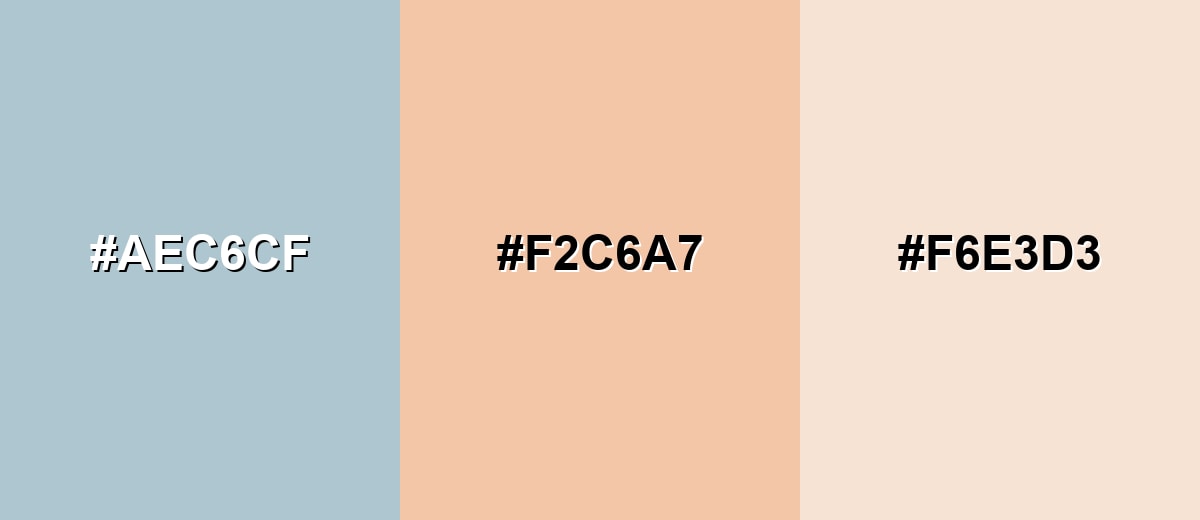
Complementary Colors
A complementary palette adds a warm counterpoint that makes pastel blue feel less cool and more welcoming. This is a strong option for calls to action, hero sections, and editorial layouts that need gentle contrast.
Complementary Palette Example: Combine pastel blue with a light peach and a creamy sand to keep contrast warm, soft, and easy on the eyes.
Analogous Color Schemes
Analogous colors sit adjacent to each other on the color wheel, creating harmonious, cohesive palettes with subtle variation.
For a calm, cohesive look, move from minty blue-green through pastel blue into a light periwinkle.
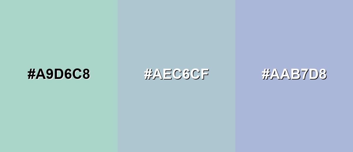
- Seafoam Mint: #A9D6C8
- Pastel Blue: #AEC6CF
- Soft Periwinkle: #AAB7D8
For a slightly brighter, playful range, pair a powdery cyan and a gentle lavender with pastel blue in the middle.
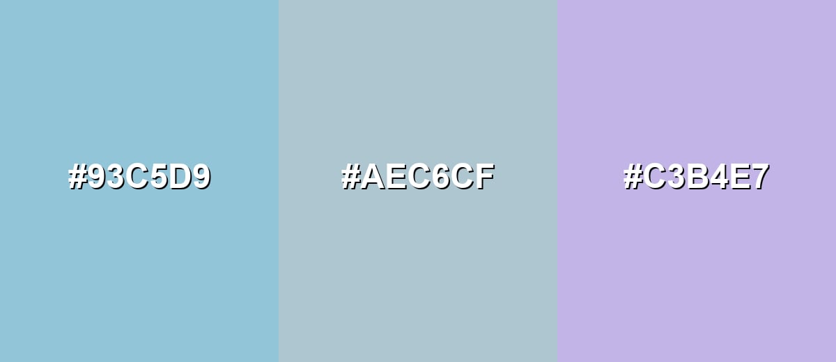
- Powder Cyan: #93C5D9
- Pastel Blue: #AEC6CF
- Light Lavender: #C3B4E7
Triadic & Tetradic Combinations
A triadic scheme brings variety while staying balanced, as long as you keep all three tones soft.
Try pastel blue with a muted lilac-pink and a pale yellow-green for cheerful, modern contrast.
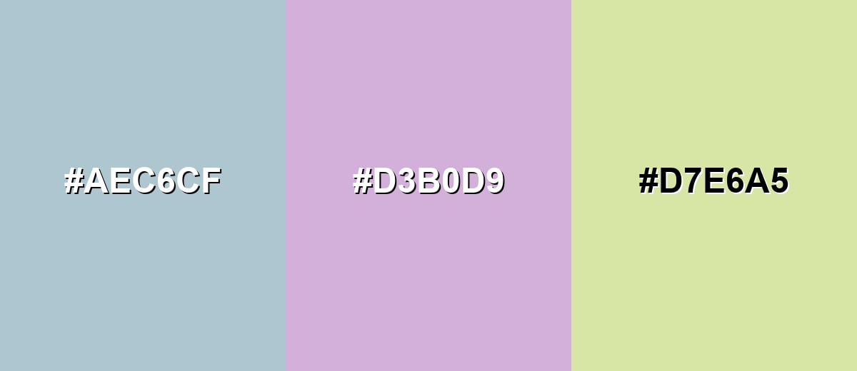
- Pastel Blue: #AEC6CF
- Muted Lilac Pink: #D3B0D9
- Pastel Yellow Green: #D7E6A5
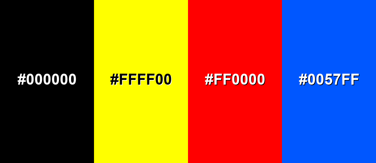
Colors to Avoid
While pastel blue is remarkably versatile, certain combinations can create problematic visual effects:
- Pure Black (#000000) - The jump in contrast can feel harsh and heavy against such a light, airy tone; a softer charcoal is usually smoother.
- Neon Yellow (#FFFF00) - High-intensity neon hues can overpower pastel blue and create visual vibration, especially in UI elements.
- Bright Red (#FF0000) - Strong red can make the palette feel alarming rather than calm, which fights the intended mood.
- Electric Blue (#0057FF) - A highly saturated blue next to pastel blue can make the pastel look washed out and unintentional.
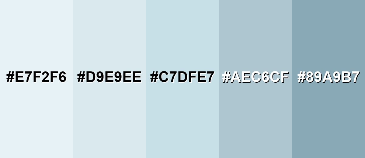
Shades, Tints & Variations of Pastel Blue
Pastel blue isn't just one fixed swatch—there's a whole range from near-white tints to deeper, grayer versions. Having a few related shades makes it easier to build hierarchy (backgrounds, panels, borders, text accents) while keeping the same calm, airy vibe.
- Mist Blue (#E7F2F6) - An extra-light, near-white blue that reads fresh and spacious. It's best used for Large backgrounds, airy sections, and subtle UI panels.
- Ice Blue (#D9E9EE) - A cool, pale tint that keeps the soft character but adds a touch more blue presence. It's best used for Cards, tables, and gentle highlights that should stay quiet.
- Powder Blue (#C7DFE7) - A slightly clearer, cleaner tint that still feels pastel and friendly. It's best used for Illustrations, gradients, and product UI accents.
- Classic Pastel Blue (#AEC6CF) - The balanced baseline: light, muted, and easy to pair with neutrals and soft accents. It's best used for Brand foundations, backgrounds, and calm interface themes.
- Dusty Blue (#89A9B7) - A deeper, grayer variation that adds structure and weight without turning harsh. It's best used for Headings, icons, borders, and supporting text on light surfaces.
Industry Applications
Pastel blue appears across industries that benefit from a calm, clean, and supportive visual tone. It is especially useful when you want a modern look without high saturation.
Fashion & Beauty
- Use pastel blue in product visuals to communicate a calm, clean, and gentle mood.
- Pair it with warm neutrals in packaging design to keep the look inviting rather than chilly.
- Build soft, airy social templates with pastel blue as a background to create "room to breathe."
- For UI in beauty apps, pastel blue supports a low-pressure browsing experience that feels friendly and approachable.
Interior Design & Decor
- Apply pastel blue to walls, textiles, or accents to brighten spaces and keep the atmosphere calm.
- Because it reflects a lot of light, it can help small rooms feel larger and more open.
- Balance it with warm neutrals to avoid a sterile or overly cool impression.
- Use deeper, grayer blue variations for structure in trims, decor details, and visual grounding.
Branding & Marketing
- Pastel blue works well for friendly, clean brand systems that aim for low-friction communication.
- In tech and SaaS, it supports clarity and structure without feeling aggressive.
- In healthcare and patient-facing materials, it can feel clean and reassuring when balanced with warm neutrals.
- For education platforms, the gentle tone helps content feel approachable and organized.
Conclusion
Pastel blue stands out for its airy, softened look that feels calm without being dull. It's a practical choice for backgrounds, gentle accents, and design systems that need a clean, friendly tone across UI, branding, and interiors. Used thoughtfully, it supports clarity and comfort while leaving room for contrast through warmer companions and deeper blue-grays. If you're exploring pastel blue color meaning, it's often tied to reassurance, openness, and a quiet sense of order—and starting from #AEC6CF makes it easy to build consistent palettes and test contrast so your designs stay easy on the eyes.
Design Smarter with AI: Media.io is an online AI studio that empowers creators with advanced image generation and enhancement tools. From text-to-image and image-to-image creation to AI upscaling and color optimization, it enables fast, creative, and professional results—all in your browser.

Frequently Asked Questions About Pastel Blue Color
Pastel blue is a light, muted blue with low saturation and high brightness. It looks soft and airy, like a washed sky-blue with a slight gray cast.
A widely used pastel blue hex value is #aec6cf. It is a balanced, gentle blue that works well as a background or supporting tone.
Pastel blue is commonly linked with calm, cleanliness, and reassurance. In everyday design, it often signals a relaxed, friendly, and orderly mood.
Soft peach, warm sand, creamy white, lavender, and muted mint pair well with pastel blue. For typography and icons, deeper blue-grays usually give better clarity than pure black.
Yes, it works well for backgrounds, cards, and gentle highlights because it feels light and modern. Just avoid white text on it and test contrast with darker text for accessibility.
Add a warm accent like peach or beige, and include natural neutrals such as off-white or warm gray. Using a slightly deeper dusty blue for headings also helps the layout feel grounded.


