

Very peri color is a lively periwinkle-blue with a soft violet undertone that reads bright yet slightly dreamy in real life. Its signature HEX code is #6667AB, a balanced mix of blue and purple that stays punchy without looking neon.
Popularized as Pantone Color of the Year 2022, it was designed to feel digital-first and can look bluer in cool light or more violet under warm lighting. Below, you'll find its key codes, conversions, best pairings, shade ideas, and practical ways to use it in design.
Very Peri Color: Codes & Values
If you're matching very peri across screens, print, or brand assets, these are the core values to keep your color consistent.
| Parameters | VALUE |
| HEX Code | #6667AB |
| RGB DECIMAL | 102, 103, 171 |
| RGB PERCENTAGE | 40.0%, 40.4%, 67.1% |
| CMYK | 40%,40%,0%,33% |
| HSL | 239°, 29%, 54% |
| HSV (HSB) | 239°, 40%, 67% |
| Web Safe | #666699 |
Key Color Space Explanations:
- HEX - HEX is the most common code for web and UI work, written as a six-digit value. Use #6667ab to match the standard very peri look on screens.
- RGB - RGB mixes red, green, and blue light for digital displays. Very peri uses 102, 103, 171 to create a blue-violet balance that stays vivid without overpowering.
- CMYK - CMYK is used for printing and describes ink percentages. The values 40%,40%,0%,33% help you estimate how it will reproduce in print workflows.
- HSL - HSL describes hue, saturation, and lightness, which is handy when creating lighter or darker variations. At 239°, 29%, 54%, it sits firmly in the blue-violet range with moderate saturation.
- Web Safe - Web-safe values map to a limited palette used by older displays and systems. The closest web-safe match to very peri is #666699.
For most projects, start with HEX for UI, RGB for on-screen motion graphics, and CMYK as a print baseline—then tweak with proofs and real-device checks to avoid unexpected shifts.
Very Peri Color Conversions
Need to translate very peri into other color systems for design tools, print workflows, or accessibility checks? Use this quick conversion chart.
| Parameters | VALUE | CSS |
| HEX | #6667ab | #6667ab |
| RGB DECIMAL | 102, 103, 171 | rgb(102,103,171) |
| RGB PERCENTAGE | 40.0%, 40.4%, 67.1% | rgb(40.0%,40.4%,67.1%) |
| CMYK | 40%,40%,0%,33% | cmyk(40%,40%,0%,33%) |
| HSL | 239°, 29%, 54% | hsl(239°,29%,54%) |
| HSV (or HSB) | 239°, 40%, 67% | -- |
| Web Safe | 666699 | #666699 |
| CIE-LAB | 46.2, 17.5, -36.8 | -- |
| XYZ | 17.7, 15.4, 40.6 | -- |
| xyY | 0.240, 0.210, 15.4 | -- |
| CIE-LCH | 46.2, 40.7, 295.4° | -- |
| CIE-LUV | 46.2, -4.3, -56.3 | -- |
| Hunter-Lab | 39.3, 14.0, -38.9 | -- |
| Binary | 01100110 01100111 10101011 | -- |
Want to generate Very Peri Color photos or posters? Try Media.io's AI Image Generator now!
Very Peri Color Meaning & Symbolism
Very peri is often linked with imagination, inventive thinking, and a forward-looking attitude. Because it sits between blue and violet, it can feel both steady and expressive in everyday visuals, from apps to packaging. In practice, very peri color symbolism tends to signal modernity with a friendly, creative edge.
Psychological Effects
In design, very peri tends to balance calm focus with a noticeable creative spark.
- Fresh Energy - Adds lift and momentum without the urgency that warmer brights can bring.
- Creative Mindset - Encourages an imaginative, exploratory feel that suits concept-driven work.
- Calm Structure - Keeps some of blue's steadiness, helping layouts feel organized and readable.
- Playful Modernity - Feels slightly futuristic and "digital-first," especially in gradients and UI highlights.
- Overuse Fatigue - Large blocks can feel cold or synthetic, so it's often better as an accent than a full-page fill.
Positive Associations
These are the common "good vibes" brands lean on when they build a very peri palette.
- Creativity - Signals inventive thinking and a maker/creator attitude.
- Optimism - Feels upbeat and forward-looking, ideal for launches and new features.
- Curiosity - Suggests discovery and experimentation in products, content, and campaigns.
- Innovation - Reads as contemporary and tech-friendly, especially with clean typography.
- Friendly Confidence - Looks bold without feeling aggressive, making it strong for CTAs and highlights.
Cultural Significance Across the World
Color meaning changes by context, but very peri's modern roots shape how it's commonly perceived.
- Digital Culture - Strongly tied to trend-led, screen-first design thanks to its 2022 spotlight.
- Individuality - Blue-violet hues often connect to self-expression and standing out with style.
- Modern Creativity - Frequently used in creative industries to imply imagination and originality.
- Context Matters - The same hue can feel premium with neutrals or youthful with bright accents.
Design Applications
Very peri is easiest to use when you treat it as a modern accent that bridges trusted blue and expressive purple. The sections below show where it tends to work best and how to avoid common contrast and saturation mistakes.
Graphic Design Tips
- Use very peri as an accent color for buttons, badges, and key callouts to keep hierarchy clear.
- Pair it with clean neutrals (white, off-white, light gray) for a polished, premium look.
- Try subtle gradients that move between blue-leaning and violet-leaning tones for depth in hero areas.
- In charts and dashboards, reserve very peri for one "featured" series so it keeps its impact.
- For print and packaging, proof early—blue-violet hues can shift depending on paper stock and ink limits.
Pro tip: If your layout feels too "cool," warm it up with off-whites and softer neutrals, then keep very peri for crisp highlights so the page stays inviting.
Very Peri Color in Photography & Video
- Use it in wardrobe, props, or set accents to add a modern pop without going full neon.
- In color grading, nudge shadows toward indigo and midtones slightly toward periwinkle for a cohesive vibe.
- Balance it with warm skin-tone lighting so subjects don't look overly cold or desaturated.
- For thumbnails and social graphics, use very peri behind white typography (after contrast checks) to boost scannability.
- When shooting product shots, test under both warm and cool lighting—very peri can read bluer or more violet depending on the source.
Recommended Tool for Image Enhancement: When incorporating very peri color into your photography projects, Media.io's AI Image tools can help you achieve more refined results. With AI-powered color enhancement, photo colorization, image upscaling, and old photo restoration, you can easily enrich very peri color tones, improve overall image quality, and highlight the color's elegant and sophisticated aesthetic.
Color Combinations
Very peri is flexible because it sits between blue and violet, so it can harmonize with both cool and warm palettes. Use the schemes below as starting points, then adjust lightness to fit your layout and contrast needs.
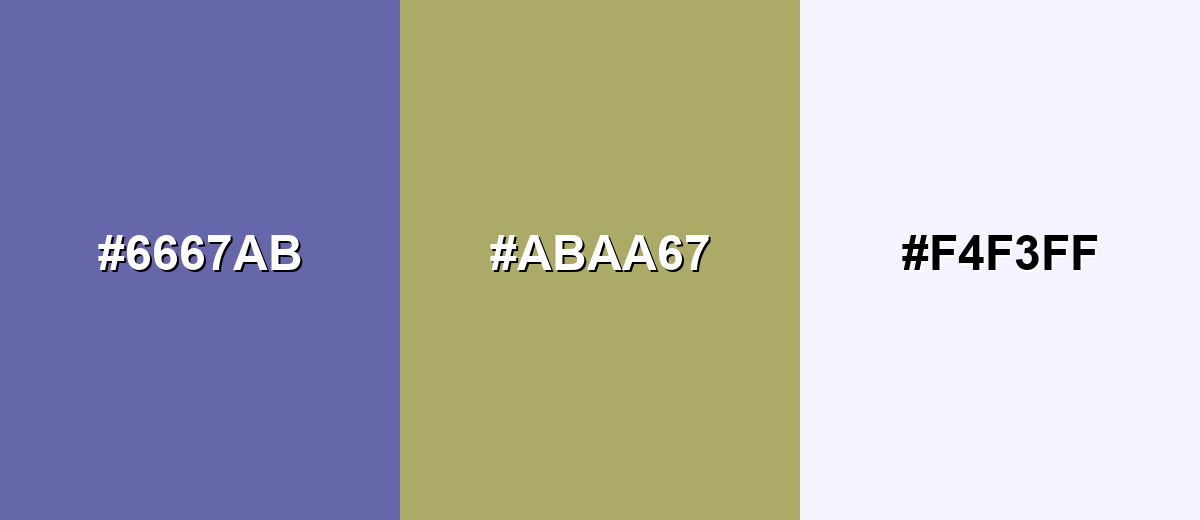
Complementary Colors
A complementary match boosts contrast by pairing very peri with a muted yellow-olive opposite on the wheel. This creates a lively, modern look that works well for banners, editorial graphics, and UI highlights.
Complementary Palette Example: Try Very Peri with Soft Chartreuse and Porcelain White for energetic contrast that still feels polished.
Analogous Color Schemes
Analogous colors sit adjacent to each other on the color wheel, creating harmonious, cohesive palettes with subtle variation.
Blue-leaning analogous tones keep it calm and cohesive for dashboards, hero gradients, and brand systems.
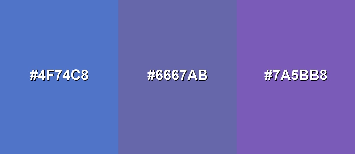
- Blueberry Blue: #4F74C8
- Very Peri: #6667AB
- Orchid Purple: #7A5BB8
A deeper-to-lighter run creates a smooth, layered feel for backgrounds, cards, and soft illustrations.
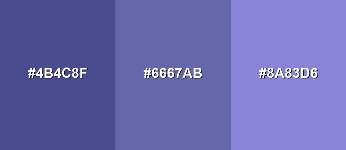
- Indigo Night: #4B4C8F
- Very Peri: #6667AB
- Lavender Blue: #8A83D6
Triadic & Tetradic Combinations
Triadic palettes add variety while keeping balance, making them useful for infographics and multi-category UI.
Combine Very Peri with a muted rose and a fresh green for a playful, evenly spaced scheme.
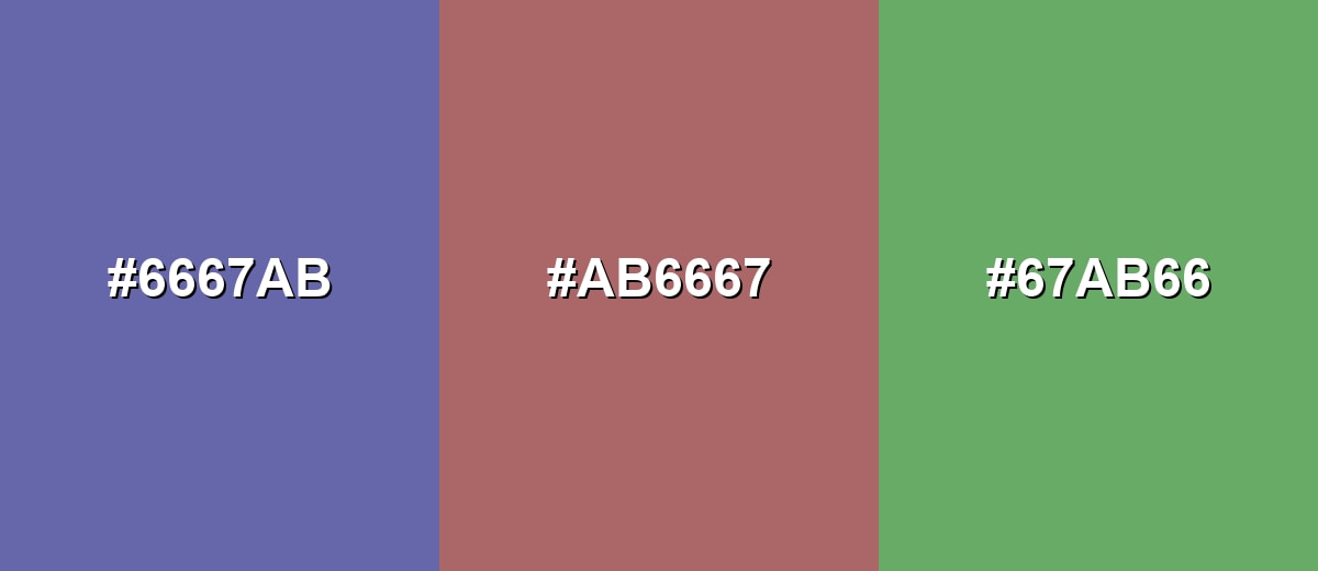
- Very Peri: #6667AB
- Muted Rose: #AB6667
- Fresh Green: #67AB66
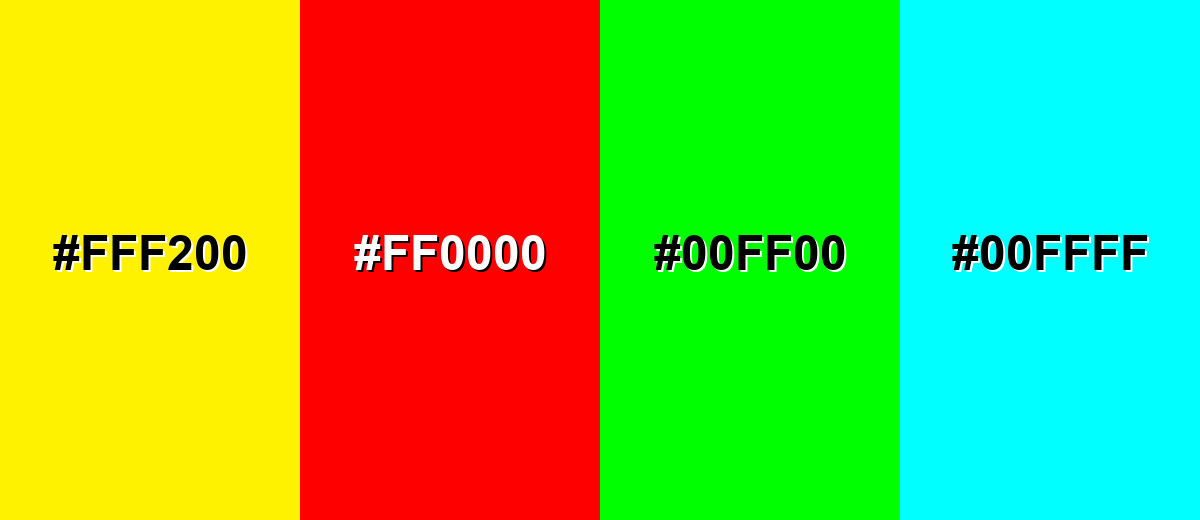
Colors to Avoid
While very peri color is remarkably versatile, certain combinations can create problematic visual effects:
- Neon Yellow (#FFF200) - The combination can vibrate visually and feel harsh, especially in UI where it reduces readability.
- Pure Red (#FF0000) - The clash creates a loud, attention-fighting pair that often looks unrefined in branding and layouts.
- Electric Green (#00FF00) - High saturation on both sides can make designs feel noisy and can be uncomfortable for long viewing.
- Bright Cyan (#00FFFF) - Both hues compete in the cool range, which can flatten hierarchy and cause a cold, clinical feel.
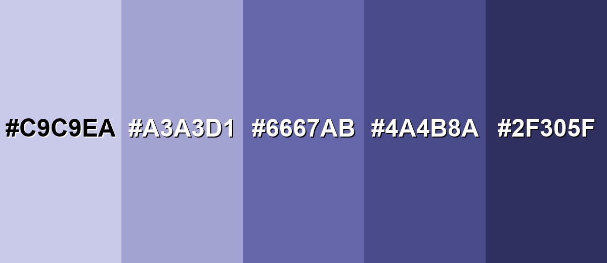
Shades, Tints & Variations of Very Peri Color
Very peri has a surprisingly usable range—from airy tints for backgrounds to deeper indigo-leaning shades for headers and UI frames. Building a small scale like this makes it easier to keep contrast consistent while staying in the same periwinkle-violet family.
- Very Peri Tint (#C9C9EA) - A pale, airy tint that keeps the periwinkle character while feeling soft and open. It's best used for Backgrounds, large panels, subtle gradients, and onboarding screens.
- Soft Periwinkle (#A3A3D1) - A gentle mid-light tone that reads friendly and modern without strong contrast. It's best used for Secondary UI surfaces, cards, and light brand accents.
- Classic Very Peri (#6667AB) - The standard reference shade: balanced blue-violet with a confident, contemporary look. It's best used for Primary accents, buttons, highlights, and brand signature elements.
- Deep Very Peri (#4A4B8A) - A darker, more serious version that feels richer and more grounded. It's best used for Headers, navigation bars, charts, and contrast-friendly accents.
- Midnight Indigo (#2F305F) - A near-indigo shade that leans moody and professional while staying within the same family. It's best used for Text on light backgrounds, deep UI frames, and premium packaging details.
Industry Applications
Because very peri sits between trust-building blue and expressive violet, it adapts well across industries that need a modern, optimistic tone. It is especially effective when you want to suggest creativity and progress without feeling overly edgy.
Fashion & Beauty
- Use it in knits, athleisure, and accessories for a modern pop that feels less loud than neon.
- Pair with clean neutrals to keep the look premium and wearable.
- In makeup and nail looks, very peri reads playful and futuristic, especially with glossy finishes.
- For campaigns, use it as a background accent so product textures stay the hero.
Interior Design & Decor
- Try it as a wall accent, textile, or artwork hue to add personality without heavy purple intensity.
- Balance with warm off-whites, pale woods, or muted golds to keep the room inviting.
- Use lighter tints for larger surfaces and deeper shades for trim, shelves, or small statement pieces.
- Test lighting first—very peri can lean bluer in cool light and more violet under warm bulbs.
Branding & Marketing
- Use it to position brands as imaginative, tech-forward, or creatively driven.
- Works well for primary buttons, focus states, links, and chart emphasis when used intentionally.
- On packaging, it signals modernity—especially alongside matte neutrals or metallic accents.
- For accessibility, keep it as an accent or use deeper variations for better text contrast.
Conclusion
Very peri is a modern periwinkle-blue with a violet twist that feels imaginative, optimistic, and distinctly digital-first. Anchor your palette around #6667AB, lean on tints and deeper shades to control contrast, and use it as a highlight color to keep your UI or branding hierarchy crisp. For pairings, soft neutrals add polish, while a subdued yellow-olive complementary accent brings extra punch without looking chaotic—making very peri a smart choice for contemporary design across web, print, and media.
Design Smarter with AI: Media.io is an online AI studio that empowers creators with advanced image generation and enhancement tools. From text-to-image and image-to-image creation to AI upscaling and color optimization, it enables fast, creative, and professional results—all in your browser.

Frequently Asked Questions About Very Peri Color
Very peri is a periwinkle-leaning blue-violet with a subtle red-violet undertone. It is best known as Pantone Color of the Year 2022 and is often used to communicate modern creativity.
It sits between both, but many people see it as blue first with a violet finish. Lighting and surrounding hues can shift it toward bluer or more purple-looking results.
It is commonly associated with creativity, optimism, and change. In everyday design, it can suggest innovative thinking while still feeling friendly and composed.
Clean whites, soft grays, warm beiges, muted yellows, and gentle pinks pair well. For stronger contrast, try a subdued yellow-olive complementary tone and keep one side less saturated.
It can work for headings or small accents, but it is not always ideal for long body text. Check contrast ratios and consider using a deeper shade or a neutral text color for readability.
Start with the CMYK values as a guide, then run proofs because blue-violet hues can shift by paper and ink. Coated stock often keeps it cleaner, while uncoated paper may mute it.


