

Bronze color is a warm, earthy metallic tone that looks like polished bronze metal, sitting between brown and gold with a subtle orange glow. A widely used digital reference for it is hex #CD7F32.
Many people read bronze as grounded, dependable, and quietly luxurious rather than flashy. This guide breaks down its meaning, codes, best combinations, popular shades, and practical ways to use it.
Bronze Color: Codes & Values
Use these standard bronze color codes to recreate a classic bronze look consistently across web, UI, and print.
| Parameters | VALUE |
| HEX Code | #CD7F32 |
| RGB DECIMAL | 205, 127, 50 |
| RGB PERCENTAGE | 80.4%, 49.8%, 19.6% |
| CMYK | 0%,38%,76%,20% |
| HSL | 30°, 61%, 50% |
| HSV (HSB) | 30°, 76%, 80% |
| Web Safe | #CC6633 |
Key Color Space Explanations:
- HEX - HEX is the most common way to specify a digital swatch in web design. Use #cd7f32 to get a classic bronze tone in CSS and design tools.
- RGB - RGB builds the tone from red, green, and blue light on screens. Bronze uses strong red, medium green, and lower blue to create its warm metallic feel.
- CMYK - CMYK is used for print, mixing cyan, magenta, yellow, and black inks. The higher yellow and moderate black help keep bronze rich instead of looking flat or washed out.
- HSL - HSL describes hue, saturation, and lightness in a way that is easy to tweak. Bronze sits around a 30° hue, making it a warm orange-brown that can be lightened or muted quickly.
- Web Safe - Web safe values approximate a swatch using the classic browser-safe palette. #cc6633 is the closest match if you need a legacy-friendly fallback.
For day-to-day design work, start with HEX #CD7F32 for consistency, then adjust saturation/lightness in HSL to build lighter or deeper bronze accents.
Bronze Color Conversions
Need bronze in a specific format for your workflow? Here are the most common conversions in one place.
| Parameters | VALUE | CSS |
| HEX | #cd7f32 | #cd7f32 |
| RGB DECIMAL | 205, 127, 50 | rgb(205,127,50) |
| RGB PERCENTAGE | 80.4%, 49.8%, 19.6% | rgb(80.4%,49.8%,19.6%) |
| CMYK | 0%,38%,76%,20% | cmyk(0%,38%,76%,20%) |
| HSL | 30°, 61%, 50% | hsl(30°,61%,50%) |
| HSV (or HSB) | 30°, 76%, 80% | -- |
| Web Safe | cc6633 | #cc6633 |
| CIE-LAB | 60.2, 23.5, 52.4 | -- |
| XYZ | 33.32, 28.36, 6.75 | -- |
| xyY | 0.487, 0.414, 28.36 | -- |
| CIE-LCH | 60.2, 57.4, 65.6° | -- |
| CIE-LUV | 60.2, 63.0, 50.6 | -- |
| Hunter-Lab | 53.3, 22.0, 29.1 | -- |
| Binary | 11001101 01111111 00110010 | -- |
Want to generate Bronze Color photos or posters? Try Media.io's AI Image Generator now!
Bronze Color Meaning & Symbolism
Bronze is often linked with resilience, craftsmanship, and earned recognition. It feels warmer and more approachable than gold, while still reading as refined and premium in everyday visuals. In practice, bronze color symbolism shows up anywhere you want a sense of tradition, stability, or understated success.
Psychological Effects
Bronze can make a layout feel grounded and dependable.
- Grounded Dependability - Bronze can make a layout feel grounded and dependable.
- Warmth Without Harshness - Because it sits between brown and gold, it brings warmth without the intensity of bright yellows.
- Mature Visual Hierarchy - This helps it work well for headers, accents, and brand marks that need maturity.
- Tactile Premium Feel - It also suggests quality and tactility, especially when paired with subtle gradients or texture.
- Calm Attention Control - Small bronze highlights can guide attention while keeping the overall look calm and controlled.
Positive Associations
In branding and design, bronze often signals "earned" value rather than flashy luxury.
- Resilience - Bronze is often linked with resilience.
- Craftsmanship - Bronze is often linked with craftsmanship.
- Earned Recognition - Bronze is often linked with earned recognition.
- Quiet Luxury - It feels warmer and more approachable than gold, while still reading as refined and premium in everyday visuals.
- Tradition And Stability - It works anywhere you want a sense of tradition, stability, or understated success.
Cultural Significance Across the World
Its symbolism is closely tied to material culture, awards, and heritage aesthetics.
- Metalwork Heritage - Associated with bronze metalwork, tools, sculpture, and decorative hardware, which reinforces a crafted, durable impression.
- Awards And Ranking - Commonly tied to awards and rankings, where it signals achievement and effort, even if it is not the top position.
- Vintage And Heritage Style - Often used in vintage and heritage aesthetics, while still fitting modern design when balanced with minimal layouts.
- Alloy And Patina - Historically tied to bronze alloy and patina, it can shift from golden to brown depending on lighting and surface texture.
Design Applications
Bronze works best as an accent that adds warmth and depth without overpowering the rest of the palette. A good approach is to treat it like a premium highlight, then support it with neutrals and one clear contrast tone.
Graphic Design Tips
- Use bronze for logos, seals, and trims when the brand message leans toward craft, heritage, or reliability.
- Pair it with off-whites, deep charcoals, or navy to keep it feeling modern rather than rustic.
- Use it for badges, focus states, dividers, or subtle gradient buttons instead of large background blocks.
- Keep supporting colors simple so the bronze accent remains the focal point.
- Add a darker outline or shadow to prevent bronze elements from blending into kraft or warm stocks.
For brand identities, bronze can communicate longevity and quiet confidence.
Bronze Color in Photography & Video
- Bronze can shift from golden to brown depending on lighting and surface texture.
- It suggests quality and tactility, especially when paired with subtle gradients or texture.
- Small bronze highlights can guide attention while keeping the overall look calm and controlled.
- Test on multiple screens because warm browns can shift visually.
- Keep supporting colors simple so the bronze accent remains the focal point.
Recommended Tool for Image Enhancement: When incorporating bronze color into your photography projects, Media.io's AI Image tools can help you achieve more refined results. With AI-powered color enhancement, photo colorization, image upscaling, and old photo restoration, you can easily enrich bronze color tones, improve overall image quality, and highlight the color's elegant and sophisticated aesthetic.
Color Combinations
Bronze pairs beautifully with cool blues, soft neutrals, and deep jewel tones. These palettes help you keep the warmth of bronze while adding contrast and clarity.
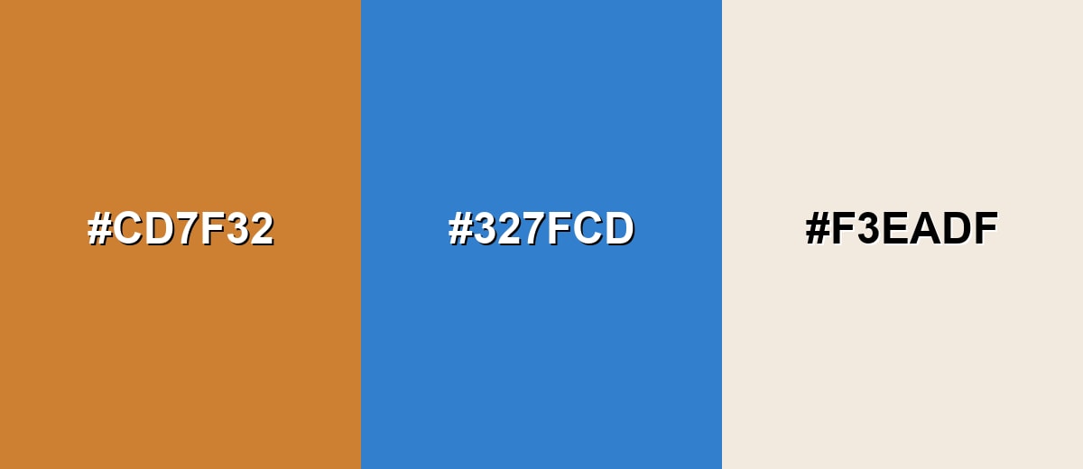
Complementary Colors
A complementary pairing balances bronze's warm orange-brown undertone with a cooler blue. This is a reliable way to make bronze accents feel sharper and more modern.
Complementary Palette Example: Combine Bronze with a medium blue and a warm off-white for a clean, premium contrast that works in branding and UI.
Analogous Color Schemes
Analogous colors sit adjacent to each other on the color wheel, creating harmonious, cohesive palettes with subtle variation.
Bronze, Copper, and Amber create a cohesive warm-metal palette with a natural, handcrafted feel.
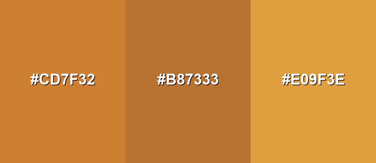
- Bronze: #CD7F32
- Copper: #B87333
- Amber: #E09F3E
Bronze with Golden Brown and Burnt Sienna keeps things warm while adding enough separation for headings and accents.
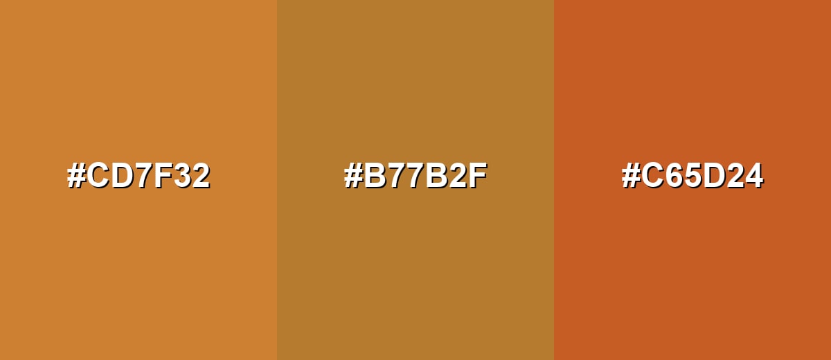
- Bronze: #CD7F32
- Golden Brown: #B77B2F
- Burnt Sienna: #C65D24
Triadic & Tetradic Combinations
A triadic palette gives you contrast without the harshness of direct complements.
Bronze with Teal Green and Royal Purple delivers a bold, balanced set for creative branding and feature graphics.
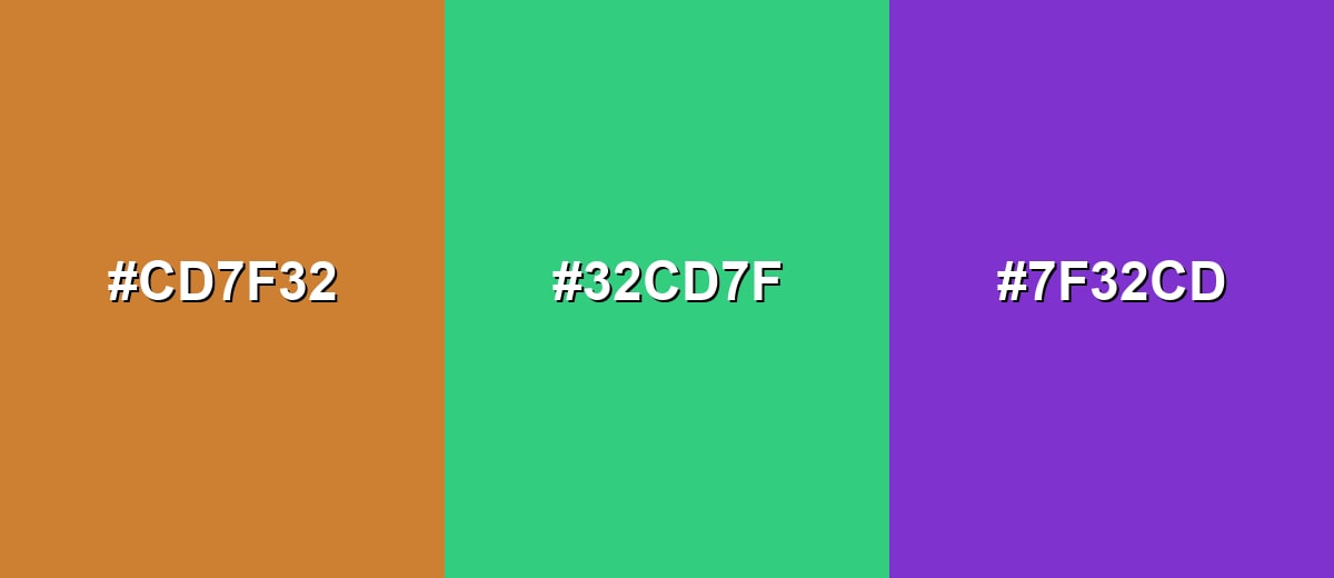
- Bronze: #CD7F32
- Teal Green: #32CD7F
- Royal Purple: #7F32CD
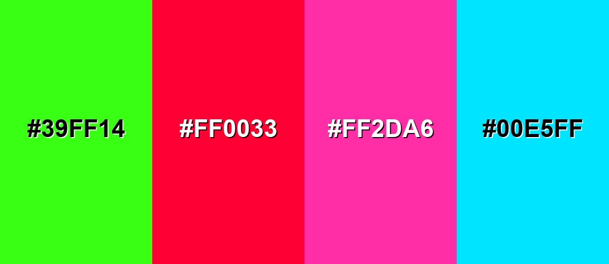
Colors to Avoid
While bronze color is remarkably versatile, certain combinations can create problematic visual effects:
- Neon Green (#39FF14) - The extreme brightness competes with bronze and can make the palette feel chaotic, especially in UI elements.
- Vivid Red (#FF0033) - This pairing can look overly aggressive and reduces the refined, grounded impression bronze usually creates.
- Hot Pink (#FF2DA6) - High-saturation pink tends to overpower bronze and can make it read dull or dirty by comparison.
- Bright Cyan (#00E5FF) - The sharp cool intensity creates a harsh edge against bronze, which often breaks the premium, natural feel.
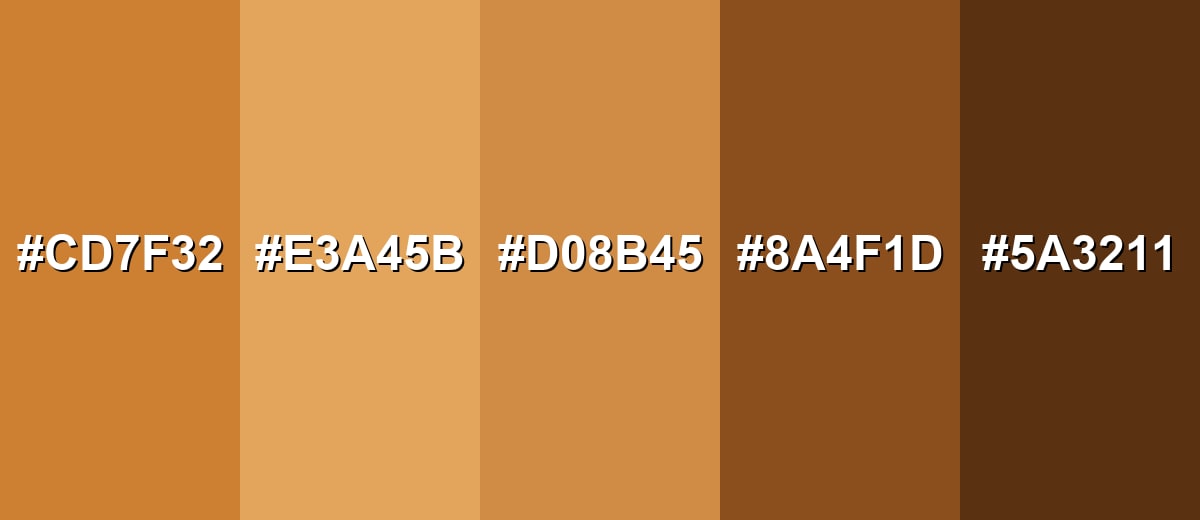
Shades, Tints & Variations of Bronze Color
Bronze isn't just one metallic brown—its range runs from brighter, sunlit tones to deep, traditional browns. Having a few go-to variations makes it easier to build hierarchy in UI, create depth in branding, and keep layouts feeling intentional.
- Classic Bronze (#CD7F32) - A balanced bronze tone with warm orange-brown depth that resembles polished metal. It's best used for Primary accents, icons, badges, and brand highlights.
- Light Bronze (#E3A45B) - A brighter, sunlit bronze that feels more golden and friendly while staying grounded. It's best used for Background accents, large UI chips, and soft gradients.
- Soft Bronze (#D08B45) - A slightly muted variation that keeps warmth but reduces intensity for calmer layouts. It's best used for Secondary buttons, borders, and subtle decorative elements.
- Deep Bronze (#8A4F1D) - A richer, darker bronze that leans toward brown, adding weight and tradition. It's best used for Headers, premium labels, and contrast against light neutrals.
- Dark Bronze (#5A3211) - A near-chocolate bronze that reads sturdy and serious, especially in low light. It's best used for Text on light backgrounds, strong outlines, and grounded UI panels.
Industry Applications
Because bronze feels both natural and elevated, it adapts well across industries that want warmth without looking casual. It can be used as a signature accent or as a supporting tone for premium details.
Fashion & Beauty
- Metallic accents in product photos and packaging
- Brand marks that signal craftsmanship and durability
- Seasonal palettes that lean warm and earthy
- Understated premium accents in identity systems
Interior Design & Decor
- Hardware, fixtures, and finish callouts in catalogs
- Material palettes paired with wood, leather, and stone
- Premium UI for product configurators
- Bronze hardware pairs well with stone, wood, leather, and matte paints for a balanced look.
Branding & Marketing
- Use bronze for logos, seals, and trims when the brand message leans toward craft, heritage, or reliability.
- Understated premium accents in identity systems
- Report covers and presentation themes
- Achievement badges and ranking visuals
Conclusion
Bronze color is a warm metallic color that blends earthy stability with a refined finish, which is why it works so well in modern branding, UI accents, and premium packaging. When you use it thoughtfully—supported by clean neutrals and a clear contrast color—it adds depth without feeling loud or dated. For a reliable starting point, stick with #CD7F32, then explore lighter and deeper bronze shades to build hierarchy, texture, and contrast across both digital and print designs.
Design Smarter with AI: Media.io is an online AI studio that empowers creators with advanced image generation and enhancement tools. From text-to-image and image-to-image creation to AI upscaling and color optimization, it enables fast, creative, and professional results—all in your browser.

Frequently Asked Questions About Bronze Color
Bronze is a warm metallic tone that sits between brown and gold, often showing orange undertones similar to polished bronze metal. It is commonly used for accents that feel classic and premium.
It depends on the shade and lighting, but most bronze tones lean brown with a golden glow. Lighter bronze variations can read more golden, while darker ones feel more earthy and brown.
Bronze pairs well with warm neutrals like ivory and beige, deep neutrals like charcoal, and cool contrast tones like medium blues. Jewel tones such as teal and purple can also work when used in controlled amounts.
Start with a warm brown base, then mix in yellow or orange to bring out the metallic warmth. Add small highlights with a lighter gold-beige and deepen shadows with dark brown to suggest metal sheen and depth.
Yes, but it usually works best as an accent for buttons, icons, badges, and dividers. Test contrast carefully, because mid-tone browns can lose clarity on certain screens or when placed on similar warm backgrounds.
Copper is typically redder and more pink-orange, brass is more yellow-gold, and bronze tends to be browner with a deeper, more muted warmth. In design, these differences affect whether a palette feels rosy, bright, or grounded.


