

 TL;DR:
Pure digital blue (Hex #0000FF) is highly effective for building trust and clarity in digital designs, provided it is balanced with warm accents or neutral surfaces to prevent interfaces from feeling cold or sterile.
● Avoid pairing pure blue with deep navy, pure black, neon magenta, or electric lime, as these specific combinations cause visual vibration, harsh contrast, or poor element separation on screens.
● Apply distinct variations for UI hierarchy by utilizing Navy Blue (#000080) for high-contrast headers, Dodger Blue (#1E90FF) for clear interactive links, and Powder Blue (#B0E0E6) for subtle background cards.
● Use yellow as a complementary highlight for attention-grabbing calls to action, or mix blue with adjacent hues like cyan and indigo to build cohesive, modern gradients.
Ask AI for a summary
 ChatGPT
 Perplexity
 Gemini
 Claude
 Grok
Grok
Blue is a vivid, cool tone that looks like a clear daytime sky or deep water, and the classic digital blue is commonly shown as hex #0000ff.
It's often linked with calm, trust, and clarity, but it can feel distant if overused; below you'll find the key codes, pairings, shades, and practical ways to use blue in real designs.
Blue Color: Codes & Values
Use these values to match blue consistently across web design, UI states, and print workflows.
| Parameters | VALUE |
| HEX Code | #0000FF |
| RGB DECIMAL | 0, 0, 255 |
| RGB PERCENTAGE | 0%, 0%, 100% |
| CMYK | 100%,100%,0%,0% |
| HSL | 240°, 100%, 50% |
| HSV (HSB) | 240°, 100%, 100% |
| Web Safe | #0000FF |
Key Color Space Explanations:
- HEX - HEX is a 6-digit code used on websites and in apps to specify a screen-ready value. For blue, it's written as #0000ff.
- RGB - RGB mixes red, green, and blue light for digital displays. This blue uses 0 red, 0 green, and 255 blue for a strong, saturated result.
- CMYK - CMYK is used for print and represents ink percentages. Pure blue typically maps to 100% cyan and 100% magenta with no yellow or black, though real printing varies by profile.
- HSL - HSL describes hue, saturation, and lightness in a more intuitive way for adjusting tints and shades. Blue sits around 240° with full saturation at mid lightness.
- Web Safe - Web-safe values are a legacy set of screen colors that displayed consistently on older devices. This blue is already web-safe, so the closest match is identical.
For most digital projects, start with HEX or RGB; for print, confirm CMYK using your printer profile to keep the final blue looking accurate on paper.
Blue Color Conversions
This quick blue color conversion chart helps you switch blue between common color systems and copy the right CSS format when needed.
| Parameters | VALUE | CSS |
| HEX | #0000ff | #0000ff |
| RGB DECIMAL | 0, 0, 255 | rgb(0,0,255) |
| RGB PERCENTAGE | 0%, 0%, 100% | rgb(0%,0%,100%) |
| CMYK | 100%,100%,0%,0% | cmyk(100%,100%,0%,0%) |
| HSL | 240°, 100%, 50% | hsl(240°, 100%, 50%) |
| HSV (or HSB) | 240°, 100%, 100% | -- |
| Web Safe | 0000ff | #0000ff |
| CIE-LAB | 32.30, 79.20, -107.86 | -- |
| XYZ | 18.05, 7.22, 95.05 | -- |
| xyY | 0.150, 0.060, 7.22 | -- |
| CIE-LCH | 32.30, 133.80, 306.30 | -- |
| CIE-LUV | 32.30, -9.40, -130.00 | -- |
| Hunter-Lab | 26.85, 65.50, -104.00 | -- |
| Binary | 00000000 00000000 11111111 | -- |
Want to generate Blue Color photos or posters? Try Media.io's AI Image Generator now!
Blue Color Meaning & Symbolism
Blue is widely linked with trust, calm, and stability. In everyday life it shows up in signals, uniforms, interfaces, and environments where clarity and reliability matter. Because it feels cool and structured, it often supports communication that needs to be easy to believe and easy to focus on.
Psychological Effects
Blue tends to calm the eye and bring a sense of control to a layout.
- Calm - Blue often feels soothing and steady, helping reduce visual stress in busy interfaces.
- Focus - It supports longer viewing sessions by keeping screens feeling organized and less chaotic.
- Clarity - Blue can make information feel cleaner and more readable, especially in dashboards and navigation.
- Competence - Many people associate blue with reliability, which can boost perceived professionalism.
- Distance - Overusing saturated blue may feel cold or overly corporate without warmer balance.
Positive Associations
These are some of the most common “good” signals designers lean on when using blue.
- Trust - Frequently used when a brand needs to feel dependable and credible at a glance.
- Stability - A structured, grounded mood that works well for systems, tools, and services.
- Cleanliness - Blue can reinforce a tidy, orderly impression in UI and informational layouts.
- Communication - It often supports messages that need to feel clear, direct, and easy to follow.
- Openness - Because it echoes sky and water, blue can suggest space, depth, and breathing room.
Cultural Significance Across the World
Blue carries broad, recognizable meanings without relying on one single cultural interpretation.
- Sky & Water - Commonly tied to nature elements that suggest depth, openness, and clarity.
- Authority - Often seen in formal settings and institutions, reinforcing professionalism and responsibility.
- Uniforms & Signals - Used in real-world systems where legibility and trust matter in the moment.
- Modern Technology - Widely adopted in digital products, where blue reads as stable and easy to rely on.
Design Applications
Blue is a dependable choice when you want a clean look and confident communication. It works as a primary brand hue, a UI base tone, or a strong accent, depending on how much saturation and contrast you apply.
Graphic Design Tips
- Use deep blues for headers or navigation to create clear hierarchy without shouting.
- Pair strong blue with warm accents to keep the overall look friendly, not sterile.
- In data visualizations, reserve the most saturated blue for the “main” series so comparisons stay readable.
- For backgrounds, shift toward softer tints to reduce glare and improve long-form comfort.
- Always test contrast for buttons and link states—legibility matters more than saturation.
If your blue feels too intense, try using it as an accent (icons, active states, highlights) while keeping main surfaces neutral so the interface stays calm and premium.
Blue Color in Photography & Video
- Use blue tones to create a cool, modern mood in product shots and tech visuals.
- Watch skin tones—strong blue lighting can make subjects look colder, so balance with warmer fill light.
- In cinematic grading, deeper blues can add depth to shadows while keeping highlights clean.
- For social videos, use blue as a background or set color to make text overlays feel crisp and readable.
- When shooting water or sky, protect detail by avoiding over-saturation that clips into flat color.
Recommended Tool for Image Enhancement: When incorporating blue color into your photography projects, Media.io's AI Image tools can help you achieve more refined results. With AI-powered color enhancement, photo colorization, image upscaling, and old photo restoration, you can easily enrich blue color tones, improve overall image quality, and highlight the color's elegant and sophisticated aesthetic.
Color Combinations
Blue pairs easily with neutrals and becomes more energetic when you add warm accents. The palettes below cover common harmony types so you can pick a look that fits your layout, brand, or illustration style.
Complementary Colors
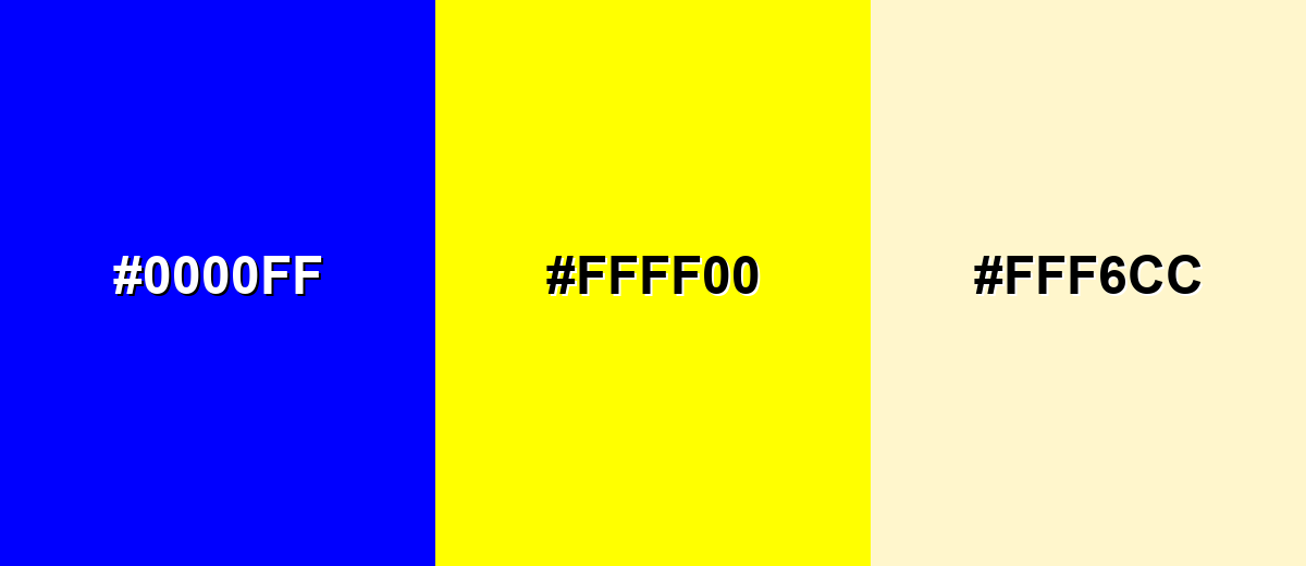
A complementary palette uses opposite hues for high contrast and strong emphasis. Blue and yellow create a crisp, attention-grabbing pairing that works well for calls to action and clear hierarchy.
Complementary Palette Example: Use blue as the base, yellow for highlights, and a soft cream to keep the contrast comfortable.
Analogous Color Schemes
Analogous colors sit adjacent to each other on the color wheel, creating harmonious, cohesive palettes with subtle variation.
Cyan-leaning blues feel fresh and modern, ideal for clean UI and tech visuals.
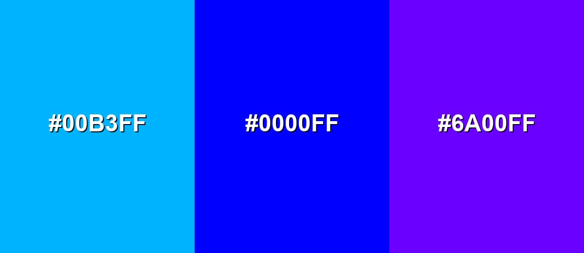
- Cyan Blue: #00B3FF
- Pure Blue: #0000FF
- Blue Violet: #6A00FF
Deeper neighboring hues create a richer, more dramatic flow for hero sections and gradients.
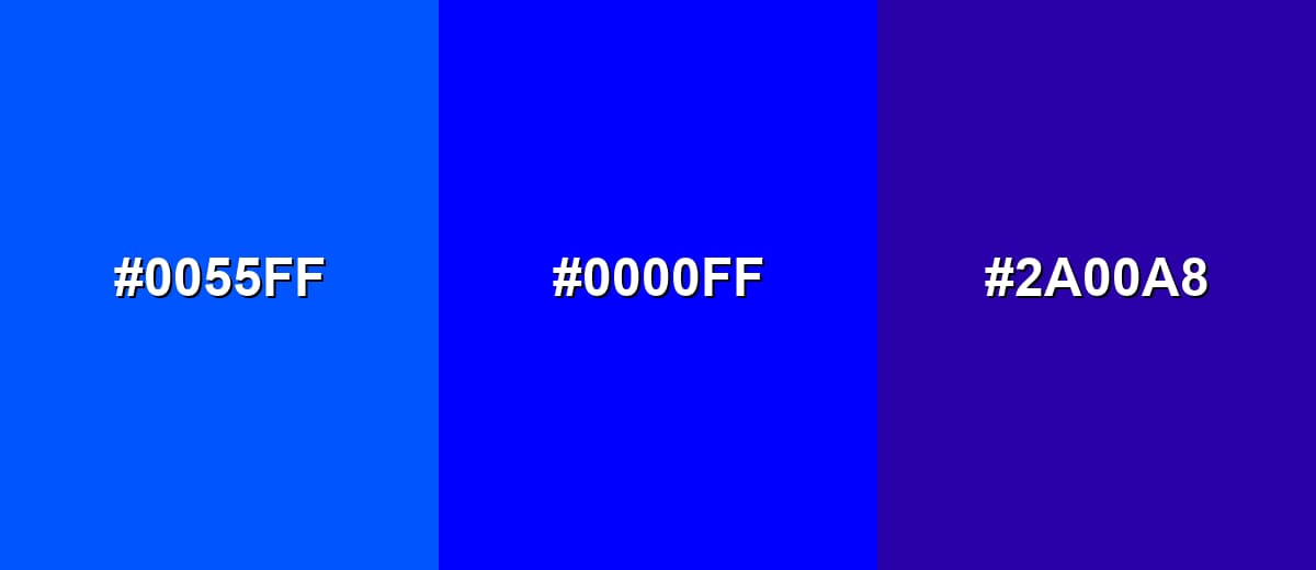
- Azure Blue: #0055FF
- Pure Blue: #0000FF
- Indigo Purple: #2A00A8
Triadic & Tetradic Combinations
A triadic scheme spreads hues evenly for a bold, balanced look.
Blue, red, and green can feel playful and high-energy when you control saturation and spacing.
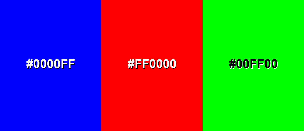
- Pure Blue: #0000FF
- Vivid Red: #FF0000
- Bright Green: #00FF00
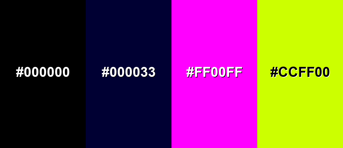
Colors to Avoid
While blue color is remarkably versatile, certain combinations can create problematic visual effects:
- Pure Black (#000000) - Next to pure blue it can look harsh and overly high-contrast, making layouts feel heavy unless carefully spaced.
- Deep Navy (#000033) - Too close in value to blue, so edges can blur and elements may lose separation in UI.
- Neon Magenta (#FF00FF) - Both hues are highly saturated, which can create visual vibration and fatigue in buttons, text, or thin lines.
- Electric Lime (#CCFF00) - The pairing can feel overly fluorescent and distract from content, especially on bright screens.
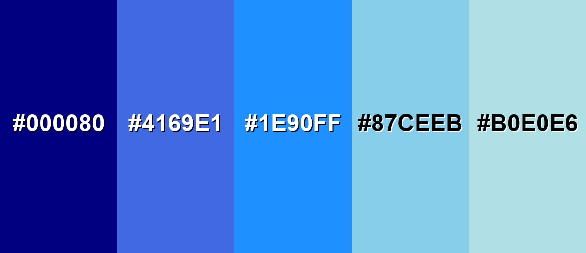
Shades, Tints & Variations of Blue Color
Blue isn't just one look—it ranges from deep, serious navies to soft, airy tints. Exploring these variations makes it easier to build hierarchy in UI, create smoother gradients, and match the mood of a brand or scene.
- Navy Blue (#000080) - A very dark, muted blue that feels serious and stable. It's best used for Great for headers, footers, and high-contrast UI with white text..
- Royal Blue (#4169E1) - A saturated mid-to-deep tone with a classic, confident look. It's best used for Strong for brand primaries, icons, and call-to-action accents..
- Dodger Blue (#1E90FF) - A bright, friendly blue that reads clearly on screens. It's best used for Useful for links, active states, and highlights in dashboards..
- Sky Blue (#87CEEB) - A light, airy tone that feels open and approachable. It's best used for Works for backgrounds, illustrations, and soft section blocks..
- Powder Blue (#B0E0E6) - A pale, gentle blue with a calm, clean finish. It's best used for Ideal for subtle UI surfaces, cards, and minimal layouts..
Industry Applications
Because blue communicates clarity and reliability, it appears across many industries where users need to feel informed and confident. Shade choice matters: deeper tones feel established, while lighter tones feel friendly and open.
Fashion & Beauty
- Use deep blues to create a polished, “tailored” feel for packaging and lookbooks.
- Try brighter blues for sporty or youthful collections where energy matters.
- In beauty branding, soft blue backgrounds can signal cleanliness and calm routines.
- Pair blue with minimal neutrals to keep product photography crisp and premium.
Interior Design & Decor
- Light blues work well for rooms that should feel open, airy, and relaxed.
- Darker blues can anchor a space when used on accent walls, cabinetry, or textiles.
- Balance cool blue with warm materials (wood tones, warm lighting) to avoid a cold look.
- Use blue strategically in signage and wayfinding for clean, readable guidance.
Branding & Marketing
- Blue is a common pick for trust-building identities in tools and services.
- In UI marketing, blue CTAs can feel confident—just verify contrast and state styles.
- For enterprise or finance, deeper blues help visuals feel established and credible.
- Use a warm accent sparingly to add approachability without losing the “reliable” signal.
Conclusion
Blue stands out for its clear, cool look and its ability to signal trust, calm, and structure in everyday visuals. Whether you use it as a bold primary or a supportive background tone, it helps interfaces and brand systems feel organized and dependable. The classic blue at #0000FF is especially strong on screens, making it a practical choice for UI states, charts, and attention points. With thoughtful pairings and enough contrast, it can feel modern and approachable instead of cold. If you are choosing a palette based on blue color meaning, focus on the shade and context so the message matches the mood you want to set.
Design Smarter with AI: Media.io is an online AI studio that empowers creators with advanced image generation and enhancement tools. From text-to-image and image-to-image creation to AI upscaling and color optimization, it enables fast, creative, and professional results—all in your browser.

Frequently Asked Questions About Blue Color
Quick answers to common questions about blue, including codes, meaning, and easy pairing ideas.
A widely recognized pure digital blue is #0000ff. Many brands use nearby shades (like royal or dodger blue) to soften the intensity while keeping a trustworthy feel.
Blue is commonly linked with trust, calm, stability, and clarity. In visual communication it often helps information feel more reliable and easier to process.
Blue pairs well with neutrals like white, gray, and charcoal, and it becomes more energetic with warm accents like yellow. For a smooth look, try neighboring hues such as cyan or indigo.
On a standard color wheel, blue's complementary hue is yellow. Using the pair creates strong contrast, which is helpful for highlights and clear hierarchy.
Yes. Blue often reads as dependable and clean, making it popular for navigation, links, and primary actions. The key is to check contrast and avoid using overly saturated blue everywhere.
Add warm accents (yellow, soft orange, or warm neutrals), and use lighter tints of blue for backgrounds. Natural textures like beige, sand, or wood tones can also reduce a cold, corporate feel.


