

Cobalt color is a vivid, deep blue that feels clean and intense, like polished enamel or a rich blue ceramic glaze. Its signature digital reference is hex #0047ab.
Many people perceive it as confident, trustworthy, and energetic, with a crisp clarity that stands out on screens and in print. Historically, cobalt-based pigments were prized for their strong, stable blue in glass and ceramics, and this guide covers its meaning, codes, combinations, shades, and practical uses.
Cobalt Color: Codes & Values
If you want a consistent "true cobalt" look across UI, print, and brand assets, start with its core codes and build tints/shades from there.
| Parameters | VALUE |
| HEX Code | #0047AB |
| RGB DECIMAL | 0, 71, 171 |
| RGB PERCENTAGE | 0%, 27.8%, 67.1% |
| CMYK | 100%,58%,0%,33% |
| HSL | 215°, 100%, 34% |
| HSV (HSB) | 215°, 100%, 67% |
| Web Safe | #003399 |
Key Color Space Explanations:
- HEX - HEX is the most common code for web design and UI styling. Use #0047ab to match a consistent cobalt look across modern browsers and design tools.
- RGB - RGB describes how much red, green, and blue light your screen emits. For cobalt, the mix is 0, 71, 171, which keeps it firmly in the blue range with high intensity.
- CMYK - CMYK is used for printing and indicates ink percentages. Cobalt translates to 100%,58%,0%,33%, but print results can vary by paper and press profile.
- HSL - HSL explains cobalt by hue, saturation, and lightness, which is handy for building tints and shades. This makes it easier to adjust brightness while keeping the same blue character.
- Web Safe - Web safe is the closest legacy-safe screen approximation based on a limited palette. The nearest web-safe match to cobalt is #003399.
Use HEX for most digital work, RGB when you're animating or styling in-app, and CMYK whenever cobalt needs to match accurately in print (ideally with a proof).
Cobalt Color Conversions
These cobalt color conversions help you keep cobalt consistent across design tools, dev handoff, and print workflows.
| Parameters | VALUE | CSS |
| HEX | #0047ab | #0047ab |
| RGB DECIMAL | 0, 71, 171 | rgb(0,71,171) |
| RGB PERCENTAGE | 0%, 27.8%, 67.1% | rgb(0%,27.8%,67.1%) |
| CMYK | 100%,58%,0%,33% | cmyk(100%,58%,0%,33%) |
| HSL | 215°, 100%, 34% | hsl(215°, 100%, 34%) |
| HSV (or HSB) | 215°, 100%, 67% | -- |
| Web Safe | 003399 | #003399 |
| CIE-LAB | 32.7, 22.0, -58.2 | -- |
| XYZ | 9.61, 7.45, 39.35 | -- |
| xyY | 0.170, 0.132, 7.45 | -- |
| CIE-LCH | 32.7, 62.2, 291.0° | -- |
| CIE-LUV | 32.7, -15.9, -80.0 | -- |
| Hunter-Lab | 27.3, 17.0, -73.6 | -- |
| Binary | 00000000 01000111 10101011 | -- |
Want to generate Cobalt Color photos or posters? Try Media.io's AI Image Generator now!
Cobalt Color Meaning & Symbolism
Cobalt is often linked with confidence, clarity, and reliability, while still feeling bold and modern. Because it is a saturated blue, it can read as serious and capable in everyday settings, from apps to packaging. This Cobalt Color meaning is usually strongest when it is used as a main accent rather than a soft background.
Psychological Effects
Used intentionally, cobalt can steer attention and set a "focused, capable" tone.
- Focus - Cobalt tends to feel focused and purposeful, helping important elements stand out.
- Competence - In branding and visual communication, it can signal competence and precision.
- Forward Momentum - Its high saturation gives a forward-looking, energetic impression that works well for modern products.
- Structure - It can make layouts feel cleaner and more structured, especially in UI systems.
- Intensity - Large areas can feel intense or cold, so balance it with warmer tones or softer tints to keep things welcoming.
Positive Associations
These are the common "good reads" designers lean on when cobalt shows up in a palette.
- Confidence - Reads as confident and dependable, with a modern edge.
- Reliability - Deep blues like cobalt are often used to suggest stability and trust.
- Clarity - The crisp, clean blue character supports a clear hierarchy in interfaces and layouts.
- Craftsmanship - Cobalt pigments are historically valued in glass and ceramics, adding a subtle "made well" association.
- Balance - Works best as an accent or anchor tone paired with warm neutrals for an approachable, polished look.
Cultural Significance Across the World
Meanings can shift, but cobalt's history in decorative arts and its "authority blue" vibe show up repeatedly.
- Ceramics & Glazes - Cobalt pigments have a long history in ceramics, valued for a strong blue that holds up well over time.
- Glass & Decorative Arts - Cobalt has been used in glass and decorative work where long-lasting saturation matters.
- Authority - In many contexts, deep blues like cobalt have been used to suggest authority and stability.
- Timeless Craft - Its association with durable pigments can imply craftsmanship and heritage, even in modern design.
Design Applications
Cobalt color is easiest to use when you treat it as a statement blue. Start with one main role for it, then support it with neutrals and a secondary accent so the overall layout stays readable and intentional.
Graphic Design Tips
- Primary role first - Use cobalt for primary actions, key highlights, or brand anchors rather than filling every surface.
- Warm neutral balance - Balance it with warm neutrals (sand, cream, light gray) to keep the look friendly.
- Control the accents - Reserve very bright pairings for small accents to avoid visual noise.
- UI contrast choices - White text is typically a strong contrast choice on cobalt backgrounds; black can look muted or low-contrast.
- Print consistency - Request a proof when cobalt is brand-critical; CMYK conversions can shift depending on paper stock.
If cobalt is your brand anchor, lock the exact value (#0047AB) in your design tokens, then create a small, reusable scale of tints and shades for states, backgrounds, and data viz.
Cobalt Color in Photography & Video
- Use as a hero accent - Cobalt works best when it's a clear focal point (wardrobe, product, prop) instead of flooding the whole frame.
- Mind color temperature - Cool lighting can push cobalt colder; warm highlights help it feel more natural and premium.
- Grade for detail - Keep an eye on saturation so cobalt doesn't clip; preserve texture in fabrics, ceramics, and glossy surfaces.
- Pair with neutrals - Creams, light grays, and soft sands help cobalt read clean on camera without looking harsh.
- Use for UI overlays - Cobalt titles, lower-thirds, and button overlays can look confident—just test legibility over busy backgrounds.
Recommended Tool for Image Enhancement: When incorporating cobalt color into your photography projects, Media.io's AI Image tools can help you achieve more refined results. With AI-powered color enhancement, photo colorization, image upscaling, and old photo restoration, you can easily enrich cobalt color tones, improve overall image quality, and highlight the color's elegant and sophisticated aesthetic.
Color Combinations
Cobalt pairs best with warm opposites, nearby blues, and a few crisp neutrals. The palettes below are practical starting points you can adjust with lighter tints or deeper shades depending on your layout and contrast needs.
Complementary Colors
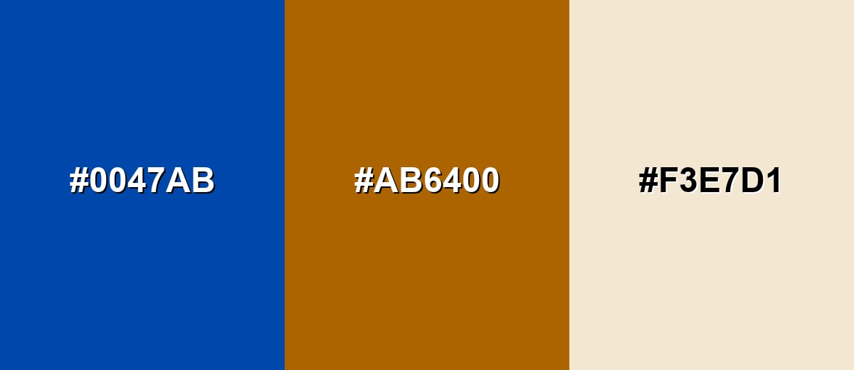
A complementary palette places cobalt opposite a warm orange, creating strong contrast that feels energetic and balanced. It is a reliable choice for call-to-action layouts and attention-grabbing visuals.
Complementary Palette Example: Use cobalt as the anchor, burnt orange for emphasis, and soft sand to keep the scheme breathable.
Analogous Color Schemes
Analogous colors sit adjacent to each other on the color wheel, creating harmonious, cohesive palettes with subtle variation.
Indigo, cobalt, and azure make a smooth blue-to-violet-to-cyan flow that feels cohesive and modern.
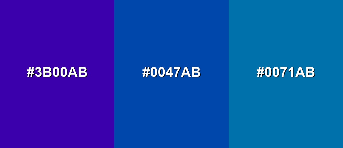
- Indigo: #3B00AB
- Cobalt: #0047AB
- Azure: #0071AB
Deep cobalt, classic cobalt, and bright cobalt create a layered monochromatic look with clear hierarchy.
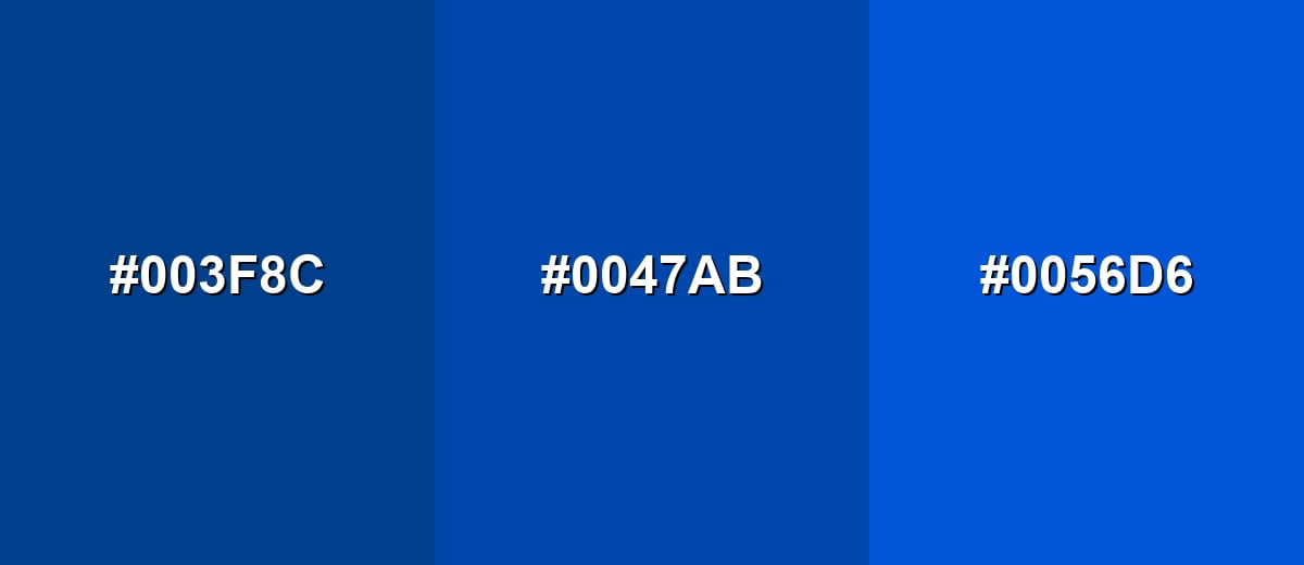
- Deep Cobalt: #003F8C
- Cobalt: #0047AB
- Bright Cobalt: #0056D6
Triadic & Tetradic Combinations
A triadic set adds two equally spaced accents for a lively, creative feel without losing balance.
Cobalt with magenta and yellow-green is bold, playful, and best used with plenty of neutral space.
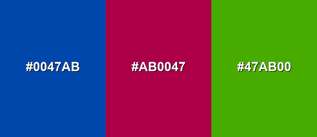
- Cobalt: #0047AB
- Magenta: #AB0047
- Yellow-Green: #47AB00
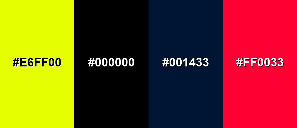
Colors to Avoid
While cobalt color is remarkably versatile, certain combinations can create problematic visual effects:
- Neon Yellow (#E6FF00) - Too much brightness next to cobalt can create harsh vibration and reduce readability in UI.
- Pure Black (#000000) - The pairing can feel heavy and overly severe, and it may not give the clean contrast you expect for small text.
- Dark Navy (#001433) - Very similar dark blues can look muddy together, making elements blend instead of separating.
- Electric Red (#FF0033) - Competing high-saturation accents can feel chaotic, especially in charts, banners, and alerts.
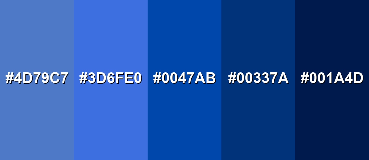
Shades, Tints & Variations of Cobalt Color
Cobalt isn't just one "perfect blue"—it comes alive when you build a small range of lighter tints and deeper shades. This makes it easier to create hierarchy (backgrounds vs. buttons vs. headers) while keeping the same crisp cobalt identity.
- Light Cobalt (#4D79C7) - A softened version that keeps the cobalt character but feels more open and friendly. It's best used for Background panels, cards, and large sections where classic cobalt would be too intense..
- Sky Cobalt (#3D6FE0) - A brighter, more luminous take that looks energetic on screens. It's best used for Links, hover states, badges, and secondary call-to-action elements..
- Classic Cobalt (#0047AB) - The iconic saturated blue that reads bold, clean, and confident. It's best used for Primary brand accents, hero graphics, key buttons, and strong visual anchors..
- Deep Cobalt (#00337A) - A darker, more grounded cobalt that feels serious and refined. It's best used for Headers, navigation bars, and areas where you want a premium, stable tone..
- Midnight Cobalt (#001A4D) - An almost-night shade that keeps a blue edge while turning dramatic. It's best used for Dark-mode themes, footers, and high-contrast layouts with light typography..
Industry Applications
Because cobalt feels both modern and dependable, it shows up in many practical design contexts. It is versatile enough for digital interfaces, print assets, and physical products when you manage saturation and contrast.
Fashion & Beauty
- Statement pieces - Use cobalt as a standout accent on footwear, bags, or outerwear for a clean, high-energy pop.
- Packaging contrast - Cobalt labels paired with off-whites can read crisp and premium without going as dark as navy.
- Sport & lifestyle - Works well for athletic palettes and apparel accents where bold visibility matters.
- Editorial styling - Cobalt backdrops and props help subjects feel modern and polished, especially with warm neutrals.
Interior Design & Decor
- Accent walls - Use cobalt as an accent wall, tile detail, or upholstery highlight for a clean, high-impact look.
- Warm materials - Pair with wood tones, cream fabrics, and brushed metals to soften the intensity.
- Small-space control - In small rooms, prefer lighter cobalt tints to avoid a heavy feel.
- Modern contrast - Combine cobalt with soft sand and off-white for a fresh, structured, contemporary palette.
Branding & Marketing
- Tech-forward trust - Works well for brands that want to appear capable and modern without relying on very dark navy.
- CTA visibility - Great for primary buttons and links that need to stand out clearly and feel trustworthy.
- Warm accent energy - Pair with a warm accent (orange or gold) to add energy and approachability.
- Cross-channel consistency - Use consistent cobalt values across web and print to avoid drifting into different blues.
Conclusion
Cobalt stands out as a saturated blue that feels crisp, confident, and visually strong in both digital and print work. Its impact comes from clarity and depth, which helps it communicate trust while still looking modern. Used thoughtfully, it can anchor a brand system, guide attention in UI, and add clean contrast in visual communication. If you are building a palette, start with #0047ab and support it with warm neutrals or a controlled orange accent to keep the overall look balanced. With the right pairings and a few well-chosen shades, cobalt becomes easy to use and hard to forget.
Design Smarter with AI: Media.io is an online AI studio that empowers creators with advanced image generation and enhancement tools. From text-to-image and image-to-image creation to AI upscaling and color optimization, it enables fast, creative, and professional results—all in your browser.

Frequently Asked Questions About Cobalt Color
Cobalt is a vivid, saturated blue that looks clean and intense, often associated with ceramic glazes and strong modern accents. It sits between royal blue and a deep azure in many palettes.
A widely used cobalt hex code is #0047ab. Different brands may label slightly different blues as cobalt, so always confirm the exact code in your design system.
Cobalt typically looks a bit deeper and more punchy, with a cleaner, more intense blue feel. Royal blue often appears slightly lighter or less inky, depending on the specific values used.
Warm oranges, soft sands, and off-whites pair especially well because they balance cobalt's intensity. Nearby blues and indigos also work for smooth, cohesive schemes.
Cobalt's complement is in the orange family, which creates strong contrast and energy. In practice, burnt oranges and warm ambers are easier to use than extremely bright oranges.
It can be a strong UI choice because it reads clearly as an interactive accent. For readability, use high-contrast text such as white on cobalt backgrounds and test contrast ratios for your exact font sizes.


