

 TL;DR:
Navy blue (#000080) is a dark, near-black cool tone that functions as a less harsh alternative to pure black in design, conveying reliability and structural clarity across digital interfaces and print.
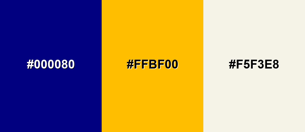
● Avoid pairing navy blue with pure black (#000000), deep purple, neon lime, or dark brown to prevent muddy visual boundaries, opting instead for high-contrast warm off-whites or amber accents.
● Rely on HEX (#000080) or RGB (0,0,128) values for accurate digital rendering, but mandate physical proofing for CMYK print projects because deep navy inks frequently shift toward unintended purple or muted tones.
● When applying navy as a UI background or photographic backdrop, increase the visual weight of small icons and thin typography to ensure they do not disappear into the low-light surface.
Ask AI for a summary
 ChatGPT
 Perplexity
 Gemini
 Claude
 Grok
Grok
Navy blue color is a very dark blue that can look almost black until light hits it, revealing a deep, inky tone.
A common reference for navy blue is the hex code #000080. It's often read as steady, capable, and trustworthy, with a calm, serious feel—thanks in part to its long-standing use in naval uniforms and durable, low-glare fabrics.
Navy Blue Color: Codes & Values
If you want a dependable, standard navy blue for web, UI, or brand systems, these are the core values to start with.
| Parameters | VALUE |
| HEX Code | #000080 |
| RGB DECIMAL | 0, 0, 128 |
| RGB PERCENTAGE | 0%, 0%, 50.2% |
| CMYK | 100%,100%,0%,50% |
| HSL | 240°, 100%, 25% |
| HSV (HSB) | 240°, 100%, 50% |
| Web Safe | #000099 |
Key Color Space Explanations:
- HEX - HEX is the most common way to specify navy blue for web and UI. Use #000080 to match the standard sRGB reference.
- RGB - RGB defines navy blue with red, green, and blue light values. It's helpful for screens, digital design tools, and CSS.
- CMYK - CMYK is used for printing and describes how inks mix to create navy tones. Results can shift based on paper, coating, and press calibration.
- HSL - HSL expresses navy blue by hue, saturation, and lightness, making it easier to adjust tints and tones consistently. It's practical for building palettes and UI states.
- Web Safe - Web safe is the nearest legacy-safe approximation based on a limited RGB set. It's mainly useful for compatibility references rather than modern design.
Use HEX/RGB for digital work, switch to HSL when you need consistent tints and tones, and rely on CMYK (with proofing) for print projects where deep blues can shift.
Navy Blue Color Conversions
Need navy blue in a different color model? Here are the most-used conversions in one place for design tools, code, and print reference.
| Parameters | VALUE | CSS |
| HEX | #000080 | #000080 |
| RGB DECIMAL | 0, 0, 128 | rgb(0,0,128) |
| RGB PERCENTAGE | 0%, 0%, 50.2% | rgb(0%,0%,50.2%) |
| CMYK | 100%,100%,0%,50% | cmyk(100%,100%,0%,50%) |
| HSL | 240°, 100%, 25% | hsl(240°,100%,25%) |
| HSV (or HSB) | 240°, 100%, 50% | -- |
| Web Safe | 000099 | #000099 |
| CIE-LAB | 13.0, 48.5, -64.8 | -- |
| XYZ | 3.90, 1.56, 20.53 | -- |
| xyY | 0.150, 0.060, 1.56 | -- |
| CIE-LCH | 13.0, 80.9, 306.5° | -- |
| CIE-LUV | 13.0, -3.8, -52.5 | -- |
| Hunter-Lab | 12.5, 35.5, -96.9 | -- |
| Binary | 00000000 00000000 10000000 | -- |
Want to generate Navy Blue Color photos or posters? Try Media.io's AI Image Generator now!
Navy Blue Color Meaning & Symbolism
Navy blue is widely associated with reliability, discipline, and quiet confidence. In everyday life it often signals seriousness and structure, which is why it shows up in uniforms, business contexts, and classic design systems. If you are searching for Navy Blue Color meaning, the simplest takeaway is that it feels dependable and composed while staying less harsh than pure black.
Psychological Effects
Because it's so dark, navy blue can reshape how a layout feels—more grounded, quieter, and more "organized."
- Calm Focus - Navy blue tends to calm visual noise and help the eye settle on what matters.
- Strong Structure - It can anchor a page or space, making sections and hierarchy feel more intentional.
- Formal Tone - Text and icons on navy often read as more serious and considered than on lighter blues.
- Trust Signal - The shade is commonly perceived as trustworthy and capable, especially in navigation and system UI.
- Heaviness Risk - Too much navy can feel strict, distant, or heavy, particularly in low-light environments.
Positive Associations
When balanced with light neutrals or warm accents, navy blue lands as classic without feeling harsh.
- Reliability - It's often used to communicate steadiness and consistency over time.
- Discipline - Navy suggests order and control, which is why it appears in uniforms and institutional design.
- Quiet Confidence - It feels self-assured without being loud, making it a popular "premium" base color.
- Professionalism - Navy is a go-to for business contexts where clarity and credibility matter.
- Timelessness - Compared to trend-driven brights, navy keeps its appeal across seasons and styles.
Cultural Significance Across the World
Its meaning can shift with context, but navy's history gives it a strong baseline of tradition and authority.
- Maritime Heritage - Navy blue is tied to naval history through uniform fabrics chosen for practicality and a low-glare look.
- Military Influence - It often carries an "official" feeling because of its long-standing presence in military styling.
- Authority & Tradition - In many settings, navy signals institution, heritage, and established standards.
- Context-Dependent Meaning - Pairings and setting can make it feel corporate, creative, classic, or modern.
Design Applications
Navy blue works best when you want depth without the starkness of black—either as a primary base or a supporting accent that strengthens contrast and hierarchy.
Graphic Design Tips
- Use navy as a background for premium layouts where you want contrast without the harsh edge of pure black.
- Pair it with warm off-whites to keep typography crisp, readable, and less sterile than pure white.
- Give small elements (thin rules, icons, light type) extra weight so they don't disappear on dark surfaces.
- Keep your accent palette tight—one highlight color is often enough to make navy systems feel modern.
- For print layouts, plan for proofing since deep blues can shift depending on paper and ink profiles.
Pro tip: If your design feels "too serious," keep navy as the foundation but introduce warmth through off-white space and a gold/amber highlight for key moments (CTAs, badges, or section titles).
Navy Blue Color in Photography & Video
- Use navy backgrounds to make skin tones and warm highlights feel richer and more cinematic.
- Watch shadow detail—navy can crush into near-black if exposure is too low or compression is heavy.
- Balance with warmer practical lights (lamps, sunset tones) to avoid a cold, distant mood.
- In product shots, navy backdrops often enhance metallics and premium materials without distracting textures.
- For grading, small shifts can change the vibe fast; test your look on multiple screens before exporting.
Recommended Tool for Image Enhancement: When incorporating navy blue color into your photography projects, Media.io's AI Image tools can help you achieve more refined results. With AI-powered color enhancement, photo colorization, image upscaling, and old photo restoration, you can easily enrich navy blue color tones, improve overall image quality, and highlight the color's elegant and sophisticated aesthetic.
Color Combinations
Navy blue is flexible because it can behave like a near-neutral while still feeling distinctly blue. The combinations below cover classic high-contrast choices, smoother neighboring hues, and balanced multi-color schemes.
Complementary Colors
A complementary pairing adds energy by placing a warm hue opposite navy on the color wheel. It's ideal when you want navy to feel modern and bold without losing its grounded base.
Complementary Palette Example: Try navy blue with a warm amber highlight and a soft off-white to keep contrast crisp and readable.
Analogous Color Schemes
Analogous colors sit adjacent to each other on the color wheel, creating harmonious, cohesive palettes with subtle variation.
For a deep, moody look, blend navy blue with midnight blue and a blue-violet accent.
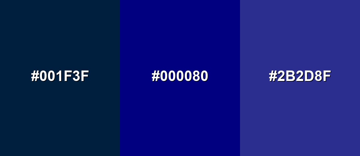
- Midnight Blue: #001F3F
- Navy Blue: #000080
- Blue Violet: #2B2D8F
For a cleaner, tech-leaning palette, pair navy blue with deep teal and dark azure.
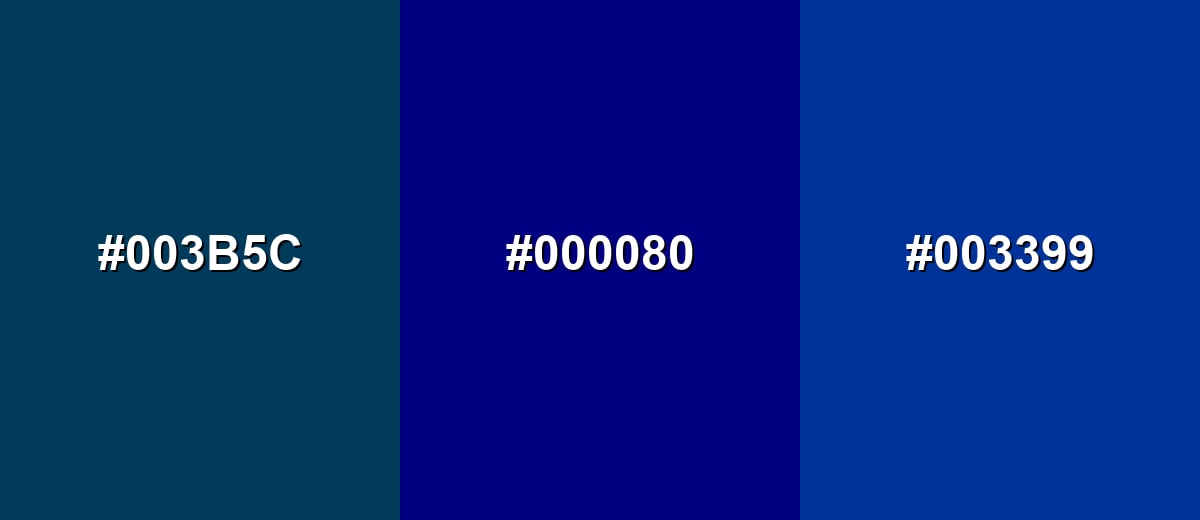
- Deep Teal: #003B5C
- Navy Blue: #000080
- Dark Azure: #003399
Triadic & Tetradic Combinations
A triadic scheme creates balance with three evenly spaced hues.
Use navy blue with maroon and classic green for a bold, structured palette that still feels traditional.
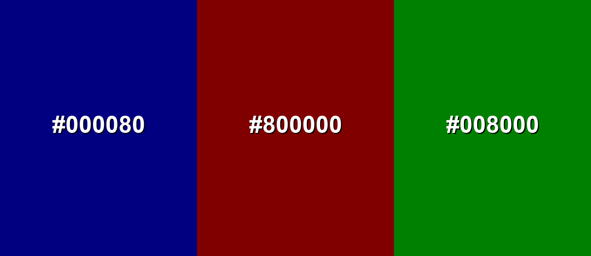
- Navy Blue: #000080
- Maroon: #800000
- Green: #008000
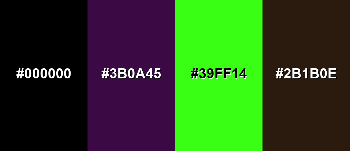
Colors to Avoid
While navy blue color is remarkably versatile, certain combinations can create problematic visual effects:
- Pure Black (#000000) - Black and navy blue can collapse into the same value, making edges, typography, and UI boundaries harder to see.
- Deep Purple (#3B0A45) - Two dark, saturated hues together can look muddy and reduce clarity, especially in small elements and icons.
- Neon Lime (#39FF14) - The intensity can feel jarring against navy blue and may overpower content instead of guiding attention.
- Dark Brown (#2B1B0E) - This combination often reads dull and heavy because both sit in a low-lightness range with limited separation.
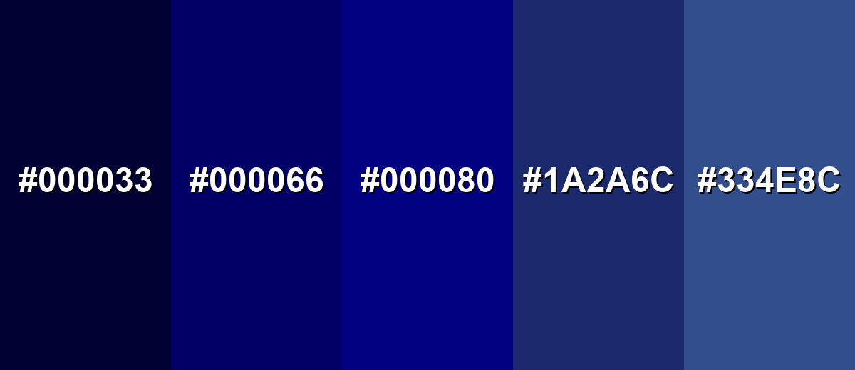
Shades, Tints & Variations of Navy Blue Color
Navy blue isn't just one "almost black" tone—its range includes ultra-deep inky bases, slightly brighter navies that separate better from black, and softer options for larger surfaces. Exploring these variations makes it easier to build clear hierarchy in UI, create smoother gradients, and keep dark themes from feeling too heavy.
- Oxford Blue (#000033) - An ultra-deep blue that reads close to black, with a subtle blue cast in bright light. It's best used for Backgrounds, premium branding bases, and high-contrast UI shells when paired with light text.
- Deep Navy (#000066) - A darker navy variation that keeps a classic feel but is slightly easier to separate from black. It's best used for Navigation bars, headers, and formal layouts that need a strong anchor tone.
- Classic Navy (#000080) - The standard navy blue reference: dark, saturated, and clean with a straightforward blue identity. It's best used for Primary brand bases, uniforms-inspired styling, and reliable UI themes.
- Indigo Navy (#1A2A6C) - A navy-leaning indigo that introduces a slight violet shift for a more modern, creative feel. It's best used for Hero sections, gradients, and accent panels where you want depth with a hint of color complexity.
- Slate Navy (#334E8C) - A lighter, softer navy that feels more approachable while still staying structured. It's best used for Secondary backgrounds, cards, and large surfaces in UI or interiors where pure navy would feel too heavy.
Industry Applications
Navy blue shows up across industries because it communicates structure and confidence while staying easy to pair with neutrals and warm accents. These are common ways it's used in real projects.
Fashion & Beauty
- Classic suiting, uniforms-inspired pieces, and eveningwear where a darker base feels polished but less severe than black.
- Accessories (bags, belts, shoes) that need to feel timeless and easy to match across seasonal palettes.
- Beauty packaging where a deep navy reads premium and "clean," especially with minimal typography.
- Editorial styling where navy helps control contrast and keeps bright accents from feeling chaotic.
Interior Design & Decor
- Feature walls, cabinetry, or upholstery to create a grounded anchor that still feels classic.
- Warm lighting and lighter textiles to prevent navy-heavy rooms from turning flat or gloomy.
- Matte finishes that make very dark blues look richer and more forgiving across different light conditions.
- Balanced palettes using warm neutrals so navy doesn't read overly cold or distant.
Branding & Marketing
- Technology and SaaS dashboards, navigation, and data-heavy screens where clear hierarchy is essential.
- Finance and professional services identity systems where stability and credibility are the priority.
- Retail and e-commerce premium pages and packaging that benefit from clean, high-end contrast.
- Media and editorial layouts where navy can replace pure black for headings and dividers—especially when you want softer depth.
Conclusion
Navy blue stands out for its deep, almost-black appearance that still carries a clear blue identity. It's a dependable choice for design because it supports strong hierarchy, clean contrast, and a calm, professional tone across web, UI, and print. With #000080 as a reliable starting point, you can reproduce navy blue consistently, then fine-tune the look with nearby shades for backgrounds, cards, gradients, and branding. Pair it with warm highlights or soft neutrals, and navy blue feels both classic and current—serious when it needs to be, but never harsh.
Design Smarter with AI: Media.io is an online AI studio that empowers creators with advanced image generation and enhancement tools. From text-to-image and image-to-image creation to AI upscaling and color optimization, it enables fast, creative, and professional results—all in your browser.

Frequently Asked Questions About Navy Blue Color
Navy blue is a very dark blue that can appear nearly black in low light, but shows a rich blue tone when viewed under brighter lighting or next to true black.
A widely used hex reference for navy blue is #000080, which represents a deep, saturated blue in the standard sRGB color space.
Navy blue is generally a cool tone. It can feel slightly warmer when paired with golds and warm whites, or even cooler when paired with icy grays and bright cyans.
Navy blue pairs well with warm off-whites, amber and gold accents, soft grays, and certain greens and teals. These combinations keep contrast clear while preventing the palette from feeling too heavy.
Use navy blue as a base for navigation and structure, then add lighter backgrounds for content areas. Keep one consistent accent for CTAs, and test contrast for small text and icons.
It can shift depending on the paper and ink profile, sometimes looking more purple or more muted than on screen. For critical work, request a proof and adjust the build or consider a spot ink for consistency.


