

Marigold color is a rich golden-yellow that mirrors the saturated petals of marigold flowers in bright sunlight. A widely used digital reference is #F4B400, sitting between yellow and orange with a bold, sunny glow.
It's often seen as upbeat, energetic, and welcoming—with just enough confidence to stand out. Below, you'll find marigold's color codes, conversions, best pairings, shades, and practical ways to use it across modern design.
Marigold Color: Codes & Values
If you want a dependable "classic marigold" for digital design, these values are the most common starting point.
| Parameters | VALUE |
| HEX Code | #F4B400 |
| RGB DECIMAL | 244, 180, 0 |
| RGB PERCENTAGE | 95.7%, 70.6%, 0% |
| CMYK | 0%,26%,100%,4% |
| HSL | 44°, 100%, 48% |
| HSV (HSB) | 44°, 100%, 96% |
| Web Safe | #FFCC00 |
Key Color Space Explanations:
- HEX - HEX is the most common way to specify marigold in web design and digital tools. Use it for CSS, UI components, and consistent brand assets.
- RGB - RGB defines marigold using red, green, and blue light values for screens. It is ideal for UI, video, and any on-screen graphics.
- CMYK - CMYK is used for print, describing how inks mix on paper. It helps you preview how marigold may shift on coated vs. uncoated stock.
- HSL - HSL describes marigold by hue, saturation, and lightness, which is handy for building tints and shades. It is especially useful when designing palettes and hover states.
- Web Safe - Web Safe is the closest legacy palette match used on older displays and constrained systems. It is useful as a fallback when exact rendering cannot be guaranteed.
For quick consistency, use HEX for web assets, RGB for screen-based work (UI/video), and CMYK when preparing print files—especially if you're proofing on different paper stocks.
Marigold Color Conversions
Need marigold color in a specific format for your workflow? Here's a handy conversion chart you can copy into design tools and CSS.
| Parameters | VALUE | CSS |
| HEX | #f4b400 | #f4b400 |
| RGB DECIMAL | 244, 180, 0 | rgb(244,180,0) |
| RGB PERCENTAGE | 95.7%, 70.6%, 0% | rgb(95.7%,70.6%,0%) |
| CMYK | 0%,26%,100%,4% | cmyk(0%,26%,100%,4%) |
| HSL | 44°, 100%, 48% | hsl(44°, 100%, 48%) |
| HSV (or HSB) | 44°, 100%, 96% | -- |
| Web Safe | ffcc00 | #ffcc00 |
| CIE-LAB | 76.8, 17.0, 78.5 | -- |
| XYZ | 56.4, 53.6, 7.4 | -- |
| xyY | 0.49, 0.46, 53.6 | -- |
| CIE-LCH | 76.8, 80.3, 77.7° | -- |
| CIE-LUV | 76.8, 43.2, 84.1 | -- |
| Hunter-Lab | 73.2, 11.8, 55.6 | -- |
| Binary | 11110100 10110100 00000000 | -- |
Want to generate Marigold Color photos or posters? Try Media.io's AI Image Generator now!
Marigold Color Meaning & Symbolism
Marigold is commonly linked with warmth, optimism, and a lively sense of momentum. When people search for Marigold Color meaning, they're often looking for a golden tone that feels cheerful without being as sharp as pure yellow. In everyday life it reads as friendly, attention-getting, and celebratory, which makes it popular for accents and highlights.
Psychological Effects
Because it's bright and saturated, marigold can shift the "energy level" of a design almost instantly.
- Mood Lifting - Marigold tends to lift the mood and make visuals feel more energetic.
- Approachable Confidence - In branding and layouts, it can make messaging feel approachable and confident.
- Grounded When Balanced - Pairing marigold with deep neutrals helps keep it visually grounded.
- Can Feel Intense - Large blocks of marigold may cause visual fatigue and compete with content.
- Best for Quick Recognition - It shines in calls to action, badges, icons, and key highlights where speed matters.
Positive Associations
Marigold's golden warmth is why it's often used to make visuals feel more welcoming and upbeat.
- Warmth - A sunlit golden tone that adds comfort and friendliness to a palette.
- Optimism - Reads as cheerful and positive without the sharpness of pure yellow.
- Momentum - Suggests forward motion and lively energy, especially in modern UI accents.
- Visibility - Naturally attention-getting, making it effective for highlights and callouts.
- Celebration - Feels festive and bright, working well for seasonal or event-led visuals.
Cultural Significance Across the World
Marigold flowers appear in many traditions, so the color can carry meaning beyond "just a warm yellow."
- Remembrance - Marigold is often associated with honoring memories and reflecting on loved ones.
- Celebration - It can signal joy and festivity, especially in decorative and ceremonial settings.
- Honor - The hue may be used to express respect and significance during important occasions.
- Context Dependent - In neutral modern design, it's usually read as sunny and uplifting rather than region-specific.
Design Applications
Marigold is a strong accent that adds warmth and clarity to many palettes. The key is balancing its brightness with calmer companions so it stays readable and intentional.
Graphic Design Tips
- Use marigold for primary accents like calls to action, badges, and key highlights where quick recognition matters.
- Keep it feeling premium by grounding it with darker, calmer tones so it doesn't read overly playful.
- In text-heavy layouts, use marigold as an accent (icons, underlines, small labels) rather than a full background.
- For print, test on your intended stock—yellow-gold tones can shift on coated vs. uncoated paper.
- For accessibility, avoid light text on marigold and add a second cue (icon/label) so meaning isn't conveyed by color alone.
Pro tip: if full-strength marigold feels too loud, use a lighter tint for surfaces and reserve the classic tone for highlights—this keeps the hierarchy clear while reducing glare.
Marigold Color in Photography & Video
- Marigold can look more golden under warm lighting and slightly sharper under cool light, so white balance makes a big difference.
- Use it as a wardrobe or prop accent to pull focus without overpowering skin tones.
- Watch highlight detail—bright golden-yellows can clip quickly if exposure is pushed too far.
- In motion graphics, marigold works well for progress accents, active states, and emphasis elements that need instant readability.
- When it's used to signal "attention" on screen, pair it with clear labeling so the message stays understandable at a glance.
Recommended Tool for Image Enhancement: When incorporating marigold color into your photography projects, Media.io's AI Image tools can help you achieve more refined results. With AI-powered color enhancement, photo colorization, image upscaling, and old photo restoration, you can easily enrich marigold color tones, improve overall image quality, and highlight the color's elegant and sophisticated aesthetic.
Color Combinations
Marigold is easiest to style when you treat it as a warm spotlight. These combinations show reliable ways to pair it for contrast, harmony, or a more playful multi-hue palette.
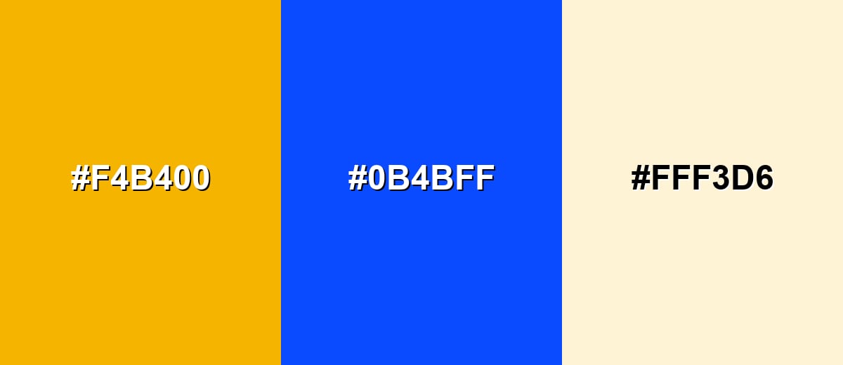
Complementary Colors
A complementary pairing puts marigold against a cool blue for maximum contrast and clarity. This is a strong option for UI highlights, posters, and any layout that needs clear visual hierarchy.
Complementary Palette Example: Use marigold as the focal accent, support it with royal blue for contrast, and soften the overall look with a creamy neutral.
Analogous Color Schemes
Analogous colors sit adjacent to each other on the color wheel, creating harmonious, cohesive palettes with subtle variation.
Golden-yellow to orange tones create a warm, cohesive look that feels sunny and flavorful.
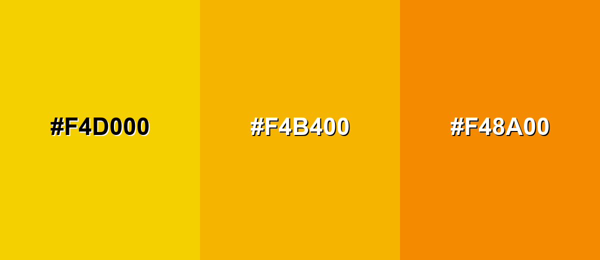
- Sunflower: #F4D000
- Marigold: #F4B400
- Tangerine: #F48A00
Yellow to olive-leaning hues keep the warmth but introduce an earthy, natural feeling.
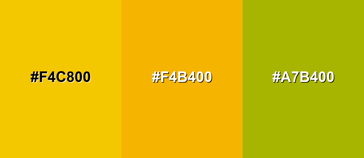
- Warm Yellow: #F4C800
- Marigold: #F4B400
- Olive Gold: #A7B400
Triadic & Tetradic Combinations
A triadic palette adds variety while staying balanced across the wheel.
Marigold with teal and violet feels modern and expressive, especially for illustrations and bold brand systems.
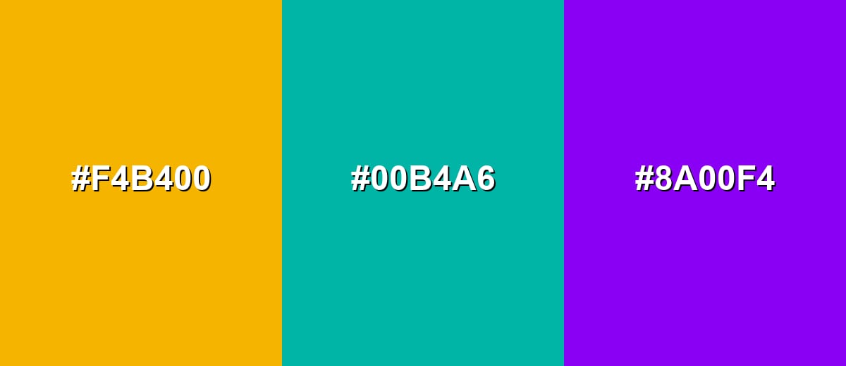
- Marigold: #F4B400
- Teal: #00B4A6
- Violet: #8A00F4
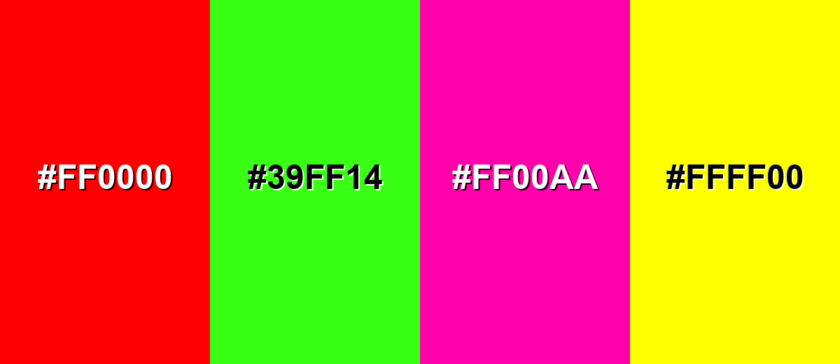
Colors to Avoid
While marigold color is remarkably versatile, certain combinations can create problematic visual effects:
- Pure Red (#FF0000) - Together with marigold it can feel visually aggressive and overly loud, reducing readability and perceived quality.
- Neon Green (#39FF14) - The combined brightness creates harsh vibration on screens and can be uncomfortable in large areas.
- Bright Magenta (#FF00AA) - Two intense accents compete for attention and can make layouts feel chaotic without strong neutrals.
- Lemon Yellow (#FFFF00) - The hues are too close in lightness and saturation, so elements can blur together and lose hierarchy.
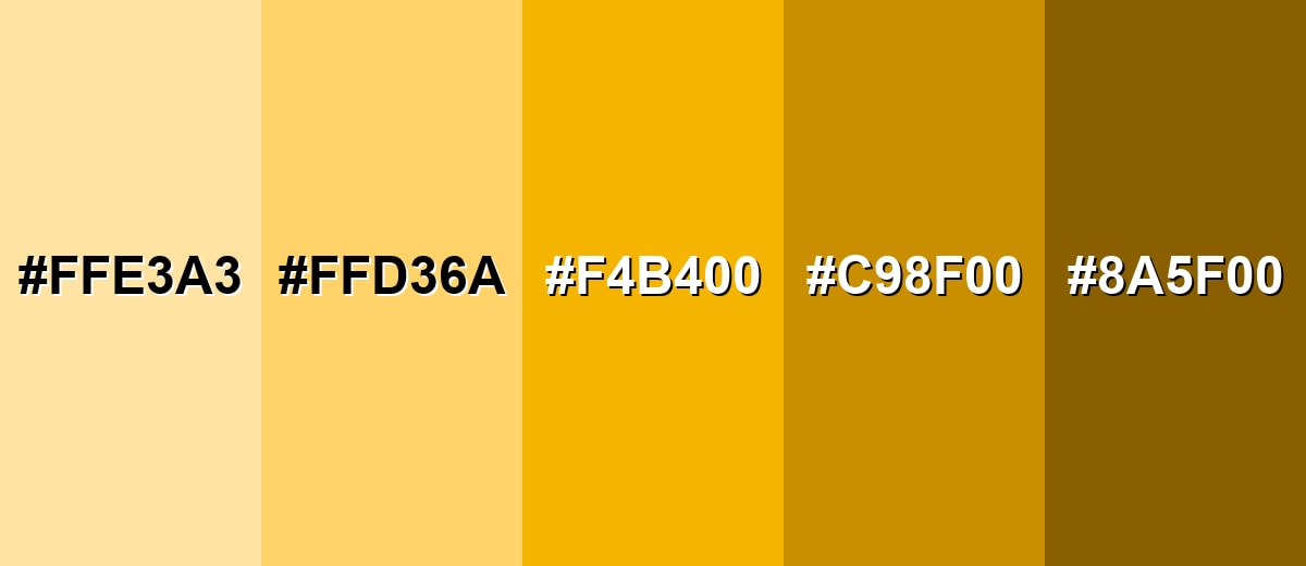
Shades, Tints & Variations of Marigold Color
Marigold has a useful range—from soft, creamy tints to deeper, earthy golds. Using these variations helps you keep the same warm identity while controlling contrast, readability, and overall intensity.
- Pale Marigold (#FFE3A3) - A light, creamy tint that keeps the golden warmth but feels softer and more airy. It's best used for Background fills, subtle highlights, and large surfaces where full-strength marigold would be too intense.
- Soft Marigold (#FFD36A) - A gentler version with reduced intensity that still reads as sunny and friendly. It's best used for Cards, secondary accents, and warm UI surfaces behind icons or small labels.
- Classic Marigold (#F4B400) - The bold, recognizable marigold tone—golden, saturated, and highly noticeable. It's best used for Primary accents, calls to action, badges, and brand highlights that need quick attention.
- Deep Marigold (#C98F00) - A darker, richer shade that feels more grounded and slightly more premium. It's best used for Headings, borders, packaging details, and paired accents with lighter neutrals.
- Burnt Marigold (#8A5F00) - A brown-leaning shade with an earthy warmth that reduces glare and adds weight. It's best used for Text on light backgrounds (when contrast allows), vintage palettes, and natural-themed designs.
Industry Applications
Marigold's warmth and visibility make it useful across many industries, especially when you need optimistic energy without relying on pure yellow.
Fashion & Beauty
- Use marigold as an accent shade in seasonal collections to bring instant warmth and a "sunlit" feel.
- In beauty packaging, it works well for highlighting hero benefits, limited editions, or festive drops.
- For product photography, small marigold props can add energy without overwhelming the main subject.
- Pair it with clean neutrals to keep the look modern and avoid an overly playful finish.
Interior Design & Decor
- Marigold is most comfortable as an accent—pillows, artwork, or decorative details rather than wall-to-wall color.
- It complements whites, warm grays, woods, and muted greens for a cozy, natural look.
- Use lighter tints on larger surfaces to reduce glare while keeping the room bright.
- Deeper marigold shades can feel more grounded and "premium" in furniture details and trims.
Branding & Marketing
- Great for promotion tags, seasonal campaigns, and product callouts where fast visibility matters.
- In digital products, use it for call-to-action buttons, feature flags, and onboarding highlights.
- For print and packaging, test proofs—yellow-gold hues can shift depending on paper and ink.
- If marigold signals status (warning/attention), include an icon or label so the meaning isn't color-only.
Conclusion
Marigold stands out as a golden-yellow that feels warm, lively, and easy to notice at a glance. It's a smart choice when you want optimism and focus without adding extra visual complexity—especially in branding, UI, and attention-driven graphics. If you need a reliable digital starting point, #F4B400 captures that classic marigold character with a bright, sunny push. Pair it with cool blues for crisp contrast, or lean into softer neutrals and earthy greens for a more relaxed, inviting mood.
Design Smarter with AI: Media.io is an online AI studio that empowers creators with advanced image generation and enhancement tools. From text-to-image and image-to-image creation to AI upscaling and color optimization, it enables fast, creative, and professional results—all in your browser.

Frequently Asked Questions About Marigold Color
Marigold is a warm golden-yellow with a slight orange undertone, similar to the petals of marigold flowers. It looks brighter than mustard and less orange than amber.
A common hex code used for marigold in digital design is #f4b400. Depending on the palette, some variations may be slightly more orange or more yellow.
It sits between the two, but it usually reads as a golden-yellow first with an orange warmth underneath. The surrounding palette can push it to appear more yellow or more orange.
Deep blues are one of the best matches because they create strong, clean contrast. Warm neutrals (cream, tan, soft gray) and grounded greens also pair well for a natural look.
It can, but it is often very bright for large surfaces. For backgrounds, a pale marigold tint is usually easier on the eyes, while full marigold is best saved for accents and highlights.
Use it sparingly with plenty of whitespace, pair it with navy or charcoal, and keep typography clean and simple. A modern look often comes from using marigold as a focused accent rather than an all-over fill.


