

 TL;DR:
Army green (HEX #4B5320) is a muted, earthy color that grounds designs and communicates durability, but requires careful contrast management to prevent large blocks from feeling visually heavy or strictly militaristic.
● Pair this shade with warm neutrals, plum, or deep teal, while strictly avoiding pure black, neon lime, or bright red to prevent muddy visuals, vibrating contrast, or an aggressive aesthetic.
● Use off-white typography rather than mid-gray for optimal UI readability on army green backgrounds, specifically limiting the color to anchors like headers, labels, and badges rather than full-bleed layouts.
● Monitor shadow levels in photography and video grading since the color easily collapses into near-black, a limitation that can be mitigated using Media.io AI enhancement tools to preserve rich midtones.
Ask AI for a summary
 ChatGPT
 Perplexity
 Gemini
 Claude
 Grok
Grok
Army green color is a muted, earthy green that looks like worn fabric dye on military uniforms—deep, practical, and slightly yellow-leaning.
Its most common digital reference is hex #4B5320, sitting between olive and forest tones, with a grounded, outdoorsy calm that shifts warmer or cooler depending on lighting and nearby neutrals.
Army Green Color: Codes & Values
If you want army green to look consistent across screens, print, and UI components, start with the core color codes below.
| Parameters | VALUE |
| HEX Code | #4B5320 |
| RGB DECIMAL | 75, 83, 32 |
| RGB PERCENTAGE | 29.4%, 32.5%, 12.5% |
| CMYK | 10%,0%,62%,68% |
| HSL | 69°, 44%, 23% |
| HSV (HSB) | 69°, 61%, 33% |
| Web Safe | #336633 |
Key Color Space Explanations:
- HEX - HEX is the most common way to specify a shade on the web and in design tools. Use the six-digit value to reproduce army green consistently across screens.
- RGB - RGB mixes red, green, and blue light for displays. The decimal and percentage formats help you match the same tone in CSS and UI systems.
- CMYK - CMYK is used for printing and packaging where inks combine on paper. These percentages are a practical starting point, but final output can vary by stock and finish.
- HSL - HSL describes hue, saturation, and lightness, which is useful when building tints and shades. It makes it easier to create a cohesive scale for components and backgrounds.
- Web Safe - Web Safe is the closest legacy-safe approximation for older display limits. It's mainly helpful for quick fallbacks or retro-styled palettes.
Use HEX for most web design, RGB for UI systems and motion work, and CMYK when you need a print-proof starting point for packaging or stationery.
Army Green Color Conversions
Here are common conversions for army green so you can copy the right value into your design tool, stylesheet, or print workflow.
| Parameters | VALUE | CSS |
| HEX | #4b5320 | #4b5320 |
| RGB DECIMAL | 75, 83, 32 | rgb(75,83,32) |
| RGB PERCENTAGE | 29.4%, 32.5%, 12.5% | rgb(29.4%,32.5%,12.5%) |
| CMYK | 10%,0%,62%,68% | cmyk(10%,0%,62%,68%) |
| HSL | 69°, 44%, 23% | hsl(69°,44%,23%) |
| HSV (or HSB) | 69°, 61%, 33% | -- |
| Web Safe | 336633 | #336633 |
| CIE-LAB | 34.2, -6.5, 28.7 | -- |
| XYZ | 9.84, 11.85, 3.75 | -- |
| xyY | 0.41, 0.49, 11.85 | -- |
| CIE-LCH | 34.2, 29.4, 102.8 | -- |
| CIE-LUV | 34.2, -6.8, 28.1 | -- |
| Hunter-Lab | 33.5, -3.9, 18.7 | -- |
| Binary | 01001011 01010011 00100000 | -- |
Want to generate Army Green Color photos or posters? Try Media.io's AI Image Generator now!
Army Green Color Meaning & Symbolism
Army green is commonly associated with resilience, preparedness, and a no-nonsense attitude. Because it sits close to natural foliage and earth tones, it often feels steady and grounded in everyday settings. In visual communication, the Army Green Color meaning tends to read as practical, reliable, and functional rather than flashy.
Psychological Effects
Because it's muted and earthy, army green often changes the "energy" of a design more than it changes the message.
- Grounding - Helps layouts feel anchored and stable, especially alongside warm neutrals.
- Calm Focus - Reduces visual noise, making it easier to concentrate on content and data.
- Rugged Confidence - Communicates utility and "ready-for-action" without looking loud.
- Perceived Heaviness - Can feel strict or dark in large blocks, particularly in low-light UI.
- Contrast Sensitivity - Low-contrast pairings (like mid-gray text) can hurt readability, so testing matters.
Positive Associations
Used thoughtfully, it's a dependable color that supports practical, nature-forward storytelling.
- Reliability - Suggests consistency and trust through its subdued, steady tone.
- Durability - Feels tough and long-lasting, echoing uniforms and utility materials.
- Nature Connection - Sits close to foliage tones, creating an outdoorsy, organic vibe.
- Functionality - Reads as "built for purpose," which works well for tools and essentials.
- Timeless Style - Avoids trendiness, making it easier to keep designs looking current over time.
Cultural Significance Across the World
Its meaning shifts with context, but the military-and-utility link is widely recognized.
- Military Heritage - Commonly associated with uniforms, equipment, and discipline.
- Workwear Culture - Connected to practical clothing and "get it done" aesthetics in modern fashion.
- Outdoor Lifestyle - Used in brands and gear that emphasize hiking, camping, and exploration.
- Minimalist Home Trends - Appears in modern interiors as a grounded alternative to brighter greens.
Design Applications
Army green is versatile when you want an earthy, dependable tone that still feels modern—great as an accent, surface color, or a quiet brand signature.
Graphic Design Tips
- Use army green for anchors (headers, labels, frames) and let lighter neutrals carry most of the page.
- Pair it with warm, matte textures (kraft, uncoated stock, linen-style backgrounds) for a premium utilitarian feel.
- Keep typography crisp: off-white text on army green usually reads cleaner than mid-gray.
- Build a small scale of tints/shades for UI states so hover and active changes are obvious.
- When using it with photography, match the undertone (warm vs. cool lighting) so the green doesn't drift muddy.
Pro tip: If your design feels "too military," soften it with warm neutrals and rounded shapes, and save the darker greens for small emphasis areas instead of full-bleed backgrounds.
Army Green Color in Photography & Video
- In outdoor scenes, army green looks natural next to wood, stone, and dry grass tones.
- For product shoots, matte surfaces and soft light help the color stay rich instead of turning flat.
- In video grading, watch shadows—army green can collapse into near-black without enough midtone detail.
- Wardrobe styling: it pairs easily with denim-like blues and sand-toned fabrics for a lived-in look.
- For social content, add one restrained accent (like a muted warm tone) so the feed doesn't feel too dark.
Recommended Tool for Image Enhancement: When incorporating army green color into your photography projects, Media.io's AI Image tools can help you achieve more refined results. With AI-powered color enhancement, photo colorization, image upscaling, and old photo restoration, you can easily enrich army green color tones, improve overall image quality, and highlight the color's elegant and sophisticated aesthetic.
Color Combinations
Army green pairs best with warm neutrals, dark inks, and a few controlled accent hues. The combinations below help you build everything from rugged outdoor palettes to modern, minimal interfaces.
Complementary Colors
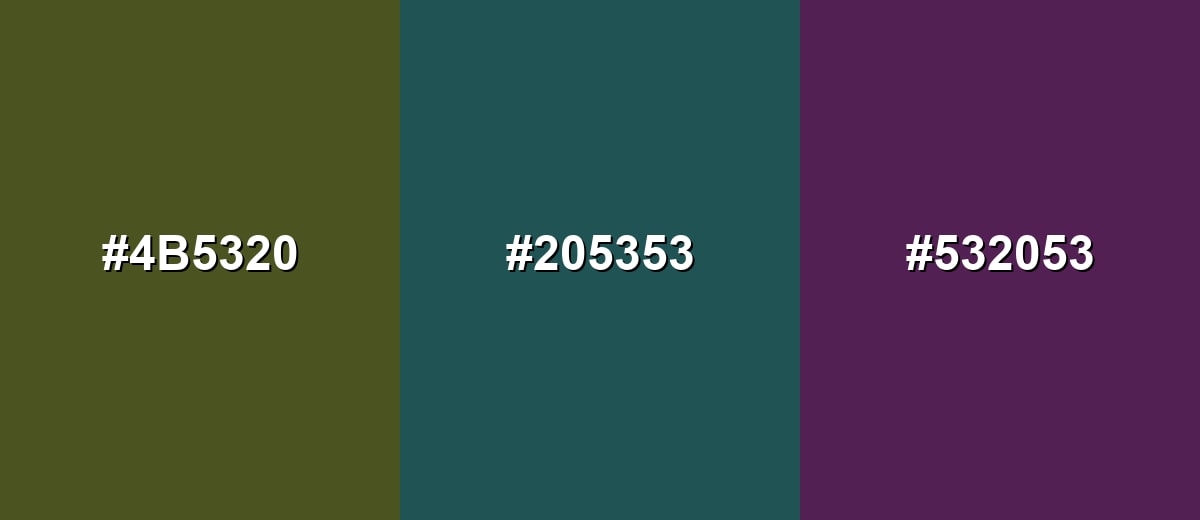
A complementary partner adds energy without fighting the muted base. With army green, a deep plum creates contrast and a more modern, editorial feel.
Complementary Palette Example: Use army green as the anchor, plum for emphasis, and a warm sand neutral to keep the palette wearable and balanced.
Analogous Color Schemes
Analogous colors sit adjacent to each other on the color wheel, creating harmonious, cohesive palettes with subtle variation.
An analogous set with deeper forest notes feels natural and cohesive for outdoor and heritage styling.
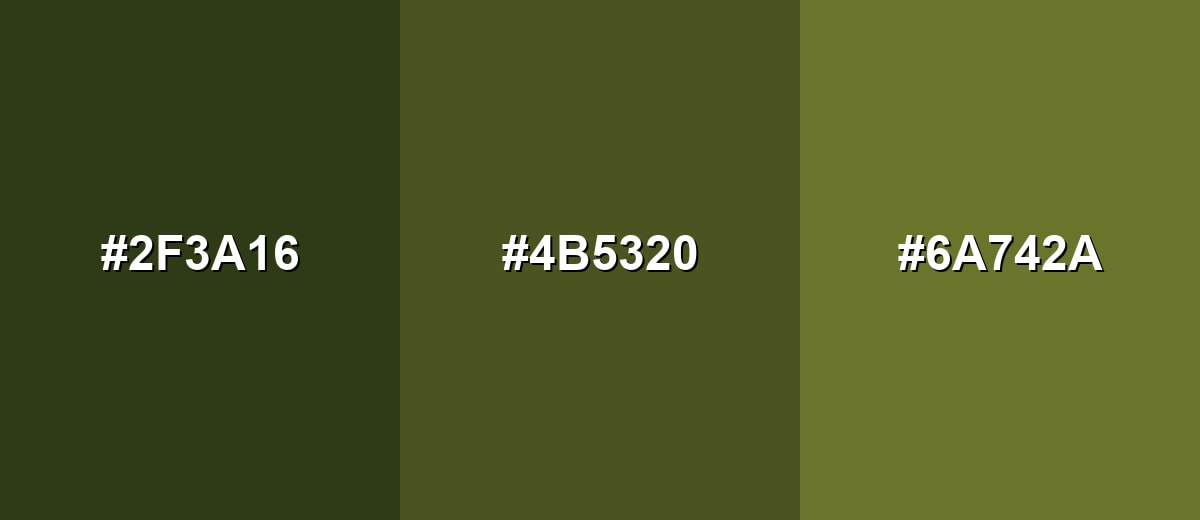
- Deep Forest: #2F3A16
- Army Green: #4B5320
- Yellow Olive: #6A742A
A warmer analogous palette leans into khaki and moss for a softer, lifestyle-friendly look.
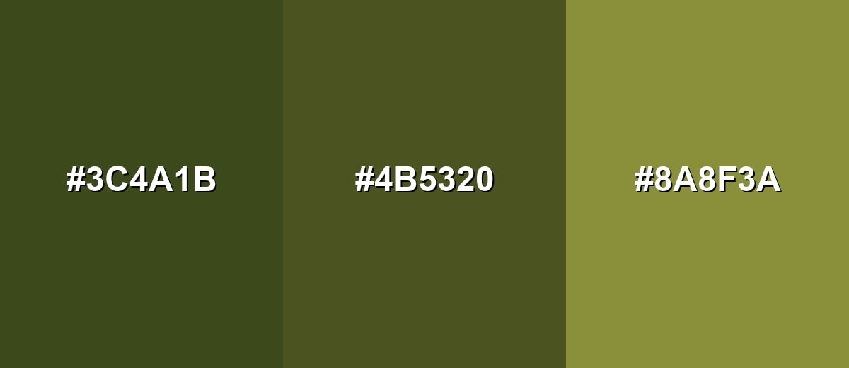
- Dark Olive: #3C4A1B
- Army Green: #4B5320
- Khaki Olive: #8A8F3A
Triadic & Tetradic Combinations
A triadic scheme gives you variety while keeping each tone distinct.
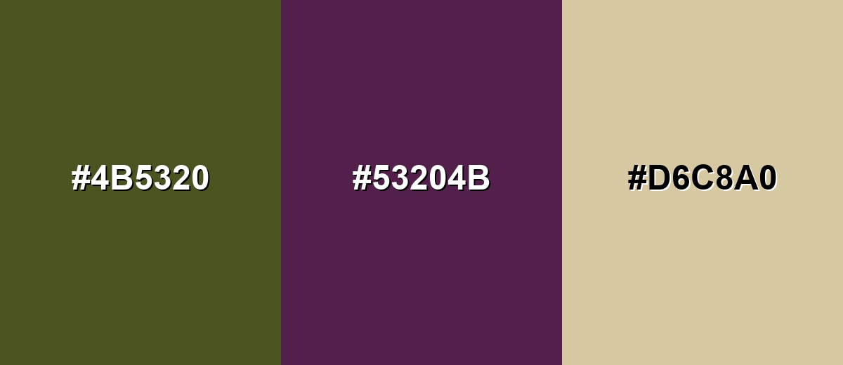
Combine army green with deep teal and dark magenta for bold accents that still feel mature and subdued.
- Army Green: #4B5320
- Deep Teal: #205353
- Dark Magenta: #532053
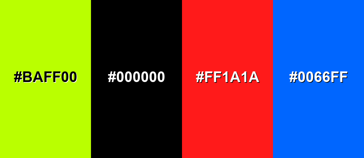
Colors to Avoid
While army green color is remarkably versatile, certain combinations can create problematic visual effects:
- Neon Lime (#BAFF00) - The intensity can make army green look dull and muddy, creating a harsh, vibrating contrast in UI and print.
- Pure Black (#000000) - This combination can feel overly heavy and militaristic, and it often reduces detail in dark layouts.
- Bright Red (#FF1A1A) - The pairing can read as alarm-like and aggressive, which may overwhelm calm or outdoorsy messaging.
- Electric Blue (#0066FF) - A highly saturated blue can clash with the muted, earthy base and pull attention away from primary content.
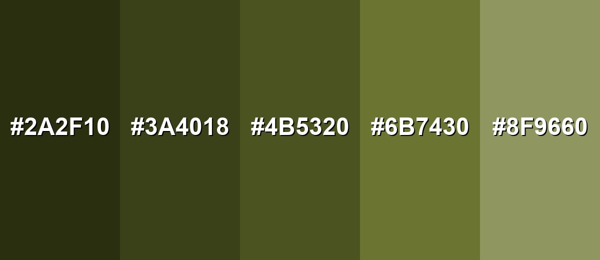
Shades, Tints & Variations of Army Green Color
Army green isn't just one swatch—it spans deeper tactical tones, classic olives, and lighter dusty tints. Having a small range makes it easier to build hierarchy in UI, create depth in interiors, or keep branding consistent across different backgrounds.
- Deep Army Green (#2A2F10) - A darker, more tactical-looking version with a stronger shadowy feel. It's best used for Navigation bars, premium labels, and dark-mode surfaces with light text..
- Rugged Olive (#3A4018) - A slightly softened deep olive that keeps the utilitarian tone without feeling too blackened. It's best used for Background panels, product packaging accents, and icon fills..
- Classic Army Green (#4B5320) - The standard army-inspired olive green with a balanced earthy depth. It's best used for Primary brand accents, uniforms-inspired visuals, and grounded UI themes..
- Mossy Army (#6B7430) - A more open, moss-like take that feels a bit fresher and more natural. It's best used for Lifestyle branding, room accents, and supporting backgrounds..
- Sage Army Tint (#8F9660) - A lighter, dustier tint that keeps the identity while becoming more airy. It's best used for Large backgrounds, editorial layouts, and calming interior palettes..
Industry Applications
Army green shows up across industries because it communicates durability and practicality while still feeling stylish—either as a signature color or a steady supporting neutral.
Fashion & Beauty
- Utility and outdoor apparel often use army green because it hides wear and looks intentional over time.
- Streetwear styling leans on it as a neutral that pairs easily with denim-like blues and warm tans.
- Minimal beauty and wellness packaging uses it to hint at nature and simplicity without going overly "green."
- It works well with matte finishes, giving products a grounded, premium feel.
Interior Design & Decor
- Popular on cabinets, accent walls, and furniture where you want depth without the sharpness of pure black.
- Pairs naturally with light wood tones and cream walls for a calm, modern look.
- Works nicely with black or brass hardware to add definition and contrast.
- Textiles in army green (pillows, throws, rugs) can "anchor" a space without overpowering it.
Branding & Marketing
- Great for brands tied to outdoors, craftsmanship, security, sustainability, or utilitarian products.
- Supports clear hierarchy in layouts when used for headers, badges, and secondary UI elements.
- Looks premium on uncoated paper, kraft textures, and minimal label systems.
- Best results come from contrast checks—especially for small text and iconography on dark greens.
Conclusion
Army green brings a rugged, grounded character that sits comfortably between olive and forest tones, making it a reliable choice for branding, interiors, and UI. Start with #4B5320 as your anchor, then keep things balanced with warm neutrals and deep, muted accents for clean contrast that doesn't feel loud. With a small shade range and careful readability checks, army green can look modern, calm, and intentional—perfect for outdoors-inspired styling or any design that needs a steady, practical edge.
Design Smarter with AI: Media.io is an online AI studio that empowers creators with advanced image generation and enhancement tools. From text-to-image and image-to-image creation to AI upscaling and color optimization, it enables fast, creative, and professional results—all in your browser.

Frequently Asked Questions About Army Green Color
Army green is a muted, earthy green with an olive undertone, often associated with military uniforms and utility gear. It tends to look rugged, grounded, and natural rather than bright or sporty.
A widely used hex value for army green is #4b5320. It's a dark olive-leaning green that works well as a base tone in palettes and interfaces.
They're closely related, but not always identical. Olive drab is often a bit browner or more muted, while army green can look slightly deeper or cleaner depending on the specific swatch and lighting.
Warm neutrals (sand, beige, cream), dark inks (charcoal, deep navy), and muted accents (plum, dusty teal, clay orange) pair especially well. These keep the palette balanced while letting army green stay the anchor.
Use it for headers, sidebars, badges, and secondary actions, then place content on light neutrals for readability. Check contrast carefully, especially for small text, and consider off-white typography on army green backgrounds.
Yes, especially in modern or nature-inspired themes. Pair it with cream, soft metallics, and textured materials (linen, wood, matte paper) to make it feel refined rather than strictly utilitarian.


