

Lime green color is a bright, zesty green that looks like the skin and pulp of a fresh lime, sitting between yellow and true green. A common digital reference for it is #32CD32, which reads as vivid and clean on screens.
People often see it as lively, youthful, and attention-grabbing, with a fresh, outdoorsy feel. In pigment and light, it tends to look more intense under cool lighting and can shift warmer when surrounded by yellows; this guide covers meaning, key codes, combinations, shades, and practical uses.
Lime Green Color: Codes & Values
If you want lime green to look consistent across web, UI, and print, start with these standard color codes and values.
| Parameters | VALUE |
| HEX Code | #32CD32 |
| RGB DECIMAL | 50, 205, 50 |
| RGB PERCENTAGE | 19.6%, 80.4%, 19.6% |
| CMYK | 76%,0%,76%,20% |
| HSL | 120°, 61%, 50% |
| HSV (HSB) | 120°, 76%, 80% |
| Web Safe | 33CC33 |
Key Color Space Explanations:
- HEX is the most common web notation for this shade. Use it in CSS, design tools, and UI specs to keep the same appearance across screens.
- RGB defines how much red, green, and blue light are mixed to display lime green. It is the standard model for screens, video, and digital graphics.
- CMYK is used for printing and describes ink percentages. Lime green can shift in print, so it is best to proof or compare against a physical swatch when accuracy matters.
- HSL expresses the hue angle plus saturation and lightness, which is handy for building tints, shades, and theme systems. It helps you adjust brightness without changing the underlying hue.
- Web Safe values approximate the shade using a limited palette historically supported by older displays. It is mainly useful for legacy constraints and quick approximations.
Use HEX and RGB for web design and digital products, and switch to CMYK when preparing files for print—then test on real materials if color accuracy is critical.
Lime Green Color Conversions
Need lime green in another format? These conversions make it easy to copy the right value into your workflow.
| Parameters | VALUE | CSS |
| HEX | #32cd32 | #32cd32 |
| RGB DECIMAL | 50, 205, 50 | rgb(50,205,50) |
| RGB PERCENTAGE | 19.6%, 80.4%, 19.6% | rgb(19.6%,80.4%,19.6%) |
| CMYK | 76%,0%,76%,20% | cmyk(76%,0%,76%,20%) |
| HSL | 120°, 61%, 50% | hsl(120°,61%,50%) |
| HSV (or HSB) | 120°, 76%, 80% | -- |
| Web Safe | 33cc33 | #33cc33 |
| CIE-LAB | 72.5, -67.0, 61.4 | -- |
| XYZ | 23.7, 44.6, 10.4 | -- |
| xyY | 0.302, 0.567, 44.6 | -- |
| CIE-LCH | 72.5, 90.9, 137.7° | -- |
| CIE-LUV | 72.5, -62.9, 81.3 | -- |
| Hunter-Lab | 66.8, -51.4, 36.8 | -- |
| Binary | 00110010 11001101 00110010 | -- |
Want to generate Lime Green Color photos or posters? Try Media.io's AI Image Generator now!
Lime Green Color Meaning & Symbolism
Lime green is commonly linked with freshness, growth, and fast-moving energy. When people search for Lime Green Color meaning, they are usually trying to understand why it feels so lively and why it stands out so quickly in a busy layout. In everyday use, it often signals something active, new, or eco-adjacent, especially when paired with clean neutrals.
Psychological Effects
This color is bright by nature, so it tends to shape attention and mood quickly.
- Upbeat Energy - High brightness and a yellow-leaning hue make lime green feel lively and stimulating.
- Fast Attention Grab - It naturally pulls the eye, which is why it works well for buttons, badges, and key UI states.
- Clean, Crisp Feel - Lime green can suggest clarity and cleanliness, especially alongside minimal layouts and neutrals.
- Playful Spring Vibe - Softer tints can feel light, youthful, and "new season" without being too intense.
- Visual Fatigue Risk - When it dominates a screen or wall, intense lime green can look harsh, loud, or tiring over time.
Positive Associations
Used thoughtfully, lime green communicates "fresh" without needing extra visual decoration.
- Freshness - Its citrus connection makes it feel bright, clean, and just-picked.
- Growth - The green base hints at nature, renewal, and steady progress.
- Youthful Optimism - The yellow influence adds a sunny, upbeat tone that reads modern and fun.
- Momentum - It often feels active and forward-moving, great for "go" moments and progress cues.
- Outdoor Spirit - Lime green can evoke plants, trails, and sporty energy when paired with grounded neutrals.
Cultural Significance Across the World
Because it resembles new leaves and citrus, lime green shows up in themes that prioritize vitality and visibility.
- Nature-Adjacent Themes - Commonly used to support messages about plants, outdoors, and natural freshness.
- Youth Trends - Often appears in playful, youth-forward visuals where bold color is part of the identity.
- Sporty Impressions - Its high-impact look can feel fast and athletic, making it popular in energetic designs.
- High-Visibility Cues - The brightness helps quick recognition, which can support "notice this now" moments in graphics.
Design Applications
Lime green works best when you treat it like a high-impact accent rather than a background default. A small amount can add a modern spark, while careful contrast choices keep it readable and polished.
Graphic Design Tips
- Use it as an accent first - Aim for highlights, trims, icons, or key shapes rather than full-page fills.
- Create hierarchy with neutrals - Surround lime green with calmer tones so it looks intentional, not accidental.
- Reserve it for "success" and "active" states - It's a natural fit for progress, confirmations, and active toggles.
- Choose dark text on lime backgrounds - Deep green or near-black is often more readable than white on bright lime.
- Keep print expectations realistic - Proof when possible, since lime greens can shift depending on paper and ink.
Pro tip: if lime green feels too loud, don't abandon it—switch to a tint for larger areas and keep the vivid version for small, high-value moments (CTAs, badges, key data points).
Lime Green Color in Photography & Video
- Use it for pop - Lime green props, wardrobe accents, or product details stand out instantly in a frame.
- Watch lighting temperature - Cool lighting can make it feel sharper; warmer lighting can push it more yellow.
- Balance saturation - If the scene already has strong colors, reduce lime green coverage to avoid a "neon" look.
- Pair with deep anchors - Dark backgrounds or shadows help lime green read crisp instead of washed out.
- Grade consistently - Keep an eye on greens during color grading so lime tones don't drift toward muddy or overly fluorescent.
Recommended Tool for Image Enhancement: When incorporating lime green color into your photography projects, Media.io's AI Image tools can help you achieve more refined results. With AI-powered color enhancement, photo colorization, image upscaling, and old photo restoration, you can easily enrich lime green color tones, improve overall image quality, and highlight the color's elegant and sophisticated aesthetic.
Color Combinations
Because lime green is bright and yellow-leaning, it pairs well with deep anchors and carefully chosen hues that control its intensity. The palettes below give you quick starting points for contrast, harmony, and balanced accents.
Complementary Colors
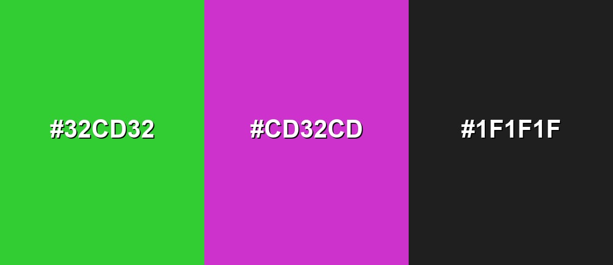
A complementary pairing places lime green against a purple-magenta opposite. This creates high contrast and a vivid, modern look that works well for hero graphics and bold calls to action.
Complementary Palette Example: Use Lime Green with Electric Magenta, then ground the palette with Charcoal for clean contrast.
Analogous Color Schemes
Analogous colors sit adjacent to each other on the color wheel, creating harmonious, cohesive palettes with subtle variation.
Yellow-green to green-cyan neighbors keep the look fresh and natural, ideal for gradients and soft UI themes.
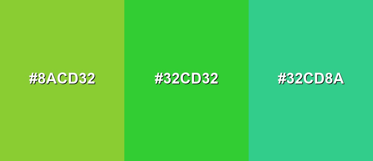
- Soft Yellow-Green: #8ACD32
- Lime Green: #32CD32
- Mint Green: #32CD8A
A tighter analogous set feels cohesive and energetic, great for icons, charts, and sporty visuals.
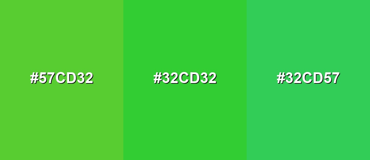
- Spring Green: #57CD32
- Lime Green: #32CD32
- Fresh Green: #32CD57
Triadic & Tetradic Combinations
Triadic palettes balance three evenly spaced hues for variety without chaos.
Combine Lime Green with a strong red and a saturated blue to create clear, playful contrast for illustrations and campaign graphics.
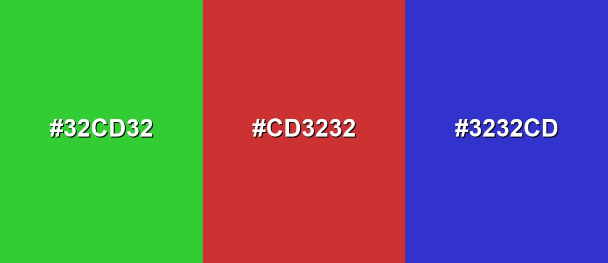
- Lime Green: #32CD32
- Vivid Red: #CD3232
- Royal Blue: #3232CD
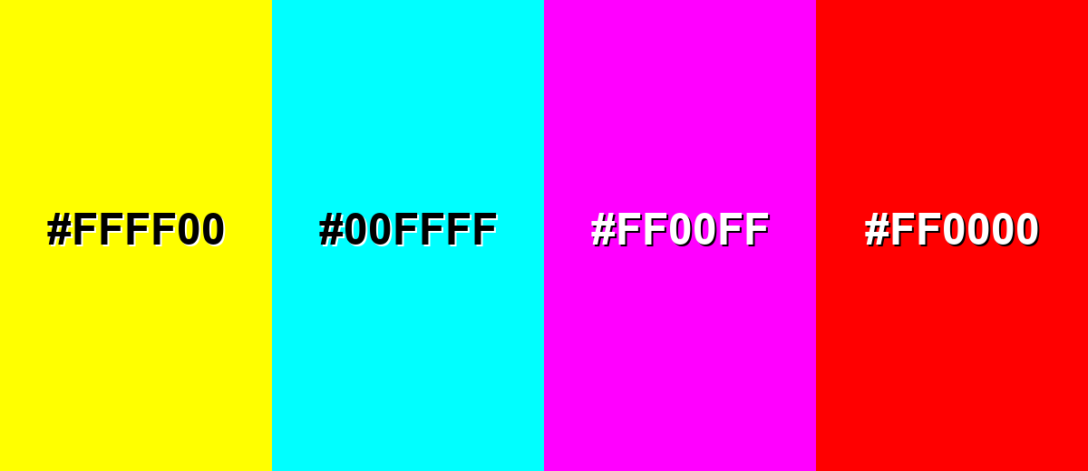
Colors to Avoid
While lime green color is remarkably versatile, certain combinations can create problematic visual effects:
- Pure Yellow (#FFFF00) - Together they can feel fluorescent and reduce legibility, especially in small UI elements.
- Pure Cyan (#00FFFF) - This combination often looks overly neon and can compete for attention instead of creating hierarchy.
- Pure Magenta (#FF00FF) - Both are high-intensity, so the pairing can appear noisy and tiring when used across large areas.
- Pure Red (#FF0000) - The clash is extremely sharp and may trigger unintended warning or holiday-like associations in visual systems.
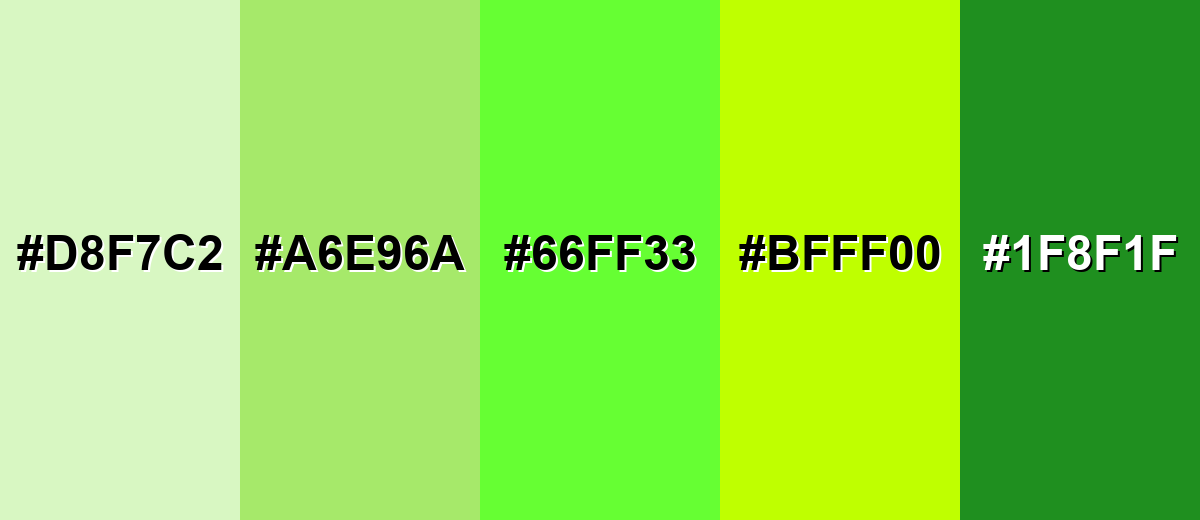
Shades, Tints & Variations of Lime Green Color
Lime green isn't just one loud, neon-leaning option—there's a full range from soft, airy tints to deeper, steadier shades. Having a few variations on hand makes it easier to control contrast, mood, and readability across backgrounds, buttons, and brand accents.
- Pale Lime (#D8F7C2) - A light, airy tint that keeps the citrus feel while staying gentle on the eyes. It's best used for Backgrounds, cards, and large UI panels where you want a fresh tone without high intensity.
- Soft Lime (#A6E96A) - A balanced tint that still reads lively but feels more approachable than the pure bright shade. It's best used for Illustrations, friendly brand accents, and secondary buttons.
- Electric Lime (#66FF33) - A punchier, neon-leaning version that is highly attention-grabbing on screens. It's best used for Badges, highlights, and small emphasis areas where quick visibility matters.
- Yellow Lime (#BFFF00) - A warmer variation that leans toward yellow and feels extra zesty and playful. It's best used for Seasonal graphics, energetic packaging, and modern gradients.
- Deep Lime (#1F8F1F) - A darker shade that keeps the green identity while adding stability and contrast. It's best used for Text on light lime backgrounds, icons, outlines, and more serious brand systems.
Industry Applications
Lime green shows up in industries that benefit from quick recognition and an energetic tone. It is especially useful as an accent where you want users to notice actions, progress, or freshness cues at a glance.
Fashion & Beauty
- Sporty accents - Works well for performance-inspired details, piping, and high-energy collections.
- Statement color moments - A small lime green element can turn a simple look into a bold, trend-forward style.
- Packaging that signals "fresh" - Ideal for clean, bright product packaging that aims for a crisp, modern feel.
- Graphics and labels - Useful for highlighting key benefits or "new" tags without cluttering the design.
Interior Design & Decor
- Accent décor - Great for pillows, art, and small furniture where you want energy without overwhelm.
- Spring-like palettes - Softer tints bring a playful, airy vibe to light rooms and natural materials.
- Modern contrast - Pairs nicely with deep neutrals for a crisp, contemporary look.
- Room zoning - Helpful for drawing attention to a focal point (reading corner, desk area, or feature shelf).
Branding & Marketing
- Tech and SaaS UI states - Strong for active states, success confirmations, and standout chart series.
- Fitness campaigns - Communicates speed, motion, and energy in ads, banners, and performance dashboards.
- Food and beverage cues - Supports citrus and freshness themes, especially with clean neutrals.
- Eco-adjacent messaging - Helps reinforce nature-forward positioning when paired with earthy supporting tones.
Conclusion
Lime green stands out for its bright, citrus-like look and its ability to feel both fresh and fast-moving in a layout. Used thoughtfully, it helps create strong visual hierarchy in branding, UI, and graphics without needing heavy decoration. Its punchy character makes it ideal for accents, highlights, and modern palettes, especially when balanced with dark neutrals or calm neighboring greens. If you need a reliable reference point, #32CD32 is a widely recognized starting value across digital tools. With the right pairings and a few controlled shades, lime green can stay energetic while still looking clean and intentional.
Design Smarter with AI: Media.io is an online AI studio that empowers creators with advanced image generation and enhancement tools. From text-to-image and image-to-image creation to AI upscaling and color optimization, it enables fast, creative, and professional results—all in your browser.

Frequently Asked Questions About Lime Green Color
It is a vivid yellow-leaning green, similar to the skin and pulp of a ripe lime. It appears brighter than true green and more energetic than most soft greens.
A common hex reference is #32cd32. Some designs use brighter, neon-leaning limes, so it helps to confirm the exact shade in your palette.
Not always. Lime green typically sits between yellow and green, while neon green is usually more fluorescent and can look more intense, especially on backlit screens.
Deep neutrals like charcoal, complementary magenta tones, and nearby yellow-green or mint hues work well. The best pairing depends on whether you want bold contrast or a smoother, natural harmony.
It is usually better as an accent or background than as body text. For readability, place dark text on a lime green background, and test contrast for your font size and weight.
Use a pale tint (add white) for backgrounds or a deeper shade (add black) for accents and outlines. Pairing it with off-whites, soft grays, or deep greens also reduces the overall intensity.


