

Wisteria color is a soft lavender-purple inspired by the powdery petals of wisteria blossoms. Its go-to digital reference is #C9A0DC, a light violet that feels dreamy, calm, and quietly romantic.
Depending on what you pair it with, wisteria can read cooler and airy or warmer and more floral. Below, you'll find the exact color codes, conversions, meanings, and modern ways to use wisteria in design.
Wisteria Color: Codes & Values
If you want wisteria to look consistent across web, UI, and print, start with these core values.
| Parameters | VALUE |
| HEX Code | #C9A0DC |
| RGB DECIMAL | 201, 160, 220 |
| RGB PERCENTAGE | 79%, 63%, 86% |
| CMYK | 9%,27%,0%,14% |
| HSL | 281°, 46%, 75% |
| HSV (HSB) | 281°, 27%, 86% |
| Web Safe | #CC99CC |
Key Color Space Explanations:
- HEX - HEX is the most common way to specify wisteria in web design. Use it in CSS, design tools, and UI systems for consistent output.
- RGB - RGB mixes red, green, and blue light to render the shade on screens. It is helpful for digital graphics, video, and interface components.
- CMYK - CMYK is used for printing and describes ink percentages. It helps you predict how wisteria may shift on paper and adjust proofs accordingly.
- HSL - HSL describes hue, saturation, and lightness in an intuitive way. It is handy for building tints, shades, and harmonious palettes.
- Web Safe - Web safe is the closest legacy-safe alternative for older displays and limited palettes. It is mainly used for fallback or quick approximation.
Use HEX for CSS and UI libraries, RGB for screen-based work (including video), and CMYK when preparing print files—then proof to confirm the final look.
Wisteria Color Conversions
Need wisteria in a specific format for your workflow? Here's a quick conversion reference you can copy into design tools and stylesheets.
| Parameters | VALUE | CSS |
| HEX | #c9a0dc | #c9a0dc |
| RGB DECIMAL | 201, 160, 220 | rgb(201,160,220) |
| RGB PERCENTAGE | 79%, 63%, 86% | rgb(79%,63%,86%) |
| CMYK | 9%,27%,0%,14% | cmyk(9%,27%,0%,14%) |
| HSL | 281°, 46%, 75% | hsl(281°, 46%, 75%) |
| HSV (or HSB) | 281°, 27%, 86% | -- |
| Web Safe | cc99cc | #cc99cc |
| CIE-LAB | 71.4, 25.5, -24.2 | -- |
| XYZ | 49.54, 42.66, 73.19 | -- |
| xyY | 0.300, 0.258, 42.66 | -- |
| CIE-LCH | 71.4, 35.1, 316.5° | -- |
| CIE-LUV | 71.4, 18.7, -42.5 | -- |
| Hunter-Lab | 65.2, 25.4, -26.4 | -- |
| Binary | 11001001 10100000 11011100 | -- |
Want to generate Wisteria Color photos or posters? Try Media.io's AI Image Generator now!
Wisteria Color Meaning & Symbolism
Wisteria is commonly linked with grace, softness, and quiet creativity. Because it sits between purple and lavender, it often reads as imaginative and elegant, but still approachable in everyday settings. In daily life, this shows up in everything from soothing room accents to gentle, premium-feeling brand visuals.
Psychological Effects
Wisteria tends to influence a design's mood more than it demands attention.
- Calming Layouts - Wisteria tends to calm a layout without making it feel empty.
- Softer UI - It can soften sharp UI elements and create a more welcoming first impression.
- Less Visual Noise - It can reduce the sense of visual noise when used as a gentle surface color.
- Overuse Risk - Because it is light and slightly cool, it can also feel distant if overused or paired with similarly cool tones.
- Energy & Contrast - In interiors or product design, too much can read as overly sweet, delicate, or lacking energy—especially when the goal is bold contrast.
Positive Associations
In branding and everyday visuals, wisteria usually reads as soft, refined, and optimistic.
- Grace - Often linked with grace and a gentle, decorative elegance.
- Softness - Communicates softness, making layouts feel more approachable.
- Quiet Creativity - Suggests creativity and imagination without feeling loud or dramatic.
- Care & Refinement - Supports themes like care and refinement for premium-feeling visuals.
- Gentle Optimism - Helps express gentle optimism, especially in wellness and lifestyle design.
Cultural Significance Across the World
As a floral-inspired violet, wisteria's symbolism tends to stay light, seasonal, and romantic.
- Springtime Imagery - Frequently associated with springtime and fresh, botanical visuals.
- Romantic Botanicals - Often tied to romantic floral aesthetics in decorative design.
- Graceful Symbolism - Generally read as graceful and decorative rather than authoritative.
- Context Matters - Symbolism can vary by context, but it typically stays soft and approachable.
Design Applications
Wisteria works best when you treat it as a gentle accent or a soft foundation. With the right contrast and supporting neutrals, it can look modern, polished, and easy to read.
Graphic Design Tips
- Background Washes - Use it for landing pages, hero sections, and onboarding screens where you want a calm first impression.
- Soft Emphasis - Try it for callouts, tags, and highlights when you need emphasis without urgency.
- Balance With Neutrals - Pair with warm off-whites or light neutrals to keep the design airy and avoid a cold cast.
- Add Gentle Counter-Accents - A muted green accent can balance wisteria, while a soft peach can warm the palette.
- Protect Readability - Prioritize strong contrast for typography and icons; wisteria is usually better for surfaces, chips, or secondary UI elements.
Pro tip: Build hierarchy with a darker anchor color for text and key UI, then use wisteria as the "soft layer" for panels, highlights, and decorative moments.
Wisteria Color in Photography & Video
- Wardrobe & Props - Use wisteria fabrics or small props to add a dreamy, airy feel without overpowering the subject.
- Set Styling - Combine wisteria with warm neutrals to avoid a cool, washed-out look in bright lighting.
- Color Grading - Keep saturation gentle so the tone stays soft rather than turning neon or muddy.
- Skin Tones - Watch for cool casts on skin; balance with warmer highlights or neutral backgrounds when needed.
- UI Overlays - For titles, lower-thirds, or captions, use darker text for readability instead of placing white text on wisteria.
Recommended Tool for Image Enhancement: When incorporating wisteria color into your photography projects, Media.io's AI Image tools can help you achieve more refined results. With AI-powered color enhancement, photo colorization, image upscaling, and old photo restoration, you can easily enrich wisteria color tones, improve overall image quality, and highlight the color's elegant and sophisticated aesthetic.
Color Combinations
Because wisteria sits in the violet family, it pairs well with both cool and warm companions. These palettes give you ready-to-use directions for clean interfaces, soft editorial layouts, and decorative brand systems.
Complementary Colors
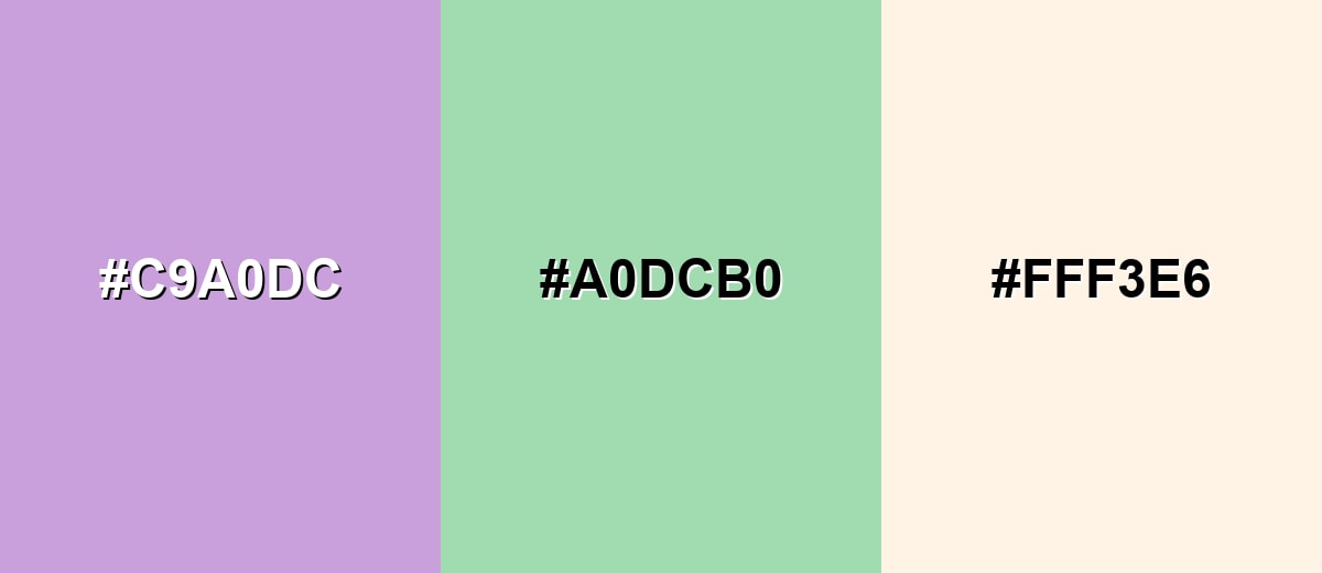
A complementary pairing balances wisteria with a gentle green, creating a fresh and lively contrast that still feels soft. Add a warm light neutral to keep the palette calm and usable for backgrounds.
Complementary Palette Example: Wisteria with mint green and a creamy off-white creates a balanced, botanical-inspired look.
Analogous Color Schemes
Analogous colors sit adjacent to each other on the color wheel, creating harmonious, cohesive palettes with subtle variation.
A pink-leaning analogous set for romantic, editorial, and beauty layouts.
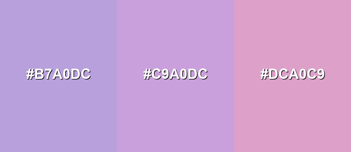
- Periwinkle Mist: #B7A0DC
- Wisteria: #C9A0DC
- Orchid Blush: #DCA0C9
A cooler analogous set for calm UI, wellness brands, and airy gradients.
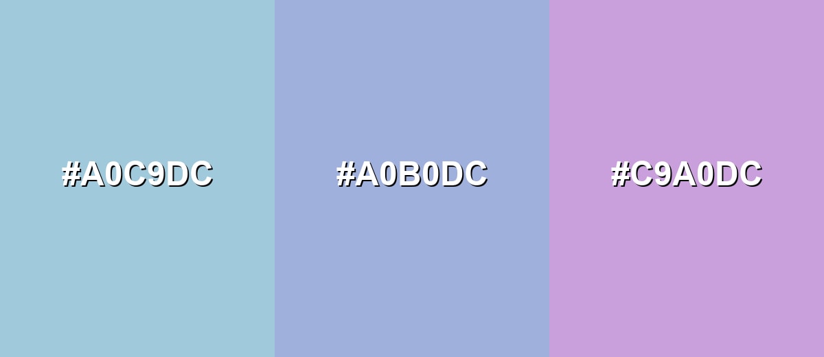
- Powder Blue: #A0C9DC
- Blue Lavender: #A0B0DC
- Wisteria: #C9A0DC
Triadic & Tetradic Combinations
A triadic palette adds variety while staying balanced across the wheel.
Pair wisteria with a soft apricot and seafoam for playful, modern contrast that still feels gentle.
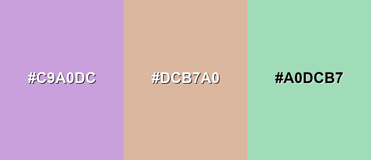
- Wisteria: #C9A0DC
- Soft Apricot: #DCB7A0
- Seafoam: #A0DCB7
Colors to Avoid
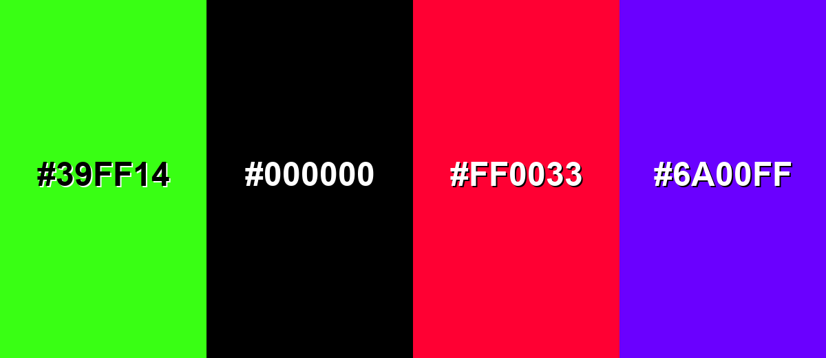
While wisteria color is remarkably versatile, certain combinations can create problematic visual effects:
- Neon Green (#39FF14) - Too intense next to wisteria, creating visual vibration that can feel noisy and unrefined.
- Pure Black (#000000) - Creates a harsh jump in contrast that can make the palette feel heavy and reduce the soft, floral character.
- Electric Red (#FF0033) - Overpowers the gentle violet and pushes the mood toward alarm or urgency rather than calm.
- Ultra Violet (#6A00FF) - A highly saturated purple can clash with wisteria's pastel softness and make gradients look muddy.
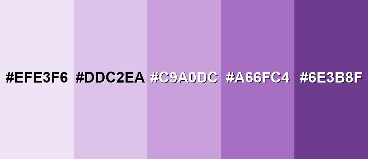
Shades, Tints & Variations of Wisteria Color
Wisteria isn't just one swatch—it has a full range from barely-there tints to deeper violets that add structure. Having a few coordinated variations makes it easier to build hierarchy in UI, create smooth gradients, and keep a brand palette consistent.
- Pale Wisteria (#EFE3F6) - A very light tint that keeps the floral feel while reading almost like a neutral wash. It's best used for Large backgrounds, subtle panels, and soft gradients..
- Soft Wisteria (#DDC2EA) - A gentle, airy version that stays pastel but adds a touch more presence. It's best used for Cards, section dividers, and quiet highlights..
- Classic Wisteria (#C9A0DC) - The recognizable wisteria tone: light violet with a calm, dreamy character. It's best used for Brand accents, hero backdrops, and decorative UI elements..
- Deep Wisteria (#A66FC4) - A richer, more saturated shade that feels more confident while staying elegant. It's best used for Buttons, headings, and focus states when you need more contrast..
- Dark Wisteria (#6E3B8F) - A dark violet shade that anchors palettes and adds depth without turning flat. It's best used for Text accents, icons, outlines, and high-contrast UI elements..
Industry Applications
Wisteria's soft violet tone fits industries that want a calm, thoughtful look with a hint of creativity. It is especially useful when you need a premium feel without a sharp, high-contrast aesthetic.
Fashion & Beauty
- Gentle Packaging - Packaging and label systems that feel gentle and refined.
- Self-Care Visuals - Spa, skincare, and self-care visuals where softness matters.
- Spring Releases - Seasonal launches that lean into spring-inspired palettes.
- Premium-Soft Aesthetic - A calm color direction that feels elevated without being harsh.
Interior Design & Decor
- Calm Spaces - Bedrooms, studios, and reading corners that aim for calm and comfort.
- Accent Styling - Accent walls, textiles, and decor where a floral hint feels natural.
- Layered Neutrals - Layering with warm neutrals to avoid a cool, washed-out effect.
- Soft Mood Building - A subtle way to add color without making a room feel busy.
Branding & Marketing
- Signature Accent - Signature accent in logos, secondary marks, and brand patterns.
- Social Templates - Background tone for social templates and lookbooks.
- Approachable Premium - Support shade for premium yet approachable positioning.
- Friendly Product UI - Onboarding screens and feature callouts that should feel friendly.
Conclusion
Wisteria is a soft lavender-purple that brings grace, calm, and a quietly creative mood to modern design. It shines as a background wash, highlight, or brand accent—especially when you pair it with warm neutrals and keep text contrast strong. Whether you're building a gentle UI theme, a wellness-inspired visual identity, or a floral-leaning interior palette, starting with #C9A0DC (and stepping through its lighter and deeper variations) makes wisteria easy to use without losing readability or polish.
Design Smarter with AI: Media.io is an online AI studio that empowers creators with advanced image generation and enhancement tools. From text-to-image and image-to-image creation to AI upscaling and color optimization, it enables fast, creative, and professional results—all in your browser.

Frequently Asked Questions About Wisteria Color
Wisteria is a light, soft violet that sits between lavender and pastel purple. It often looks airy and floral, like the petals of wisteria blossoms.
A common reference hex for wisteria is #c9a0dc. It is a light violet that works well for soft backgrounds and gentle accents.
It typically reads closer to lavender because it is light and slightly cool, but it still has enough violet character to feel distinctly purple rather than pink.
It pairs nicely with muted greens, warm light neutrals, soft pinks, and gentle blues. These combinations keep the look calm while adding contrast and balance.
It is usually better as a surface or accent than as small body text because it is light. For buttons, it can work when you ensure strong contrast for labels and icons and test across states.
The closest web-safe approximation is #cc99cc. It is a useful fallback when working with limited or legacy palettes.


