

Ochre color is a warm, earthy yellow-orange that looks like sun-baked clay, dried grass, or natural pigment on stone. A widely used digital reference is #CC7722, sitting between golden yellow and soft rust.
It's often seen as grounded, welcoming, and quietly confident rather than loud. Below, you'll find ochre's meaning, exact color codes, easy combinations, shade ideas, and practical ways to use it in design.
Ochre Color: Codes & Values
If you want a consistent ochre across web, UI, print, and brand assets, start with these standard values.
| Parameters | VALUE |
| HEX Code | #CC7722 |
| RGB DECIMAL | 204, 119, 34 |
| RGB PERCENTAGE | 80%, 46.7%, 13.3% |
| CMYK | 0%,42%,83%,20% |
| HSL | 30°, 71%, 47% |
| HSV (HSB) | 30°, 83%, 80% |
| Web Safe | #CC6633 |
Key Color Space Explanations:
- HEX - HEX is the most common code for screens and web design. Use it in CSS and design tools to get the same ochre tone consistently.
- RGB - RGB mixes red, green, and blue light to form the final on-screen look. Higher red with moderate green gives ochre its warm, earthy cast.
- CMYK - CMYK is used for printing and describes ink coverage. Ochre typically needs strong yellow with a notable magenta component and some black for depth.
- HSL - HSL describes hue, saturation, and lightness in a way that's easier to tweak by eye. It's helpful when building lighter tints or deeper shades around ochre.
- Web Safe - Web safe is the closest legacy palette approximation for broad display consistency. It's a slightly redder, more simplified match to the target shade.
Use HEX for web and UI, RGB for screen-based tools, and CMYK when you're preparing packaging or print files so the final output stays true to the same ochre family.
Ochre Color Conversions
Need ochre values in different formats for a CSS theme, print workflow, or color-matching in design software? Here's the full conversion list.
| Parameters | VALUE | CSS |
| HEX | #cc7722 | #cc7722 |
| RGB DECIMAL | 204, 119, 34 | rgb(204,119,34) |
| RGB PERCENTAGE | 80%, 46.7%, 13.3% | rgb(80%,46.7%,13.3%) |
| CMYK | 0%,42%,83%,20% | cmyk(0%,42%,83%,20%) |
| HSL | 30°, 71%, 47% | hsl(30°,71%,47%) |
| HSV (or HSB) | 30°, 83%, 80% | -- |
| Web Safe | cc6633 | #cc6633 |
| CIE-LAB | 54.7, 19.4, 56.2 | -- |
| XYZ | 34.5, 29.6, 7.1 | -- |
| xyY | 0.49, 0.42, 29.6 | -- |
| CIE-LCH | 54.7, 59.4, 71.0° | -- |
| CIE-LUV | 54.7, 47.1, 56.0 | -- |
| Hunter-Lab | 54.4, 17.8, 41.5 | -- |
| Binary | 11001100 01110111 00100010 | -- |
Want to generate Ochre Color photos or posters? Try Media.io's AI Image Generator now!
Ochre Color Meaning & Symbolism
Ochre is commonly linked with earth, warmth, and dependable energy. It feels natural and lived-in, which is why it shows up so often in interiors, craft brands, and outdoors-inspired visuals.
Psychological Effects
Because it sits between yellow and orange, ochre can feel warm, active, and steady at the same time.
- Warmth - Ochre often makes spaces and layouts feel warmer without being overly sweet or bright.
- Stability - It can bring a sense of steadiness, which helps brands feel trustworthy, handmade, or rooted in nature.
- Optimism - Its yellow-orange neighborhood adds an upbeat, energetic undertone that doesn't read as neon.
- Attention (In Moderation) - Used in small doses, it draws attention to calls to action, icons, and highlights while staying softer than pure orange.
- Heaviness Risk - Too much ochre can feel dusty, dated, or heavy, especially in low light or when contrast is too low.
Positive Associations
Ochre's appeal is rooted in natural materials and a calm, confident kind of warmth.
- Earthiness - Mineral-like tones connect instantly to soil, clay, and outdoor landscapes.
- Comfort - The color reads cozy and welcoming in both digital layouts and physical spaces.
- Resilience - Its grounded character suggests durability and "built-to-last" energy rather than fragility.
- Craftsmanship - Ochre's history as a natural pigment gives it a handmade, artisanal feel.
- Quiet Confidence - It stands out without shouting, making it a strong accent for understated systems.
Cultural Significance Across the World
Across art and design traditions, ochre often signals heritage, materials, and place.
- Natural Pigment Heritage - Ochre has a long history as a natural pigment in art and decoration, so it carries a sense of tradition.
- Landscape Connection - Because it's derived from mineral-rich earth tones, it's closely associated with terrain and nature-forward visuals.
- Material Storytelling - It commonly evokes tactile surfaces like clay, leather, wood, and stone.
- Craft & Tradition - The color often feels handcrafted and "lived-in," supporting visuals that favor authenticity over gloss.
Design Applications
Ochre is flexible: it can feel rustic, modern, or premium depending on what you pair it with and how much you use. The key is to treat it as a warm anchor, then choose supporting tones that keep the design clean and readable.
Graphic Design Tips
- Use ochre for accents (badges, icons, highlights) instead of long blocks of text.
- Pair it with a deep cool tone to create a cleaner hierarchy and stronger contrast.
- If your layout already leans warm and neutral, introduce a cooler counterbalance to avoid a flat, dusty look.
- For print and packaging, check CMYK output—earth tones can print darker than they look on screen.
- Keep typography clean and spacing generous so the palette feels modern, not vintage-heavy.
Pair it with a deep cool tone for clean hierarchy and stronger contrast.
Ochre Color in Photography & Video
- Use ochre as a natural-looking backdrop tone when you want a handcrafted, editorial mood.
- Test the color under daytime and evening lighting—ochre can shift noticeably with warmth and exposure.
- For product shots, combine ochre props with soft neutrals to keep the scene breathable and true-to-color.
- When color grading, avoid pushing saturation too far; ochre looks best when it stays mineral and grounded.
- In motion graphics, treat ochre as an accent for callouts and highlights so it doesn't muddy the overall frame.
Recommended Tool for Image Enhancement: When incorporating ochre color into your photography projects, Media.io's AI Image tools can help you achieve more refined results. With AI-powered color enhancement, photo colorization, image upscaling, and old photo restoration, you can easily enrich ochre color tones, improve overall image quality, and highlight the color's elegant and sophisticated aesthetic.
Color Combinations
Ochre pairs best with cool blues for balance, earthy neighbors for tonal palettes, and a few bright accents when you want a modern pop. Below are reliable schemes you can copy into brand boards, UI themes, or interior palettes.
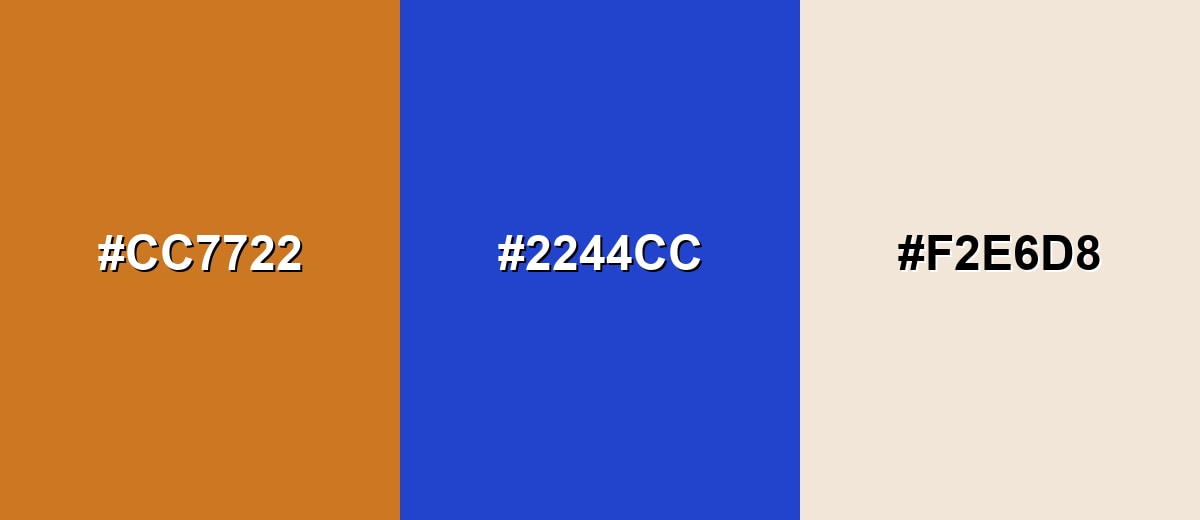
Complementary Colors
The complementary match sits across the wheel and creates strong, clean contrast. A deep blue helps ochre feel sharper and more contemporary, while a soft neutral keeps the palette breathable.
Complementary Palette Example: Combine Ochre with Denim Blue and Warm Sand for a balanced warm-cool palette that still feels natural.
Analogous Color Schemes
Analogous colors sit adjacent to each other on the color wheel, creating harmonious, cohesive palettes with subtle variation.
Ochre, Golden Maize, and Olive Clay create a desert-inspired, earthy flow.
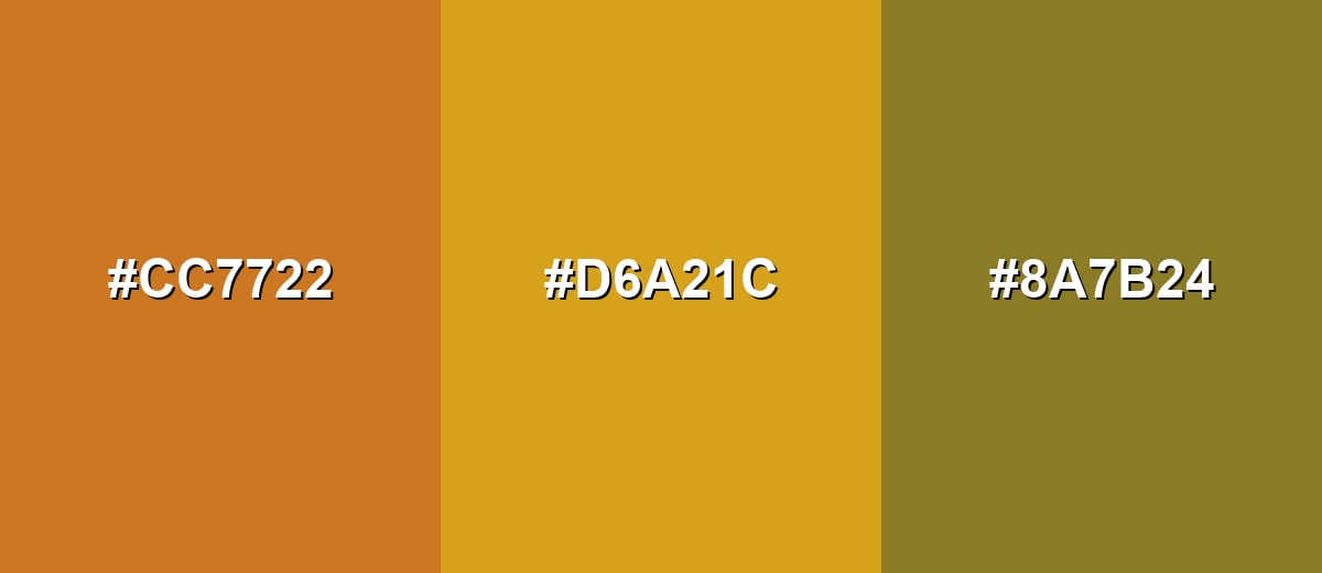
- Ochre: #CC7722
- Golden Maize: #D6A21C
- Olive Clay: #8A7B24
Ochre, Rustic Sienna, and Soft Tan form a warm, layered palette for cozy visuals.
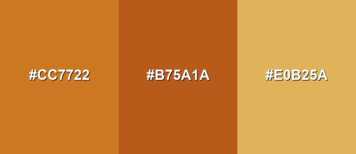
- Ochre: #CC7722
- Rustic Sienna: #B75A1A
- Soft Tan: #E0B25A
Triadic & Tetradic Combinations
A triadic scheme adds variety while staying balanced.
Ochre with Mint Green and Vivid Violet feels energetic and modern, especially for illustration and marketing graphics.
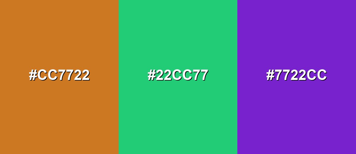
- Ochre: #CC7722
- Mint Green: #22CC77
- Vivid Violet: #7722CC
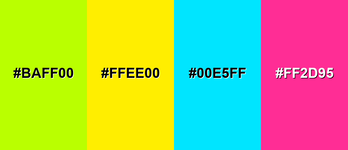
Colors to Avoid
While ochre color is remarkably versatile, certain combinations can create problematic visual effects:
- Neon Lime (#BAFF00) - Creates a harsh, highlighter-like clash that can make ochre look muddy and unrefined.
- Laser Yellow (#FFEE00) - Too close in warmth but far brighter, which can wash out ochre and reduce hierarchy.
- Electric Cyan (#00E5FF) - The saturation gap is extreme, making layouts feel unbalanced unless you deliberately want a loud, pop-art effect.
- Hot Pink (#FF2D95) - Competes for attention and can push the overall look into a playful tone that fights ochre's grounded character.
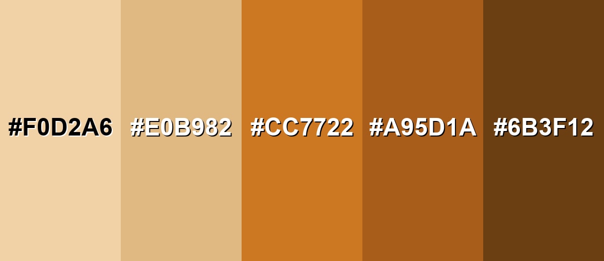
Shades, Tints & Variations of Ochre Color
Ochre isn't just one shade—its range runs from creamy, sunlit tints to deep, leather-like browns. Having a few variations ready makes it easier to build hierarchy (backgrounds, surfaces, accents, and text) while keeping everything in the same warm, earthy family.
- Pale Ochre (#F0D2A6) - A light, creamy tint that keeps the earthy feel while looking airy and soft. It's best used for Backgrounds, large surfaces, minimal UI sections, and gentle product backdrops.
- Light Ochre (#E0B982) - A warm, sunlit tone that reads friendly and natural without feeling too saturated. It's best used for Cards, panels, packaging highlights, and warm interior accents.
- Classic Ochre (#CC7722) - The balanced mid-tone ochre most people recognize: earthy, golden, and slightly rustic. It's best used for Brand accents, buttons, icons, and feature elements that need warm emphasis.
- Deep Ochre (#A95D1A) - A richer, browner variation that feels more grounded and substantial. It's best used for Headers, trims, leather-like textures, and autumn-themed visuals.
- Dark Ochre Brown (#6B3F12) - A deep shade with a strong earthy base that can read almost like a warm brown in low light. It's best used for Text over light tints, outlines, contrast accents, and premium, craft-forward branding.
Industry Applications
Because ochre feels natural and dependable, it fits many industries that want warmth without looking overly trendy. It can work as a signature accent, a background tone, or a supporting shade in a broader earth-tone system.
Fashion & Beauty
- Autumnal palettes, utility styles, and vintage-inspired looks.
- Accessories and outerwear accents that feel durable and classic.
- Editorial shoots that need a natural, sunlit backdrop tone.
- Warm accent color for labels, tags, or lookbook graphics that should feel grounded.
Interior Design & Decor
- Accent walls, textiles, and ceramics for a sun-warmed feel.
- Earth-tone palettes that pair naturally with wood, stone, and natural fibers.
- Hospitality spaces aiming for cozy rather than stark.
- Layering rugs, cushions, and trims using lighter tints and deeper shades for depth.
Branding & Marketing
- Craft and handmade positioning for logos, patterns, and packaging.
- Warm accent in minimalist brand systems that need personality.
- Secondary brand tone for seasonal campaigns and product drops.
- Food and beverage packaging cues for baked, roasted, spiced, or caramel notes.
Conclusion
Ochre is a warm, earthy yellow-orange that brings comfort, heritage, and dependable energy to modern design. With #CC7722 as a reliable reference, you can build everything from soft backgrounds to bold accents—especially when you balance it with cooler blues or clean neutrals to keep contrast crisp. Whether you're designing a brand system, a UI theme, packaging, or an interior mood board, ochre works best when it's treated as a warm anchor and supported with thoughtful spacing, typography, and lighting-aware color checks.
Design Smarter with AI: Media.io is an online AI studio that empowers creators with advanced image generation and enhancement tools. From text-to-image and image-to-image creation to AI upscaling and color optimization, it enables fast, creative, and professional results—all in your browser.

Frequently Asked Questions About Ochre Color
Ochre looks like an earthy yellow-orange, similar to sun-baked clay, dry soil, or a golden-brown mineral pigment. It usually feels warm and natural rather than neon or overly bright.
A commonly used HEX value for ochre in digital design is #cc7722. Depending on the palette and lighting, ochre can shift slightly toward yellow or toward rust.
They are related but not identical. Mustard typically leans more yellow and can feel sharper or more acidic, while ochre is usually earthier and more mineral, often with a subtle brown or clay undertone.
Cool blues are a strong match because they balance ochre's warmth and improve visual contrast. Earthy neighbors like tan and sienna create smooth tonal palettes, while a green or violet accent can add a modern, energetic twist.
Treat ochre as an accent for highlights, icons, and components rather than body text. Keep text on high-contrast backgrounds, and don't rely on hue alone for states like errors or selection—use weight, icons, and clear patterns too.
Screens mix light (RGB) while print uses inks (CMYK), so warm earth tones can deepen or dull depending on paper and ink profiles. Always soft-proof when possible and do a small test print for critical brand or packaging work.


