

The color Midnight green is a very dark, cool green that reads like teal in low light and looks almost black at a distance. Its signature HEX code is #004953, which gives it a deep ocean tone on screens and in print.
People often associate it with composure, depth, and quiet confidence. Because it sits between green and blue, it can shift slightly depending on lighting and surrounding hues.
Midnight Green Color: Codes & Values
Here are the core color codes for midnight green, so you can match #004953 consistently across web, UI, and print.
| Parameters | VALUE |
| HEX Code | #004953 |
| RGB DECIMAL | 0, 73, 83 |
| RGB PERCENTAGE | 0%, 29%, 33% |
| CMYK | 100%,12%,0%,67% |
| HSL | 187°, 100%, 16% |
| HSV (HSB) | 187°, 100%, 33% |
| Web Safe | #003366 |
Key Color Space Explanations:
- HEX - HEX is the most common way to specify midnight green for web and UI work. Use it directly in CSS and design tools to match the shade consistently.
- RGB - RGB describes how much red, green, and blue light create the shade on screens. It is useful for digital graphics, video overlays, and UI components.
- CMYK - CMYK is used for printing with cyan, magenta, yellow, and black inks. It helps you predict how midnight green will reproduce on paper and packaging.
- HSL - HSL expresses hue, saturation, and lightness, which makes it easier to create lighter or darker variations. It is handy when building consistent themes and gradients.
- Web Safe - Web-safe values map the shade to the closest legacy palette used on older displays. It is mainly helpful for compatibility checks and quick approximations.
If you're designing for screens, start with HEX or RGB; for print, check CMYK first and run a small proof to confirm how the dark teal tone reproduces.
Midnight Green Color Conversions
Use this conversion table to copy the right value into your design tool, CSS, or print workflow without guesswork.
| Parameters | VALUE | CSS |
| HEX | #004953 | #004953 |
| RGB DECIMAL | 0, 73, 83 | rgb(0,73,83) |
| RGB PERCENTAGE | 0%, 29%, 33% | rgb(0%,29%,33%) |
| CMYK | 100%,12%,0%,67% | cmyk(100%,12%,0%,67%) |
| HSL | 187°, 100%, 16% | hsl(187°, 100%, 16%) |
| HSV (or HSB) | 187°, 100%, 33% | -- |
| Web Safe | 003366 | #003366 |
| CIE-LAB | 28, -17, -12 | -- |
| XYZ | 3.94, 5.39, 9.02 | -- |
| xyY | 0.215, 0.294, 5.39 | -- |
| CIE-LCH | 28, 20, 215 | -- |
| CIE-LUV | 28, -21, -13 | -- |
| Hunter-Lab | 23, -9, -9 | -- |
| Binary | 00000000 01001001 01010011 | -- |
Want to generate midnight green color photos or posters? Try Media.io's AI Image Generator now!
Midnight Green Meaning & Symbolism
Midnight green commonly represents depth, steadiness, and discretion. Because it is darker and cooler than most greens, it often feels more reserved and formal in everyday visuals. In many contexts, it reads as a thoughtful alternative to black or navy while still keeping a natural, grounded edge.
Psychological Effects
Because it's dark and cool, midnight green changes the "energy level" of a layout fast.
- Calm Focus - Midnight green can make a layout feel calm and controlled, helping content stand out without visual noise.
- Reduced Distraction - It tends to quiet busy screens, which is why it fits dashboards, headers, and background surfaces.
- Mature Tone - It signals maturity and seriousness without the harshness that pure black sometimes brings.
- Quiet Confidence - In branding and UI, it can suggest reliability and composure when paired with soft neutrals and clear type.
- Heavy If Under-Contrasted - Large dark areas can feel distant or cold when contrast is too low, so warm accents and spacing matter.
Positive Associations
These are the common "good" signals designers pull from midnight green in modern visuals.
- Depth - Its deep teal character adds visual weight and richness, especially as a base tone.
- Steadiness - The grounded green-blue balance often reads as stable and dependable.
- Discretion - It feels reserved and refined, making it a smart alternative to loud or overly bright colors.
- Professional Polish - Sitting close to teal, it can hint at professionalism and modern clarity.
- Natural Edge - Unlike plain navy or charcoal, it keeps a subtle connection to nature and calm.
Cultural Significance Across the World
Meaning shifts by context, but these themes show up often when midnight green is used thoughtfully.
- Nature & Stability - Green is widely linked with nature and stability, and the midnight tone adds a private, sophisticated mood.
- Water & Depth - Because it sits close to teal, it can evoke water, deep space, and a sense of quiet scale.
- Modern Professionalism - In contemporary visual communication, it can read as a serious, polished brand color.
- Context-First Symbolism - Symbolism varies by setting, so pairing and usage usually matter more than any fixed meaning.
Design Applications
Midnight green is most effective when you treat it as a deep base tone and build contrast around it. It can anchor a palette, sharpen hierarchy, and add a premium feel without looking flashy.
Graphic Design Tips
- Use it for app headers, sidebars, and footers when you want a dark theme that's softer than pure black.
- Pair with warm off-whites to keep contrast readable and avoid a sterile, cold look.
- Add one brighter accent to create a clear focal point and keep the palette intentional.
- Avoid stacking multiple near-black tones together unless typography weight and spacing are doing the heavy lifting.
- For accessibility, light text on midnight green generally performs better than dark text on it.
Pro tip: treat #004953 as your anchor surface, then use warm neutrals for readability and a single controlled highlight color for buttons, links, or key metrics.
Midnight Green in Photography & Video
- Use it as a deep backdrop tone to add depth without the harshness of pure black.
- In color grading, it can push a scene toward a calm, controlled mood—especially when balanced with warm highlights.
- For overlays and titles, keep typography light and clean so the dark teal base doesn't swallow fine details.
- When scenes feel cold or somber, add warmer accents to bring back approachability and separation.
- Because it can read almost black at a distance, test on multiple displays and lighting conditions to confirm contrast.
Recommended Tool for Image Enhancement: When incorporating midnight green into your photography projects, Media.io's AI Image tools can help you achieve more refined results. With AI-powered color enhancement, photo colorization, image upscaling, and old photo restoration, you can easily enrich midnight green tones, improve overall image quality, and highlight the color's elegant and sophisticated aesthetic.
Color Combinations
Midnight green pairs beautifully with warm neutrals, muted earth tones, and carefully chosen brights. Below are practical schemes you can use for branding, UI palettes, and visual systems.
Complementary Colors
A complementary partner adds energy by opposing midnight green on the color wheel. This works best when the warm tone is used as an accent rather than a full background.
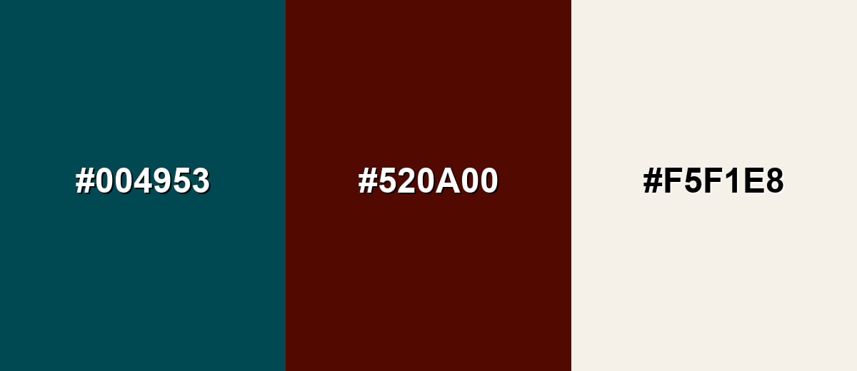
Complementary Palette Example: Try midnight green with a deep rust accent and a soft ivory to keep the look rich but readable.
Analogous Color Schemes
Analogous colors sit adjacent to each other on the color wheel, creating harmonious, cohesive palettes with subtle variation.
Ocean-leaning analogs feel cohesive and modern, ideal for calm interfaces and editorial accents.
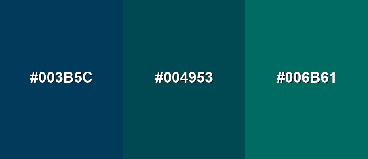
- Deep Blue: #003B5C
- Midnight Green: #004953
- Deep Sea Green: #006B61
Greener analogs add a natural mood while staying dark and sophisticated for premium palettes.
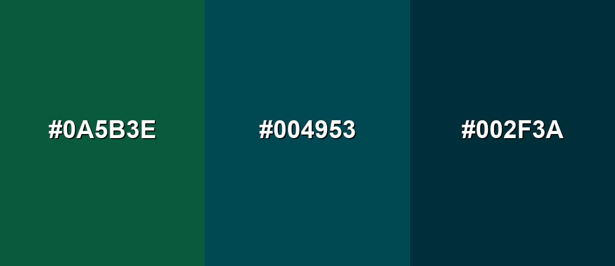
- Dark Emerald: #0A5B3E
- Midnight Green: #004953
- Deep Cyan Black: #002F3A
Triadic & Tetradic Combinations
A triadic scheme adds variety while keeping balance, giving you three distinct roles: base, accent, and highlight.
Use midnight green as the anchor, plum for a creative accent, and dark mustard for warm emphasis.
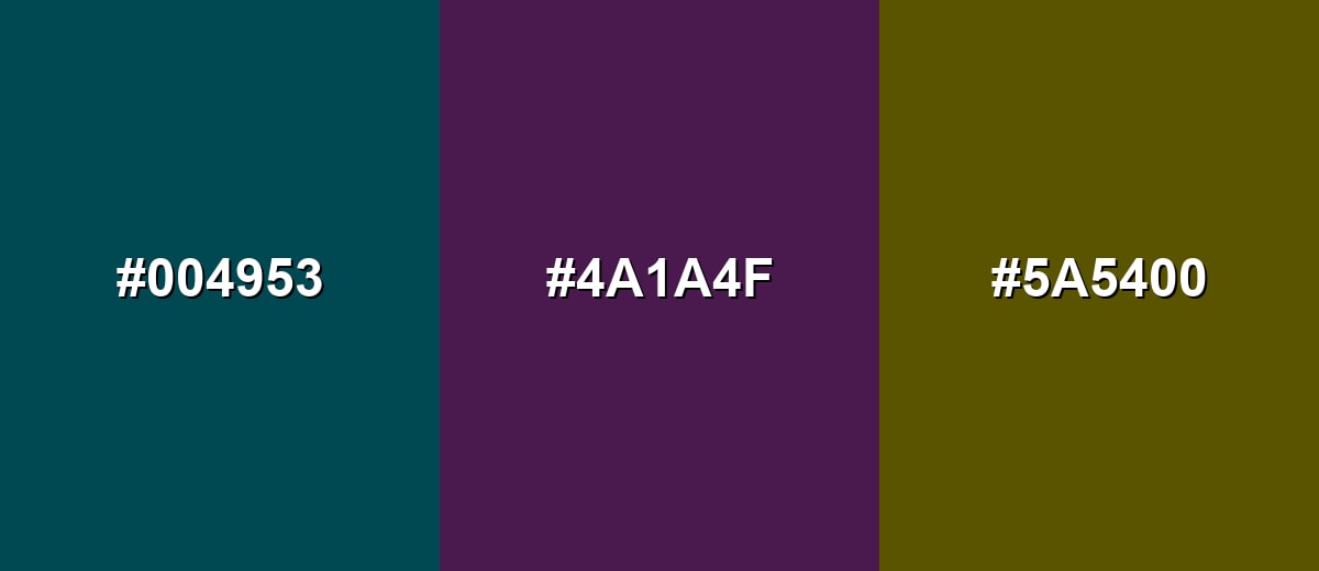
- Midnight Green: #004953
- Deep Plum: #4A1A4F
- Dark Mustard: #5A5400
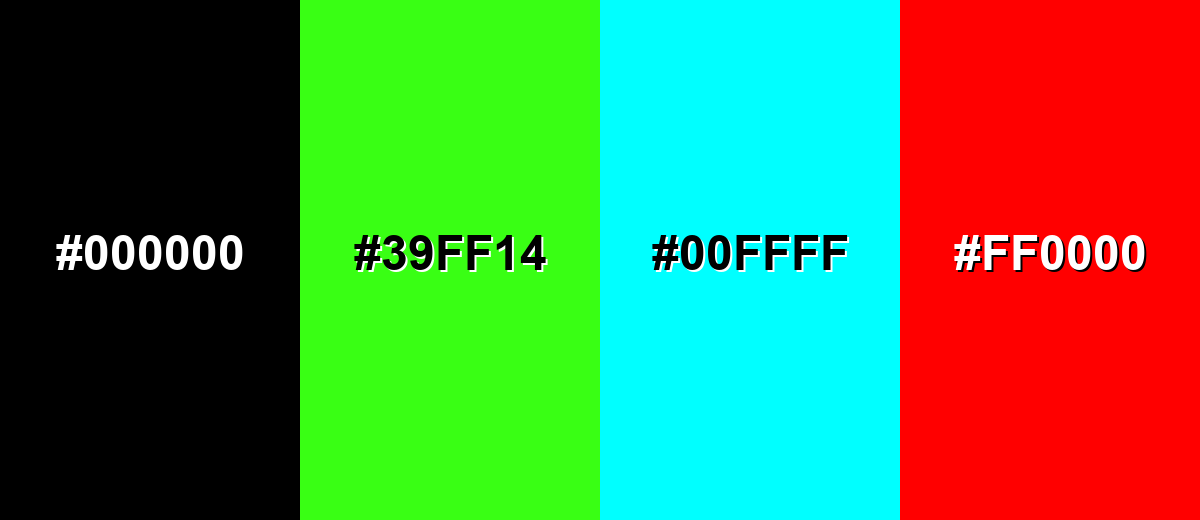
Colors to Avoid
While midnight green is remarkably versatile, certain combinations can create problematic visual effects:
- Pure Black (#000000) - It can crush contrast and make midnight green look flat, especially in dark UI themes with subtle shadows.
- Neon Green (#39FF14) - The brightness clashes with the subdued tone and can feel jarring or overly sporty.
- Bright Cyan (#00FFFF) - Highly saturated cyan competes with the blue-green undertone and can create a harsh, vibrating edge on screens.
- Pure Red (#FF0000) - Strong red creates aggressive contrast that can overpower the refined mood and may look festive rather than elegant.
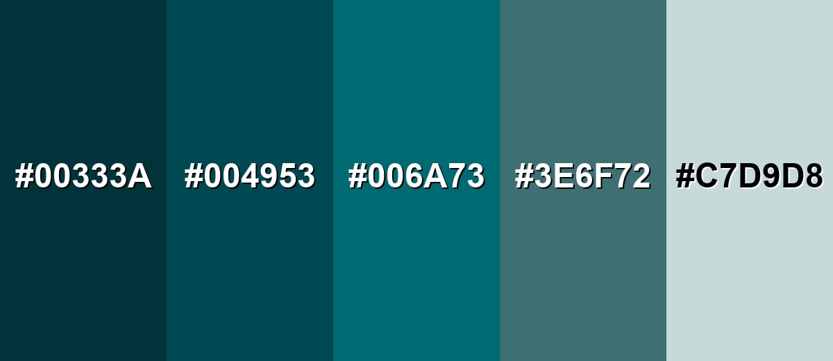
Shades, Tints & Variations of Midnight Green
Midnight green isn't just one flat swatch—its range includes near-black depths, clearer teals, and soft seafoam tints. Having a few related variations makes it much easier to build hierarchy (backgrounds, surfaces, accents, and highlights) without drifting away from the original mood.
- Deep Midnight Green (#00333A) - A darker, near-black variant with a cool teal cast that stays subtle in low light. It's best used for Navigation bars, dark backgrounds, and premium packaging where you want depth without pure black.
- Midnight Green (#004953) - The classic midnight green shade: deep, cool, and slightly blue-leaning. It's best used for Brand anchors, UI surfaces, and accents that need a calm but confident presence.
- Deep Teal (#006A73) - A clearer teal variation that keeps the mood serious while improving visibility. It's best used for Buttons, highlights, charts, and interactive states on dark themes.
- Dusty Sea Green (#3E6F72) - A muted mid-tone that feels softer and more approachable than the base shade. It's best used for Secondary UI elements, infographics, and backgrounds where you want less contrast.
- Pale Seafoam Tint (#C7D9D8) - A light, airy tint with a cool, clean finish that pairs easily with deep tones. It's best used for Background fills, cards, spacious layouts, and gentle contrast with dark typography.
Industry Applications
Because it feels steady and polished, midnight green shows up across digital products and physical design. It works best when you use it to create hierarchy and let supporting tones handle brightness and warmth.
Fashion & Beauty
- Use midnight green as a deep base that feels refined and mature, similar to black or navy but with a fresher edge.
- Pair it with warm off-whites and ivory for a softer, more wearable contrast.
- Bring in gold/brass-like accents to keep the look polished and intentional.
- Keep contrast strong so the color doesn't read too heavy or distant in low light.
Interior Design & Decor
- Use it on accent walls and cabinetry for a moody, refined look.
- Pair it with wood, brass, and warm textiles to prevent a cold feel.
- Try it as statement upholstery with light walls for balanced contrast.
- Use it to create depth and restraint in spaces where you want a calm, controlled atmosphere.
Branding & Marketing
- Use it as a primary brand base for premium or heritage-leaning identities.
- Apply it as a secondary accent for wordmarks, monograms, and brand patterns.
- Use it as a background for product photography to add depth.
- In dark mode UI, pair it with warm neutrals for readable typography and a modern, steady tone.
Conclusion
Midnight green (#004953) stands out for its deep, teal-leaning character that feels calm, polished, and quietly confident. It's dark enough to anchor layouts like navy or charcoal, yet it keeps a subtle natural edge that works beautifully in modern branding, UI surfaces, and premium packaging. The key is contrast: lean on warm off-whites for readability, avoid piling on near-black tones, and use one purposeful accent to guide attention. When you build a palette around its shades and tints, midnight green delivers depth without sliding into gloomy or overly formal.
Design Smarter with AI: Media.io is an online AI studio that empowers creators with advanced image generation and enhancement tools. From text-to-image and image-to-image creation to AI upscaling and color optimization, it enables fast, creative, and professional results—all in your browser.

Frequently Asked Questions About Midnight Green Color
Midnight green is a very dark green with a noticeable blue-teal undertone. In dim light it can appear almost black, but in brighter settings it reads like deep ocean green.
A commonly used HEX value for midnight green is #004953. This code is widely recognized in digital design and matches the classic deep teal-leaning appearance.
It sits between the two, but it usually leans slightly toward blue because of its teal undertone. Surrounding hues and lighting can push it to look greener or bluer in practice.
Warm off-whites, ivory, beige, brass or gold accents, and muted earth tones pair well. For bolder contrast, deep rust or plum can work when used in smaller doses.
Yes, it is a strong dark-mode base because it feels softer than pure black while still offering depth. Use high-contrast text and clear interactive states to maintain readability.
Mix it with light neutral tints (like pale seafoam or off-white) rather than adding pure white aggressively. In HSL terms, raising lightness while slightly reducing saturation often keeps the result looking natural.


