

 TL;DR:
Dark green (HEX #006400) is a stabilizing, nature-linked color that serves as a premium alternative to black in design, functioning best when balanced with warm neutrals to prevent visual heaviness.
● Pairs optimally with warm beige, cream, and deep reds for structured contrast, but avoid combining it with pure black, dark brown, or charcoal gray to prevent muddy tones and poor visual separation.
● Carries a critical low-contrast risk requiring verification for small typography readability, careful monitoring of shadow clipping in low-light photography, and mandatory test printing to check for unintended gray or overly black ink shifts.
● Functions effectively as a "base neutral" in user interfaces and interior spaces, particularly when anchored by lighter contrasting elements or warm material textures like brass and wood.
Ask AI for a summary
 ChatGPT
 Perplexity
 Gemini
 Claude
 Grok
Grok
Dark green color is a deep, rich green that looks like dense pine needles or shaded leaves in a forest. A common digital reference for it is the hex code #006400.
It's often read as grounded, steady, and quietly confident—strongly tied to nature and endurance. Below, you'll find dark green color meaning, key codes, best combinations, popular shade ideas, and practical ways to use it without losing contrast or clarity.
Dark Green Color: Codes & Values
If you're building a palette or matching dark green across tools, these are the most useful values to keep on hand.
| Parameters | VALUE |
| HEX Code | #006400 |
| RGB DECIMAL | 0, 100, 0 |
| RGB PERCENTAGE | 0%, 39.22%, 0% |
| CMYK | 100%,0%,100%,61% |
| HSL | 120°, 100%, 20% |
| HSV (HSB) | 120°, 100%, 39% |
| Web Safe | #006600 |
Key Color Space Explanations:
- HEX - HEX is the most common code used on the web. #006400 describes the red, green, and blue channels in a compact format.
- RGB - RGB defines how much red, green, and blue light a screen emits. Dark green uses low red and blue with a stronger green channel.
- CMYK - CMYK is mainly used for printing and describes ink percentages. It helps you predict how dark green will reproduce on paper compared with screens.
- HSL - HSL groups the shade by hue, saturation, and lightness, which can feel more intuitive for adjustments. It is useful when you want lighter or deeper variations while keeping the same green identity.
- Web Safe - Web-safe values come from a limited palette designed for older displays. #006600 is a close match when you need a safer legacy-friendly alternative.
Use HEX for web design, RGB for screen-based tools, and CMYK when you're preparing files for print (always test on your final paper stock when possible).
Dark Green Color Conversions
Need dark green in different color models for design, development, or printing? Use this conversion table as a quick reference.
| Parameters | VALUE | CSS |
| HEX | #006400 | #006400 |
| RGB DECIMAL | 0, 100, 0 | rgb(0,100,0) |
| RGB PERCENTAGE | 0%, 39.22%, 0% | rgb(0%,39.22%,0%) |
| CMYK | 100%,0%,100%,61% | cmyk(100%,0%,100%,61%) |
| HSL | 120°, 100%, 20% | hsl(120°, 100%, 20%) |
| HSV (or HSB) | 120°, 100%, 39% | -- |
| Web Safe | 006600 | #006600 |
| CIE-LAB | L* 36.2, a* -45.5, b* 42.2 | -- |
| XYZ | X 6.2, Y 12.5, Z 2.1 | -- |
| xyY | x 0.29, y 0.59, Y 12.5 | -- |
| CIE-LCH | L* 36.2, C* 62.1, h° 137.2 | -- |
| CIE-LUV | L* 36.2, u* -51.0, v* 49.5 | -- |
| Hunter-Lab | L 35.4, a -33.0, b 30.5 | -- |
| Binary | 00000000 01100100 00000000 | -- |
Want to generate dark green color photos or posters? Try Media.io's AI Image Generator now!
Dark Green Meaning & Symbolism
Dark green is widely linked with nature, resilience, and stability. It tends to feel more mature and grounded than brighter greens, which makes it a common choice when you want a calm but confident look in everyday visuals.
Psychological Effects
In design, dark green can make layouts feel calm, structured, and more intentional.
- Steady - Dark green often reads as stable and reassuring, especially in navigation and large background areas.
- Organized - Its deep value can reduce visual noise and help pages feel more structured.
- Serious - Used too heavily, it may feel overly formal or weighty in small, dense interfaces.
- Low-Contrast Risk - Without enough separation, dark green can look dull or become hard to read on screens.
- Nature-Linked - It commonly reinforces reliability, quality, and a connection to the natural world.
Positive Associations
These themes show up often in branding, packaging, and interiors where dark green is used as a core color.
- Resilience - It's frequently tied to endurance and long-term strength.
- Stability - A grounded tone that supports "dependable" or "trusted" messaging.
- Calm - Helps designs feel quieter and less visually loud than bright greens.
- Confidence - Communicates a subtle, mature confidence without demanding attention.
- Comfort - In interiors, it can make spaces feel cozy and contained (especially with warm lighting).
Cultural Significance Across the World
Meanings can shift by culture and context, so it's best to judge dark green within the full palette and message.
- Growth - Green commonly symbolizes renewal and growth across many settings.
- Tradition - Darker greens are often connected to forests, heritage, and timelessness.
- Strength - A frequent visual shorthand for durability and long-term value.
- Context-Dependent - Interpretation varies by audience, industry, and surrounding colors.
Design Applications
Dark green is a practical alternative to black when you want depth, warmth, and a natural feel—without losing that "premium" weight.
Graphic Design Tips
- Use dark green for headers, sidebars, or section dividers to create a confident visual anchor.
- Pair it with off-whites and warm neutrals so the layout doesn't feel cold or heavy.
- In print, test on the final stock—dark green can shift gray or overly black depending on paper and ink coverage.
- Keep small typography out of dark green unless contrast and dot gain are verified.
- Validate contrast ratios for body text, icons, and interactive states in real components.
Pro tip: treat dark green like a "base neutral" and let one lighter neutral (cream, warm beige, or soft gray) carry most of the background space—your greens will look richer and your UI will feel less dense.
Dark Green in Photography & Video
- Use dark green backgrounds to make skin tones and warm highlights feel more cinematic and grounded.
- Watch shadow detail—dark greens can clip quickly in low light, especially after compression.
- Balance with warm accents (wood, brass, beige props) to avoid a flat, "cold forest" look.
- For product shots, keep the green slightly separated from the subject with rim light or a brighter neutral surface.
- In color grading, keep saturation controlled so the green reads premium, not neon.
Recommended Tool for Image Enhancement: When incorporating dark green into your photography projects, Media.io's AI Image tools can help you achieve more refined results. With AI-powered color enhancement, photo colorization, image upscaling, and old photo restoration, you can easily enrich dark green tones, improve overall image quality, and highlight the color's elegant and sophisticated aesthetic.
Color Combinations
Dark green pairs best with warm neutrals, earthy browns, and carefully chosen accents that add light or energy. Use the schemes below as starting points, then adjust brightness to match your layout and contrast needs.
Complementary Colors
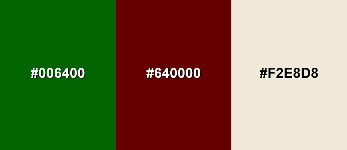
A complementary scheme uses a hue from the opposite side of the wheel to create strong contrast. With dark green, deep reds can look refined rather than loud when you control saturation.
Complementary Palette Example: Balance dark green with a deep maroon and a soft beige to keep the contrast bold but usable.
Analogous Color Schemes
Analogous colors sit adjacent to each other on the color wheel, creating harmonious, cohesive palettes with subtle variation.
A cool-leaning set that moves from teal-green into olive for a natural, layered look.
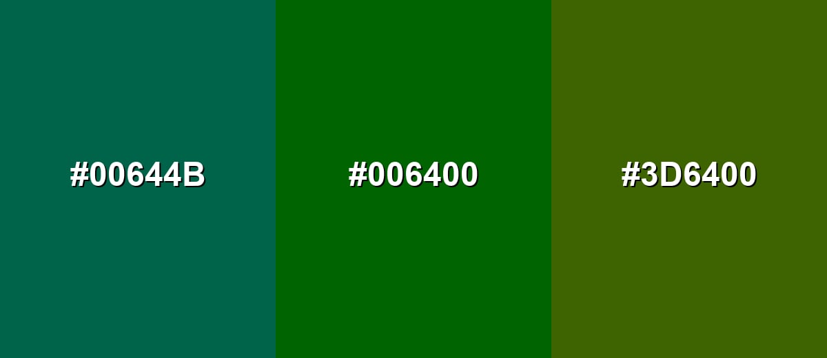
- Deep Green Teal: #00644B
- Dark Green: #006400
- Dark Olive: #3D6400
A slightly brighter, outdoorsy set that stays cohesive while adding a hint of yellow-green energy.
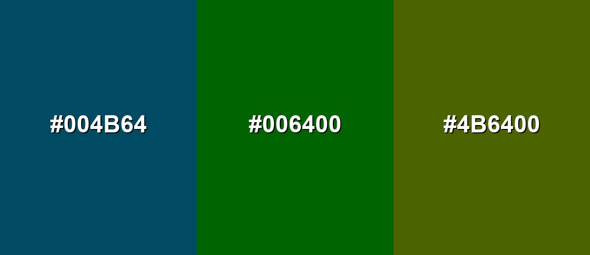
- Deep Blue Green: #004B64
- Dark Green: #006400
- Mossy Olive: #4B6400
Triadic & Tetradic Combinations
A triadic scheme uses three evenly spaced hues to create contrast with balance.
Combine dark green with deep navy and deep maroon for a strong, classic triad that still feels grounded.
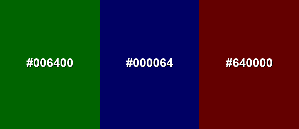
- Dark Green: #006400
- Deep Navy: #000064
- Deep Maroon: #640000
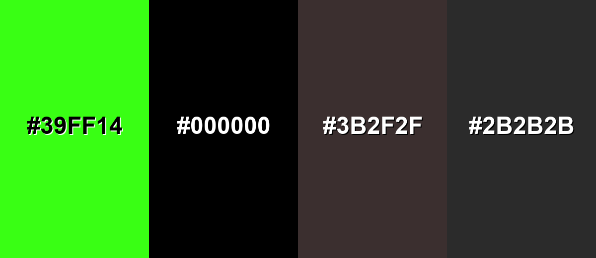
Colors to Avoid
While dark green is remarkably versatile, certain combinations can create problematic visual effects:
- Neon Green (#39FF14) - Its high intensity can overpower dark green and make the overall look feel unstable or harsh.
- Pure Black (#000000) - In large areas it can feel too heavy next to dark green, reducing separation and making layouts look overly dark.
- Dark Brown (#3B2F2F) - The combination can turn muddy, especially in low light or on matte prints where tones blend together.
- Charcoal Gray (#2B2B2B) - Both tones sit low in brightness, so edges and text can lose clarity without a lighter buffer.
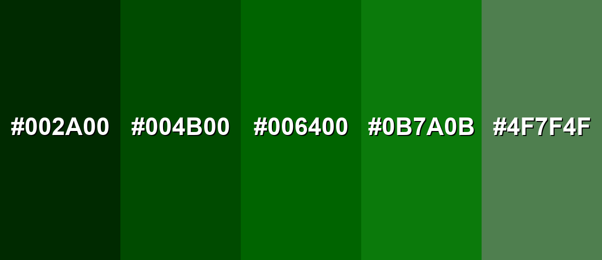
Shades, Tints & Variations of Dark Green
Dark green isn't just one tone—it runs from near-black pines to softer, grayer sages. Exploring a few variations makes it easier to build hierarchy (backgrounds, accents, states) while keeping the overall look cohesive.
- Black Pine (#002A00) - An extra-deep green that reads almost black, with a subtle natural undertone. It's best used for Use for dramatic headers, luxury packaging accents, and dark-mode foundations where you want warmth instead of pure black.
- Deep Forest (#004B00) - A darker, denser take that still feels clearly green but stays understated. It's best used for Great for sidebars, hero backgrounds, and evergreen brand elements that need a serious tone.
- Classic Dark Green (#006400) - A balanced dark green with strong saturation and a familiar, natural feel. It's best used for Works well for primary accents, buttons, icons, and brand marks that need a steady presence.
- Pine Green (#0B7A0B) - A slightly brighter variation that feels fresher while staying grounded. It's best used for Use for highlights, positive states, and supporting accents when the base tone feels too heavy.
- Muted Sage Green (#4F7F4F) - A softened, gray-leaning green that is calmer and more flexible in backgrounds. It's best used for Ideal for large surfaces, cards, and interior-inspired palettes where you want a relaxed, natural atmosphere.
Industry Applications
Because it reads stable, natural, and premium, dark green shows up everywhere—from product interfaces to interiors—especially when brands want a calmer alternative to pure black.
Fashion & Beauty
- Use dark green as a core wardrobe shade for an understated, "evergreen" look that still feels elevated.
- Pair it with warm neutrals (cream, beige) for softer contrast in lookbooks and campaign visuals.
- For premium beauty packaging, combine dark green with matte finishes and cream typography for a refined shelf presence.
- Use it as a supporting accent rather than the only dark tone to keep product labels readable and clean.
Interior Design & Decor
- Try dark green on cabinetry or an accent wall to create a timeless, cozy room foundation.
- Combine with wood and stone textures to strengthen the natural material story.
- Add brass or warm metallic details so the palette doesn't feel too muted.
- Use lighter trims and textiles to maintain separation and avoid a cave-like effect.
Branding & Marketing
- Great for identity systems that need a grounded, trustworthy tone without relying on bright green.
- Works well on premium labels and heritage-inspired designs where depth matters.
- In web and product UI, use it for navigation bars, footers, and "anchoring" sections with light text.
- For packaging and retail, dark green pairs cleanly with cream or gold accents for a premium, botanical feel.
Conclusion
Dark green stands out for its depth, natural character, and ability to feel calm and serious at the same time. Whether you're designing a brand system, building UI components, or choosing a palette for print, starting with #006400 makes it easy to stay consistent across formats. For the most reliable results, balance dark green with warm neutrals to keep layouts open and readable, and use controlled complementary reds when you want contrast that looks intentional rather than loud.
Design Smarter with AI: Media.io is an online AI studio that empowers creators with advanced image generation and enhancement tools. From text-to-image and image-to-image creation to AI upscaling and color optimization, it enables fast, creative, and professional results—all in your browser.

Frequently Asked Questions About Dark Green Color
A widely used hex code for dark green is #006400, which is also the standard CSS name DarkGreen in many design and development contexts.
Dark green is commonly associated with nature, stability, endurance, and quiet confidence. It often feels more mature and grounded than brighter greens.
It depends on the undertone. Dark green can feel cooler when it leans toward blue-green, and warmer when it leans toward olive or yellow-green.
Warm neutrals like beige and cream are easy pairings, while deep reds can provide strong complementary contrast. Navy, muted gold, and natural wood tones also combine well with dark green.
Use it as an anchor for navigation or key components, then add lighter backgrounds and generous spacing. Clear contrast for text and interactive states prevents the interface from looking dense.
Dark green is a broad label for deep greens, while forest green usually implies a slightly more natural, outdoorsy variation that may be less saturated or a touch lighter depending on the palette.


