

 TL;DR:
To effectively use pure yellow (HEX #FFFF00, RGB 255, 255, 0) in digital and print design without causing visual fatigue, restrict its application to high-priority UI accents or callouts while strictly pairing it with dark text to maintain accessibility.
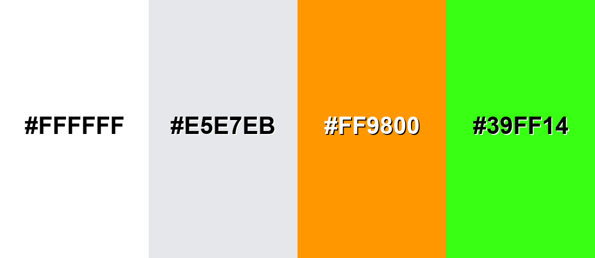
● Avoid pairing yellow with pure white, light gray (#E5E7EB), or neon green (#39FF14), as these combinations severely reduce readability, weaken visual hierarchy, and cause straining visual vibrations.
● Maintain cross-platform consistency by restricting HEX or RGB profiles to digital components, while exclusively using CMYK (0%, 0%, 100%, 0%) with soft-proofing for print outputs to prevent unpredictable ink shifts.
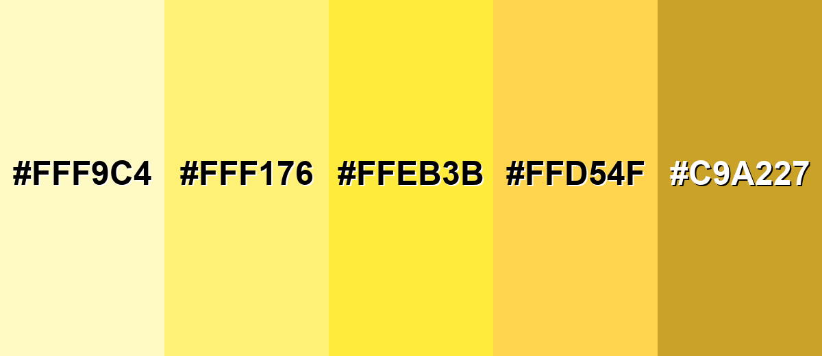
● Adapt the color's mood by shifting to specific shade variants: select Golden Yellow (#FFD54F) for premium brand warmth, Pastel Yellow (#FFF9C4) for readable background panels, or Mustard Yellow (#C9A227) for earthy editorial layouts requiring higher text stability.
Ask AI for a summary
 ChatGPT
 Perplexity
 Gemini
 Claude
 Grok
Grok
Yellow sits between green and orange on the color wheel and is one of the most visible, attention-grabbing colors in the spectrum. The yellow color meaning is commonly associated with sunshine, optimism, energy, and clarity. Because of its high brightness and natural warmth, yellow instantly draws the eye—making it a powerful choice for branding, marketing visuals, UI highlights, and call-to-action elements.
In this guide, you'll explore yellow color codes (HEX, RGB, CMYK), accurate color conversions, symbolism and psychology, design applications, color combinations, popular shades and tints, and industry-specific uses—so you can apply yellow confidently across digital and print projects.
Yellow Color: Codes & Values
Use these standard yellow color codes to keep your UI, web, and print work consistent across tools and exports.
| Parameters | VALUE |
| HEX Code | #FFFF00 |
| RGB DECIMAL | 255, 255, 0 |
| RGB PERCENTAGE | 100%, 100%, 0% |
| CMYK | 0%,0%,100%,0% |
| HSL | 60°, 100%, 50% |
| HSV (HSB) | 60°, 100%, 100% |
| Web Safe | #FFFF00 |
Key Color Space Explanations:
- HEX is the most common way to specify yellow in web design and UI tools. It encodes the red, green, and blue channels in a compact format.
- RGB defines yellow by mixing light on screens using red, green, and blue values. Higher values produce brighter results, which is why yellow often looks very luminous.
- CMYK is used for print, describing the mix of cyan, magenta, yellow, and black inks. Yellow-heavy colors can shift depending on paper and ink profiles, so soft-proofing helps.
- HSL describes yellow by hue, saturation, and lightness, which is useful when creating tints and shades consistently. It's a practical model for adjusting brightness without changing the hue too much.
- Web Safe colors are a legacy set designed to render consistently on older displays. Today they're mainly a reference point for simple, predictable palettes.
If you're building a design system, keep HEX/RGB for digital components and use CMYK when preparing print-ready files to reduce surprises at output.
Want to generate yellow color photos or posters? Try Media.io's AI Image Generator now!
Yellow Color Conversions
Need yellow in a different color model? Here are quick conversions you can copy into design tools, CSS, or print workflows.
| Parameters | VALUE | CSS |
| HEX | #ffff00 | #ffff00 |
| RGB DECIMAL | 255, 255, 0 | rgb(255,255,0) |
| RGB PERCENTAGE | 100%, 100%, 0% | rgb(100%,100%,0%) |
| CMYK | 0%,0%,100%,0% | cmyk(0%,0%,100%,0%) |
| HSL | 60°, 100%, 50% | hsl(60°,100%,50%) |
| HSV (or HSB) | 60°, 100%, 100% | -- |
| Web Safe | ffff00 | #ffff00 |
| CIE-LAB | 97.14, -21.56, 94.48 | -- |
| XYZ | 77.00, 92.78, 13.85 | -- |
| xyY | 0.419, 0.505, 92.78 | -- |
| CIE-LCH | 97.14, 96.91, 102.9° | -- |
| CIE-LUV | 97.14, 7.70, 106.79 | -- |
| Hunter-Lab | 96.98, -17.23, 95.83 | -- |
| Binary | 11111111, 11111111, 00000000 | -- |
Yellow Meaning & Symbolism
Yellow is widely read as bright and uplifting, largely because it's associated with sunlight and high visibility. In design, it can signal friendliness and urgency at the same time, depending on how it's used.
Psychological Effects
Because it's so luminous, yellow can change how "loud" a layout feels in just a few touches.
- Optimism And Warmth - Often linked to sunlight, yellow can make a scene feel brighter and more welcoming.
- Clarity And Alertness - Its high visibility helps draw the eye to important cues and moments.
- Creativity And Playfulness - Yellow can add a lively, idea-driven energy to visuals and illustrations.
- Approachability And Friendliness - Used as an accent, it can make interfaces and branding feel more open and upbeat.
- Visual Fatigue - Visual fatigue when overused at high brightness can make designs feel tiring.
Positive Associations
When balanced well, yellow is a fast way to communicate brightness without feeling aggressive.
- Optimism And Warmth - Helps set a sunny, uplifting tone in brand moments and announcements.
- Clarity And Alertness - Great for highlights and callouts where you want instant recognition.
- Creativity And Playfulness - Adds a fun, inventive feel that supports cheerful themes.
- Approachability And Friendliness - Common in friendly UI accents and welcoming onboarding touches.
- High Visibility - Associated with sunlight and high visibility, making it easy to notice quickly.
Cultural Significance Across the World
Yellow meaning can change by audience and context, so pair it with clear messaging when it matters.
- Context Matters - Color meanings can shift with context, industry, and audience expectations.
- Safety And Warnings - When yellow is used for safety, warnings, or status signals, rely on supporting text and icons so the message doesn't depend on color alone.
- Status Signals - In status moments, add labels and icons so the interpretation is consistent.
- Seasonal And Sunny Themes - Yellow is often used for seasonal and sunny themes where brightness is part of the story.
Design Applications
Because yellow is naturally bright, small adjustments to contrast and saturation can make a big difference. Use it intentionally: as a spotlight, a highlight, or a supportive accent rather than a constant background.
Graphic Design Tips
- Use yellow for badges, highlights, and subtle notifications rather than large body sections.
- Pair with dark text for readability; light text on yellow typically loses clarity fast.
- Reserve the brightest yellows for small, high-priority UI moments to avoid visual strain.
- Use a strong outline or a dark supporting color when yellow needs to be legible at small sizes.
- Don't rely on yellow alone to convey meaning; add labels, patterns, or icons.
Yellow is often the first color to fail contrast checks when paired with light neutrals.
Yellow in Photography & Video
- Use yellow to simulate sunlight, glow, and highlights.
- Combine with cool hues to create depth and pop.
- Use gradients sparingly; keep the center of attention clear.
- Small adjustments to contrast and saturation can make a big difference.
- Avoid very light yellows for fine text because they can disappear under certain lighting.
Recommended Tool for Image Enhancement: When incorporating yellow into your photography projects, Media.io's AI Image tools can help you achieve more refined results. With AI-powered color enhancement, photo colorization, image upscaling, and old photo restoration, you can easily enrich yellow tones, improve overall image quality, and highlight the color's elegant and sophisticated aesthetic.
Color Combinations
Yellow can be energetic, elegant, or sporty depending on what you pair it with. The palettes below give you reliable starting points for contrast, harmony, and emphasis.
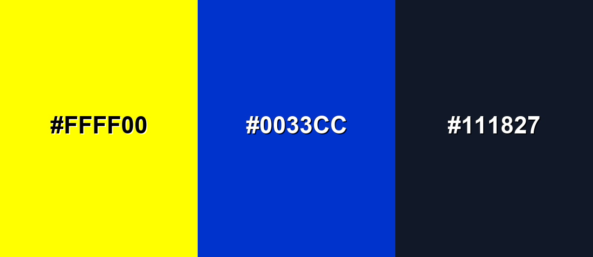
Complementary Colors
A complementary palette pairs yellow with a blue hue for strong contrast. This is a classic approach when you want yellow to feel vivid without becoming overwhelming.
Complementary Palette Example: Use yellow for highlights, blue for structure, and a dark neutral to keep the layout readable.
Analogous Color Schemes
Analogous colors sit adjacent to each other on the color wheel, creating harmonious, cohesive palettes with subtle variation.
Yellow + Amber + Lime creates a lively, sun-to-leaf transition that feels natural and upbeat.
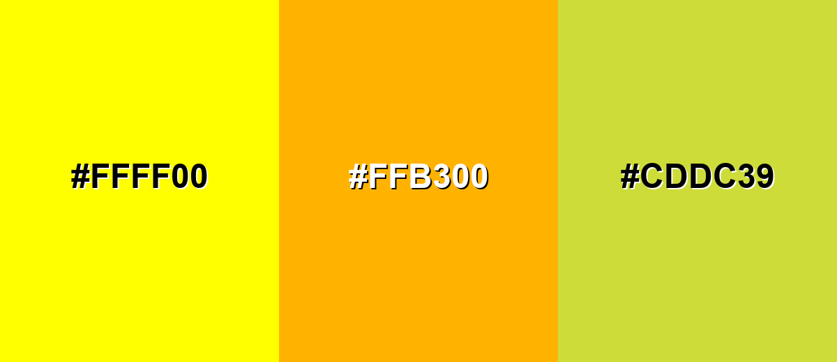
- Yellow: #FFFF00
- Amber: #FFB300
- Lime: #CDDC39
Yellow + Pale Gold + Yellow-Green is softer and more modern, ideal for friendly UI accents.
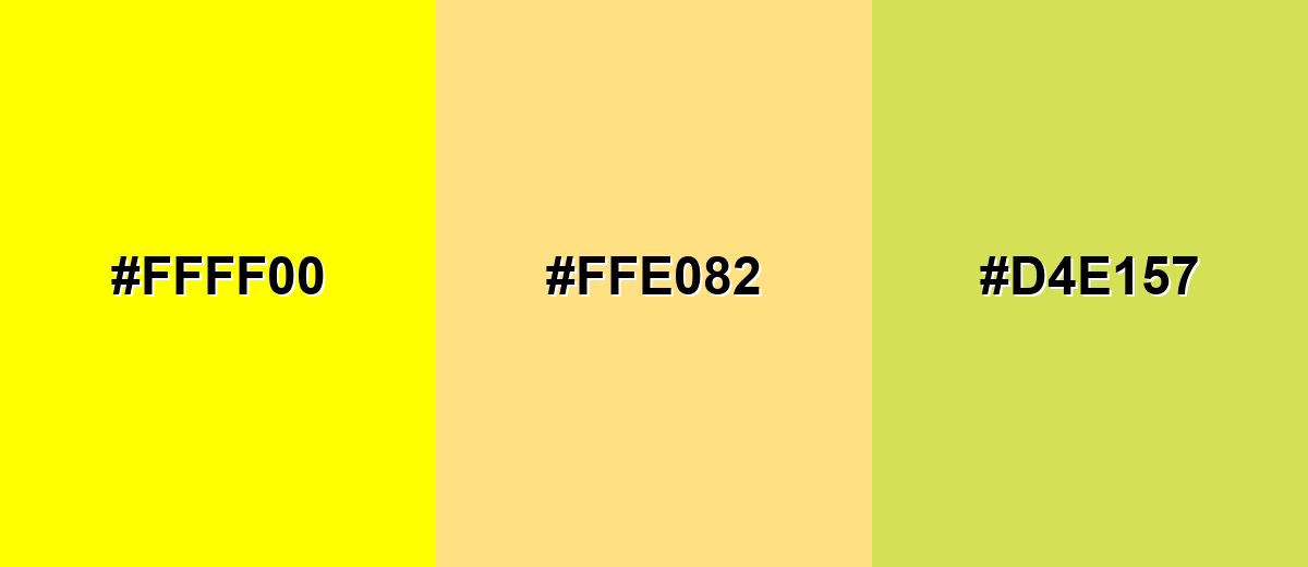
- Yellow: #FFFF00
- Pale Gold: #FFE082
- Yellow-Green: #D4E157
Triadic & Tetradic Combinations
Triadic palettes balance three evenly spaced hues for vibrant variety.
Yellow + Cyan + Purple works well for playful branding, illustrations, and energetic dashboards.
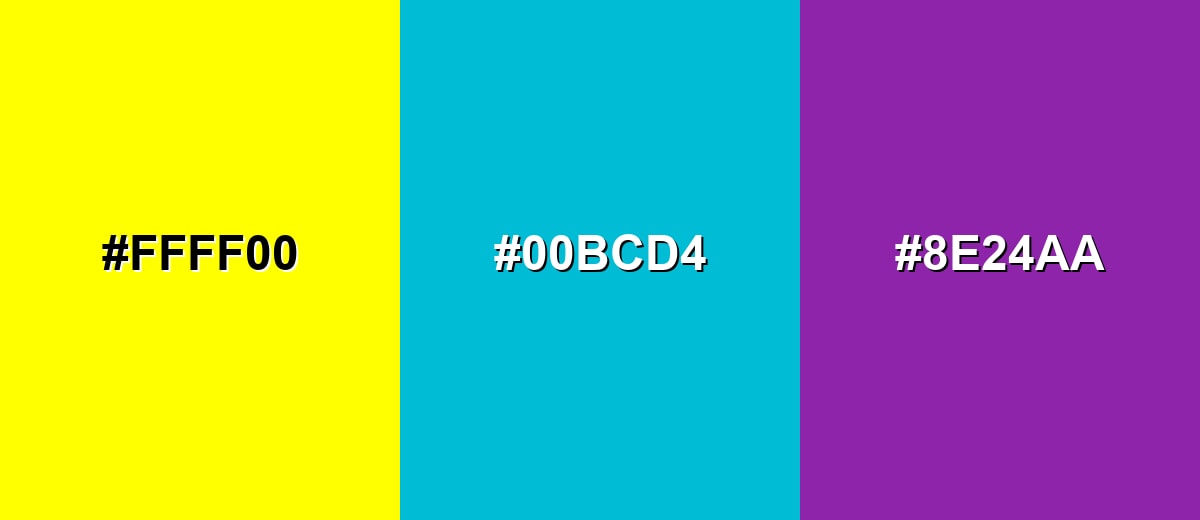
- Yellow: #FFFF00
- Cyan: #00BCD4
- Purple: #8E24AA
Colors to Avoid
While yellow is remarkably versatile, certain combinations can create problematic visual effects:
- Pure White (#FFFFFF) - Yellow on white (or white on yellow) often lacks contrast, making text and UI elements hard to read.
- Light Gray (#E5E7EB) - Light gray next to yellow can look washed out, reducing clarity and weakening hierarchy.
- Bright Orange (#FF9800) - Very warm neighbors can blur together, especially in small UI elements, and may feel overly intense.
- Neon Green (#39FF14) - Two highly luminous colors can visually vibrate, creating fatigue and making edges harder to perceive.
Shades, Tints & Variations of Yellow
Yellow isn't just "bright yellow"—it ranges from airy pastels to earthy mustards. Knowing the shade range helps you control mood, improve readability, and keep your palette feeling intentional across UI, branding, and print.
- Pastel Yellow (#FFF9C4) - A very light, creamy yellow with a gentle, airy feel. It's best used for Backgrounds, subtle highlights, and calm lifestyle visuals where readability is handled with dark text..
- Soft Lemon (#FFF176) - A friendly lemon tint that stays bright without being harsh. It's best used for Badges, onboarding hints, and supportive UI accents..
- Sunflower Yellow (#FFEB3B) - A punchy, cheerful yellow that reads as energetic and modern. It's best used for Primary highlights, promotional graphics, and attention cues..
- Golden Yellow (#FFD54F) - A warmer yellow with a golden glow that feels more premium than pure yellow. It's best used for Brand accents, illustrations, and product highlights that need warmth without neon brightness..
- Mustard Yellow (#C9A227) - A deeper, earthier yellow with a muted, vintage character. It's best used for Autumn palettes, editorial layouts, and backgrounds that need warmth with better text stability..
Industry Applications
Yellow is used across industries when a design needs to feel energetic, noticeable, or upbeat. The key is controlling how much yellow is used and ensuring strong contrast for critical information.
Fashion & Beauty
- Seasonal and sunny themes
- Cheerful brand moments and announcements
- Golden shades for premium cues; reserve bright yellow for promotions.
- Use yellow to simulate sunlight, glow, and highlights.
Interior Design & Decor
- Light or muted yellows can work as backgrounds, especially for callout panels and friendly sections.
- For large backgrounds, avoid overly bright yellows and prioritize dark text and clear spacing for readability.
- Mustard Yellow: backgrounds that need warmth with better text stability.
- Test on the target paper stock; uncoated paper can reduce vibrancy.
Branding & Marketing
- Yellow works best as an accent when you need energy and visibility.
- For premium or serious brands, pairing yellow with dark neutrals and restrained typography can keep it confident rather than playful.
- Use yellow for highlights, tags, and empty-state illustrations.
- Use yellow for price tags, limited-time banners, and highlights.
Conclusion
Yellow is a high-impact color that can communicate warmth, clarity, and urgency depending on context. Start with the core codes (like HEX #FFFF00 and RGB 255, 255, 0), then build palettes that respect contrast—especially on light surfaces—so your highlights stay readable. From bright accents in UI to warmer golden tones in branding and muted mustard shades in editorial layouts, choosing the right yellow makes your design feel intentional instead of overwhelming.
Design Smarter with AI: Media.io is an online AI studio that empowers creators with advanced image generation and enhancement tools. From text-to-image and image-to-image creation to AI upscaling and color optimization, it enables fast, creative, and professional results—all in your browser.

Frequently Asked Questions About Yellow Color
Yellow is a bright hue between green and orange on the visible spectrum. In design, it's often used to add energy, highlight important elements, and create a sunny, optimistic tone.
Yellow has high perceived brightness, so the eye notices it quickly. That makes it great for highlights and signals, but it can also become tiring if used in large, intense areas.
Yellow pairs well with deep blues for strong contrast, with nearby warm hues for harmonious palettes, and with dark neutrals to keep layouts readable. The best pairing depends on whether you want bold contrast or a softer, blended look.
Light or muted yellows can work as backgrounds, especially for callout panels and friendly sections. For large backgrounds, avoid overly bright yellows and prioritize dark text and clear spacing for readability.
Choose bright yellow for energetic, playful emphasis; golden yellow for warmer, more premium moods; and mustard for a muted, vintage or editorial feel. Test the shade across your key assets to ensure consistent readability and tone.
Use yellow primarily as an accent, pair it with dark text and icons, and don't rely on color alone to convey status. Add labels, shapes, or icons so the meaning stays clear for all users.


