

 TL;DR:
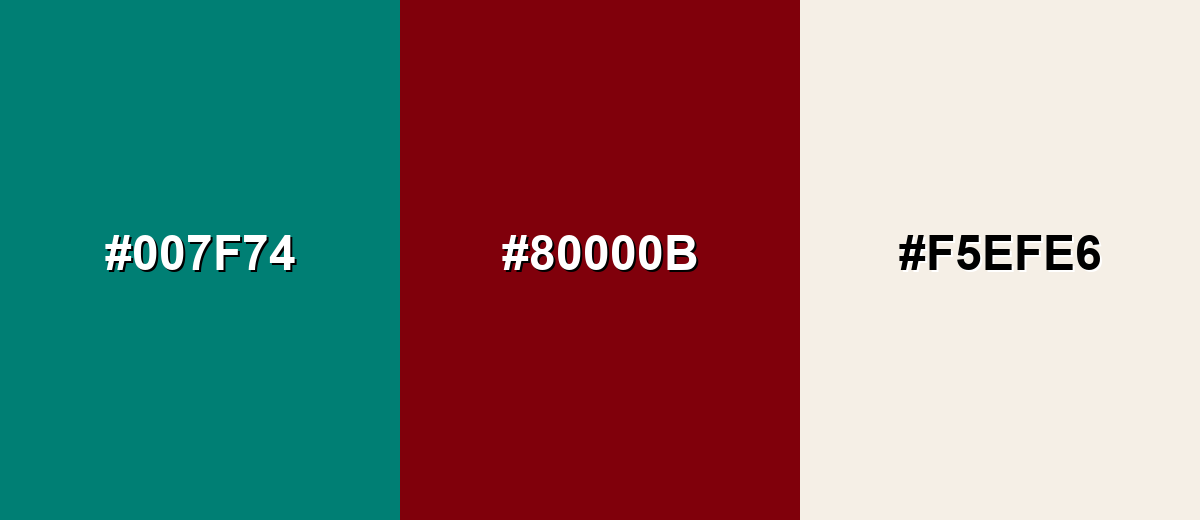
Peacock green (#007F74) is a sophisticated, blue-leaning jewel tone that functions best as a premium accent against warm neutrals or metallic finishes to prevent the overly cold or serious tone caused by heavy application.
● For cross-medium consistency, utilize HEX #007F74 or RGB for digital UI elements, but rely on CMYK (100%,0%,17%,50%) proofs for physical printing because the hue will naturally deepen on uncoated paper.
● Pair the color with cream-leaning whites, brass textures, or deep raspberry for balanced contrast, while strictly avoiding Neon Green (#39FF14), Pure Cyan, and Electric Blue to prevent visual vibration and harsh clashing.
● When capturing this shade in photography or video setups, account for environmental lighting conditions where warm indoor light shifts the hue greener and cooler light pushes it bluer, taking care to protect shadow details from becoming muddy during color grading.
Ask AI for a summary
 ChatGPT
 Perplexity
 Gemini
 Claude
 Grok
Grok
Peacock green color is a rich, blue-leaning green that feels like the saturated teal found in peacock feathers and polished gemstones. Its signature look sits between emerald and deep teal, with a bold, slightly cool undertone.
The most commonly referenced peacock green hex code is #007F74. It's often perceived as confident and refined, and it can shift greener or bluer depending on lighting and nearby hues—so pairing and contrast choices matter.
Peacock Green Color: Codes & Values
If you're matching peacock green across screens, print, and brand assets, these core codes are the most practical starting point.
| Parameters | VALUE |
| HEX Code | #007F74 |
| RGB DECIMAL | 0, 127, 116 |
| RGB PERCENTAGE | 0%, 50%, 45% |
| CMYK | 100%,0%,17%,50% |
| HSL | 175°, 100%, 25% |
| HSV (HSB) | 175°, 100%, 50% |
| Web Safe | #006666 |
Key Color Space Explanations:
- HEX - HEX is the most common way to specify peacock green for web and UI work. Use it in CSS and design tools to reproduce the same tone consistently.
- RGB - RGB defines peacock green using red, green, and blue light values for screens. It is the go-to format for digital graphics, video, and app interfaces.
- CMYK - CMYK is used for ink-based printing and helps estimate how peacock green will translate on paper. Results can vary by paper stock and printer calibration, so proofs help.
- HSL - HSL describes hue, saturation, and lightness, which is useful for building tints, shades, and matching related tones. It helps you adjust the look without changing the base character too much.
- Web Safe - Web Safe is the closest legacy-safe approximation used for older displays and limited palettes. It is mainly helpful for fallback styling or quick approximations.
For consistent results, use HEX/RGB for digital work and CMYK for print prep, then fine-tune with HSL when you need lighter tints or deeper, moodier shades.
Peacock Green Color Conversions
Here are peacock green conversions you can copy into design tools, dev handoffs, and print specs without second-guessing the format.
| Parameters | VALUE | CSS |
| HEX | #007f74 | #007f74 |
| RGB DECIMAL | 0, 127, 116 | rgb(0,127,116) |
| RGB PERCENTAGE | 0%, 50%, 45% | rgb(0%,50%,45%) |
| CMYK | 100%,0%,17%,50% | cmyk(100%,0%,17%,50%) |
| HSL | 175°, 100%, 25% | hsl(175°, 100%, 25%) |
| HSV (or HSB) | 175°, 100%, 50% | -- |
| Web Safe | 006666 | #006666 |
| CIE-LAB | 47.6, -32.0, -2.4 | -- |
| XYZ | 10.78, 16.50, 19.17 | -- |
| xyY | 0.232, 0.355, 16.50 | -- |
| CIE-LCH | 47.6, 32.1, 184.3 | -- |
| CIE-LUV | 47.6, -37.9, 1.3 | -- |
| Hunter-Lab | 40.6, -23.7, 0.5 | -- |
| Binary | 00000000 01111111 01110100 | -- |
Want to generate peacock green color photos or posters? Try Media.io's AI Image Generator now!
Peacock Green Meaning & Symbolism
Peacock green is commonly linked with sophistication, confidence, and a sense of depth. Because it sits between green and blue, it can feel both natural and polished, making it a frequent choice for accents that should look premium without being loud. In everyday life, it often reads as composed and modern, especially when paired with clean neutrals or metallic finishes.
Psychological Effects
Peacock green blends green's calm with a cooler, more focused edge.
- Calm Presence - The green base can feel soothing and steady, which is useful when you want a relaxed tone.
- Focused Clarity - The blue undertone adds a crisp, “clear-headed” vibe that suits dashboards and structured layouts.
- Reliable Confidence - As a primary brand color, it can read dependable and tasteful rather than loud or flashy.
- Premium Restraint - Its jewel-like depth suggests refinement, especially when you give it breathing room with simple typography and spacing.
- Cool Distance (If Overused) - Heavy coverage—especially with other dark/cool hues—can feel cold or overly serious without warm balance.
Positive Associations
When used intentionally, peacock green often carries upscale, modern associations.
- Sophistication - Deep teal-greens are often treated as jewel tones, suggesting craft and quality.
- Confidence - The saturation feels bold, but the hue stays composed, making it a “quiet statement” color.
- Modern Polish - It reads clean and contemporary against off-whites, light grays, and minimal layouts.
- Natural Elegance - Sitting between green and blue helps it feel both organic and refined at the same time.
- Beauty & Display - Peacock imagery is tied to beauty and visual impact, which can elevate fashion and decor contexts.
Cultural Significance Across the World
Peacock references and jewel-tone styling influence how this color is interpreted in design and everyday aesthetics.
- Beauty & Pride - Peacock imagery is often associated with beauty, pride, and display in decorative arts and fashion.
- Jewel-Tone Luxury - Deep teal-greens are widely treated as jewel tones, hinting at premium materials and craftsmanship.
- Composed Modernity - In contemporary design, peacock green often signals a modern, controlled mood rather than playful energy.
- Refined Contrast - Paired with metallic finishes and clean neutrals, it's commonly used to create an upscale, gallery-like feel.
Design Applications
Peacock green is versatile because it can act as a bold accent or a refined base, depending on how much of it you use. It is especially effective when you plan contrast intentionally and let it stand next to calmer supporting tones.
Graphic Design Tips
- Use peacock green for CTAs, icons, or key highlights, and keep large backgrounds neutral for better readability.
- On light layouts, place peacock green elements on off-white or light gray to maintain a clean, premium feel.
- If you're building a brand system, set a small range of tints/shades so the color stays consistent across components.
- For print, expect it to deepen on uncoated paper—proofing helps preserve the intended teal balance.
- Keep type contrast high and spacing generous so the saturation feels intentional, not heavy.
Pro tip: If peacock green starts to feel too cool in a layout, introduce warmth through neutrals (cream-leaning whites) and textures, then reserve the color for the moments you want people to notice.
Peacock Green in Photography & Video
- Use peacock green as a wardrobe or prop accent to add a jewel-tone focal point without overpowering skin tones.
- In product shots, it pairs nicely with brass-like highlights and warm wood textures for a premium look.
- Watch mixed lighting: warm indoor light can push it greener, while cooler light can shift it bluer.
- For video UI overlays or motion graphics, keep peacock green areas simple and avoid pairing with high-saturation cool neighbors.
- When color grading, protect shadow detail—deep teal-greens can get muddy if blacks are crushed too hard.
Recommended Tool for Image Enhancement: When incorporating peacock green into your photography projects, Media.io's AI Image tools can help you achieve more refined results. With AI-powered color enhancement, photo colorization, image upscaling, and old photo restoration, you can easily enrich peacock green tones, improve overall image quality, and highlight the color's elegant and sophisticated aesthetic.
Color Combinations
Peacock green pairs best with warm neutrals, gentle pastels, and a few carefully chosen jewel tones. Below are reliable schemes you can use for branding, UI palettes, and interiors, with ready-to-pick hex values.
Complementary Colors
A complementary pairing adds punch by placing peacock green opposite a red-leaning tone. Keep one dominant and use the other as an accent to prevent visual overload.
Complementary Palette Example: Try peacock green with deep raspberry and soft ivory for a bold but balanced look.
Analogous Color Schemes
Analogous colors sit adjacent to each other on the color wheel, creating harmonious, cohesive palettes with subtle variation.
Green-leaning teal, peacock green, and ocean teal create a smooth, nature-inspired gradient.
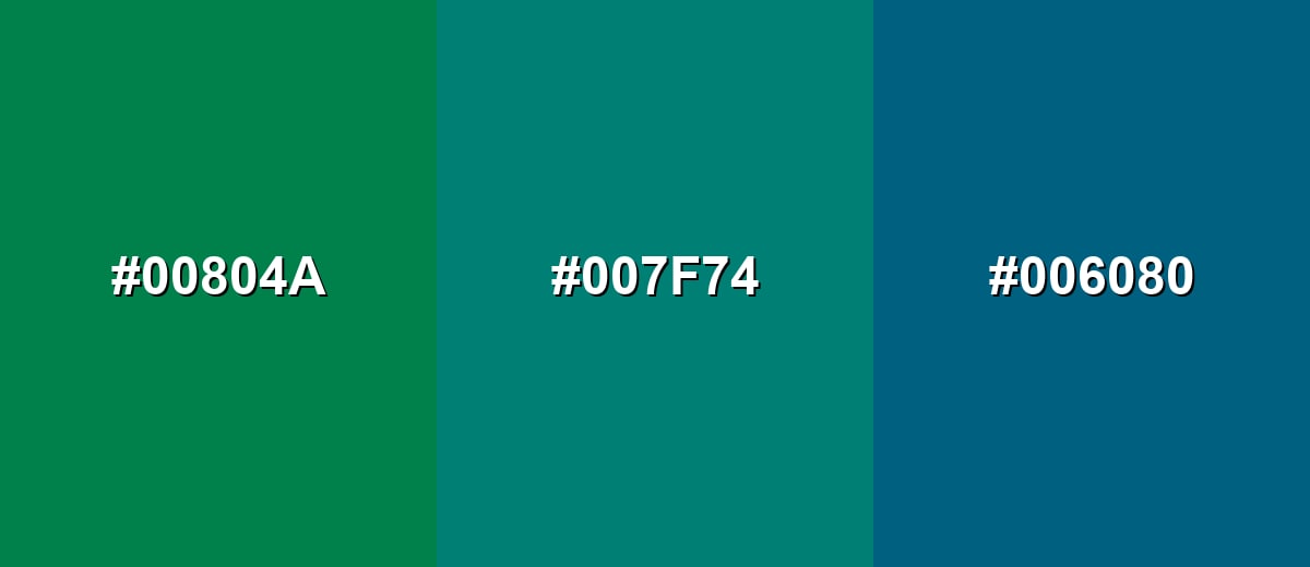
- Jade Teal: #00804A
- Peacock Green: #007F74
- Ocean Teal: #006080
A softer analogous set uses a light tint and a deep shade to keep the palette cohesive and flexible.
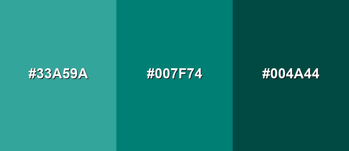
- Light Peacock: #33A59A
- Peacock Green: #007F74
- Dark Teal: #004A44
Triadic & Tetradic Combinations
A triadic scheme brings variety while staying balanced across the wheel.
Peacock green with marigold and deep purple adds contrast for modern branding and editorial layouts.
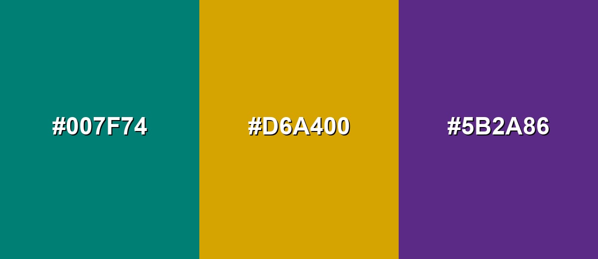
- Peacock Green: #007F74
- Marigold: #D6A400
- Deep Purple: #5B2A86
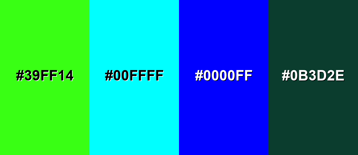
Colors to Avoid
While peacock green is remarkably versatile, certain combinations can create problematic visual effects:
- Neon Green (#39FF14) - The high intensity creates visual vibration next to peacock green, which can feel loud and reduce legibility in UI.
- Pure Cyan (#00FFFF) - Both hues sit in a similar cool range, so the pairing can look harsh and overly saturated without enough separation.
- Electric Blue (#0000FF) - The extreme blue pulls the palette colder and can make peacock green look muted or dirty by comparison.
- Deep Forest Green (#0B3D2E) - Two dark greens together often lack contrast, causing elements to blend and feel heavy in layouts and interiors.
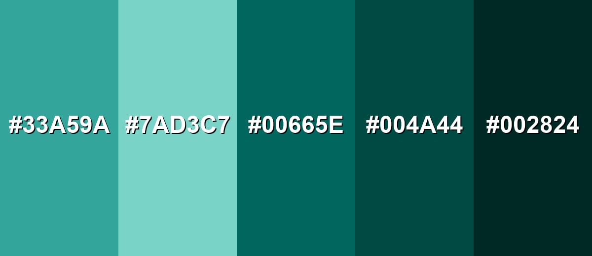
Shades, Tints & Variations of Peacock Green
Peacock green has a surprisingly flexible range—from soft, airy tints to near-black teals that still keep a hint of green. Having a few reliable variations makes it easier to build UI states, print hierarchy, and layered interior palettes without drifting away from the original vibe.
- Light Peacock (#33A59A) - A lighter, friendlier teal-green that keeps the peacock character but feels more airy. It's best used for Background panels, subtle highlights, large UI sections..
- Seafoam Peacock (#7AD3C7) - A soft tint that reads fresh and clean while staying connected to the base tone. It's best used for Wellness branding, calm dashboards, secondary backgrounds..
- Deep Peacock (#00665E) - A deeper version that feels more dramatic and jewel-like without shifting too blue. It's best used for Headers, navigation bars, packaging accents, dark-mode surfaces..
- Dark Teal (#004A44) - A shadowy teal-green that emphasizes seriousness and depth. It's best used for Text on light backgrounds, premium branding, strong contrast accents..
- Midnight Teal (#002824) - An almost-black teal that keeps a hint of green for a softer alternative to pure black. It's best used for Dark UI themes, outlines, luxury labels, background grounding..
Industry Applications
Because it reads as both natural and refined, peacock green shows up across products that want to feel modern, trustworthy, and slightly luxurious. These examples can help you decide where it fits best.
Fashion & Beauty
- Use it as a packaging accent to signal sophistication without leaning overly soft or pastel.
- Pair it with botanical visuals for a polished “nature-meets-premium” beauty aesthetic.
- Apply it to labels, caps, or secondary panels when you want a jewel-tone detail that photographs well.
- For branding, it supports a confident, refined mood that suits elevated personal care lines.
Interior Design & Decor
- Works beautifully on cabinetry or an accent wall, especially alongside warm wood tones.
- Use it in textiles (pillows, rugs, curtains) to add depth while keeping the room composed.
- Pairs naturally with brass-like finishes to create an upscale, modern contrast.
- For decor details, it adds jewel-tone richness without needing a full dark palette.
Branding & Marketing
- In Tech and SaaS, it's strong for feature highlights, badges, and calm dashboard accents that still feel premium.
- In Hospitality and events, it supports jewel-tone menus and signage for a memorable, upscale mood.
- In Education and professional services, it can keep presentations composed and confident without feeling overly corporate.
- Across campaigns, it's an easy “hero accent” color when supported by clean neutrals and clear contrast.
Conclusion
Peacock green stands out for its jewel-toned depth and its balance of green calm and blue sophistication. Used thoughtfully, #007F74 can feel premium and modern in branding, UI, print, and interiors—especially when you support it with warm neutrals and strong contrast for readability. Once you've got the right pairings and a few dependable shades in your toolkit, peacock green becomes an easy, confident choice for building polished visual systems that still feel fresh.
Design Smarter with AI: Media.io is an online AI studio that empowers creators with advanced image generation and enhancement tools. From text-to-image and image-to-image creation to AI upscaling and color optimization, it enables fast, creative, and professional results—all in your browser.

Frequently Asked Questions About Peacock Green Color
Peacock green is a saturated blue-leaning green, similar to deep teal seen in peacock feathers. It often looks richer and more jewel-toned than standard teal.
A commonly used hex value for peacock green is #007f74. Small variations exist across brands and paint lines, so check your exact swatch when matching.
It sits between green and blue, but it usually leans slightly blue compared to emerald. Lighting and nearby hues can push it to read greener or more teal.
Warm neutrals (ivory, beige), charcoal, and metallics like gold are reliable partners. For stronger contrast, try a deep raspberry or a warm amber accent.
Yes. Use it sparingly as an accent against clean neutrals, and keep typography and spacing simple so the saturated tone feels intentional rather than busy.
It can, especially as an accent on near-black or deep charcoal backgrounds. For readability, reserve it for icons, outlines, and highlights rather than long text.


