

 TL;DR:
To effectively use the standard digital gold (HEX #d4af37) in modern design, restrict it to a 5–15% accent color against deep neutrals like navy or charcoal to communicate premium quality without visual clutter.
● Limit gold application strictly to icons, borders, and badges rather than dense body text, and avoid clashing it with pure yellow (#FFFF00), vivid orange, hot pink, or neon green to maintain accessibility and contrast.
● Expect a visual shift between digital screens using RGB (212, 175, 55) and physical print using CMYK (0%, 17%, 74%, 17%), as print environments require physical metallic inks or foils to achieve a true reflective shine.
● Shift to specific tonal variations based on your application, utilizing Antique Gold (#C49A2C) for heritage branding, Pale Gold (#F3DE8A) for gentle background tints, or Bronze Gold (#8F6B1F) for textured dark-mode accents.
Ask AI for a summary
 ChatGPT
 Perplexity
 Gemini
 Claude
 Grok
Grok
Gold is a warm, metallic-looking yellow that resembles polished precious metal in real life. The classic digital reference is hex #d4af37, which sits between yellow and orange with a rich, luminous feel.
It is often perceived as premium, celebratory, and confident—especially when used as an accent. Below, you'll find practical codes, pairings, shades, and contrast tips to help gold look intentional in modern design.
Gold Color: Codes & Values
If you want a reliable starting point for "digital gold," these values will help you match the look across UI, branding, and print planning.
| Parameters | VALUE |
| HEX Code | #D4AF37 |
| RGB DECIMAL | 212, 175, 55 |
| RGB PERCENTAGE | 83.1%, 68.6%, 21.6% |
| CMYK | 0%,17%,74%,17% |
| HSL | 46°, 65%, 52% |
| HSV (HSB) | 46°, 74%, 83% |
| Web Safe | #CC9933 |
Key Color Space Explanations:
- HEX - HEX is the standard web notation for specifying a precise shade in CSS and design tools. For gold, #d4af37 is a common reference point for a rich, metallic-like yellow.
- RGB - RGB defines the amount of red, green, and blue light used on screens. Gold uses strong red and green with a lower blue value, which creates a warm yellow-orange impression.
- CMYK - CMYK is used for print and describes ink percentages. Gold-like tones often need careful calibration in print, and metallic inks or foils may be required to truly look reflective.
- HSL - HSL organizes the shade by hue, saturation, and lightness, which is helpful for building matching tints and shades. Gold sits around a mid lightness with a warm hue in the yellow range.
- Web Safe - Web safe values approximate a shade using the classic 216-color palette. #cc9933 is the closest web safe match and can help maintain consistency in older or limited environments.
Use HEX/RGB for screens, CMYK for print prep, and HSL/HSV when you need quick tints and shades that stay visually consistent within a palette.
Gold Color Conversions
Need gold in a specific format for your editor or workflow? Here are the most common conversions in one place.
| Parameters | VALUE | CSS |
| HEX | #d4af37 | #d4af37 |
| RGB DECIMAL | 212, 175, 55 | rgb(212,175,55) |
| RGB PERCENTAGE | 83.1%, 68.6%, 21.6% | rgb(83.1%,68.6%,21.6%) |
| CMYK | 0%,17%,74%,17% | cmyk(0%,17%,74%,17%) |
| HSL | 46°, 65%, 52% | hsl(46°, 65%, 52%) |
| HSV (or HSB) | 46°, 74%, 83% | -- |
| Web Safe | cc9933 | #cc9933 |
| CIE-LAB | 72.6, 2.5, 62.6 | -- |
| XYZ | 43.09, 44.98, 10.03 | -- |
| xyY | 0.439, 0.458, 44.98 | -- |
| CIE-LCH | 72.6, 62.7, 87.7° | -- |
| CIE-LUV | 72.6, 30.8, 69.1 | -- |
| Hunter-Lab | 67.1, 9.2, 44.7 | -- |
| Binary | 11010100 10101111 00110111 | -- |
Want to generate Gold Color photos or posters? Try Media.io's AI Image Generator now!
Gold Color Meaning & Symbolism
Gold is commonly linked with value, achievement, and a sense of refinement. In everyday life it shows up where people want to signal something special, from awards and packaging to interface highlights. As gold color symbolism, it often points to premium quality, confidence, and celebration without needing extra words.
Psychological Effects
Gold tends to feel rewarding and attention-guiding, especially when it's used with restraint.
- Rewarding - Gold often feels uplifting and "earned," which is why it works well for badges, premium tiers, and achievement moments.
- Attention-Grabbing - In visual hierarchy, gold can add importance and pull focus to the next step or a key feature.
- Warm And Friendly - Because it sits near yellow on the spectrum, lighter gold accents can feel energetic and approachable.
- Polished - A restrained touch of gold can make layouts and interiors feel warmer, cleaner, and more refined.
- Overwhelming If Overused - Heavy gold coverage may read as flashy or dated, and similar bright yellows can hurt readability in UI and print.
Positive Associations
In branding and design, gold is commonly used as a shorthand for value and special status.
- Premium Quality - Gold is frequently used to imply higher-tier materials, features, or craftsmanship.
- Confidence - It can communicate boldness and certainty without relying on loud, saturated palettes.
- Celebration - Gold naturally fits milestones, awards, and festive moments where you want a "special" cue.
- Achievement - It's a familiar visual signal for success states, highlights, and status markers.
- Refinement - Paired with calm foundations, gold can feel elegant rather than overpowering.
Cultural Significance Across the World
Gold symbolism varies, but it's widely recognized as a marker of respect, honor, and ceremony.
- Prosperity - Gold has long-standing connections to wealth and prosperity in many contexts.
- Honor - It's often used to represent achievement, prestige, and high status in formal design.
- Ceremony - Gold shows up in ceremonial objects and celebratory visuals where significance matters.
- Tradition And Legacy - In religious art and traditional craftsmanship, gold can signal heritage, respect, and lasting value.
Design Applications
Gold can look elegant or playful depending on the surrounding palette and how much you use. The simplest way to keep control is to treat it like a highlight—let neutrals do the heavy lifting, and let gold do the emphasis.
Graphic Design Tips
- Keep gold as an accent (about 5–15% of the palette) so it still reads as premium, not noisy.
- Use gold for logos, seals, badges, and premium cues—then support it with calm layout colors.
- Avoid using gold for dense text; it's usually clearer on icons, strokes, borders, and small components.
- If the gold looks too yellow, slightly reduce saturation or darken the tone to bring back richness.
- For accessibility, place gold elements on deep neutrals and always verify contrast with a checker.
Pro tip: for UI, gold works best when the hierarchy is obvious—neutral backgrounds, clear spacing, and one "gold moment" per screen (like a selected state or premium badge).
Gold Color in Photography & Video
- Lean into warm lighting to make gold feel luminous, but avoid pushing highlights so far that details clip.
- Gold props and surfaces read best when the background is calm, letting reflections stay controlled.
- For product shots, adjust warmth and saturation gently—too much can turn gold into flat yellow.
- In color grading, use gold sparingly as a highlight tone so skin tones and neutrals stay natural.
- If you want a more "antique" vibe, shift gold slightly darker and less saturated for a crafted look.
Recommended Tool for Image Enhancement: When incorporating gold color into your photography projects, Media.io's AI Image tools can help you achieve more refined results. With AI-powered color enhancement, photo colorization, image upscaling, and old photo restoration, you can easily enrich gold color tones, improve overall image quality, and highlight the color's elegant and sophisticated aesthetic.
Color Combinations
Gold pairs best with deep, steady bases that let it stand out. Use the palettes below as starting points for UI themes, branding systems, and balanced layouts where gold is an accent rather than the whole page.
Complementary Colors
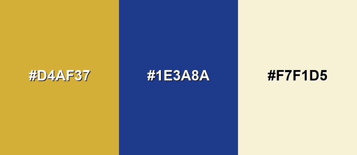
A complementary scheme uses an opposite hue to create strong contrast and visual energy. With gold, a deep blue base makes highlights feel crisp and intentional.
Complementary Palette Example: Try gold with deep navy for contrast, then soften the layout with a warm ivory neutral.
Analogous Color Schemes
Analogous colors sit adjacent to each other on the color wheel, creating harmonious, cohesive palettes with subtle variation.
Gold, amber, and olive create a warm, earthy flow that feels natural and grounded.
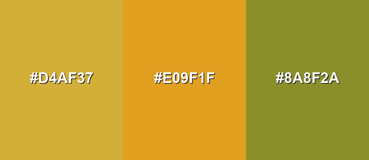
- Gold: #D4AF37
- Amber: #E09F1F
- Olive: #8A8F2A
Gold with mustard and peach makes a softer, sunlit palette for friendly, lifestyle-focused visuals.

- Gold: #D4AF37
- Mustard: #CAA21A
- Soft Peach: #F0C27B
Triadic & Tetradic Combinations
A triadic palette spreads hues evenly for a lively but balanced look.
Gold with teal and royal purple can feel modern and expressive when one shade stays dominant and the others are accents.
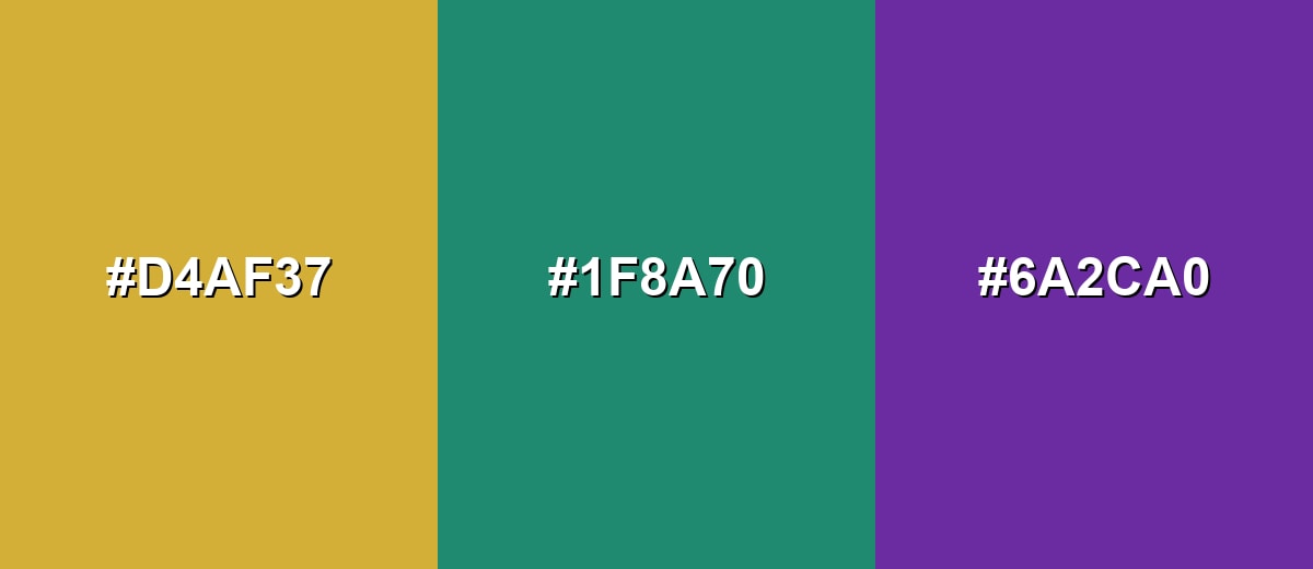
- Gold: #D4AF37
- Teal: #1F8A70
- Royal Purple: #6A2CA0
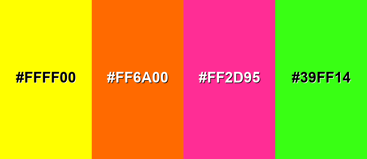
Colors to Avoid
While gold color is remarkably versatile, certain combinations can create problematic visual effects:
- Pure Yellow (#FFFF00) - Too close in hue and too bright, which can make gold look flat and reduce readability.
- Vivid Orange (#FF6A00) - Competes with gold's warmth and can push the palette into an overly loud, low-contrast range.
- Hot Pink (#FF2D95) - High saturation next to gold often feels chaotic and distracts from premium or refined messaging.
- Neon Green (#39FF14) - The fluorescent contrast can look harsh and can undermine the classic, crafted feel gold usually signals.
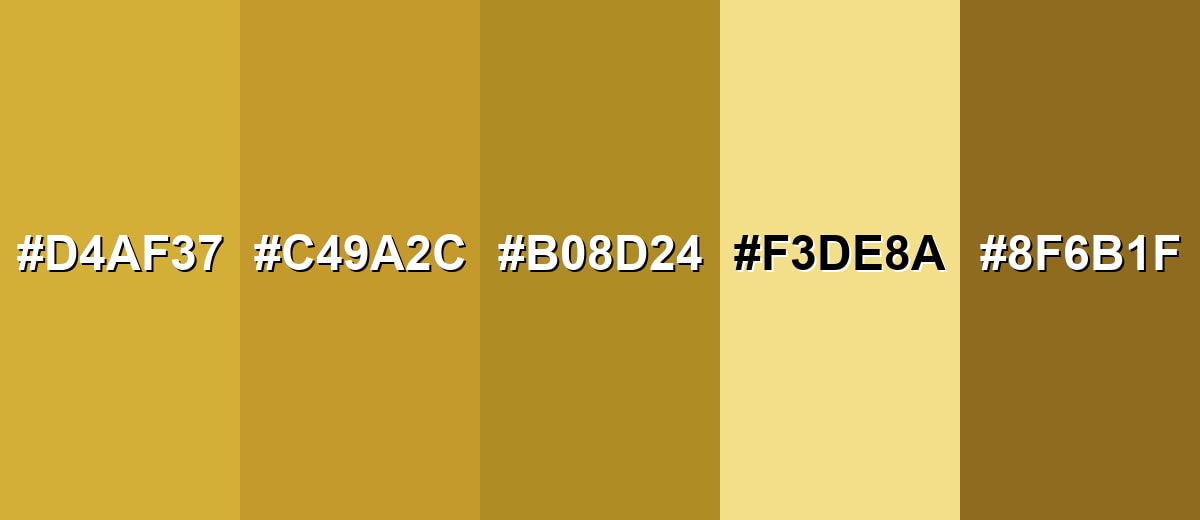
Shades, Tints & Variations of Gold Color
Gold isn't just one flat tone—its range runs from pale, creamy highlights to deep, bronze-leaning shades. Having a few gold variations ready makes it easier to build hierarchy (backgrounds, accents, and emphasis) without losing that signature warm, premium feel.
- Rich Gold (#D4AF37) - A classic, balanced gold with strong warmth and a polished feel. It's best used for Primary accents, badges, highlights, and premium cues.
- Antique Gold (#C49A2C) - Slightly muted and darker, with a more vintage, crafted character. It's best used for Heritage branding, editorial layouts, and traditional motifs.
- Old Gold (#B08D24) - A deeper, browner gold that reads steady and less flashy. It's best used for UI accents on light backgrounds and understated packaging.
- Pale Gold (#F3DE8A) - A light, creamy version that feels soft and friendly. It's best used for Background tints, gentle gradients, and airy compositions.
- Bronze Gold (#8F6B1F) - A dark, bronze-leaning tone that feels grounded and dramatic. It's best used for Textured visuals, dark-mode accents, and luxury contrast palettes.
Industry Applications
Gold shows up wherever a design needs to communicate quality, reward, or a special tier. The key is restraint: small gold touches are usually more convincing than large blocks.
Fashion & Beauty
- Use gold accents to signal "premium" collections or limited releases without changing the whole palette.
- Work gold into labels, caps, or small packaging elements to keep the look elevated and clean.
- Pair gold details with quiet neutrals for a refined finish that doesn't feel overly flashy.
- Reserve gold for highlights in campaigns tied to milestones, awards, or special drops.
Interior Design & Decor
- Gold trims and hardware add warmth when balanced with matte surfaces like wood, stone, or soft fabrics.
- Keep reflective gold limited to a few focal points so the space feels polished, not heavy.
- For a vintage mood, lean toward darker, muted gold tones that feel crafted and steady.
- Use gold as a "finishing touch" color to add emphasis without competing with main materials.
Branding & Marketing
- Apply gold to seals, badges, and hero highlights to communicate premium quality at a glance.
- In SaaS and product UI, gold is effective for premium tiers, featured features, and selected states.
- For e-commerce and packaging, gold warmth helps create a gift-ready, high-end feel when used sparingly.
- In media and publishing, use gold for cover accents and section headers to add refinement without overpowering content.
Conclusion
Gold stands out because it combines warmth with a naturally premium feel—even in small doses. Start with #D4AF37, then adjust lighter or darker depending on whether you want a modern, vintage, or understated direction. For the cleanest results, keep gold as an accent and support it with steady bases from your palette, so contrast stays readable and the "special" message stays clear across branding, UI highlights, print planning, and polished visual storytelling.
Design Smarter with AI: Media.io is an online AI studio that empowers creators with advanced image generation and enhancement tools. From text-to-image and image-to-image creation to AI upscaling and color optimization, it enables fast, creative, and professional results—all in your browser.

Frequently Asked Questions About Gold Color
A widely used reference for gold is #d4af37. It produces a warm yellow-orange tone that reads gold-like on most screens.
Gold sits between yellow and orange. It typically has strong red and green values with lower blue, which gives it a warm, metal-like appearance.
Screens emit light (RGB), while print uses inks (CMYK), so the same values can shift in brightness and warmth. For true metallic shine in print, foil or metallic inks are often needed.
Deep navy, charcoal, black, ivory, and muted greens pair well because they give gold clean contrast. Gold also works with teal or purple when used as an accent in a balanced palette.
Gold is usually better for icons, strokes, or small highlights than body text. If you do use it for text, place it on a dark background and confirm contrast for accessibility.
Use it sparingly, reduce saturation slightly, and pair it with matte neutrals. Keeping most of the layout simple makes gold accents feel intentional and contemporary.


