

Pastel yellow color is a pale, creamy yellow that looks like gentle sunlight filtered through a soft fabric or painted wall. Its hex code is #fdfd96, giving it a bright feel without the sharp intensity of pure yellow.
Many people read it as friendly, hopeful, and comforting, with a quiet warmth that stays easy on the eyes. Because it's created by adding white to yellow in pigment or increasing lightness in digital palettes, it tends to reflect light smoothly and feel airy; this guide covers meaning, codes, combinations, shades, and practical uses.
Pastel Yellow Color: Codes & Values
Use these values to match pastel yellow consistently across UI design, branding files, and print specs.
| Parameters | VALUE |
| HEX Code | #FDFD96 |
| RGB DECIMAL | 253, 253, 150 |
| RGB PERCENTAGE | 99.2%, 99.2%, 58.8% |
| CMYK | 0%,0%,41%,1% |
| HSL | 60°, 96%, 79% |
| HSV (HSB) | 60°, 41%, 99% |
| Web Safe | #FFFF99 |
Key Color Space Explanations:
- HEX - HEX is the most common web notation, written as a six-digit code that represents red, green, and blue. Use #fdfd96 to match this pastel yellow precisely in digital design.
- RGB - RGB builds the shade from red, green, and blue light. Pastel yellow uses very high red and green with a softer blue value, which keeps it bright but mellow.
- CMYK - CMYK is used for printing and mixes cyan, magenta, yellow, and black inks. This tint relies mostly on yellow with minimal black to keep the look light on paper.
- HSL - HSL describes hue, saturation, and lightness in a way that's convenient for adjusting tints. Pastel yellow sits around 60° with high lightness, which explains its soft glow.
- Web Safe - Web Safe is the closest match from the classic 216-color palette used on older displays. For a similar on-screen look, #ffff99 is the nearest web-safe alternative.
For web and product design, HEX and RGB are usually the quickest way to apply pastel yellow, while CMYK is the better reference point for printing (always test on your target paper).
Pastel Yellow Color Conversions
If you're moving between tools (Figma, Photoshop, After Effects, or print templates), these conversions help keep your pastel yellow consistent.
| Parameters | VALUE | CSS |
| HEX | #fdfd96 | #fdfd96 |
| RGB DECIMAL | 253, 253, 150 | rgb(253,253,150) |
| RGB PERCENTAGE | 99.2%, 99.2%, 58.8% | rgb(99.2%,99.2%,58.8%) |
| CMYK | 0%,0%,41%,1% | cmyk(0%,0%,41%,1%) |
| HSL | 60°, 96%, 79% | hsl(60°, 96%, 79%) |
| HSV (or HSB) | 60°, 41%, 99% | -- |
| Web Safe | ffff99 | #ffff99 |
| CIE-LAB | 97.4, -14.4, 49.1 | -- |
| XYZ | 81.1, 93.3, 42.7 | -- |
| xyY | 0.374, 0.430, 93.3 | -- |
| CIE-LCH | 97.4, 51.2, 106.3° | -- |
| CIE-LUV | 97.4, 4.9, 68.0 | -- |
| Hunter-Lab | 96.6, -19.2, 41.4 | -- |
| Binary | 11111101 11111101 10010110 | -- |
Want to generate pastel yellow color photos or posters? Try Media.io's AI Image Generator now!
Pastel Yellow Meaning & Symbolism
Pastel yellow is widely associated with warmth, optimism, and gentle encouragement rather than loud excitement. In everyday life it often reads as approachable and reassuring, like a soft glow that makes a space feel more inviting without demanding attention.
Psychological Effects
Because it's so light, pastel yellow tends to brighten the mood without feeling intense.
- Airy Brightness - It can make screens and spaces feel more open, especially in low natural light.
- Gentle Cheer - It keeps a cheerful tone while staying calmer than a saturated yellow.
- Friendly Onboarding - It's often used in onboarding screens and welcoming moments to reduce "cold" UI vibes.
- Soft Focus - It supports subtle emphasis (like highlights or tags) without shouting over your content.
- Low-Contrast Risk - Overuse or pairing with very light neutrals can feel washed out and become hard to read.
Positive Associations
Pastel yellow's symbolism usually leans warm, safe, and optimistic.
- Hope - It suggests a light-at-the-end-of-the-tunnel feeling that's uplifting but not overwhelming.
- Comfort - The creamy tint reads as soft and reassuring, like warm indoor lighting.
- Approachability - It feels welcoming and "easy," making it a natural accent for friendly brands.
- Simplicity - It can signal clean, uncomplicated design when balanced with stronger supporting tones.
- Fresh Starts - It often evokes spring-like renewal and gentle momentum.
Cultural Significance Across the World
Color meaning can shift by place and context, so it helps to let typography and layout carry the message too.
- Sunlight & Spring - Commonly linked with sunshine, warmth, and seasonal renewal in many contexts.
- Playful Softness - Pastel versions often feel more youthful and lighthearted than classic bright yellow.
- Context-Dependent Meaning - The same yellow can read differently depending on tradition, industry, and surrounding colors.
- Brand Clarity - Consistent visual systems (type, spacing, and contrast) help keep the intended meaning stable.
Design Applications
Pastel yellow is easiest to work with when you treat it as a light source in your palette: it lifts the scene, adds friendliness, and keeps things feeling fresh. The key is balancing its brightness with grounded neutrals or cool complements so it stays readable and intentional.
Graphic Design Tips
- Use it for backgrounds, cards, empty states, and gentle highlights where you want warmth without visual noise.
- Pair it with deeper accents for structure; pastels look best when at least one supporting tone adds contrast and definition.
- In branding, it can signal approachability and care; in product UI, it works well for subtle emphasis and positive moments.
- Dark text generally performs better than mid-gray on pastel yellow because the background is already high in lightness.
- Check contrast for any text or icon placed on top of it, especially at smaller sizes.
If your layout starts to feel "too sweet," keep pastel yellow as a supporting surface and introduce one stronger anchor color (like a deep blue) to sharpen hierarchy and improve readability.
Pastel Yellow in Photography & Video
- Use pastel yellow as a warm overlay to create a soft sunrise/sunset mood without heavy orange casts.
- In product shots, it works well as a background sweep for clean, friendly visuals—especially when the subject has darker edges.
- For portraits, treat it like gentle fill light: subtle highlights can feel sunny while still natural.
- In video, pastel yellow props or backdrops can lift the frame, but avoid overexposure so details don't wash out.
- If you're color grading, keep an eye on contrast—pastel palettes look best when shadows are still defined.
Recommended Tool for Image Enhancement: When incorporating pastel yellow into your photography projects, Media.io's AI Image tools can help you achieve more refined results. With AI-powered color enhancement, photo colorization, image upscaling, and old photo restoration, you can easily enrich pastel yellow tones, improve overall image quality, and highlight the color's elegant and sophisticated aesthetic.
Color Combinations
Pastel yellow pairs best with cool tones that add structure and with gentle neighbors that keep the palette airy. Use these combinations as starting points, then adjust contrast depending on whether you're building a background, an accent system, or a headline palette.
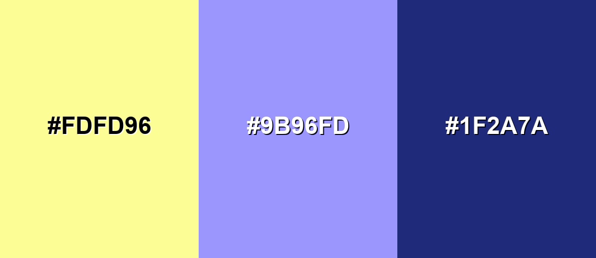
Complementary Colors
A complementary pairing adds the strongest visual balance by placing a cool opposite against pastel yellow's warmth. This is a reliable choice for hero sections, callouts, and brand accents where you want clarity without harsh contrast.
Complementary Palette Example: Use pastel yellow with soft periwinkle and deep navy to keep the mood light while still feeling anchored.
Analogous Color Schemes
Analogous colors sit adjacent to each other on the color wheel, creating harmonious, cohesive palettes with subtle variation.
Warm analogous mix: buttery yellow with peach and apricot-like warmth for friendly, upbeat visuals.
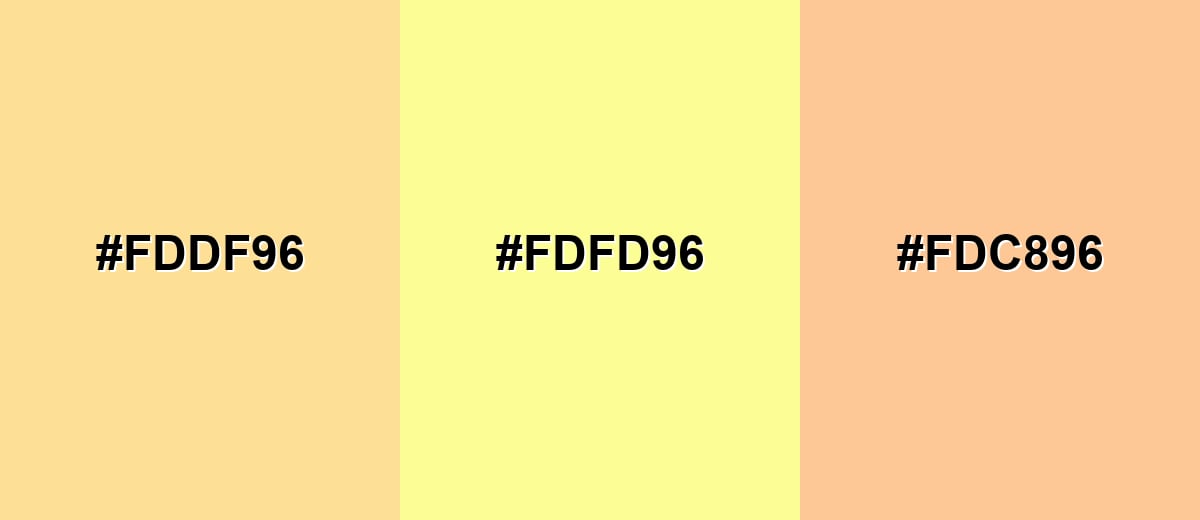
- Soft Apricot: #FDDF96
- Pastel Yellow: #FDFD96
- Light Peach: #FDC896
Fresh analogous mix: pastel yellow with yellow-green notes to feel clean, springlike, and light.
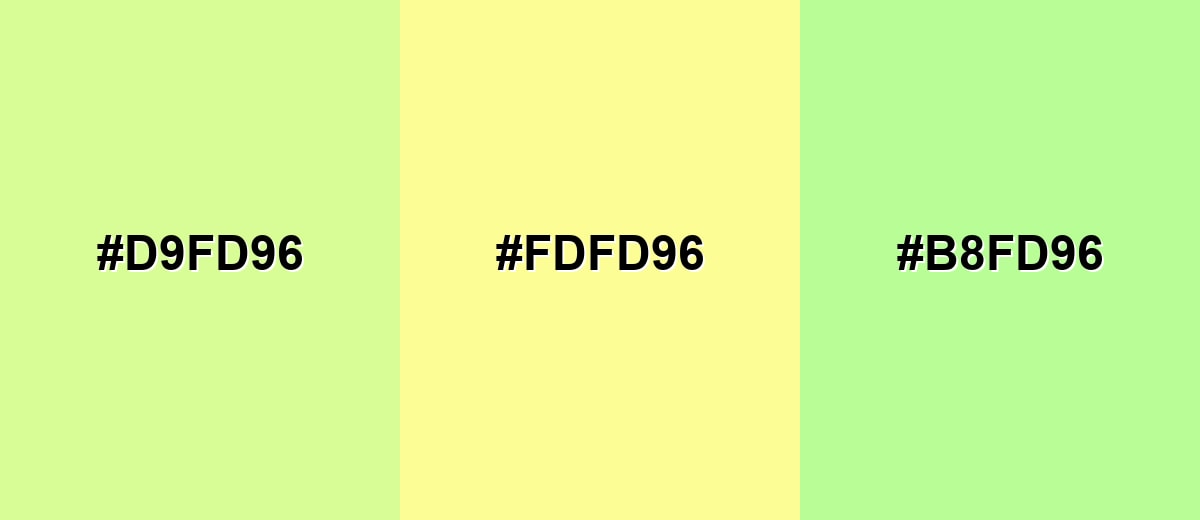
- Soft Lime: #D9FD96
- Pastel Yellow: #FDFD96
- Tender Chartreuse: #B8FD96
Triadic & Tetradic Combinations
A triadic palette keeps energy high while staying balanced, because the hues are evenly spaced.
Pastel yellow with airy aqua and soft magenta creates a playful, modern set for illustrations, highlights, and campaign graphics.
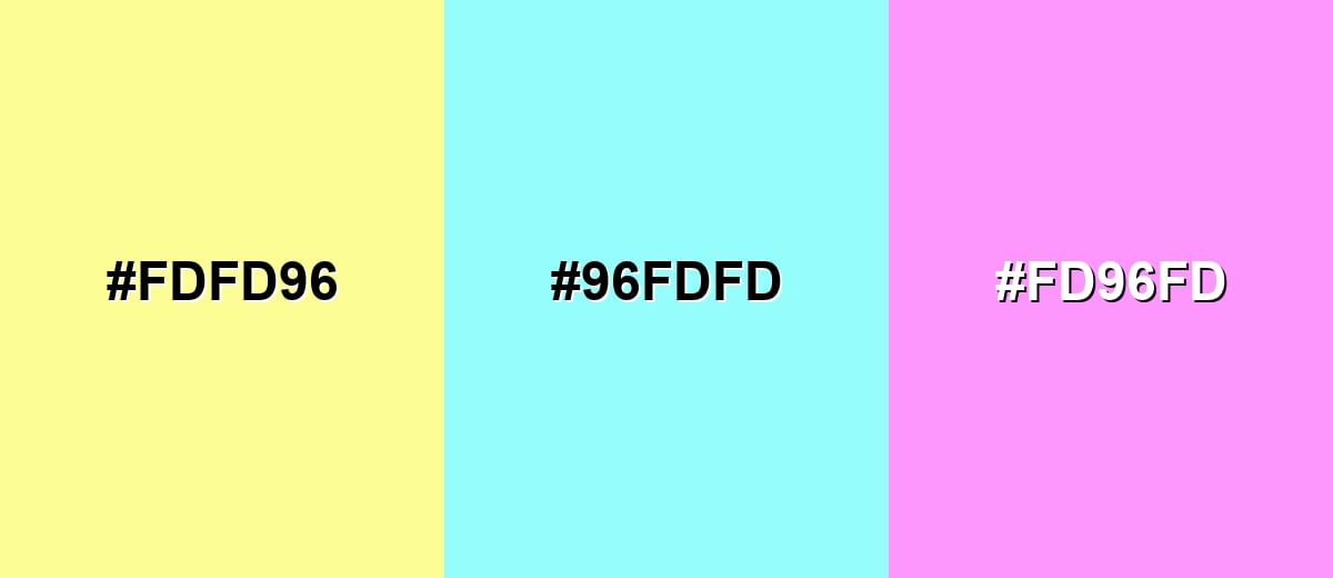
- Pastel Yellow: #FDFD96
- Airy Aqua: #96FDFD
- Soft Magenta: #FD96FD
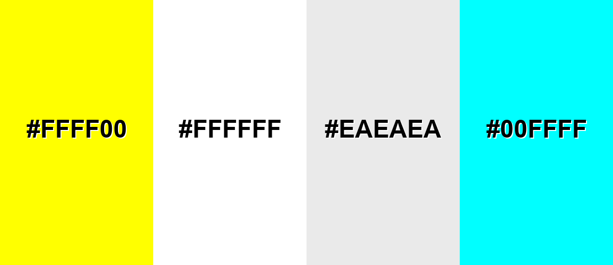
Colors to Avoid
While pastel yellow is remarkably versatile, certain combinations can create problematic visual effects:
- Neon Yellow (#FFFF00) - Too intense next to a soft tint, it can make pastel yellow look dull and create visual vibration.
- Pure White (#FFFFFF) - Often reduces separation and makes layouts feel washed out, especially for UI surfaces and text contrast.
- Very Light Gray (#EAEAEA) - Can flatten the palette and lower readability, because both tones sit close in lightness.
- Bright Cyan (#00FFFF) - Creates a harsh, high-energy clash that fights the gentle mood pastel yellow is meant to create.
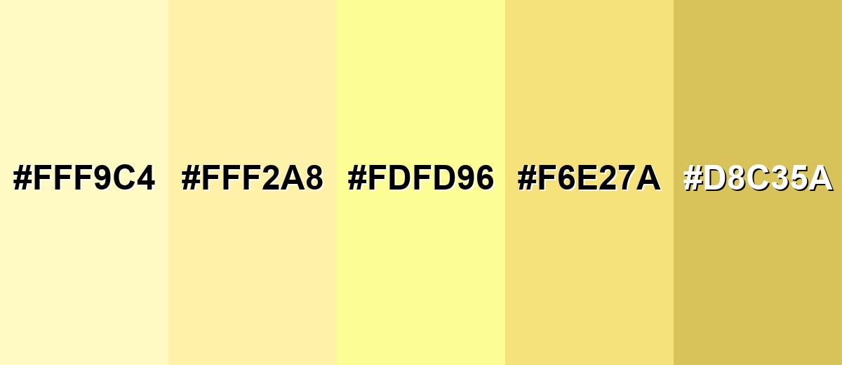
Shades, Tints & Variations of Pastel Yellow
Pastel yellow isn't just one "soft yellow"—it runs from creamy, near-white tints to deeper, more grounded yellow tones. Exploring this range helps you keep the same sunny vibe while adjusting contrast for buttons, backgrounds, and readable UI elements.
- Creamy Lemon Tint (#FFF9C4) - A very light, creamy version that reads almost like warm paper with a hint of sunshine. It's best used for Large backgrounds, soft cards, minimal layouts, and gentle lighting effects..
- Buttercream Yellow (#FFF2A8) - A slightly stronger tint that still feels soft, with a cozy, baked-goods warmth. It's best used for Brand backgrounds, packaging panels, and friendly UI highlights..
- Pastel Yellow (#FDFD96) - The balanced reference tone: bright, airy, and approachable without looking neon. It's best used for Accents, badges, icons, and cheerful supporting surfaces..
- Soft Golden Pastel (#F6E27A) - A warmer, more golden direction that adds a little depth while staying light. It's best used for Buttons, callouts, illustrations, and warmth in photography overlays..
- Muted Mustard Tint (#D8C35A) - A more subdued, earthy variation that feels mature and grounded compared to the lighter tints. It's best used for Secondary accents, headers, and places where you need more definition than a very light yellow provides..
Industry Applications
Because it's bright but gentle, pastel yellow fits many industries that want warmth without shouting. It works especially well when you need a friendly first impression, a clean background tone, or a highlight system that feels positive.
Fashion & Beauty
- Spring-forward collections that aim for a soft, optimistic mood.
- Beauty packaging accents that feel clean, fresh, and approachable.
- Minimal label designs where a light warm tone replaces stark white.
- Campaign backdrops that keep the focus on the product while lifting the scene.
Interior Design & Decor
- Nurseries and kid-friendly spaces where warmth should stay gentle.
- Kitchens and breakfast corners to add a "sunlit" feel without heavy yellow paint.
- Small rooms that need brightness, especially when natural light is limited.
- Soft decor accents (pillows, art, throws) to warm up neutral interiors.
Branding & Marketing
- Approachable brand accents for wellness, stationery, snacks, and lifestyle products.
- UI highlights for onboarding, empty states, and positive moments (with careful contrast).
- Seasonal refresh palettes that lean optimistic without turning neon.
- Editorial layouts and event materials that need a bright mood while staying refined.
Conclusion
Pastel yellow is a designer-friendly way to bring sunlight into a palette without the glare of saturated yellow. With HEX #FDFD96 as a dependable baseline, you can use it for soft backgrounds, gentle highlights, and approachable brand accents—then shift to lighter or deeper variations when you need more contrast. It pairs smoothly with warm neighbors like peach and yellow-green for airy harmony, and it feels more structured when balanced with cool complements. Overall, pastel yellow's meaning tends to land on friendliness, hope, and quiet reassurance, making it a practical choice for UI, packaging, editorial work, and interior styling.
Design Smarter with AI: Media.io is an online AI studio that empowers creators with advanced image generation and enhancement tools. From text-to-image and image-to-image creation to AI upscaling and color optimization, it enables fast, creative, and professional results—all in your browser.

Frequently Asked Questions About Pastel Yellow Color
It looks like a pale, creamy yellow similar to soft sunlight, buttercream, or a lightly tinted wall paint. It's bright enough to feel cheerful, but it doesn't have the sharp glare of pure yellow.
It's generally warm because it sits in the yellow range, which people often associate with sunlight. That said, its high lightness can make it feel airy and neutral in modern palettes, especially when paired with cool blues.
A common digital reference is HEX #fdfd96 with RGB 253, 253, 150. For print workflows, CMYK is often represented as 0%,0%,41%,1%, though exact output can vary by paper and ink.
It pairs well with cool tones like periwinkle and soft blues for balance, and with gentle neighbors like peach or yellow-green for a light, cohesive look. Adding one deeper accent usually helps the palette feel intentional and readable.
Avoid using it for body text or thin icons on light backgrounds, because contrast can drop quickly and reduce readability. It's safer as a background wash, highlight block, or secondary accent with dark text on top.
In paint, you typically start with a standard yellow and mix in white until the intensity softens into a creamy tint. In digital tools, you can keep the hue near yellow while increasing lightness and reducing perceived intensity through a lighter tint.


