

Mint color is a light, cool green that looks like fresh mint leaves with a soft, airy brightness. A common reference point for this shade is the hex code #98ff98, which reads as a clean pastel green with a hint of spring.
It is often perceived as refreshing, calming, and optimistic without feeling heavy. In both light and pigment-based systems, mint tends to brighten quickly, so small shifts in lighting can make it look more green or more aqua.
Mint Color: Codes & Values
If you want mint to look consistent across screens, print, and brand assets, start with its core color codes and then adjust only when you need a specific mood or contrast level.
| Parameters | VALUE |
| HEX Code | #98FF98 |
| RGB DECIMAL | 152, 255, 152 |
| RGB PERCENTAGE | 59.6%, 100%, 59.6% |
| CMYK | 40%,0%,40%,0% |
| HSL | 120°, 100%, 80% |
| HSV (HSB) | 120°, 40%, 100% |
| Web Safe | #99FF99 |
Key Color Space Explanations:
- HEX - HEX is the standard code used for digital design to specify an exact shade on screens. Use #98ff98 to consistently reproduce mint across web and UI work.
- RGB - RGB mixes red, green, and blue light for displays. Mint is strong in green with balanced red and blue, which creates its clean pastel look.
- CMYK - CMYK is used for printing and represents ink percentages. Mint's values are light, so paper type and print calibration can noticeably affect the final result.
- HSL - HSL describes hue, saturation, and lightness in a way that is intuitive for adjusting tints and shades. Mint sits at a green hue with high saturation and high lightness.
- Web Safe - Web Safe is the closest match from the classic 216-color palette used on older displays. #99ff99 is the nearest web-safe alternative to this mint.
Use HEX or RGB for UI and web design, and lean on CMYK when you're preparing files for print—especially for light mint backgrounds where subtle shifts can show up quickly.
Mint Color Conversions
Need mint in a different format for CSS, printing, or color grading? Use these conversions as a quick reference when moving between tools.
| Parameters | VALUE | CSS |
| HEX | #98ff98 | #98ff98 |
| RGB DECIMAL | 152, 255, 152 | rgb(152,255,152) |
| RGB PERCENTAGE | 59.6%, 100%, 59.6% | rgb(59.6%,100%,59.6%) |
| CMYK | 40%,0%,40%,0% | cmyk(40%,0%,40%,0%) |
| HSL | 120°, 100%, 80% | hsl(120°, 100%, 80%) |
| HSV (or HSB) | 120°, 40%, 100% | -- |
| Web Safe | 99ff99 | #99ff99 |
| CIE-LAB | 92.1, -51.5, 40.0 | -- |
| XYZ | 54.38, 80.46, 42.33 | -- |
| xyY | 0.307, 0.454, 80.46 | -- |
| CIE-LCH | 92.1, 65.2, 142.4° | -- |
| CIE-LUV | 92.1, -48.9, 64.3 | -- |
| Hunter-Lab | 89.7, -45.3, 32.4 | -- |
| Binary | 10011000 11111111 10011000 | -- |
Want to generate Mint Color photos or posters? Try Media.io's AI Image Generator now!
Mint Color Meaning & Symbolism
Mint is commonly linked with freshness, clarity, and a light, renewing energy. Because it sits between green and a cool pastel range, it often feels cleaner and more modern than deeper greens. In everyday life, it shows up where people want a gentle sense of wellbeing without the intensity of neon shades.
Psychological Effects
In visual design, mint usually reads as calm first—but its brightness means it needs thoughtful balance.
- Soothing Feel - Mint tends to feel soothing and breathable, helping pages and spaces feel calmer.
- More Openness - It can soften dense layouts and make a design feel more open when paired with generous white space.
- Crisp Impression - Because it is bright and cool, mint can read as crisp or even clinical when used in large, flat blocks.
- Friendlier With Warmth - Adding warmer neutrals or a darker anchor helps mint feel welcoming rather than sterile.
- Readability Risks - Low-contrast pairings can reduce legibility, so mint works best as a supporting shade with intentional contrast.
Positive Associations
These are the most common "at-a-glance" impressions mint creates in modern palettes.
- Fresh And Clean - Mint is often perceived as fresh and clean, especially in minimal layouts.
- Calm And Airy - Its lightness gives designs a calm, airy mood that feels easy to take in.
- Modern And Minimal - Mint's cool pastel character supports modern, uncluttered aesthetics.
- Softly Playful - With warm accents, mint can feel gently playful instead of overly serious.
- Renewal - The shade is frequently tied to a renewed, optimistic "springlike" energy.
Cultural Significance Across the World
Mint's meaning is widely understood because it connects to familiar real-world cues.
- Plant-Based Freshness - Mint is recognized through the real-world plant association, signaling freshness in an approachable way.
- Hygiene And Cleanliness - It often appears in contexts that imply hygiene and a "clean" standard.
- Spring And Renewal - In many modern contexts, mint overlaps with ideas of spring and renewal.
- Lighthearted Optimism - Its pastel brightness can suggest gentle positivity without feeling loud.
Design Applications
Mint is easiest to use when you treat it as a bright, light foundation or highlight and then build structure with deeper accents. The goal is to preserve its fresh feel while keeping text and key elements readable.
Graphic Design Tips
- Use It As A Support Shade - Apply mint to backgrounds, subtle cards, and badges rather than long paragraphs of text.
- Anchor With Dark Neutrals - Pair mint with a deeper neutral for navigation and typography to avoid washed-out layouts.
- Keep Hierarchy Clear - Reserve the brightest mint moments for small surfaces so CTAs and headings stay prioritized.
- Plan For Print Shifts - Test on the exact paper stock since light greens can shift and lose highlight separation.
- Design For Accessibility - Don't rely on mint alone to communicate states; add icons, labels, or patterns and check contrast.
If mint is your "fresh" signature color, treat it like a highlighter: use it to guide attention, then let charcoal or a deeper green carry structure, type, and UI contrast.
Mint Color in Photography & Video
- Watch White Balance - Cooler white balance can push mint toward aqua, while warmer light brings out the greener side.
- Protect Highlights - Mint is bright, so preserve detail by keeping highlights from clipping in light fabrics, walls, or product shots.
- Use Neutral Anchors - Add charcoal or darker greens in props, wardrobe, or backgrounds to keep the frame from feeling washed out.
- Be Careful With Skin Tones - If mint lighting reflects onto skin, reduce green cast in grading or add warmer fill light.
- Choose Clean Textures - Matte surfaces and natural textures help mint look soft and premium instead of clinical.
Recommended Tool for Image Enhancement: When incorporating mint color into your photography projects, Media.io's AI Image tools can help you achieve more refined results. With AI-powered color enhancement, photo colorization, image upscaling, and old photo restoration, you can easily enrich mint color tones, improve overall image quality, and highlight the color's elegant and sophisticated aesthetic.
Color Combinations
Mint pairs well with both cool and warm accents, depending on whether you want a clean, modern feel or a softer, playful vibe. Use the palettes below as starting points, then adjust balance and contrast to match your layout.
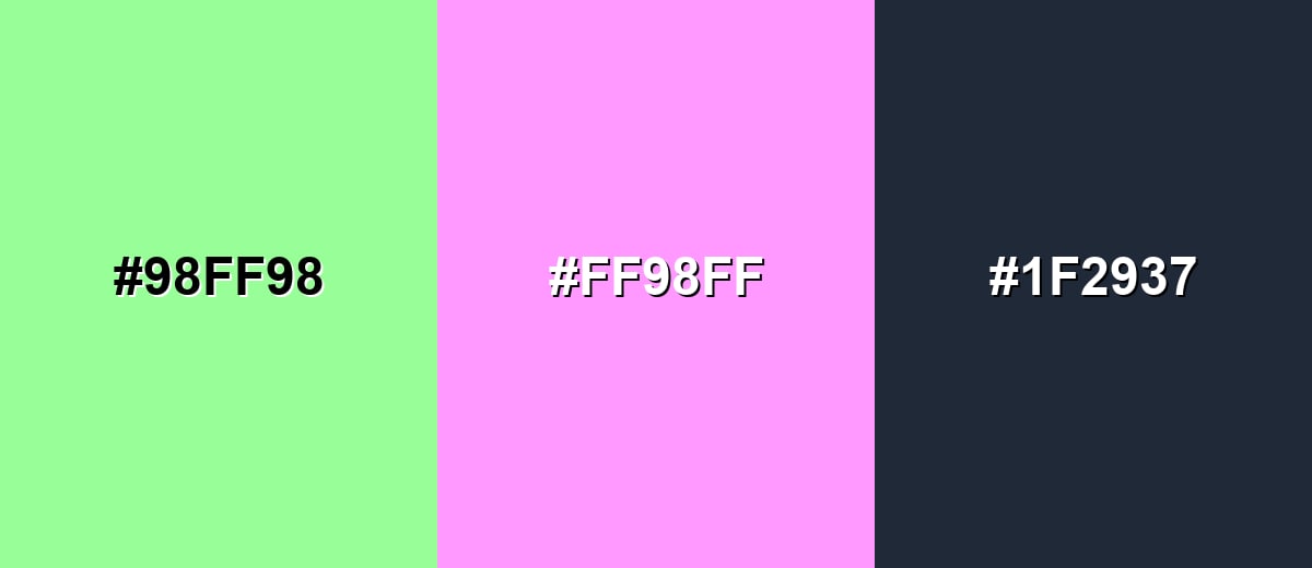
Complementary Colors
A complementary pairing puts mint opposite a soft magenta tone, creating energetic contrast while still staying pastel and friendly.
Complementary Palette Example: Use mint as the base, add soft magenta for highlights, and anchor the layout with charcoal for readability.
Analogous Color Schemes
Analogous colors sit adjacent to each other on the color wheel, creating harmonious, cohesive palettes with subtle variation.
Aqua-mint and lime accents keep the palette fresh and nature-leaning without feeling loud.
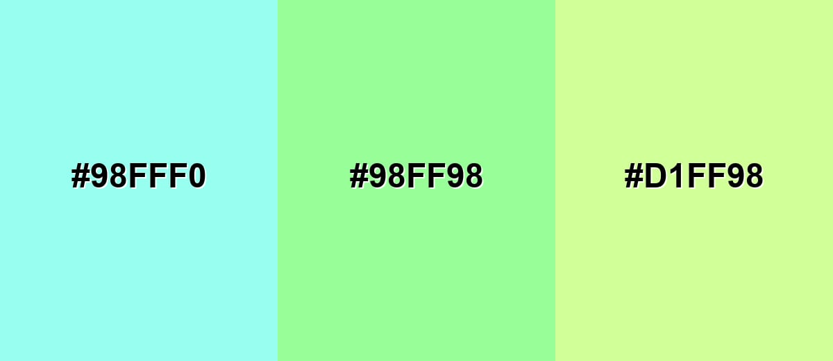
- Pale Aqua: #98FFF0
- Mint: #98FF98
- Pale Lime: #D1FF98
A cooler run from sky blue to mint to soft yellow-green works well for clean, modern layouts.
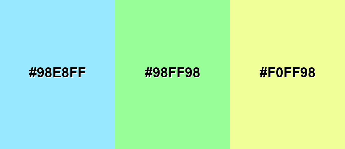
- Icy Sky: #98E8FF
- Mint: #98FF98
- Soft Lemon: #F0FF98
Triadic & Tetradic Combinations
A triadic scheme adds two evenly spaced accents for variety while keeping balance.
Mint with blush red and light periwinkle feels playful, friendly, and great for modern illustrations.
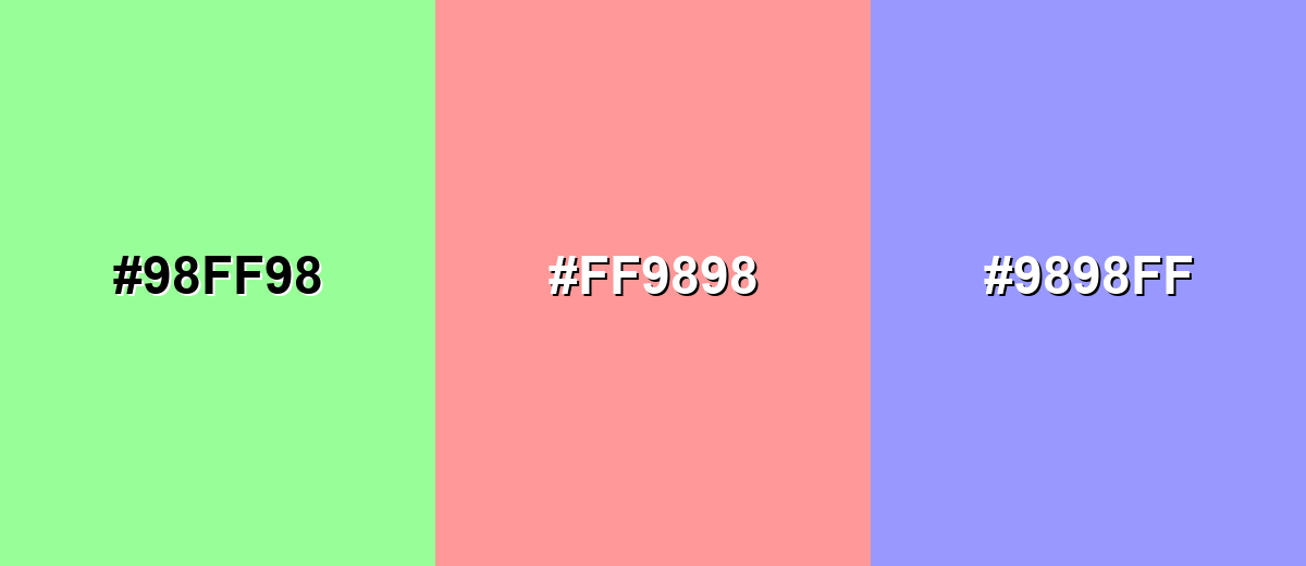
- Mint: #98FF98
- Blush Red: #FF9898
- Light Periwinkle: #9898FF
Colors to Avoid
While mint color is remarkably versatile, certain combinations can create problematic visual effects:
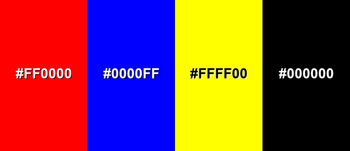
- Pure Red (#FF0000) - The contrast is harsh and can make mint look overly neon, which may feel noisy in UI and branding.
- Pure Blue (#0000FF) - This pairing can look overly primary and unrefined, pulling attention away from mint's soft, fresh character.
- Neon Yellow (#FFFF00) - Both are high-energy; together they can overwhelm the eye and reduce readability for key elements.
- Pure Black (#000000) - The jump in contrast can feel abrupt and clinical; a softer dark neutral often looks more balanced.
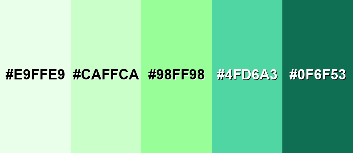
Shades, Tints & Variations of Mint Color
Mint isn't just one pastel green—its range runs from barely-there tints to deeper green-teal anchors. Using a few related variations helps you keep that fresh "mint" identity while still building depth, hierarchy, and contrast across a layout.
- Mint Frost (#E9FFE9) - An ultra-light tint that feels almost white with a gentle green cast. It's best used for Backgrounds, large surfaces, and airy layouts where you want a clean, bright feel..
- Pastel Mint (#CAFFCA) - A soft tint that keeps mint's freshness but reads more subtle and calm. It's best used for Cards, section panels, packaging, and supporting UI areas..
- Classic Mint (#98FF98) - The bright, recognizable mint tone with a crisp pastel look. It's best used for Accents, highlights, illustrations, and brand palettes that need a fresh signature shade..
- Deep Mint (#4FD6A3) - A richer, darker mint that adds structure while staying cool and modern. It's best used for Buttons, icons, headers, and contrast elements alongside lighter mint tints..
- Dark Mint (#0F6F53) - A grounded green-teal shade that keeps the mint family feel with more weight. It's best used for Text accents, navigation, outlines, and any place you need strong contrast..
Industry Applications
Because mint reads as clean, light, and approachable, it fits industries that benefit from clarity and a sense of wellbeing. It is also flexible enough for playful consumer brands when paired with warmer accents.
Fashion & Beauty
- Skincare Labeling - Supports clean product labeling and minimal brand systems that feel gentle and modern.
- Ingredient-Forward Visuals - Helps ingredient or routine messaging feel fresh and simple instead of heavy.
- Wellness Onboarding - Works well for calm landing pages and app onboarding in self-care experiences.
- Pastel Collections - Fits seasonal collections built around pastel palettes, especially with soft accent colors.
Interior Design & Decor
- Brightening Accents - Great for paint accents, tiles, and cabinetry when you want a brighter, more open feel.
- Fresh Textiles - Adds lightness through textiles and décor without making a room feel heavy.
- Small-Space Details - Works best as a focused accent in smaller rooms where full coverage can feel clinical.
- Kid-Friendly Spaces - A playful option for kids spaces when balanced with neutrals and warm materials.
Branding & Marketing
- Friendly SaaS UI - Helps dashboards and product surfaces feel calm and approachable in technology and SaaS.
- Progress And Success States - Ideal for success states and progress indicators when paired with clear labels and icons.
- Fresh Food Cues - Signals fresh or light flavor cues (herbal, citrus, cooling) in food and beverage visuals.
- Modern Badges - Works well for menu highlights and promotional badges when used sparingly.
Conclusion
Mint color stands out for its crisp pastel green look and its ability to feel both clean and welcoming in modern design. With #98FF98 as a reliable starting point, you can build a consistent palette for UI, branding, print, or interiors—then add structure with deeper neutrals or darker mint variations for contrast and readability. Whether you use mint as a soft background, a gentle highlight, or a signature accent, the best results come from balance: let mint deliver freshness, and let stronger supporting colors handle hierarchy, text clarity, and focus.
Design Smarter with AI: Media.io is an online AI studio that empowers creators with advanced image generation and enhancement tools. From text-to-image and image-to-image creation to AI upscaling and color optimization, it enables fast, creative, and professional results—all in your browser.

Frequently Asked Questions About Mint Color
Mint is a light, cool green with a soft pastel brightness, similar to the look of fresh mint leaves. It often sits between green and aqua, which gives it a clean, airy feel.
A widely used digital reference for mint is #98ff98. It produces a bright pastel green that works well for clean, modern palettes.
Mint is primarily green, but it can lean slightly toward blue depending on lighting, surrounding hues, and screen settings. Cooler environments tend to make it look more aqua, while warm surroundings make it look greener.
Mint is commonly associated with freshness, clarity, and a calm, renewed feeling. In practical design terms, it can make interfaces and visuals feel lighter, cleaner, and more approachable.
Mint pairs nicely with soft magenta or blush accents for contrast, and with charcoal-like neutrals for readability. It also works well with nearby hues like pale aqua and light yellow-green for a gentle, cohesive look.
Use mint mainly for backgrounds, highlights, or large soft areas, and place text and key controls on darker neutrals for contrast. Also avoid relying on mint alone to communicate important states; add labels, icons, or patterns.


