

Puce color is a muted purplish red that often reads like a dusty rose with a subtle brown cast in real life. A widely used reference for puce is the HEX code #CC8899, which feels vintage, grounded, and a little dramatic without being loud.
The name traces back to French origins (famously linked to the word for "flea"), which helped shape its historical identity in fashion and décor. Below, you'll find puce color codes, conversions, symbolism, best pairings, and practical ways to use it in modern design.
Puce Color: Codes & Values
If you want puce color to look consistent across tools, screens, and print outputs, start with its core values below.
| Parameters | VALUE |
| HEX Code | #CC8899 |
| RGB DECIMAL | 204, 136, 153 |
| RGB PERCENTAGE | 80%, 53%, 60% |
| CMYK | 0%,33%,25%,20% |
| HSL | 345°, 40%, 67% |
| HSV (HSB) | 345°, 33%, 80% |
| Web Safe | #CC9999 |
Key Color Space Explanations:
- HEX - HEX is the most common way to specify puce in web design and digital tools. Use #cc8899 to keep the shade consistent across screens.
- RGB - RGB mixes red, green, and blue light for screens and UI elements. Puce at 204, 136, 153 helps you fine-tune tints and overlays in digital layouts.
- CMYK - CMYK is used for ink-based printing like packaging and stationery. The CMYK values help reduce unexpected shifts when puce is printed on different paper stocks.
- HSL - HSL describes hue, saturation, and lightness, which is handy for building matching tints and darker accents. It makes it easier to keep the overall look muted rather than overly pink.
- Web Safe - Web Safe is a legacy palette used for very limited displays, approximated here as #cc9999. It is useful when you need a simple fallback shade that stays close to puce.
For most web projects, using #CC8899 is the simplest option; switch to RGB when you're building overlays, and reference CMYK when you need puce to print reliably.
Puce Color Conversions
Use these conversions when moving puce between apps (web, design software, and printing workflows) without losing its dusty, muted character.
| Parameters | VALUE | CSS |
| HEX | #cc8899 | #cc8899 |
| RGB DECIMAL | 204, 136, 153 | rgb(204,136,153) |
| RGB PERCENTAGE | 80%, 53%, 60% | rgb(80%,53%,60%) |
| CMYK | 0%,33%,25%,20% | cmyk(0%,33%,25%,20%) |
| HSL | 345°, 40%, 67% | hsl(345°,40%,67%) |
| HSV (or HSB) | 345°, 33%, 80% | -- |
| Web Safe | cc9999 | #cc9999 |
| CIE-LAB | 64.0, 29.0, 2.0 | -- |
| XYZ | 39.5, 32.8, 34.3 | -- |
| xyY | 0.370, 0.307, 32.8 | -- |
| CIE-LCH | 64.0, 29.1, 4.0 | -- |
| CIE-LUV | 64.0, 42.4, -2.7 | -- |
| Hunter-Lab | 57.2, 26.8, 1.5 | -- |
| Binary | 11001100 10001000 10011001 | -- |
Want to generate Puce Color photos or posters? Try Media.io's AI Image Generator now!
Puce Color Meaning & Symbolism
Puce is often associated with mature warmth, nostalgia, and understated confidence. Because it sits between pink, red, and brown, it can feel both romantic and grounded in everyday settings.
Psychological Effects
In visual design, puce tends to calm the mood while still adding emotional depth.
- Soft Depth - Puce feels gentler than a true red, but it still carries a strong, expressive tone.
- Refined Calm - Balanced with light neutrals, it reads calm and polished rather than flashy.
- Serious Warmth - Its muted quality can signal stability and maturity, especially in branding and packaging.
- Nostalgic Comfort - The dusty, vintage cast often brings a sense of familiarity and "lived-in" charm.
- Visual Heaviness Risk - Overused or placed in low-contrast layouts, puce can look dull or heavy and reduce clarity.
Positive Associations
When used thoughtfully, puce communicates warmth without leaning overly sweet.
- Authenticity - Its earthy undertone feels honest and less "manufactured" than bright pinks.
- Understated Luxury - Deeper puce accents can look premium without going stark or cold.
- Romance, Grown-Up - It nods to romance while staying mature and grounded.
- Editorial Sophistication - Puce works well in lifestyle layouts that aim for a curated, modern-classic vibe.
- Welcoming Energy - As an accent, it adds warmth that makes interfaces and spaces feel inviting.
Cultural Significance Across the World
Puce has a strong historical identity, and today it's often read through a vintage, fashion-forward lens.
- French Heritage - The name comes from French roots, tying the color to older European style references.
- Fashion & Décor History - Dusty, complex reds like puce appeared in historical fashion and interior trends.
- Vintage Charm - Modern usage commonly signals nostalgia, craftsmanship, and a classic mood.
- Dramatic Elegance - It suggests a quiet drama—more elegant and restrained than bright, sugary pinks.
Design Applications
Puce is easiest to use when you treat it as a sophisticated accent rather than an all-over statement. Start with one main role, then build supporting tones around it.
Graphic Design Tips
- Use puce for highlights like badges, tabs, or selected states when you want something softer than bright red but still noticeable.
- Pair it with a pale background to keep layouts airy and editorial, then introduce a deeper puce shade for headings.
- Reserve puce for brand accents (labels, patterns, icons) if your palette already has many mid-tones.
- In typography, choose a strong neutral for body text and keep puce for emphasis, not paragraphs.
- Check contrast early—puce can blend into nearby dusty tones, especially in muted UI themes.
Pro tip: If puce feels a bit "flat," add hierarchy with a darker puce for key UI elements and keep surrounding surfaces lighter so the color reads intentional, not faded.
Puce Color in Photography & Video
- Use puce as a background or prop color to add a vintage mood without stealing attention from the subject.
- In portraits, puce accents can complement warm skin tones, especially in soft, diffused lighting.
- For product shots, try puce as a secondary tone (ribbons, packaging details, shadows) to create depth.
- In video color grading, keep puce in the mid-tones and avoid pushing saturation too far to preserve the dusty look.
- Always test on multiple screens—muted reds can shift warmer or cooler depending on display settings.
Recommended Tool for Image Enhancement: When incorporating puce color into your photography projects, Media.io's AI Image tools can help you achieve more refined results. With AI-powered color enhancement, photo colorization, image upscaling, and old photo restoration, you can easily enrich puce color tones, improve overall image quality, and highlight the color's elegant and sophisticated aesthetic.
Color Combinations
Puce pairs best with soft greens, gentle blues, and light neutrals that keep its dusty character intact. These palettes cover common harmony choices you can reuse in branding, UI themes, and décor planning.
Complementary Colors
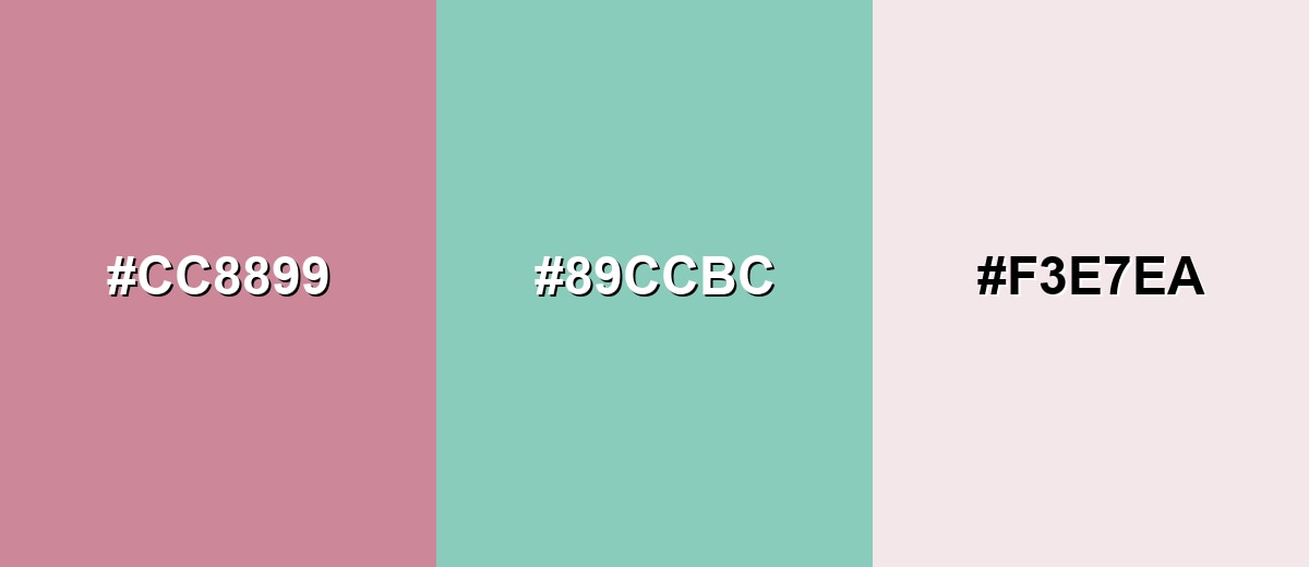
A complementary match brings in a green-leaning counterpoint to balance puce and keep it from feeling overly rosy. This pairing is great for layouts that need energy but still look refined.
Complementary Palette Example: Try Puce with Seafoam and a light neutral for a clean, modern contrast.
Analogous Color Schemes
Analogous colors sit adjacent to each other on the color wheel, creating harmonious, cohesive palettes with subtle variation.
Stay close on the wheel for a romantic, blended look using Puce with Orchid Mist and Rosy Taupe.
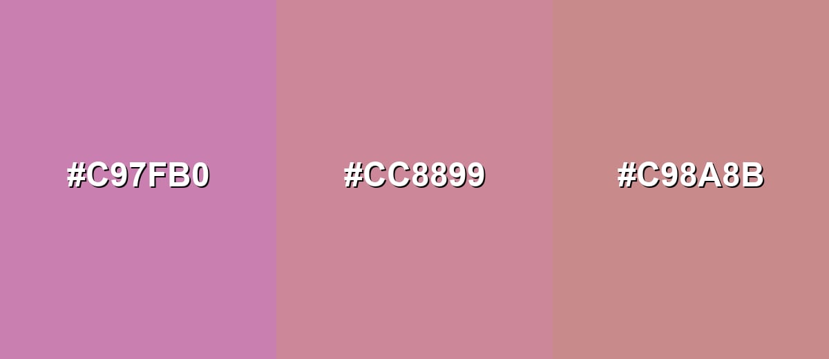
- Orchid Mist: #C97FB0
- Puce: #CC8899
- Rosy Taupe: #C98A8B
For a warmer, vintage palette, combine Puce with Clay Pink and Soft Mulberry.
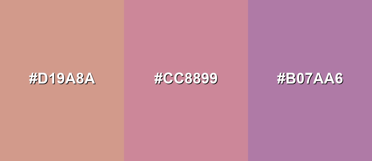
- Clay Pink: #D19A8A
- Puce: #CC8899
- Soft Mulberry: #B07AA6
Triadic & Tetradic Combinations
A triadic palette creates variety while keeping balance across warm and cool notes.
Use Puce with Sage Green and Dusty Cornflower for a friendly, design-forward mix.
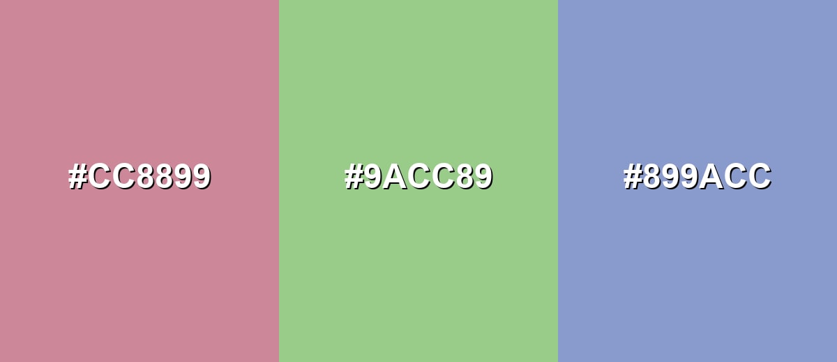
- Puce: #CC8899
- Sage Green: #9ACC89
- Dusty Cornflower: #899ACC
Colors to Avoid
While puce color is remarkably versatile, certain combinations can create problematic visual effects:
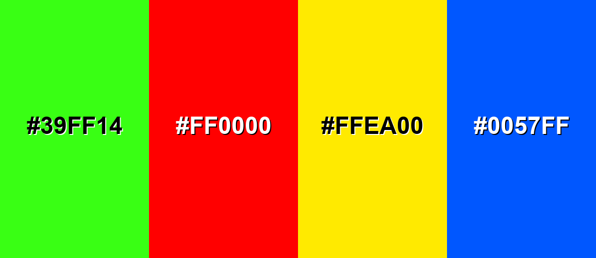
- Neon Green (#39FF14) - The intensity overpowers puce and makes it look muddy or gray by comparison.
- Pure Red (#FF0000) - A fully saturated red competes with puce and can make it feel washed out rather than rich.
- Bright Yellow (#FFEA00) - High-brightness yellow creates harsh contrast that breaks puce's soft, vintage character.
- Electric Blue (#0057FF) - Strong blue contrast can turn the overall palette loud and distract from puce's subtle warmth.
Shades, Tints & Variations of Puce Color
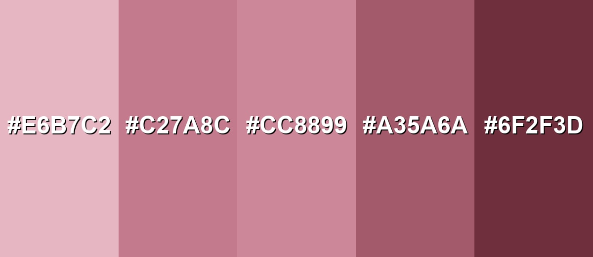
Puce isn't just one fixed shade—its range runs from light, airy tints to deep, wine-leaning tones. Having a few puce variations on hand makes it easier to create contrast, hierarchy, and a more "designed" look across UI, print, and interiors.
- Light Puce (#E6B7C2) - A soft, airy tint that keeps the rosy undertone while feeling brighter and more delicate. It's best used for Backgrounds, large areas, and gentle gradients in UI or editorial layouts..
- Dusty Puce (#C27A8C) - A slightly deeper, more muted take that reads balanced between rose and brown. It's best used for Buttons, cards, and accent sections where you want warmth without high saturation..
- Classic Puce (#CC8899) - The reference shade with a dusty rose character and a subtle brown cast. It's best used for Brand accents, packaging elements, and highlight details..
- Deep Puce (#A35A6A) - A darker version that feels more dramatic and works well for structure and emphasis. It's best used for Headings, borders, icons, and anchor elements that need stronger visual weight..
- Dark Puce (#6F2F3D) - A rich, wine-leaning shade that can feel moody while staying within the same family. It's best used for Text on light backgrounds, luxury styling, and high-contrast accents..
Industry Applications
Because puce sits between soft romance and earthy maturity, it adapts well across industries that want warmth without looking overly sweet. It is especially effective when used as an accent supported by calm neutrals and a darker shade for contrast.
Fashion & Beauty
- Muted lipstick or blush-inspired palettes that feel mature, not neon-bright.
- Autumn and vintage styling concepts where dusty tones look intentional and luxe.
- Accessories that add warmth to neutral outfits without overpowering the look.
- Packaging or campaign accents that signal softness with a confident edge.
Interior Design & Decor
- Accent walls that feel cozy and flattering in softer light.
- Textiles like cushions, throws, and curtains for a warm, layered palette.
- Decor pieces that add depth without high saturation or glossy brightness.
- Pairing with natural materials (wood, linen, stone looks) for a grounded finish.
Branding & Marketing
- Accent tone for premium, vintage-inspired brands that want warmth and restraint.
- Secondary brand shade for lifestyle and editorial positioning (especially with clean neutrals).
- Badges, selected states, and subtle highlights in UI that need to stand out softly.
- Packaging details that feel handcrafted or authentic without drifting into bright pink.
Conclusion
Puce stands out for its dusty, purplish-red character that feels nostalgic and grounded at the same time. It brings warmth without the sharpness of bright red, making it a smart choice for branding accents, UI highlights, packaging details, and cozy interior touches. Start with #CC8899, keep contrast clear, and balance it with supportive greens, muted blues, and light neutrals to preserve its refined, vintage mood. With lighter tints and deeper puce shades available, it's also easy to build a complete palette with strong hierarchy and personality.
Design Smarter with AI: Media.io is an online AI studio that empowers creators with advanced image generation and enhancement tools. From text-to-image and image-to-image creation to AI upscaling and color optimization, it enables fast, creative, and professional results—all in your browser.

Frequently Asked Questions About Puce Color
Puce typically looks like a muted purplish red, similar to dusty rose with a slight brown undertone. It can appear warmer or cooler depending on lighting and nearby shades.
A common digital reference for puce is #cc8899. If you need a close fallback, the web-safe approximation is #cc9999.
It sits between the two. Many people read puce as a softened red-pink with a hint of purple, especially when placed next to true pinks or violets.
Soft greens, muted blues, and light neutrals pair especially well. Seafoam, Sage Green, Dusty Cornflower, and Warm Ivory are dependable options for balanced palettes.
Use it as an accent rather than a full background, and support it with a lighter surface tone. For text and key UI elements, consider a deeper puce shade to improve separation.
Yes, especially for brands that want warmth, authenticity, or a vintage edge. It can feel modern when paired with clean neutrals and cool counterpoints like soft greens or blues.


