

Duck egg blue color is a pale, muted blue-green that looks like a washed sky tone with a hint of soft seafoam. With its low saturation and airy feel, it's a go-to shade for calm, clean palettes that never feel loud.
Commonly referenced as #C3D6D6, duck egg blue can lean slightly cooler or greener depending on lighting and nearby colors. Below, you'll find its key color codes, conversions, pairing ideas, and shade variations you can use in UI, branding, and interiors.
Duck Egg Blue Color: Codes & Values
These are the standard values designers and printers use to reproduce duck egg blue consistently across screens and materials.
| Parameters | VALUE |
| HEX Code | #C3D6D6 |
| RGB DECIMAL | 195, 214, 214 |
| RGB PERCENTAGE | 76.5%, 83.9%, 83.9% |
| CMYK | 9%,0%,0%,16% |
| HSL | 180°, 19%, 80% |
| HSV (HSB) | 180°, 9%, 84% |
| Web Safe | #CCCCCC |
Key Color Space Explanations:
- HEX - HEX is the most common digital identifier for this shade, used in web design tools and CSS. Duck egg blue is #c3d6d6.
- RGB - RGB mixes red, green, and blue light to display the tone on screens. Higher values here create the soft, airy look typical of duck egg blue.
- CMYK - CMYK is used for printing, describing ink percentages for cyan, magenta, yellow, and black. Low ink levels help keep the finish light and muted on paper.
- HSL - HSL describes hue, saturation, and lightness, which is helpful for adjusting the shade without changing its overall character. Duck egg blue sits around a 180° hue with low saturation and high lightness.
- Web Safe - Web safe is the closest older-browser palette approximation of the shade. The nearest match to #c3d6d6 is #cccccc.
For quick styling, use the HEX code in CSS, then switch to RGB/HSL when you need fine control over transparency, contrast, or shade adjustments.
Duck Egg Blue Color Conversions
Use these conversions to match duck egg blue across different software, color pickers, and print workflows.
| Parameters | VALUE | CSS |
| HEX | #c3d6d6 | #c3d6d6 |
| RGB DECIMAL | 195, 214, 214 | rgb(195,214,214) |
| RGB PERCENTAGE | 76.5%, 83.9%, 83.9% | rgb(76.5%,83.9%,83.9%) |
| CMYK | 9%,0%,0%,16% | cmyk(9%,0%,0%,16%) |
| HSL | 180°, 19%, 80% | hsl(180°,19%,80%) |
| HSV (or HSB) | 180°, 9%, 84% | -- |
| Web Safe | cccccc | #cccccc |
| CIE-LAB | 84.2, -7.0, -2.2 | -- |
| XYZ | 58.6, 64.6, 72.9 | -- |
| xyY | 0.299, 0.329, 64.6 | -- |
| CIE-LCH | 84.2, 7.3, 197.4° | -- |
| CIE-LUV | 84.2, -10.7, -2.5 | -- |
| Hunter-Lab | 80.4, -6.5, -2.1 | -- |
| Binary | 11000011 11010110 11010110 | -- |
Want to generate duck egg blue color photos or posters? Try Media.io's AI Image Generator now!
Duck Egg Blue Meaning & Symbolism
Duck egg blue is widely associated with calm, clarity, and softness. Because it sits between blue and green, it often feels both restful and fresh, which is why it shows up in spaces meant to feel light and welcoming. In everyday life, duck egg blue color meaning often lands somewhere between soothing and quietly refined, rather than energetic or loud.
Psychological Effects
Because it's muted and light, duck egg blue tends to soften the overall "volume" of a design.
- Lower Visual Intensity - This shade reduces harshness on the eyes, helping layouts and rooms feel calmer and less busy.
- Breathable Space - In UI and branding, it can make compositions feel more open by adding color without adding noise.
- Clean & Ordered Feel - Its soft, cool balance can communicate tidiness and structure, especially in minimal layouts.
- Trustworthy Calm - The gentle blue-green tone often reads as steady and comforting rather than flashy.
- Can Feel Chilly If Overused - When paired with very cool neutrals or used everywhere, it may come across as distant or sterile.
Positive Associations
Duck egg blue is often chosen when you want a friendly, welcoming mood with a polished edge.
- Calm - A soothing presence that supports relaxed, low-stress visuals.
- Clarity - Helps content feel easy to scan, especially as a background or surface color.
- Softness - Adds a gentle touch without turning overly sweet or bright.
- Freshness - The hint of green gives it a clean, airy lift that still feels understated.
- Quiet Refinement - A subtle, "considered" look that feels modern with a touch of vintage charm.
Cultural Significance Across the World
Its name and popularity in décor give duck egg blue a familiar, lived-in character.
- Natural Origin - Named after the subtle tint found on some duck eggshells, it carries an organic, recognizable association.
- Vintage Decor Link - Commonly tied to classic painted finishes, often used to create a softly nostalgic look.
- Coastal Mood - Frequently read as light and breezy, echoing sea-and-sky tones in relaxed styling.
- Understated Tradition - Can feel timeless rather than trendy, especially when paired with warm neutrals and natural textures.
Design Applications
Duck egg blue is easy to live with because it is light, soft, and adaptable. Use it as a background, a gentle brand tone, or a supporting shade that keeps other elements feeling balanced.
Graphic Design Tips
- Use it for backgrounds and surfaces behind cards, forms, and content blocks to keep visual noise low.
- Pair it with deeper anchors (like slate tones) for crisp hierarchy in headings, icons, and dividers.
- For buttons and highlights, keep contrast clear by using darker text or a deeper accent color.
- Balance warmth and coolness with soft warm accents (like blush-leaning tones) to avoid a sterile feel.
- Plan accessibility early: duck egg blue is very light, so white text often won't pass contrast checks.
A practical rule: treat duck egg blue as a "canvas color," then add one dark anchor for readability and one warm accent for personality.
Duck Egg Blue in Photography & Video
- Use it as a clean backdrop for product shots where you want a calm, airy mood.
- Add warmer props or materials to prevent the scene from leaning too cool or clinical.
- Watch lighting shifts: it can look greener in warm light and bluer in cool light, especially on textured surfaces.
- For lifestyle compositions, pair it with natural textures (wood, stone-like neutrals, brushed metal finishes) for depth.
- When color grading, keep saturation modest so the "soft vintage" quality stays intact.
Recommended Tool for Image Enhancement: When incorporating duck egg blue into your photography projects, Media.io's AI Image tools can help you achieve more refined results. With AI-powered color enhancement, photo colorization, image upscaling, and old photo restoration, you can easily enrich duck egg blue tones, improve overall image quality, and highlight the color's elegant and sophisticated aesthetic.
Color Combinations
Duck egg blue pairs best with grounded darks, soft warm tints, and neighboring blue-green pastels. The palettes below offer a practical mix of calm, contrast, and accent options for modern layouts and décor.
Complementary Colors
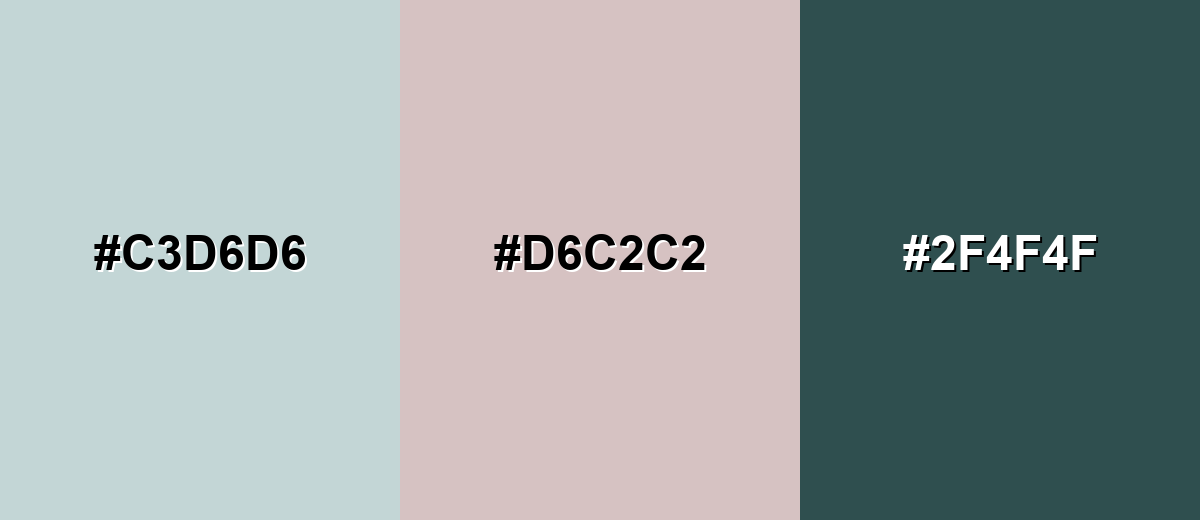
A soft blush complement adds warmth and keeps the overall look balanced, while a deep slate provides the contrast needed for clean hierarchy.
Complementary Palette Example: Use duck egg blue with soft blush and deep slate for a calm base with warm lift and strong readability.
Analogous Color Schemes
Analogous colors sit adjacent to each other on the color wheel, creating harmonious, cohesive palettes with subtle variation.
Blue-leaning pastels keep things airy while still feeling layered and dimensional.
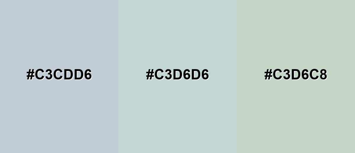
- Pale Blue Gray: #C3CDD6
- Duck Egg Blue: #C3D6D6
- Pale Aqua: #C3D6C8
A slightly richer seafoam and powdery blue make a relaxed palette with a bit more character.
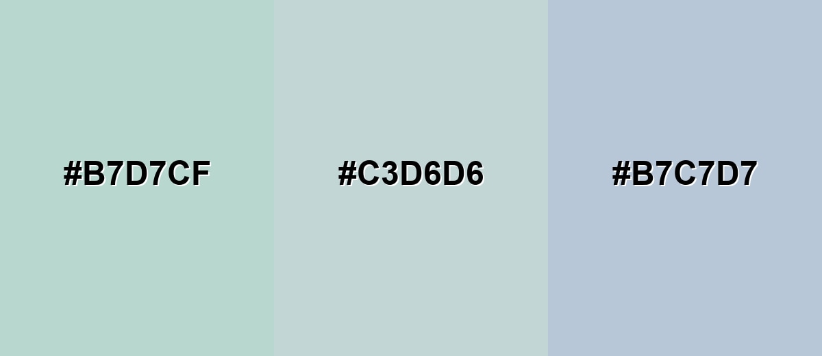
- Seafoam Tint: #B7D7CF
- Duck Egg Blue: #C3D6D6
- Powder Blue Tint: #B7C7D7
Triadic & Tetradic Combinations
A triadic set adds gentle variety without turning the palette loud.
Combine duck egg blue with pale butter and soft lavender for a balanced pastel trio.
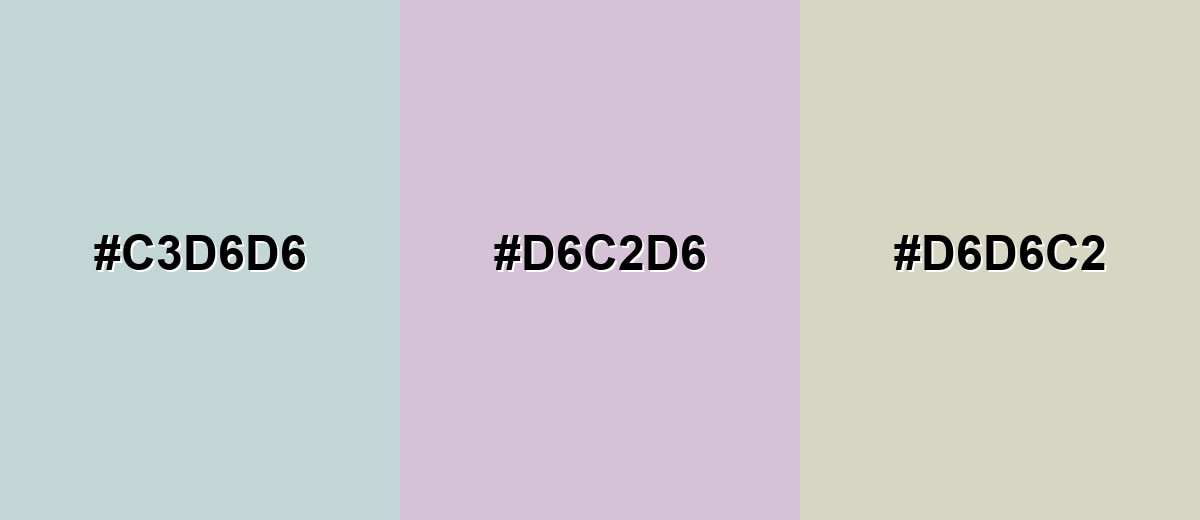
- Duck Egg Blue: #C3D6D6
- Soft Lavender: #D6C2D6
- Pale Butter: #D6D6C2
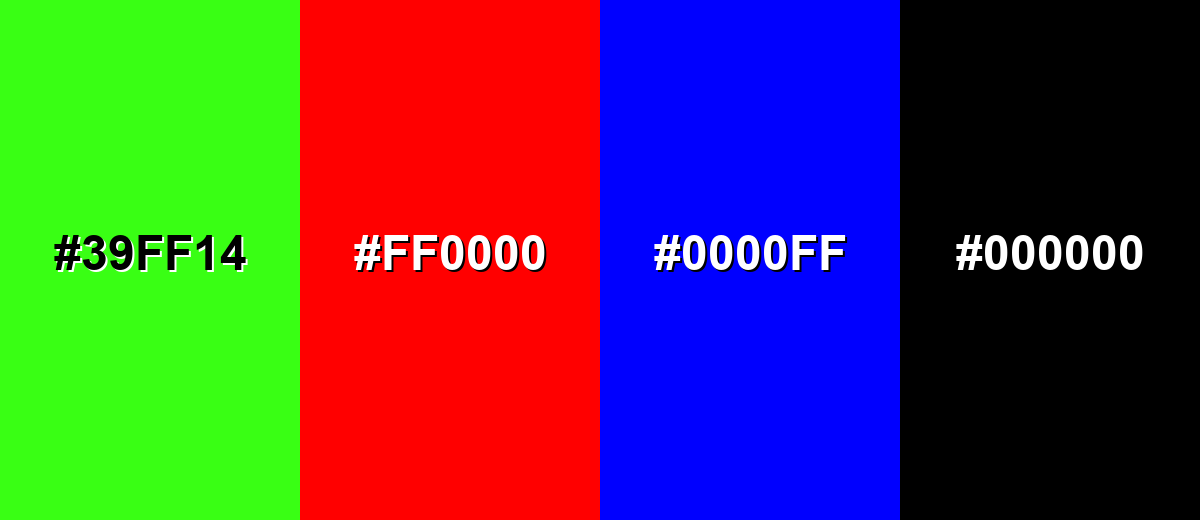
Colors to Avoid
While duck egg blue is remarkably versatile, certain combinations can create problematic visual effects:
- Neon Lime (#39FF14) - The intensity overwhelms duck egg blue and creates a sharp, high-vibration clash that can feel chaotic.
- Pure Red (#FF0000) - Strong red pulls focus too aggressively and can make the overall look feel unbalanced and overly loud.
- Electric Blue (#0000FF) - A fully saturated blue can make duck egg blue look dull by comparison and reduces the subtle, refined effect.
- Jet Black (#000000) - The contrast can be harsh and heavy; charcoal or deep slate usually feels smoother and more modern.
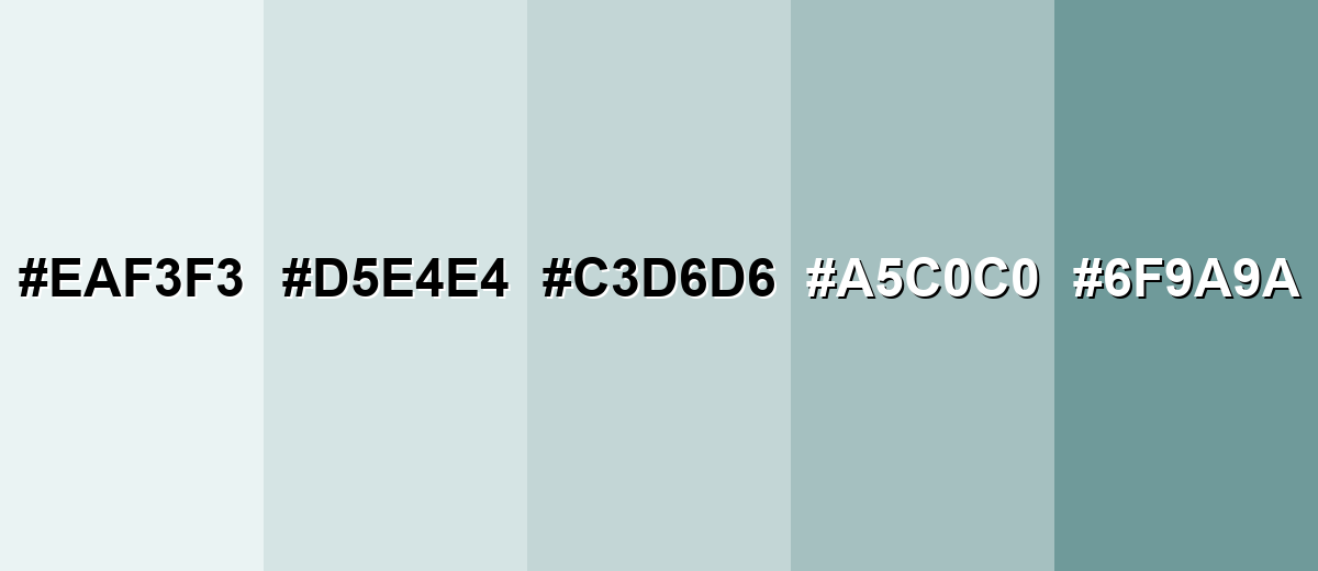
Shades, Tints & Variations of Duck Egg Blue
Duck egg blue has a surprisingly flexible range—from barely-there tints for bright, minimal backgrounds to deeper versions that add structure and contrast. Exploring these variations helps you keep the same mood while dialing the design up or down for different screens, rooms, and materials.
- Ice Mist (#EAF3F3) - A barely-there tint that reads clean and bright while keeping a soft blue-green undertone. It's best used for Large backgrounds, minimal UI, airy rooms, and negative space.
- Pale Duck Egg (#D5E4E4) - A light, gentle variation that stays neutral enough to pair with many materials and accents. It's best used for Walls, card surfaces, subtle fills, and calming brand backdrops.
- Classic Duck Egg (#C3D6D6) - The balanced, recognizable duck egg look: muted, fresh, and softly coastal. It's best used for Primary brand tone, interface sections, décor accents, and stationery.
- Dusty Duck Egg (#A5C0C0) - A more muted mid-tone that feels slightly aged and works well with natural textures. It's best used for Secondary UI elements, cabinetry, textiles, and supporting brand colors.
- Deep Duck Egg (#6F9A9A) - A deeper, more grounded variation that brings stronger contrast and structure. It's best used for Headings, icons, borders, feature walls, and paired accents with light neutrals.
Industry Applications
Because it is soft and adaptable, duck egg blue shows up across digital design and physical products. It works best where you want calm clarity and an inviting, modern finish.
Fashion & Beauty
- Use it as a wearable pastel that pairs naturally with denim and soft neutrals.
- Build gentle seasonal palettes with beige, gray, and blush-leaning accents.
- For lookbooks and ecommerce visuals, it makes a clean, quiet backdrop that doesn't steal focus.
- Keep finishes soft and muted to match its understated, refined character.
Interior Design & Decor
- Use it on walls, cabinetry, or built-ins to create an airy look without stark white.
- Pair it with warm whites, light woods, and brushed metal finishes for balance.
- Add texture through textiles (linens, cushions, ceramics) to keep the palette feeling layered.
- Test it under real lighting since it can shift bluer or greener depending on the room.
Branding & Marketing
- Fit it into soft brand identities that want calm, care, and reliability.
- Use it in packaging for home, wellness, and lifestyle positioning with minimal typography.
- In web/app design, apply it to backgrounds, onboarding screens, and calm empty states.
- Support readability with deeper text colors rather than white on this light shade.
Conclusion
Duck egg blue brings a soft blue-green balance that feels calm, clean, and quietly refined—perfect for airy interfaces, gentle brand systems, and welcoming interiors. Starting with #C3D6D6, you can create palettes that stay relaxed but still look intentional by pairing it with deeper anchors for contrast and a small warm accent for lift. Whether you lean minimal with pale tints or add structure using deeper variations, duck egg blue is one of those easy-to-use shades that keeps visual communication readable, modern, and comfortable.
Design Smarter with AI: Media.io is an online AI studio that empowers creators with advanced image generation and enhancement tools. From text-to-image and image-to-image creation to AI upscaling and color optimization, it enables fast, creative, and professional results—all in your browser.

Frequently Asked Questions About Duck Egg Blue Color
Quick answers to the most common questions about duck egg blue, from how it looks to pairing and contrast tips.
Duck egg blue is a light, muted blue-green. It often looks like a soft, powdery mix of pale blue and a hint of seafoam, with a slightly gray, vintage finish.
A commonly used hex value for duck egg blue is #c3d6d6. Depending on the paint brand or digital palette, you may see close variations that lean a bit greener or bluer.
It pairs well with warm whites, sand, light wood tones, blush, muted terracotta, and deeper anchors like slate or charcoal. These combinations keep the look soft while maintaining clear contrast.
A gentle complementary direction is a soft, warm blush or pale peach. Using a muted complement rather than a saturated orange helps maintain duck egg blue's calm, refined feel.
No. Robin egg blue is usually brighter and more saturated, often reading as a clearer turquoise. Duck egg blue is typically softer, grayer, and more understated.
It is excellent for backgrounds because it is light and low-intensity, but it needs dark text for readability. Deep slate, charcoal, or near-black usually provides stronger contrast than white.


