

Mulberry color is a deep purplish-red that looks like the skin of ripe mulberries—rich, velvety, and slightly wine-toned. A widely used digital reference for this shade is hex #C54B8C.
It often feels creative and luxurious, with a confident warmth that still reads refined. Below, you'll find mulberry's key color codes, conversions, meanings, best pairings, and practical ways to use it in design.
Mulberry Color: Codes & Values
If you want mulberry to look consistent across web, UI, and print, start with these core values and adjust from there based on lighting, screens, and paper stock.
| Parameters | VALUE |
| HEX Code | #C54B8C |
| RGB DECIMAL | 197, 75, 140 |
| RGB PERCENTAGE | 77.3%, 29.4%, 54.9% |
| CMYK | 0%,62%,29%,23% |
| HSL | 328°, 51%, 53% |
| HSV (HSB) | 328°, 62%, 77% |
| Web Safe | #CC3399 |
Key Color Space Explanations:
- HEX - HEX is the most common way to specify a screen-ready shade for web and UI. Use #c54b8c to match this mulberry tone consistently across digital assets.
- RGB - RGB defines how much red, green, and blue light is mixed on screens. Mulberry's RGB values help you fine-tune opacity, gradients, and on-screen effects.
- CMYK - CMYK is used for printing with cyan, magenta, yellow, and black inks. The CMYK breakdown gives a practical starting point for packaging, posters, and stationery.
- HSL - HSL describes hue, saturation, and lightness in a way that's intuitive for adjusting tone. It's handy when you want lighter tints for backgrounds or deeper shades for headings.
- Web Safe - Web-safe values are older, simplified screen standards based on fixed channel steps. The closest web-safe match can be useful when you need broad compatibility or quick approximations.
For most projects, lock in the HEX for UI/branding, lean on RGB for digital effects, and use CMYK as your print starting point—then proof and tweak until the berry-red balance feels right.
Mulberry Color Conversions
Need mulberry in a different format? Here's a quick conversion chart you can copy into design tools, dev handoffs, and print specs.
| Parameters | VALUE | CSS |
| HEX | #c54b8c | #c54b8c |
| RGB DECIMAL | 197, 75, 140 | rgb(197,75,140) |
| RGB PERCENTAGE | 77.3%, 29.4%, 54.9% | rgb(77.3%,29.4%,54.9%) |
| CMYK | 0%,62%,29%,23% | cmyk(0%,62%,29%,23%) |
| HSL | 328°, 51%, 53% | hsl(328°,51%,53%) |
| HSV (or HSB) | 328°, 62%, 77% | -- |
| Web Safe | cc3399 | #cc3399 |
| CIE-LAB | 55.1, 52.4, -9.3 | -- |
| XYZ | 34.2, 20.8, 27.4 | -- |
| xyY | 0.416, 0.253, 20.8 | -- |
| CIE-LCH | 55.1, 53.2, 349.9° | -- |
| CIE-LUV | 55.1, 80.0, -22.0 | -- |
| Hunter-Lab | 45.6, 42.8, -4.8 | -- |
| Binary | 11000101 01001011 10001100 | -- |
Want to generate Mulberry Color photos or posters? Try Media.io's AI Image Generator now!
Mulberry Color Meaning & Symbolism
Mulberry often represents creative confidence, sophistication, and a sense of depth. It carries some of red's energy while borrowing purple's association with imagination and style. In everyday life, the Mulberry Color meaning is frequently tied to expressive taste—bold, but not loud.
Psychological Effects
Mulberry tends to feel intimate and intentional, especially when you give it space and pair it with calmer support colors.
- Intimate - Creates a close, personal mood that feels considered rather than flashy.
- Intentional - Reads deliberate and curated, making layouts feel designed (not default).
- Anchoring - Strong enough to hold attention and structure a page when used in accents.
- Nuanced Warmth - Keeps a confident warmth without the harshness some bright reds can bring.
- Potentially Heavy - In large blocks, it can feel moody or dense and may reduce perceived readability in UI.
Positive Associations
In branding and visual communication, mulberry is often chosen when you want modern premium energy with a human touch.
- Premium Quality - Suggests a richer, more elevated feel than standard pinks or reds.
- Individuality - Signals a distinctive point of view that stands out without being loud.
- Warmth - Adds approachability and confidence, especially against soft neutrals.
- Fashion-Forward - Feels modern and style-led, fitting contemporary brand aesthetics.
- Refinement - Balances boldness with polish, making it ideal for elegant accents and highlights.
Cultural Significance Across the World
Because meanings shift by context, it's smart to test mulberry with your audience and the message your design needs to carry.
- Artistry - Berry-dye associations can hint at creativity, craft, and expressive taste.
- Indulgence - Wine-like tones can feel lush or treat-like, depending on the styling.
- Seasonal Richness - Often reads as autumnal or evening-leaning because of its depth.
- Context-Dependent Meaning - The same shade can feel premium, romantic, or dramatic based on pairing and typography.
Design Applications
Mulberry is easiest to use when you treat it as a statement shade and build breathing room around it. The goal is to keep its richness while maintaining clarity and contrast across screens and print.
Graphic Design Tips
- Use mulberry for primary accents like buttons, badges, active states, or key illustrations rather than full-page backgrounds.
- Pair it with calm neutrals such as Soft Ivory (#f6f1f4) to keep layouts airy and premium-feeling.
- For gradients, blend toward Orchid Purple (#b14bc5) for a more playful feel or toward Wine (#8c2f5c) for a more grounded, editorial look.
- For packaging and print, test proofs under different lighting to confirm the magenta-red balance stays consistent.
- For legibility, reserve mulberry for elements that can carry strong contrast, especially in digital interfaces.
Pro tip: Use mulberry for primary accents like buttons, badges, and active states, then let light backgrounds and generous spacing keep the interface feeling clean.
Mulberry Color in Photography & Video
- Use mulberry as a wardrobe or prop accent to add richness without overpowering skin tones.
- When color grading, watch for shifts toward overly magenta highlights—keep whites and neutrals balanced.
- In product shots, mulberry backdrops work best with clean separation and controlled shadows to avoid a “muddy” look.
- For titles and lower-thirds, use mulberry as a highlight bar or keyline instead of full-screen fills for better readability.
- If you're using gels or colored lighting, test on-camera first—mulberry can read warmer or cooler depending on exposure and surrounding hues.
Recommended Tool for Image Enhancement: When incorporating mulberry color into your photography projects, Media.io's AI Image tools can help you achieve more refined results. With AI-powered color enhancement, photo colorization, image upscaling, and old photo restoration, you can easily enrich mulberry color tones, improve overall image quality, and highlight the color's elegant and sophisticated aesthetic.
Color Combinations
Mulberry pairs best with grounded neutrals, fresh greens, and select blues that keep its berry character intact. Use the palettes below as starting points, then adjust saturation and lightness to match your project's mood.
Complementary Colors
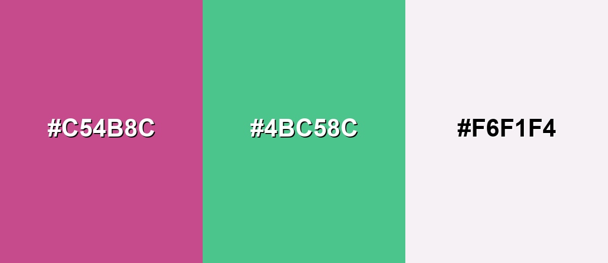
A complementary pairing adds crisp contrast by placing mulberry against a green-leaning opposite. It's a strong choice for calls to action, editorial highlights, and packaging that needs instant separation.
Complementary Palette Example: Try Mulberry with Sea Green and Soft Ivory for a lively but polished balance.
Analogous Color Schemes
Analogous colors sit adjacent to each other on the color wheel, creating harmonious, cohesive palettes with subtle variation.
This analogous set stays close on the wheel for a smooth, berry-forward gradient feel.
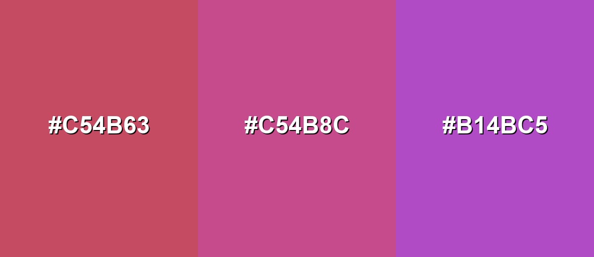
- Raspberry: #C54B63
- Mulberry: #C54B8C
- Orchid Purple: #B14BC5
A deeper analogous mix that leans more dramatic, ideal for editorial layouts and premium branding.
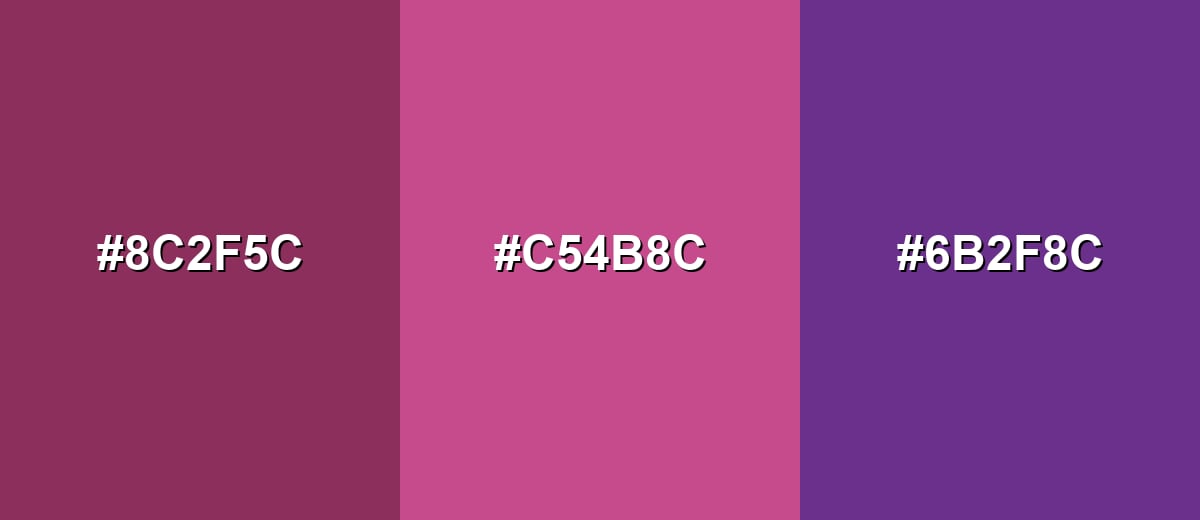
- Wine: #8C2F5C
- Mulberry: #C54B8C
- Plum: #6B2F8C
Triadic & Tetradic Combinations
A triadic palette creates contrast without the sharpness of pure complements.
Use Mulberry with Golden Olive and Teal Blue for energetic, well-spaced variety.
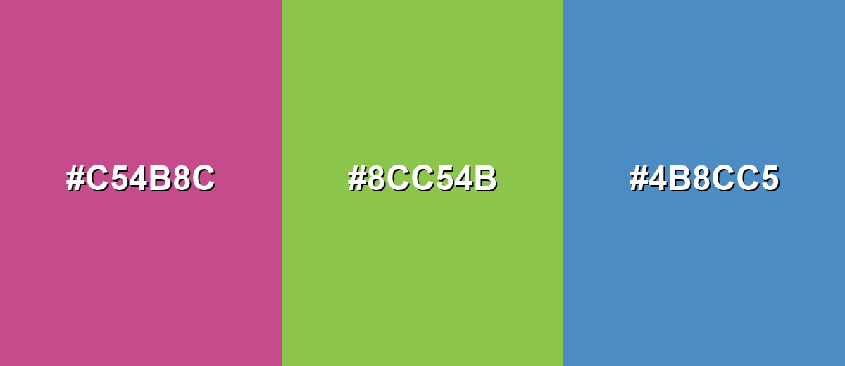
- Mulberry: #C54B8C
- Golden Olive: #8CC54B
- Teal Blue: #4B8CC5
Colors to Avoid
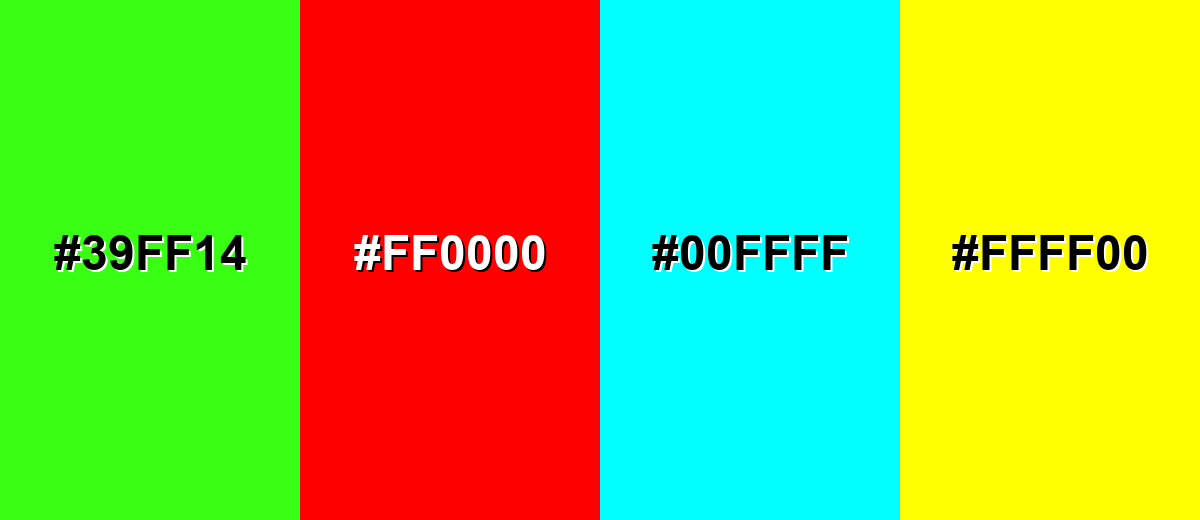
While mulberry color is remarkably versatile, certain combinations can create problematic visual effects:
- Neon Lime (#39FF14) - Both shades compete for attention, creating a sharp, vibrating look that can feel chaotic in UI and branding.
- Pure Red (#FF0000) - Too close in warmth but much louder, which can make mulberry look muted or muddy by comparison.
- Electric Cyan (#00FFFF) - The intensity creates harsh contrast and can push mulberry into an overly synthetic, poster-like look.
- Vivid Yellow (#FFFF00) - High brightness can overpower mulberry and reduce readability, especially in small text or thin UI elements.
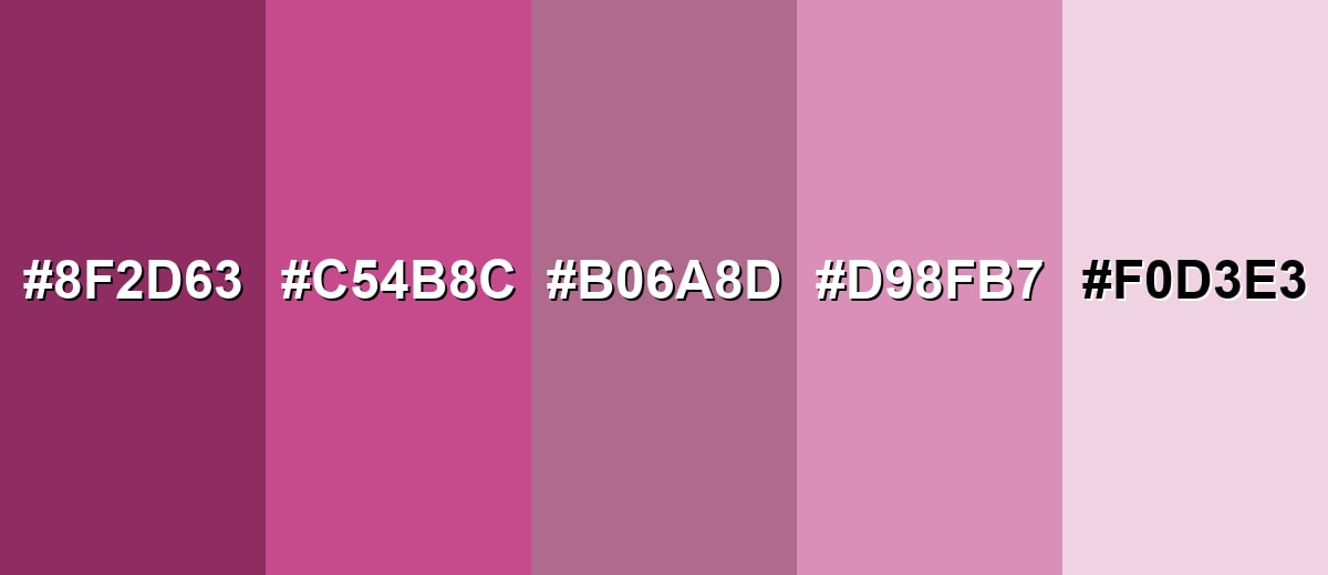
Shades, Tints & Variations of Mulberry Color
Mulberry isn't just one look—its range runs from deep, wine-like shades to soft, airy tints. Having a few variations ready makes it easier to build hierarchy (headings vs. backgrounds) while keeping the same signature berry tone.
- Deep Mulberry (#8F2D63) - A darker, more wine-leaning mulberry that feels mature and grounded. It's best used for Headings, premium packaging, and dramatic hero sections with plenty of whitespace.
- Classic Mulberry (#C54B8C) - The balanced berry tone most people recognize as mulberry—rich, smooth, and expressive. It's best used for Brand accents, buttons, logos, and key highlights in editorial layouts.
- Dusty Mulberry (#B06A8D) - A muted variation with a softer, more relaxed feel and less saturation. It's best used for Background panels, secondary accents, and calmer lifestyle branding.
- Soft Mulberry (#D98FB7) - A lighter, friendlier version that reads airy while keeping the berry character. It's best used for UI surfaces, illustrations, beauty or wellness visuals, and gentle gradients.
- Mulberry Tint (#F0D3E3) - A pale tint that feels clean, delicate, and modern. It's best used for Large backgrounds, cards, and subtle section breaks where legibility is a priority.
Industry Applications
Mulberry's versatility makes it useful across industries that want a confident, refined tone. It can read artistic, premium, or comforting depending on the palette and typography you pair with it.
Fashion & Beauty
- Use it in lookbooks to add a modern, fashion-forward tone that still feels approachable.
- Bring mulberry into packaging for a luxe vibe, especially alongside deeper plum-like accents.
- For seasonal campaigns, mulberry delivers richness without relying on loud primaries.
- Pair it with softer tints when you want a more delicate, wellness-friendly presentation.
Interior Design & Decor
- Try mulberry as an accent wall when you want warmth without the brightness of true red.
- Use it in textiles (pillows, throws, rugs) to add depth while keeping the space flexible.
- Combine it with muted greens to create a balanced, nature-meets-luxury palette.
- Stick to smaller decor pieces if you want the color's richness without a heavy feel.
Branding & Marketing
- Use mulberry for logos, accent systems, and premium brand marks to suggest individuality and quality.
- In UI, reserve it for buttons, active states, and tags—avoid dense body text for clarity.
- For events and editorial graphics, mulberry supports dramatic layouts when paired with careful spacing.
- In food and beverage design, use it sparingly so it enhances the visual mood without feeling too heavy.
Conclusion
Mulberry stands out as a deep purplish-red that feels expressive yet polished—ideal when you want warmth with a refined edge. Anchor your palette with #C54B8C, support it with light neutrals or balanced greens, and you'll keep the color vibrant without overwhelming the layout. Whether you're building a brand system, designing UI accents, or creating editorial-style visuals, mulberry works best when you prioritize contrast, whitespace, and a few well-chosen tints and shades to control mood and readability.
Design Smarter with AI: Media.io is an online AI studio that empowers creators with advanced image generation and enhancement tools. From text-to-image and image-to-image creation to AI upscaling and color optimization, it enables fast, creative, and professional results—all in your browser.

Frequently Asked Questions About Mulberry Color
Mulberry is a deep purplish-red inspired by the ripe mulberry fruit. It typically looks like a berry-toned mix of magenta and red with a slightly wine-like depth.
A common digital reference for mulberry is #c54b8c. It's a practical starting point for web, UI, and brand systems that need consistent rendering.
It sits between the two, but many versions lean slightly toward magenta-purple. Lighting, surrounding shades, and screen calibration can push it to read warmer (redder) or cooler (more purple).
Soft neutrals and muted greens are reliable partners, and deep blues can also work well. For a clean complementary look, pair Mulberry (#c54b8c) with Sea Green (#4bc58c) and a light neutral like Soft Ivory (#f6f1f4).
Mulberry is often perceived as creative, confident, and slightly luxurious. Mulberry color symbolism can also suggest depth and individuality, which makes it useful for brands that want to feel distinctive without relying on loud primaries.
Use it for accents such as buttons, highlights, and key states rather than long paragraphs. Pair it with light backgrounds like Mulberry Tint (#f0d3e3) or Soft Ivory (#f6f1f4), and keep body text in a neutral shade for clarity.


