

Light green is a gentle, pale green that looks like new leaves in spring or a softly lit meadow. A common reference for it is the HEX code #90ee90, sitting between fresh green and airy mint.
It's often perceived as calming, healthy, and optimistic without feeling too bold. Below, you'll find light green's key color codes, contrast tips, reliable pairings, popular shades, and practical ways to use it in modern design.
Light Green Color: Codes & Values
Use these standard values to keep light green consistent across web, UI, and print workflows.
| Parameters | VALUE |
| HEX Code | #90EE90 |
| RGB DECIMAL | 144, 238, 144 |
| RGB PERCENTAGE | 56.5%, 93.3%, 56.5% |
| CMYK | 40%,0%,40%,7% |
| HSL | 120°, 73%, 75% |
| HSV (HSB) | 120°, 40%, 93% |
| Web Safe | #99FF99 |
Key Color Space Explanations:
- HEX - HEX is the most common way to specify a screen-ready value in web design. #90ee90 represents the red, green, and blue mix that creates this light green tint.
- RGB - RGB defines how much red, green, and blue light is used on digital displays. With 144, 238, 144, this shade leans heavily on green while staying bright and soft.
- CMYK - CMYK is used for print and describes ink percentages. Light green converts to 40%,0%,40%,7%, which helps you reproduce a similar look on paper with less surprise.
- HSL - HSL organizes the shade by hue, saturation, and lightness, which is helpful for creating tints and matching families. At 120°, 73%, 75%, it sits squarely in the green range with high lightness.
- Web Safe - Web safe is the closest value from the older 216-color browser palette. #99ff99 is the nearest web-safe match and can be useful for legacy compatibility.
For day-to-day work, HEX and RGB are easiest for screens, while CMYK is the safest starting point for print proofs and packaging.
Want to generate light Green color photos or posters? Try Media.io's AI Image Generator now!
Light Green Color Conversions
This conversion table helps you copy the right value for your design tool, CSS file, or print setup.
| Parameters | VALUE | CSS |
| HEX | #90ee90 | #90ee90 |
| RGB DECIMAL | 144, 238, 144 | rgb(144,238,144) |
| RGB PERCENTAGE | 56.5%, 93.3%, 56.5% | rgb(56.5%,93.3%,56.5%) |
| CMYK | 40%,0%,40%,7% | cmyk(40%,0%,40%,7%) |
| HSL | 120°, 73%, 75% | hsl(120°, 73%, 75%) |
| HSV (or HSB) | 120°, 40%, 93% | -- |
| Web Safe | 99ff99 | #99ff99 |
| CIE-LAB | 86.4, -46.5, 36.6 | -- |
| XYZ | 47.1, 69.1, 37.2 | -- |
| xyY | 0.307, 0.450, 69.1 | -- |
| CIE-LCH | 86.4, 59.2, 141.7° | -- |
| CIE-LUV | 86.4, -45.1, 58.4 | -- |
| Hunter-Lab | 83.1, -41.0, 29.4 | -- |
| Binary | 10010000 11101110 10010000 | -- |
Light Green Color Meaning & Symbolism
Light green is commonly linked to freshness, growth, and a clean start. In everyday life, it shows up in cues for nature, wellness, and gentle positivity, which is why it often feels friendly rather than intense. This light Green Color meaning also makes it a popular choice when you want something reassuring and modern at the same time.
Psychological Effects
Because it's soft and bright, light green tends to support comfort and clarity rather than intensity.
- Calming - Helps interfaces and spaces feel relaxed and less stressful.
- Restorative - Suggests a "reset" feeling, making layouts feel easier to spend time with.
- Comfortable Focus - Works well where users need to stay comfortable and attentive.
- Approachable - Can make products feel friendly and safe during onboarding or confirmations.
- Washed-Out Risk - Overuse without contrast can feel weak, overly sweet, or a bit sterile.
Positive Associations
These are the most common "good" signals people read from light green in branding and visual design.
- Freshness - Communicates clean, crisp energy and just-picked vibes.
- Growth - Connects naturally to progress, learning, and improvement.
- New Beginnings - Feels like springtime, renewal, and starting again.
- Health - Often used for wellness cues, nutrition labels, and balanced living.
- Everything's Okay - Common in UI success states and "approved" style messaging.
Cultural Significance Across the World
Green meanings are widely shared, but the exact "tone" depends on context, industry, and pairing choices.
- Nature & Renewal - Broadly tied to plants, outdoors, and regeneration.
- Spring & Youth - Lighter tints often lean toward youthfulness and early-season energy.
- Permission & Safety - In some settings, it can signal "go ahead" or "safe."
- Context Matters - Interpretations can shift by industry and setting, so messaging and contrast matter.
Design Applications
Light green is easiest to use when you treat it as a soft accent or background that supports other elements. The key is to control contrast, since pale greens can lose definition next to light neutrals.
Graphic Design Tips
- Use light green for success states, gentle highlights, badges, and supportive notifications that shouldn't feel loud.
- Pair it with dark text for readability; avoid light gray typography on light green backgrounds.
- For buttons, consider a darker green or a clear outline so the call to action stays easy to spot.
- Balance the palette with a deeper neutral so the design doesn't feel washed out or overly pastel.
- When printing, proof CMYK on your actual paper stock because pale greens can shift on different finishes.
Pro tip: If light green is your background, make your hierarchy do the heavy lifting—use one strong neutral for text, and reserve saturated accents for only the most important actions.
Light Green Color in Photography & Video
- Use light green props or backdrops to create a clean, "fresh" mood that still feels natural.
- Keep highlights under control—pale greens can lose detail if exposure is pushed too far.
- Watch white balance: cool lighting can make light green look icy, while warmer light makes it feel more spring-like.
- For color grading, treat light green as an accent and anchor the scene with neutral blacks/whites for contrast.
- In product shots, add a darker outline or shadow separation so light green elements don't blend into the background.
Recommended Tool for Image Enhancement: When incorporating light green color into your photography projects, Media.io's AI Image tools can help you achieve more refined results. With AI-powered color enhancement, photo colorization, image upscaling, and old photo restoration, you can easily enrich light green color tones, improve overall image quality, and highlight the color's elegant and sophisticated aesthetic.
Color Combinations
Light green pairs best with grounded neutrals and one clear supporting accent. Below are reliable harmony options you can use in branding, UI themes, illustrations, and room palettes.
Complementary Colors
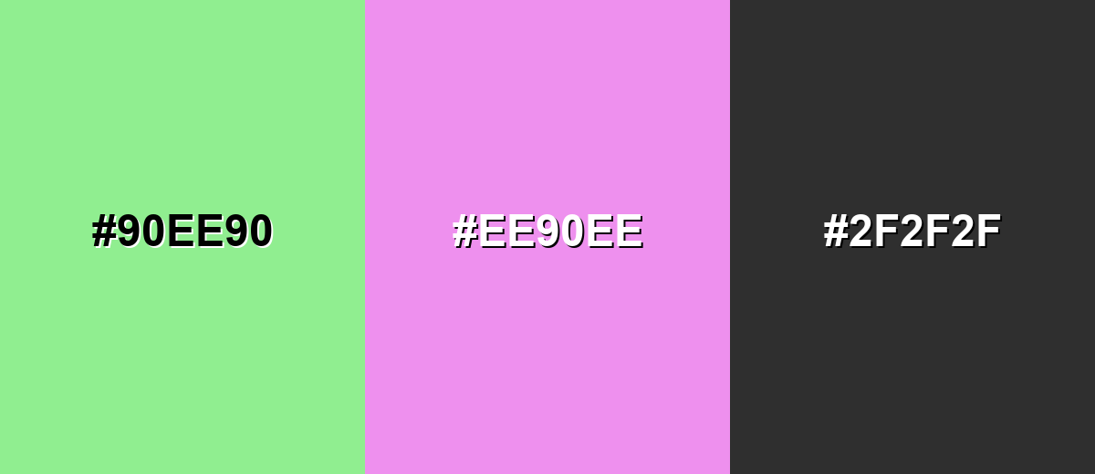
The complementary match sits opposite on the color wheel, giving you a lively contrast that still feels soft because both sides are light. This is useful for highlights, illustrations, and playful branding accents.
Complementary Palette Example: Combine light green with a light orchid accent and a dark neutral to keep the contrast clean and readable.
Analogous Color Schemes
Analogous colors sit adjacent to each other on the color wheel, creating harmonious, cohesive palettes with subtle variation.
Yellow-green to mint creates a fresh, nature-first palette that feels smooth and cohesive.
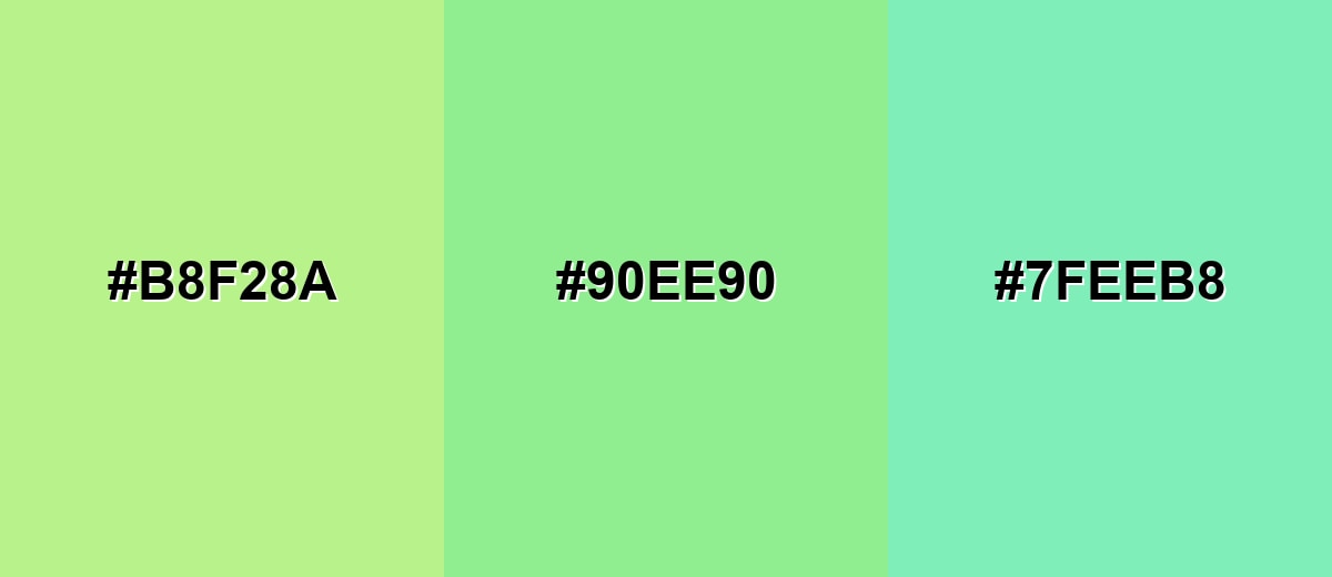
- Pale Yellow-Green: #B8F28A
- Light Green: #90EE90
- Soft Mint: #7FEEB8
A slightly cooler analogous set keeps things airy, modern, and clean for backgrounds and UI panels.
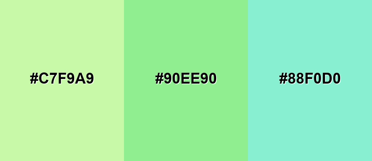
- Pastel Lime: #C7F9A9
- Light Green: #90EE90
- Powder Teal: #88F0D0
Triadic & Tetradic Combinations
A triadic palette balances three evenly spaced hues for a playful but stable look.
Use light green with soft blue and soft red to create clear separation for charts, icons, and illustrations.
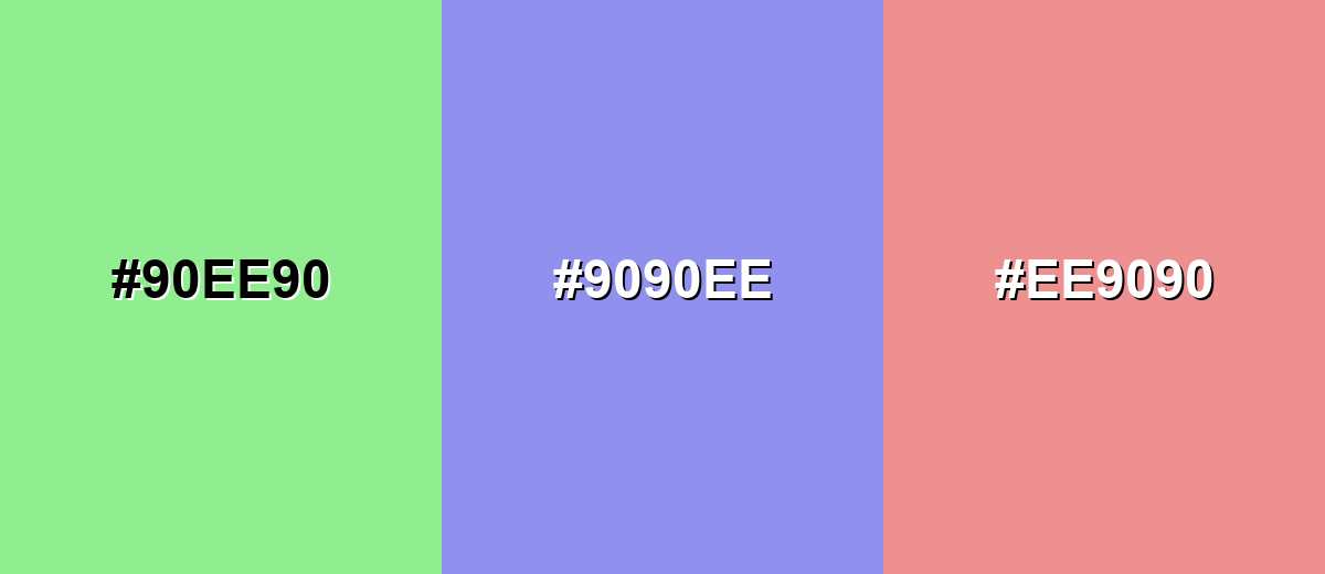
- Light Green: #90EE90
- Soft Periwinkle: #9090EE
- Light Rose: #EE9090
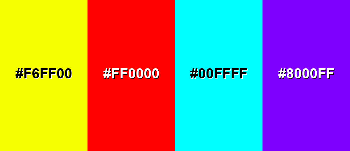
Colors to Avoid
While light green color is remarkably versatile, certain combinations can create problematic visual effects:
- Neon Yellow (#F6FF00) - High brightness next to light green can create a vibrating look that feels loud and hard to read.
- Pure Red (#FF0000) - This pairing can feel aggressive and seasonal in an unintended way, and it often overwhelms the soft base.
- Electric Cyan (#00FFFF) - Both are bright and cool, which can reduce hierarchy and make interfaces feel harsh or overly saturated.
- Bright Purple (#8000FF) - The contrast is strong but can look mismatched unless you carefully control saturation and add neutral spacing.
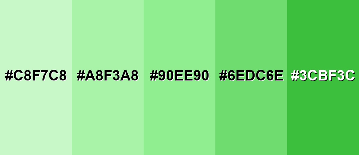
Shades, Tints & Variations of Light Green Color
Light green can range from milky, barely-there pastels to deeper, more energetic greens that hold contrast better. Having a few variations ready makes it easier to build hierarchy in UI, create depth in illustrations, or keep a brand palette feeling consistent across backgrounds, buttons, and highlights.
- Tea Green (#C8F7C8) - A very light, milky green that reads clean and gentle, ideal when you want the faintest hint of green. It's best used for Large backgrounds, cards, and subtle section breaks.
- Pastel Green (#A8F3A8) - A brighter pastel that keeps the soft feel while adding a bit more presence on screen. It's best used for Highlights, tags, and friendly UI accents.
- Light Green (#90EE90) - The balanced reference shade: fresh, readable, and easy to combine with neutrals and cool tones. It's best used for Primary accent, success cues, and soft brand palettes.
- Soft Green (#6EDC6E) - A slightly deeper tint that stays approachable but holds up better against white backgrounds. It's best used for Buttons, icons, and chart series that need clearer contrast.
- Fresh Green (#3CBF3C) - A more saturated green that still feels natural, adding energy without turning neon. It's best used for Call-to-action elements, headings, and strong accent areas.
Industry Applications
Light green appears across many industries because it quickly communicates freshness and a gentle sense of approval. It's especially useful when you want positivity without the intensity of brighter greens.
Fashion & Beauty
- Use it as a clean packaging background for skincare and personal care lines that want a gentle, "fresh" feel.
- Pair with simple typography to reinforce a calm, minimal, clean-label aesthetic.
- Works well for spring collections and limited editions where you want light, optimistic color cues.
- Use deeper accents for logos and product names so the brand stays legible at small sizes.
Interior Design & Decor
- Soft green walls or accents can make rooms feel brighter and more relaxed, especially for rest or light work.
- Combine with warm whites and natural wood to keep the palette grounded and inviting.
- Muted stone tones pair nicely with light green for a clean, modern, nature-inspired look.
- Avoid very cool lighting if you want the color to stay fresh instead of icy.
Branding & Marketing
- Great for eco services and sustainability messaging when you want "friendly" rather than preachy.
- In food and beverage, it's a strong freshness cue for produce, light recipes, and natural flavors.
- In education and productivity tools, it supports calm progress indicators and low-stress feedback.
- In health and finance apps, it fits non-alarming success confirmations and positive chart trends (with strong contrast controls).
Conclusion
Light green (#90EE90) is a go-to shade when you want visuals that feel clean, calm, and quietly optimistic. It works especially well as a background tint, success-state color, or friendly brand accent—as long as you plan contrast with dark neutrals and avoid relying on color alone to communicate meaning. With the right pairings and a few smart variations (from soft pastels to deeper greens for buttons), light green stays modern, readable, and easy to use across UI, print, and everyday design.
Design Smarter with AI: Media.io is an online AI studio that empowers creators with advanced image generation and enhancement tools. From text-to-image and image-to-image creation to AI upscaling and color optimization, it enables fast, creative, and professional results—all in your browser.

Frequently Asked Questions About Light Green Color
A widely used reference hex code for light green is #90ee90, which matches the LightGreen value commonly seen in CSS and digital palettes.
It usually reads slightly cool because it is light and clean, but it can lean warmer when paired with creamy whites, beige, or yellow-green accents.
It often represents freshness, growth, and gentle positivity. In practical design, it's commonly used to suggest health, renewal, and a sense of things going well.
Reliable pairings include charcoal, deep green, navy, soft peach, pale yellow-green, and light orchid accents. These combinations keep it balanced and easy to read.
Yes, it works well for backgrounds and panels, but you should use dark text and test contrast. For buttons and links, consider a darker shade or clear outlines to maintain visibility.
The closest web-safe match is #99ff99. It's a useful fallback for legacy environments, though modern systems can display #90ee90 accurately.


