

Fawn color is a warm, sandy beige-brown that resembles light suede, dried grass, or the soft coat of a young deer. A common reference HEX is #C19A6B, sitting between tan and light brown with a gentle golden undertone.
It's often perceived as grounded, calm, and natural—an easy neutral for everyday visuals. Since it can look warmer in sunlight and more muted under cool indoor lighting, the sections below cover its meaning, codes, combinations, shades, and practical uses.
Fawn Color: Codes & Values
If you're trying to match fawn across web, UI, and print, these are the most used color values to start from.
| Parameters | VALUE |
| HEX Code | #C19A6B |
| RGB DECIMAL | 193, 154, 107 |
| RGB PERCENTAGE | 76%, 60%, 42% |
| CMYK | 0%,20%,45%,24% |
| HSL | 33°, 41%, 59% |
| HSV (HSB) | 33°, 45%, 76% |
| Web Safe | #CC9966 |
Key Color Space Explanations:
- HEX - HEX is the six-digit code used for screens and web design to define the exact sRGB value. It is the fastest way to apply fawn in CSS and design tools.
- RGB - RGB mixes red, green, and blue light to create the displayed tone on digital screens. Use RGB when matching UI elements, video overlays, or web graphics.
- CMYK - CMYK is used for ink-based printing and approximates how a shade will reproduce on paper. It helps reduce surprises when fawn is used in packaging, cards, or labels.
- HSL - HSL describes hue, saturation, and lightness, which makes it easier to tweak warmth and depth. It is useful for generating lighter backgrounds or deeper accents while staying in the same family.
- Web Safe - Web safe is the closest legacy palette match designed for older displays and limited rendering. It is mainly helpful for consistency in constrained environments and quick approximations.
For most digital work, start with #C19A6B and adjust lightness (HSL/HSV) for backgrounds versus accents, then confirm contrast with your type and icons.
Fawn Color Conversions
Need fawn in a different format for your workflow? Use the conversion table below to copy values quickly into design tools, CSS, and print specs.
| Parameters | VALUE | CSS |
| HEX | #c19a6b | #c19a6b |
| RGB DECIMAL | 193, 154, 107 | rgb(193,154,107) |
| RGB PERCENTAGE | 76%, 60%, 42% | rgb(76%,60%,42%) |
| CMYK | 0%,20%,45%,24% | cmyk(0%,20%,45%,24%) |
| HSL | 33°, 41%, 59% | hsl(33°, 41%, 59%) |
| HSV (or HSB) | 33°, 45%, 76% | -- |
| Web Safe | cc9966 | #cc9966 |
| CIE-LAB | 66.2, 11.5, 30.2 | -- |
| XYZ | 36.2, 35.5, 18.9 | -- |
| xyY | 0.399, 0.392, 35.5 | -- |
| CIE-LCH | 66.2, 32.3, 69.2° | -- |
| CIE-LUV | 66.2, 29.4, 36.8 | -- |
| Hunter-Lab | 59.6, 7.6, 21.4 | -- |
| Binary | 11000001 10011010 01101011 | -- |
Want to generate Fawn Color photos or posters? Try Media.io's AI Image Generator now!
Fawn Color Meaning & Symbolism
Fawn commonly represents warmth, reliability, and a natural, down-to-earth attitude. Because it sits close to materials people recognize, it often signals comfort and quiet confidence in everyday visuals. In practice, fawn color symbolism is frequently tied to simplicity, approachability, and timeless style rather than trend-driven energy.
Psychological Effects
In design, fawn tends to influence mood through softness and familiarity.
- Calming Baseline - Fawn tends to calm a layout and make spaces feel settled.
- Softer Interfaces - It can soften sharp interfaces and reduce harshness compared to pure white or cool gray.
- Lower Visual Noise - It helps reduce visual noise, making content and products feel easier to take in.
- Trust & Steadiness - Because it reads as familiar and practical, it often supports trust and steadiness in branding.
- Needs Contrast - Too much fawn can feel bland or dusty, so a darker anchor or a cool counterbalance keeps it from looking flat.
Positive Associations
Fawn is often chosen when you want a neutral that feels warm, human, and quietly premium.
- Warmth - A sun-warmed undertone gives fawn a cozy, inviting feel.
- Reliability - Its grounded character supports stable, dependable brand messaging.
- Natural Simplicity - It connects easily to earth tones and a down-to-earth attitude.
- Approachability - As a friendly neutral, it helps designs feel open and easy to live with.
- Timeless Style - It reads classic and practical rather than loud or trend-chasing.
Cultural Significance Across the World
Because it's inspired by natural materials, fawn is usually interpreted through context more than strict symbolism.
- Nature Link - The name comes from the coat of a fawn, so it often connects to nature and wildlife.
- Material Familiarity - It's commonly associated with leather, wool, and other tactile surfaces.
- Earth & Sand Tones - It evokes sand and earth tones across many settings, making it feel neutral and adaptable.
- Practical Classic - It is typically read as neutral, classic, and practical rather than ceremonial.
Design Applications
Fawn is a flexible neutral that works as a background, a mid-tone surface, or a soft accent. It's especially helpful when you want warmth without the intensity of orange or the heaviness of dark brown.
Graphic Design Tips
- Use fawn for large backgrounds to warm up layouts without overpowering photography.
- Pair it with a crisp light and a clear dark to create clean hierarchy in headers, cards, and sections.
- Lean on texture (grain, paper, fabric) to make flat fawn areas feel more premium and tactile.
- For CTAs, choose deeper fawn shades for buttons and keep the main fawn as the surface tone.
- Always check contrast—fawn can wash out thin fonts if the text color is too close.
If your design starts to look "dusty," add one cool accent (like a muted blue) and increase spacing—fawn looks best when the layout feels breathable.
Fawn Color in Photography & Video
- Fawn works well in lifestyle scenes: skin tones, wood, linen, and outdoor light tend to harmonize naturally.
- In color grading, it can push highlights warmer without turning the image overly orange.
- For product shots, use fawn backdrops to reduce glare versus pure white and keep a natural mood.
- In video overlays, fawn panels can soften harsh UI elements while keeping the frame calm and editorial.
- Under cool indoor lighting, fawn may look muted—fine-tune white balance so it keeps its golden undertone.
Recommended Tool for Image Enhancement: When incorporating fawn color into your photography projects, Media.io's AI Image tools can help you achieve more refined results. With AI-powered color enhancement, photo colorization, image upscaling, and old photo restoration, you can easily enrich fawn color tones, improve overall image quality, and highlight the color's elegant and sophisticated aesthetic.
Color Combinations
Because fawn color sits in the warm-neutral range, it pairs easily with both cool blues and earthy browns. The fawn color palettes below show balanced options for contrast, harmony, and controlled accents.
Complementary Colors
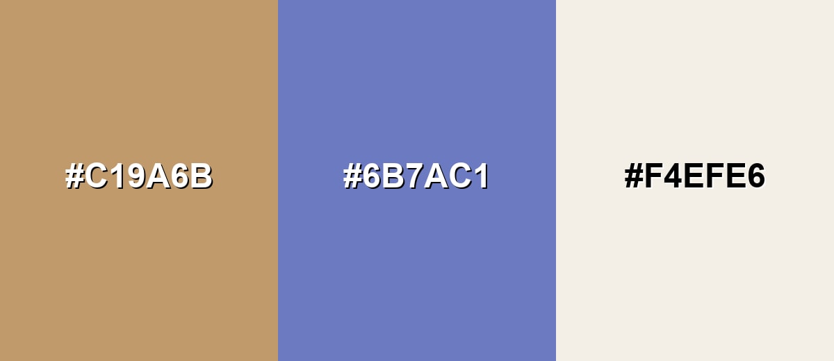
A blue complement adds crisp contrast and keeps fawn from feeling too monotone. This pairing is useful when you want a grounded base with a clear, cool counterpoint.
Complementary Palette Example: Use fawn as the main surface, dusty blue for emphasis, and warm ivory to keep the overall look bright and breathable.
Analogous Color Schemes
Analogous colors sit adjacent to each other on the color wheel, creating harmonious, cohesive palettes with subtle variation.
Analogous tones around fawn create a smooth, tonal look that feels natural and cohesive.
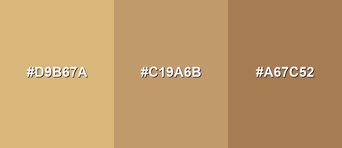
- Honey Beige: #D9B67A
- Fawn: #C19A6B
- Warm Umber: #A67C52
A slightly lighter and slightly redder neighbor set brings warmth while still reading as a neutral palette.
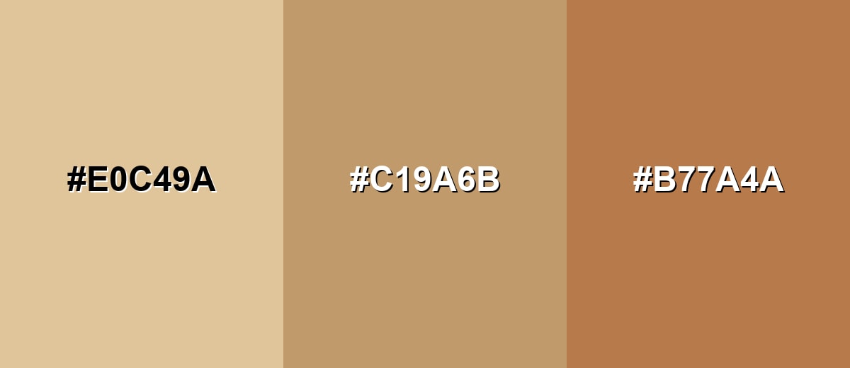
- Soft Sand: #E0C49A
- Fawn: #C19A6B
- Terracotta Tan: #B77A4A
Triadic & Tetradic Combinations
A triadic scheme adds variety while staying balanced, especially when the accents are softened.
Pair fawn with muted green and soft plum for a modern, creative palette that still feels grounded.
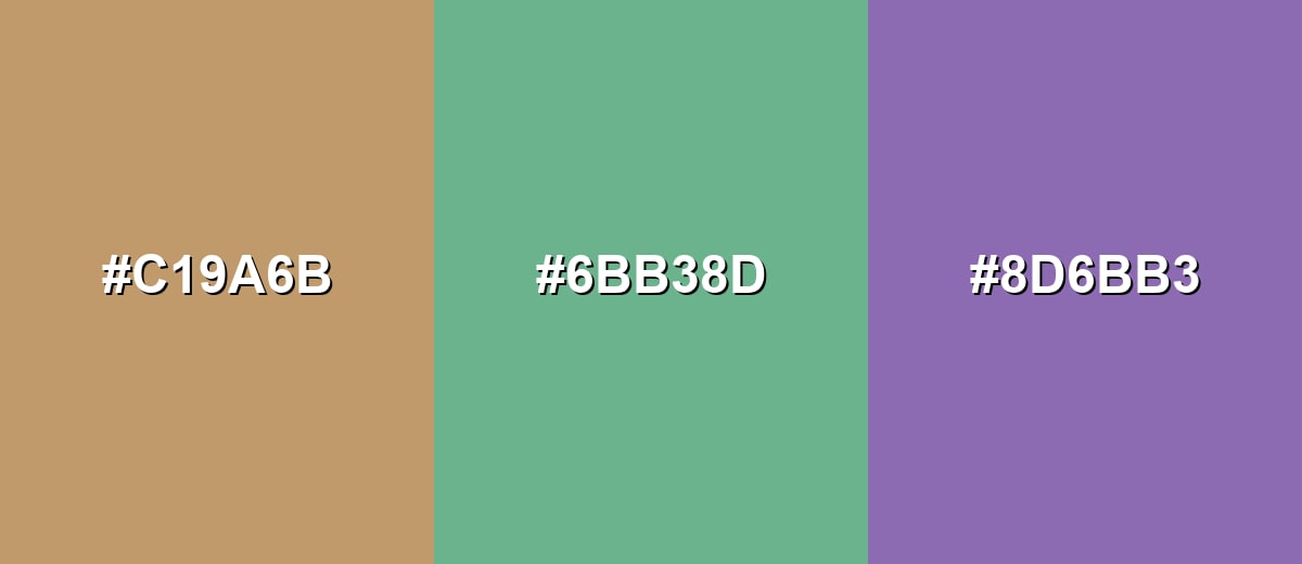
- Fawn: #C19A6B
- Sage Green: #6BB38D
- Soft Plum: #8D6BB3
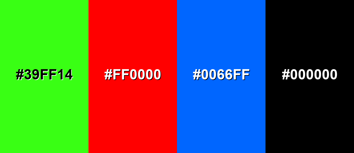
Colors to Avoid
While fawn color is remarkably versatile, certain combinations can create problematic visual effects:
- Neon Green (#39FF14) - The intensity overwhelms fawn and can make the overall design feel jarring rather than warm.
- Pure Red (#FF0000) - High-saturation red can read harsh against fawn, creating an unintended holiday or warning-like vibe.
- Electric Blue (#0066FF) - The sharp, vivid contrast can look unbalanced unless heavily moderated with neutrals and spacing.
- Pure Black (#000000) - While it provides contrast, large black areas can make fawn feel dull or dirty; use softer dark browns or charcoals when possible.
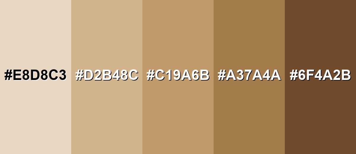
Shades, Tints & Variations of Fawn Color
Fawn isn't just one shade—it spans from creamy, airy tints to deeper cocoa-leaning browns. Having a small range makes it easier to build hierarchy (background, surface, accent, text) while keeping everything in the same warm-neutral family.
- Pale Fawn (#E8D8C3) - A creamy, barely-there beige with a warm undertone that reads soft and airy. It's best used for Backgrounds, large surfaces, and minimal layouts where you want warmth without visual weight..
- Sand Fawn (#D2B48C) - A classic sandy tan that keeps the fawn family feel while leaning lighter and more golden. It's best used for Interior palettes, web sections, and product backdrops that should feel natural and approachable..
- Classic Fawn (#C19A6B) - The balanced reference tone: warm beige-brown with a gentle golden cast. It's best used for Primary neutral in brand systems, UI surfaces, and packaging where a grounded base is needed..
- Deep Fawn (#A37A4A) - A richer, browner shade that adds depth while staying warm and earthy. It's best used for Buttons, headers, leather-like materials, and accents that need more presence..
- Dark Fawn (#6F4A2B) - A dark, cocoa-leaning version that works as a strong anchor without going fully black. It's best used for Text on light fawn backgrounds, outlines, shadows, and contrast elements in UI and print..
Industry Applications
Fawn is widely used anywhere a warm neutral helps products feel trustworthy, natural, or quietly premium. It can look modern in digital design and classic in physical materials.
Fashion & Beauty
- Use fawn in capsule wardrobes when you need a versatile neutral that pairs easily with other tones.
- Lean into it for outerwear and knitwear to create a timeless, understated look.
- For accessories, fawn reads especially natural on leather goods and footwear.
- In beauty visuals, fawn backdrops can make product shots feel warm, soft, and editorial.
Interior Design & Decor
- Apply fawn on walls or large textiles to create a cozy base without going overly yellow.
- Pair it with wood, stone, and natural fibers for an organic, layered feel.
- Mix creams and browns for tonal depth while keeping the room calm and cohesive.
- Test in different lighting since fawn can shift warmer or more muted across the day.
Branding & Marketing
- Use fawn in wordmarks, secondary backgrounds, and stationery for warm, approachable identities.
- For packaging, it supports minimalist product boxes with dark type and premium simplicity.
- It's a strong fit for kraft-inspired, eco-forward design cues and natural product labels.
- In UI marketing pages, fawn sections can reduce "stark white" glare and keep the focus on imagery.
Conclusion
Fawn is a warm, suede-like beige-brown that feels natural without disappearing into the background. With #C19A6B as your starting point, you can build a dependable neutral system by adding a clear light for breathing room and a confident dark for structure and readability. Whether you're designing a calm UI, a tactile brand identity, or print packaging that needs quiet premium energy, fawn delivers a grounded look—just make sure you manage contrast and let texture (or a cool counter-accent) do some of the heavy lifting.
Design Smarter with AI: Media.io is an online AI studio that empowers creators with advanced image generation and enhancement tools. From text-to-image and image-to-image creation to AI upscaling and color optimization, it enables fast, creative, and professional results—all in your browser.

Frequently Asked Questions About Fawn Color
Fawn is a warm beige-brown with a gentle golden undertone. It often resembles sand, light suede, or natural leather.
They are close, but not identical. Fawn usually sits between beige and tan, leaning slightly browner and more natural than many standard beiges.
A widely used reference hex for fawn is #c19a6b. Different brands and paint lines may offer slightly different versions depending on pigments and lighting.
Muted blues, sage greens, warm ivories, and deeper browns are reliable pairings. These combinations keep fawn looking rich and intentional instead of flat.
Treat it as a mid-light surface and use darker text and icons for readability. Add a strong anchor shade for buttons or headers, and verify contrast with accessibility checks.
Yes, but results vary by paper and finish. Uncoated stock can make it look softer and lighter, so a proof helps when accurate matching is important.


