

 TL;DR:
Mocha (#8B6B57) is a warm, coffee-brown neutral used as a foundational design element to establish a grounded, approachable aesthetic without the harshness of pure black or cold gray.
● Apply HEX (#8B6B57) or RGB for digital interfaces and CMYK for physical printing, ensuring you use light off-white typography on mocha surfaces to prevent mid-tone accessibility and readability failures.
● Choose mocha over taupe when a project requires a richer, warmer brown base, keeping in mind that mocha's color perception will shift toward a cooler, muted taupe under cool lighting conditions.
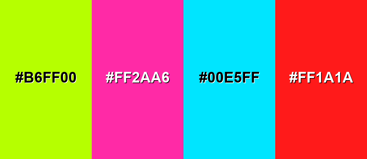
● Avoid combining mocha with highly saturated colors like Electric Lime (#B6FF00), Hot Magenta (#FF2AA6), or Pure Cyan (#00E5FF), which overpower its natural undertones and cause the palette to appear visually jarring and muddy.
Ask AI for a summary
 ChatGPT
 Perplexity
 Gemini
 Claude
 Grok
Grok
Mocha color is a warm, coffee-brown neutral that looks like brewed mocha with a hint of cream and cocoa. Its HEX code is #8B6B57, giving it a balanced, earthy depth that reads natural without feeling heavy.
Many people perceive it as comforting, reliable, and quietly refined. Inspired by the mocha drink and brown pigments found in nature, it tends to look richer in warm light and softer in cool light, and this guide covers meaning, codes, combinations, shades, and practical uses.
Mocha Color: Codes & Values
Here are the core color codes for mocha, ready for web design, print, and quick palette building.
| Parameters | VALUE |
| HEX Code | #8B6B57 |
| RGB DECIMAL | 139, 107, 87 |
| RGB PERCENTAGE | 55%, 42%, 34% |
| CMYK | 0%,23%,37%,46% |
| HSL | 23°, 23%, 44% |
| HSV (HSB) | 23°, 37%, 55% |
| Web Safe | #846666 |
Key Color Space Explanations:
- HEX - HEX is the most common way to specify mocha for web and UI work. Use #8b6b57 for consistent results across modern browsers and design tools.
- RGB - RGB defines the red, green, and blue light values used on screens. It helps you tune mocha for digital visuals, overlays, and motion graphics.
- CMYK - CMYK is used for printing with ink. It is useful when you need mocha to reproduce predictably on packaging, stationery, or posters.
- HSL - HSL describes hue, saturation, and lightness, which makes it easier to build matching palettes. It is especially helpful for generating lighter tints and deeper tones.
- Web Safe - Web Safe is the closest legacy-safe approximation used on older displays and systems. It is not required today, but it can be useful for compatibility checks.
If you're designing for screens, start with HEX or RGB; for print work like labels or boxes, rely on CMYK and always proof on your final paper stock.
Mocha Color Conversions
Need mocha in a different format? Use the conversions below to copy, paste, and stay consistent across tools.
| Parameters | VALUE | CSS |
| HEX | #8b6b57 | #8b6b57 |
| RGB DECIMAL | 139, 107, 87 | rgb(139,107,87) |
| RGB PERCENTAGE | 55%, 42%, 34% | rgb(55%,42%,34%) |
| CMYK | 0%,23%,37%,46% | cmyk(0%,23%,37%,46%) |
| HSL | 23°, 23%, 44% | hsl(23°, 23%, 44%) |
| HSV (or HSB) | 23°, 37%, 55% | -- |
| Web Safe | 846666 | #846666 |
| CIE-LAB | 48.0, 9.5, 16.0 | -- |
| XYZ | 17.6, 16.7, 11.4 | -- |
| xyY | 0.385, 0.365, 16.7 | -- |
| CIE-LCH | 48.0, 18.6, 59.0° | -- |
| CIE-LUV | 48.0, 21.9, 17.9 | -- |
| Hunter-Lab | 40.9, 7.8, 10.6 | -- |
| Binary | 100010110110101101010111 | -- |
Want to generate Mocha Color photos or posters? Try Media.io's AI Image Generator now!
Mocha Color Meaning & Symbolism
Mocha color is commonly linked with warmth, steadiness, and simple comfort. Because it sits between brown and soft taupe, it often feels practical and approachable in everyday life. It is a go-to choice when you want something natural, mature, and quietly premium without looking flashy.
Psychological Effects
Mocha typically sets a calm, grounded tone that makes other design choices feel more intentional.
- Grounding - Helps a layout or space feel stable and "held together," especially when there are lots of elements on screen.
- Calm Focus - Reduces visual noise, making it easier for users to read, browse, and stay oriented.
- Cozy Comfort - Adds warmth that feels familiar, like coffee shop interiors or natural materials.
- Craft & Care - Suggests a handmade, considered feel that works well for artisanal or wellness brands.
- Heaviness Risk - Overuse can feel dull or muddy, especially without clean neutrals and clear contrast.
Positive Associations
Because it's warm and understated, mocha often communicates quiet quality rather than loud luxury.
- Reliability - Reads steady and dependable, which is useful for brands that want trust and consistency.
- Authenticity - Feels natural and tactile, pairing well with paper textures, wood, and organic visuals.
- Approachability - Softer than black or charcoal, so it can feel friendlier in UI and packaging.
- Warm Minimalism - Delivers a modern neutral look without the coldness of pure gray palettes.
- Everyday Ritual - Strongly tied to coffee culture and daily comfort moments (cafés, mornings, routine).
Cultural Significance Across the World
Mocha's meaning is mostly contextual, but it commonly lands in the "earthy and familiar" category.
- Hospitality - Coffee-inspired tones are often used to signal welcome, warmth, and a relaxed environment.
- Nature Connection - Echoes soil, wood, and cocoa, making it a go-to for earthy, natural positioning.
- Practical Neutral - Often treated as an everyday color rather than a formal or ceremonial one.
- Craft Tradition - Frequently associated with craftsmanship and quality materials in packaging and interiors.
Design Applications
Mocha is a versatile neutral that can anchor a palette without dominating it, adding warmth, structure, and a human feel across digital and physical design.
Graphic Design Tips
- Use it as a base neutral - Treat mocha as your "warm gray" for backgrounds, panels, and supporting blocks.
- Balance with light space - Pair it with warm off-whites so layouts don't feel too brown or heavy.
- Pick one accent hue - A muted teal, sage, or dusty violet can add contrast while keeping the palette calm.
- Watch text contrast - Avoid mid-tone typography on mocha surfaces; go lighter for readability and clarity.
- Lean into texture - Mocha looks especially premium with paper grain, fabric, wood, or subtle noise overlays.
If you're building a brand system, use mocha for foundational pieces (backgrounds, label bases, navigation) and let accent colors handle calls-to-action so the design stays clean and readable.
Mocha Color in Photography & Video
- Warm color grading - Mocha tones shine in warm highlights and soft shadows for a cozy, cinematic look.
- Skin-tone friendly - As a backdrop or wardrobe neutral, it's often flattering and less harsh than black.
- Product storytelling - Works great for coffee, leather goods, baked items, and handmade textures.
- Lighting matters - In cool light, mocha can shift taupe; use a warm key light to keep it rich.
- Control saturation - Keep surrounding colors slightly muted so mocha reads refined instead of muddy.
Recommended Tool for Image Enhancement: When incorporating mocha color into your photography projects, Media.io's AI Image tools can help you achieve more refined results. With AI-powered color enhancement, photo colorization, image upscaling, and old photo restoration, you can easily enrich mocha color tones, improve overall image quality, and highlight the color's elegant and sophisticated aesthetic.
Color Combinations
Mocha pairs best with warm neutrals, muted greens, and softened blues because they preserve its grounded feel. The palettes below cover classic harmony options, plus a few high-risk picks to handle with care.
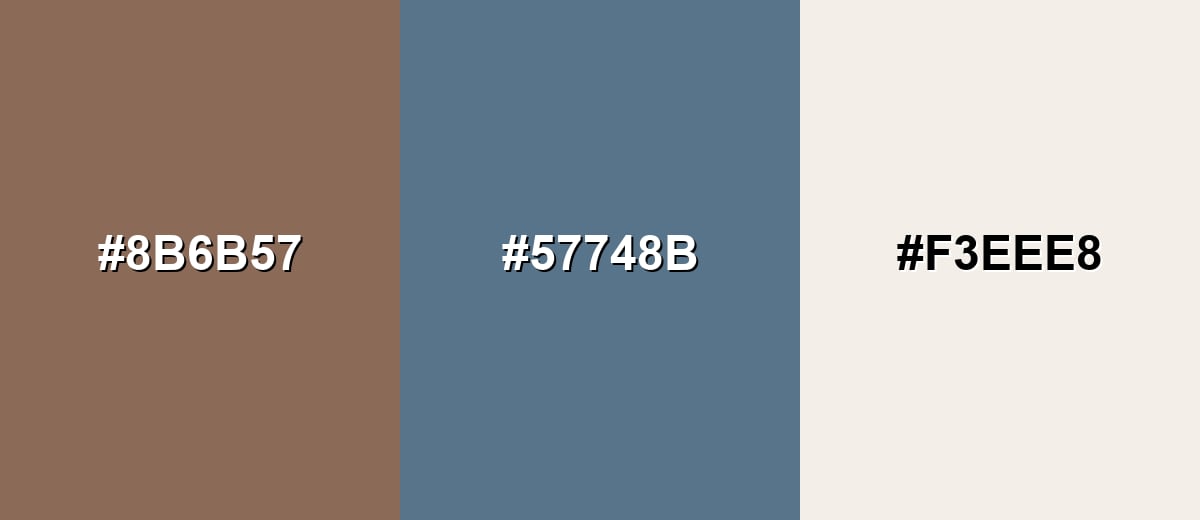
Complementary Colors
A complementary palette places mocha against a muted blue-teal to create balanced contrast without harshness. This is a strong choice for call-to-action accents, hero sections, and packaging systems that need both warmth and freshness.
Complementary Palette Example: Use Mocha as the base, add Dusty Teal for contrast, and lift the layout with Warm Ivory for breathing room.
Analogous Color Schemes
Analogous colors sit adjacent to each other on the color wheel, creating harmonious, cohesive palettes with subtle variation.
Cocoa, Mocha, and Caramel Tan create a smooth, warm progression for cozy and elegant layouts.
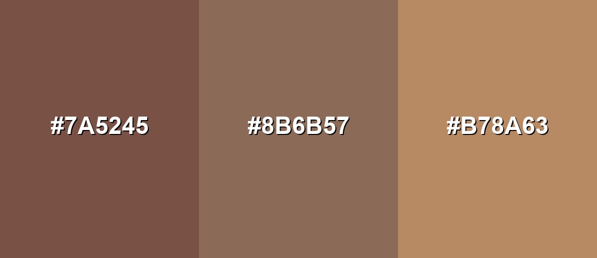
- Cocoa: #7A5245
- Mocha: #8B6B57
- Caramel Tan: #B78A63
Almond Beige, Mocha, and Olive Taupe feel natural and muted, ideal for calm, earthy themes.
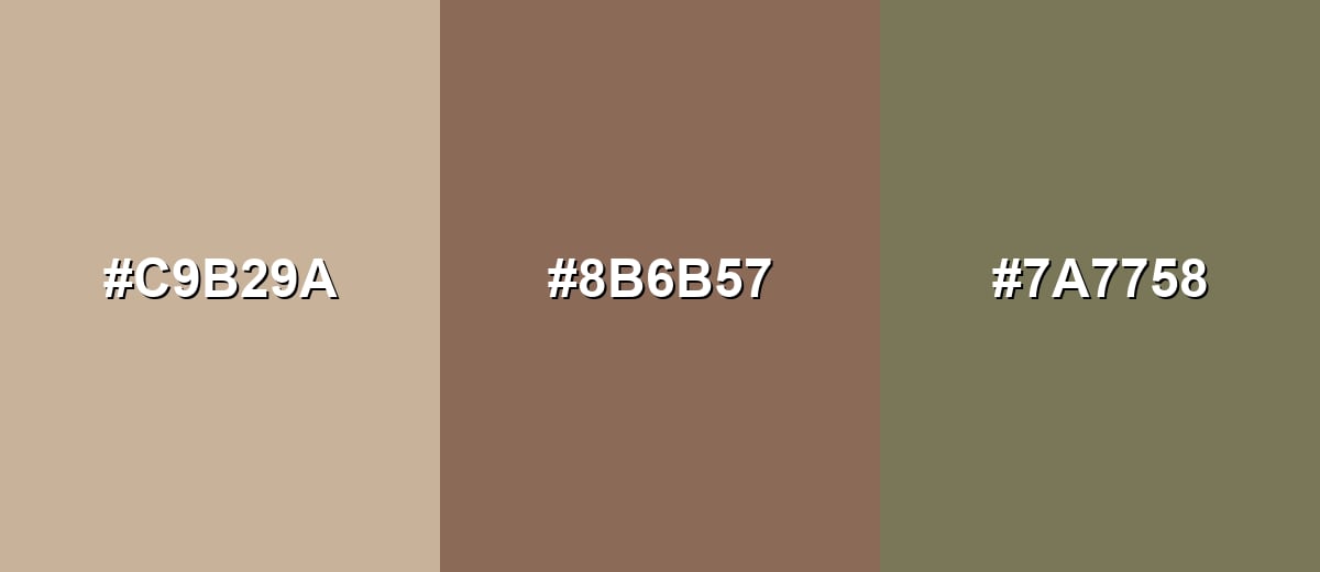
- Almond Beige: #C9B29A
- Mocha: #8B6B57
- Olive Taupe: #7A7758
Triadic & Tetradic Combinations
A triadic set adds variety while staying balanced, which helps when you need multiple UI states or a richer brand palette.
Mocha, Sage Green, and Dusty Plum form a soft triad that feels modern, calm, and creative.
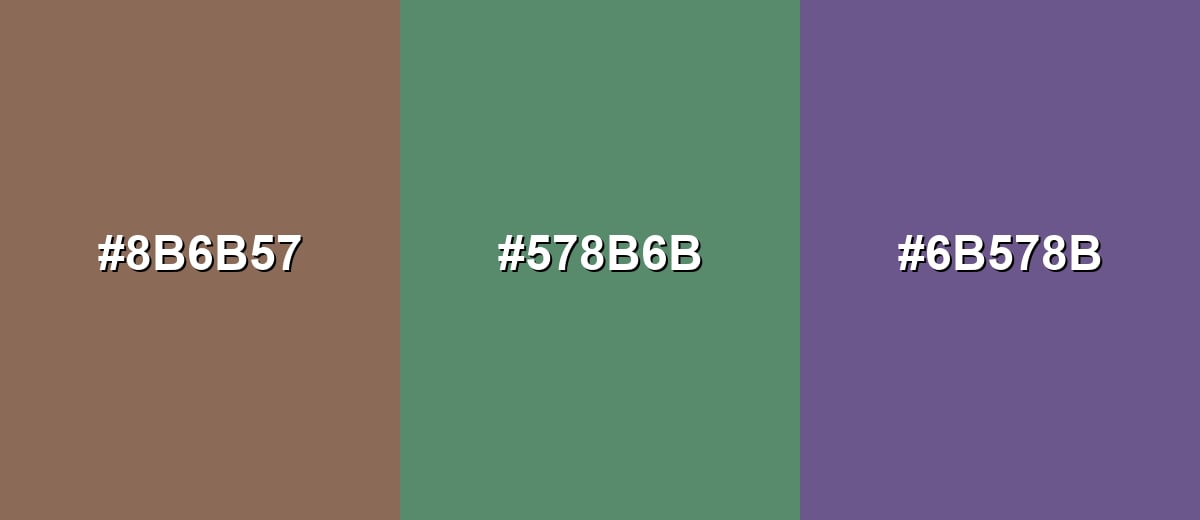
- Mocha: #8B6B57
- Sage Green: #578B6B
- Dusty Plum: #6B578B
Colors to Avoid
While mocha color is remarkably versatile, certain combinations can create problematic visual effects:
- Electric Lime (#B6FF00) - The neon intensity overpowers mocha and can make the palette feel noisy and unrefined.
- Hot Magenta (#FF2AA6) - This high-saturation pink creates a jarring clash that often reads less natural and less premium.
- Pure Cyan (#00E5FF) - Very bright cyan can look overly digital next to mocha, weakening the warm, grounded tone.
- Signal Red (#FF1A1A) - Strong red competes with mocha's warm undertone and may make the combination feel aggressive or muddy.
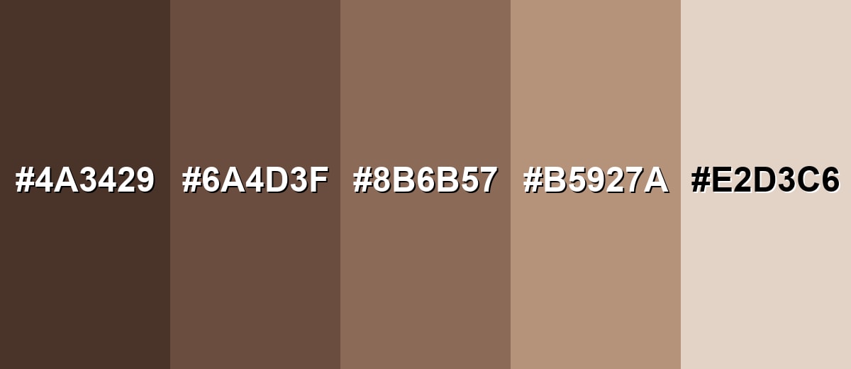
Shades, Tints & Variations of Mocha Color
Mocha isn't just one flat brown—its range runs from deep espresso-like tones to creamy, oatmeal tints. Having a few variations makes it easier to build hierarchy (text, backgrounds, borders, and accents) without leaving the same warm color family.
- Dark Espresso (#4A3429) - A deep, near-chocolate brown with strong warmth and visual weight. It's best used for headers, outlines, icons, and grounding dark accents.
- Deep Mocha (#6A4D3F) - A richer, darker mocha that feels cozy and slightly more dramatic. It's best used for navigation bars, packaging backgrounds, and shadowy overlays.
- Classic Mocha (#8B6B57) - The balanced coffee-brown that sits comfortably between tan and cocoa. It's best used for base tone for brand palettes, UI surfaces, and natural-themed designs.
- Latte (#B5927A) - A lighter, milkier version that feels soft and inviting. It's best used for large backgrounds, cards, and secondary surfaces to keep layouts airy.
- Creamy Oat (#E2D3C6) - A pale oatmeal-beige tint that pairs easily with warm browns. It's best used for backgrounds, whitespace replacement, and gentle gradients.
Industry Applications
Because mocha is familiar and understated, it fits many industries that want warmth without loud saturation. It's especially effective when paired with clean neutrals and one muted accent for contrast.
Fashion & Beauty
- Leather goods & accessories - Use mocha tones to signal craftsmanship and quality in lookbooks and product pages.
- Seasonal wardrobes - Ideal for knitwear palettes and earthy seasonal collections built around warm neutrals.
- Natural skincare - Works well for natural skincare packaging where you want calm, clean, and organic cues.
- Spa-like branding - Great for wellness websites and calming brand systems that avoid overly bright color.
Interior Design & Decor
- Textiles & soft goods - Mocha feels cozy on rugs, throws, and upholstery, especially with warm lighting.
- Furniture catalogs - Adds depth to product spreads without stealing attention from materials and form.
- Warm neutral mood boards - Easy to layer with beiges and wood tones for a natural, lived-in feel.
- Feature surfaces - Works for accent walls or finishes when balanced with lighter neutrals to prevent heaviness.
Branding & Marketing
- Coffee & dessert branding - A natural fit for coffee packaging, café menus, and rustic product labels.
- Packaging & paper goods - Reads tactile and premium on cartons, sleeves, and stationery with good CMYK proofing.
- Human-centered tech - Helps SaaS and tech brands soften their UI and move away from cold gray systems.
- Minimalist identities - Supports restrained typography and clean layouts where you want quiet confidence.
Conclusion
Mocha is a warm coffee-brown neutral that brings calm structure to almost any palette, whether you're designing a modern website, building premium packaging, or styling an interior mood board. With #8B6B57 as your anchor, the easiest wins come from pairing it with light neutrals for breathing room and muted accents (like soft greens, teals, or dusty purples) for contrast that still feels natural. Keep accessibility in mind—mocha can look muddy if contrast is too low—and you'll get a grounded, approachable look that quietly communicates comfort, reliability, and craft.
Design Smarter with AI: Media.io is an online AI studio that empowers creators with advanced image generation and enhancement tools. From text-to-image and image-to-image creation to AI upscaling and color optimization, it enables fast, creative, and professional results—all in your browser.

Frequently Asked Questions About Mocha Color
Mocha is a warm coffee-brown neutral with soft, earthy undertones. It typically sits between cocoa brown and taupe, making it versatile for modern palettes.
Mocha usually reads warm because of its brown base and subtle reddish-yellow undertones. In cooler lighting or next to blue-grays, it can look more muted and slightly taupe.
Mocha pairs well with warm ivories, beiges, sage greens, muted teals, and dusty purples. These keep the palette balanced while preserving mocha's natural, grounded feel.
Light neutrals tend to be the safest choice, such as warm off-white tones. For accessibility, test contrast and avoid mid-tone text that can blend into mocha and reduce readability.
Mocha is generally deeper and more coffee-brown, while taupe leans more gray and subdued. Taupe often feels cooler or more neutral, whereas mocha feels warmer and richer.
Yes, mocha can work as a primary brand tone when you want warmth and reliability. It is best supported by a light neutral for space and a single accent hue for emphasis in key elements.


