

Vermilion color is a vivid red-orange shade that looks like heated embers or a bold orange-leaning red paint. Its hex code is #E34234, giving it a high-impact look that reads warm and vivid on screens.
People often perceive vermilion as energetic, confident, and urgent, which makes it a natural accent in visual communication. Historically, vermilion is tied to classic pigment traditions, so it can feel both modern and timeless depending on how it is paired.
Vermilion Color: Codes & Values
Use these standard vermilion color values to keep vermilion consistent across web, product UI, and print production.
| Parameters | VALUE |
| HEX Code | #E34234 |
| RGB DECIMAL | 227, 66, 52 |
| RGB PERCENTAGE | 89%, 26%, 20% |
| CMYK | 0%,71%,77%,11% |
| HSL | 5°, 76%, 55% |
| HSV (HSB) | 5°, 77%, 89% |
| Web Safe | #CC3333 |
Key Color Space Explanations:
- HEX - HEX is the most common way to specify vermilion for web design and digital tools. Use it for CSS, UI libraries, and brand style guides.
- RGB - RGB defines how much red, green, and blue light create the shade on screens. It is the standard for digital graphics, video, and UI components.
- CMYK - CMYK is used for print where ink percentages matter more than light. It helps you keep vermilion consistent across posters, packaging, and editorial layouts.
- HSL - HSL describes vermilion by hue, saturation, and lightness, which is useful for creating tints and shades. Designers often prefer it when tuning contrast and making harmonious palettes.
- Web Safe - Web safe is the closest legacy-safe approximation for older displays and limited palettes. It is helpful as a fallback when you need a simpler, more compatible value.
If you're building a design system, set #E34234 as your base vermilion token, then derive lighter tints and deeper shades from HSL for consistent states (hover, active, disabled) across components.
Vermilion Color Conversions
This conversion table makes it easy to copy the correct format into your design tool, CSS, or print workflow without second-guessing values.
| Parameters | VALUE | CSS |
| HEX | #e34234 | #e34234 |
| RGB DECIMAL | 227, 66, 52 | rgb(227,66,52) |
| RGB PERCENTAGE | 89%, 26%, 20% | rgb(89%,26%,20%) |
| CMYK | 0%,71%,77%,11% | cmyk(0%,71%,77%,11%) |
| HSL | 5°, 76%, 55% | hsl(5°,76%,55%) |
| HSV (or HSB) | 5°, 77%, 89% | -- |
| Web Safe | cc3333 | #cc3333 |
| CIE-LAB | 52.4, 61.0, 44.4 | -- |
| XYZ | 34.33, 20.52, 5.44 | -- |
| xyY | 0.569, 0.340, 20.52 | -- |
| CIE-LCH | 52.4, 75.4, 36.3° | -- |
| CIE-LUV | 52.4, 126.2, 31.8 | -- |
| Hunter-Lab | 45.3, 60.2, 24.0 | -- |
| Binary | 111000110100001000110100 | -- |
Want to generate Vermilion Color photos or posters? Try Media.io's AI Image Generator now!
Vermilion Color Meaning & Symbolism
Vermilion commonly represents energy, warmth, and bold intention. Because it sits between red and orange, it can feel both passionate and friendly, which makes it easy to notice in everyday visuals.
Psychological Effects
In design, vermilion is often used to increase perceived intensity and draw attention to what matters most.
- High Visual Energy - Vermilion feels lively and "turned on," making layouts look more active and dynamic.
- Urgency & Action - It naturally pulls the eye, so it works well for time-sensitive prompts and key actions.
- Confidence - The hue reads bold and decisive, helping brands feel more assertive and memorable.
- Warmth - Its orange undertone adds friendliness, which can soften the sharpness you'd get from pure red.
- Overstimulation Risk - Too much vermilion can feel loud or tiring, so it's best balanced with calm neutrals and spacing.
Positive Associations
When used with intention, vermilion can communicate upbeat, optimistic signals without needing extra visual noise.
- Motivation - A strong "go" color that supports progress moments like onboarding, achievements, and promotions.
- Playfulness - Adds a spirited, youthful punch—especially in modern illustration and social graphics.
- Warm Welcome - Helps a layout feel inviting when used as a small accent against soft, light backgrounds.
- Bold Creativity - Feels expressive and artsy, nodding to classic pigment traditions while still looking modern.
- Visibility - High noticeability makes it useful for highlights, labels, and important interface states.
Cultural Significance Across the World
Vermilion has a long pigment history, and its meaning can shift depending on region, tradition, and context.
- Ceremonial Heritage - Often linked with traditional decorative and ceremonial uses in art and design.
- Celebration - In many contexts, it can signal festivity and importance due to its bright, standout tone.
- Protection - Sometimes associated with protective symbolism in decorative applications.
- Context Matters - Its message can change by setting, pairing, and proportion—from joyful to urgent.
Design Applications
Vermilion is best treated as a high-impact accent that adds heat and momentum to a layout. With the right contrast and a supportive palette, it can feel premium, modern, or playfully bold.
Graphic Design Tips
- Use for high-priority UI - Apply vermilion to primary CTAs, badges, or key highlights, and keep surrounding UI neutral to avoid overload.
- Build contrast on purpose - Pair it with cool complements for crisp pop, or warm neutrals for a more editorial, grounded look.
- Soften for large areas - For backgrounds, shift into a tint or a controlled gradient to keep readability comfortable.
- Design for accessibility - White text often works on vermilion, but always confirm contrast for your font size and weight.
- Don't rely on hue alone - For alerts and warnings, add an icon or label so meaning isn't carried by color only.
If vermilion starts to dominate the page, reduce its surface area first (thin bars, small chips, icons), then increase whitespace—this keeps the energy without the "shouting."
Vermilion Color in Photography & Video
- Use as a hero accent - Vermilion props, wardrobe, or graphics make natural focal points in frames and thumbnails.
- Balance skin tones - Because it's warm and intense, keep nearby reds/oranges controlled to avoid an overly hot look.
- Try teal contrast - Pairing vermilion accents with cooler blue-green elements can create clean separation on camera.
- Watch saturation - Vermilion can clip quickly in heavy grading; dial saturation carefully to preserve detail.
- Use tints for overlays - Softer vermilion overlays can add warmth to titles and lower thirds without reducing legibility.
Recommended Tool for Image Enhancement: When incorporating vermilion color into your photography projects, Media.io's AI Image tools can help you achieve more refined results. With AI-powered color enhancement, photo colorization, image upscaling, and old photo restoration, you can easily enrich vermilion color tones, improve overall image quality, and highlight the color's elegant and sophisticated aesthetic.
Color Combinations
Vermilion pairs well with cool opposites and grounded neutrals. Use the palettes below as starting points for branding, UI accents, posters, and illustration systems where you want clear hierarchy and punch.
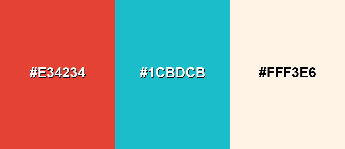
Complementary Colors
A complementary palette puts vermilion against a blue-green opposite for strong, clean contrast. This is a reliable choice for calls to action, headlines, and focal points that must stand out fast.
Complementary Palette Example: Try Vermilion with Sea Teal and a warm Ivory base to keep the look vivid but readable.
Analogous Color Schemes
Analogous colors sit adjacent to each other on the color wheel, creating harmonious, cohesive palettes with subtle variation.
For a fiery, cohesive look, blend Crimson Red, Vermilion, and Tangerine Orange.
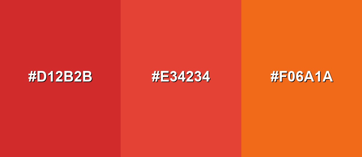
- Crimson Red: #D12B2B
- Vermilion: #E34234
- Tangerine Orange: #F06A1A
For a warmer, sunlit gradient feel, combine Vermilion with Apricot Orange and Golden Amber.
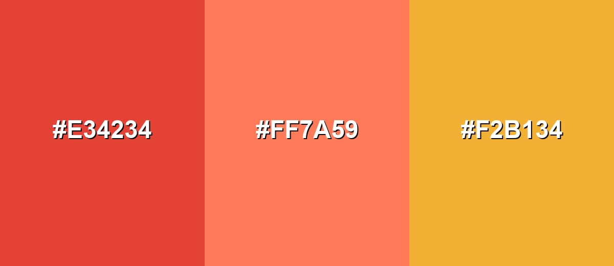
- Vermilion: #E34234
- Apricot Orange: #FF7A59
- Golden Amber: #F2B134
Triadic & Tetradic Combinations
A triadic palette gives you variety while staying balanced across the wheel.
Use Vermilion with Spring Green and Ultramarine Blue for a bold, playful system.
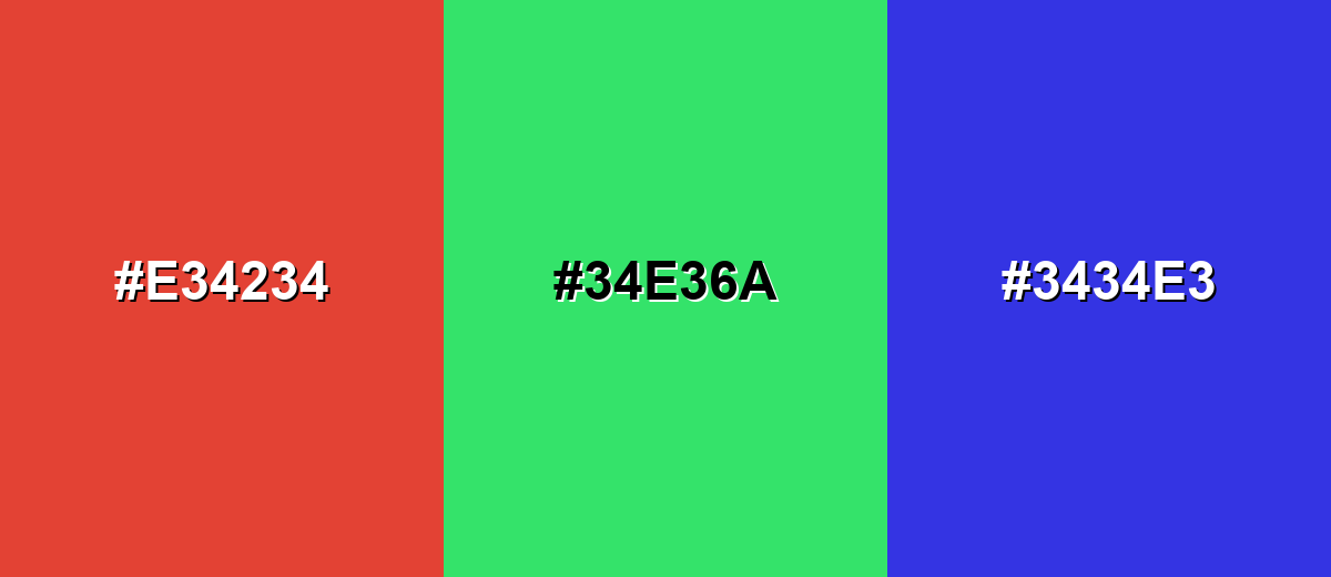
- Vermilion: #E34234
- Spring Green: #34E36A
- Ultramarine Blue: #3434E3
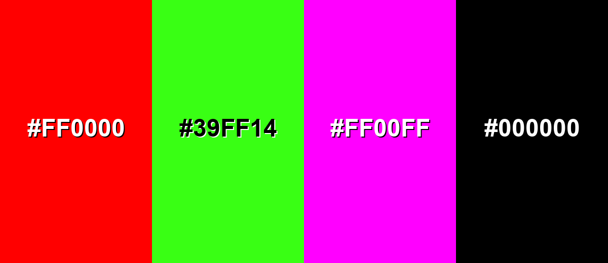
Colors to Avoid
While vermilion color is remarkably versatile, certain combinations can create problematic visual effects:
- Pure Red (#FF0000) - Too close in hue and even more intense, which can make layouts feel harsh and reduce hierarchy.
- Neon Green (#39FF14) - High saturation on both sides creates a vibrating effect that is tiring in UI and difficult for long viewing.
- Hot Magenta (#FF00FF) - Competes for attention and can push the palette into a loud, conflicting look unless carefully controlled.
- Pure Black (#000000) - The contrast can feel overly aggressive; a softer charcoal often keeps the design warmer and more refined.
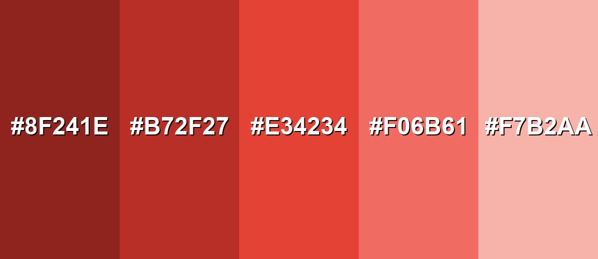
Shades, Tints & Variations of Vermilion Color
Vermilion has a flexible range—from deeper, earthier versions to soft, modern tints—so you can keep the same warm personality while dialing intensity up or down for different layouts and lighting.
- Burnt Vermilion (#8F241E) - A deeper, brown-leaning version that feels grounded and mature while keeping the warm undertone. It's best used for Headers, packaging accents, and warm dark themes where pure red-orange would be too loud.
- Deep Vermilion (#B72F27) - A richer, darker vermilion that boosts contrast and adds seriousness without turning maroon. It's best used for Buttons, emphasis text, and brand marks that need stronger weight on light backgrounds.
- Classic Vermilion (#E34234) - The vivid red-orange baseline: energetic, attention-grabbing, and highly legible as an accent. It's best used for CTAs, highlight states, promo badges, and focal elements in illustrations.
- Soft Vermilion (#F06B61) - A slightly lighter, friendlier take that keeps warmth while reducing visual sharpness. It's best used for Secondary accents, friendly branding, onboarding screens, and lifestyle graphics.
- Pale Vermilion (#F7B2AA) - A gentle tint that reads warm and modern, ideal when you want the vibe without the intensity. It's best used for Background panels, cards, subtle gradients, and large areas behind dark text.
Industry Applications
Because it is warm and high-visibility, vermilion works across many industries as a signal shade and a brand accent. It is most effective when you define clear rules for where it appears and what it should communicate.
Fashion & Beauty
- Statement pieces - Use vermilion for standout outerwear, bags, or shoes where instant impact matters.
- Beauty accents - Works well for bold lip or nail storytelling in campaigns thanks to its energetic, warm tone.
- Seasonal edits - Great for summer and festival drops, especially as a highlight against clean neutrals.
- Packaging pops - Small vermilion areas (labels, caps, stickers) help products read quickly on shelves and thumbnails.
Interior Design & Decor
- Accent furniture - A chair, side table, or cabinet in vermilion can become a room's focal point without repainting everything.
- Art & textiles - Add vermilion through prints, cushions, or rugs to inject warmth into cooler spaces.
- Feature moments - Use it on small architectural details (niches, trim, decor objects) for controlled intensity.
- Balance with breathing room - Pair with quiet surfaces and natural materials so the color feels curated, not chaotic.
Branding & Marketing
- Campaign energy - Vermilion communicates momentum and confidence in promo graphics and launch pages.
- Clear hierarchy - Use it for the "one thing" you want clicked first (primary CTA, limited-time badge, key price callout).
- Memorable identity - As a signature accent, it's distinctive and easy to recognize across social, web, and print.
- Systemized usage - Define where it appears (buttons, tags, highlights) to avoid visual fatigue and keep consistency.
Conclusion
Vermilion is an ember-like red-orange that's built for emphasis: it looks warm, confident, and urgent without losing its friendly edge. As a practical design color, #E34234 is easy to standardize across web and product UI, and its deeper shades or softer tints let you control how bold it feels in different layouts. If you're using Vermilion Color meaning as a guide, think energy and momentum—then balance it with calm neutrals or cool contrasts to keep everything readable and polished.
Design Smarter with AI: Media.io is an online AI studio that empowers creators with advanced image generation and enhancement tools. From text-to-image and image-to-image creation to AI upscaling and color optimization, it enables fast, creative, and professional results—all in your browser.

Frequently Asked Questions About Vermilion Color
Vermilion is a vivid red-orange shade that sits between bright red and orange. It is often used as an accent because it grabs attention quickly.
A widely used digital hex value for vermilion is #e34234. Different libraries may define slightly different versions, so check your brand palette for consistency.
Vermilion usually reads as red first, with a clear orange warmth underneath. The balance can shift depending on surrounding hues and lighting.
It commonly signals energy, urgency, confidence, and warmth. In interfaces, it often functions well for highlights, alerts, and primary actions when used sparingly.
Cool teal and cyan tones create strong contrast, while warm neutrals like ivory and sand keep it polished. It also works in analogous palettes with reds and oranges for a fiery look.
It can, but full backgrounds may feel intense and can reduce readability. For large areas, use a pale tint or reserve it for panels, banners, and controlled sections with verified contrast.


