

 TL;DR:
Maroon (#800000) is a deep, brown-leaning red utilized in branding and UI design to communicate stability and premium warmth, performing best as a strategic accent rather than a dense, visually heavy background.
● Unlike burgundy, which carries a distinct wine or purple undertone, true maroon relies strictly on earthy brown undertones for its grounded aesthetic.
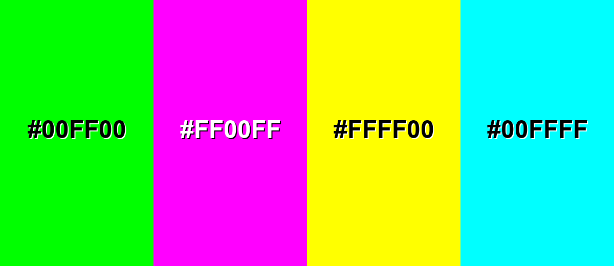
● Avoid combining maroon with pure yellow (#FFFF00) or neon green (#00FF00), as these extreme saturations overwhelm the red base, reduce UI legibility, and cause harsh visual vibration.
● To prevent detail loss and maintain accessibility in digital layouts, pair maroon elements with warm neutrals like ivory, and strictly use white (#ffffff) for overlay text.
Ask AI for a summary
 ChatGPT
 Perplexity
 Gemini
 Claude
 Grok
Grok
Maroon is a deep, brown-leaning red known for its richness and depth. The maroon color meaning is often associated with sophistication, stability, and quiet strength. Depending on how it's styled, maroon can feel classic and formal in luxury branding, academic design, and traditional interiors—or warm and cozy when paired with soft textures and earthy neutrals.
On this page you'll find clear definitions, accurate color codes, reliable conversions, and ready-to-use palettes for common design scenarios.
Maroon Color Color: Codes & Values
To apply maroon consistently across your projects, it's important to start with standardized color values. The maroon color codes below are widely used in web design, user interfaces, branding systems, and professional print workflows to ensure reliable reproduction. By referencing accurate HEX, RGB, CMYK, and HSL values, you can minimize color shifts between screens and physical materials—keeping your maroon rich, balanced, and true to its intended tone in every environment.
| Parameters | VALUE |
| HEX Code | #800000 |
| RGB DECIMAL | 128, 0, 0 |
| RGB PERCENTAGE | 50.2%, 0%, 0% |
| CMYK | 0%,100%,100%,50% |
| HSL | 0°, 100%, 25% |
| HSV (HSB) | 0°, 100%, 50% |
| Web Safe | #990000 |
Key Color Space Explanations:
- HEX - HEX is the most common way to specify maroon for web and UI work. It's a compact code that directly maps to the red, green, and blue channels.
- RGB - RGB defines maroon using light on screens by mixing red, green, and blue values. It's the standard for digital design and CSS color functions.
- CMYK - CMYK is used for print production, describing ink percentages for cyan, magenta, yellow, and black. Expect results to vary slightly by paper, coating, and press profile.
- HSL - HSL describes maroon by hue, saturation, and lightness, which is helpful for building tints/shades and consistent palettes. It's also convenient for adjusting perceived brightness without changing hue too much.
- Web Safe - Web-safe colors are a legacy palette designed for older displays. It's mainly useful today when you want a simplified approximation that stays consistent across very constrained environments.
For most projects, start with HEX (#800000) for CSS and UI mockups, then reference RGB for screen-based tools and CMYK when preparing print files.
Want to generate maroon color color photos or posters? Try Media.io's AI Image Generator now!
Maroon Color Color Conversions
When transitioning between design tools, exporting assets, or matching on-screen colors to printed materials, accurate color conversion becomes essential. This maroon color conversion table provides equivalent values across major color models, helping you maintain consistency between RGB, HEX, CMYK, and other formats. Whether you're refining a digital interface or preparing files for press, these conversions make it easier to keep maroon visually consistent across platforms and production workflows.
| Parameters | VALUE | CSS |
| HEX | #800000 | #800000 |
| RGB DECIMAL | 128, 0, 0 | rgb(128,0,0) |
| RGB PERCENTAGE | 50.2%, 0%, 0% | rgb(50.2%,0%,0%) |
| CMYK | 0%,100%,100%,50% | cmyk(0%,100%,100%,50%) |
| HSL | 0°, 100%, 25% | hsl(0°, 100%, 25%) |
| HSV (or HSB) | 0°, 100%, 50% | -- |
| Web Safe | 990000 | #990000 |
| CIE-LAB | 25.4, 47.5, 38.0 | -- |
| XYZ | 8.83, 4.55, 0.41 | -- |
| xyY | 0.640, 0.330, 4.55 | -- |
| CIE-LCH | 25.4, 60.8, 38.6° | -- |
| CIE-LUV | 25.4, 83.6, 18.2 | -- |
| Hunter-Lab | 21.3, 36.6, 13.8 | -- |
| Binary | 10000000, 00000000, 00000000 | -- |
Maroon Color Meaning & Symbolism
The maroon color meaning comes from its position between red and brown, blending emotional intensity with grounded stability. This balance gives maroon a confident, mature character that feels intentional rather than loud. In branding and design, maroon is often chosen when the goal is to communicate strength, heritage, and refined warmth instead of urgency or flashiness.
Psychological Effects
From a color psychology perspective, maroon reshapes how we perceive red. The added depth and brown undertone soften red's urgency, creating a more composed and controlled emotional response. These psychological effects of maroon make it especially suitable for formal branding, institutional design, and premium visual identities.
- Controlled Energy - Compared to bright red, maroon feels more controlled and reflective rather than impulsive.
- Grounded Confidence - Its brown undertone adds stability, helping maroon read steady and intentional.
- Seriousness - Maroon often signals depth and seriousness, making it a natural fit for formal design.
- Warm Comfort - When paired with natural neutrals, maroon can feel warm, cozy, and inviting.
- Perceived Weight - Large maroon areas can feel visually heavy, especially on smaller screens or tight layouts.
Positive Associations
Designers often rely on the symbolism of maroon to convey heritage, craftsmanship, and steady ambition. Compared to brighter reds, maroon communicates authority and premium warmth in a more understated way, making it a strong choice for luxury packaging, editorial layouts, and established brand systems.
- Heritage - Maroon suggests tradition and a sense of permanence that feels established.
- Craftsmanship - It can hint at quality materials and handmade detail, especially with textured finishes.
- Determination - Maroon communicates ambition in a calmer, more mature way than bright red.
- Premium Warmth - It can replace black when you want luxury without a cold or stark feel.
- Editorial Elegance - In layouts, maroon can add a classic, formal mood that supports storytelling and hierarchy.
Cultural Significance Across the World
The cultural significance of maroon is closely tied to its connection with deep red and earthy brown tones. Across many regions, it represents tradition, ceremony, and formality while still carrying a sense of warmth and approachability. This dual meaning allows maroon to feel both passionate and grounded in global design contexts.
- Tradition - In many contexts, maroon is used to express legacy, ceremony, or institutional identity.
- Formality - Maroon frequently appears in uniforms and formal wear, reinforcing a composed, respectful tone.
- Warm Hospitality - When paired with ivory or beige, maroon can feel welcoming and "home-like," especially in interiors.
- Quality Signaling - In packaging and print, maroon is often chosen to imply richness and craftsmanship.
Design Applications
When applying maroon in graphic design, focus on hierarchy and proportion. Strategic placement—such as logos, headings, or accent elements—helps preserve its premium feel while preventing visual heaviness. Thoughtful maroon color pairings with cream, warm gray, or muted teal can shift the tone from heritage-inspired to modern and high-contrast.
Graphic Design Tips
- Use maroon for logos, headings, and signature accents rather than full backgrounds.
- Pair with cream or warm gray for a heritage look, or teal for a more modern, high-contrast system.
- Choose an off-white background if you want maroon to feel elegant instead of intense.
- Use generous margins—dark colors feel denser in print and can crowd a layout.
- On dark backgrounds, maroon may lose detail—run a quick contrast check and adjust with a lighter tint when needed.
If maroon starts to overpower a layout, treat it like a "punctuation color": use it on the key elements (titles, dividers, badges), and let warm neutrals carry the larger surfaces.
Maroon Color in Photography & Video
- Use maroon props or wardrobe to add depth without pulling attention as aggressively as bright red.
- Balance maroon-heavy frames with lighter backgrounds so shadows don't swallow texture and detail.
- For product shots, maroon pairs especially well with warm neutrals that keep the scene natural and premium.
- In grading, watch for crushed reds—maroon can lose separation quickly if contrast is pushed too far.
- If maroon appears on dark sets, add subtle rim light to preserve edges and keep the subject readable.
Recommended Tool for Image Enhancement: When incorporating maroon color into your photography projects, Media.io's AI Image tools can help you achieve more refined results. With AI-powered color enhancement, photo colorization, image upscaling, and old photo restoration, you can easily enrich maroon color tones, improve overall image quality, and highlight the color's elegant and sophisticated aesthetic.
Color Combinations
Maroon pairs best with colors that either (1) brighten it with warm neutrals, or (2) cut through it with cool blue-green contrast. Use the palettes below as starting points and adjust lightness for your medium.
Complementary Colors
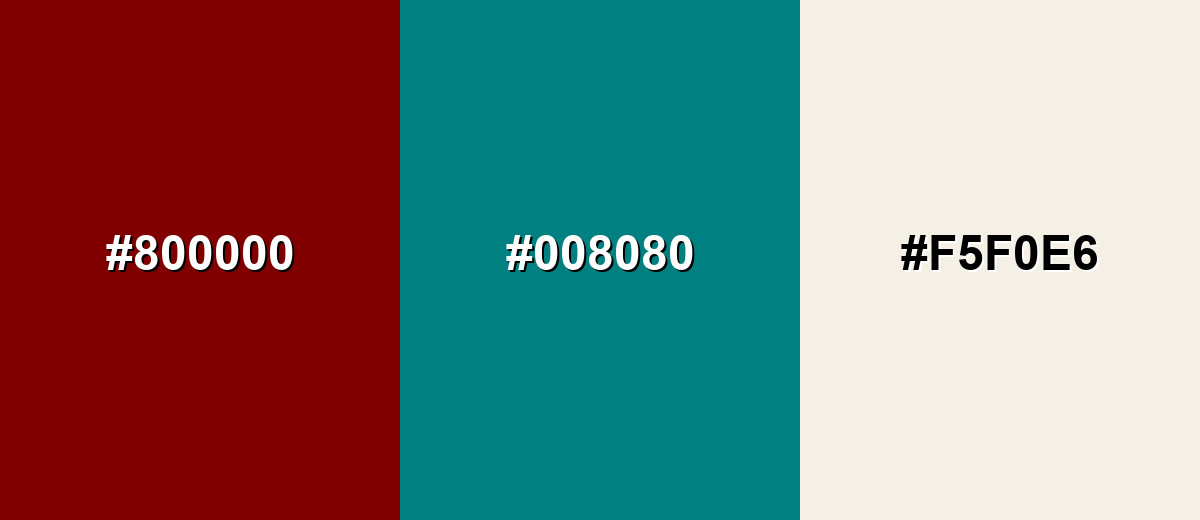
A complementary palette balances maroon's warm depth with a cool blue-green for strong, clean contrast. Add a soft neutral to keep the pairing usable across backgrounds and surfaces.
Complementary Palette Example: Pair Maroon with Deep Teal and Soft Ivory for a crisp, high-contrast look that still feels classic.
Analogous Color Schemes
Analogous colors sit adjacent to each other on the color wheel, creating harmonious, cohesive palettes with subtle variation.
Maroon + Wine Plum + Burnt Orange builds a warm, vintage-leaning gradient.
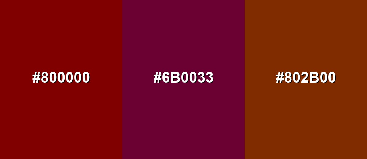
- Maroon: #800000
- Wine Plum: #6B0033
- Burnt Orange: #802B00
Maroon + Deep Plum + Copper Brown creates a richer, more dramatic analogous range.
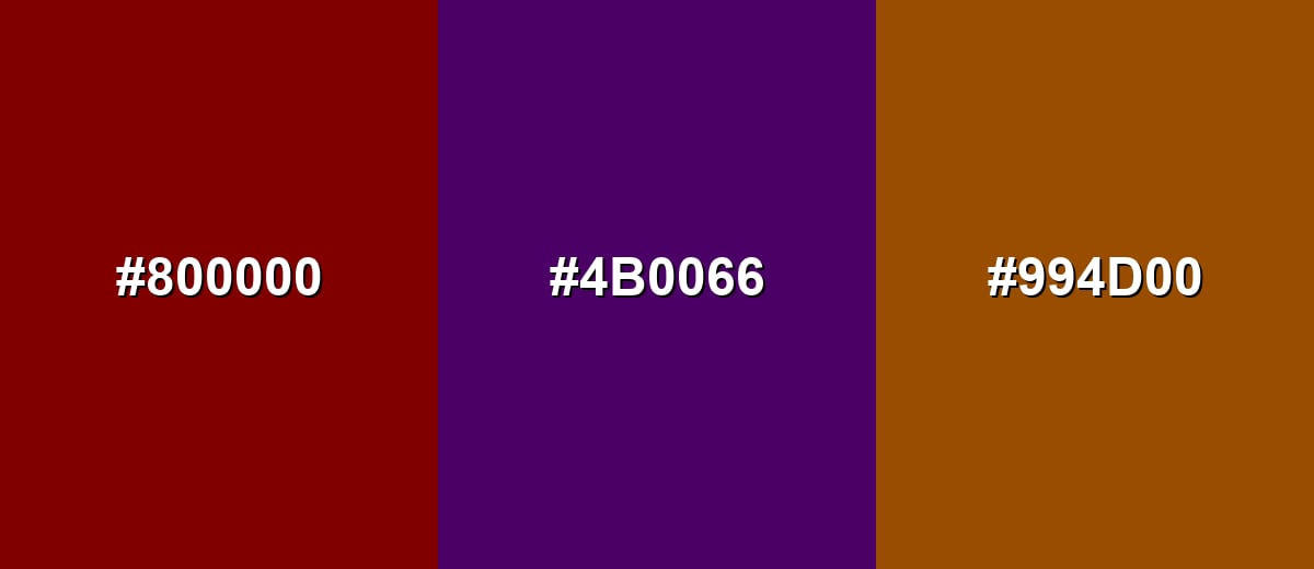
- Maroon: #800000
- Deep Plum: #4B0066
- Copper Brown: #994D00
Triadic & Tetradic Combinations
A triadic scheme spreads hues evenly for a bold but balanced palette.
Maroon + Forest Green + Navy works well for editorial layouts and team/sports-style branding.
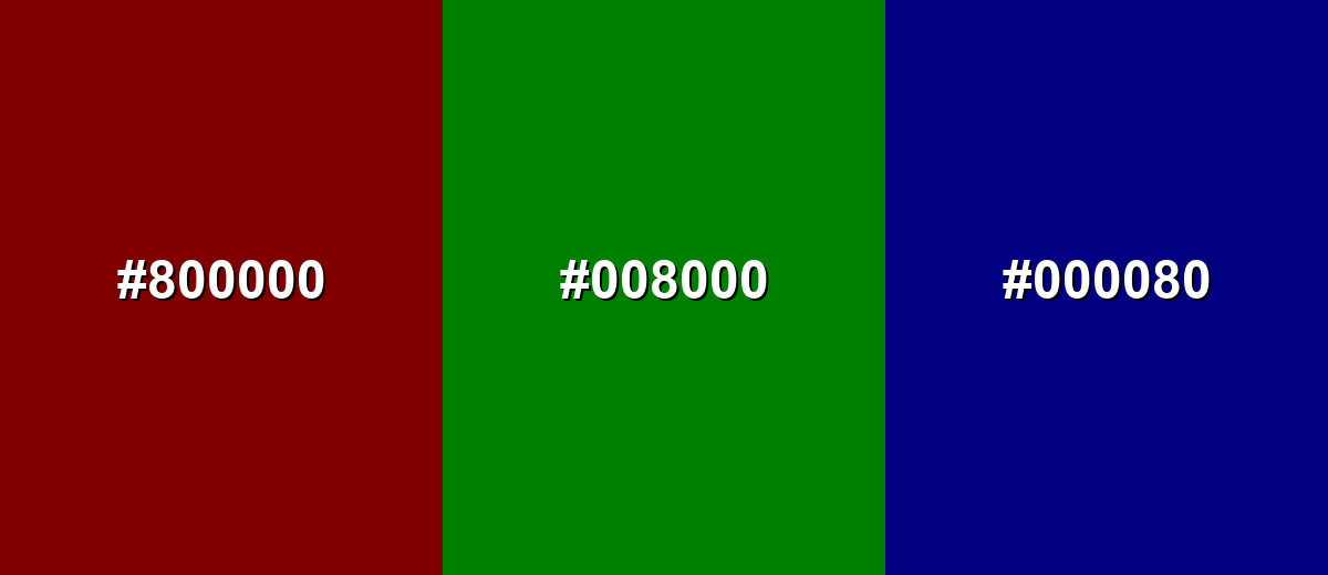
- Maroon: #800000
- Forest Green: #008000
- Navy: #000080
Colors to Avoid
While maroon color is remarkably versatile, certain combinations can create problematic visual effects:
- Neon Green (#00FF00) - The saturation clash can feel harsh and can create visual vibration next to maroon.
- Hot Magenta (#FF00FF) - Competes with maroon's red base and often looks noisy unless carefully muted.
- Pure Yellow (#FFFF00) - High brightness overwhelms maroon and can reduce legibility in UI and print.
- Pure Cyan (#00FFFF) - The contrast is extreme and can feel synthetic, especially for classic or premium themes.
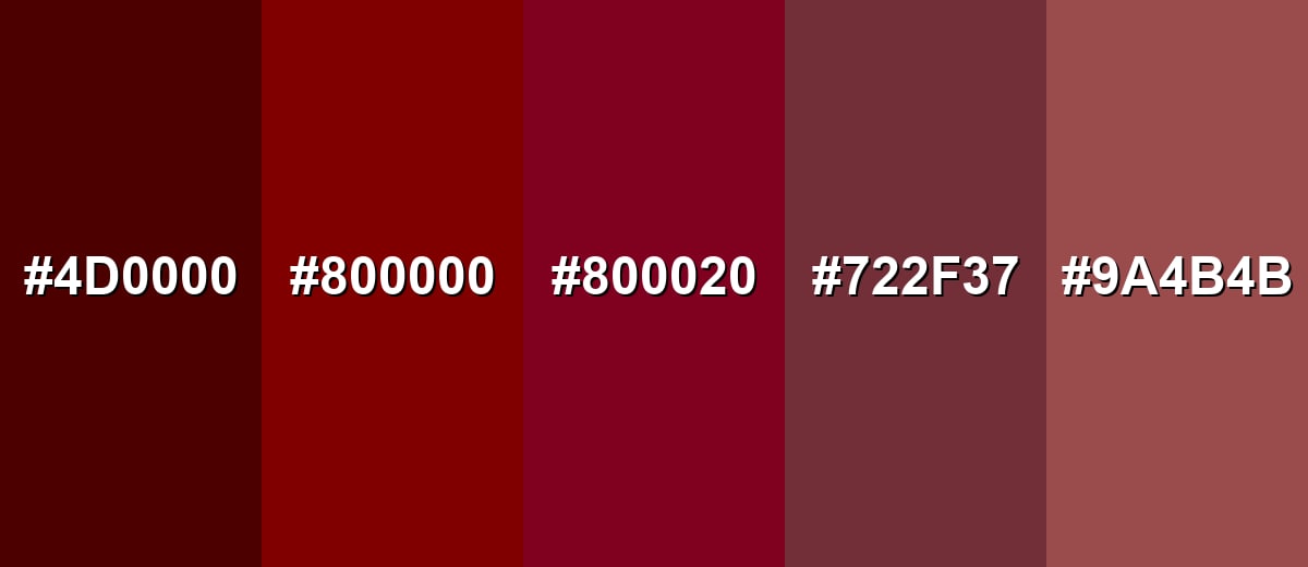
Shades, Tints & Variations of Maroon Color
Maroon isn't just one fixed swatch—its range runs from near-black reds to softer, dustier variations. Knowing these options makes it easier to set the mood (dramatic vs. approachable) while keeping the same core color family.
- Dark Maroon (#4D0000) - A deeper, near-black maroon that feels dramatic and authoritative. It's best used for Headers, luxury packaging, and high-contrast accents when paired with warm whites..
- Classic Maroon (#800000) - The reference maroon: a balanced red-brown with strong presence and timeless character. It's best used for Brand accents, CTAs, uniforms, and editorial highlights..
- Burgundy (#800020) - A maroon-adjacent shade with a subtle wine/purple undertone. It's best used for Fashion palettes, premium branding, and elegant event themes..
- Wine Red (#722F37) - A softer, muted maroon that reads more approachable and less formal. It's best used for Background blocks, lifestyle branding, and cozy interior palettes..
- Dusty Maroon (#9A4B4B) - A lighter, desaturated maroon that feels modern and calm. It's best used for UI surfaces, cards, and large areas where pure maroon would feel too heavy..
Industry Applications
Because it balances warmth with seriousness, maroon shows up in many industries—from identity systems to product design—especially when a brand wants to feel established and intentional.
Fashion & Beauty
- Use maroon as a statement shade that still feels wearable and refined.
- Lean into burgundy or wine red variations when you want a more elegant, "evening" mood.
- Pair maroon with warm neutrals for a premium look, or deeper tones for a dramatic seasonal palette.
- Maroon packaging with gold-toned details often reads classic and upscale.
Interior Design & Decor
- Use maroon as an accent wall, upholstery, or décor rather than across every surface.
- Balance it with light wood, beige, or soft stone tones to keep the space open.
- Try maroon with uncoated cream-like finishes for a warm, classic atmosphere.
- Metals like brass and matte gold tend to complement maroon's warmth.
Branding & Marketing
- Maroon supports premium and heritage positioning without the coldness of pure black.
- Use maroon for logos, headings, and signature accents rather than full backgrounds.
- Pair with warm gray or soft ivory for classic systems, or teal for crisp contrast.
- In campaigns, reserve maroon for key highlights so it stays impactful instead of heavy.
Conclusion
Maroon is a deep red-brown that brings weight, warmth, and a sense of tradition to designs. Use the #800000 base for strong accents, lean on warm neutrals for timeless palettes, and add teal or navy when you want crisp contrast. With the codes, conversions, combinations, and shades above, you can apply maroon confidently across web, print, and real-world materials.
Design Smarter with AI: Media.io is an online AI studio that empowers creators with advanced image generation and enhancement tools. From text-to-image and image-to-image creation to AI upscaling and color optimization, it enables fast, creative, and professional results—all in your browser.

Frequently Asked Questions About Maroon Color Color
Maroon is a dark red with brown undertones. It sits between red and brown on the spectrum, so it feels warmer and more grounded than bright red.
A widely used standard HEX code for maroon is #800000. It's a common reference in web design and digital color libraries.
Maroon is often associated with depth, tradition, determination, and maturity. It can also convey warmth and craftsmanship when paired with natural neutrals.
Maroon pairs well with warm neutrals (ivory, beige, warm gray), deep blues (navy), and blue-greens (teal). For a richer palette, add gold or copper tones.
Maroon typically leans more brown and earthy, while burgundy usually has a stronger wine/purple undertone. In practice, the difference is subtle and depends on the exact shade and lighting.
In many designs, white (#ffffff) provides clear readability on maroon backgrounds. For accessibility, always verify contrast for your exact font weight and background shade.


