

Lilac is a soft, floral purple with a light, powdery appearance that sits between lavender and light violet on the color spectrum. The lilac color meaning is often associated with calmness, renewal, femininity, and gentle optimism. Because it carries less intensity than deeper purples, lilac feels airy and approachable—making it a popular choice for calming user interfaces, romantic branding concepts, pastel color palettes, and light-filled interior design schemes.
Below you'll find lilac's core color codes, what it commonly communicates, and ready-to-use combinations or palettes that pair well with it.
Lilac Color: Codes & Values
If you're using lilac color in UI design, branding systems, packaging, or print materials, starting with accurate color specifications is essential. Below you'll find the standard lilac color codes in HEX, RGB, CMYK, and HSL formats—ready to copy and paste into your design tools. These core values help ensure consistent lilac color reproduction across screens, CSS stylesheets, digital products, and professional print workflows, keeping your soft purple tone balanced and true across platforms.
| Parameters | VALUE |
| HEX Code | #C8A2C8 |
| RGB DECIMAL | 200, 162, 200 |
| RGB PERCENTAGE | 78.4%, 63.5%, 78.4% |
| CMYK | 0%,19%,0%,22% |
| HSL | 300°, 26%, 71% |
| HSV (HSB) | 300°, 19%, 78% |
| Web Safe | #CC99CC |
Key Color Space Explanations:
- HEX - A hexadecimal color used in web design and UI styling. Lilac is written as #c8a2c8.
- RGB - RGB mixes red, green, and blue light for screens and digital media. Lilac uses 200, 162, 200 in RGB decimal.
- CMYK - CMYK is used for printing and describes ink percentages. Lilac converts to 0%,19%,0%,22% as a practical print reference.
- HSL - HSL describes hue, saturation, and lightness, which is helpful for creating tints and tones. Lilac sits at 300° with low-to-moderate saturation and high lightness.
- Web Safe - A web-safe value is the closest match from the classic 216-color palette. For lilac, the nearest web-safe approximation is #cc99cc.
Use HEX or RGB for digital design, and treat CMYK as a starting point for print—then tweak after a proof if you need a perfect match.
Want to generate lilac color photos or posters? Try Media.io's AI Image Generator now!
Lilac Color Conversions
To maintain accurate lilac color consistency across platforms, this conversion chart provides equivalent values in HEX, RGB, CMYK, and HSL formats. Whether you're switching between design tools, coding lilac in CSS, adjusting tones in a UI system, or preparing files for professional print, these lilac color conversions help eliminate guesswork. Using standardized values ensures your soft purple hue appears balanced and consistent across screens, browsers, and physical materials.
| Parameters | VALUE | CSS |
| HEX | #c8a2c8 | #c8a2c8 |
| RGB DECIMAL | 200, 162, 200 | rgb(200,162,200) |
| RGB PERCENTAGE | 78.4%, 63.5%, 78.4% | rgb(78.4%,63.5%,78.4%) |
| CMYK | 0%,19%,0%,22% | cmyk(0%,19%,0%,22%) |
| HSL | 300°, 26%, 71% | hsl(300°,26%,71%) |
| HSV (or HSB) | 300°, 19%, 78% | -- |
| Web Safe | cc99cc | #cc99cc |
| CIE-LAB | 71.1, 19.5, -14.0 | -- |
| XYZ | 47.0, 42.4, 60.2 | -- |
| xyY | 0.314, 0.283, 42.4 | -- |
| CIE-LCH | 71.1, 24.0, 324° | -- |
| CIE-LUV | 71.1, 18.3, -24.5 | -- |
| Hunter-Lab | 65.1, 18.9, -13.9 | -- |
| Binary | 11001000, 10100010, 11001000 | -- |
Lilac Color Meaning & Symbolism
Lilac is often used when you want a soft, uplifting mood without the intensity of deeper purples. It feels light, delicate, and slightly dreamy—great for designs that should be gentle but still memorable.
Psychological Effects
In color psychology, lilac has a smoothing effect on a layout. The psychological effects of lilac lean toward relaxation and emotional ease, helping interfaces and visual compositions feel less intense and more inviting. It’s especially effective in wellness design, lifestyle branding, and soft editorial aesthetics.
- Calm - Helps create a quiet, low-pressure atmosphere that feels easy to stay in.
- Comfort - Adds a gentle "safe" feeling, especially when used as a background tint.
- Tenderness - Brings a soft emotional warmth that can feel caring and personal.
- Quiet Creativity - Suggests imagination and artistry without looking loud or intense.
- Nostalgia - Can feel slightly vintage or dreamy, like a soft memory rather than a sharp statement.
Positive Associations
Within branding and visual communication, the symbolism of lilac often connects to romance, thoughtful elegance, and light optimism. When paired with clean neutrals and balanced contrast, lilac reads intentional and refined rather than overly sweet—making it a strong option for modern pastel color palettes.
- Romance - A floral purple that naturally supports romantic themes and gentle storytelling.
- Approachable Elegance - Feels premium, but not harsh or overly formal.
- Wellness - Often linked to self-care visuals that aim to be calming and airy.
- Playful Sophistication - Pastel energy with a refined edge—fun, but not childish.
- Soft Uplift - Keeps designs light and optimistic while still being memorable.
Cultural Significance Across the World
The cultural meaning of lilac varies by setting, but it frequently appears in floral symbolism, spring color palettes, and contemporary "soft aesthetic" trends. From event styling to digital lifestyle branding, lilac is commonly used to signal freshness, mindfulness, and a gentle celebratory tone.
- Floral Symbolism - Commonly connected to springtime, blossoms, and gentle, romantic mood cues.
- Modern Lifestyle Aesthetics - Often appears in pastel-forward "soft" aesthetics used in social and editorial design.
- Wellness Culture - Frequently used to communicate rest, mindfulness, and a calm routine vibe.
- Event & Celebration Styling - A popular choice for invitations and decor where you want elegance without heavy tones.
Design Applications
The lilac color in design adapts easily across digital and physical spaces. It works beautifully as a background tint in UI layouts, as a highlight color in branding systems, or as a supporting tone in pastel room palettes. Used with intention—alongside structured typography and well-managed contrast—lilac can soften a composition while still keeping it polished and memorable.
Graphic Design Tips
- Use lilac as a background and pair it with a dark text color for readability.
- Reserve saturated accents for calls-to-action; lilac itself works best as a supporting tone.
- Add structure with borders or separators so pastel surfaces don't blend together.
- Use the CMYK values as a starting point and run a proof if accuracy is critical.
- Avoid placing white text directly on lilac for small UI text; contrast may be insufficient depending on size and weight.
Pro tip: lilac looks most "designed" when you anchor it with one deeper shade (for type or icons) and one clean neutral to keep spacing and hierarchy clear.
Lilac Color in Photography & Video
- Use lilac props, florals, or wardrobe to create a soft focal point without overpowering skin tones.
- In color grading, keep saturation moderate so lilac stays powdery rather than turning neon-purple.
- Pair lilac scenes with creamy highlights to maintain that airy, romantic look.
- For product shots, add a darker anchor (shadows, typography, or outlines) so lilac doesn't wash out.
- When lilac is used in overlays or titles, choose a deeper text color to avoid low-contrast readability issues.
Recommended Tool for Image Enhancement: When incorporating lilac color into your photography projects, Media.io's AI Image tools can help you achieve more refined results. With AI-powered color enhancement, photo colorization, image upscaling, and old photo restoration, you can easily enrich lilac color tones, improve overall image quality, and highlight the color's elegant and sophisticated aesthetic.
Color Combinations
Lilac pairs beautifully with soft greens, muted blues, and creamy neutrals. The palettes below cover classic harmony rules so you can quickly build a balanced lilac color palette for branding, UI, or print.
Complementary Colors
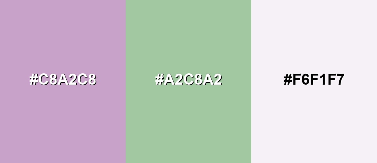
A complementary palette uses opposite hues to create contrast. With lilac, a gentle green provides balance without turning the look loud.
Complementary Palette Example: Use lilac with a soft green and a light neutral to keep the contrast clean and calming.
Analogous Color Schemes
Analogous colors sit adjacent to each other on the color wheel, creating harmonious, cohesive palettes with subtle variation.
Lilac with neighboring purples and rosy tones creates a smooth, floral gradient.
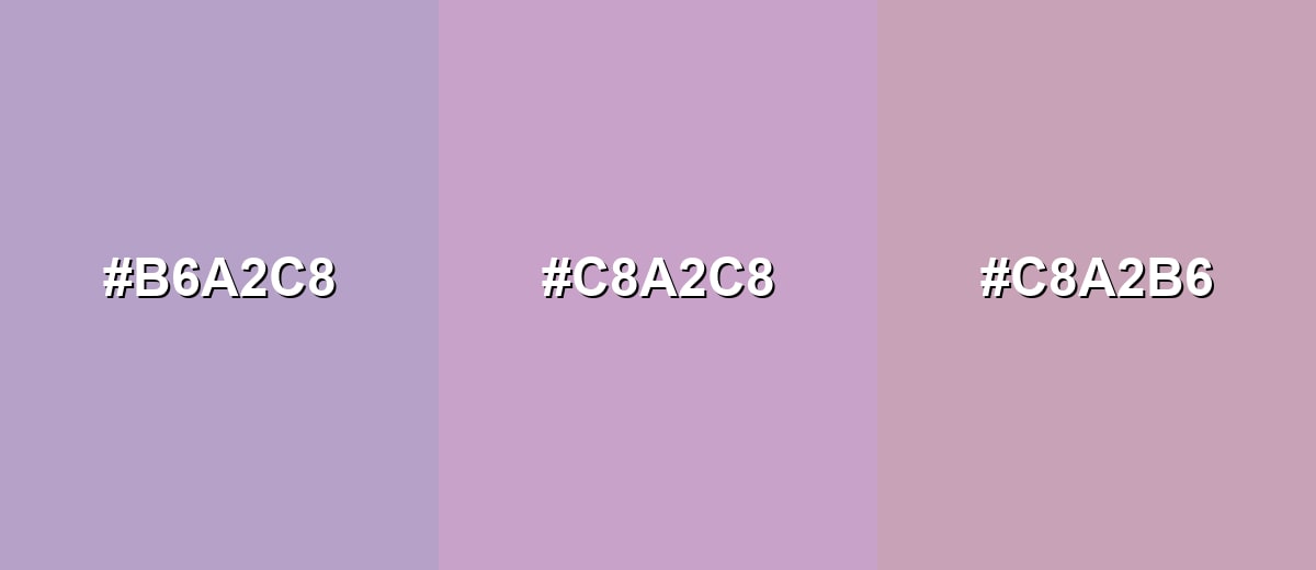
- Periwinkle Mist: #B6A2C8
- Lilac: #C8A2C8
- Rose Mauve: #C8A2B6
A cooler analogous mix adds airy blue while keeping the overall feel soft and modern.
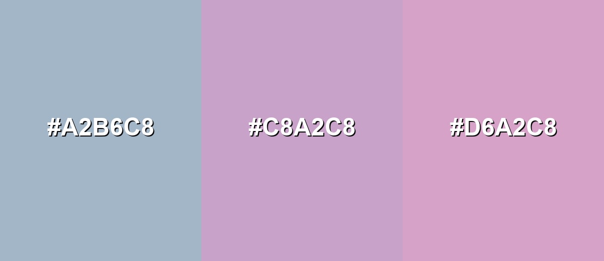
- Dusty Blue: #A2B6C8
- Lilac: #C8A2C8
- Soft Magenta: #D6A2C8
Triadic & Tetradic Combinations
A triadic palette uses three evenly spaced hues for lively balance.
Pair lilac with a gentle yellow and a cool aqua to keep the energy bright but still pastel-friendly.
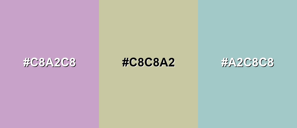
- Lilac: #C8A2C8
- Butter Yellow: #C8C8A2
- Seafoam: #A2C8C8
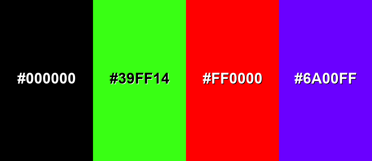
Colors to Avoid
While lilac color is remarkably versatile, certain combinations can create problematic visual effects:
- Pure Black (#000000) - The jump from pastel lilac to pure black can feel harsh and overly dramatic unless carefully softened with neutrals.
- Neon Green (#39FF14) - Neon green overwhelms lilac's subtlety and can create a visually vibrating clash.
- Bright Red (#FF0000) - Highly saturated red competes with lilac and can push the palette toward a noisy, mismatched look.
- Electric Violet (#6A00FF) - A strong, saturated purple can make lilac look washed out and inconsistent within the same purple family.
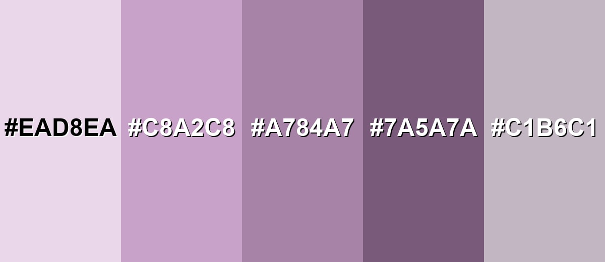
Shades, Tints & Variations of Lilac Color
Lilac isn't just one pastel purple—there's a whole range from airy tints to deeper anchors. Having a few reliable variations makes it much easier to build hierarchy in UI, create depth in print, or keep a brand system consistent.
- Pale Lilac (#EAD8EA) - A very light tint of lilac that reads airy and minimal, with a soft, powdery finish. It's best used for Backgrounds, large surfaces, and subtle gradients in UI or editorial layouts.
- Classic Lilac (#C8A2C8) - The balanced lilac reference—soft purple with a floral feel and gentle saturation. It's best used for Brand accents, highlight blocks, illustrations, and calm yet recognizable UI elements.
- Dusty Lilac (#A784A7) - A toned lilac with more gray influence, making it feel mature and understated. It's best used for Typography accents, secondary buttons, packaging, and sophisticated branding systems.
- Deep Lilac (#7A5A7A) - A darker lilac shade that keeps the purple identity while adding weight and contrast. It's best used for Headings, icons, outlines, and anywhere you need a stronger anchor color.
- Lilac Gray (#C1B6C1) - A neutral-leaning lilac that acts like a colored gray, softening layouts without feeling overtly purple. It's best used for Borders, UI dividers, muted backgrounds, and minimal design themes.
Industry Applications
Because lilac feels soft and refined, it shows up most often in categories that benefit from calmness, care, and a touch of romance. It can work as a hero background, a secondary brand color, or a product highlight depending on contrast needs.
Fashion & Beauty
- Use lilac for skincare and fragrance visuals where harsh colors feel out of place.
- Pair lilac packaging with minimalist typography for a clean, gentle product story.
- In makeup branding, lilac reads soft and modern—especially as an accent rather than a full fill.
- Combine lilac with neutral backdrops to keep the focus on texture and finish.
Interior Design & Decor
- Great for airy rooms and soft decor themes where you want calm without going plain white.
- Works well as a wall tint or textile accent when balanced with grounding neutrals.
- Pairs naturally with soft greens and creamy off-whites for a floral, relaxed mood.
- Use deeper lilac accents for contrast in trims, outlines, or decor details.
Branding & Marketing
- Signals approachable elegance—premium, but not harsh.
- Fits wellness and self-care messaging with a calm, breathable feel.
- Supports youthful or playful sophistication when used in pastel-forward palettes.
- In digital campaigns, use lilac as a supporting tone and keep CTAs more saturated for clarity.
Conclusion
Lilac color is a light, floral purple that communicates calm, tenderness, and understated creativity—making it a smart choice for wellness brands, romantic event designs, and soft, modern UI. Start with lilac's base hex #C8A2C8, then build clarity with a grounding neutral and a contrasting accent (soft greens, gentle yellows, airy blues, and clean off-whites work especially well). With the right contrast and a few darker supporting shades, lilac stays dreamy without ever looking washed out.
Design Smarter with AI: Media.io is an online AI studio that empowers creators with advanced image generation and enhancement tools. From text-to-image and image-to-image creation to AI upscaling and color optimization, it enables fast, creative, and professional results—all in your browser.

Frequently Asked Questions About Lilac Color
Lilac is a pale, soft purple inspired by lilac flowers. It typically sits between lavender and light violet and is known for a calm, delicate look.
A commonly used lilac value is #c8a2c8. In RGB decimal, that's 200, 162, 200.
They're similar, but not identical. Lavender often leans slightly bluer, while lilac usually reads a bit pinker or more floral depending on the specific shade.
Lilac pairs well with soft greens, creamy off-whites, muted blues, gentle yellows, and calm grays. These combinations keep the palette light while still balanced.
Lilac is popular in branding, UI backgrounds, beauty and wellness visuals, and event designs. It helps create a soft mood and works well as an accent or supporting color.
The closest classic web-safe approximation to lilac (#c8a2c8) is #cc99cc.


