

Sand color is a warm, muted beige that looks like sunlit shoreline sand—soft, natural, and slightly golden. A widely used reference for this tone is #C2B280, which sits between tan and light khaki.
It's often read as grounded, calm, and approachable, and it can shift from creamy to dusty depending on lighting and surrounding tones. Below, you'll find its meaning, color codes, best pairings, shade ideas, and practical ways to use it in design.
Sand Color: Codes & Values
If you want sand to look consistent across UI, print, and brand assets, start with these core color codes.
| Parameters | VALUE |
| HEX Code | #C2B280 |
| RGB DECIMAL | 194, 178, 128 |
| RGB PERCENTAGE | 76.1%, 69.8%, 50.2% |
| CMYK | 0%,8%,34%,24% |
| HSL | 45°, 35%, 63% |
| HSV (HSB) | 45°, 34%, 76% |
| Web Safe | #CC9999 |
Key Color Space Explanations:
- HEX - HEX is the most common way to specify sand on the web and in digital tools. Use it for UI styles, brand guidelines, and consistent screen rendering.
- RGB - RGB defines sand using red, green, and blue light values. It's ideal for screens, video, and any work that stays in a digital workflow.
- CMYK - CMYK translates sand into ink percentages for print. Results can vary by paper and coating, so a proof helps when accuracy matters.
- HSL - HSL describes sand by hue, saturation, and lightness, making it easier to adjust warmth or softness. It's helpful for building accessible UI states and tonal systems.
- Web Safe - Web Safe is the closest legacy-safe approximation for older displays. It's mainly useful for backward compatibility rather than modern design work.
Use HEX/RGB for digital design, lean on HSL when building a scalable palette system, and check CMYK with a print proof if color accuracy is critical.
Sand Color Conversions
Need sand color values in multiple formats? Use this conversion table to copy the right number for your workflow.
| Parameters | VALUE | CSS |
| HEX | #c2b280 | #c2b280 |
| RGB DECIMAL | 194, 178, 128 | rgb(194,178,128) |
| RGB PERCENTAGE | 76.1%, 69.8%, 50.2% | rgb(76.1%,69.8%,50.2%) |
| CMYK | 0%,8%,34%,24% | cmyk(0%,8%,34%,24%) |
| HSL | 45°, 35%, 63% | hsl(45°, 35%, 63%) |
| HSV (or HSB) | 45°, 34%, 76% | -- |
| Web Safe | cc9999 | #cc9999 |
| CIE-LAB | 72.6, -1.0, 27.2 | -- |
| XYZ | 42.1, 44.9, 26.9 | -- |
| xyY | 0.370, 0.394, 44.9 | -- |
| CIE-LCH | 72.6, 27.2, 92.1° | -- |
| CIE-LUV | 72.6, 13.0, 37.0 | -- |
| Hunter-Lab | 67.0, -1.6, 21.1 | -- |
| Binary | 11000010 10110010 10000000 | -- |
Want to generate Sand Color photos or posters? Try Media.io's AI Image Generator now!
Sand Color Meaning & Symbolism
Sand color is commonly associated with simplicity, stability, and a close-to-nature sensibility. Because it resembles beaches, deserts, and natural stone, it often signals comfort and ease in everyday spaces. In practical terms, sand color meaning usually comes through as a friendly neutral that supports other tones rather than competing with them.
Psychological Effects
Sand tends to create a calm baseline that makes other elements easier to read and trust.
- Calm - Helps reduce visual intensity, making layouts feel quieter and easier to scan.
- Soft Focus - Works as a gentle backdrop that supports content instead of fighting it.
- Warmth - Feels less stark than pure white, adding a subtle inviting tone.
- Reliability - Suggests steadiness and modest confidence, especially in minimalist branding.
- Flatness Risk - When overused with low-contrast neutrals, it can look dusty or dated without a darker anchor.
Positive Associations
These are the most common “good” signals people pick up from sand in design and everyday settings.
- Natural - Connects to landscapes like beaches, dunes, and stone.
- Comfort - Creates a lived-in, relaxed feel that's easy to spend time with.
- Approachable - Reads friendly and down-to-earth rather than formal or flashy.
- Craft - Pairs naturally with wood, linen, clay, and other tactile materials.
- Timeless - Sits in that “always usable” neutral zone for modern-minimal palettes.
Cultural Significance Across the World
Sand's symbolism shifts by context, but it's widely understood as understated and nature-led.
- Travel - Evokes beaches and deserts, often tied to escape, exploration, and open space.
- Time - Suggests natural cycles and erosion—weathered stone, dunes, and shorelines.
- Simplicity - Often read as practical and restrained rather than ceremonial.
- Grounding - Signals stability and everyday comfort through its earthy neutrality.
Design Applications
Sand is a flexible base that brings warmth without dominating the palette, so it's easiest to use as a foundation and then build contrast on top.
Graphic Design Tips
- Use it as a background neutral - Sand keeps pages softer than white while staying clean and modern.
- Add a dark anchor early - Pair sand with a deeper tone for headings, rules, and key UI structure so the layout doesn't feel flat.
- Watch contrast in small UI - Buttons, tags, and input borders need clear separation when the base tone is light and warm.
- Lean into texture - Paper grain, linen, or matte finishes make sand feel intentional rather than “beige by default.”
- Keep accents controlled - One cool accent plus one deep neutral usually looks more premium than lots of mid-neutrals.
Pro tip: If your design starts to look “dusty,” keep sand for large surfaces, then introduce one darker shade for structure and one cooler accent for clarity—especially for UI states and call-to-action areas.
Sand Color in Photography & Video
- Great for warm backdrops - Sand tones flatter skin and products without the harshness of bright white.
- Mind the yellow shift - Mixed lighting can push sand too golden; correct white balance before you fine-tune saturation.
- Use shadows for separation - Slightly deeper shadows help sand scenes avoid looking washed out.
- Pair with cool props - Subtle blues or soft greens create clean contrast in lifestyle setups.
- Keep grain intentional - A little texture can feel cinematic, but heavy noise can make sand look muddy.
Recommended Tool for Image Enhancement: When incorporating sand color into your photography projects, Media.io's AI Image tools can help you achieve more refined results. With AI-powered color enhancement, photo colorization, image upscaling, and old photo restoration, you can easily enrich sand color tones, improve overall image quality, and highlight the color's elegant and sophisticated aesthetic.
Color Combinations
Sand is easiest to style when you balance its warmth with cooler accents and add one darker tone for contrast. The palettes below show practical routes for clean, modern combinations—ranging from calm neutrals to richer, more colorful mixes.
Complementary Colors
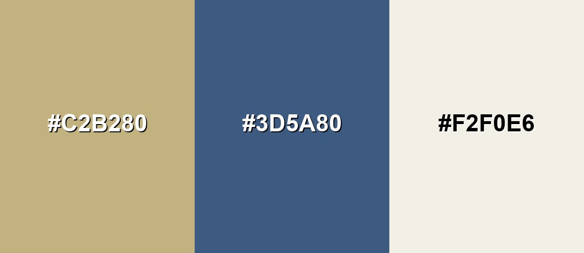
A complementary pairing contrasts sand's warm beige with a cooler blue family accent, creating instant balance and visual clarity. This is a reliable approach for UI highlights, hero sections, and brand palettes that need both warmth and trust.
Complementary Palette Example: Use Sand as the base, Steel Blue for structure and emphasis, and Shell White to keep spacing airy and readable.
Analogous Color Schemes
Analogous colors sit adjacent to each other on the color wheel, creating harmonious, cohesive palettes with subtle variation.
Warm neutrals that stay close on the wheel for a cohesive, sunlit look.
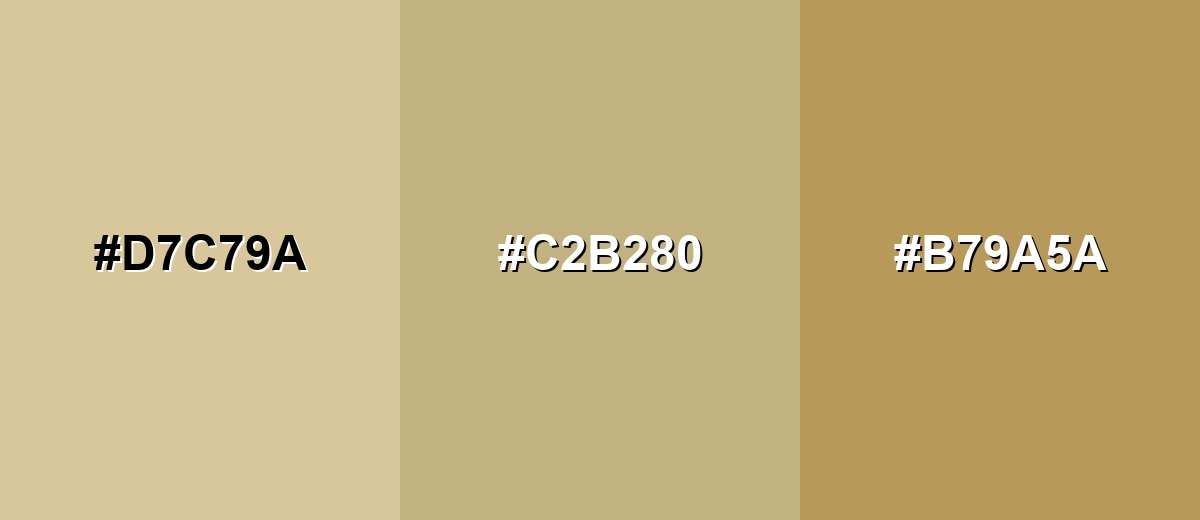
- Wheat: #D7C79A
- Sand: #C2B280
- Antique Gold: #B79A5A
A grounded neutral set with a hint of green for a natural, relaxed finish.
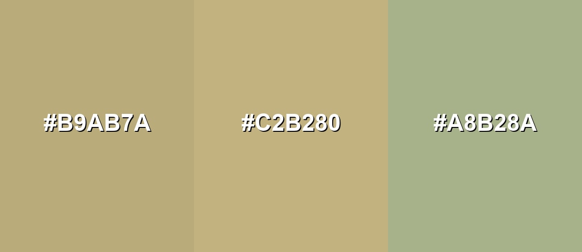
- Warm Taupe: #B9AB7A
- Sand: #C2B280
- Soft Sage: #A8B28A
Triadic & Tetradic Combinations
Triadic palettes add variety while staying balanced, making them useful for illustrations, dashboards, and multi-section layouts.
Sand with Seafoam and Dusty Orchid creates a friendly, modern trio with clear separation.
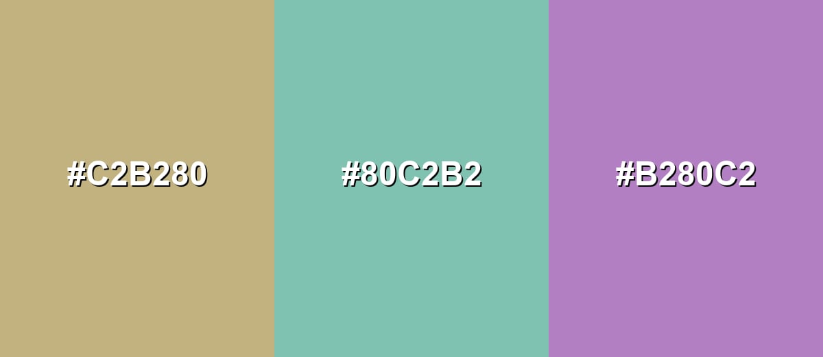
- Sand: #C2B280
- Seafoam: #80C2B2
- Dusty Orchid: #B280C2
Colors to Avoid
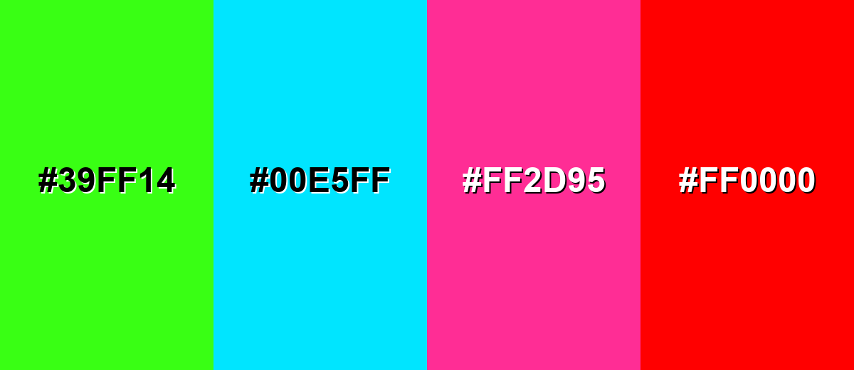
While sand color is remarkably versatile, certain combinations can create problematic visual effects:
- Neon Lime (#39FF14) - Its high intensity overwhelms sand's softness and can make layouts feel harsh and unbalanced.
- Electric Cyan (#00E5FF) - The sharp, bright cast can clash with sand's muted warmth and pull attention away from content.
- Hot Magenta (#FF2D95) - This saturated accent can look jarring next to sand and may reduce the calm, natural impression.
- Pure Red (#FF0000) - Strong red can create a warning-like feel against sand, which is better suited to subtle, grounded communication.
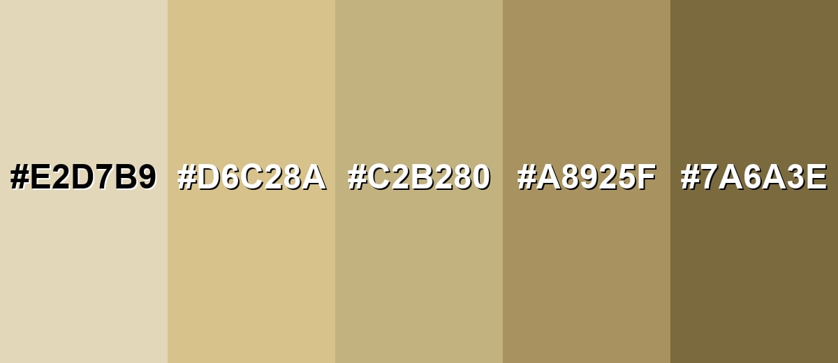
Shades, Tints & Variations of Sand Color
Sand isn't just one beige—its range runs from creamy, airy tints to deeper dune-like shades. Having a few options makes it easier to control contrast, build hierarchy in UI, and add depth to interiors or brand systems without leaving the same warm-neutral family.
- Light Sand (#E2D7B9) - A creamy, airy tint that feels brighter and softer while staying warm. It's best used for Large backgrounds, minimal layouts, and gentle product backdrops..
- Desert Sand (#D6C28A) - A sunnier, slightly richer take that leans more golden. It's best used for Highlights, cards, and warm sections that need a bit more presence..
- Classic Sand (#C2B280) - The balanced mid-tone reference: neutral, warm, and easy to pair. It's best used for Brand base tones, UI surfaces, and timeless neutral palettes..
- Deep Sand (#A8925F) - A deeper, earthier shade that adds weight without turning muddy. It's best used for Secondary text, icons, borders, and grounding accents..
- Dark Dune (#7A6A3E) - A dark, dune-like brown-beige that brings strong contrast and depth. It's best used for Headlines, UI contrast anchors, and trim details in interiors..
Industry Applications
Because sand reads as natural and neutral, it shows up across industries where warmth, clarity, and restraint matter. It can support content-heavy layouts, premium packaging, and lifestyle visuals without stealing focus.
Fashion & Beauty
- Minimal wardrobe palettes - Works as a core neutral for modern, clean styling.
- Skincare packaging - Adds a warm, “natural” feel that still looks premium and tidy.
- Editorial backdrops - Keeps attention on fabric texture, makeup, and skin tones.
- Product photography sets - Pairs easily with wood, stone, and matte props for a calm look.
Interior Design & Decor
- Wall and large-surface color - Creates an inviting base without feeling dark or heavy.
- Material coordination - Bridges wood, rattan, stone, and brushed metal accents smoothly.
- Lower-glare rooms - Softer than bright white in sunlit spaces, helping the room feel less harsh.
- Depth with contrast - Looks sharper when you add one deeper neutral for trim or focal points.
Branding & Marketing
- Wellness and lifestyle brands - Communicates calm, care, and approachability.
- Travel and hospitality - Naturally fits beach/desert storytelling and relaxed visuals.
- Food and craft - Supports handmade, earthy positioning without feeling rustic or messy.
- Content-heavy layouts - Helps readability by softening the page while keeping it neutral.
Conclusion
Sand color (#C2B280) is one of those warm neutrals that quietly elevates almost any palette—natural, readable, and easy to live with in both digital and print design. Use it as a base for backgrounds, cards, packaging, or interiors, then keep your results sharp by adding one deeper anchor shade and a cooler accent for balance. With the right contrast and a few intentional shade variations, sand delivers a relaxed, modern look that feels stable, clean, and timeless.
Design Smarter with AI: Media.io is an online AI studio that empowers creators with advanced image generation and enhancement tools. From text-to-image and image-to-image creation to AI upscaling and color optimization, it enables fast, creative, and professional results—all in your browser.

Frequently Asked Questions About Sand Color
Quick answers to the most common questions about sand color, from codes to pairing and practical design use.
Sand is a warm, muted beige with a soft golden or khaki undertone, similar to dry shoreline sand in daylight. It sits between tan and light brown, usually reading as natural and understated.
A common digital reference for sand is #c2b280. Similar sand-like tones may look slightly more yellow, gray, or tan depending on the palette and lighting.
They're closely related, but sand usually feels a bit more earthy and sun-warmed than standard beige, and softer than many tans. The difference often comes down to undertone and saturation rather than brightness alone.
Sand pairs well with muted blues, soft greens, warm whites, and deeper browns or charcoals. It also works nicely with dusty pinks or mauves when you want a warmer, lifestyle-oriented palette.
Use sand for large surfaces and keep text and key icons in noticeably darker tones. Add clear spacing, borders, and hover states so buttons and cards don't blend into the background.
Start with white, then add a small amount of yellow ochre and a touch of brown to warm it up. If it gets too bright or orange, neutralize it with a tiny amount of gray or a cool brown until it looks softly sunlit.


