

Bright yellow color is a vivid, punchy yellow that looks like concentrated sunshine and fresh lemon peel. Its hex code is #FFEA00, a high-intensity tone that reads bold even at a glance.
People often perceive it as optimistic, energetic, and attention-grabbing. In both light (screens) and pigment (print) systems, it stays bright but can shift warmer or greener depending on surrounding tones and lighting, and this guide covers its meaning, codes, combinations, shades, and practical uses.
Bright Yellow Color: Codes & Values
If you're matching bright yellow across web, UI, and print, these values give you a reliable starting point.
| Parameters | VALUE |
| HEX Code | #FFEA00 |
| RGB DECIMAL | 255, 234, 0 |
| RGB PERCENTAGE | 100%, 92%, 0% |
| CMYK | 0%,8%,100%,0% |
| HSL | 55°, 100%, 50% |
| HSV (HSB) | 55°, 100%, 100% |
| Web Safe | #FFFF00 |
Key Color Space Explanations:
- HEX - HEX is the most common way to specify a screen-ready value for web and UI. Use #ffea00 to get a saturated bright yellow in CSS and design tools.
- RGB - RGB mixes red, green, and blue light for displays. Bright yellow here is made with maximum red, very high green, and no blue.
- CMYK - CMYK is used for print and describes ink percentages. Bright yellow relies heavily on yellow ink with a small amount of magenta to keep it warm and vivid.
- HSL - HSL describes hue, saturation, and lightness, which is helpful when building consistent palettes. It also makes it easier to create lighter tints or deeper tones while keeping the same hue.
- Web Safe - Web-safe values are a legacy palette intended for consistent display on older systems. The closest web-safe match to this bright yellow is #ffff00.
Use HEX or RGB for digital work (CSS, UI, motion graphics), and switch to CMYK when you're preparing files for print so the color stays consistent from screen to paper.
Bright Yellow Color Conversions
Need bright yellow in a different format? Here are the most common conversions designers and developers use.
| Parameters | VALUE | CSS |
| HEX | #ffea00 | #ffea00 |
| RGB DECIMAL | 255, 234, 0 | rgb(255,234,0) |
| RGB PERCENTAGE | 100%, 92%, 0% | rgb(100%,92%,0%) |
| CMYK | 0%,8%,100%,0% | cmyk(0%,8%,100%,0%) |
| HSL | 55°, 100%, 50% | hsl(55°,100%,50%) |
| HSV (or HSB) | 55°, 100%, 100% | -- |
| Web Safe | ffff00 | #ffff00 |
| CIE-LAB | 91.7, -11.0, 90.4 | -- |
| XYZ | 70.7, 80.3, 11.7 | -- |
| xyY | 0.435, 0.493, 80.3 | -- |
| CIE-LCH | 91.7, 91.1, 97.0° | -- |
| CIE-LUV | 91.7, 21.7, 99.7 | -- |
| Hunter-Lab | 89.6, -15.8, 54.9 | -- |
| Binary | 11111111 11101010 00000000 | -- |
Want to generate bright yellow color photos or posters? Try Media.io's AI Image Generator now!
Bright Yellow Color Meaning & Symbolism
Bright yellow is commonly linked with positivity, clarity, and high visibility. Because it stands out quickly, it often signals importance, speed, and a sense of upbeat energy in everyday visuals. In practical terms, bright yellow color meaning tends to revolve around being noticed, staying alert, and feeling optimistic.
Psychological Effects
It's a "turn your head" color, so it changes how fast people notice and react to what's on the screen.
- Energy Boost - A small hit of bright yellow can make a layout feel more lively and awake.
- Faster Attention - It helps users spot calls to action, highlights, and key info quickly.
- Visual Intensity - Large blocks can feel loud or tiring, especially on high-brightness displays.
- Hierarchy Pressure - If everything is yellow, nothing feels important; it works best when it has a clear role.
- Balance Needed - Pairing it with deep, steady tones can keep the message confident rather than frantic.
Positive Associations
When used with restraint, bright yellow often reads as friendly, clear, and optimistic.
- Optimism - It brings a sunny, upbeat mood that feels encouraging.
- Clarity - Yellow is commonly used to spotlight what matters most in a design.
- Freshness - It can suggest lemony brightness and a clean, "new" feeling.
- Playfulness - The color naturally leans fun, youthful, and high-spirited.
- Visibility - Its standout nature is useful when you want information to be unmissable.
Cultural Significance Across the World
Yellow symbolism shifts by place and context, so it's smart to sanity-check meaning for your audience.
- Sunlight And Warmth - Across many contexts, it connects to sun, warmth, and seasonal abundance.
- Harvest Themes - It's often tied to crops, ripeness, and celebratory "golden" moments.
- Context Matters - Meanings vary by culture and era, so don't assume one universal interpretation.
- Design Due Diligence - For global campaigns, confirm symbolism in the specific region or tradition you're designing for.
Design Applications
Bright yellow is easiest to use when you treat it like a spotlight. Lead with a clear role for it in the layout, then support it with stable, darker companions for readability and balance.
Graphic Design Tips
- Use it for emphasis: buttons, badges, tags, highlights, and key states.
- Keep backgrounds restrained; if you need a large area, consider a lighter tint instead of full saturation.
- Pair with near-black or deep blue for strong contrast and a more premium, controlled feel.
- Check contrast in real UI states (default, hover, disabled) because yellow can wash out on light surfaces.
- Limit how many "attention colors" you use at once so bright yellow stays the hero, not the noise.
Pro tip: if bright yellow feels too sharp at full strength, keep the same hue but reduce saturation slightly or swap it for a softer tint on large panels—then bring #FFEA00 back for the CTA.
Bright Yellow in Photography & Video
- Use bright yellow props or wardrobe as a focal point against darker, calmer backgrounds.
- Watch highlights: this color can clip quickly under harsh light, so expose carefully.
- For product shots, add neutral surfaces (gray/black) to keep the yellow from bleeding into nearby tones.
- In video graphics, reserve bright yellow for titles, callouts, and key UI overlays rather than full frames.
- Color grade with restraint—small tweaks to warmth or vibrance can shift bright yellow toward green or orange.
Recommended Tool for Image Enhancement: When incorporating bright yellow into your photography projects, Media.io's AI Image tools can help you achieve more refined results. With AI-powered color enhancement, photo colorization, image upscaling, and old photo restoration, you can easily enrich bright yellow tones, improve overall image quality, and highlight the color's elegant and sophisticated aesthetic.
Bright Yellow Color Combinations
Bright yellow pairs best with grounded darks, crisp cool tones, and a few carefully chosen brights. The palettes below give you practical options for contrast, harmony, and attention control.
Complementary Colors
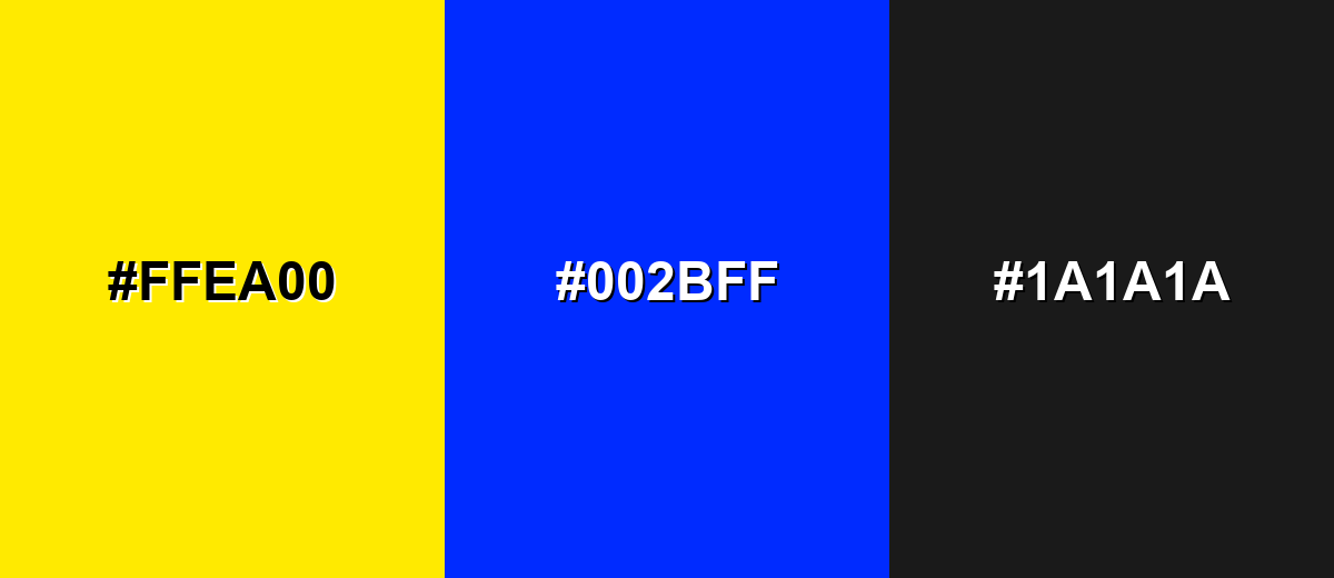
A complementary palette uses opposite hues to create maximum contrast. With bright yellow, the blue counterpart feels bold and modern, while a dark neutral keeps it readable.
Complementary Palette Example: Use bright yellow with electric blue and charcoal for high-impact accents, hero banners, and standout UI highlights.
Analogous Color Schemes
Analogous colors sit adjacent to each other on the color wheel, creating harmonious, cohesive palettes with subtle variation.
Yellow to amber to lime feels sunny, playful, and fresh while staying harmonious.
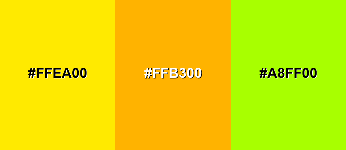
- Bright Yellow: #FFEA00
- Amber: #FFB300
- Lime Green: #A8FF00
A softer neighboring range works well for backgrounds, gradients, and gentle emphasis.
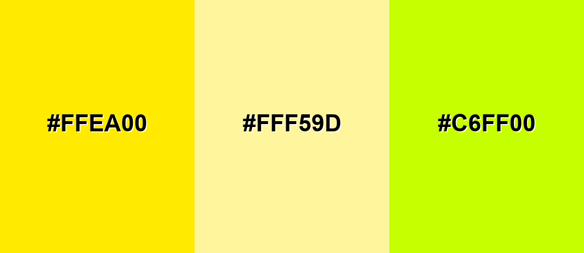
- Bright Yellow: #FFEA00
- Soft Lemon: #FFF59D
- Chartreuse: #C6FF00
Triadic & Tetradic Combinations
Triadic schemes balance energy by spacing hues evenly around the color wheel.
Bright yellow with vivid cyan and punchy pink creates a lively, youth-forward palette for graphics and campaigns.
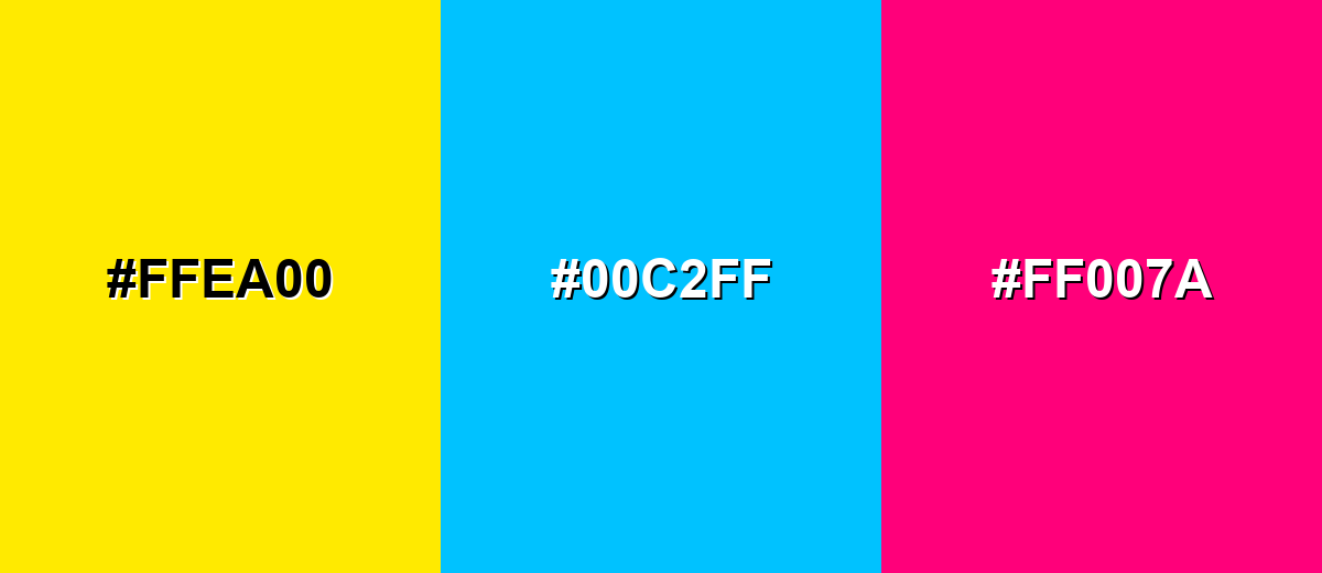
- Bright Yellow: #FFEA00
- Vivid Cyan: #00C2FF
- Hot Pink: #FF007A
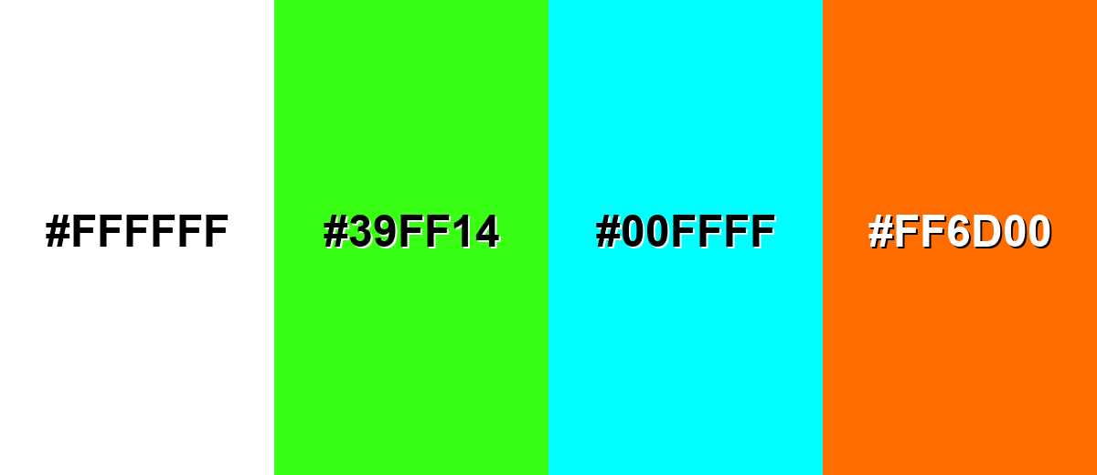
Colors to Avoid
While bright yellow is remarkably versatile, certain combinations can create problematic visual effects:
- White (#FFFFFF) - Bright yellow on white often looks washed out and can fail readability, especially for small text or thin UI elements.
- Neon Green (#39FF14) - Two high-energy brights together can create harsh visual vibration and unclear hierarchy.
- Pure Cyan (#00FFFF) - This pairing can feel overly loud and can be difficult to balance for branding or long-form layouts.
- Vivid Orange (#FF6D00) - The hues are too close in brightness and warmth, so elements can blend and lose contrast in fast-scanning UI.
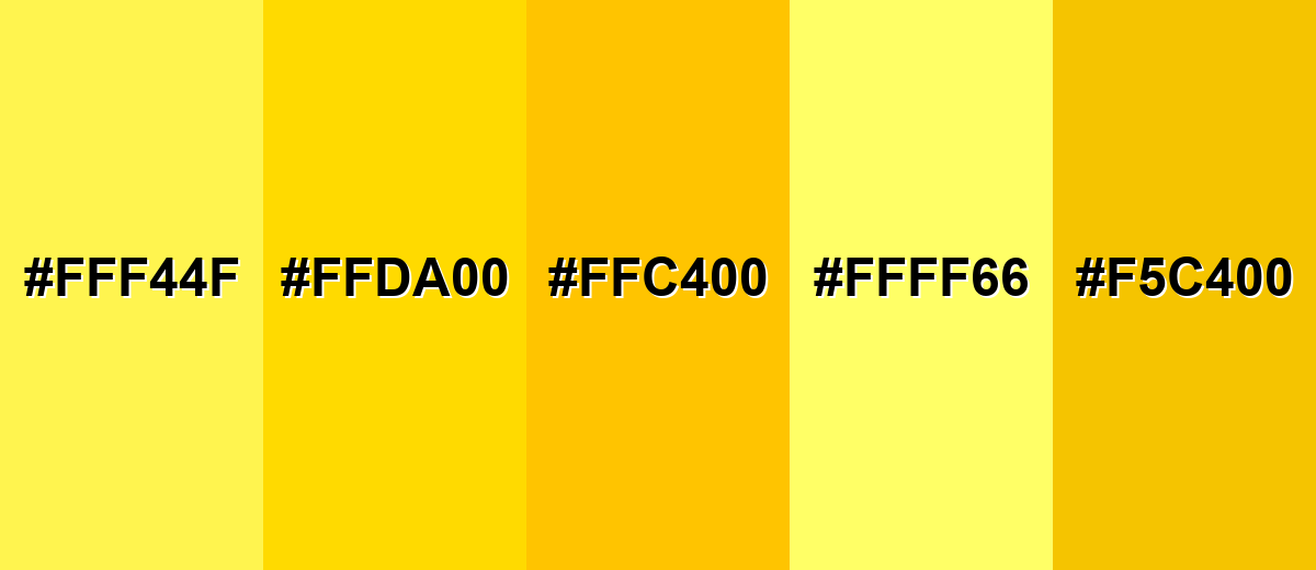
Shades, Tints & Variations of Bright Yellow
Bright yellow has a surprisingly flexible range—from softer lemon tints to deeper, more grounded golden tones. Exploring these variations makes it easier to control glare, improve readability, and keep the "sunny" feeling without overwhelming the design.
- Lemon Yellow (#FFF44F) - A lighter, slightly softer take that keeps the sunny feel with less intensity. It's best used for Background tints, gentle highlights, and large sections where full saturation would be too strong..
- Sunflower Yellow (#FFDA00) - A warmer, deeper yellow that reads a little more natural and less neon. It's best used for Brand accents, packaging, and illustrations that need warmth without harsh glare..
- Golden Yellow (#FFC400) - A rich yellow leaning toward gold, with a more premium and grounded tone. It's best used for Badges, premium UI accents, and highlights paired with dark neutrals..
- Canary Yellow (#FFFF66) - A bright, airy yellow with extra lightness and a cheerful, spring-like feel. It's best used for Friendly product UI, onboarding screens, and upbeat editorial graphics..
- Deep Yellow (#F5C400) - A slightly muted, deeper variant that reduces glare while staying clearly yellow. It's best used for Longer viewing contexts like dashboards, infographics, and print elements that need comfortable contrast..
Industry Applications
Because it is so noticeable, bright yellow is often used where speed, clarity, and visibility matter. The key is assigning it a specific job and limiting how many elements compete for attention.
Fashion & Beauty
- Use it as a pop color in accessories (bags, sneakers, nails) to add instant energy.
- Pair with black or deep navy for a sharper, more editorial look.
- In beauty packaging, bright yellow works well for "fresh," "citrus," and summer-limited lines.
- For eCommerce visuals, keep bright yellow as an accent so skin tones and product details stay natural.
Interior Design & Decor
- Use it in small, high-impact areas (pillows, art, chair accents) to brighten a room fast.
- Balance it with steady neutrals (charcoal, warm gray) to avoid a restless feel.
- Try softer yellow tints for larger surfaces to reduce glare and eye fatigue.
- In wayfinding within public spaces, bright yellow works best with dark text for instant readability.
Branding & Marketing
- Launch graphics and limited-time offers
- Logos and brand accents when paired with dark anchors
- Social media highlights and thumbnail emphasis
- Use it like a "label color" to guide scanning and make key messages unmissable.
Conclusion
Bright yellow (#FFEA00) is one of the fastest ways to grab attention and communicate upbeat energy—when it's used with control. Treat it like a spotlight: keep it for CTAs, badges, highlights, and key moments, then anchor it with deep neutrals or cool tones so the design stays readable and confident. With the right contrast checks (especially on light backgrounds) and a few well-chosen variations like golden or deep yellow, you can keep the "sunshine" impact without the visual overload.
Design Smarter with AI: Media.io is an online AI studio that empowers creators with advanced image generation and enhancement tools. From text-to-image and image-to-image creation to AI upscaling and color optimization, it enables fast, creative, and professional results—all in your browser.

Frequently Asked Questions About Bright Yellow Color
Bright yellow is a vivid, saturated yellow that looks like intense sunlight or a fresh lemon hue. It is designed to be highly noticeable and energetic in both digital and print design.
A commonly used bright yellow hex code is #ffea00. It is a strong, saturated yellow with no blue component, which helps it read bold and luminous.
Bright yellow often represents optimism, clarity, and attention. In everyday visuals it is used to highlight what matters most, from key UI actions to important labels.
Deep blues, charcoal, and clean whites (with enough contrast) pair well because they balance the intensity. For more playful palettes, try vivid cyan or hot pink, but keep the layout structured so it does not feel chaotic.
It can be, but contrast is the deciding factor. Bright yellow works best as a background for dark text or as an accent on dark surfaces; avoid using it as text on white or light gray.
Use it like a highlight rather than a base: buttons, icons, badges, and small callouts. Pair it with dark neutrals and limit the number of competing bright hues so users can scan and understand hierarchy quickly.


