Purple haze color is a muted, smoky violet that looks like purple seen through soft mist or low light. Its signature hex code is #7B5AA6, a balanced mix of red and blue with a calm, dusky finish.
It's often read as imaginative, slightly mysterious, and soothing without feeling overly sweet—making it a go-to for modern palettes, branding accents, and atmospheric visuals.
Purple Haze Color: Codes & Values
Here are the standard color codes you'll need to use purple haze accurately across digital design tools and print workflows.
| Parameters | VALUE |
| HEX Code | #7B5AA6 |
| RGB DECIMAL | 123, 90, 166 |
| RGB PERCENTAGE | 48.2%, 35.3%, 65.1% |
| CMYK | 26%,46%,0%,35% |
| HSL | 266°, 30%, 50% |
| HSV (HSB) | 266°, 46%, 65% |
| Web Safe | #666699 |
Key Color Space Explanations:
- HEX - HEX is the most common way to specify a screen-ready value in web design. Use #7b5aa6 for consistent results in CSS and design tools.
- RGB - RGB defines how much red, green, and blue light is mixed to create the shade on displays. Purple haze uses 123, 90, 166, which keeps it violet without becoming neon.
- CMYK - CMYK is used for printing and describes ink percentages rather than light. The CMYK mix 26%,46%,0%,35% is a practical starting point, though real prints may need proofing.
- HSL - HSL describes hue, saturation, and lightness in a way that's intuitive for adjusting tints and shades. At 266°, 30%, 50%, it stays subdued and easy to pair with neutrals.
- Web Safe - Web safe values come from an older, limited palette that renders reliably across systems. The closest match to purple haze is #666699.
If you're building a UI, start with HEX or RGB for on-screen consistency; for print, treat CMYK as a baseline and always proof muted purples before a final run.
Purple Haze Color Conversions
Need purple haze in a different format? Use this conversion chart to copy the value you need for your design or development workflow.
| Parameters | VALUE | CSS |
| HEX | #7b5aa6 | #7b5aa6 |
| RGB DECIMAL | 123, 90, 166 | rgb(123,90,166) |
| RGB PERCENTAGE | 48.2%, 35.3%, 65.1% | rgb(48.2%,35.3%,65.1%) |
| CMYK | 26%,46%,0%,35% | cmyk(26%,46%,0%,35%) |
| HSL | 266°, 30%, 50% | hsl(266°,30%,50%) |
| HSV (or HSB) | 266°, 46%, 65% | -- |
| Web Safe | 666699 | #666699 |
| CIE-LAB | 44.7, 29.5, -36.0 | -- |
| XYZ | 18.72, 14.27, 37.91 | -- |
| xyY | 0.264, 0.201, 14.27 | -- |
| CIE-LCH | 44.7, 46.5, 309.3° | -- |
| CIE-LUV | 44.7, 10.5, -56.5 | -- |
| Hunter-Lab | 37.8, 2.2, -3.3 | -- |
| Binary | 01111011 01011010 10100110 | -- |
Want to generate purple haze color photos or posters? Try Media.io's AI Image Generator now!
Purple Haze Meaning & Symbolism
Purple haze commonly represents imagination, calm confidence, and a touch of mystery. Because it's softened and slightly grayish, it can feel more approachable than brighter purples. In everyday life, it often shows up when you want a thoughtful, creative mood without looking loud.
Psychological Effects
Purple haze tends to slow the pace of a layout and create a reflective vibe.
- Soothing Atmosphere - It often reads as calming and helps reduce visual harshness in backgrounds, gradients, and hero areas.
- Creative Signal - It can suggest creativity and individuality, giving branding a modern, artistic edge.
- Curated Feel - Used with clean typography and spacing, it makes a design feel intentional and thoughtfully designed.
- Risk Of Low Clarity - If overused or paired with low-contrast text, it may feel foggy or distant in data-heavy screens.
- Better As An Accent - Reserving it for panels, highlights, or brand moments keeps the mood without sacrificing readability.
Positive Associations
Because it sits between classic purple symbolism and contemporary styling, purple haze can communicate a lot—quietly.
- Imagination - A dreamy violet tone that feels inventive and idea-driven.
- Calm Confidence - Muted saturation makes it feel composed rather than flashy.
- Approachable Elegance - Softer and slightly grayish, it's less formal than brighter purples.
- Modern Premium - It can look refined and elevated, especially with minimal layouts.
- Atmospheric Mood - Great for creating depth and "haze" in visuals without overwhelming other elements.
Cultural Significance Across the World
Meanings change by context, but purple haze generally keeps the core purple themes and tones them down.
- Luxury - Purple is widely linked with luxury; the hazy version feels more understated and contemporary.
- Spirituality - Purple often carries spiritual or reflective undertones, and the muted finish can amplify that calm mood.
- Creativity - Across many contexts, purple is tied to creative expression; purple haze reads artistic without being loud.
- Context Matters - Since meanings vary by culture, it's best to test it with your audience and surrounding palette.
Design Applications
Purple haze works best when you want a soft, modern violet that still feels distinctive. It's flexible across digital design and print, but it benefits from strong contrast and deliberate pairings.
Graphic Design Tips
- Use purple haze for logos, secondary brand blocks, or highlight elements to convey creativity with premium restraint.
- Try it in app headers, cards, and subtle backgrounds—especially in dark mode palettes where it can glow softly.
- Keep interactive elements (buttons and links) in higher-contrast companion tones so actions don't get lost.
- For readable content, prefer very light backgrounds or deep charcoal-like text instead of mid-gray on purple haze.
- Avoid using purple haze alone to communicate status; add icons, labels, or patterns for clarity.
Pro tip: If purple haze is your main brand accent, keep your layout "breathable" with generous white space and let #7B5AA6 appear in a few repeatable places (headings, badges, key illustrations) for a consistent signature.
Purple Haze in Photography & Video
- Use purple haze as a soft overlay to add a dreamy, cinematic atmosphere without crushing detail.
- It works well with grain and texture, helping posters, album art, and editorial images feel deeper and more intentional.
- Try subtle gradients that move from darker violet into purple haze for depth in thumbnails and hero images.
- In low-contrast scenes, keep key subjects separated with lighting or clarity so the "haze" effect doesn't feel muddy.
- Pair it with clean typography so titles stay crisp against the smoky violet tone.
Recommended Tool for Image Enhancement: When incorporating purple haze into your photography projects, Media.io's AI Image tools can help you achieve more refined results. With AI-powered color enhancement, photo colorization, image upscaling, and old photo restoration, you can easily enrich purple haze tones, improve overall image quality, and highlight the color's elegant and sophisticated aesthetic.
Color Combinations
Purple haze pairs well with muted neutrals, soft greens, and warm, earthy accents. The palettes below show reliable ways to build contrast without losing its misty character.
Complementary Colors
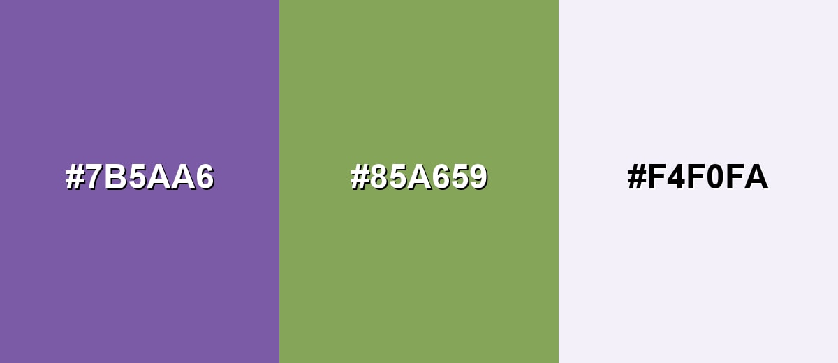
A complementary pairing puts purple haze against a yellow-green opposite, creating crisp contrast while still feeling modern.
Complementary Palette Example: Use purple haze for the main surface, yellow-green for energetic highlights, and a pale violet-white to keep the layout breathable.
Analogous Color Schemes
Analogous colors sit adjacent to each other on the color wheel, creating harmonious, cohesive palettes with subtle variation.
An analogous set that shifts from blue-violet through purple haze into mauve for smooth, layered depth.
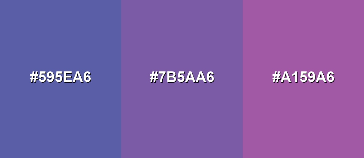
- Indigo Mist: #595EA6
- Purple Haze: #7B5AA6
- Smoky Orchid: #A159A6
A softer analogous blend using deeper violet and lighter mauve to add range without changing the mood.
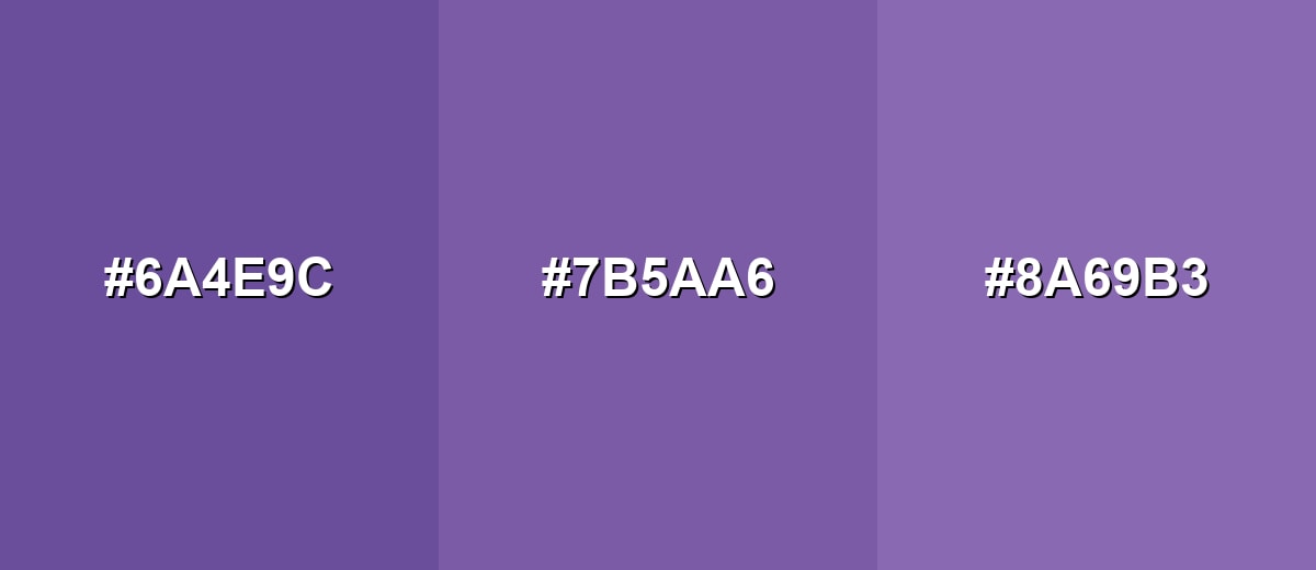
- Deep Violet: #6A4E9C
- Purple Haze: #7B5AA6
- Mauve Mist: #8A69B3
Triadic & Tetradic Combinations
Triadic palettes add variety while keeping balance across warm and cool accents.
Combine purple haze with a muted terracotta and a softened green for a lively but controlled look.
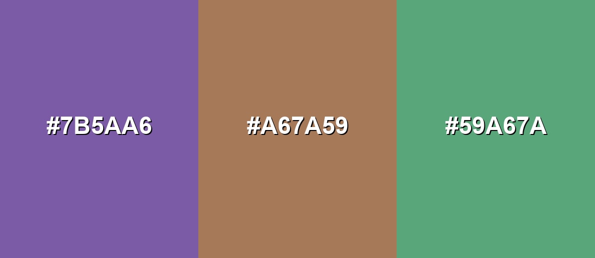
- Purple Haze: #7B5AA6
- Dusty Terracotta: #A67A59
- Sage Teal: #59A67A
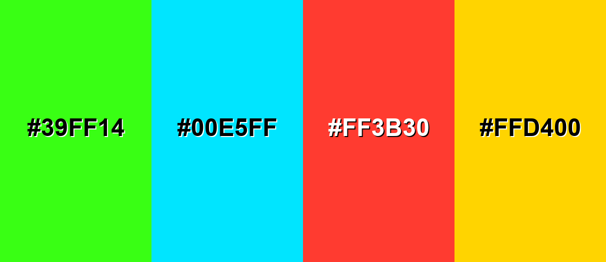
Colors to Avoid
While purple haze is remarkably versatile, certain combinations can create problematic visual effects:
- Neon Green (#39FF14) - It overwhelms the muted, hazy quality and can create a harsh, vibrating edge on screens.
- Electric Cyan (#00E5FF) - The high intensity competes with purple haze and can make layouts feel flashy rather than atmospheric.
- Bright Alert Red (#FF3B30) - This combination can look noisy and tense, especially in UI where red already signals errors.
- Vivid Yellow (#FFD400) - The saturation gap is so large that the palette can feel unbalanced unless carefully toned down.
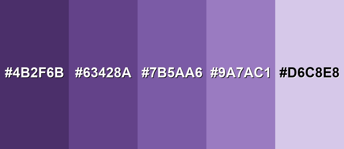
Shades, Tints & Variations of Purple Haze
From deep, moody violets to pale lavender tints, the purple haze range gives you flexible options for hierarchy—darker tones for impact, lighter tones for breathable backgrounds, and the core shade for signature accents.
- Deep Haze Purple (#4B2F6B) - A darker, moodier take that keeps the violet core while adding a night-sky depth. It's best used for Great for headers, overlays, and dramatic backgrounds with light text..
- Shadowed Violet (#63428A) - A mid-dark shade that feels richer and more grounded than the base tone. It's best used for Works well for navigation bars, icons, and strong brand accents..
- Purple Haze (#7B5AA6) - The core shade: smoky violet with balanced saturation and a soft, modern finish. It's best used for Use as a primary accent, surface tint, or signature brand hue..
- Soft Mauve Haze (#9A7AC1) - A lighter, friendlier variation that looks more airy and decorative. It's best used for Ideal for backgrounds, UI panels, and gentle gradients..
- Lavender Fog (#D6C8E8) - A pale tint that reads clean and calm with a subtle violet undertone. It's best used for Best for large background areas, cards, and minimal layouts..
Industry Applications
Purple haze is a strong fit for brands and products that want a creative, polished mood without relying on loud saturation. It can feel premium, artistic, or calming depending on the supporting tones and typography.
Fashion & Beauty
- Use it as a modern packaging accent that feels serene and polished rather than overly sweet.
- Build calm, creative social templates where the smoky violet sets the mood without fighting product photos.
- Apply it to seasonal lifestyle collections to create a distinctive look that still feels soft and wearable.
- Pair it with clean layouts and generous spacing to keep beauty messaging fresh and contemporary.
Interior Design & Decor
- Try it in textiles, feature walls, or decor objects for a calm yet expressive space.
- Matte finishes help purple haze look less cold under bright lighting.
- Use lighter tints for large background areas (like cards or minimal wall palettes) to keep rooms airy.
- Combine it with warm neutrals to balance the cool violet lean and maintain comfort.
Branding & Marketing
- Use it for logos, secondary brand blocks, or highlight elements to communicate creativity with premium restraint.
- Bring it into dashboards and SaaS layouts as section headers or accents that add personality without hurting readability.
- Use it in poster and thumbnail overlays for entertainment visuals that need dreamy, cinematic atmosphere.
- Create brand patterns that stay soft while still feeling distinctive across web and print.
Conclusion
Purple haze is a smoky violet that feels imaginative, calm, and quietly modern—perfect when you want mood and depth without loud saturation. With a dependable base value of #7B5AA6, it's easy to apply across branding, UI surfaces, and atmospheric visuals, as long as you plan contrast and pairings thoughtfully. Balance it with clean neutrals, proof it carefully for print, and you'll get a premium, contemporary look that still feels approachable.
Design Smarter with AI: Media.io is an online AI studio that empowers creators with advanced image generation and enhancement tools. From text-to-image and image-to-image creation to AI upscaling and color optimization, it enables fast, creative, and professional results—all in your browser.

Frequently Asked Questions About Purple Haze Color
Purple haze is a muted violet with a smoky, slightly grayish feel. It looks softer than bright purple and can appear more atmospheric, especially in gradients or low-contrast lighting.
A commonly used hex value for purple haze is #7b5aa6. It represents a balanced, medium-depth violet that pairs well with neutrals and soft greens.
It usually reads as cool because of its blue-leaning violet hue, but the muted saturation keeps it from feeling icy. Pairing it with warm neutrals can make it feel more inviting.
It pairs nicely with soft off-whites, charcoal, muted olive tones, dusty terracotta, and misty blues. These combinations keep the look modern and balanced without overpowering the haze effect.
Yes, it works well for panels, headers, and gradient backgrounds. Just check contrast carefully for text and interactive elements, since mid-tone violets can reduce readability if the foreground is too similar.
Start from its CMYK conversion and run a proof, because paper, ink, and coatings can shift muted purples. For the best match, compare print proofs under consistent lighting and adjust the mix if the result looks too blue or too dull.