

 TL;DR:
To effectively apply classic purple (#800080) across your designs, use its RGB values (128, 0, 128) for digital screens and CMYK (0%, 100%, 0%, 50%) for print, treating it as a statement color supported by ample negative space and neutral backgrounds to maintain a premium feel.
● Pair purple with neutrals, gold, teal, or balanced green for cohesive contrast, while strictly avoiding saturated hues like Hot Magenta (#FF00FF), Neon Green (#00FF00), Pure Red, or Electric Blue which cause harsh visual vibrations and readability issues.
● Reserve saturated purples for UI hierarchy elements like primary buttons and headers, shifting to lighter tints like Lavender (#B57EDC) for soft background visuals or deeper tones like Eggplant (#3B0A45) for luxury branding and dark accents.
● Ensure readability on purple backgrounds by using white text for darker shades and dark text for light tints, always verifying contrast ratios especially when using thin typography or designing for small mobile screens.
Ask AI for a summary
 ChatGPT
 Perplexity
 Gemini
 Claude
 Grok
Grok
Purple is a deep, rich hue that sits between red and blue, often seen as a bold, violet-leaning tone in real life. Its classic reference is #800080, a balanced purple that feels both vivid and refined.
Many people associate purple with creativity, luxury, and a touch of mystery. Historically, purple dyes were rare and costly, which helped cement its prestige—today, this guide covers meaning, codes, combinations, shades, and practical uses.
Purple Color: Codes & Values
If you want purple to look consistent across web, UI, and print, start with its core purple color codes and build from there.
| Parameters | VALUE |
| HEX Code | #800080 |
| RGB DECIMAL | 128, 0, 128 |
| RGB PERCENTAGE | 50.2%, 0%, 50.2% |
| CMYK | 0%,100%,0%,50% |
| HSL | 300°, 100%, 25% |
| HSV (HSB) | 300°, 100%, 50% |
| Web Safe | #990099 |
Key Color Space Explanations:
- HEX is the most common digital notation for screens and web design. #800080 defines the red, green, and blue channels using hexadecimal pairs.
- RGB describes how much red, green, and blue light is mixed to produce the hue on screens. Purple here uses strong red and blue with no green: 128, 0, 128.
- CMYK is used for printing and represents ink percentages rather than light. The values help keep purples consistent across print runs and paper types.
- HSL maps the hue by angle plus saturation and lightness, which is helpful for building tints and shades. Purple sits around 300° on the hue wheel with high saturation and low lightness.
- Web Safe values are a simplified palette historically used for consistent display. #990099 is the closest web-safe approximation to this purple.
Use HEX/RGB for screen work, lean on HSL/HSV when you're creating tints and shades, and reference CMYK when you need more predictable print results.
Want to generate Purple color photos or posters? Try Media.io's AI Image Generator now!
Purple Color Conversions
Here are the most common purple color conversions in one place—helpful when you're switching between design tools, CSS, and print specs.
| Parameters | VALUE | CSS |
| HEX | #800080 | #800080 |
| RGB DECIMAL | 128, 0, 128 | rgb(128,0,128) |
| RGB PERCENTAGE | 50.2%, 0%, 50.2% | rgb(50.2%,0%,50.2%) |
| CMYK | 0%,100%,0%,50% | cmyk(0%,100%,0%,50%) |
| HSL | 300°, 100%, 25% | hsl(300°, 100%, 25%) |
| HSV (or HSB) | 300°, 100%, 50% | -- |
| Web Safe | 990099 | #990099 |
| CIE-LAB | 29.8, 58.5, -36.8 | -- |
| XYZ | 12.81, 6.15, 20.95 | -- |
| xyY | 0.321, 0.154, 6.15 | -- |
| CIE-LCH | 29.8, 69.1, 327.8° | -- |
| CIE-LUV | 29.8, 41.5, -53.7 | -- |
| Hunter-Lab | 24.8, 51.6, -37.0 | -- |
| Binary | 10000000 00000000 10000000 | -- |
Purple Color Meaning & Symbolism
Purple often represents imagination, individuality, and a premium feel. Because it blends the energy of red with the calm of blue, it can read as both expressive and composed in everyday settings.
Psychological Effects
Purple can shape the mood of a layout fast—especially when it's used with breathing room and clear contrast.
- Creativity Boost - Purple often makes a design feel more imaginative and idea-driven, which is why it shows up in creative brands and tools.
- Distinctive Identity - As a less "default" choice than blue or red, purple can help a product feel unique and memorable.
- Premium Mood - Deeper purples can suggest sophistication and a curated, high-end tone when paired with clean typography.
- Emotional Distance - Very dark or highly saturated purples can feel heavy or dramatic if the design lacks whitespace and softer supporting colors.
- Focus & Emphasis - Used as an accent, purple can pull attention to headers or key actions without overwhelming the whole page.
Positive Associations
In branding and visuals, purple is frequently chosen for its "special" feeling and expressive character.
- Imagination - Purple is closely linked with creative thinking and artistic expression.
- Individuality - It can signal a distinct point of view, perfect for brands that don't want to blend in.
- Sophistication - A rich purple can feel refined and intentional, especially with neutral support.
- Luxury - The color's historic rarity still influences modern perception, making it a common "premium cue."
- Mystery - Purple can add intrigue and depth, helping visuals feel more layered and memorable.
Cultural Significance Across the World
Purple meanings can shift by context, but a few themes show up repeatedly across history and modern culture.
- Royalty & Status - Purple has long been tied to wealth and prestige because dyes were once expensive and difficult to produce.
- Spirituality - In modern contexts, purple can suggest reflection, ceremony, or a more symbolic mood.
- Artistic Identity - It's often used to represent creative communities and cultural spaces where expression matters.
- Context-Dependent Meaning - Interpretations vary by community and setting, so pairing and shade selection matter.
Design Applications
Purple is versatile: it can feel luxurious, playful, or calm depending on the shade and what you pair it with. Use the tips below to keep it readable, balanced, and consistent across screens and print.
Graphic Design Tips
- Use purple for primary buttons or highlights when you want a confident, creative tone; pair with off-white backgrounds to keep the interface light.
- For dark UI, shift toward slightly brighter purples (or add a subtle tint) so elements don't sink into the background.
- Support purple with neutral grays and clear typography to prevent a busy, overly saturated look.
- Choose one core purple and build a small system of tints and shades to keep brand assets consistent across web, social, and print.
- Check contrast carefully: saturated purple on dark backgrounds may fail readability, and thin text can look fuzzy.
Pro tip: treat purple like a "statement ingredient"—use it for hierarchy (headlines, key UI states, hero accents) and let neutrals carry the layout so the design stays clean.
Purple Color in Photography & Video
- Use purple as a mood setter in overlays and backgrounds when you want a more cinematic, dramatic feel.
- For product shots, lighter purples can feel airy and soft, while deep purples add weight and a premium tone.
- If purple looks too heavy in a scene, lift the lightness slightly (tints) instead of pushing saturation further.
- When mixing multiple purple elements, separate them with neutrals to avoid a "flat" or overly dense look.
- For social video and thumbnails, pair purple with clear, high-contrast text to keep details readable on small screens.
Recommended Tool for Image Enhancement: When incorporating purple color into your photography projects, Media.io's AI Image tools can help you achieve more refined results. With AI-powered color enhancement, photo colorization, image upscaling, and old photo restoration, you can easily enrich purple color tones, improve overall image quality, and highlight the color's elegant and sophisticated aesthetic.
Color Combinations
Purple pairs beautifully with both warm and cool accents, but the best results come from controlling saturation and contrast. The palettes below cover classic harmony rules you can apply to UI, branding, illustrations, and interiors.
Complementary Colors
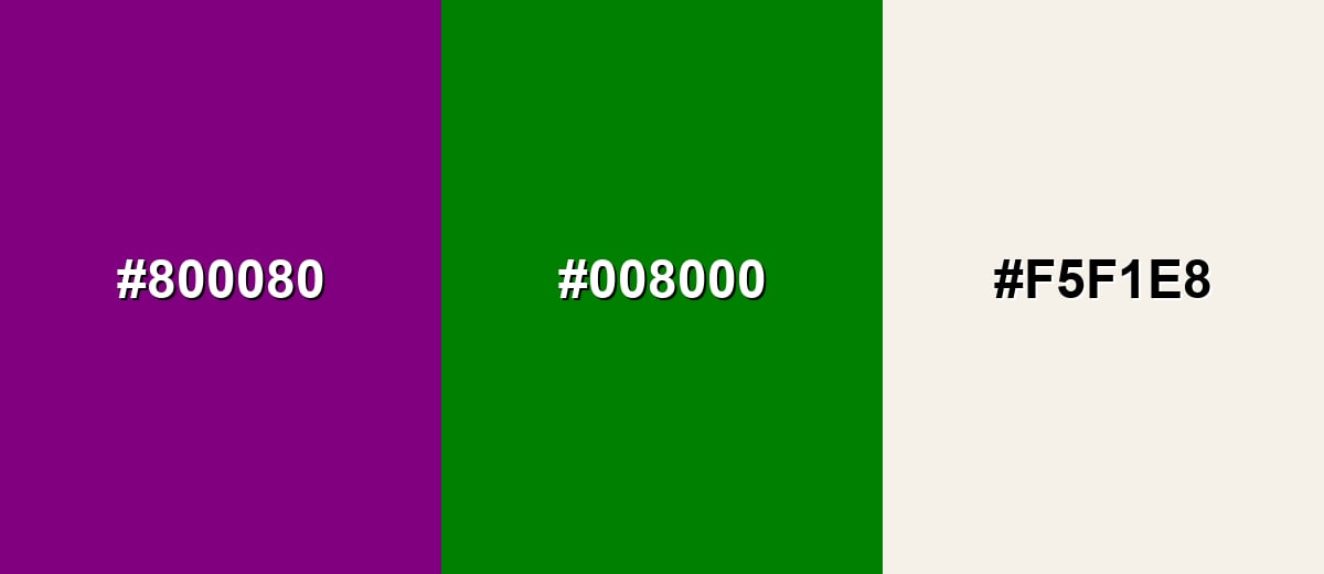
A complementary scheme uses opposite hues to create strong contrast and instant energy. Purple with green is bold, so a soft neutral helps the pairing feel intentional rather than intense.
Complementary Palette Example: Try Purple with a balanced green and a light neutral for a clean, high-contrast look.
Analogous Color Schemes
Analogous colors sit adjacent to each other on the color wheel, creating harmonious, cohesive palettes with subtle variation.
Analogous palette with indigo, purple, and rich magenta for a smooth gradient.
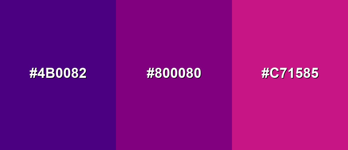
- Indigo: #4B0082
- Classic Purple: #800080
- Deep Magenta: #C71585
Analogous palette with blue-violet, purple, and berry tones for modern creative work.
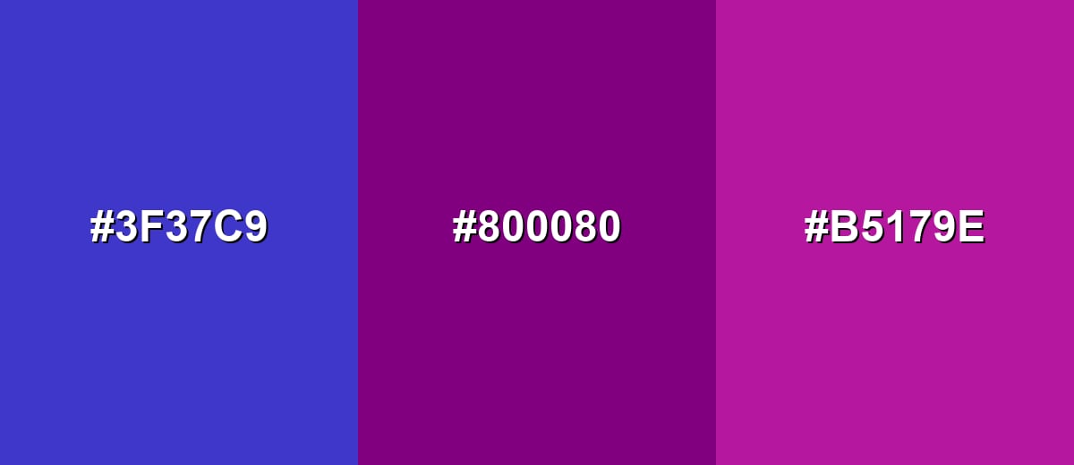
- Blue Violet: #3F37C9
- Classic Purple: #800080
- Berry: #B5179E
Triadic & Tetradic Combinations
Triadic palettes use three evenly spaced hues for lively balance.
Combine purple with a warm yellow and a calm teal to keep the contrast playful but usable.
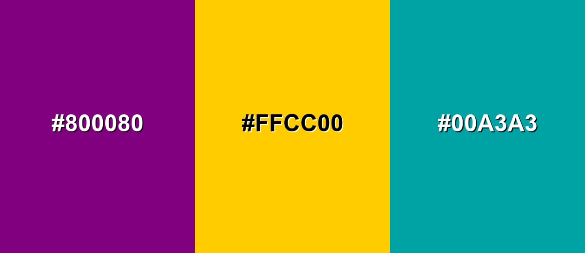
- Classic Purple: #800080
- Golden Yellow: #FFCC00
- Teal: #00A3A3
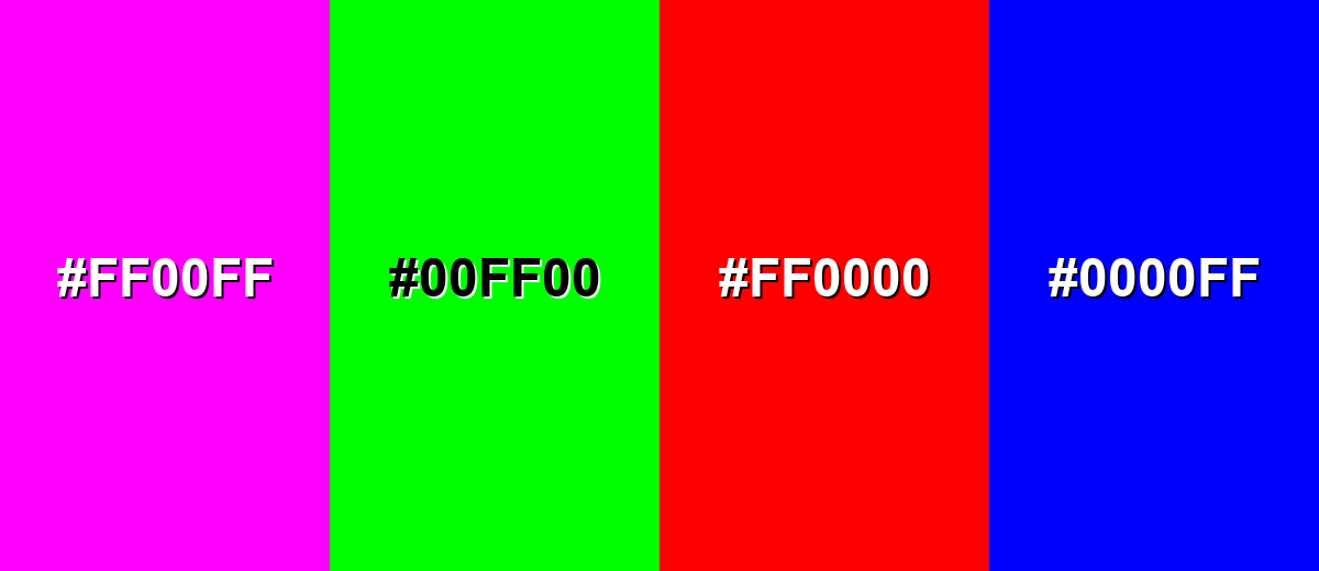
Colors to Avoid
While purple color is remarkably versatile, certain combinations can create problematic visual effects:
- Hot Magenta (#FF00FF) - Too close in hue and equally saturated, which can look noisy and reduce hierarchy.
- Neon Green (#00FF00) - Extremely high intensity creates harsh vibration against purple and can feel visually aggressive.
- Pure Red (#FF0000) - Both are strong and heavy; together they often feel loud and can be difficult to balance in UI.
- Electric Blue (#0000FF) - Similar depth with competing saturation can flatten contrast and make elements blend instead of stand out.
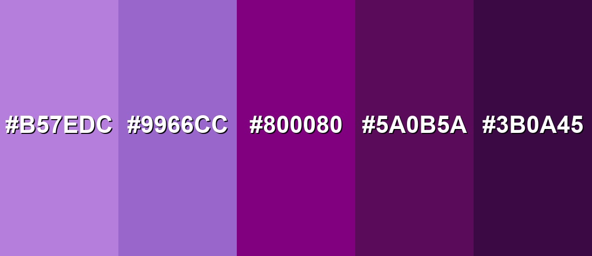
Shades, Tints & Variations of Purple Color
Purple has a surprisingly wide range—from airy, soft florals to deep, dramatic near-black tones. Exploring these variations makes it easier to match the right mood for branding, UI hierarchy, backgrounds, and print finishes.
- Lavender (#B57EDC) - A light, floral purple with a soft, airy presence. It's best used for Background tints, wellness visuals, invitations, and gentle UI sections..
- Amethyst (#9966CC) - A medium purple that feels friendly while still refined. It's best used for Brand accents, illustrations, gradients, and secondary buttons..
- Classic Purple (#800080) - A balanced, saturated purple that reads bold and iconic. It's best used for Primary brand color, headers, key highlights, and statement graphics..
- Plum (#5A0B5A) - A darker, moodier purple with a subtle wine-like depth. It's best used for Premium packaging, dark UI accents, and dramatic photography overlays..
- Eggplant (#3B0A45) - A very deep purple that leans sophisticated and grounded. It's best used for Luxury branding, elegant backgrounds, and high-contrast accent areas..
Industry Applications
Because purple can shift from playful to premium depending on the shade, it shows up across many industries. The key is choosing the right tone and pairing it with supporting neutrals and accents that match your message.
Fashion & Beauty
- Lavender and softer purples can signal calm, self-care, and gentle routines in beauty and wellness visuals.
- Deeper purples can communicate premium formulas or nighttime product lines.
- For packaging and labels, purple often feels "giftable," making it a natural fit for limited editions.
- When you need a refined look, keep the palette simple and let purple carry the hero role.
Interior Design & Decor
- Deep purples can anchor a space as an accent wall, upholstery, or decor piece; balance with warm woods or soft neutrals.
- Lavender and lilac shades are easier for larger areas and feel airy, especially with natural light.
- Avoid using multiple saturated purples in the same room unless you separate them with neutrals.
- For a premium finish, treat purple as an accent and keep surrounding surfaces clean and uncluttered.
Branding & Marketing
- Purple works well for brands that want to communicate originality, premium quality, or a distinctive point of view.
- Choose one core purple and build a small system of tints and shades for consistent brand assets.
- Add a warm accent for a luxurious feel or a cool accent for a modern, tech-forward vibe.
- In campaigns and landing pages, check contrast and don't rely on color alone to communicate key actions.
Conclusion
Purple is a confident blend of red and blue that can feel creative, luxurious, or dramatic depending on the shade you choose. Starting with the classic reference #800080 makes it easy to build a consistent system of tints, shades, and supporting accents for UI, branding, print, or interiors. Pair purple with neutrals when you want clarity, then introduce harmonious or complementary colors for extra energy—just keep contrast in check so text and key elements stay readable. With a little restraint and smart pairings, purple becomes one of the most flexible "statement" colors in modern design.
Design Smarter with AI: Media.io is an online AI studio that empowers creators with advanced image generation and enhancement tools. From text-to-image and image-to-image creation to AI upscaling and color optimization, it enables fast, creative, and professional results—all in your browser.

Frequently Asked Questions About Purple Color
Purple is a hue created by combining red and blue. Depending on the mix, it can look warmer (more red) or cooler (more blue).
Violet often refers to a more blue-leaning, spectral hue, while purple commonly describes a broader range made by mixing red and blue pigments or light. In everyday design, the terms are frequently used interchangeably.
Neutrals like ivory, gray, and charcoal are easy matches, while gold, teal, and green add stronger contrast. The best pairing depends on whether you want a calm, premium, or playful feel.
It can be either. Red-leaning purples feel warmer and more energetic, while blue-leaning purples feel cooler and more calm.
Mix red and blue, then adjust. Add more red for a warmer, magenta-leaning purple, or more blue for a cooler, violet-leaning result; add white to create lavender tints.
White often works well on darker purples, while very light purples typically need dark text. Always verify contrast with an accessibility checker, especially for small text.


