

Mint blue color is a light blue-green that looks like cool mint with a soft, watery tint. Its signature HEX code is #9FE7E5, which gives it a clean pastel feel without looking icy.
Because it sits between cyan and green, mint blue can shift slightly toward aqua or teal depending on lighting and surrounding tones. Below, you'll find its exact codes, conversions, best pairings, and practical ways to use it in design and décor.
Mint Blue Color: Codes & Values
If you're matching mint blue across tools (CSS, design apps, and print), these are the core values you'll reference most often.
| Parameters | VALUE |
| HEX Code | #9FE7E5 |
| RGB DECIMAL | 159, 231, 229 |
| RGB PERCENTAGE | 62.4%, 90.6%, 89.8% |
| CMYK | 31%,0%,1%,9% |
| HSL | 178°, 60%, 76% |
| HSV (HSB) | 178°, 31%, 91% |
| Web Safe | #99FFCC |
Key Color Space Explanations:
- HEX is the most common way to specify mint blue in web design and digital tools. Use #9fe7e5 anywhere a six-digit hex value is accepted.
- RGB defines mint blue for screens using red, green, and blue light values. It is useful for CSS, app UI, video overlays, and general digital work.
- CMYK is used for printing and describes how inks mix on paper. Mint blue typically needs careful proofing because light pastels can shift based on paper and ink profiles.
- HSL describes mint blue by hue, saturation, and lightness, which is intuitive for adjusting tints and shades. It is handy when you want consistent variations for a design system.
- Web Safe is the closest legacy-safe approximation for older displays and palettes. For mint blue, the nearest web-safe match is #99ffcc.
For most projects, start with HEX (#9FE7E5) for web, RGB for screen-based design, and CMYK as a starting point for print (then proof on your chosen stock).
Mint Blue Color Conversions
Need mint blue in a specific format for your editor, printer, or CSS workflow? Use the quick conversions below.
| Parameters | VALUE | CSS |
| HEX | #9fe7e5 | #9fe7e5 |
| RGB DECIMAL | 159, 231, 229 | rgb(159,231,229) |
| RGB PERCENTAGE | 62.4%, 90.6%, 89.8% | rgb(62.4%,90.6%,89.8%) |
| CMYK | 31%,0%,1%,9% | cmyk(31%,0%,1%,9%) |
| HSL | 178°, 60%, 76% | hsl(178°,60%,76%) |
| HSV (or HSB) | 178°, 31%, 91% | -- |
| Web Safe | 99ffcc | #99ffcc |
| CIE-LAB | 87.1, -23.0, -5.8 | -- |
| XYZ | 57.09, 70.24, 84.60 | -- |
| xyY | 0.269, 0.331, 70.24 | -- |
| CIE-LCH | 87.1, 23.7, 194.1° | -- |
| CIE-LUV | 87.1, -34.4, -5.5 | -- |
| Hunter-Lab | 83.8, -21.3, -6.3 | -- |
| Binary | 10011111 11100111 11100101 | -- |
Want to generate mint blue color photos or posters? Try Media.io's AI Image Generator now!
Mint Blue Meaning & Symbolism
Mint blue is commonly tied to freshness, clarity, and a relaxed sense of order. It feels airy and modern, so it often shows up in spaces and interfaces that aim to be welcoming without being loud. In everyday life, it reads as clean and light, like cool water or a gentle breeze.
Psychological Effects
Most people experience mint blue as soothing, especially when it's used as a background or large surface.
- Lower Visual Tension - Mint blue softens layouts and helps reduce harsh contrast, making pages feel easier to scan.
- Calm Focus - It supports concentration without demanding attention, which is why it works well behind text and UI panels.
- Clean Readability - Dark text can look sharper on mint blue compared to brighter cyan tones, improving perceived clarity.
- Friendly Distance - Overusing it can feel slightly chilly or clinical in minimal designs, especially with lots of white.
- Balance Through Contrast - Pairing mint blue with warmer accents, natural textures, or deeper neutrals keeps it from feeling sterile.
Positive Associations
When you want "fresh" without "neon," mint blue is a reliable mood-setter.
- Freshness - The blue-green tint feels crisp and newly washed, making designs look tidy and up-to-date.
- Clarity - Its lightness suggests openness and transparency, helping information feel less heavy.
- Relaxation - It reads like cool water or a soft breeze, adding a gentle sense of ease.
- Approachability - Mint blue can make brands and interfaces feel welcoming rather than overly formal.
- Modern Order - The color naturally fits clean grids and minimal styling, reinforcing a sense of calm organization.
Cultural Significance Across the World
Because mint blue sits between green and blue, it often borrows meaning from both—depending on context.
- Growth & Renewal - The green side can hint at refreshment, balance, and a "new start" feeling.
- Trust & Calm - The blue side commonly reads as reassuring and steady, especially in modern design.
- Water & Air - Many people connect mint blue with clean water and open space, which supports a light, breathable mood.
- Contemporary Neutral - In many settings, it works best as a clean, soothing accent rather than a strongly traditional symbol.
Design Applications
Mint blue is easiest to use when you treat it as a gentle base and then build contrast with darker anchors or warm highlights. Below are practical ways to apply it across digital, print, and physical spaces.
Graphic Design Tips
- Use mint blue for backgrounds, cards, and empty states to reduce harsh contrast compared with pure white.
- Pair it with deep slate or charcoal typography to keep body text readable and hierarchy clear.
- Reserve stronger accents for CTAs so actions stay obvious on softer surfaces.
- For print and packaging, add deep type or outlines so small labels stay crisp at a distance.
- Always check contrast ratios—mint blue is usually too light for white text in body copy.
If mint blue starts to feel too "clinical," bring in one warm counterbalance (like a soft, rosy accent) and one darker teal for structure—your layout will instantly feel more grounded.
Mint Blue in Photography & Video
- Use mint blue as a backdrop color for clean, airy scenes that still feel modern and approachable.
- In color grading, push shadows slightly deeper (teal-leaning) to keep the pastel highlights from washing out.
- For product shots, mint blue props or surfaces can make "fresh" categories (wellness, skincare, travel) look instantly on-theme.
- On video overlays, mint blue works best for lower-contrast panels with dark text and icons.
- Balance skin tones with warmer accents in wardrobe or set pieces so the overall frame doesn't feel cold.
Recommended Tool for Image Enhancement: When incorporating mint blue into your photography projects, Media.io's AI Image tools can help you achieve more refined results. With AI-powered color enhancement, photo colorization, image upscaling, and old photo restoration, you can easily enrich mint blue tones, improve overall image quality, and highlight the color's elegant and sophisticated aesthetic.
Color Combinations
Mint blue pairs best with grounded dark neutrals, warm pastels, and a few saturated accents for structure. These palettes are a practical starting point for layouts, branding sets, and décor planning.
Complementary Colors
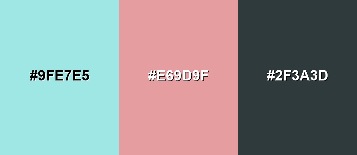
A complementary pairing puts mint blue against a soft red-pink for lively contrast that still feels gentle. This is a strong option for CTAs, highlights, and feature sections.
Complementary Palette Example: Use mint blue as the main surface, add dusty rose for focal points, and anchor the layout with deep slate.
Analogous Color Schemes
Analogous colors sit adjacent to each other on the color wheel, creating harmonious, cohesive palettes with subtle variation.
A soft seafoam-to-aqua flow that feels fresh, light, and cohesive.
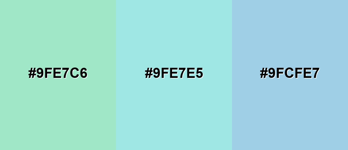
- Soft Seafoam: #9FE7C6
- Mint Blue: #9FE7E5
- Powder Aqua: #9FCFE7
A slightly deeper aqua range that adds definition while staying calm.
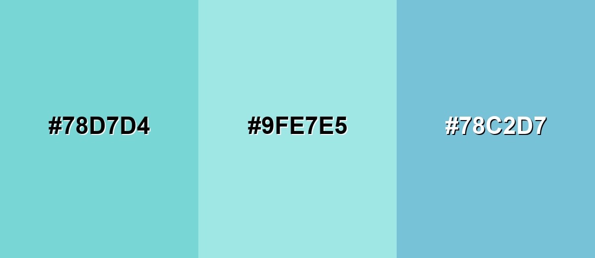
- Pale Turquoise: #78D7D4
- Mint Blue: #9FE7E5
- Light Blue Gray: #78C2D7
Triadic & Tetradic Combinations
A triadic palette balances mint blue with two evenly spaced accents for variety without chaos.
Mint blue with soft butter and lavender pink works well for playful-but-clean visuals.
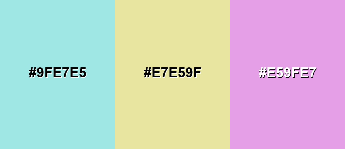
- Mint Blue: #9FE7E5
- Soft Butter: #E7E59F
- Lavender Pink: #E59FE7
Colors to Avoid
While mint blue is remarkably versatile, certain combinations can create problematic visual effects:
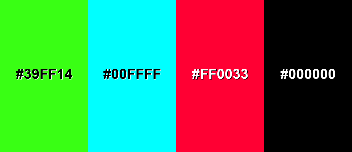
- Neon Green (#39FF14) - It can overpower mint blue and create a harsh, highlighter-like effect that feels unbalanced in most layouts.
- Pure Cyan (#00FFFF) - Both hues sit close together, so the pairing can look loud and visually vibrating rather than smooth.
- Bright Red (#FF0033) - The contrast is extremely strong and can make mint blue look washed out or overly sweet by comparison.
- Jet Black (#000000) - The jump in contrast can feel stark and cold; softer charcoals often look more refined with pastel blue-greens.
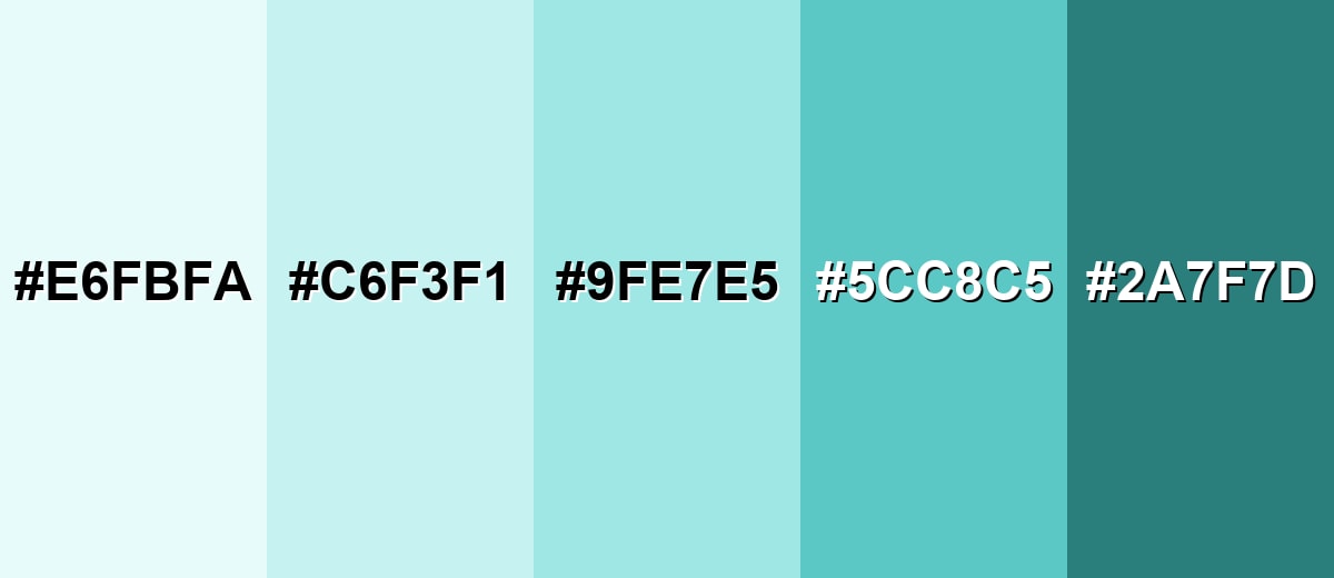
Shades, Tints & Variations of Mint Blue
Mint blue has a surprisingly flexible range—from near-white tints for spacious backgrounds to deeper teals for contrast and UI structure. Keeping a small set of variations makes it easier to design consistent layouts, build a brand palette, or plan décor without guesswork.
- Icy Mint (#E6FBFA) - A near-white tint with just a whisper of blue-green that reads clean and spacious. It's best used for Large backgrounds, subtle panels, airy presentations, and minimal UI sections..
- Soft Mint Blue (#C6F3F1) - A light pastel that keeps the mint feel while adding a touch more presence than an off-white tint. It's best used for Cards, form areas, soft gradients, and gentle highlights in layouts..
- Mint Blue (#9FE7E5) - The balanced mid tint: fresh, calm, and modern without being overly saturated. It's best used for Primary surfaces, brand backgrounds, and calm accent blocks..
- Deep Mint Teal (#5CC8C5) - A stronger teal-leaning shade that adds clarity and structure while staying friendly. It's best used for Buttons, tabs, icons, charts, and secondary brand accents..
- Midnight Teal (#2A7F7D) - A dark, muted teal that pairs naturally with mint blue for contrast and readability. It's best used for Typography on mint surfaces, headers, outlines, and high-contrast UI elements..
Industry Applications
Mint blue is widely used when a product or space needs to feel fresh, tidy, and easy to trust. It also works as a neutral-like pastel that supports content without competing with it.
Fashion & Beauty
- Use mint blue as a clean packaging background for a fresh, minimal look.
- Bring it into websites and product pages to emphasize simplicity and comfort.
- Pair it with deeper teal accents when you need more definition for labels and categories.
- Use it in spa-like interior accents and signage to keep the mood calm and approachable.
Interior Design & Decor
- Paint or style well-lit rooms with mint blue for an airy look that still feels soft.
- Combine it with warm woods, sand tones, or brass-like finishes for a more comfortable balance.
- Add deeper teal accents to create depth in larger spaces and open-plan layouts.
- Use mint blue accents in hospitality-inspired settings to keep spaces feeling cool and clean.
Branding & Marketing
- Use mint blue in brand systems that want a modern, neat, "well cared for" impression.
- Apply it to dashboard backgrounds, widgets, and onboarding screens so content stays the focus.
- Reserve high-contrast colors for CTAs while mint blue handles the supporting surfaces.
- In brochures and collateral, anchor mint blue with dark typography so small text stays crisp.
Conclusion
Mint blue (#9FE7E5) is a soft blue-green that feels clean, fresh, and easy to live with—perfect for calming interfaces, lightening up branding, and creating airy interiors without stealing attention from the main content. The key is balance: use mint blue as the supportive surface, then add structure with deeper teal tones and warmth with gentle accents when you need more energy. Start with the core codes above, build a small set of consistent shades, and you'll have a mint blue palette that works smoothly across screens, print, and real-world spaces.
Design Smarter with AI: Media.io is an online AI studio that empowers creators with advanced image generation and enhancement tools. From text-to-image and image-to-image creation to AI upscaling and color optimization, it enables fast, creative, and professional results—all in your browser.

Frequently Asked Questions About Mint Blue Color
Mint blue is a pale blue-green with a cool, watery feel. It sits between aqua and soft teal, usually reading as fresh and clean rather than bright or neon.
A commonly used mint blue hex value is #9fe7e5. This code is popular in digital design because it stays soft while still looking clearly blue-green.
It is a balanced blend, but it often leans slightly blue in most lighting. Nearby colors and materials can shift it toward green (with warm neutrals) or toward aqua (with cool grays and whites).
Deep charcoal or slate creates strong contrast, while dusty rose, warm beige, sand, and soft lavender add friendly variety. For a clean look, pair it with white and one darker teal accent.
Mint blue is usually too light for body text on white backgrounds. It works better as a background or accent, while text is set in a dark neutral like charcoal or deep teal for readability.
Pastel blue-greens can shift in print depending on paper and profiles, so proofs help. Using the CMYK values as a starting point and testing on the intended stock is the safest approach.


