

Ruby color is a deep, jewel-like red that feels rich and slightly cool—think polished ruby stone or a dark red lipstick. A reliable digital reference is #9B111E, which stays bold without looking like a bright, primary red.
It's often read as passionate, confident, and luxurious, with a refined edge that works well in modern UI, branding, and premium print. Below, you'll find ruby's color codes, conversions, pairings, shades, and practical contrast tips.
Ruby Color: Codes & Values
Use these standard values to keep ruby consistent across websites, apps, and print-ready artwork.
| Parameters | VALUE |
| HEX Code | #9B111E |
| RGB DECIMAL | 155, 17, 30 |
| RGB PERCENTAGE | 60.78%, 6.67%, 11.76% |
| CMYK | 0%,89%,81%,39% |
| HSL | 354°, 80%, 34% |
| HSV (HSB) | 354°, 89%, 61% |
| Web Safe | #990033 |
Key Color Space Explanations:
- HEX - HEX is the most common way to specify ruby in web and UI work. Use #9b111e to keep the same look across apps, websites, and design tools.
- RGB - RGB defines ruby by mixing red, green, and blue light for screens. It is useful for animations, overlays, and any effect built in an RGB workflow.
- CMYK - CMYK is used for print where inks, not light, create the final tone. Ruby can shift depending on paper and coating, so a print proof helps when accuracy matters.
- HSL - HSL describes ruby by hue, saturation, and lightness, which makes it easier to create tints and shades. It is handy when you want consistent variations for UI states.
- Web Safe - Web Safe is the nearest legacy-safe approximation for older displays and strict palettes. For ruby, the closest web-safe match is #990033.
In practice: use HEX for UI specs, RGB for on-screen effects, HSL to build tidy variants, and CMYK when the output is going to press.
Ruby Color Conversions
These ruby color conversions help you recreate the same ruby tone across different tools, workflows, and export formats.
| Parameters | VALUE | CSS |
| HEX | #9b111e | #9b111e |
| RGB DECIMAL | 155, 17, 30 | rgb(155,17,30) |
| RGB PERCENTAGE | 60.78%, 6.67%, 11.76% | rgb(60.78%,6.67%,11.76%) |
| CMYK | 0%,89%,81%,39% | cmyk(0%,89%,81%,39%) |
| HSL | 354°, 80%, 34% | hsl(354°, 80%, 34%) |
| HSV (or HSB) | 354°, 89%, 61% | -- |
| Web Safe | 990033 | #990033 |
| CIE-LAB | 34.2, 56.8, 26.7 | -- |
| XYZ | 18.7, 10.2, 2.7 | -- |
| xyY | 0.60, 0.33, 10.2 | -- |
| CIE-LCH | 34.2, 62.8, 25.2° | -- |
| CIE-LUV | 34.2, 86.1, 16.3 | -- |
| Hunter-Lab | 31.9, 44.6, 12.7 | -- |
| Binary | 10011011 00010001 00011110 | -- |
Want to generate Ruby Color photos or posters? Try Media.io's AI Image Generator now!
Ruby Color Meaning & Symbolism
Ruby is often linked with passion, strength, and a sense of premium quality. In Ruby Color meaning, it commonly signals confident energy without the loudness of a bright, primary red. In everyday life, it shows up where designers want warmth, romance, or authority with a polished finish.
Psychological Effects
Because it's deep and saturated, ruby tends to grab attention fast and set a decisive tone.
- Motivation - Ruby feels energizing, making key messages and CTAs feel more intentional.
- Confidence - It reads as bold and assured, which helps create authority in branding and UI.
- Expressiveness - Ruby can amplify emotion, so it's great for standout highlights and hero moments.
- Intensity - Large ruby surfaces may feel heavy or dramatic, so balance it with calmer tones.
- Visual Weight - Overuse can cause fatigue; using ruby as an accent keeps layouts comfortable.
Positive Associations
Ruby brings a "premium warmth" that feels richer and more refined than brighter reds.
- Passion - A classic signal of romance and heartfelt emotion without looking overly playful.
- Strength - Communicates resilience and power in a polished, upscale way.
- Luxury - The gemstone connection helps ruby feel expensive and gift-worthy.
- Warmth - Adds depth and coziness, especially next to soft neutrals.
- Elegance - Looks more refined than primary red, particularly with clean typography and spacing.
Cultural Significance Across the World
Across many contexts, ruby's symbolism blends love, vitality, and status.
- Gemstone Heritage - Ruby is tied to the ruby gemstone, long associated with love and vitality.
- Status & Prestige - Deep ruby tones often signal premium quality and long-lasting value.
- Celebration - Frequently used in festive and gift-oriented themes where a richer red feels more elegant.
- Romance - A popular choice for romantic visuals that need depth rather than bright sweetness.
Design Applications
Ruby color works best when you treat it like a statement shade: use it to guide attention, add richness, or set a bold mood while keeping the surrounding palette calm.
Graphic Design Tips
- Use ruby for primary actions or key highlights, then balance it with off-whites or warm grays to prevent overwhelm.
- Pair it with clean typography and generous spacing; deep reds feel more premium when the layout is simple.
- For charts and data viz, reserve ruby for the most important series so it keeps its visual weight.
- When ruby is used as text on a light background, avoid thin font weights and keep the size comfortably readable.
- In print, ruby may shift toward maroon on uncoated stock—request a proof when color accuracy matters.
Pro tip: If ruby is your hero accent, keep the rest of the palette quiet—simple neutrals and plenty of whitespace help it look more "jewel-like" and less heavy.
Ruby Color in Photography & Video
- Ruby pops beautifully in wardrobe, lipstick, props, and product shots—especially against soft, neutral backgrounds.
- Under warm lighting, ruby can feel more dramatic; under cooler lighting, it may lean wine-like—white balance makes a big difference.
- For cinematic edits, use ruby accents sparingly (signage, highlights, accessories) to direct the viewer's eye.
- Try gentle contrast and saturation adjustments instead of pushing vibrance too far—ruby looks best when it stays deep.
- In gradients and overlays, ruby works well for moody depth, but keep skin tones protected with selective masking.
Recommended Tool for Image Enhancement: When incorporating ruby color into your photography projects, Media.io's AI Image tools can help you achieve more refined results. With AI-powered color enhancement, photo colorization, image upscaling, and old photo restoration, you can easily enrich ruby color tones, improve overall image quality, and highlight the color's elegant and sophisticated aesthetic.
Color Combinations
Ruby pairs well with cool greens and teals for contrast, and with nearby reds and purples for a cohesive, luxe look. Use neutrals to give it space, and keep highly saturated neighbors under control so the palette does not feel noisy.
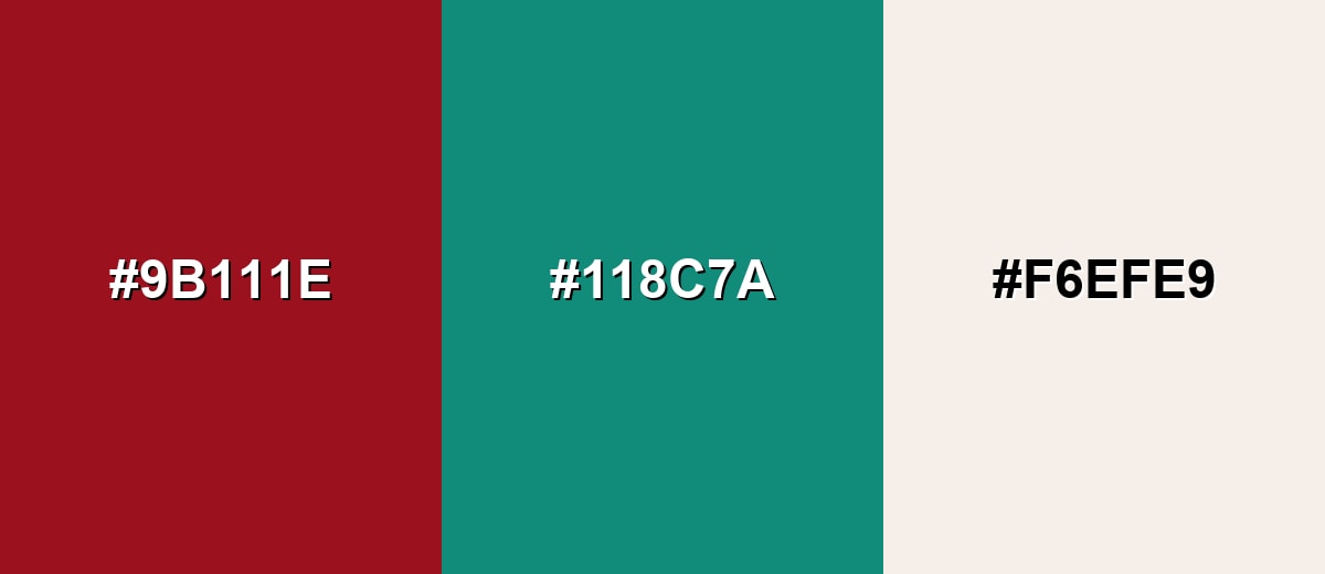
Complementary Colors
A teal-green complement makes ruby feel sharper and more modern, while a light neutral keeps the contrast readable and refined.
Complementary Palette Example: Try Ruby with Deep Teal and Soft Ivory for a bold but balanced palette.
Analogous Color Schemes
Analogous colors sit adjacent to each other on the color wheel, creating harmonious, cohesive palettes with subtle variation.
Ruby, Berry Magenta, and Dark Burgundy create a warm, romantic gradient with a premium feel.
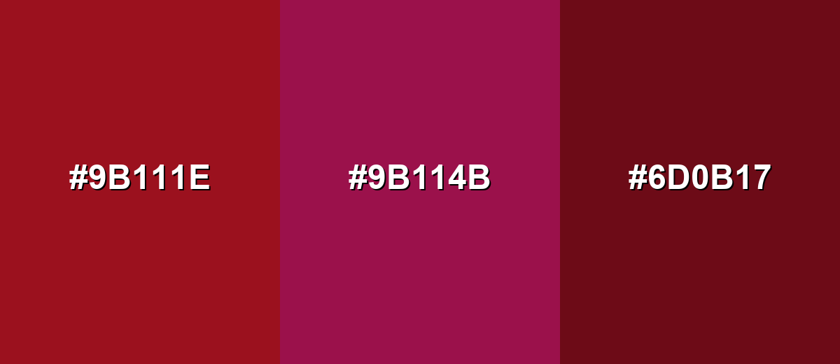
- Ruby: #9B111E
- Berry Magenta: #9B114B
- Dark Burgundy: #6D0B17
Ruby, Bright Crimson, and Deep Plum keep the palette cohesive while adding depth for headings and accents.
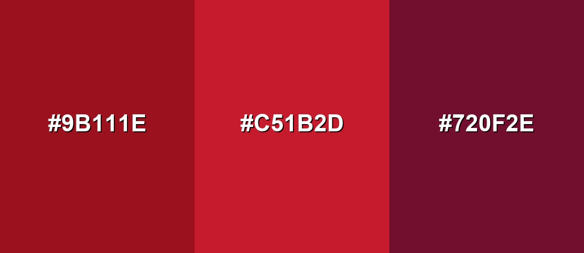
- Ruby: #9B111E
- Bright Crimson: #C51B2D
- Deep Plum: #720F2E
Triadic & Tetradic Combinations
A triadic scheme spreads hues evenly, giving ruby a lively, high-contrast set of partners.
Combine Ruby with Leaf Green and Cobalt Blue for energetic branding or editorial graphics.
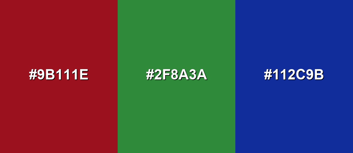
- Ruby: #9B111E
- Leaf Green: #2F8A3A
- Cobalt Blue: #112C9B
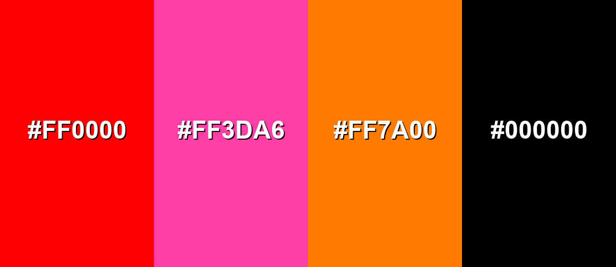
Colors to Avoid
While ruby color is remarkably versatile, certain combinations can create problematic visual effects:
- Pure Red (#FF0000) - Too close in hue but much brighter, which can make ruby look dull or muddy side-by-side.
- Hot Pink (#FF3DA6) - Competes with ruby's depth and can push the overall look into a harsh, overly loud palette.
- Neon Orange (#FF7A00) - High saturation next to ruby often feels chaotic and reduces the sense of elegance.
- True Black (#000000) - Creates a very heavy, dramatic feel; better to use near-black charcoal if you want a softer premium look.
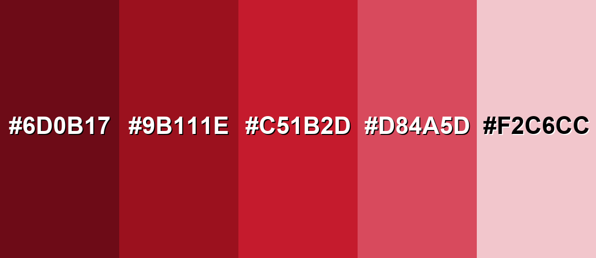
Shades, Tints & Variations of Ruby Color
Ruby isn't a single "one-note" red—its range includes deeper, wine-leaning shades and lighter, rosy tints. Building with variations helps you create hierarchy (backgrounds, hover states, accents, and emphasis) while keeping the overall mood consistent.
- Deep Ruby (#6D0B17) - A darker, wine-leaning ruby that feels dramatic and classic. It's best used for Luxury packaging, headers, deep backgrounds, and moody photography overlays.
- Classic Ruby (#9B111E) - The core ruby tone: jewel-like red with strong depth and presence. It's best used for Brand accents, primary buttons, icons, and standout highlights.
- Bright Ruby (#C51B2D) - A more vivid ruby that reads slightly more energetic and modern. It's best used for CTAs, badges, sale tags, and editorial emphasis where you want faster attention.
- Ruby Rose (#D84A5D) - A softened ruby with a rosy lift that feels more approachable. It's best used for Beauty branding, lifestyle visuals, event designs, and supporting accents.
- Pale Ruby Tint (#F2C6CC) - A light tint that keeps ruby's warmth while becoming airy and gentle. It's best used for Background panels, subtle UI states, gradients, and romantic stationery.
Industry Applications
Because ruby sits between bold and refined, it fits industries that want warmth, confidence, and a premium edge without relying on harsh primary reds.
Fashion & Beauty
- Use ruby for lipstick, nail, and fragrance visuals to communicate richness and glamour.
- Pair ruby accents with softer tones like #F2C6CC to keep campaigns approachable.
- For premium packaging moments, balance ruby with light neutrals like #F6EFE9.
- Use darker ruby shades for editorial layouts when you want drama without looking neon.
Interior Design & Decor
- Ruby works well as an accent (pillows, artwork, table settings) to add warmth and depth.
- On large surfaces, choose deeper ruby to avoid visual fatigue and keep the room feeling grounded.
- Combine ruby with soft neutrals for a timeless, romantic look that still feels modern.
- In event styling, ruby details can make spaces feel more intentional and upscale.
Branding & Marketing
- Ruby is strong for CTAs, badges, and "featured" labels because it's saturated and relatively dark.
- Luxury and jewelry brands can lean into ruby's gemstone association for status and gift-ready storytelling.
- Food and beverage brands (wine, berries, desserts) can use ruby to signal indulgence and depth of flavor.
- In entertainment and editorial, ruby helps create a bold focal point while keeping typography clean and readable.
Conclusion
Ruby color stands out as a jewel-inspired red that feels bold, refined, and emotionally warm all at once. With #9B111E as a dependable reference, you can keep ruby consistent across UI, branding, and print—then build hierarchy using deeper shades for drama and lighter tints for breathing room. For pairings, let soft neutrals keep it elegant, use teals and greens for modern contrast, or stay close to plums and burgundies for a luxe, cohesive look. When you give ruby enough space and confirm contrast, it delivers memorable impact without needing loud, neon intensity.
Design Smarter with AI: Media.io is an online AI studio that empowers creators with advanced image generation and enhancement tools. From text-to-image and image-to-image creation to AI upscaling and color optimization, it enables fast, creative, and professional results—all in your browser.

Frequently Asked Questions About Ruby Color
A commonly used digital ruby reference is #9b111e. It is a deep, gemstone-like red that stays rich on both light and dark layouts.
Ruby is primarily red, but it can show a subtle cool or magenta undertone depending on lighting and surrounding shades. Compared to rose tones, it looks deeper and more dramatic.
Ruby pairs especially well with soft ivory and warm grays for balance, deep teal for complementary contrast, and gold accents for a premium feel. For a cohesive palette, try nearby plums and burgundies.
Start with a strong red, then deepen it with a tiny amount of blue or a cool purple to shift it toward a jewel tone. Add a touch of black or a dark brown sparingly if you need more depth without turning it muddy.
Yes, ruby is effective for CTAs and key states because it is saturated and relatively dark. Use it with white text in most cases, and verify contrast for small text or thin font weights.
Common variations include Deep Ruby for dramatic themes, Bright Ruby for more energy, Ruby Rose for a softer feel, and Pale Ruby Tint for backgrounds. These make it easy to build hierarchy while keeping a consistent mood.


