

 TL;DR:
Taupe (#8B7D6B) is a low-saturation, gray-brown neutral (RGB: 139, 125, 107; CMYK: 0%, 10%, 23%, 46%) best utilized as a foundational surface color that provides warm stability without the starkness of pure gray.
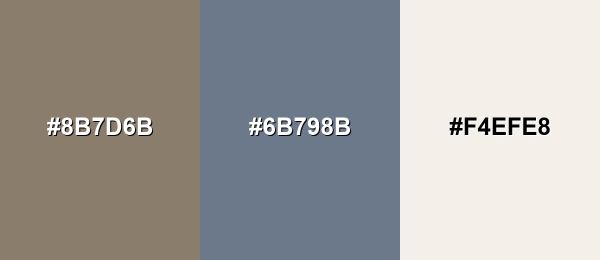
● To build an effective UI or brand hierarchy, pair the primary #8B7D6B hex with a lighter ivory (#F4EFE8) for negative space, a deeper taupe (#5F5346) for text and contrast, and a slate blue-gray (#6B798B) to balance the warmth.
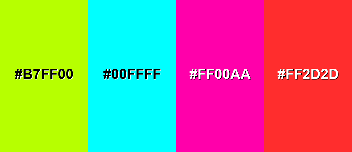
● Avoid combining taupe with highly saturated colors like Pure Cyan (#00FFFF), Neon Lime (#B7FF00), or Hot Magenta (#FF00AA), as their extreme brightness clashes with and completely overwhelms taupe's muted, natural aesthetic.
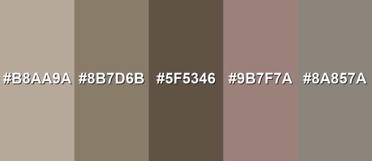
● Adapt the color for specific industry contexts by substituting the classic hex with Light Taupe (#B8AA9A) for minimalist backgrounds, Rose Taupe (#9B7F7A) for beauty and lifestyle palettes, or Greige Taupe (#8A857A) for cooler, contemporary architectural designs.
Ask AI for a summary
 ChatGPT
 Perplexity
 Gemini
 Claude
 Grok
Grok
Taupe is a balanced, earthy neutral that sits between brown and gray, often with a subtle warm undertone. It's popular because it reads as calm and refined without feeling cold, making it easy to pair with both warm and cool palettes.
On this page, you'll find taupe's exact color codes, quick conversion references, practical pairing ideas, and ready-to-use combinations that work in digital design, print, and real spaces.
Taupe Color: Codes & Values
If you're matching taupe across design tools, CSS, and print, these are the most useful formats to keep on hand.
| Parameters | VALUE |
| HEX Code | #8B7D6B |
| RGB DECIMAL | 139, 125, 107 |
| RGB PERCENTAGE | 55%, 49%, 42% |
| CMYK | 0%,10%,23%,46% |
| HSL | 34°, 13%, 48% |
| HSV (HSB) | 34°, 23%, 55% |
| Web Safe | #996666 |
Key Color Space Explanations:
- HEX - HEX is the most common digital format for web and UI work. Use #8b7d6b in CSS, design tools, and most brand style guides.
- RGB - RGB defines the red, green, and blue light values used on screens. Taupe is RGB 139, 125, 107, which helps match the color across devices and exports.
- CMYK - CMYK is used for printing and describes ink percentages. For taupe, CMYK 0%,10%,23%,46% is a practical starting point, though real print results depend on paper and profiles.
- HSL - HSL expresses hue, saturation, and lightness, making it easier to tweak warmth and softness. Taupe at 34°, 13%, 48% is low-saturation and mid-lightness, which is why it reads neutral.
- Web Safe - Web Safe is the closest color from the legacy 216-color palette. Taupe's nearest web-safe approximation is #996666.
Use HEX/RGB for screens, CMYK for print production, and HSL/HSV when you want to fine-tune taupe's warmth or depth without drifting too far from neutral.
Want to generate taupe color photos or posters? Try Media.io's AI Image Generator now!
Taupe Color Conversions
Need taupe in a specific format for a workflow or spec sheet? Here's a quick conversion table you can copy into your project.
| Parameters | VALUE | CSS |
| HEX | #8b7d6b | #8b7d6b |
| RGB DECIMAL | 139, 125, 107 | rgb(139,125,107) |
| RGB PERCENTAGE | 55%, 49%, 42% | rgb(55%,49%,42%) |
| CMYK | 0%,10%,23%,46% | cmyk(0%,10%,23%,46%) |
| HSL | 34°, 13%, 48% | hsl(34°, 13%, 48%) |
| HSV (or HSB) | 34°, 23%, 55% | -- |
| Web Safe | 996666 | #996666 |
| CIE-LAB | 53.1, 2.0, 12.0 | -- |
| XYZ | 20.58, 21.21, 16.91 | -- |
| xyY | 0.351, 0.361, 21.21 | -- |
| CIE-LCH | 53.1, 12.2, 80.5° | -- |
| CIE-LUV | 53.1, 9.4, 15.0 | -- |
| Hunter-Lab | 46.1, 1.7, 8.7 | -- |
| Binary | 10001011, 01111101, 01101011 | -- |
Taupe Color Meaning & Symbolism
Taupe is often chosen when you want a neutral that feels warmer and more natural than a flat gray, but more subdued than a typical brown. It tends to communicate stability and quiet confidence rather than trendiness.
Psychological Effects
Because it's low-saturation and mid-toned, taupe tends to feel easy on the eyes.
- Calming - Its muted character reduces visual noise, making layouts feel more restful.
- Grounding - As an earth-leaning neutral, taupe creates a sense of steadiness and routine.
- Soft Focus - Taupe supports content by staying in the background, helping highlights stand out.
- Warm Neutrality - It brings a gentle warmth that can make spaces and interfaces feel more inviting than cool gray.
- Refined Restraint - Taupe suggests maturity and balance, which can make designs feel intentional and composed.
Positive Associations
Taupe works best when you want “premium” without being flashy.
- Grounded And Dependable - It's linked to earth tones and natural materials.
- Understated Elegance - It looks refined without demanding attention.
- Calm And Balanced - Its low saturation makes it visually restful.
- Craftsmanship - Taupe often reads as tactile, like stone, leather, or wood finishes.
- Timelessness - It avoids loud trends, helping palettes feel durable across seasons and campaigns.
Cultural Significance Across the World
As a neutral, taupe adapts easily—its meaning often depends on context and materials.
- Minimalist Design - Frequently used as a quiet base that lets typography, layout, and negative space do the work.
- Natural Material Aesthetics - Common in palettes inspired by clay, stone, linen, and wood for an organic feel.
- Modern Luxury - Often appears in premium packaging and interiors where softness signals sophistication.
- Everyday Neutral - Widely accepted across markets because it feels practical, wearable, and easy to pair.
Design Applications
Taupe is a workhorse neutral. It can be your main background, a soft surface color, or a supporting tone that lets accent colors shine.
Graphic Design Tips
- Use #8B7D6B as a “base neutral” for UI surfaces, packaging backgrounds, or editorial blocks.
- Pair taupe with a lighter neutral like #F4EFE8 to create breathable, premium-looking space.
- Add a darker anchor such as #5F5346 for headlines, dividers, and buttons so the layout doesn't feel washed out.
- Balance warmth with a cooler supporting tone like #6B798B when you want a modern, less “beige” mood.
- Keep accent colors muted; taupe looks best when saturation stays controlled across the whole palette.
Pro tip: When taupe is your hero neutral, build hierarchy with depth (e.g., #5F5346) and spacing first—then use color accents sparingly so the palette stays calm and intentional.
Taupe Color in Photography & Video
- For warm, natural grading, use taupe-like tones to soften shadows without pushing images overly brown.
- In product photography, taupe backdrops can reduce glare compared to pure gray while keeping the focus on the subject.
- For lifestyle scenes, taupe pairs well with light neutrals such as #F4EFE8 to create a clean, airy look.
- Use deeper taupe (#5F5346) as a vignette or edge darkening for a subtle, cinematic frame.
- Add cool contrast (like #6B798B) in props or wardrobe to keep taupe-heavy scenes from feeling too warm.
Recommended Tool for Image Enhancement: When incorporating taupe color into your photography projects, Media.io's AI Image tools can help you achieve more refined results. With AI-powered color enhancement, photo colorization, image upscaling, and old photo restoration, you can easily enrich taupe color tones, improve overall image quality, and highlight the color's elegant and sophisticated aesthetic.
Color Combinations
Taupe's low saturation makes it flexible: it can anchor bold accents, support soft neutrals, or blend into tonal palettes. Use the combinations below as plug-and-play starting points.
Complementary Colors
A complementary scheme pairs taupe with a blue-leaning opposite to create balanced contrast. This is a reliable choice for modern brands and UIs that need warmth plus clarity.
Complementary Palette Example: Combine taupe #8b7d6b with slate blue gray #6b798b and soften the overall look with soft ivory #f4efe8.
Analogous Color Schemes
Analogous colors sit adjacent to each other on the color wheel, creating harmonious, cohesive palettes with subtle variation.
Warm analogous taupes: a cozy range from cocoa to sand that stays cohesive and natural.
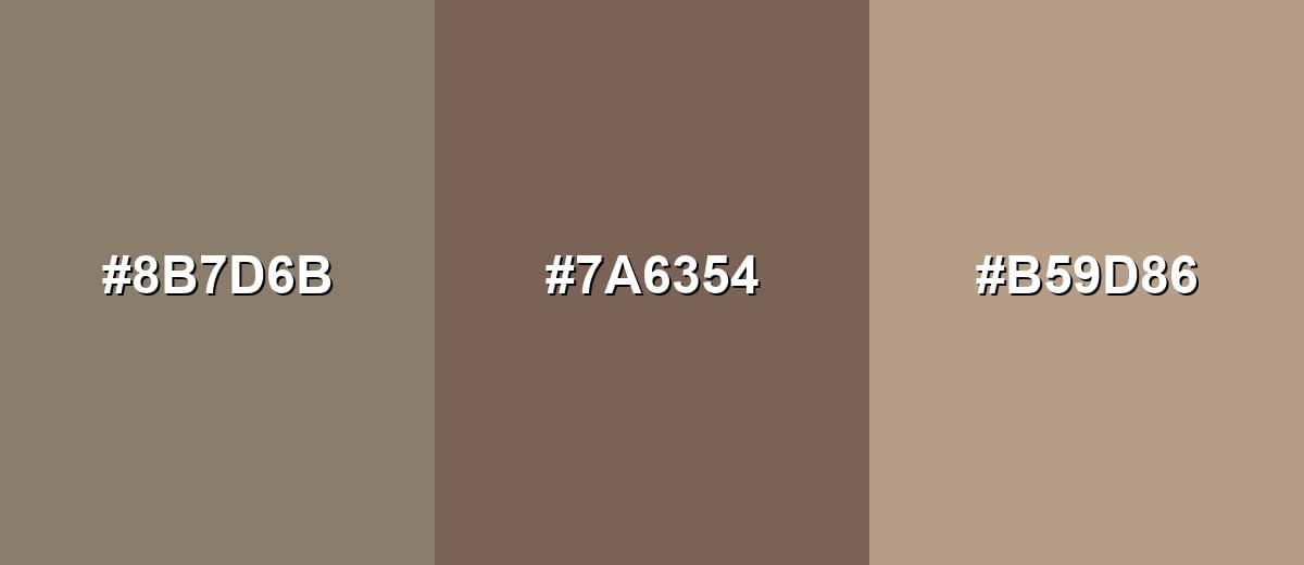
- Taupe: #8B7D6B
- Cocoa Brown: #7A6354
- Sand Beige: #B59D86
Earthy greige-leaning analogs: a slightly cooler, stone-inspired palette that still feels organic.
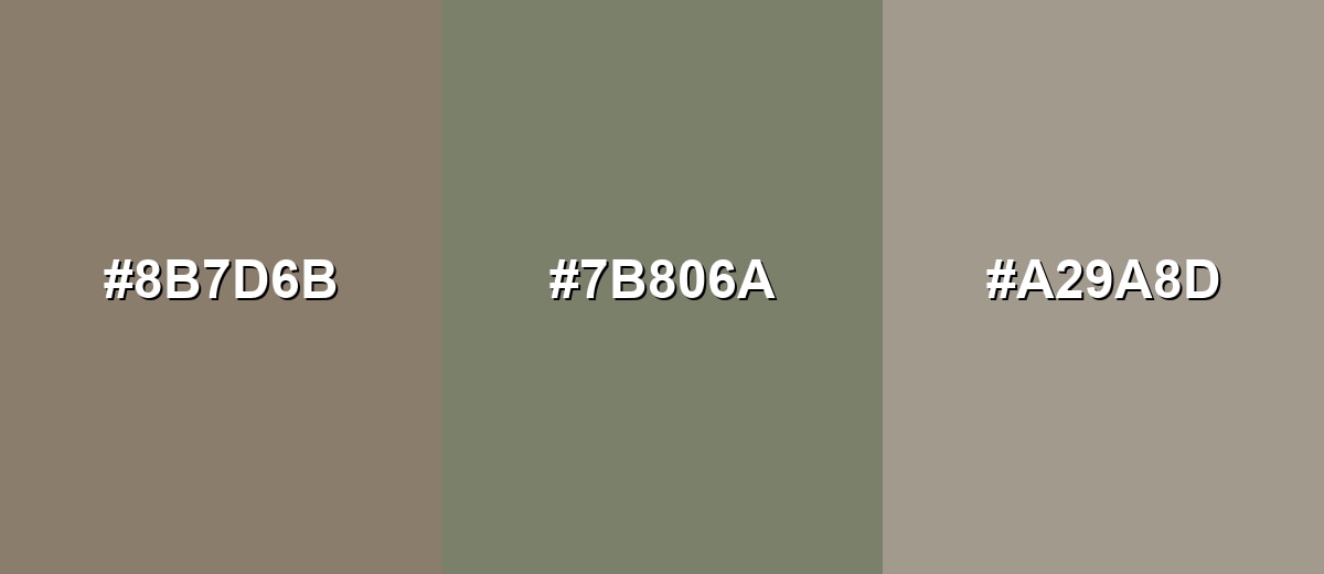
- Taupe: #8B7D6B
- Olive Gray: #7B806A
- Stone Gray: #A29A8D
Triadic & Tetradic Combinations
A triadic scheme uses three evenly spaced hues for a lively but controlled look.
Keep it muted: taupe with dusty teal and muted plum gives color variety without loud saturation.
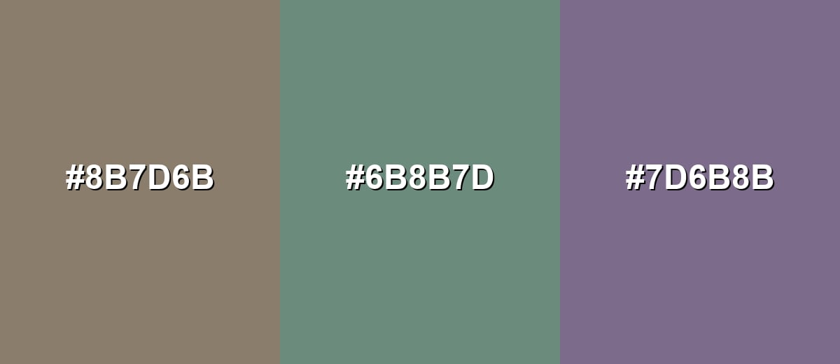
- Taupe: #8B7D6B
- Dusty Teal: #6B8B7D
- Muted Plum: #7D6B8B
Colors to Avoid
While taupe color is remarkably versatile, certain combinations can create problematic visual effects:
- Neon Lime (#B7FF00) - The extreme brightness overwhelms taupe's subtlety and can make designs feel accidental rather than intentional.
- Pure Cyan (#00FFFF) - Highly saturated cyan creates harsh contrast against taupe, which often reads as jarring in large areas.
- Hot Magenta (#FF00AA) - This intense pink pulls attention away from taupe and can clash with taupe's natural, quiet mood.
- Signal Red (#FF2D2D) - Bright red next to taupe can skew the palette muddy or overly aggressive unless carefully limited to tiny accents.
Shades, Tints & Variations of Taupe Color
Taupe has a surprisingly wide range—from airy, light taupes for backgrounds to deep taupes that work like soft charcoal. Knowing a few reliable variations helps you build hierarchy, contrast, and tonal depth without leaving the neutral family.
- Light Taupe (#B8AA9A) - A softer, brighter taupe that reads airy and gentle while keeping a natural warmth. It's best used for Backgrounds, large surfaces, minimalist layouts, and interior wall colors where you want warmth without heaviness.
- Classic Taupe (#8B7D6B) - The balanced gray-brown midpoint that works as a dependable neutral in both digital and print. It's best used for Primary neutral for branding, UI surfaces, packaging, and wardrobe basics.
- Deep Taupe (#5F5346) - A darker, richer taupe that adds depth and improves contrast while staying softer than true brown. It's best used for Text, headings, outlines, shadows, and accent walls where you need a grounded anchor.
- Rose Taupe (#9B7F7A) - Taupe with a subtle rosy undertone that feels warmer and slightly more expressive. It's best used for Beauty, lifestyle, fashion palettes, or any design that needs warmth without using obvious pink.
- Greige Taupe (#8A857A) - A more gray-leaning taupe that feels modern and slightly cooler while remaining approachable. It's best used for Contemporary UI themes, architectural palettes, and clean brand systems that want a neutral with less warmth.
Industry Applications
Because taupe is neutral but not flat, it appears across many industries where an understated, premium tone helps products feel trustworthy and well-made.
Fashion & Beauty
- Use taupe-forward palettes for capsule collections and accessories that need to pair easily with warm and cool colors.
- For beauty packaging, taupe can feel natural and elevated—especially alongside a clean light neutral like #F4EFE8.
- Pair taupe with a gentle accent such as #8B6B84 for a soft, lifestyle-friendly warmth.
- In product visuals, taupe reads like suede/leather tones, adding a tactile, premium vibe without going overly dark.
Interior Design & Decor
- Layer #B8AA9A, #8B7D6B, and #5F5346 to create tonal depth for walls, cabinetry, textiles, and trim.
- Taupe coordinates naturally with stone, wood, and mixed-metal finishes for a modern but cozy look.
- For ecommerce-friendly home goods, taupe reduces harsh contrast and glare compared to cooler grays.
- Balance taupe-heavy spaces with a cool supporting color like #6B798B in rugs, pillows, or artwork.
Branding & Marketing
- Use taupe to signal craftsmanship and premium approachability, especially with clean typography and generous spacing.
- For digital products, taupe-based UI themes can feel warmer and less fatiguing than high-contrast gray interfaces.
- Build contrast and clarity with a deeper neutral like #5F5346 for headings, navigation, and CTAs.
- Keep brand systems modern by pairing taupe with a cool counterbalance such as #6B798B and a light neutral like #F4EFE8.
Conclusion
Taupe is a versatile gray-brown neutral that brings warmth, calm, and polish to almost any palette—whether you're designing a website, building a brand identity, or choosing finishes for a real space. Start with #8B7D6B as your anchor, add depth with #5F5346 for contrast, and introduce a cool balance like #6B798B when you want a more modern, less beige-leaning feel. With the codes and palettes above, you can keep taupe consistent across screens, print proofs, and everyday materials.
Design Smarter with AI: Media.io is an online AI studio that empowers creators with advanced image generation and enhancement tools. From text-to-image and image-to-image creation to AI upscaling and color optimization, it enables fast, creative, and professional results—all in your browser.

Frequently Asked Questions About Taupe Color
Taupe is a low-saturation neutral that blends brown and gray, often with a warm undertone. It's commonly used as a soft alternative to gray or beige.
A widely used taupe reference is #8b7d6b. It's a balanced gray-brown that works well as a base neutral in design systems.
Taupe #8b7d6b is RGB 139, 125, 107. A practical CMYK starting point is 0%,10%,23%,46%, though print results vary by paper and color profile.
Taupe can be warm or cool depending on its undertone. The taupe on this page (#8b7d6b) is slightly warm, which helps it feel softer than many grays.
Taupe pairs well with light neutrals like #f4efe8, cool counterbalances like #6b798b, and muted accents such as #6b8b7d or #7d6b8b. These keep the overall look calm and cohesive.
Use taupe as a main neutral, add a lighter companion (like #b8aa9a) for spaciousness, and introduce a deeper anchor (#5f5346) for contrast. For a contemporary edge, mix in one cool accent such as #6b798b.


