

 TL;DR:
Pastel pink (Hex: #FFD1DC) is a soft, high-lightness tint utilized in digital and print design to convey warmth and approachability, requiring strict contrast management to maintain visual structure.
● When applying this color to UI backgrounds, use larger, darker typography for readability, and avoid using it for alert states where its soft tone could confuse visual hierarchy.
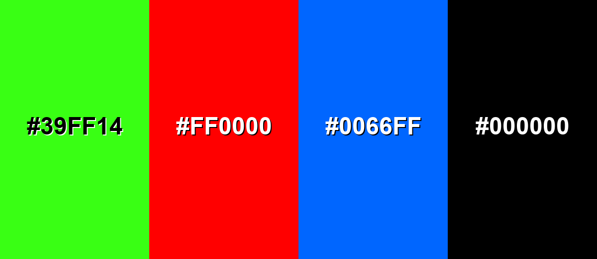
● Build balanced palettes using soft mint, off-white, lavender, or powder blue, while avoiding Neon Green (#39FF14), Pure Red (#FF0000), and Electric Blue (#0066FF) which will clash with or overpower its gentle finish.
● For consistent cross-medium output, establish Hex #FFD1DC as your digital baseline, rely on CMYK (0%, 18%, 14%, 0%) with physical proofs for print, and maintain neutral white balance in photography to prevent unintentional color casts.
Ask AI for a summary
 ChatGPT
 Perplexity
 Gemini
 Claude
 Grok
Grok
Pastel pink is a pale, creamy pink that looks like rose petals softened with a wash of white. Its signature hex code is #ffd1dc, giving it a light, airy appearance that feels gentle rather than bold.
People often read it as sweet, caring, and reassuring, with a playful touch. Because it's essentially a tint made by adding white to a stronger pink pigment, it stays bright in light while keeping a soft finish; this guide covers pastel pink color meaning, codes, combinations, shades, and practical uses.
Pastel Pink Color: Codes & Values
Use these values to match pastel pink across web design, digital graphics, and print production.
| Parameters | VALUE |
| HEX Code | #FFD1DC |
| RGB DECIMAL | 255, 209, 220 |
| RGB PERCENTAGE | 100%, 82%, 86% |
| CMYK | 0%,18%,14%,0% |
| HSL | 346°, 100%, 91% |
| HSV (HSB) | 346°, 18%, 100% |
| Web Safe | #FFCCCC |
Key Color Space Explanations:
- HEX - #ffd1dc. HEX is the most common way to specify this shade for websites and UI. Use it in CSS, design tools, and brand guidelines for consistent output.
- RGB - 255, 209, 220. RGB is how screens mix red, green, and blue light to display pastel pink. Higher red with softened green and blue creates the light, rosy tint.
- CMYK - 0%,18%,14%,0%. CMYK is used for printing with cyan, magenta, yellow, and black inks. Pastel pink relies mostly on light magenta and yellow with minimal to no black.
- HSL - 346°, 100%, 91%. HSL describes hue, saturation, and lightness in a way that's easy to tweak. The high lightness is what keeps this pink looking pastel rather than vivid.
- Web Safe - #ffcccc. Web safe is the closest legacy-safe approximation for older display constraints. It's a practical fallback if you need a simplified, widely supported palette.
If you're working digitally, start with HEX (#FFD1DC) for consistency; for print, convert to CMYK and always proof light tints on your chosen paper.
Want to generate Pastel Pink color photos or posters? Try Media.io's AI Image Generator now!
Pastel Pink Color Conversions
This conversion chart helps you translate pastel pink between common color models for design tools, development, and print workflows.
| Parameters | VALUE | CSS |
| HEX | #ffd1dc | #ffd1dc |
| RGB DECIMAL | 255, 209, 220 | rgb(255,209,220) |
| RGB PERCENTAGE | 100%, 82%, 86% | rgb(100%,82%,86%) |
| CMYK | 0%,18%,14%,0% | cmyk(0%,18%,14%,0%) |
| HSL | 346°, 100%, 91% | hsl(346°,100%,91%) |
| HSV (or HSB) | 346°, 18%, 100% | -- |
| Web Safe | ffcccc | #ffcccc |
| CIE-LAB | 89.7, 20.2, 3.1 | -- |
| XYZ | 82.5, 78.6, 78.9 | -- |
| xyY | 0.343, 0.327, 78.6 | -- |
| CIE-LCH | 89.7, 20.4, 8.7 | -- |
| CIE-LUV | 89.7, 31.0, 3.5 | -- |
| Hunter-Lab | 88.7, 12.5, 2.0 | -- |
| Binary | 11111111 11010001 11011100 | -- |
Pastel Pink Color Meaning & Symbolism
Pastel pink is widely associated with softness, warmth, and a gentle sense of care. In everyday life, it often signals sweetness, approachability, and a calm, friendly vibe. Because it's a light tint, it reads as comforting and non-threatening in many visual contexts.
Psychological Effects
In design, pastel pink can shift the "feel" of a layout before a single word is read.
- Welcoming Mood - Pastel pink tends to make designs feel lighter and more welcoming.
- Softer Visual Hierarchy - It can soften sharp layouts and reduce the perceived intensity of messaging.
- More Personal Tone - It can help a page or package feel more personal.
- Kind & Reassuring - Used in branding and UI, it often suggests kindness, reassurance, and subtle playfulness.
- Needs Contrast - If contrast is too low, it may feel overly cute, less serious, or even washed out.
Positive Associations
These are common "good" signals pastel pink communicates when used intentionally.
- Softness - Pastel pink is widely associated with softness and gentle energy.
- Warmth - It carries warmth without the intensity of brighter pinks.
- Care - It often suggests a sense of care and support, especially in wellness visuals.
- Approachability - It reads as calm, friendly, and non-threatening in many visual contexts.
- Subtle Playfulness - It keeps things light and uplifting without shouting for attention.
Cultural Significance Across the World
Pastel pink symbolism can shift depending on context, audience, and setting.
- Tenderness - It has long been linked to tenderness, making it a natural fit for heartfelt visuals.
- Romance - It's often associated with romance, especially in gifts, florals, and celebratory styling.
- Youthful & Playful - In some settings, it reads youthful and playful, adding a friendly tone.
- Nostalgic or Refined - In other contexts, it can feel nostalgic or refined, depending on pairings and typography.
Design Applications
Pastel pink works best when you want a soft focal point without heavy visual weight. Before using it, decide whether it's the main background tint or a gentle accent, then build contrast and hierarchy around that role.
Graphic Design Tips
- Use it for highlights, badges, and secondary surfaces to create a friendly tone without overpowering primary CTAs.
- Pair it with clear typography and strong spacing; very light pinks can blur edges if components are too tight.
- For UI states, keep success/error colors distinct so pastel pink doesn't get mistaken for an alert shade.
- Avoid placing small, thin text directly on pastel pink backgrounds; use darker text and larger type for comfortable reading.
- If it's used as a background, reserve it for large areas with clear contrast cues (buttons, borders, and icon fills).
Avoid placing small, thin text directly on pastel pink backgrounds; use darker text and larger type for comfortable reading.
Pastel Pink Color in Photography & Video
- Expose carefully to keep the tint airy—overexposure can wash pastel pink into near-white.
- For skin tones, keep white balance neutral so the pink reads intentional, not like a color cast.
- Use pastel pink backdrops to soften product shots, especially for beauty, wellness, and lifestyle content.
- In video graphics, use darker outlines or shadows on icons so pastel pink overlays don't disappear.
- When grading, protect highlights and add subtle contrast so the frame still has structure.
Recommended Tool for Image Enhancement: When incorporating pastel pink color into your photography projects, Media.io's AI Image tools can help you achieve more refined results. With AI-powered color enhancement, photo colorization, image upscaling, and old photo restoration, you can easily enrich pastel pink color tones, improve overall image quality, and highlight the color's elegant and sophisticated aesthetic.
Color Combinations
Pastel pink is easy to combine because it sits near the light end of the spectrum. The palettes below show practical pairings that keep it soft, balanced, or more energetic depending on your goal.
Complementary Colors
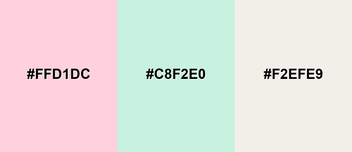
A gentle mint-green counterpoint keeps pastel pink fresh and modern. Add a warm off-white to maintain a clean, airy look.
Complementary Palette Example: Use Pastel Pink with Soft Mint and Warm Off-White for a calm, spa-like palette.
Analogous Color Schemes
Analogous colors sit adjacent to each other on the color wheel, creating harmonious, cohesive palettes with subtle variation.
Lean rosy and lavender for a dreamy, delicate flow.
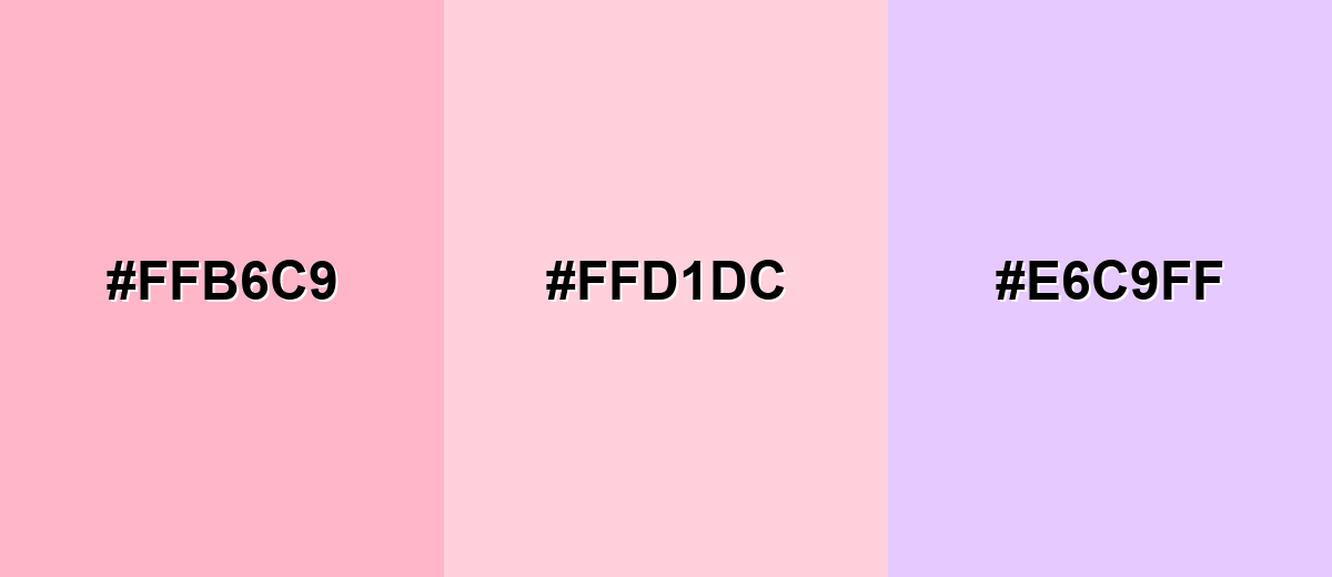
- Pastel Rose: #FFB6C9
- Pastel Pink: #FFD1DC
- Blush Lavender: #E6C9FF
Shift toward peach and soft baby pink for warmth and sweetness.
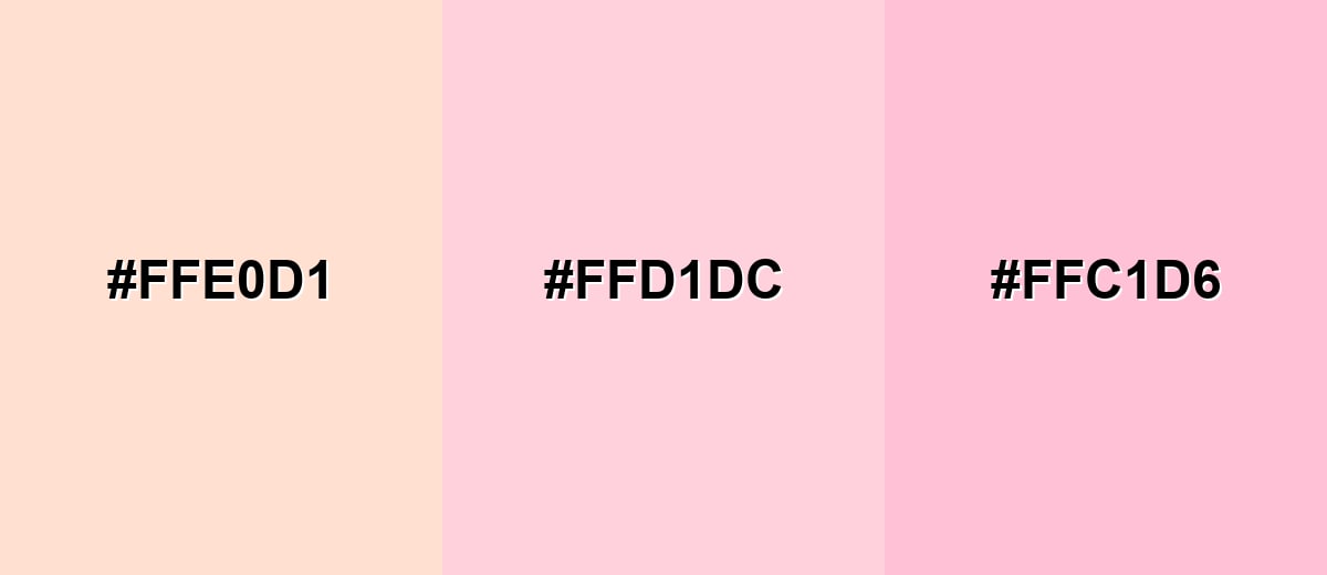
- Peach Cream: #FFE0D1
- Pastel Pink: #FFD1DC
- Baby Pink: #FFC1D6
Triadic & Tetradic Combinations
Triadic palettes add variety while staying balanced.
Mix pastel pink with powder blue and pale mint for a playful, airy trio.
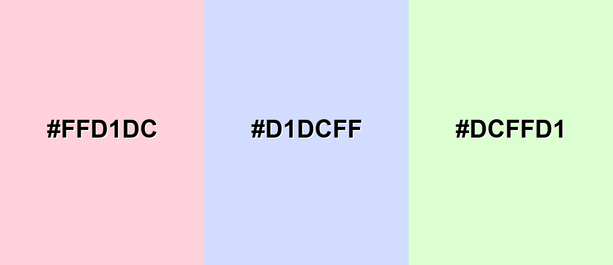
- Pastel Pink: #FFD1DC
- Powder Blue: #D1DCFF
- Pale Mint: #DCFFD1
Colors to Avoid
While pastel pink color is remarkably versatile, certain combinations can create problematic visual effects:
- Neon Green (#39FF14) - The neon intensity overpowers pastel pink and can feel visually jarring, especially in UI.
- Pure Red (#FF0000) - It pushes the palette into a harsh, high-alert zone and competes with pastel pink's gentle tone.
- Electric Blue (#0066FF) - Strong saturated blue can create a loud contrast that makes pastel pink look faded or overly sweet.
- Pure Black (#000000) - The jump in contrast can feel too sharp and heavy; it can dominate the composition if not used carefully.
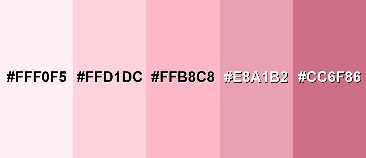
Shades, Tints & Variations of Pastel Pink Color
Pastel pink isn't just one look—its range goes from barely-there tints to deeper rose accents. Knowing these variations helps you control contrast, mood, and hierarchy while keeping the overall palette soft.
- Barely Pink (#FFF0F5) - An ultra-light pink with a near-white finish that reads soft and clean. It's best used for Backgrounds, large surfaces, and minimal layouts where you want a hint of warmth..
- Pastel Pink (#FFD1DC) - The classic pastel pink tint: airy, gentle, and easy to combine with other pastels. It's best used for Brand accents, hero sections, packaging, and friendly UI highlights..
- Blush Pink (#FFB8C8) - A slightly deeper blush that adds definition while staying soft. It's best used for Buttons, headings, illustration fills, and accent blocks that need clearer presence..
- Dusty Pink (#E8A1B2) - A muted, grayer pink that feels more mature and less sugary. It's best used for Editorial design, interiors, and branding that aims for a calm, refined mood..
- Deep Rose (#CC6F86) - A richer rose tone that can anchor palettes built around lighter pinks. It's best used for Contrast accents, outlines, icons, and supporting elements that need stronger structure..
Industry Applications
Because it feels gentle and approachable, pastel pink shows up across many industries where warmth, care, or light playfulness matters. The key is matching the intensity to your message and choosing pairings that keep it readable and intentional.
Fashion & Beauty
- Works well for soft packaging and product backgrounds in beauty and skincare.
- Supports a clean, pampering mood for launches, kits, and gift sets.
- Fits casual looks and spring palettes when balanced with creamy whites.
- Use stronger accessories or darker trims if you want more definition and less sweetness.
Interior Design & Decor
- As a wall tint, it can warm up natural light and make rooms feel softer.
- Matte finishes help keep the look calmer and less reflective.
- In textiles and accents, it adds a cozy touch without saturated intensity.
- Balance it with clearer neutrals and stronger accents so it feels modern, not washed out.
Branding & Marketing
- Useful for calming visuals in wellness and self-care apps, landing pages, and social content.
- A popular choice for wedding invitations, floral themes, and event styling.
- Adds friendliness to education and kids products, but needs higher-contrast accents for readability.
- Often used for sweets, bakery branding, and seasonal launches where a light, cheerful look signals fun.
Conclusion
Pastel pink (#FFD1DC) is a go-to shade when you want warmth and softness without visual noise. It's light enough to act as a background tint, but still distinct as an accent—especially when you pair it with supportive neutrals and deeper tones for structure. From UI highlights and gentle branding to packaging, interiors, and event design, pastel pink works best when you manage contrast and keep typography crisp. With the codes, conversions, and ready-to-use palettes above, you can apply it consistently across digital and print while keeping the mood friendly, clean, and intentional.
Design Smarter with AI: Media.io is an online AI studio that empowers creators with advanced image generation and enhancement tools. From text-to-image and image-to-image creation to AI upscaling and color optimization, it enables fast, creative, and professional results—all in your browser.

Frequently Asked Questions About Pastel Pink Color
Pastel pink is a light tint of pink softened with white, giving it a gentle, airy appearance. It's commonly used when you want a warm, friendly look rather than a bold statement.
A widely used hex value for pastel pink is #ffd1dc. It's a soft, pale pink that works well as a background tint or a subtle accent.
It often represents softness, care, sweetness, and approachability. In visual communication, it can make interfaces and branding feel more welcoming and less intense.
Soft mint, warm off-white, lavender tones, and powder blue are reliable matches. These pairings keep the overall look light and balanced while adding variety.
It can be, especially for backgrounds and gentle highlights, but it needs strong contrast for text and icons. Use darker typography and clear component boundaries so the interface stays readable.
Pastel pink is lighter and softer because it contains much more white, so it feels calm and subtle. Hot or bright pinks are more saturated and intense, creating stronger contrast and a louder mood.


