

 TL;DR:
Light brown is a warm, earthy neutral defined by the hex code #c4a484, functioning effectively as a stable, approachable background surface when pure white feels too stark.
● In contrast to similar neutrals, light brown is deeper than off-white beige and has a stronger brown base than yellow-leaning tan, making it better suited for anchoring palettes with natural warmth.
● When applying it in UI design, restrict its use to backgrounds, cards, or secondary elements rather than primary buttons, and ensure you use dark text and crisp light neutrals to prevent the layout from looking outdated or dusty.
● Avoid pairing light brown with highly saturated colors like Bright Neon Coral (#FF6B6B) or Electric Cyan (#00C2FF), as their high chroma overpowers the muted warmth and creates disconnected, noisy visuals.
Ask AI for a summary
 ChatGPT
 Perplexity
 Gemini
 Claude
 Grok
Grok
Light brown is a soft, warm brown that looks like sand, latte, or pale wood in everyday life. A common reference point for it is the hex code #c4a484, which sits between beige and mid-brown.
People often perceive it as grounded, friendly, and natural because it echoes materials like leather, paper, and soil. This guide covers meaning, key codes, pairings, shade ideas, and practical ways to use it.
Light Brown Color: Codes & Values
Here are the standard digital and print values for a commonly used light brown reference shade.
| Parameters | VALUE |
| HEX Code | #C4A484 |
| RGB DECIMAL | 196, 164, 132 |
| RGB PERCENTAGE | 77%, 64%, 52% |
| CMYK | 0%,16%,33%,23% |
| HSL | 30°, 35%, 64% |
| HSV (HSB) | 30°, 33%, 77% |
| Web Safe | #CC9999 |
Key Color Space Explanations:
- HEX - HEX is the most common way to specify this shade on the web and in digital tools. Use #c4a484 to match light brown precisely across screens.
- RGB - RGB defines the mix of red, green, and blue light used on screens. The values 196, 164, 132 create a warm, muted neutral that reads natural rather than bright.
- CMYK - CMYK is used for print, based on ink percentages. 0%,16%,33%,23% is a practical starting point, but printed results can shift with paper and profiles.
- HSL - HSL describes hue, saturation, and lightness, which is helpful for building tints and shades. At 30° hue and moderate saturation, it stays warm and easy to pair.
- Web Safe - Web safe is the closest legacy-safe approximation for older palettes. #cc9999 is the nearest match when you must use the web-safe grid.
Use the HEX value for UI and web work, keep RGB for screen-based tools, and switch to CMYK when you're preparing files for print.
Light Brown Color Conversions
If you're moving between tools (web, print, and color pickers), this conversion table helps you keep light brown consistent.
| Parameters | VALUE | CSS |
| HEX | #c4a484 | #c4a484 |
| RGB DECIMAL | 196, 164, 132 | rgb(196,164,132) |
| RGB PERCENTAGE | 77%, 64%, 52% | rgb(77%,64%,52%) |
| CMYK | 0%,16%,33%,23% | cmyk(0%,16%,33%,23%) |
| HSL | 30°, 35%, 64% | hsl(30°,35%,64%) |
| HSV (or HSB) | 30°, 33%, 77% | -- |
| Web Safe | cc9999 | #cc9999 |
| CIE-LAB | 69.4, 7.5, 21.0 | -- |
| XYZ | 40.17, 39.87, 27.44 | -- |
| xyY | 0.374, 0.371, 39.87 | -- |
| CIE-LCH | 69.4, 22.3, 70.3° | -- |
| CIE-LUV | 69.4, 22.7, 26.8 | -- |
| Hunter-Lab | 63.2, 6.7, 16.3 | -- |
| Binary | 110001001010010010000100 | -- |
Want to generate Light Brown Color photos or posters? Try Media.io's AI Image Generator now!
Light Brown Color Meaning & Symbolism
Light brown is widely associated with stability, comfort, and everyday reliability. Because it resembles natural materials like wood, paper, and wheat, it often feels approachable and down-to-earth in daily life. This makes it a popular choice when you want warmth without the intensity of deeper browns.
Psychological Effects
These are common ways light brown is perceived in spaces, interfaces, and brand visuals.
- Calmer Feel - Light brown can make a space or interface feel calmer and more familiar, which helps reduce visual tension.
- Practical Support - It tends to read as practical and supportive, especially when used as a background or secondary accent.
- Warm Simplicity - It also signals warmth and simplicity, which can make brands seem friendly and honest.
- Low-Contrast Risk - Too much light brown can look dull, dusty, or outdated if there is not enough contrast or a sharper accent.
- Keep Layouts Airy - Pair with a crisp light neutral to keep layouts airy.
Positive Associations
When used well, light brown often reinforces a comfortable, trustworthy tone.
- Grounded - Widely associated with stability.
- Cozy - Often linked to comfort.
- Natural - Resembles natural materials like wood, paper, and wheat.
- Dependable - Connected to everyday reliability.
- Approachable - Frequently described as approachable and down-to-earth.
Cultural Significance Across the World
Brown tones tend to carry "earthy" meaning across many settings, even though specifics can vary.
- Earth - Across many contexts, brown tones are linked to earth.
- Harvest - Brown tones are linked to harvest.
- Craftsmanship - Brown tones are linked to craftsmanship.
- Natural Fibers - Brown tones are linked to natural fibers.
Design Applications
Light brown works best when you want warmth and neutrality at the same time. It can anchor a palette, soften stark layouts, and make images with wood, skin tones, or natural textures feel more cohesive.
Graphic Design Tips
- Use it for cards, panels, or subtle section breaks rather than primary buttons.
- Support readability with strong typography weight and clear spacing.
- Introduce one deep accent for focus states and calls to action.
- Use dark text for body copy on light brown backgrounds.
- Do not rely on hue alone to communicate status; use icons or labels too.
Because light brown sits in a mid-lightness range, contrast can drop quickly when paired with similar neutrals.
Light Brown Color in Photography & Video
- Balance it with lighter neutrals to prevent rooms from feeling dim.
- Add greenery or blue-toned accents for freshness.
- Request proofs when exact matching matters.
- Use texture and negative space to enhance the earthy feel.
- Keep small text away from low-contrast areas.
Recommended Tool for Image Enhancement: When incorporating light brown color into your photography projects, Media.io's AI Image tools can help you achieve more refined results. With AI-powered color enhancement, photo colorization, image upscaling, and old photo restoration, you can easily enrich light brown color tones, improve overall image quality, and highlight the color's elegant and sophisticated aesthetic.
Color Combinations
Light brown is flexible: it can feel earthy and classic with warm neighbors, or modern when balanced with cool blues and greens. Use the palettes below as starting points for branding, UI, interiors, and illustration.
Complementary Colors
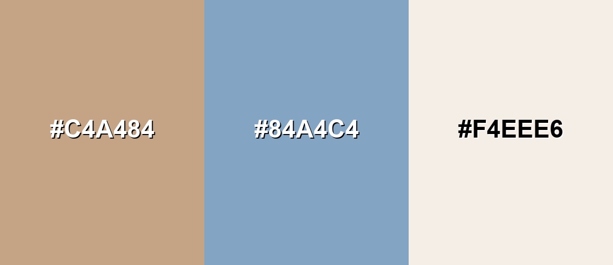
A complementary pairing adds a cool counterbalance that makes light brown look richer and more intentional. This is a reliable approach when you want an earthy base with a clean, modern contrast.
Complementary Palette Example: Combine light brown with a muted blue and a soft off-white for a calm, balanced look.
Analogous Color Schemes
Analogous colors sit adjacent to each other on the color wheel, creating harmonious, cohesive palettes with subtle variation.
Stay warm with a caramel-to-tan flow that feels cozy and natural.
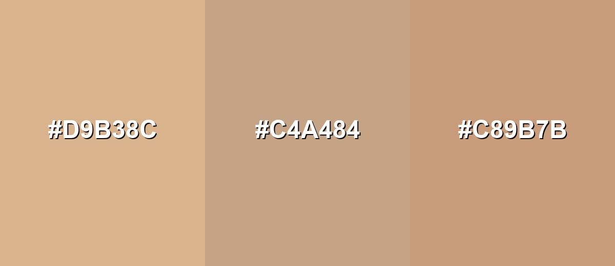
- Soft Caramel: #D9B38C
- Light Brown: #C4A484
- Toasted Beige: #C89B7B
Create a gentle, sunlit palette by blending wheat tones with a soft rosy brown.
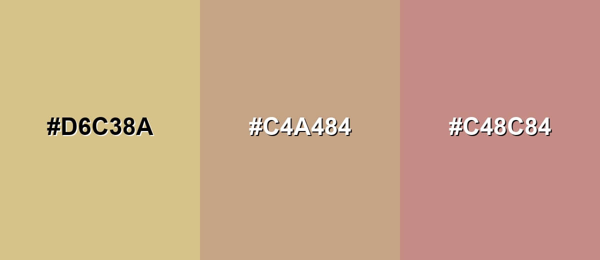
- Pale Wheat: #D6C38A
- Light Brown: #C4A484
- Dusty Rose Brown: #C48C84
Triadic & Tetradic Combinations
A triadic scheme adds variety while keeping the palette friendly and not overly loud.
Pair light brown with a muted green and a soft purple for a balanced, creative mix.
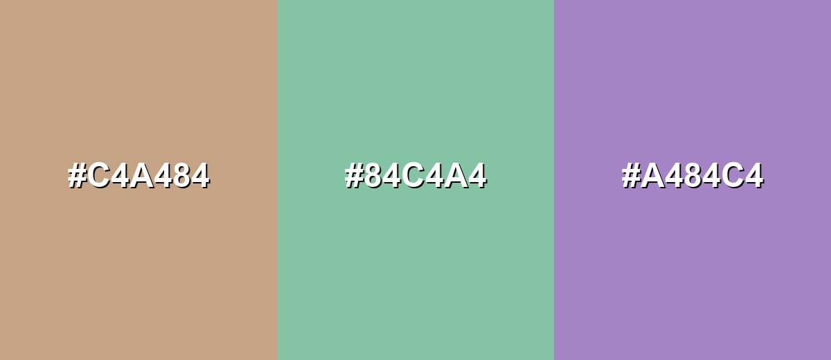
- Light Brown: #C4A484
- Sage Green: #84C4A4
- Dusty Lavender: #A484C4
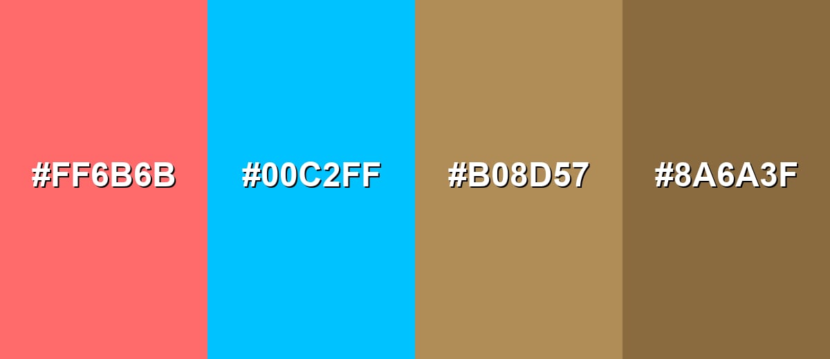
Colors to Avoid
While light brown color is remarkably versatile, certain combinations can create problematic visual effects:
- Bright Neon Coral (#FF6B6B) - The saturation can overpower light brown and make the overall palette feel unbalanced or noisy.
- Electric Cyan (#00C2FF) - High-chroma cyan often clashes with earthy tones, creating a sharp contrast that feels disconnected.
- Strong Ochre (#B08D57) - Too close in warmth and depth, it can make designs look muddy with little visual separation.
- Dark Mud Brown (#8A6A3F) - When paired heavily, it can darken the palette and reduce clarity, especially for text-heavy layouts.
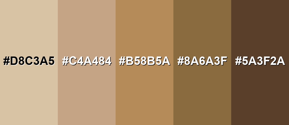
Shades, Tints & Variations of Light Brown Color
Light brown covers a surprisingly useful range—from soft, creamy tints to deeper, earthy shades. Exploring these variations helps you build better hierarchy (backgrounds, surfaces, accents, and text) while keeping the overall look warm and natural.
- Creamy Tan (#D8C3A5) - A lighter, creamier take that keeps warmth while feeling airy and soft. It's best used for Backgrounds, large surfaces, and gentle gradients..
- Wheat Brown (#C4A484) - The core light brown tone with a balanced warmth that reads natural and approachable. It's best used for Base neutrals for UI, branding, and lifestyle visuals..
- Caramel Brown (#B58B5A) - A deeper, more golden variation that adds richness without turning too dark. It's best used for Accents, icons, borders, and highlighted UI elements..
- Cocoa Brown (#8A6A3F) - A grounded mid-dark brown that brings stronger contrast and a more traditional feel. It's best used for Text headers, outlines, and contrast accents paired with lighter neutrals..
- Deep Umber (#5A3F2A) - A dark, earthy shade that feels sturdy and timeless. It's best used for High-contrast details, typography, and premium, natural themes..
Industry Applications
Because it feels natural and familiar, light brown appears across many industries as a background, material cue, or tone-setting neutral. It is especially effective when you want warmth and approachability without looking overly playful.
Fashion & Beauty
- Earthy, gentle branding for clean or botanical lines
- Background tones that flatter product shots and skin-adjacent hues
- Leather, suede, and knitwear storytelling
- Classic palettes that stay relevant across trends
Interior Design & Decor
- Furniture catalogs and decor sites that lean on natural materials
- Packaging that hints at craft and durability
- Neutral base palettes for seasonal collections
- Use on walls or textiles for a cozy, lived-in look.
Branding & Marketing
- Coffee, chocolate, baked goods, and pantry branding
- Menu backgrounds and product labels that suggest warmth and comfort
- Lifestyle photography styling with wood and paper textures
- artisan and craft goods
Conclusion
Light brown is an easygoing neutral that still feels warm and human—ideal for cozy interiors, approachable branding, and calm, content-first layouts. Using #c4a484 as a practical baseline makes it simple to build palettes that lean classic with warm neighbors or feel fresher with cooler accents. Keep an eye on contrast (especially with nearby neutrals), and add one intentional darker or cooler anchor so the whole design stays crisp, modern, and readable.
Design Smarter with AI: Media.io is an online AI studio that empowers creators with advanced image generation and enhancement tools. From text-to-image and image-to-image creation to AI upscaling and color optimization, it enables fast, creative, and professional results—all in your browser.

Frequently Asked Questions About Light Brown Color
Quick answers to the most common questions about using and identifying light brown.
A commonly used hex code for light brown is #c4a484. It produces a soft, warm brown that resembles sand, latte, or pale wood.
Most light browns are warm because they lean toward orange or yellow undertones. A light brown can feel cooler if it is muted with gray or balanced with blue accents.
It pairs well with warm off-whites, beige, and caramel tones for a cozy look, and with muted blues or sage greens for a cleaner contrast. Deep browns also work well for hierarchy and readability.
Beige is typically lighter and closer to off-white, while tan often looks more yellow or sandy. Light brown usually sits a bit deeper than beige and can show a stronger brown base than tan.
It works well as a background, card surface, or secondary accent when white feels too stark. Use strong text contrast and add a darker accent for buttons or key actions to keep the interface clear.
Start with a medium brown, then add white to lighten it gradually. If it becomes too pink, add a touch of yellow; if it turns too orange, add a tiny amount of blue to neutralize the warmth.


