

Steel blue color is a cool, muted blue that looks like polished metal with a soft gray undertone. Its hex code is #4682B4, giving it a balanced, slightly desaturated feel compared with brighter blues.
Often read as calm, dependable, and quietly modern, steel blue stays steady under different lighting and works well for both screens and print. Below you'll find the exact color codes, conversions, palettes, and practical pairing tips.
Steel Blue Color: Codes & Values
Use these core values to match steel blue color consistently across UI design tools, CSS, and print workflows.
| Parameters | VALUE |
| HEX Code | #4682B4 |
| RGB DECIMAL | 70, 130, 180 |
| RGB PERCENTAGE | 27.5%, 51%, 70.6% |
| CMYK | 61%,28%,0%,29% |
| HSL | 207°, 44%, 49% |
| HSV (HSB) | 207°, 61%, 71% |
| Web Safe | #3399CC |
Key Color Space Explanations:
- HEX - HEX is the most common way to specify this shade on the web. Use #4682b4 in CSS, design tools, and UI systems for consistent rendering.
- RGB - RGB defines the red, green, and blue light values used by screens. Steel blue uses 70, 130, 180 to create its cool, mid-depth look.
- CMYK - CMYK is used for printing and is based on ink percentages. It helps you estimate how steel blue will translate on paper, where blues can shift depending on stock and coating.
- HSL - HSL describes hue, saturation, and lightness in a way that's easy to tweak. It's useful when you need lighter tints, darker shades, or consistent variations for a UI theme.
- Web Safe - Web safe is the closest legacy browser-safe approximation. #3399cc is a practical fallback when you need a classic, limited palette.
For day-to-day design, start with HEX for digital layouts, use RGB for motion/video and screen work, and rely on CMYK as your baseline for print proofs.
Steel Blue Color Conversions
Need steel blue in a different color space? Here are the common conversions you can copy into design apps or documentation.
| Parameters | VALUE | CSS |
| HEX | #4682b4 | #4682b4 |
| RGB DECIMAL | 70, 130, 180 | rgb(70,130,180) |
| RGB PERCENTAGE | 27.5%, 51%, 70.6% | rgb(27.5%,51%,70.6%) |
| CMYK | 61%,28%,0%,29% | cmyk(61%,28%,0%,29%) |
| HSL | 207°, 44%, 49% | hsl(207°,44%,49%) |
| HSV (or HSB) | 207°, 61%, 71% | -- |
| Web Safe | 3399cc | #3399cc |
| CIE-LAB | 52.3, -2.5, -32.4 | -- |
| XYZ | 18.7, 20.6, 46.1 | -- |
| xyY | 0.219, 0.241, 20.6 | -- |
| CIE-LCH | 52.3, 32.5, 265.6° | -- |
| CIE-LUV | 52.3, -25.1, -47.6 | -- |
| Hunter-Lab | 45.3, -3.3, -33.7 | -- |
| Binary | 01000110 10000010 10110100 | -- |
Want to generate Steel Blue Color photos or posters? Try Media.io's AI Image Generator now!
Steel Blue Color Meaning & Symbolism
Steel blue is often linked with trust, stability, and clear thinking, but with a softer edge than strong navy. In everyday life it reads as professional and composed, which is why it shows up in workwear, digital products, and understated interiors. When people search Steel Blue Color meaning, they're usually looking for that balance between calm and confidence.
Psychological Effects
Steel blue tends to support focus and clarity without feeling loud or attention-seeking.
- Calm Focus - Helps information-heavy layouts feel organized and easier to scan.
- Controlled Energy - Feels active enough for modern products, but not as intense as highly saturated blues.
- Eye Comfort - Works well in large areas because the gray undertone reduces visual strain.
- Reserved Mood - Can read as distant if you don't balance it with warmer accents or friendly imagery.
- Cool Atmosphere - In low light, it can look grayer and cooler, shaping a quieter, more subdued vibe.
Positive Associations
When used thoughtfully, steel blue communicates competence with a modern, understated finish.
- Trust - Suggests dependability for services, platforms, and long-term products.
- Stability - Feels steady and grounded, especially as a background or framework color.
- Professionalism - Looks polished in presentations, templates, and corporate systems.
- Modern Sophistication - Adds a "quiet premium" feel without relying on heavy dark tones.
- Clarity - Supports clean typography and structured spacing for a composed message.
Cultural Significance Across the World
In many modern contexts, steel blue is read through the lens of technology, materials, and clean design.
- Technology - Commonly linked with digital products, systems thinking, and practical innovation.
- Reliability - Often used in corporate communication where consistency and confidence matter.
- Metal & Industry - Echoes steel and machinery, suggesting durability and resilience.
- Water & Depth - Can hint at calm seas and depth, reinforcing a composed, thoughtful tone.
Design Applications
Steel blue works best when you want a cool, modern base that doesn't overpower other elements. Below are practical ways to apply it across digital, brand, and physical design.
Graphic Design Tips
- Use steel blue as a "structure color" for headers, sidebars, and section dividers in editorial layouts.
- Pair it with near-whites for a clean, modern feel that still looks soft (not stark).
- For hierarchy, combine one deep shade for emphasis and a lighter tint for large background areas.
- In presentations, keep charts readable by using steel blue as the base series and one warm highlight for key points.
- On print pieces, leave generous whitespace so the muted tone looks intentional and premium.
Pro tip: If steel blue is your main brand color, build a simple scale (light tint → classic → deep) and reuse it across components so your UI or layouts feel consistent.
Steel Blue Color in Photography & Video
- Steel blue works well in shadows and midtones to create a cinematic, modern cool grade.
- For product shots, use it as a background color to make warm metals and neutral materials stand out.
- In portraits, keep skin tones natural by balancing steel blue with warmer highlights or a soft neutral fill.
- For lifestyle video, steel blue is great for rainy-day, urban, or coastal moods without going full navy.
- When color matching, watch mixed lighting—steel blue can shift toward gray under warm bulbs.
Recommended Tool for Image Enhancement: When incorporating steel blue color into your photography projects, Media.io's AI Image tools can help you achieve more refined results. With AI-powered color enhancement, photo colorization, image upscaling, and old photo restoration, you can easily enrich steel blue color tones, improve overall image quality, and highlight the color's elegant and sophisticated aesthetic.
Color Combinations
Because steel blue sits between blue and gray, it pairs easily with both crisp neutrals and warmer accents. Use these palettes as starting points, then adjust tint and contrast for your specific medium.
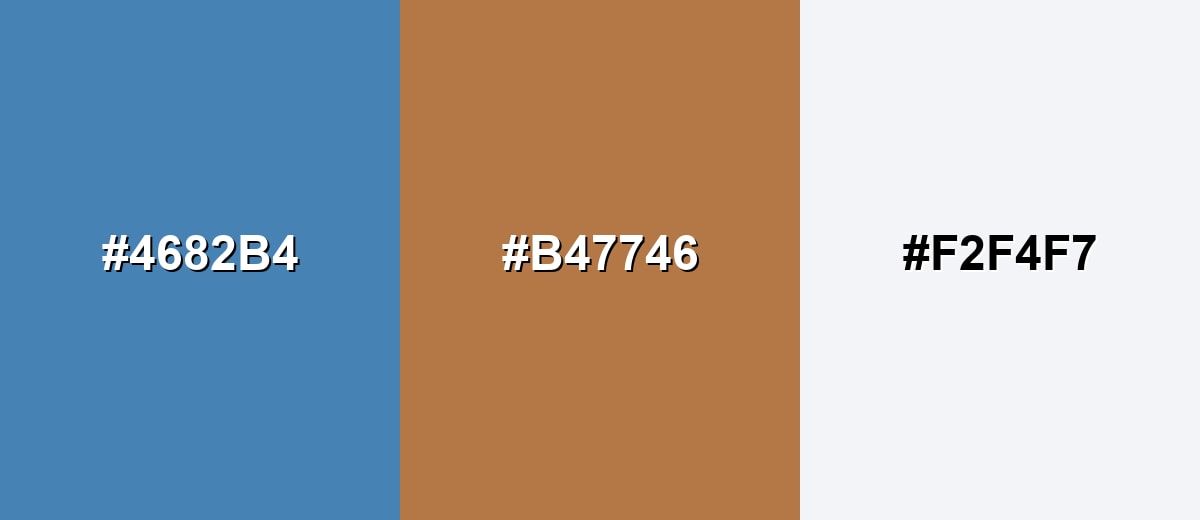
Complementary Colors
A complementary palette adds energy by placing a warm orange-brown opposite steel blue. This is a reliable way to make key UI elements or focal points stand out without using neon accents.
Complementary Palette Example: Steel blue with warm copper and a clean off-white feels balanced, modern, and easy to read.
Analogous Color Schemes
Analogous colors sit adjacent to each other on the color wheel, creating harmonious, cohesive palettes with subtle variation.
Analogous blues and blue-greens create a smooth, calm palette for backgrounds, gradients, and quiet branding.
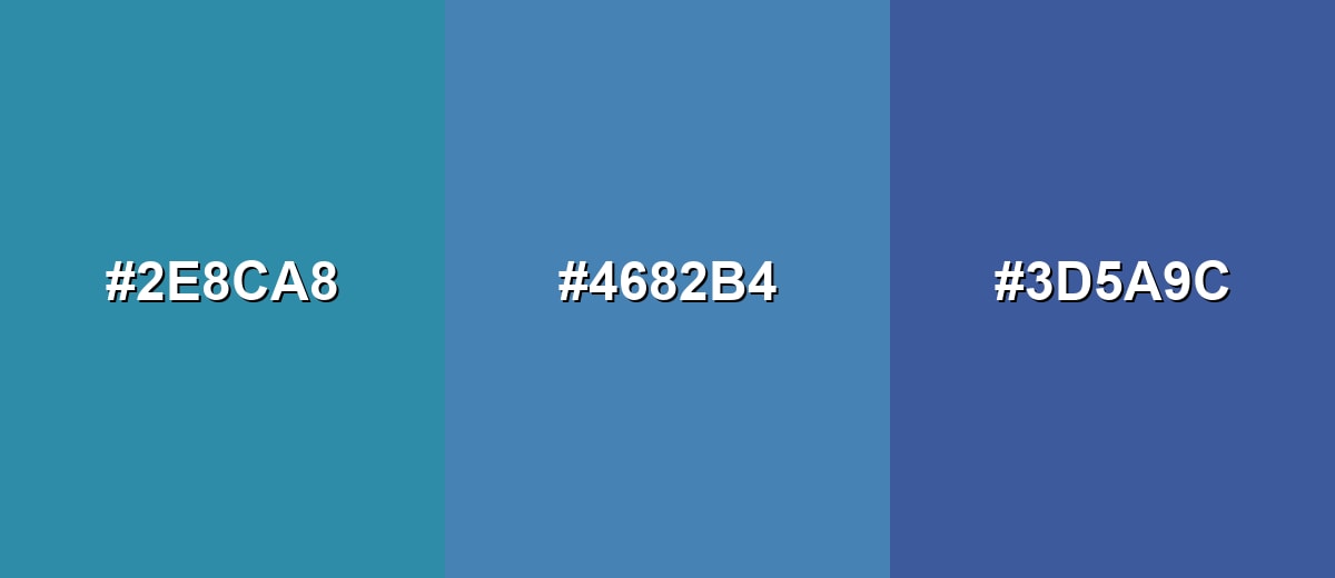
- Teal Blue: #2E8CA8
- Steel Blue: #4682B4
- Royal Indigo: #3D5A9C
A lighter-to-deeper analogous mix adds depth while keeping the overall mood cohesive and understated.
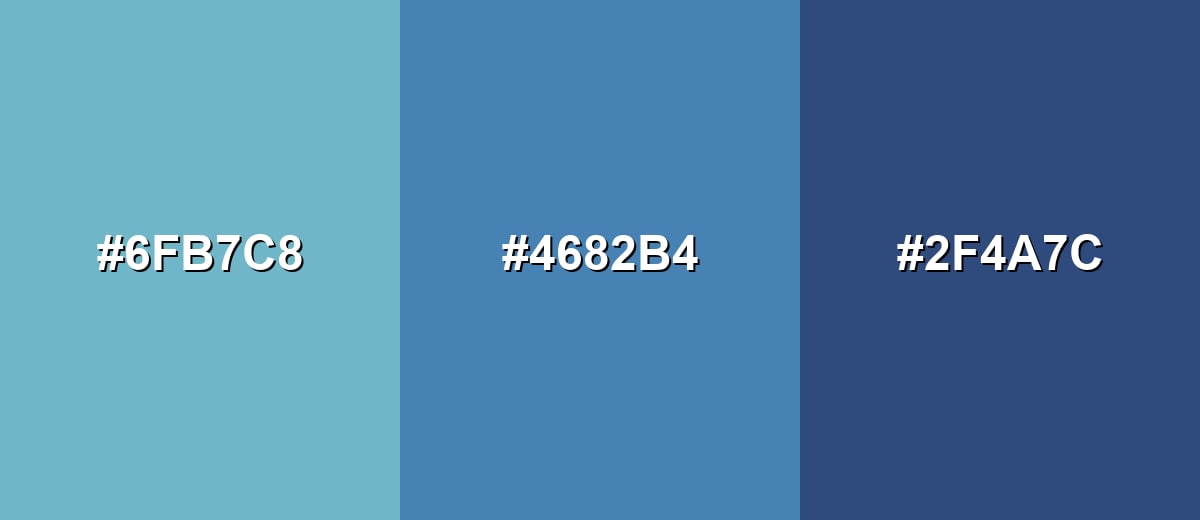
- Mist Teal: #6FB7C8
- Steel Blue: #4682B4
- Slate Indigo: #2F4A7C
Triadic & Tetradic Combinations
A triadic scheme gives you balanced contrast without the sharpness of direct complements.
Steel blue with muted magenta and soft olive works well for illustrations, brand systems, and multi-category UI tags.
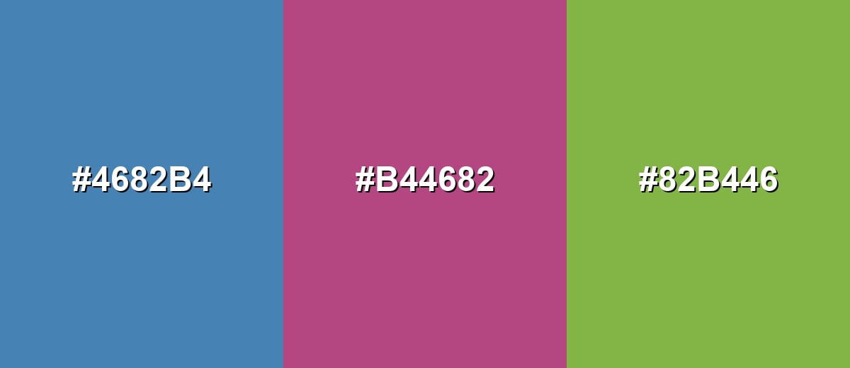
- Steel Blue: #4682B4
- Muted Magenta: #B44682
- Soft Olive: #82B446
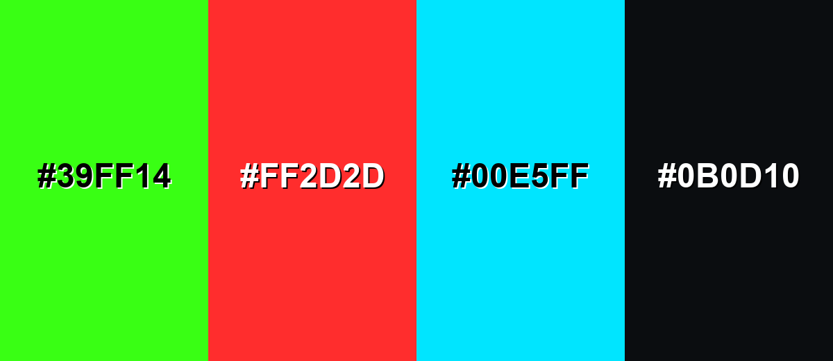
Colors to Avoid
While steel blue color is remarkably versatile, certain combinations can create problematic visual effects:
- Neon Green (#39FF14) - The saturation and brightness overpower steel blue and can make layouts feel harsh and unbalanced.
- Pure Red (#FF2D2D) - High-contrast red can create a stop-sign effect and may feel alarming against a calm, professional base.
- Bright Cyan (#00E5FF) - Too close in hue but far brighter, it often looks mismatched and can cause a vibrating edge on screens.
- Jet Black (#0B0D10) - Very deep blacks can make steel blue look dull or muddy; charcoal or off-white usually pairs more smoothly.
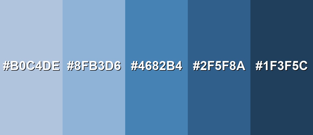
Shades, Tints & Variations of Steel Blue Color
From airy, light tints to deep, near-navy shades, the steel blue range gives you flexibility for backgrounds, accents, and readable contrast. These variations are especially useful when you want a consistent UI theme or a layered interior palette without shifting away from the same cool blue-gray family.
- Light Steel Blue (#B0C4DE) - A pale, airy variation that keeps the steel-like coolness while feeling softer and more open. It's best used for Large backgrounds, UI surfaces, and spacious interior schemes..
- Soft Steel Blue (#8FB3D6) - A gentle mid-light tone that stays calm but adds more presence than very light tints. It's best used for Cards, panels, secondary backgrounds, and textiles..
- Classic Steel Blue (#4682B4) - The reference shade: cool, balanced, and slightly muted with a modern, practical feel. It's best used for Brand bases, navigation areas, accent walls, and key UI sections..
- Deep Steel Blue (#2F5F8A) - A darker, more grounded version that increases contrast while keeping the same blue-gray character. It's best used for Headers, footers, buttons, and high-contrast accents..
- Midnight Steel (#1F3F5C) - A very deep variation that reads almost navy, with a subdued, serious tone. It's best used for Text overlays, hero banners, and sophisticated branding elements..
Industry Applications
Steel blue fits many industries because it communicates steadiness and clarity while staying visually gentle. It's a reliable base color when you want modern, calm design that still feels professional.
Fashion & Beauty
- Works as a refined alternative to navy for workwear, outerwear, and minimal street style palettes.
- Pairs well with cool neutrals for clean seasonal collections and lookbooks.
- In beauty branding, it supports "clinical-meets-premium" packaging and calm product pages.
- Ideal for background tones in product photography where you want a soft, modern mood.
Interior Design & Decor
- Great for cabinetry, built-ins, or an accent wall when you want color without high saturation.
- Looks especially balanced with warm wood, off-white trim, and textured fabrics.
- In lower-light rooms, it can read grayer—warm lighting helps keep it welcoming.
- Matte finishes feel soft and modern; satin finishes lean into the "polished metal" vibe.
Branding & Marketing
- Common in technology and SaaS where clarity and trust are key (dashboards, nav, UI surfaces).
- Fits finance and professional services for reports, decks, and data-heavy visuals.
- In healthcare and wellness, it feels clean and calm without looking overly sterile.
- Works well as a system color for templates and social graphics, especially with a warm accent for CTAs.
Conclusion
Steel blue stands out for its cool, modern balance of blue with a subtle gray undertone—steady enough for dashboards, branding, and interiors, yet soft enough to use in large areas without visual fatigue. With #4682B4 as your anchor, you can keep designs minimal and professional, or introduce warmth by pairing it with copper-like accents and clean off-whites for an approachable, contemporary look. Used with intentional contrast and a simple shade scale, steel blue delivers a dependable aesthetic that holds up across screens and print.
Design Smarter with AI: Media.io is an online AI studio that empowers creators with advanced image generation and enhancement tools. From text-to-image and image-to-image creation to AI upscaling and color optimization, it enables fast, creative, and professional results—all in your browser.

Frequently Asked Questions About Steel Blue Color
It's a medium, cool blue with a noticeable gray cast, similar to painted metal or a clear sky seen through a haze. It feels less vivid than bright blues and more refined than pure primary tones.
The commonly referenced hex value for steel blue is #4682b4. It's a balanced, slightly muted blue that works well as a base tone in design systems.
Steel blue is generally cool because it leans toward blue with a gray undertone. It can feel even cooler in low light or next to bright whites, so warm accents help balance it.
It pairs well with off-whites, soft grays, warm copper/orange-browns, muted greens, and dusty purples. For a clean modern look, combine it with cloud whites and charcoal; for more energy, add a warm complementary accent.
Use it for navigation, headers, and panels where you want calm structure around content. Keep text contrast strong (near-white or deep charcoal depending on the background), and use one warm accent for calls to action.
It can print well, but like many blues it may shift depending on paper and finishing. Use the CMYK values as a starting point and request a proof, especially for brand-critical pieces or large solid areas.


