

Cornflower color is a vivid medium blue that looks like fresh sky-blue petals with a slightly cool, crisp edge. Its most common digital reference is hex #6495ED.
People often read it as friendly and calming, with a confident, modern feel. Below, you'll find cornflower's meaning, color codes, conversions, pairings, shades, and practical ways to use it in design.
Cornflower Color: Codes & Values
If you're matching cornflower across web, UI, print, or brand assets, these are the core values designers use most often.
| Parameters | VALUE |
| HEX Code | #6495ED |
| RGB DECIMAL | 100, 149, 237 |
| RGB PERCENTAGE | 39.22%, 58.43%, 92.94% |
| CMYK | 58%,37%,0%,7% |
| HSL | 219°, 79%, 66% |
| HSV (HSB) | 219°, 58%, 93% |
| Web Safe | #6399FF |
Key Color Space Explanations:
- HEX - HEX is the most common way to specify this shade on the web and in UI tools. Use #6495ed when you want consistent screen rendering across design apps and browsers.
- RGB - RGB builds the shade with red, green, and blue light, which is how screens display it. The RGB values are useful for CSS, video overlays, and interface components.
- CMYK - CMYK is used for print and packaging where inks mix on paper. It helps you predict how cornflower will shift when moving from screen to physical materials.
- HSL - HSL describes hue, saturation, and lightness, which is practical for creating tints, shades, and consistent UI states. It is often easier than RGB for adjusting brightness without changing the overall hue.
- Web Safe - Web-safe is the closest approximation from the classic 216-color palette. It is mainly helpful for legacy constraints and quick alignment to coarse color steps.
Use HEX for most web work, RGB for screen-based apps and motion, CMYK for print proofing, and HSL when you need consistent tints/shades across UI states.
Cornflower Color Conversions
Need cornflower in another format for your workflow? This conversion chart helps you move between design apps, CSS, and print specs without guessing.
| Parameters | VALUE | CSS |
| HEX | #6495ed | #6495ed |
| RGB DECIMAL | 100, 149, 237 | rgb(100,149,237) |
| RGB PERCENTAGE | 39.22%, 58.43%, 92.94% | rgb(39.22%,58.43%,92.94%) |
| CMYK | 58%,37%,0%,7% | cmyk(58%,37%,0%,7%) |
| HSL | 219°, 79%, 66% | hsl(219°,79%,66%) |
| HSV (or HSB) | 219°, 58%, 93% | -- |
| Web Safe | 6399ff | #6399ff |
| CIE-LAB | 61.8, 10.0, -49.2 | -- |
| XYZ | 31.30, 30.29, 84.43 | -- |
| xyY | 0.214, 0.208, 30.29 | -- |
| CIE-LCH | 61.8, 50.2, 281.5° | -- |
| CIE-LUV | 61.8, -22.8, -79.8 | -- |
| Hunter-Lab | 55.0, 8.4, -60.1 | -- |
| Binary | 01100100, 10010101, 11101101 | -- |
Want to generate Cornflower Color photos or posters? Try Media.io's AI Image Generator now!
Cornflower Color Meaning & Symbolism
Cornflower is widely associated with clarity, openness, and a steady, optimistic energy. In everyday life, it often reads as approachable and trustworthy without feeling heavy. That mix is why Cornflower Color meaning is frequently linked to calm confidence and straightforward communication.
Psychological Effects
This is how cornflower typically feels in real-world design and everyday viewing.
- Clean Focus - Helps interfaces and layouts feel organized, making information easier to scan.
- Calm Energy - Feels soothing without becoming sleepy, so it's useful for action-driven UI.
- Modern Clarity - Reads crisp and contemporary, especially in high-contrast, minimal layouts.
- Attention Direction - Naturally pulls the eye, which supports visual hierarchy for links and highlights.
- Cool Distance Risk - Overuse (especially with other cool saturated tones) can feel slightly cold or remote.
Positive Associations
When balanced well, cornflower tends to signal "friendly confidence" more than strict corporate formality.
- Approachability - Feels welcoming and easy to engage with, especially alongside soft neutrals.
- Trust - Shares the reliability cue many blues have, without the heaviness of deep navy.
- Freshness - Suggests a bright, airy "clean" vibe that works well for modern digital products.
- Optimism - Adds an upbeat tone that still stays professional in most contexts.
- Communication - Fits messaging-heavy designs where clarity and openness are the goal.
Cultural Significance Across the World
Symbolism varies by context, but these are common, widely recognized themes tied to cornflower-like blues.
- Nature-Inspired Identity - Its floral name brings a soft, organic association even in modern layouts.
- Everyday Professionalism - Often used where brands want to look dependable but not overly formal.
- Clarity & Openness - Frequently linked to clear communication and "open sky" freshness.
- Tech-Friendly Blue - Common in digital products because it stays readable and crisp on screens.
Design Applications
Cornflower works best when you want a clear blue that stays lively on modern screens. A few practical choices around contrast, spacing, and pairing will help it look intentional rather than decorative.
Graphic Design Tips
- Use cornflower for primary actions, links, toggles, and active states where you need quick visual recognition.
- Reserve large solid backgrounds for sections with generous padding; the brightness can feel intense in tight layouts.
- For readability, pair it with very dark text tones for body copy, and use lighter text primarily for large headings or icons.
- In branding, keep shapes simple so the color stays crisp at small sizes (icons, badges, app marks).
- For print, run test proofs—bright blues can shift depending on paper and coating.
If cornflower is your main accent, build the rest of the palette with calmer neutrals, then add just one warm accent when you need extra emphasis.
Cornflower Color in Photography & Video
- Use cornflower props or wardrobe for a "fresh + modern" pop that still feels natural on camera.
- In color grading, keep an eye on skin tones—cool blues can make warmth look muted if pushed too far.
- For product shots, cornflower backgrounds work best with plenty of separation and clean shadows.
- In motion graphics, cornflower makes strong lower-thirds, captions, and UI overlays (especially with dark text).
- When shooting bright blues, avoid overexposure—cornflower can wash out quickly under harsh lighting.
Recommended Tool for Image Enhancement: When incorporating cornflower color into your photography projects, Media.io's AI Image tools can help you achieve more refined results. With AI-powered color enhancement, photo colorization, image upscaling, and old photo restoration, you can easily enrich cornflower color tones, improve overall image quality, and highlight the color's elegant and sophisticated aesthetic.
Color Combinations
Cornflower pairs easily with both warm and cool companions, so you can push it toward playful, professional, or relaxed looks. Use the palettes below as starting points, then adjust lightness to match your layout and contrast needs.
Complementary Colors
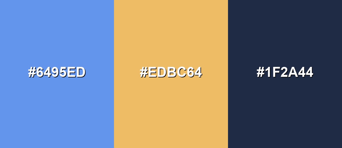
A complementary pairing places a warm orange opposite cornflower on the wheel, creating bold contrast that is great for calls to action and key highlights.
Complementary Palette Example: Try cornflower as the main blue, add a warm orange accent, then anchor the layout with a deep, quiet navy.
Analogous Color Schemes
Analogous colors sit adjacent to each other on the color wheel, creating harmonious, cohesive palettes with subtle variation.
For a smooth, unified look, blend cornflower with nearby blues and blue-violets for gradients, hero sections, or calm UI states.
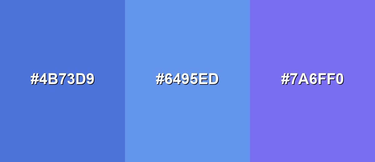
- Royal Blue: #4B73D9
- Cornflower: #6495ED
- Periwinkle Violet: #7A6FF0
If you want a brighter, airy direction, shift toward cyan on one side and a cooler indigo on the other to keep the palette energetic but cohesive.
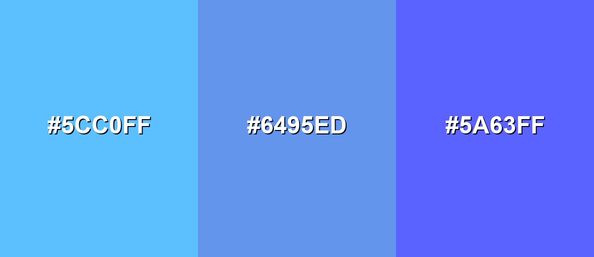
- Sky Cyan: #5CC0FF
- Cornflower: #6495ED
- Bright Indigo: #5A63FF
Triadic & Tetradic Combinations
A triadic scheme gives you three evenly spaced hues, which creates variety without losing balance.
Combine cornflower with a lively green and a vivid pink-magenta for playful branding, illustrations, or standout data categories.
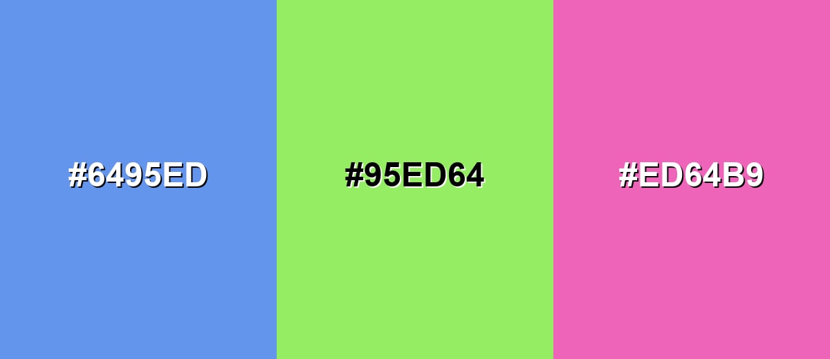
- Cornflower: #6495ED
- Fresh Leaf Green: #95ED64
- Berry Magenta: #ED64B9
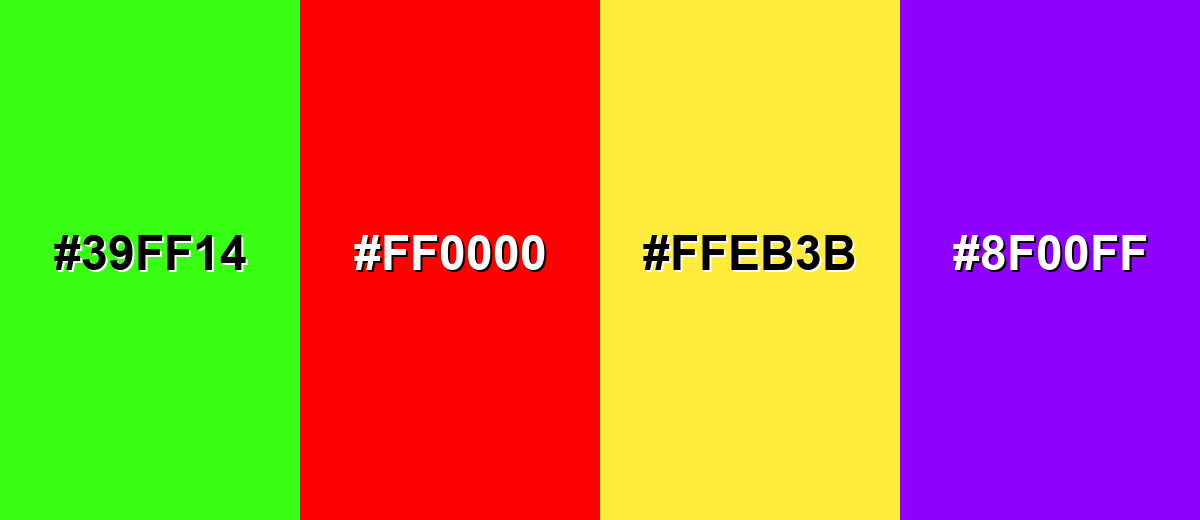
Colors to Avoid
While cornflower color is remarkably versatile, certain combinations can create problematic visual effects:
- Neon Green (#39FF14) - Both hues are high-intensity, and together they can feel harsh and distracting in interfaces or long-form visuals.
- Pure Red (#FF0000) - The contrast is aggressive and can create a stop-and-go effect that pulls attention away from your main message.
- Bright Yellow (#FFEB3B) - This combination can appear overly loud and may reduce legibility in small text or thin UI elements.
- Electric Purple (#8F00FF) - Both sit on the cool side with strong saturation, which can make the overall palette feel busy rather than clear.
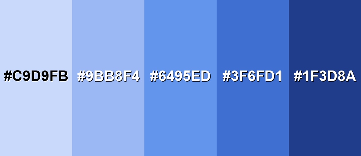
Shades, Tints & Variations of Cornflower Color
Cornflower isn't just one blue—its usable range goes from airy tints for backgrounds to deeper shades for navigation, headers, and high-contrast detail. Having a few consistent variations makes it easier to build clean UI states and cohesive brand systems.
- Cornflower Mist (#C9D9FB) - A pale, airy tint that keeps the same blue personality with much softer contrast. It's best used for Background panels, subtle gradients, onboarding screens, and gentle highlight fills..
- Soft Cornflower (#9BB8F4) - A lighter, quieter take that still reads clearly as cornflower but feels less bold. It's best used for Secondary buttons, info banners, UI hover states, and calming illustration accents..
- Classic Cornflower (#6495ED) - The standard cornflower shade: bright, friendly, and clean with a cool undertone. It's best used for Primary accents, links, icons, charts, and modern brand highlights..
- Deep Cornflower (#3F6FD1) - A deeper shade that feels more grounded while staying vibrant on screens. It's best used for Headers, active navigation, emphasized UI elements, and stronger contrast situations..
- Midnight Cornflower (#1F3D8A) - A dark, inky variation that keeps the blue identity but adds seriousness and depth. It's best used for Text over light tints, footer areas, premium branding, and high-contrast charts..
Industry Applications
Cornflower is flexible across digital and physical work because it reads clearly at small sizes and still feels friendly at larger scales. Here are a few places it naturally fits, from consumer-facing visuals to professional systems.
Fashion & Beauty
- Use cornflower as a statement shade for sporty, clean, "fresh" seasonal color stories.
- Works well in packaging accents where you want clarity and a modern, hygienic feel.
- As a supporting tone, it balances warm neutrals and keeps layouts looking crisp.
- In campaign graphics, it adds contrast without the heaviness of deeper blues.
Interior Design & Decor
- Use as an accent on textiles, ceramics, or feature pieces to bring a fresh, airy note.
- Balance with warm woods, creams, or sandy neutrals to keep the space from feeling too cool.
- Great for kids rooms and creative corners where a cheerful blue feels inviting.
- Try it in smaller areas first (pillows, art, decor) before committing to large blocks.
Branding & Marketing
- Strong fit for tech, education, and service brands that want approachable trust.
- Useful for landing page accents, section dividers, and feature callouts.
- In UI-heavy brands, it's a clear choice for links, selected states, and primary actions.
- Pairs nicely with clean typography and simple shapes for sharp, scalable identity work.
Conclusion
Cornflower stands out as a bright, crisp blue that feels friendly while still communicating reliability. Its biggest advantage is clarity: #6495ED stays readable in UI accents, charts, and brand details without the heaviness you get from darker blues. For a bold, modern look, pair it with warm oranges; for calmer harmony, stay near neighboring blues and blue-violets; and when you need more weight, lean on deeper cornflower shades. With smart contrast and a balanced palette, cornflower helps you build clean hierarchy and a calm, confident visual message across screens and print.
Design Smarter with AI: Media.io is an online AI studio that empowers creators with advanced image generation and enhancement tools. From text-to-image and image-to-image creation to AI upscaling and color optimization, it enables fast, creative, and professional results—all in your browser.

Frequently Asked Questions About Cornflower Color
Cornflower is a vivid medium blue inspired by the cornflower bloom. It looks like a bright sky-leaning blue with a cool, clean finish that works well in modern digital design.
A widely used hex value for cornflower is #6495ed, which is also known from standard digital color libraries.
Cornflower is commonly associated with clarity, calm confidence, and approachability. It often feels friendly and trustworthy, making it a useful choice for communication-heavy designs.
It is generally considered cool because it leans toward blue-violet rather than green-blue. That coolness can feel refreshing, but it may also feel slightly distant if overused.
Warm oranges create strong contrast, while neighboring blues and violets create smooth harmony. For more variety, a triadic mix with green and magenta can feel energetic and modern.
Use cornflower for accents like buttons, links, and selected states, then keep body text in very dark tones for clear contrast. If you place text on large cornflower areas, increase font size and spacing and test contrast before shipping.


