

Kelly green color is a bright, clean green that looks like fresh grass in strong daylight—vivid, balanced, and easy to spot from a distance. A common digital reference for it is #4cbb17, which captures its punchy, spring-like look on screens.
It's often perceived as upbeat and confident, with a friendly sense of energy and growth. This guide covers its meaning, codes, combinations, shades, and practical uses.
Kelly Green Color: Codes & Values
Use these core values to keep kelly green consistent across UI, branding, and print specs.
| Parameters | VALUE |
| HEX Code | #4CBB17 |
| RGB DECIMAL | 76, 187, 23 |
| RGB PERCENTAGE | 29.8%, 73.3%, 9.0% |
| CMYK | 59%,0%,88%,27% |
| HSL | 101°, 78%, 41% |
| HSV (HSB) | 101°, 88%, 73% |
| Web Safe | #33CC00 |
Key Color Space Explanations:
- HEX - HEX is the most common way to specify kelly green for web and UI work. Use #4cbb17 in CSS, design tools, and brand guidelines for consistent results.
- RGB - RGB defines the red, green, and blue light levels used by screens. These values help you reproduce the same look across digital products and displays.
- CMYK - CMYK is used for print and packaging where inks, not light, create the final appearance. It's a practical starting point, but paper, coating, and printer profiles can shift the result.
- HSL - HSL describes hue, saturation, and lightness, which is helpful when creating tints, tones, and hover states. It's often easier than RGB for adjusting brightness without changing the basic hue.
- Web Safe - Web-safe values are older standardized screen colors that reduce banding on limited displays. The closest web-safe match can be useful when you need a simplified fallback.
For most digital projects, HEX (#4CBB17) is the quickest, most reliable choice—then use RGB/HSL when you need fine control for UI states and variations.
Kelly Green Color Conversions
If you're moving between design tools, web CSS, and print workflows, these conversions help you match kelly green more accurately.
| Parameters | VALUE | CSS |
| HEX | #4cbb17 | #4cbb17 |
| RGB DECIMAL | 76, 187, 23 | rgb(76,187,23) |
| RGB PERCENTAGE | 29.8%, 73.3%, 9.0% | rgb(29.8%,73.3%,9.0%) |
| CMYK | 59%,0%,88%,27% | cmyk(59%,0%,88%,27%) |
| HSL | 101°, 78%, 41% | hsl(101°,78%,41%) |
| HSV (or HSB) | 101°, 88%, 73% | -- |
| Web Safe | 33cc00 | #33cc00 |
| CIE-LAB | 67.3, -57.5, 63.8 | -- |
| XYZ | 20.8, 37.1, 6.9 | -- |
| xyY | 0.321, 0.573, 37.1 | -- |
| CIE-LCH | 67.3, 85.9, 132° | -- |
| CIE-LUV | 67.3, -51.2, 78.9 | -- |
| Hunter-Lab | 61.0, -46.0, 54.0 | -- |
| Binary | 01001100 10111011 00010111 | -- |
Want to generate kelly green color photos or posters? Try Media.io's AI Image Generator now!
Kelly Green Meaning & Symbolism
Kelly green is widely linked with growth, freshness, and a bold kind of optimism. Because it's bright and highly visible, it often reads as energetic and straightforward in everyday visuals, from signage to sports-inspired graphics.
Psychological Effects
Because it's saturated and easy to spot, kelly green can shift the "tone" of a design fast.
- Motivating Energy - Kelly green tends to feel motivating and lively, which helps messages land as active and positive.
- Crisp Focus - Used in small doses, it can make key elements feel crisp and easy to find.
- Intensity at Scale - Large blocks can feel intense or a bit loud, especially next to other high-chroma hues.
- Best as an Accent - In branding, UI, and interiors, it often works best as an accent or paired with calmer neutrals.
- Go / Success Signal - It can signal go, success, or confirmation, which is useful for calls to action and status indicators.
Positive Associations
When you want something to feel fresh and forward-moving, kelly green is a natural fit.
- Growth - Commonly tied to growth themes, especially in nature-forward messaging.
- Freshness - Reads clean and fresh, making visuals feel newly updated.
- Optimism - Its brightness supports a bold, optimistic mood.
- Energy - High visibility gives it an energetic, active presence in layouts.
- Straightforward Clarity - Often feels direct and easy to interpret in quick-glance communication.
Cultural Significance Across the World
Context matters—kelly green can pick up different meanings depending on where and how it's used.
- Nature Themes - Frequently associated with nature themes and outdoor visuals.
- Active Lifestyles - Often shows up in designs that signal movement, fitness, and momentum.
- Team Palettes - Common in sports-inspired graphics and team palettes where visibility is key.
- Festive Design - Regularly used in festive designs; pairing and typography help keep the message consistent.
Design Applications
Kelly green is most effective when you use its brightness with intention. Start by deciding whether it should be the main statement or a high-impact accent, then build supporting tones around it.
Graphic Design Tips
- Use #4CBB17 for bold accents, then support it with calmer neutrals to avoid visual fatigue.
- For logos, pair kelly green with a dark neutral for legibility and avoid overly thin strokes on bright backgrounds.
- In UI, reserve it for primary actions, success states, or highlights where quick recognition matters.
- For print and packaging, start with CMYK as a baseline and request proofs—paper stock and coating can shift saturated greens.
- Plan contrast early: dark charcoal text or a deeper green shade usually reads clearer than white-on-kelly-green.
If you want the color to feel confident (not overwhelming), treat kelly green as a "signal" color—use it on the moments that matter (CTAs, badges, callouts), and keep the rest of the layout anchored with off-whites or darker supporting tones.
Kelly Green in Photography & Video
- Use kelly green as a controlled accent (wardrobe, props, signage) so it stays punchy instead of dominating the frame.
- Watch highlights and saturation—bright greens can clip quickly under strong daylight and high-contrast lighting.
- Balance with neutral surfaces and natural textures to keep the scene from feeling too "loud."
- When color grading, small saturation changes can swing the look from fresh to harsh; adjust in tiny steps.
- For on-screen graphics, test legibility at real sizes—thin lines and small text can vibrate against intense green.
Recommended Tool for Image Enhancement: When incorporating kelly green into your photography projects, Media.io's AI Image tools can help you achieve more refined results. With AI-powered color enhancement, photo colorization, image upscaling, and old photo restoration, you can easily enrich kelly green tones, improve overall image quality, and highlight the color's elegant and sophisticated aesthetic.
Color Combinations
Kelly green pairs best with tones that either calm its intensity (neutrals), sharpen its clarity (deep blues), or add deliberate contrast (purples and warm accents). The palettes below give you ready-to-use starting points for UI, branding, and creative layouts.
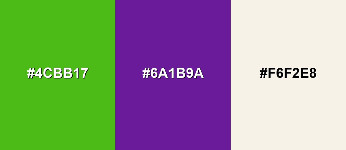
Complementary Colors
A complementary pairing puts kelly green opposite a purple-leaning hue to create bold contrast. Add a soft neutral to keep the design readable and prevent the palette from feeling too loud.
Complementary Palette Example: Use Kelly Green with Rich Purple for impact, and Ivory Mist to give the eye a place to rest.
Analogous Color Schemes
Analogous colors sit adjacent to each other on the color wheel, creating harmonious, cohesive palettes with subtle variation.
A yellow-green to green-to-teal run feels fresh and outdoorsy, ideal for friendly brands and upbeat UI accents.
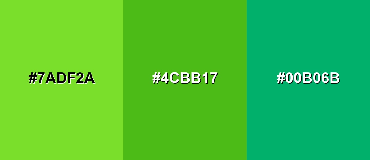
- Spring Lime: #7ADF2A
- Kelly Green: #4CBB17
- Jade Green: #00B06B
A warmer analogous set leans into leafy greens, which works well for natural products and calming layouts.
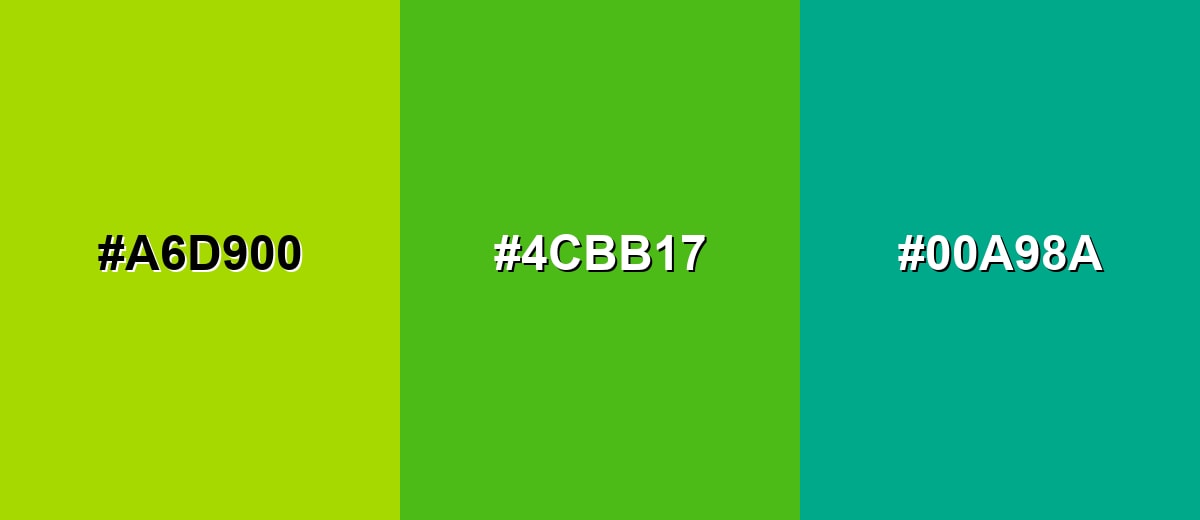
- Chartreuse Glow: #A6D900
- Kelly Green: #4CBB17
- Emerald Teal: #00A98A
Triadic & Tetradic Combinations
A triadic palette spreads hues evenly for a playful, balanced look.
Pair Kelly Green with Deep Blue and Rose Magenta to get contrast without losing harmony.
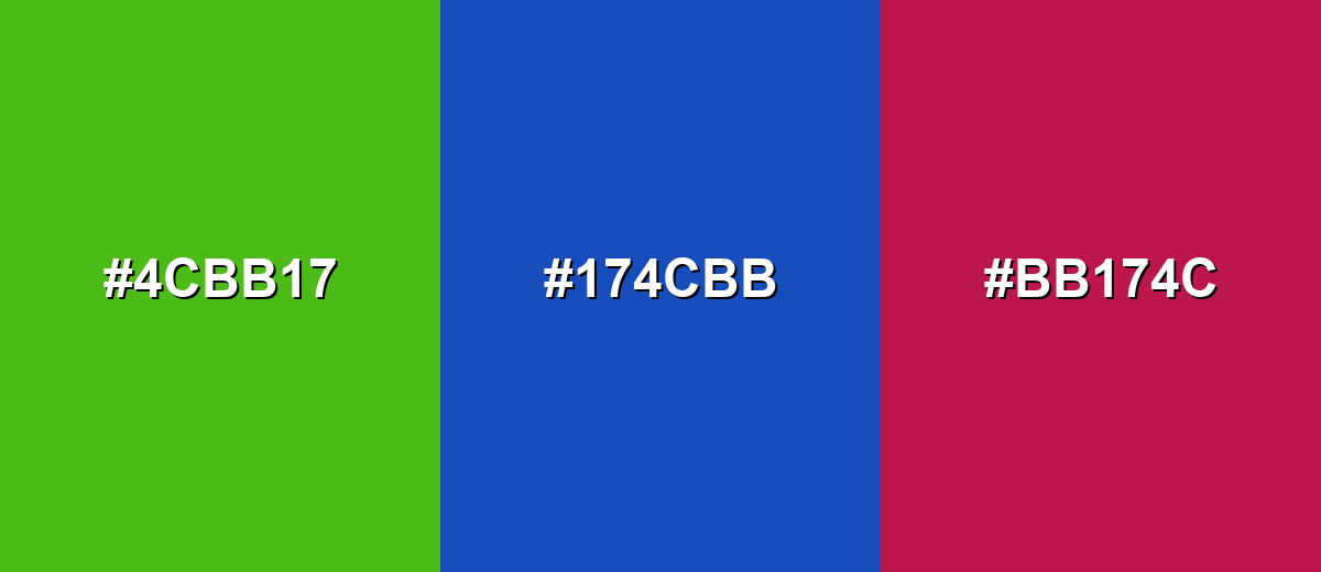
- Kelly Green: #4CBB17
- Deep Blue: #174CBB
- Rose Magenta: #BB174C
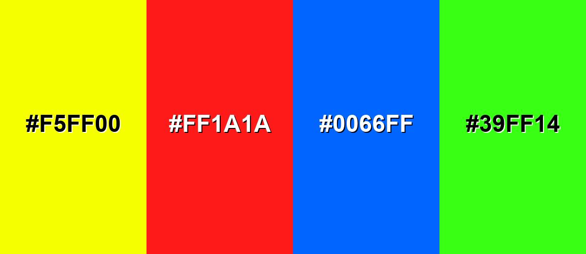
Colors to Avoid
While kelly green is remarkably versatile, certain combinations can create problematic visual effects:
- Neon Yellow (#F5FF00) - Both hues are extremely bright, which can create glare and reduce readability in UI and print.
- Pure Red (#FF1A1A) - This combination can feel visually aggressive and is often associated with conflicting signals like go versus stop.
- Electric Blue (#0066FF) - High saturation on both sides can cause vibration effects, especially on screens and small text.
- Neon Green (#39FF14) - A near-neon neighbor competes with kelly green and makes the overall design look unbalanced and harsh.
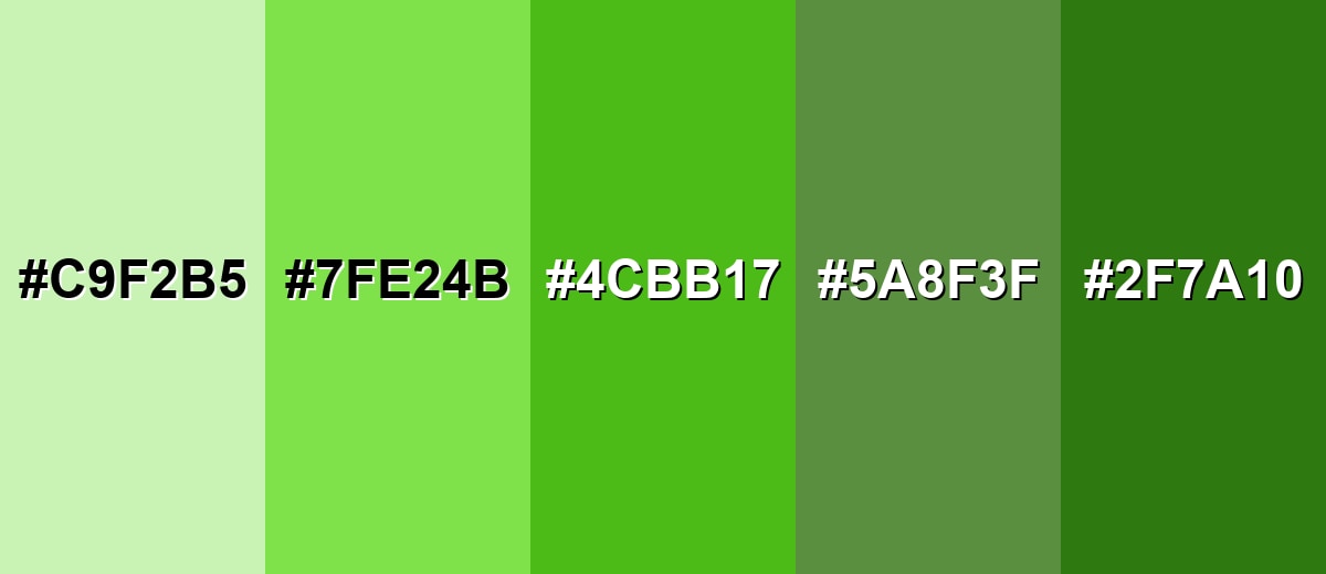
Shades, Tints & Variations of Kelly Green
Kelly green has a surprisingly useful range—from soft tints for backgrounds to deeper greens that hold up better for text and contrast. Mixing these variations helps you keep the same "green identity" while controlling intensity across a full design system.
- Pale Kelly Tint (#C9F2B5) - A soft, airy tint that keeps the green identity while feeling gentle and modern. It's best used for Backgrounds, cards, subtle highlights, and large UI panels.
- Light Kelly Green (#7FE24B) - A brighter, more luminous version that reads energetic without going neon. It's best used for Accents, icons, positive states, and playful brand graphics.
- Kelly Green (#4CBB17) - The classic vivid mid-green that looks crisp, clean, and highly noticeable. It's best used for Primary accents, calls to action, and bold brand elements.
- Muted Kelly Green (#5A8F3F) - A toned-down option that feels more natural and easier on the eyes. It's best used for Secondary UI elements, textiles, packaging, and long-view designs.
- Deep Kelly Green (#2F7A10) - A darker, weightier shade that adds stability and improves contrast. It's best used for Text on light backgrounds, headers, borders, and premium-feeling branding.
Industry Applications
Because it's bold and easy to recognize, kelly green shows up in many practical design settings. It works especially well anywhere you need a fresh signal, a sporty tone, or a clear highlight.
Fashion & Beauty
- Use it as an accent color for sporty, high-energy looks that need instant visibility.
- Pair it with calmer neutrals to keep outfits, packaging, or layouts from feeling too intense.
- Try muted or deep variations when you want a more natural, wearable green.
- Keep typography and details clean so the bright green reads modern instead of noisy.
Interior Design & Decor
- As a feature-wall or furniture accent, it adds an energetic, garden-like pop.
- Balance it with warm woods, off-whites, and natural textures so it doesn't overpower the room.
- Use softer tints for larger surfaces when you want a lighter, more breathable feel.
- Deep shades work well for borders, trim, and contrast-heavy details.
Branding & Marketing
- It can communicate freshness, momentum, and confidence—especially for wellness, sustainability, food, or sports.
- Use it for success states, progress indicators, and positive confirmation in digital products.
- In retail and packaging, it helps call out natural, fresh, or active positioning with clear shelf contrast.
- For long-form materials, consider muted variations to feel more trustworthy and less urgent.
Conclusion
Kelly green (#4CBB17) is a vivid, confident green that feels fresh and energetic without drifting into neon—making it ideal for accents, highlights, and attention-driving elements in branding, UI, and visual communication. When you build around it with calm neutrals or deeper supporting tones, the result stays clean and readable, while complementary purples and structured palettes like triads add contrast that still feels intentional. With a few smart shade choices and contrast checks, kelly green remains one of the most practical high-impact greens to design with.
Design Smarter with AI: Media.io is an online AI studio that empowers creators with advanced image generation and enhancement tools. From text-to-image and image-to-image creation to AI upscaling and color optimization, it enables fast, creative, and professional results—all in your browser.

Frequently Asked Questions About Kelly Green Color
Kelly green is a bright, saturated mid-green that looks lively and clean, similar to fresh grass in strong light. It's commonly used when you want a bold, upbeat green accent.
A common hex code used for kelly green is #4cbb17. Keep in mind that named greens can vary slightly across brands and libraries.
No. Emerald green is usually deeper and slightly cooler, often with more blue. Kelly green is typically brighter and more direct, with a punchier, spring-like look.
It pairs well with off-whites, charcoal grays, navy blues, and warm accents like amber. For strong contrast, purple-leaning hues can create a complementary, high-energy palette.
Yes, but test contrast carefully. It often works best for buttons, icons, and highlights, while darker greens or dark neutrals are usually more readable for smaller text.
Start with the CMYK conversion as a baseline, then request a proof because paper type and printer profiles can shift saturated greens. Coated stock usually keeps it brighter than uncoated paper.


