Magenta is a high-impact purplish-pink that sits between red and blue in the visible spectrum—often perceived as energetic, expressive, and modern. In digital color systems, "pure" magenta is commonly represented as #ff00ff, created by mixing full red and full blue with no green.
Because it's so saturated, magenta works best when it's used intentionally: as a hero accent, a brand signature, or a highlight color paired with calmer neutrals. Below you'll find precise codes, conversions, pairing ideas, and practical ways to apply magenta across UI, print, and content design.
Magenta Color: Codes & Values
If you want a "true" digital magenta, these are the standard values designers use for consistent results across tools and platforms.
| Parameters | VALUE |
| HEX Code | #FF00FF |
| RGB DECIMAL | 255, 0, 255 |
| RGB PERCENTAGE | 100%, 0%, 100% |
| CMYK | 0%,100%,0%,0% |
| HSL | 300°, 100%, 50% |
| HSV (HSB) | 300°, 100%, 100% |
| Web Safe | #FF00FF |
Key Color Space Explanations:
- HEX - HEX is the most common web identifier for magenta, used in CSS and design tools to reproduce the exact digital color.
- RGB - RGB defines magenta with red, green, and blue light values. For pure magenta, red and blue are maxed while green is zero.
- CMYK - CMYK is used for printing and describes how inks combine on paper. Magenta ink is a primary channel in CMYK workflows.
- HSL - HSL describes magenta by hue, saturation, and lightness, which can feel more intuitive when creating tints, tones, and shades.
- Web Safe - Web-safe colors were designed for older displays; the closest web-safe value for this magenta is the same as its HEX here.
Use HEX for web and UI, RGB for screen-based editing, and CMYK for print production so your magenta stays consistent from mockup to final output.
Want to generate magenta color photos or posters? Try Media.io's AI Image Generator now!
Magenta Color Conversions
Need magenta in a different color model? Use these conversions to copy/paste values into design software, CSS, and print workflows.
| Parameters | VALUE | CSS |
| HEX | #ff00ff | #ff00ff |
| RGB DECIMAL | 255, 0, 255 | rgb(255,0,255) |
| RGB PERCENTAGE | 100%, 0%, 100% | rgb(100%,0%,100%) |
| CMYK | 0%,100%,0%,0% | cmyk(0%,100%,0%,0%) |
| HSL | 300°, 100%, 50% | hsl(300°,100%,50%) |
| HSV (or HSB) | 300°, 100%, 100% | -- |
| Web Safe | ff00ff | #ff00ff |
| CIE-LAB | 44.21, 98.50, -61.00 | -- |
| XYZ | 59.29, 28.48, 96.98 | -- |
| xyY | 0.3209, 0.1542, 28.48 | -- |
| CIE-LCH | 44.21, 115.90, 328.10° | -- |
| CIE-LUV | 44.21, 61.60, -79.70 | -- |
| Hunter-Lab | 53.36, 111.20, -79.50 | -- |
| Binary | 11111111 00000000 11111111 | -- |
Magenta Color Meaning & Symbolism
Magenta blends the warmth of red with the cool depth of blue, which is why it can feel both playful and sophisticated. It often signals creativity, individuality, and bold expression.
Psychological Effects
Because it's intense and high-visibility, magenta tends to be felt quickly—before it's fully "read."
- High Energy - Magenta brings an instant sense of motion and excitement, making it great for moments that need attention.
- Expressive Mood - It encourages a more creative, experimental feel than classic reds or blues.
- Modern Edge - The hue often reads as contemporary and digital-forward, especially in UI and media design.
- Bold Individuality - Magenta can signal nonconformity and confidence, which is why it's popular in standout branding.
- Visual Fatigue Risk - In large blocks, highly saturated magenta can feel loud and tiring on bright screens.
Positive Associations
When balanced with space and neutrals, magenta can feel premium, playful, and distinctly memorable.
- Creativity - Often tied to imagination and artistic energy in campaigns, posters, and creative tools.
- Confidence - Reads as assertive without leaning into the aggression that pure red can imply.
- Modernity - Common in tech-forward visuals and contemporary design systems.
- Youthful Vibrancy - A go-to for high-visibility accents that feel fresh and upbeat.
- Luxury Accents - Paired with dark neutrals, magenta can act like a jewel tone and elevate the overall look.
Cultural Significance Across the World
Magenta doesn't have one universal meaning everywhere, but it shows up in recognizable modern contexts globally.
- Entertainment Visual Language - Frequently used in nightlife, posters, and cover art to communicate intensity and spectacle.
- Digital Creativity - A familiar color in digital art, gradients, and experimental web aesthetics.
- Print Production - Magenta is foundational in CMYK printing, making it a practical (and symbolic) pillar of modern publishing.
- Brand Distinction - Globally, brands use magenta as a signature to stand out in crowded feeds and retail spaces.
Design Applications
Magenta is easiest to use when you treat it as an accent first, then scale up only if the layout has enough breathing room. A little goes a long way—especially for UI.
Graphic Design Tips
- Use magenta for primary highlights like buttons, badges, chart series, or key calls-to-action.
- Balance saturation with deep neutrals (like charcoal) so the page still feels readable and premium.
- When magenta becomes the background, increase whitespace and keep typography simple to reduce visual noise.
- For product UI, reserve magenta for one main action so it doesn't compete with other accents.
- Build a consistent shade scale (light to dark) to keep the color system cohesive across components.
Pro tip: If #FF00FF feels too neon for your layout, step down to a deeper shade for most surfaces and save the pure value for hover states, badges, or small high-impact highlights.
Magenta Color in Photography & Video
- Use magenta lighting for portraits to add a bold, editorial vibe—especially against dark backdrops.
- In color grading, magenta can help neutralize green casts, but keep it subtle to avoid unnatural skin tones.
- For thumbnails and posters, magenta accents can pull focus to faces, titles, and key objects.
- Try magenta-to-cyan gradients for modern, techy visuals—great for music, events, and motion graphics.
- In dark mode video overlays, consider deeper magenta tones for a refined look with less glare.
Recommended Tool for Image Enhancement: When incorporating magenta color into your photography projects, Media.io's AI Image tools can help you achieve more refined results. With AI-powered color enhancement, photo colorization, image upscaling, and old photo restoration, you can easily enrich magenta color tones, improve overall image quality, and highlight the color's elegant and sophisticated aesthetic.
Color Combinations
Magenta pairs beautifully with high-contrast opposites (greens), clean spectral partners (cyan/yellow), and nearby pinks and purples. The palettes below are ready to lift into design work.
Complementary Colors
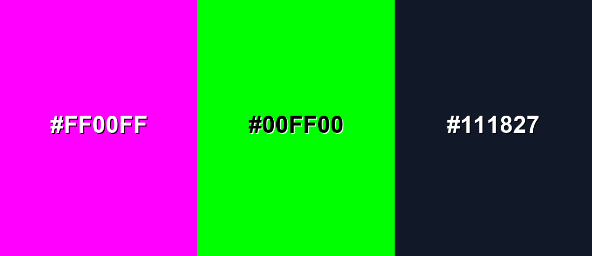
Complementary palettes maximize contrast by pairing magenta with green. This creates a vibrant, attention-grabbing look that works best with a grounding neutral.
Complementary Palette Example: Use Magenta (#ff00ff) with Bright Green (#00ff00) and Charcoal (#111827) for punchy contrast that still feels controlled.
Analogous Color Schemes
Analogous colors sit adjacent to each other on the color wheel, creating harmonious, cohesive palettes with subtle variation.
Magenta with Hot Pink and Electric Purple for a smooth, high-energy blend.
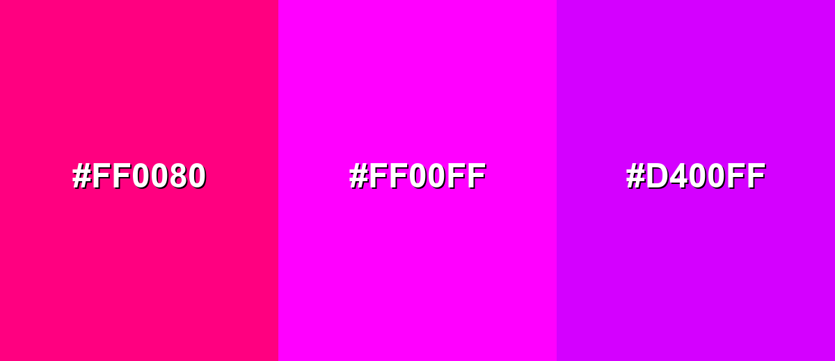
- Hot Pink: #FF0080
- Magenta: #FF00FF
- Electric Purple: #D400FF
Magenta with Light Magenta and Vivid Violet for softer transitions and modern gradients.
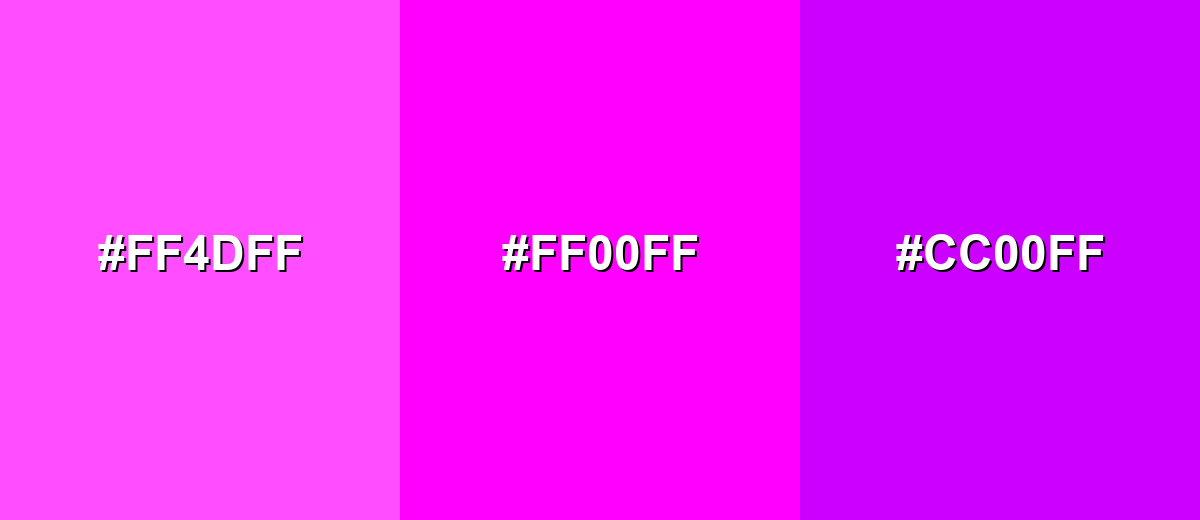
- Light Magenta: #FF4DFF
- Magenta: #FF00FF
- Vivid Violet: #CC00FF
Triadic & Tetradic Combinations
Triadic palettes use three evenly spaced hues to stay colorful without collapsing into a single tone.
Triadic: Magenta with Cyan and Yellow for a bright, playful, highly visible system.
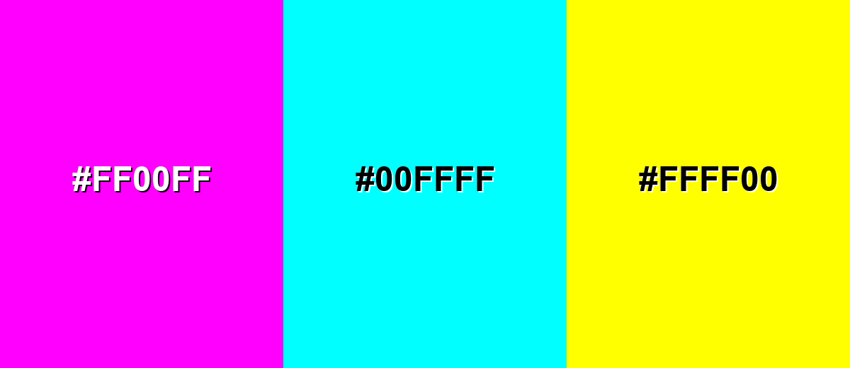
- Magenta: #FF00FF
- Cyan: #00FFFF
- Yellow: #FFFF00
Colors to Avoid
While magenta color is remarkably versatile, certain combinations can create problematic visual effects:
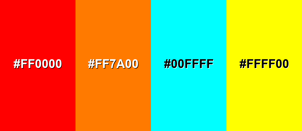
- Pure Red (#FF0000) - Red next to magenta can create harsh vibration and makes both hues feel less distinct, especially in small UI elements.
- Vivid Orange (#FF7A00) - Highly saturated orange competes with magenta for attention, which can flatten hierarchy and feel chaotic without strong neutrals.
- Pure Cyan (#00FFFF) - Cyan with magenta is extremely high-chroma; it can be great intentionally, but for text and dense layouts it often reduces comfort and readability.
- Pure Yellow (#FFFF00) - Yellow at full intensity can overwhelm magenta and cause glare on bright screens; use muted yellows if you need warmth.
Shades, Tints & Variations of Magenta Color
Magenta isn't just one "neon" look—its range runs from soft tints to deep, plum-like shades. Building a small set of variations makes it much easier to create hierarchy (backgrounds, borders, hover states, and headlines) while keeping the brand feel consistent.
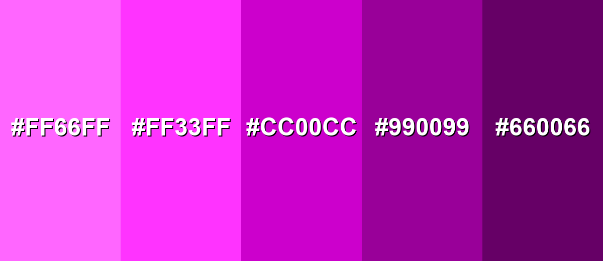
- Light Magenta (#FF66FF) - A softer, airier tint of magenta that keeps the character but feels less intense. It's best used for Background gradients, subtle highlights, large surfaces where pure magenta would be too loud..
- Bright Magenta (#FF33FF) - A slightly tempered version of pure magenta that still reads as vivid and modern. It's best used for Buttons, icons, and emphasis states when you want strong visibility with a touch more comfort..
- Deep Magenta (#CC00CC) - A richer, darker magenta that feels more premium and less neon. It's best used for Headlines, brand marks, and dark-mode accents paired with charcoal or deep navy..
- Dark Magenta (#990099) - A moody shade with stronger purple undertones and reduced brightness. It's best used for Secondary accents, borders, and UI components where you need restraint and consistency..
- Blackened Magenta (#660066) - A near-plum shade that anchors palettes while still referencing magenta's identity. It's best used for Backgrounds, shadows, and sophisticated brand systems that need depth without plain black..
Industry Applications
Magenta's visibility makes it effective in competitive visual spaces, but the best results come from pairing it with supportive neutrals and a clear hierarchy.
Fashion & Beauty
- Use magenta as a statement shade for seasonal launches, limited editions, and bold product photography.
- Pair it with deep, clean backgrounds to make packaging and swatches look more premium.
- Works well for social-first creatives where you need instant "stop scrolling" impact.
- Great for accent details (caps, labels, badges) when the main design is neutral and minimal.
Interior Design & Decor
- Use magenta as an accent wall color or decor highlight when the rest of the room is calm and neutral.
- In modern spaces, magenta details can add personality without changing the whole palette.
- Deep magenta variations can feel rich and dramatic in low-light settings.
- Works best when you limit it to one or two focal points to avoid visual overload.
Branding & Marketing
- Campaign accents that stand out in feeds and banners.
- Distinctive brand signatures for creative or youth-forward products.
- Primary CTAs, active states, and selected filters (used sparingly).
- Data visualization series when you need a color that's easy to track.
Conclusion
Magenta is a vivid purplish‑pink that communicates creativity, confidence, and modern energy—especially in its pure digital form, #FF00FF. Use it for high-impact accents like CTAs, badges, and headlines, then balance the intensity with whitespace, structured shade scales, and calmer supporting tones so your design stays readable and intentional across UI, print, and content.
Design Smarter with AI: Media.io is an online AI studio that empowers creators with advanced image generation and enhancement tools. From text-to-image and image-to-image creation to AI upscaling and color optimization, it enables fast, creative, and professional results—all in your browser.

Frequently Asked Questions About Magenta Color
Magenta is a vivid purplish‑pink hue commonly described as a mix of red and blue light. In digital color, pure magenta appears when red and blue are at full intensity with no green.
In many digital contexts, magenta and fuchsia are used interchangeably and often share the same value (#ff00ff). In art and print discussions, the terms may be used to describe slightly different pink‑purple ranges.
Green is the complementary color to magenta. Pairing magenta with a bright green creates strong contrast, so adding a neutral helps keep the palette balanced.
For pure magenta, RGB is 255, 0, 255. In CMYK, it is commonly represented as 0%,100%,0%,0%.
Use magenta as an accent for key UI elements or highlights, and anchor it with dark neutrals like charcoal (#111827). Build a shade scale (lighter and darker magentas) so you can keep consistency across components.
Yes—magenta can look crisp and vibrant in dark mode, especially for accents and interactive states. Use deeper shades (like #cc00cc or #990099) when you want a more refined, less neon feel.
