TL;DR:
Cognac is a warm amber-brown design tone, anchored by HEX #A35D2A, that functions best as a premium UI accent paired with bright neutrals or deep blues to convey craftsmanship without overwhelming layouts.
● Maintain legibility in digital products by applying cognac to isolated UI elements like buttons and badges, as filling large backgrounds without high-contrast near-white text creates an overly heavy appearance that reduces readability.
● Shift from digital RGB values of 163, 93, 42 to a CMYK profile of 0%, 43%, 74%, 36% when transitioning designs to physical print to prevent the orange undertone from losing its targeted warmth on paper or coated materials.
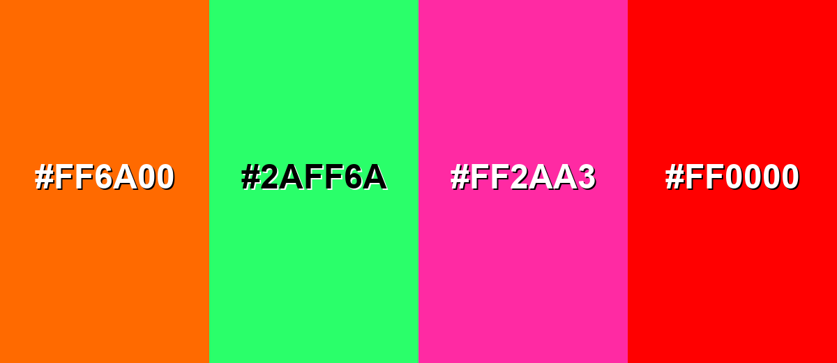
● Differentiate cognac from lighter, neutral tans by avoiding pairings with highly saturated colors like Neon Orange (#FF6A00) or Pure Red (#FF0000), which clash with its natural saturation and trigger unintended visual vibration.
Ask AI for a summary
 ChatGPT
 Perplexity
 Gemini
 Claude
 Grok
Grok
Cognac color is a warm amber-brown that recalls aged leather, polished wood, and barrel-aged spirits. It's most commonly represented by the HEX code #A35D2A, a grounded brown with a subtle orange glow.
Designers like cognac because it feels cozy and premium without being flashy—and it can shift from golden to chestnut depending on lighting and nearby tones. Below, you'll find its exact codes, conversions, best pairings, and practical ways to use it.
Cognac Color: Codes & Values
If you want a reliable, repeatable cognac tone across screens and print, start with these core values.
| Parameters | VALUE |
| HEX Code | #A35D2A |
| RGB DECIMAL | 163, 93, 42 |
| RGB PERCENTAGE | 64%, 36%, 16% |
| CMYK | 0%,43%,74%,36% |
| HSL | 25°, 59%, 40% |
| HSV (HSB) | 25°, 74%, 64% |
| Web Safe | #996633 |
Key Color Space Explanations:
- HEX - HEX is the most common way to specify cognac in web design and digital tools. Use #a35d2a to match this specific amber-brown consistently.
- RGB - RGB mixes red, green, and blue light for screens and UI. Cognac is 163, 93, 42, which explains its warm, slightly orange-leaning brown character.
- CMYK - CMYK is used for print where inks combine on paper. The values 0%,43%,74%,36% help you reproduce a similar tone in packaging, stationery, and production work.
- HSL - HSL describes hue, saturation, and lightness, which is helpful when adjusting tints and shades. With 25°, 59%, 40%, cognac sits in the orange-brown range with moderate depth.
- Web Safe - Web safe colors are an older set of screen-friendly options that reduce banding on limited displays. The closest web-safe match to cognac is #996633.
Use HEX and RGB for UI, product pages, and digital assets, then switch to CMYK when you're preparing print files so the warmth stays consistent.
Cognac Color Conversions
Need cognac in another color format? Use this quick conversion chart for design tools, dev handoff, and production workflows.
| Parameters | VALUE | CSS |
| HEX | #a35d2a | #a35d2a |
| RGB DECIMAL | 163, 93, 42 | rgb(163,93,42) |
| RGB PERCENTAGE | 64%, 36%, 16% | rgb(64%,36%,16%) |
| CMYK | 0%,43%,74%,36% | cmyk(0%,43%,74%,36%) |
| HSL | 25°, 59%, 40% | hsl(25°, 59%, 40%) |
| HSV (or HSB) | 25°, 74%, 64% | -- |
| Web Safe | 996633 | #996633 |
| CIE-LAB | 45.2, 27.6, 43.8 | -- |
| XYZ | 25.6, 20.3, 5.7 | -- |
| xyY | 0.44, 0.35, 20.3 | -- |
| CIE-LCH | 45.2, 51.7, 58° | -- |
| CIE-LUV | 45.2, 54.0, 49.0 | -- |
| Hunter-Lab | 45.0, 20.2, 33.1 | -- |
| Binary | 10100011 01011101 00101010 | -- |
Want to generate Cognac Color photos or posters? Try Media.io's AI Image Generator now!
Cognac Color Meaning & Symbolism
Cognac is widely associated with warmth, craftsmanship, and a sense of quiet luxury. In everyday life it often shows up where you want a grounded, natural feeling that still looks intentional and elevated. This is why cognac color symbolism frequently overlaps with ideas like tradition, reliability, and well-made materials.
Psychological Effects
Because it sits between brown and orange, cognac can feel steady and comforting, with a subtle spark of energy.
- Welcoming - Cognac tends to make spaces and layouts feel inviting and secure, especially next to soft neutrals.
- Dependable - It can read as mature and reliable, which helps brands that want to signal trust and longevity.
- Warm Energy - Its orange undertone adds a gentle sense of momentum when used in small doses.
- Attention Without Alarm - In UI, it works for highlights, badges, and warm accents that feel less aggressive than bright orange.
- Heavy If Overused - If you don't balance it with contrast and whitespace, cognac can feel overly rustic and may reduce readability in digital products.
Positive Associations
These are the most common "good" signals designers tap into when using cognac as a core tone or accent.
- Warmth - A cozy amber-brown that makes visuals feel approachable and human.
- Craftsmanship - Strong links to well-made materials like leather goods and wood finishes.
- Quiet Luxury - Premium energy that feels refined rather than flashy.
- Tradition - A heritage-leaning color that suggests timeless style and longevity.
- Reliability - A grounded tone that supports trust-focused messaging and stable brand systems.
Cultural Significance Across the World
The name and look of cognac connect to aging, patina, and materials that get better over time.
- Barrel-Aged Heritage - The name connects to the look of aged spirits and tones found in wood barrels.
- Leather & Craft Goods - Often associated with leather goods, adding a made-to-last feel in product design.
- Wood & Natural Materials - Commonly reads as natural and grounded because it resembles warm wood tones.
- Patina & Time - Suggests depth and character, like surfaces that develop a richer look over time.
Design Applications
Cognac is easiest to work with when you treat it as a warm foundation tone and build contrast around it. It can act as a main surface shade, an accent, or a bridge between neutrals and bolder hues.
Graphic Design Tips
- Use cognac as a premium accent for buttons, callouts, or key UI moments on light backgrounds.
- For dark cognac surfaces, choose near-white text; for light cognac tints, switch to charcoal typography.
- Keep body text away from low-contrast tan-on-cognac pairings—reserve similar tans for backgrounds or large areas.
- In branding, lean into cognac for artisan, heritage, boutique, and editorial-style layouts.
- For print, request proofs—warm browns can shift depending on paper and coating.
Pro tip: If your layout starts feeling too "rustic," balance cognac with bright neutrals and clean spacing, then use it in smaller, deliberate blocks (buttons, borders, tags) instead of full-page fills.
Cognac Color in Photography & Video
- Expect cognac to look more golden under warm lighting and deeper chestnut under cooler or low light.
- Use cognac props (leather, wood, fabric) to add a premium, tactile cue without overpowering the subject.
- Pair with off-white surfaces to keep shots airy while still letting the amber-brown read clearly.
- In grading, protect highlight detail—cognac can lose its glow if midtones get crushed.
- For overlays and lower-thirds, maintain strong contrast so text remains readable over cognac-heavy footage.
Recommended Tool for Image Enhancement: When incorporating cognac color into your photography projects, Media.io's AI Image tools can help you achieve more refined results. With AI-powered color enhancement, photo colorization, image upscaling, and old photo restoration, you can easily enrich cognac color tones, improve overall image quality, and highlight the color's elegant and sophisticated aesthetic.
Color Combinations
Cognac pairs best with calm neutrals, deep blues, and muted greens that balance its warmth. Use these palettes as starting points, then adjust lightness for your layout or material.
Complementary Colors
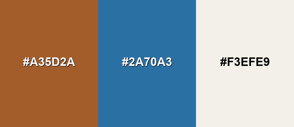
A complementary scheme balances cognac with a blue tone across the wheel, creating crisp contrast without losing a refined look.
Complementary Palette Example: Pair Cognac with Steel Blue and a soft off-white for clean, premium contrast.
Analogous Color Schemes
Analogous colors sit adjacent to each other on the color wheel, creating harmonious, cohesive palettes with subtle variation.
Cognac, Golden Tan, and Chestnut feel cohesive and earthy, ideal for warm, natural layouts.
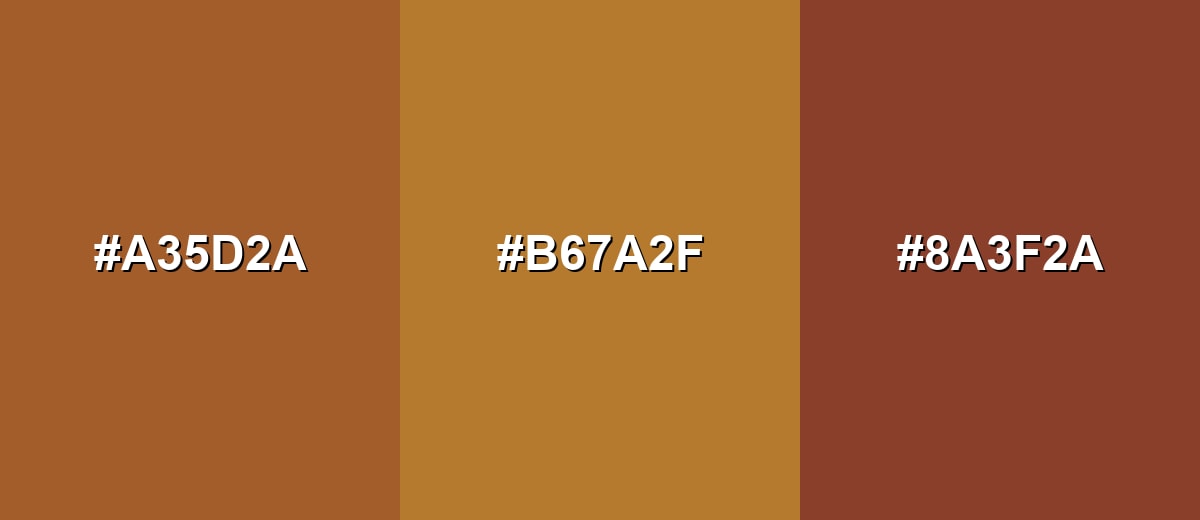
- Cognac: #A35D2A
- Golden Tan: #B67A2F
- Chestnut: #8A3F2A
Deep Cognac with Classic Cognac and Caramel creates a smooth gradient that works well for depth and hierarchy.
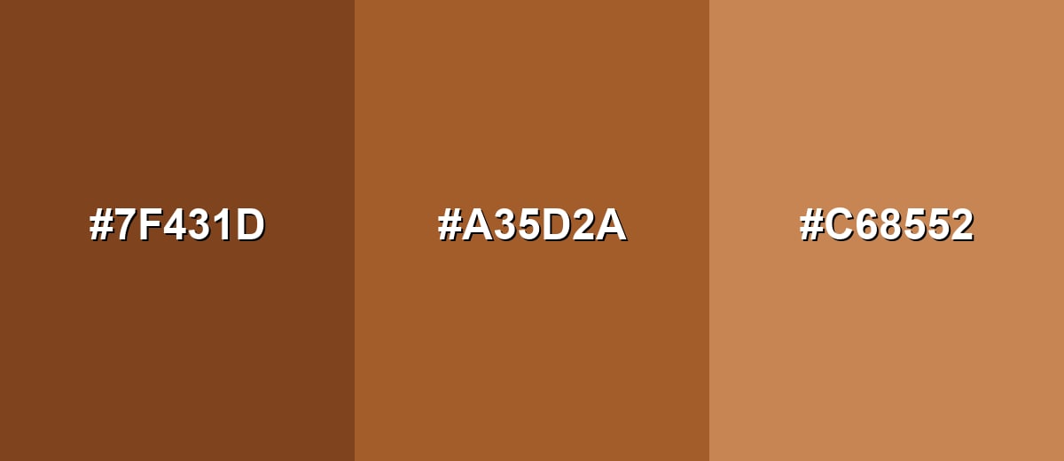
- Deep Cognac: #7F431D
- Cognac: #A35D2A
- Caramel: #C68552
Triadic & Tetradic Combinations
A triadic palette keeps contrast high while staying balanced across warm and cool tones.
Use Cognac with Teal Green and Royal Purple for bold, modern variety with clear separation.
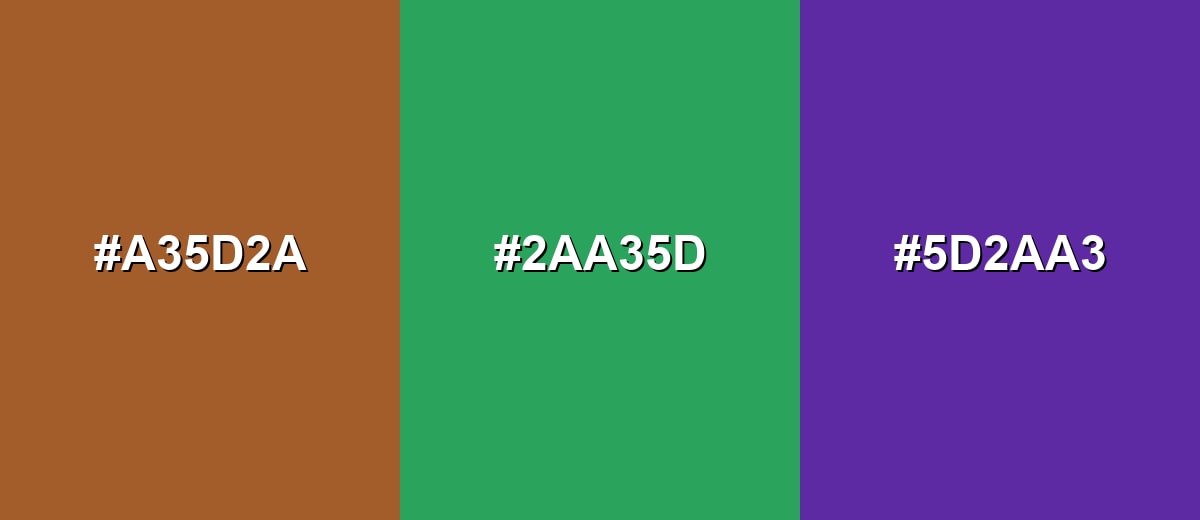
- Cognac: #A35D2A
- Teal Green: #2AA35D
- Royal Purple: #5D2AA3
Colors to Avoid
While cognac color is remarkably versatile, certain combinations can create problematic visual effects:
- Neon Orange (#FF6A00) - Too close in temperature and saturation, making the palette feel loud and reducing legibility for UI accents.
- Electric Green (#2AFF6A) - Creates a harsh, unnatural contrast that can distract from content and look mismatched with cognac's crafted vibe.
- Hot Magenta (#FF2AA3) - Can clash and create a vibrating effect, especially in digital layouts with thin typography.
- Pure Red (#FF0000) - Pushes the palette into a warning or urgency feel, which can overpower cognac's calm, premium tone.
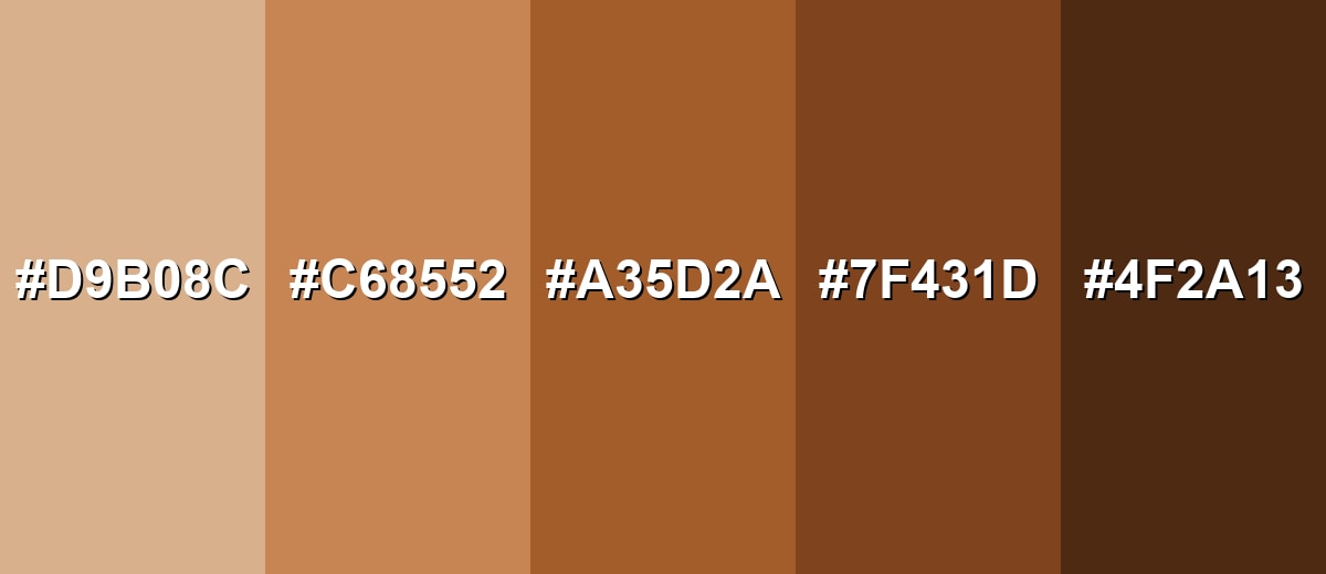
Shades, Tints & Variations of Cognac Color
Cognac has a surprisingly flexible range—from airy tan tints to deep, espresso-like browns. Using a few related variations helps you build hierarchy (backgrounds, surfaces, accents, and text) while keeping the palette cohesive.
- Light Cognac (#D9B08C) - A softened, creamy tan with a gentle cognac undertone that feels airy and approachable. It's best used for Backgrounds, large surfaces, and warm minimal layouts..
- Caramel Cognac (#C68552) - A mid-light caramel shade that keeps warmth while adding a little more richness. It's best used for Secondary panels, cards, and friendly packaging accents..
- Classic Cognac (#A35D2A) - The core cognac tone: amber-brown, balanced, and strongly associated with leather and wood. It's best used for Primary brand accents, buttons, highlights, and focal objects..
- Deep Cognac (#7F431D) - A darker, more grounded version that feels sturdy and traditional without turning flat. It's best used for Headers, footers, borders, and depth in gradients or materials..
- Espresso Brown (#4F2A13) - A near-brown shade with a warm undertone, useful when you want cognac's mood with stronger contrast. It's best used for Text on light tints, outlines, and high-contrast interface elements..
Industry Applications
Cognac fits industries that benefit from warmth, trust, and material cues. It can feel handcrafted in lifestyle contexts, or premium and steady in more structured brand systems.
Fashion & Beauty
- Use leather-inspired cognac tones in lookbooks and product pages to highlight craftsmanship.
- Apply it on hang tags, labels, and packaging to signal premium, well-made materials.
- Pair cognac neutrals with metals and natural fibers for accessories and apparel styling.
- Bring it into earthy, botanical beauty packaging and refined UI accents that emphasize glow and richness.
Interior Design & Decor
- Feature cognac in upholstery and leather-inspired finishes as a warm focal point.
- Use it alongside wood tones and trim to add depth without making a room feel too dark.
- Support swatches and finish selectors where natural materials and tactile cues matter.
- Add it as an accent tone in catalogs and mood boards for cozy, editorial-style storytelling.
Branding & Marketing
- In food and beverage branding, use cognac-like warmth to hint at aging, roasting, or barrel notes.
- Build premium labels and menus with warm backgrounds and cream-forward typography.
- For tech and SaaS, use cognac as a human, warm accent for buttons, onboarding, and empty states.
- In packaging and campaigns, lean into heritage cues tied to wood, leather, and patina over time.
Conclusion
Cognac is one of those rare warm browns that feels both natural and elevated. With #A35D2A as your anchor, you can create interfaces, brand systems, and interiors that look confident, crafted, and comfortable—especially when you balance it with bright neutrals and clear contrast. Whether you're building a premium product page, a heritage-inspired package, or a cozy UI accent palette, cognac delivers warmth without drifting into loud orange, making it a dependable choice for modern design.
Design Smarter with AI: Media.io is an online AI studio that empowers creators with advanced image generation and enhancement tools. From text-to-image and image-to-image creation to AI upscaling and color optimization, it enables fast, creative, and professional results—all in your browser.

Frequently Asked Questions About Cognac Color
It is a warm amber-brown with an orange undertone, similar to aged leather, polished wood, or the hue of barrel-aged spirits.
A common digital reference for cognac is #a35d2a, which produces a rich amber-brown on screens.
It sits between both. The base reads as brown, but the orange undertone is what gives cognac its golden warmth and lively feel.
Off-white and cream create a clean, cozy look, while deep blues add strong contrast. Muted greens, charcoal, and warm grays also pair well for a natural, balanced palette.
Use it as an accent on light backgrounds or as a surface color with near-white text. Avoid pairing it with similar tans for body text, and check contrast for buttons, links, and small labels.
Tan is usually lighter and more neutral, while cognac is deeper and more saturated with a noticeable orange-brown richness.