

Neon green color is an ultra-bright, electric-looking green that feels fluorescent and highly visible in real life. Its most common digital reference is #39ff14, a vivid green that almost seems to glow on screens.
People often read it as energetic, futuristic, and attention-grabbing, with a playful edge. This guide covers neon green meaning, codes, combinations, shades, and practical uses.
Neon Green Color: Codes & Values
If you want a consistent neon green across screens and files, start with the core color codes below.
| Parameters | VALUE |
| HEX Code | #39FF14 |
| RGB DECIMAL | 57, 255, 20 |
| RGB PERCENTAGE | 22%, 100%, 8% |
| CMYK | 78%,0%,92%,0% |
| HSL | 111°, 100%, 54% |
| HSV (HSB) | 111°, 92%, 100% |
| Web Safe | #33FF00 |
Key Color Space Explanations:
- HEX - A six-digit code used in web and digital design to define the exact on-screen shade. For neon green, #39ff14 is the standard reference.
- RGB - Defines the mix of red, green, and blue light used on screens. Neon green is driven by very high green with minimal blue and some red for intensity.
- CMYK - Used for printing with cyan, magenta, yellow, and black inks. Bright neon-like greens can shift in print, so proofs help when accuracy matters.
- HSL - Represents hue, saturation, and lightness in a way that is easy to adjust for UI and palettes. Neon green sits around 111° with maximum saturation.
- Web Safe - The closest web-safe alternative for older display constraints. For this shade, #33ff00 is a practical approximation.
Use HEX for web layouts, RGB/HSL for UI systems and motion graphics, and CMYK as your starting point for print (then proof if you need that true neon punch).
Neon Green Color Conversions
These conversions help you match neon green across common design tools, color pickers, and file formats.
| Parameters | VALUE | CSS |
| HEX | #39ff14 | #39ff14 |
| RGB DECIMAL | 57, 255, 20 | rgb(57,255,20) |
| RGB PERCENTAGE | 22%, 100%, 8% | rgb(22%,100%,8%) |
| CMYK | 78%,0%,92%,0% | cmyk(78%,0%,92%,0%) |
| HSL | 111°, 100%, 54% | hsl(111°,100%,54%) |
| HSV (or HSB) | 111°, 92%, 100% | -- |
| Web Safe | 33ff00 | #33ff00 |
| CIE-LAB | 88.3, -81.5, 82.6 | -- |
| XYZ | 37.58, 72.44, 12.66 | -- |
| xyY | 0.306, 0.590, 72.44 | -- |
| CIE-LCH | 88.3, 116.0, 134.7° | -- |
| CIE-LUV | 88.3, -78.6, 106.4 | -- |
| Hunter-Lab | 85.1, -67.7, 50.0 | -- |
| Binary | 00111001 11111111 00010100 | -- |
Want to generate neon green color photos or posters? Try Media.io's AI Image Generator now!
Neon Green Meaning & Symbolism
Neon green is widely associated with energy, visibility, and a modern, tech-forward vibe. Because it is so bright, it often signals urgency or draws the eye to what matters most. In everyday life, it shows up where being noticed is the point, from highlights and labels to sporty accents and digital calls to action.
Psychological Effects
Neon green tends to read as an "on" color—fast, active, and hard to ignore.
- Alertness - Neon green tends to feel activating and alert, making elements look "live" or in motion.
- Playful Intensity - It can make layouts feel more playful and experimental, especially as a controlled accent.
- Attention Direction - Used in small doses, it helps users spot key actions like buttons, toggles, or status indicators quickly.
- Bold Innovation - In branding, it can communicate innovation and boldness when paired with dark neutrals that keep it readable.
- Visual Fatigue - Overuse can feel harsh or visually tiring, particularly on bright backgrounds or in long-form reading.
Positive Associations
When it's balanced well, neon green carries a modern, optimistic edge.
- High Visibility - Its standout brightness naturally suggests clarity and "notice me" emphasis.
- Futuristic Energy - The shade often feels modern and tech-forward, especially against near-black or deep neutrals.
- Youthful Boldness - It's commonly read as bold and youthful, making it useful for high-energy creative directions.
- Clean Hierarchy - As an accent, it sharpens hierarchy by clearly separating what matters most from supporting content.
- Sporty Vibe - The highlighter-like look connects to sporty accents and fast, performance-focused styling.
Cultural Significance Across the World
Neon green is closely tied to modern visibility culture—both digital and physical.
- High-Visibility Gear - It strongly connects to safety and visibility contexts where being seen is the goal.
- Digital Aesthetics - Neon green is associated with tech-forward styling, modern UI, and futuristic visuals.
- Gaming Culture - It shows up across gaming and esports aesthetics, often paired with dark neutrals for impact.
- Highlighters & Fluorescent Lighting - The color is linked to highlighter stationery and fluorescent lighting, reinforcing "emphasis" and attention.
Design Applications
Neon green works best when you treat it like a spotlight. A little goes a long way, and the right supporting tones can make it look intentional instead of overwhelming.
Graphic Design Tips
- UI accents and calls to action - Use it for buttons, focus states, badges, or progress indicators on dark backgrounds, and reserve it for the highest-priority actions.
- Brand systems and logos - Pair with charcoal, deep purple, or clean white space to keep the mark crisp, and use neon green as the accent thread.
- Posters, thumbnails, and social graphics - Lean on neon green for hooks, tags, and headline underlines, with plenty of breathing room.
- Interiors and product styling - Use it as a small feature (trims, edge details, piping, or a single statement item) rather than a full surface.
- Print considerations - Expect neon-like greens to dull in typical CMYK; spot inks or fluorescent inks may be needed for an accurate match.
Treat it like a spotlight: keep it intentional, give it space, and let darker anchors do the heavy lifting for readability.
Neon Green in Photography & Video
- Use it as a highlight - Neon green is strongest as an accent detail that pulls the viewer to the focal point.
- Build contrast with dark anchors - Pair it with near-black or deep neutrals so the neon stays crisp instead of washing out.
- Keep on-screen text readable - Avoid long neon-green paragraphs; use it for icons, badges, and short emphasis text.
- Lean into modern, tech-forward styling - The shade naturally supports futuristic, digital aesthetics and high-energy edits.
- Use it for hooks in thumbnails - It's effective for tags, labels, and quick emphasis where visibility is critical.
Recommended Tool for Image Enhancement: When incorporating neon green into your photography projects, Media.io's AI Image tools can help you achieve more refined results. With AI-powered color enhancement, photo colorization, image upscaling, and old photo restoration, you can easily enrich neon green tones, improve overall image quality, and highlight the color's elegant and sophisticated aesthetic.
Color Combinations
Pair neon green with tones that either calm it down or intentionally amplify its punch. Dark neutrals, deep purples, and crisp whites are common anchors, while adjacent greens create a modern gradient feel.
Complementary Colors
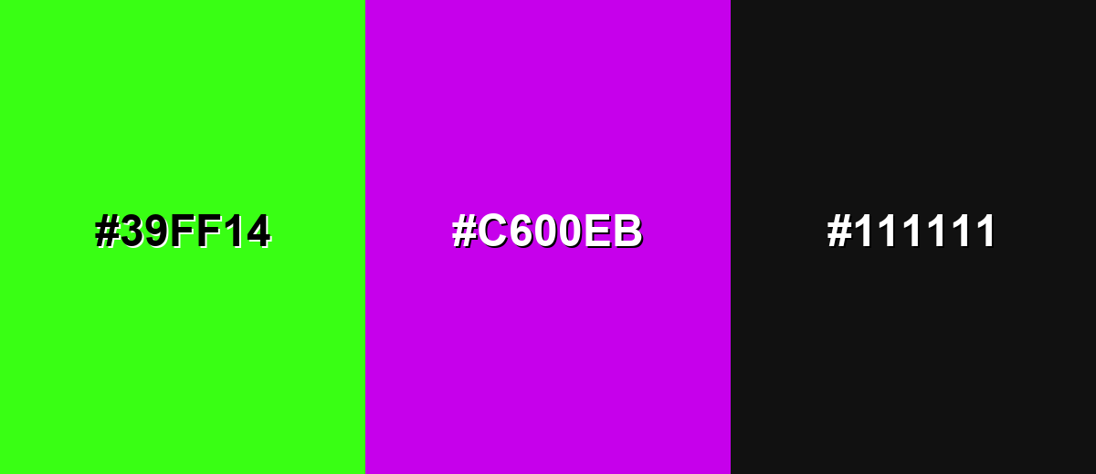
A complementary pairing puts neon green against a purple-violet opposite for maximum energy and separation. This works well for posters, gaming visuals, and bold UI accents when you want immediate attention.
Complementary Palette Example: Use neon green as the highlight, electric purple for contrast, and a near-black neutral to keep the layout grounded.
Analogous Color Schemes
Analogous colors sit adjacent to each other on the color wheel, creating harmonious, cohesive palettes with subtle variation.
Yellow-lime to neon green to fresh spring green creates a high-energy gradient that still feels cohesive.
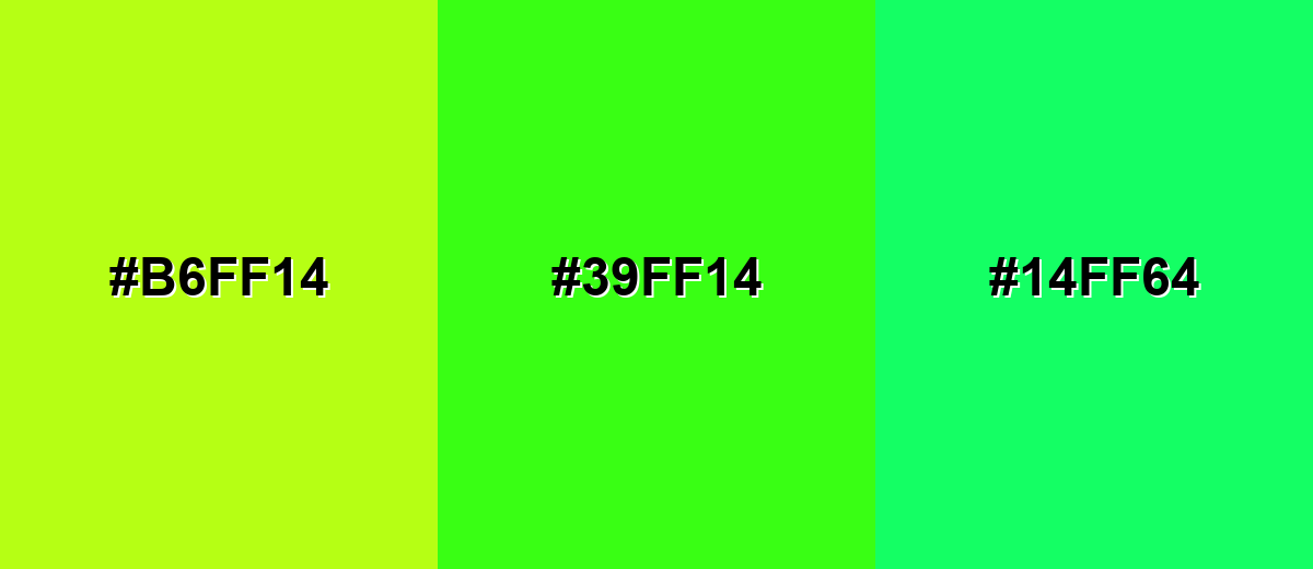
- Lemon Lime: #B6FF14
- Neon Green: #39FF14
- Neon Spring: #14FF64
Acid yellow with neon green and vivid mint pushes a sporty, techy look for highlights and motion graphics.
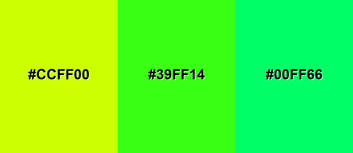
- Acid Yellow: #CCFF00
- Neon Green: #39FF14
- Neon Mint: #00FF66
Triadic & Tetradic Combinations
A triadic scheme adds two evenly spaced hues for variety without losing balance.
Combine neon green with a vivid blue and a hot pink-red to get a punchy, modern palette for digital art and event visuals.
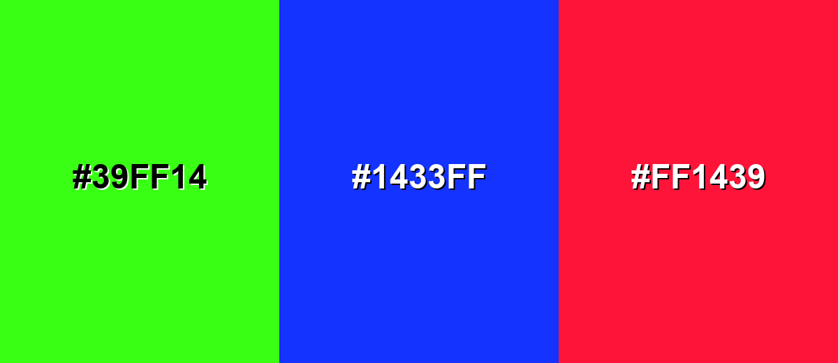
- Neon Green: #39FF14
- Neon Blue: #1433FF
- Neon Pink Red: #FF1439
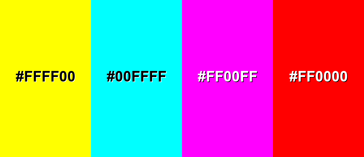
Colors to Avoid
While neon green is remarkably versatile, certain combinations can create problematic visual effects:
- Pure Yellow (#FFFF00) - High brightness next to neon green can create glare and reduce readability, especially in UI labels and small text.
- Pure Cyan (#00FFFF) - Two intense luminous hues can compete and cause vibrating edges, making layouts feel unstable.
- Pure Magenta (#FF00FF) - Another neon-level opponent that easily overwhelms the eye when used at similar sizes or saturation.
- Pure Red (#FF0000) - This pairing can feel aggressive and can be hard to balance for accessibility and comfort in long viewing sessions.
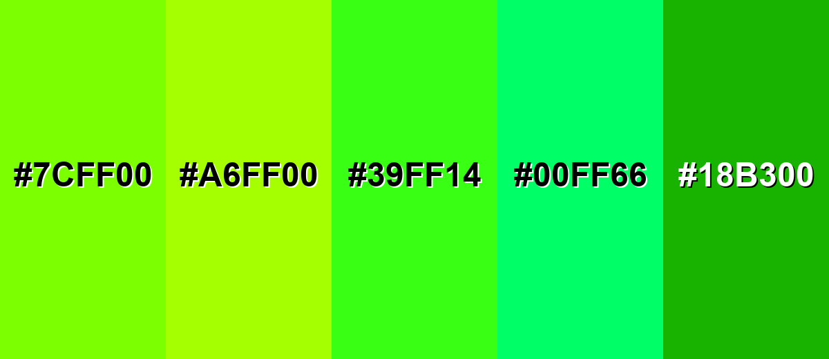
Shades, Tints & Variations of Neon Green
Neon green isn't just one look—there's a useful range from warmer lime-leaning options to cooler mint shifts and deeper versions that reduce glare. Exploring these variations helps you keep the same energy while tuning readability, mood, and hierarchy.
- Electric Lime (#7CFF00) - A brighter lime-leaning option that keeps the neon feel while shifting slightly warmer. It's best used for Eye-catching highlights, sporty accents, and energetic headers.
- Fluorescent Chartreuse (#A6FF00) - A yellow-green variation that reads closer to highlighter ink and feels extra punchy. It's best used for Tags, labels, and attention markers on dark layouts.
- Neon Green (#39FF14) - The classic vivid neon green with a strong glow-like presence on screens. It's best used for Primary accent for CTAs, indicators, and bold graphic details.
- Neon Mint (#00FF66) - A cooler, mint-shifted neon that feels cleaner and slightly more tech-forward. It's best used for Secondary accents, gradients, and modern UI highlights.
- Deep Neon Green (#18B300) - A darker, more grounded version that keeps the energy but reduces glare. It's best used for Text accents, outlines, and backgrounds where full neon is too intense.
Industry Applications
Neon green is chosen in industries where visibility, speed, and modernity matter. It is especially effective when you need a quick signal, a high-impact accent, or a futuristic look.
Fashion & Beauty
- Performance-inspired accents - Use it for trim details and high-energy palettes that feel bold and sporty.
- Limited-edition drops - Neon green works well as a standout accent for special releases and statement styling.
- Product and packaging pop - Add neon green highlights that jump off the shelf and read quickly at a distance.
- High-visibility-inspired styling - Lean into its visibility message for designs where being noticed is the point.
Interior Design & Decor
- Small feature color - Use neon green for trims, edge details, piping, or a single statement item rather than full walls.
- Modernizing neutral spaces - Pair it with near-black or charcoal anchors to keep the look crisp and intentional.
- Futuristic accents - Neon green naturally supports a modern, tech-forward vibe when used as a controlled highlight.
- Balance for comfort - Give it breathing room so the space feels energetic, not overwhelming.
Branding & Marketing
- CTA and UI hierarchy - Use it for high-priority buttons, focus states, and progress indicators, especially on dark themes.
- Posters and promo visuals - Neon green is strong for hooks, tags, and headline underlines that need instant attention.
- Gaming and esports identity - It's a natural fit for HUD-like highlights and bold accents paired with dark neutrals.
- Wayfinding-style emphasis - Use it for directional cues and highlights in signage-inspired graphics where clarity matters.
Conclusion
Neon green stands out because it looks almost fluorescent, delivering instant visibility and a modern, high-energy feel. When you use #39FF14 as an accent—especially on dark neutrals—it can sharpen hierarchy, guide attention, and add a futuristic edge to branding, UI, and visual communication. The key is balance: give it space, anchor it with calmer tones, and avoid stacking competing neons in the same focal area so the color reads as a deliberate highlight rather than a distraction.
Design Smarter with AI: Media.io is an online AI studio that empowers creators with advanced image generation and enhancement tools. From text-to-image and image-to-image creation to AI upscaling and color optimization, it enables fast, creative, and professional results—all in your browser.

Frequently Asked Questions About Neon Green Color
A common digital HEX code for neon green is #39ff14. It is an extremely bright green that often appears to glow on screens.
Neon green is commonly linked with energy, visibility, and a futuristic or techy feel. It can also suggest emphasis, urgency, or playful intensity depending on how it is used.
In RGB decimal, #39ff14 is 57, 255, 20. This means it uses very high green, with a small amount of red and very little blue.
Neon green pairs well with near-black and charcoal for clean contrast, and with purples for a strong complementary look. It also works with adjacent yellow-lime and mint tones for modern gradients.
It can be, but it depends on contrast and how much you use. Neon green on dark backgrounds is often clear for icons and highlights, while neon green backgrounds typically need very dark text and careful testing for readability.
Screens create brightness with light (RGB), while most print uses inks (CMYK) that cannot always reach the same luminous intensity. For a true neon effect, fluorescent or spot inks and print proofs may be needed.


